For my Zine I first went through all my photographs in Lightroom to decide which photos work well together and which didn’t. I also looked to see how my landscape images would look like as a double spread. While in lightroom I also edited the photographs by adjusting the levels and tones, I feel that this will enhance my photographs overall.
Step One: InDesign – document set-up
Create new document
width: 148mm
height: 210
pages: 16
orientation: portrait
columns:2
column gutter: 5mm
margins: top, bottom, inside, outside: 10mm
bleed: top, bottom, inside, outside: 3mm
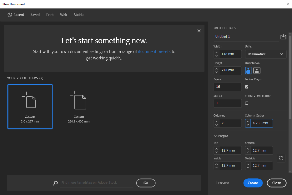
Step Two : While I was using indesign it took me a couple of different try’s to make sure all my photographs positioned correctly so I had to experiment first before making my final decisions. However I have decided that I want to include double spreads within my work as well as photographs with a white border to attract attention.
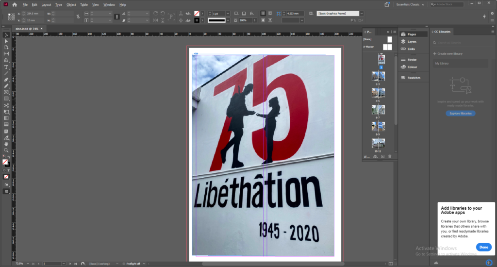
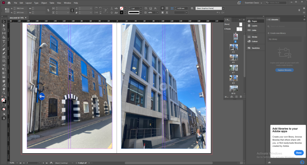
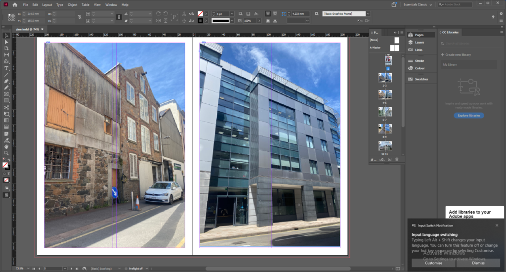
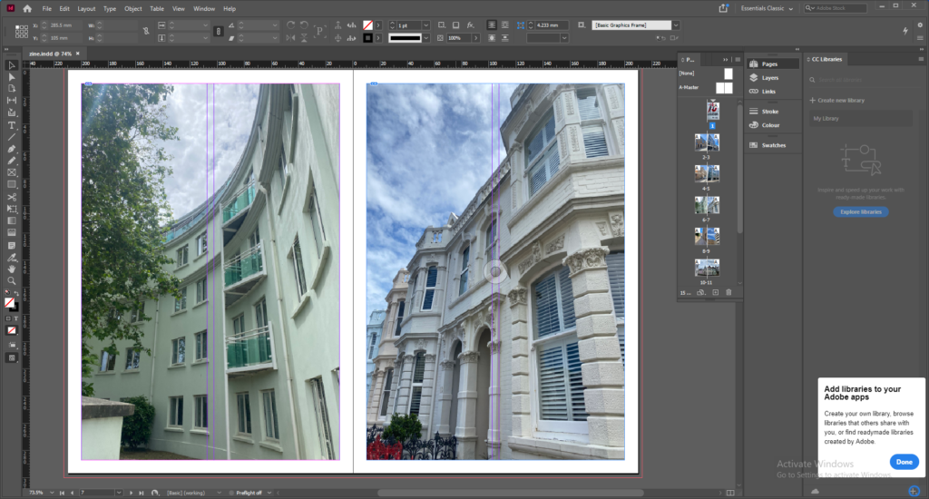
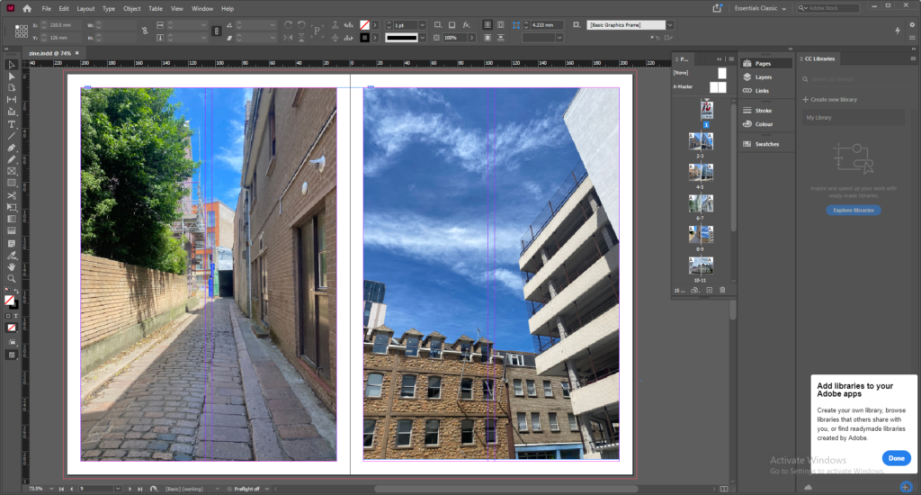
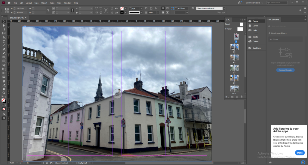
Finally aboveshows the final outcome of what I decided to do for my zine. I feel that the way in which I positioned the photos clearly shows jerseys communities and I also felt that the contrasts between the photographs works well. Furthermore I also believe that I have achieved what I wanted to do because all the photos have been adjusted and I have managed to include a double spread which I feel works well within the zine.
