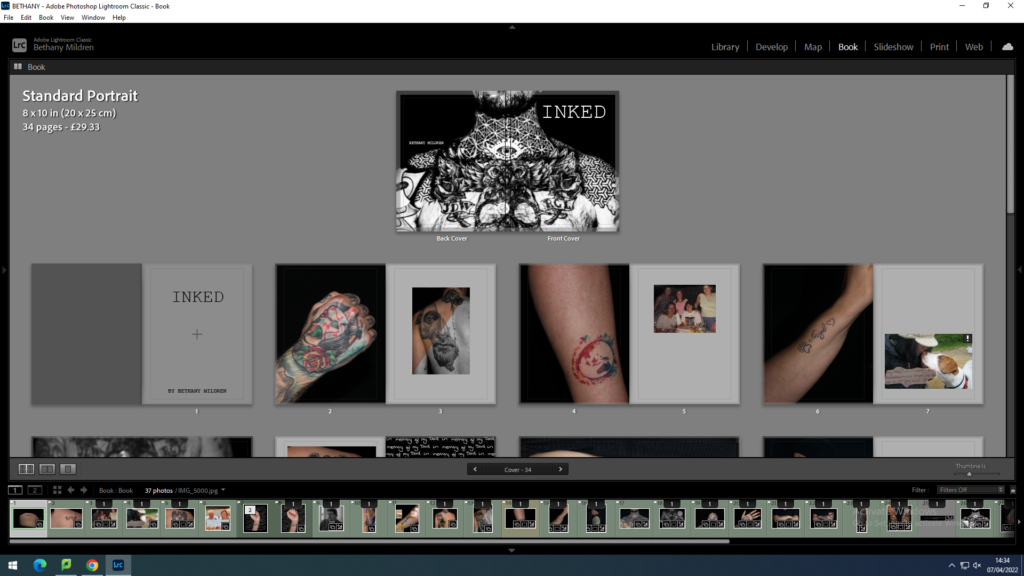
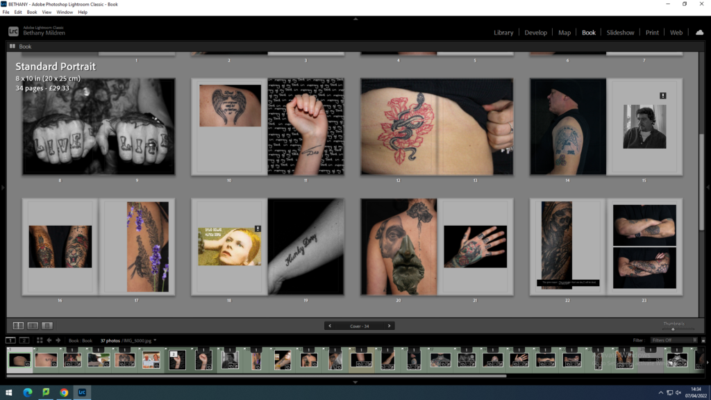
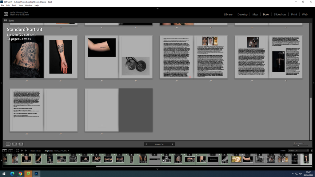
Here we see the final layout for my photobook within Lightroom. On this app I have spent a couple weeks revisiting the layout and making small adjustments to ensure the book looked how I wanted. I decided to add a slight grey tint to the pages as I found that having white pages quite bright and seemed quite bold, this concerned me as it could have drawn attention away from the actual images.


I concluded my photobook by adding my essay to the back pages. I took this option as my photobook doesn’t contain a lot of text. Having the essay helps add context to the project and it supports the ideas presented about identity through body art.
