
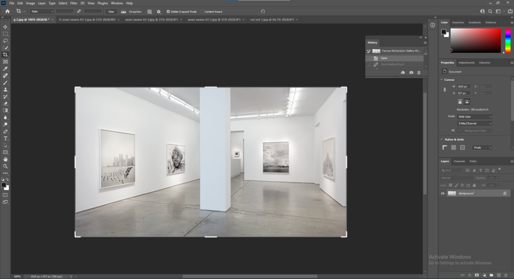
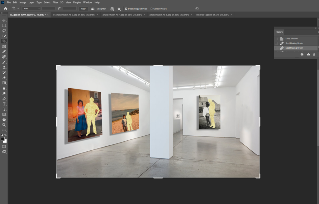
First I opened a picture into Photoshop of an art gallery I found on Google.
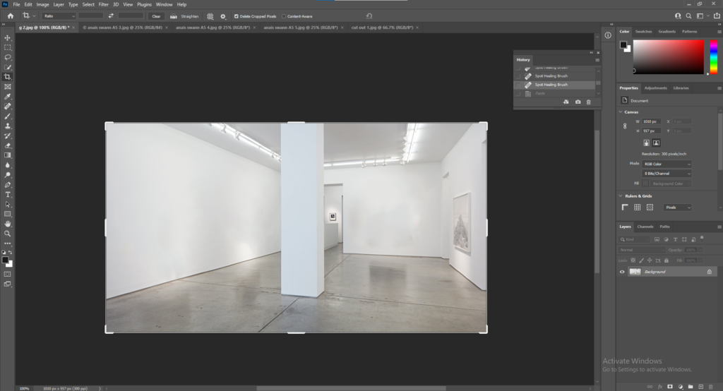
I used the Spot Healing Brush Tool to remove the canvases in the picture so I can add my own.
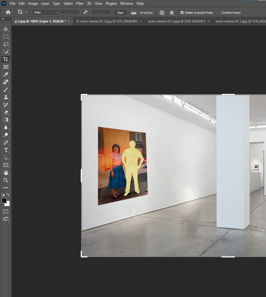
I opened the image I wanted to used and went up to Edit, Transform, Scale and Distort to fit the image correctly onto the wall at the right angle.
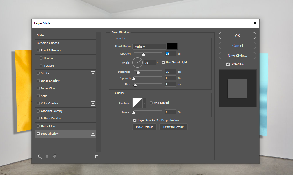
Next I wanted to add a shadow to make the gallery look more realistic. To do this I went up to Layers, Layer Style, Drop Shadow.
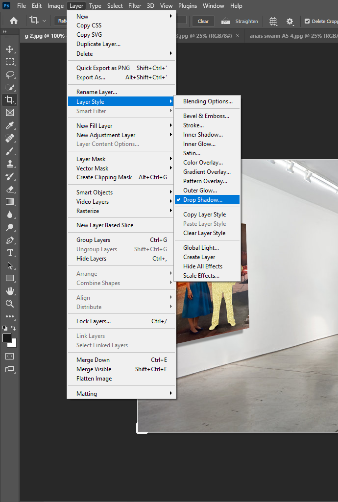
I adjusted the Distance, Speed and Size of the shadow.
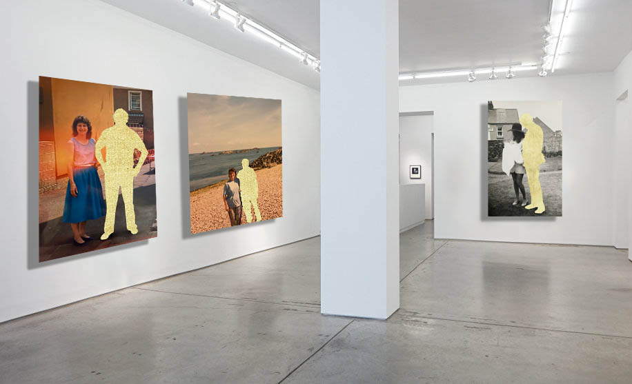
This is the final outcome.
Final Edits


Final images for Printing
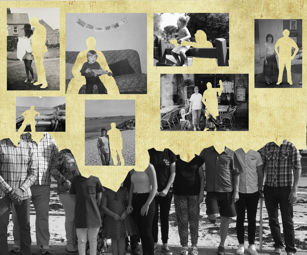

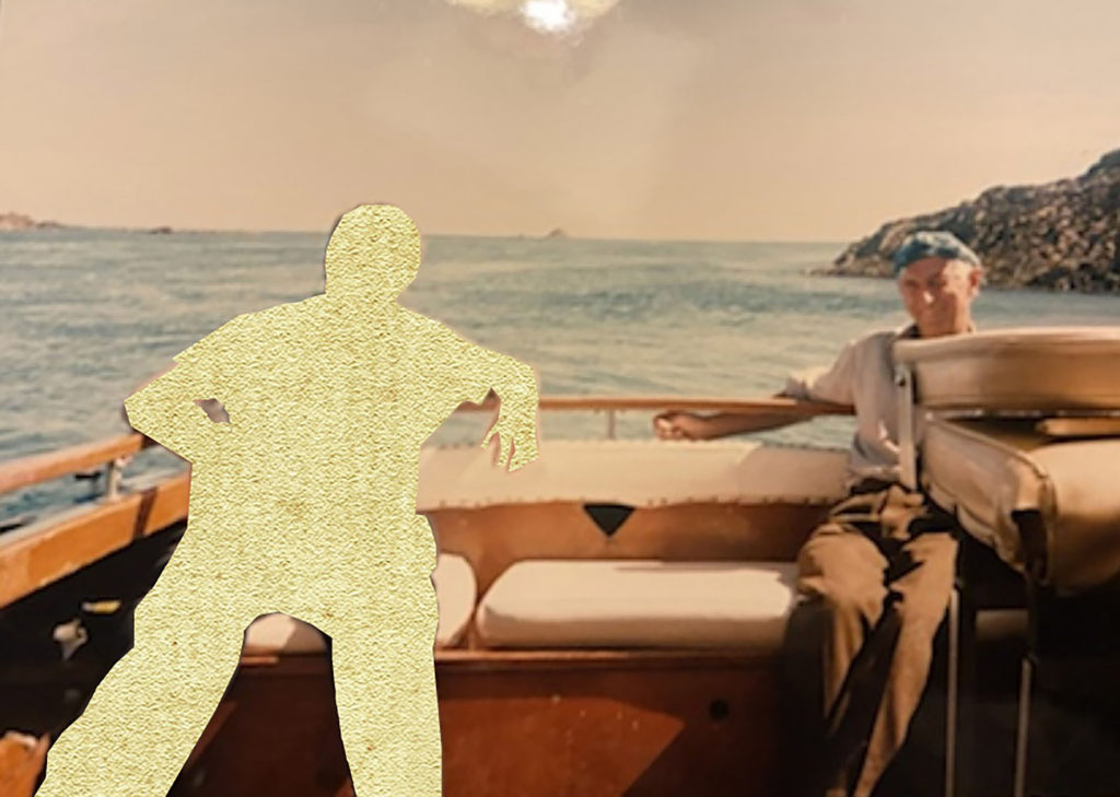

I chose the images above for my final prints because I think they are strong edits with a strong narrative. I took photographs of old family photos, the yellow cut-outs are to represent a loss in the family. The top edit is particularly my favourite, the yellow covering their heads is filled with memories we all had with the person we lost. I like how the warm yellow contrasts against the tones in the back and white image, along with the coloured images, they have a variety of warm tones that go well with the yellow which will look good as a series of 3 in my portfolio.


These 2 images I chose because they are fun and have a lot of life to them. They are filled with bright, positive colours and will add vibrancy to my portfolio.


I really liked these images, especially in black and white as there is no colour to distract from the deep shadows and bright highlights within the image. These 2 images fit well together and create a sense of curiosity, the viewer will create a narrative of their own to these images and everyone’s will be different, either positive or negative.
Overall these 3 sets of images contrast against each other and show a variety of my skills within my portfolio, the depth of the black and white images, the bright colours and the edits.