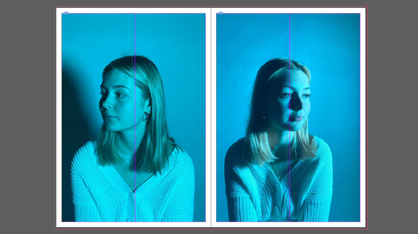
For my newspaper spread I decided to incorporate work from various different projects and topics we have covered throughout our 2 year photography course, including studio portraits, landscape, and object photography. I chose what I think were my best work from these projects and experimented with different ways of laying them out in various sequences and narratives. To begin this process, I went through all of my published blog posts and selected the images that I thought best represented my progress and effort throughout photography. I tried to use images that were not too similar to each other, in order to keep the viewer interested. I then had to check that all the photographs were high quality, and that they had the appropriate number of pixels each. After that I imported all the images into InDesign and began to experiment with different layouts until I found one that I was happy with.
FINAL LAYOUT


