Ernst Haas
Ernst Haas was an Austrian-American photojournalist and colour photographer. During his 40-year career, he bridged the gap between photojournalism and using photography for expression and creativity. He was a photographer for many big companies such as Vogue, Life and Look. Haas received the Hasselblad award in 1986, the year of his death. Haas has continued to be the subject of museum exhibitions and publications such as Ernst Haas, Color Photography(1989), Ernst Haas in Black and White (1992), and Color Correction (2011).


The photos above are abstract but vibrant and have a strong reference to the human world compared to natural photography. Some of his photos contain a very strong theme of reflections showing the real subject of the image. Also he takes photographs with a low shutter speed letting in more light and visualizes motion. In my interpretation of Haas’s method of taking photos i will include colour paired with low shutter speed and reflection to show subjects of the image.
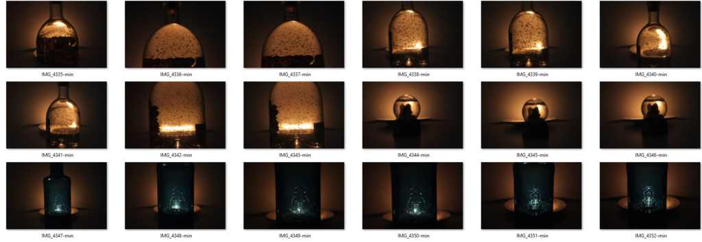
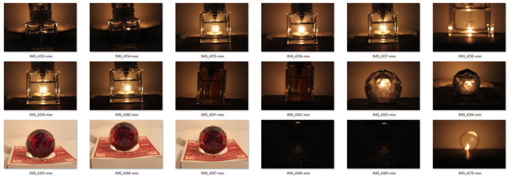
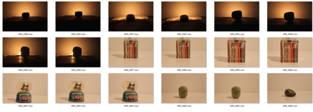
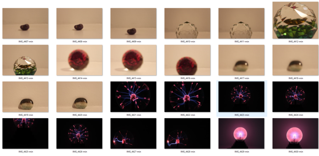
Contact Sheet



My Finalised Images

My Finalised Image Edits


For the image above, I slightly increased the brightness and contrast to give the image an extra warm glow. Finally I adjusted the curves slightly make the background slightly darker.
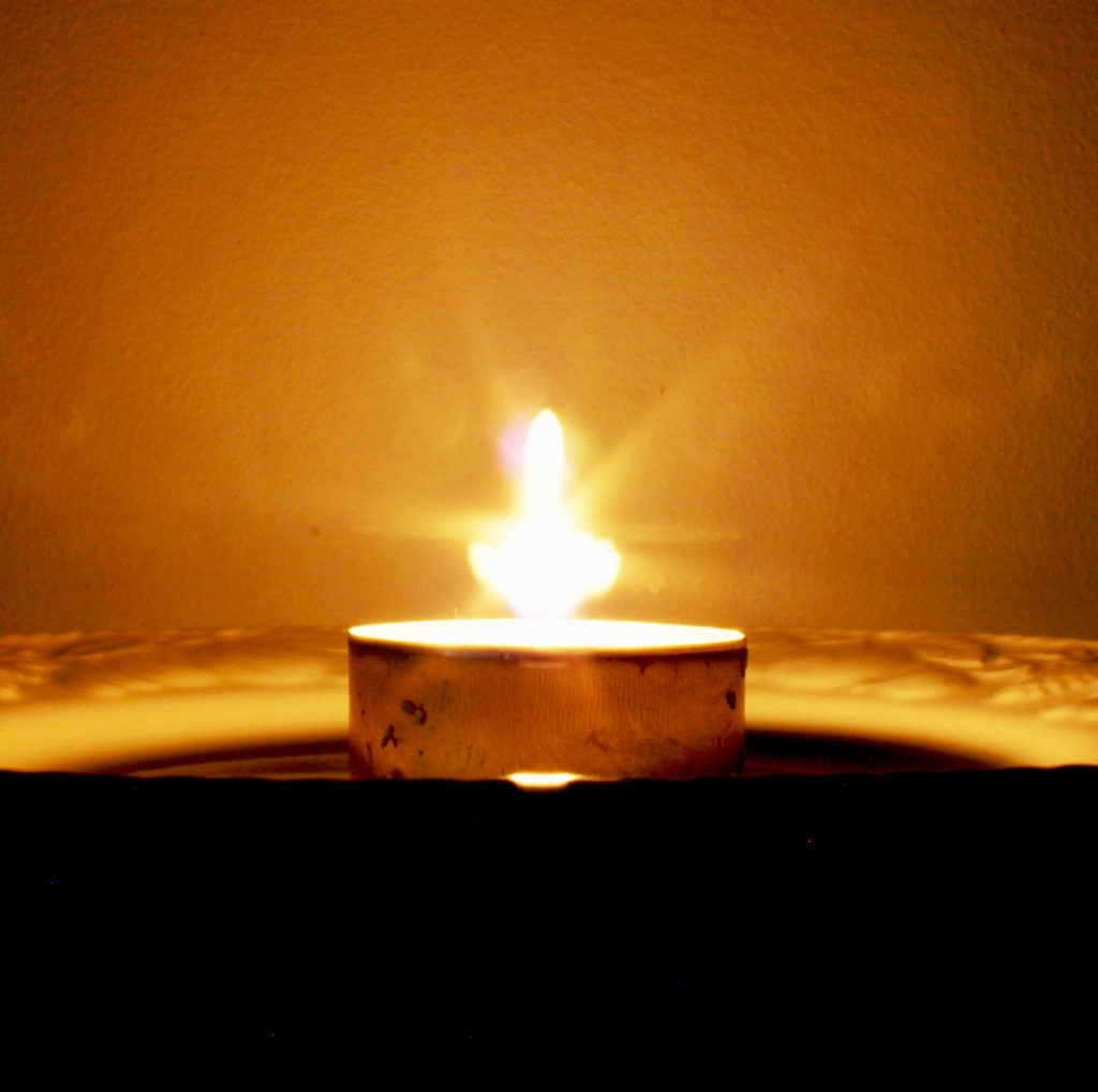
For the image above, I cropped the image so that the plate and candle in the middle of the frame (rule of threes). I decreased the brightness and increased the contrast so that the image is in contrast with the theme of darkness and light. It also gives the candle a starlike visual and a warm glow. I also increased the exposure and gamma correction slightly to make the subject of the image clearer and decreased the offset.
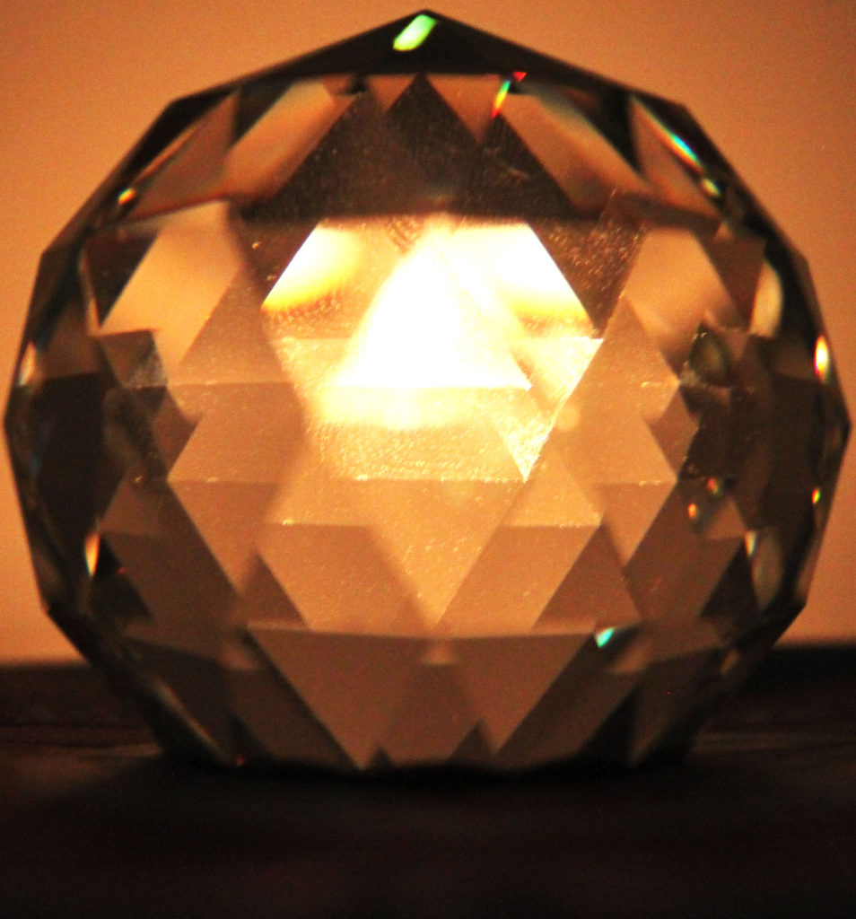
Fo the image above, I cropped it to be in line with the rule of thirds in the centre of the frame. I also increased the brightness and contrast to warm the light from the candle.
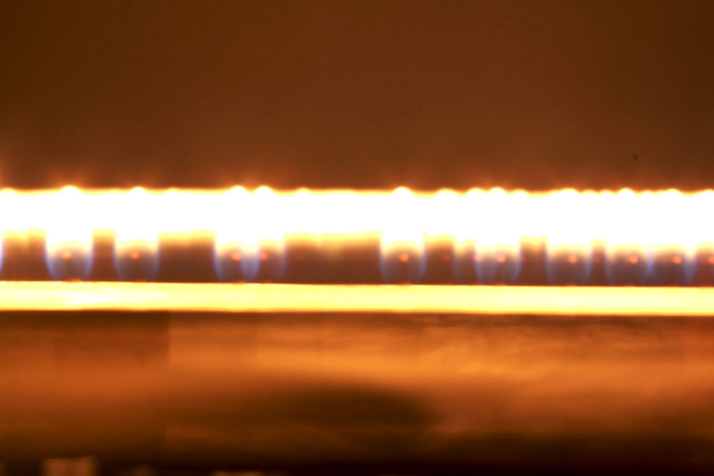
For the image above, I increased the contrast between dark and bright and increased exposure and gamma to make the line of light and the different colours distinguishable.
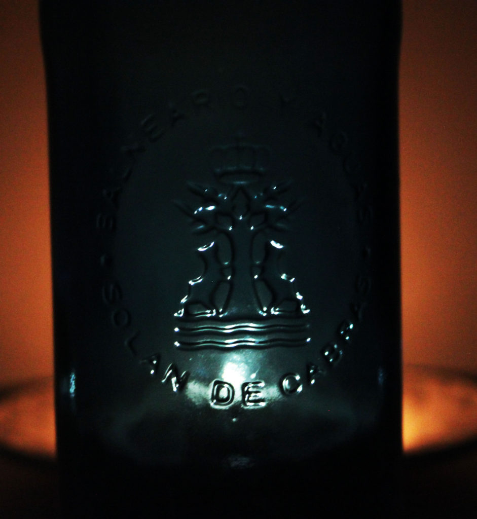
I cropped the image above to the rule of threes so that the lit up logo on the glass bottle was in the centre of the frame. I increased the brightness and contrast to bring out the outline of the logo and writing with a white light and a warm tone either side of the bottle.
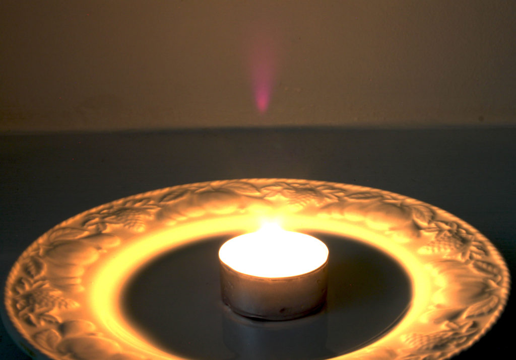
I cropped the image above to the rule of threes so the plate and candle were visible and centred in the frame. I decreased brightness and increased contrast to bring out a very bright and warm set of colours that bring out the pattern on the edge of the plate. I increased the exposure and gamma to brighten and make the colours and light warmer.
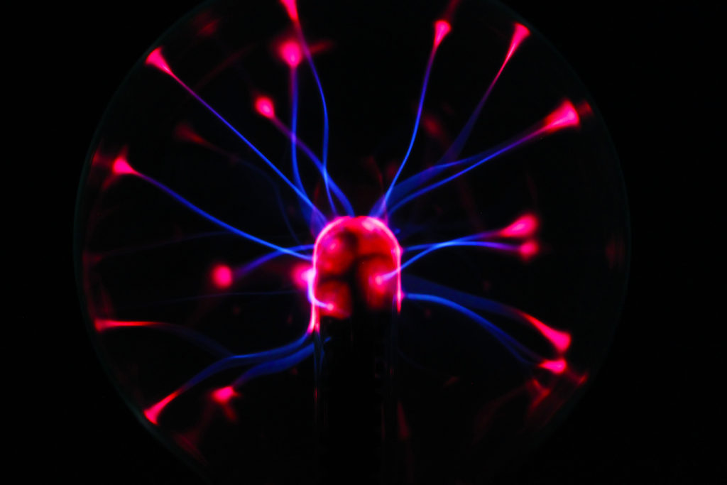
For the image above I did not have to crop the image as I took it originally as a close up in the middle of the frame on my camera. I turned the curves down which made the tone and shadows decrease. I lastly turned the vibrance and saturation up to bring out the neon like colours.
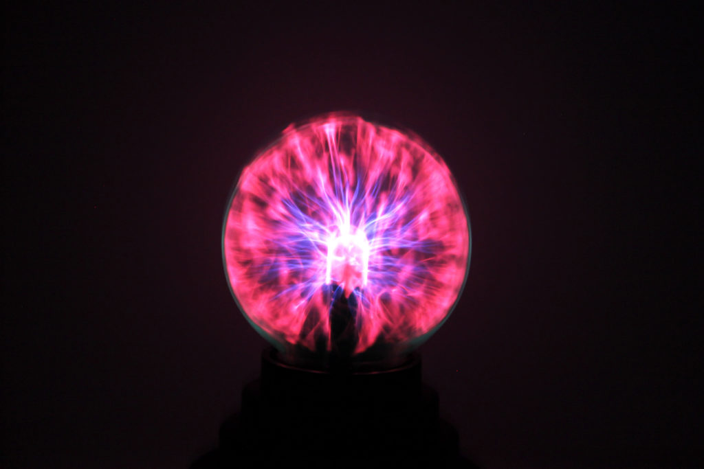
For the image above, I didn’t have to crop the image as I believe it looks better from a medium shot distance. I turned the brightness and contrast up to bring out the bright colours. I also increased the exposure which really brings out the contrast between the neon blue and pink.
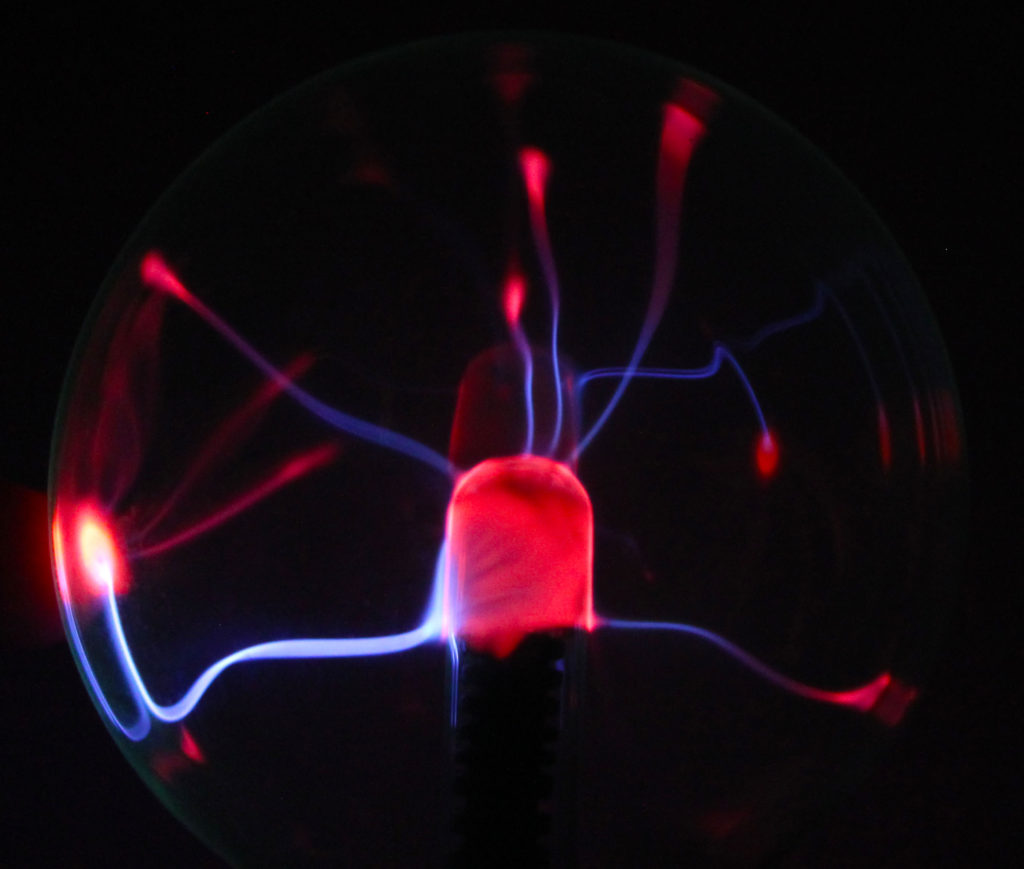
I cropped the image above using the idea of the rule of three to centre the subject. I increased the saturation and vibrance to bring out the glowing colours and make them contrast each other and the pitch black background.
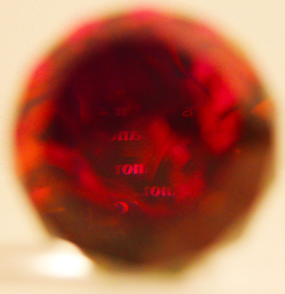
Finally, I cropped the crystal to the rule of three and increased the vibrance and saturation to make the colours really ‘pop’. This is effective because the background is blurred and the camera when taking the image focused on the reflection of the canon logo on the camera.
