I started my editing process by importing my photos into Lightroom.
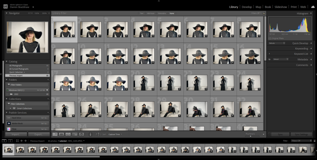
Once imported, I went through my images and flagged the ones I wanted to use in my photobook.
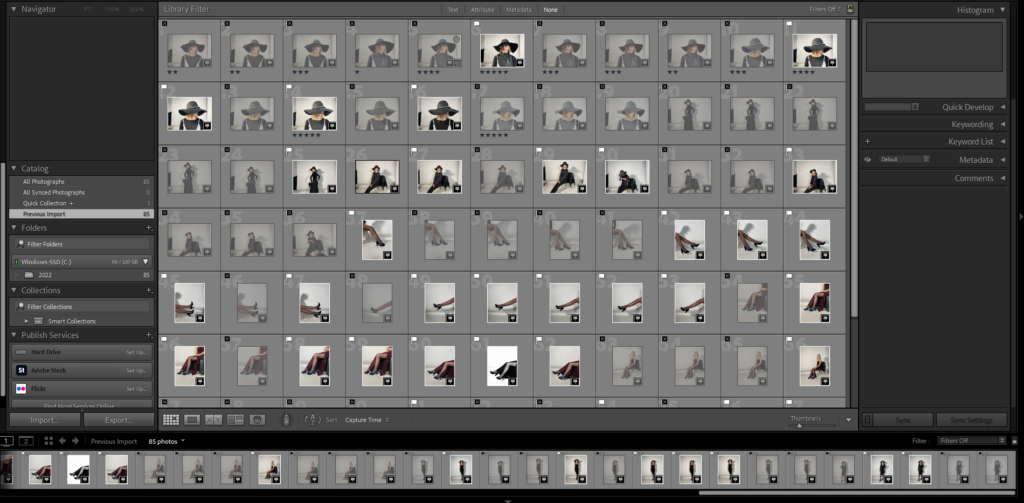
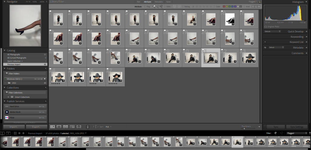
Editing process, images inspired by Guy Bourdin
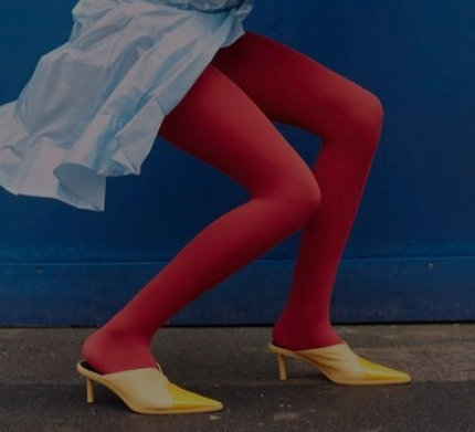
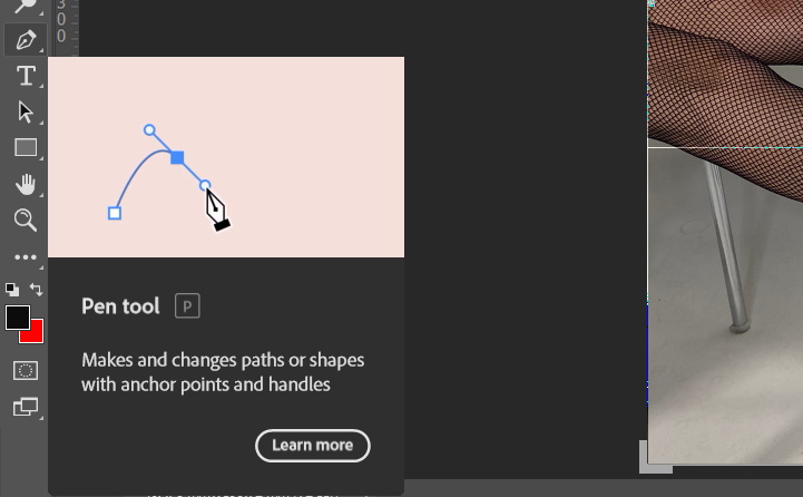
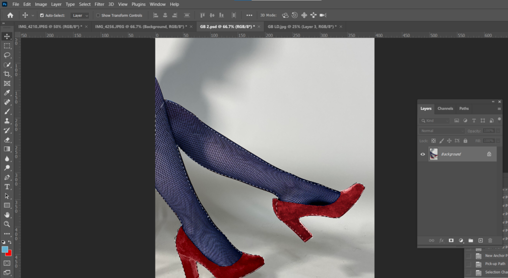
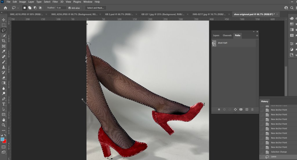
For my first image, I opened it up in Photoshop and cropped and adjusted it to how I wanted. My aim was to change the colour of the shoe to match Bourdin’s images. To do this, I used the Pen Tool and carefully cut out around the shoe.
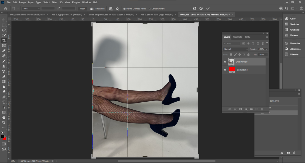
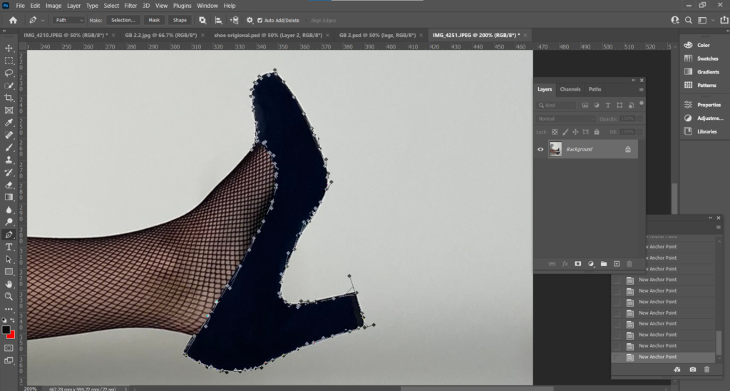
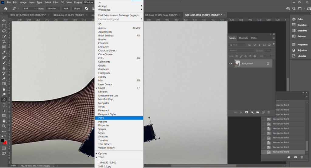
After I outlined the shoe with the Pen Tool, I went up to the menu, under Window and selected Paths.
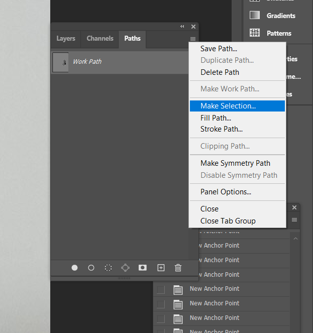
Within Paths, I selected Make Selection under the 3 small lines, this converts an outline drawn by the Pen Tool, to a dotted outline.
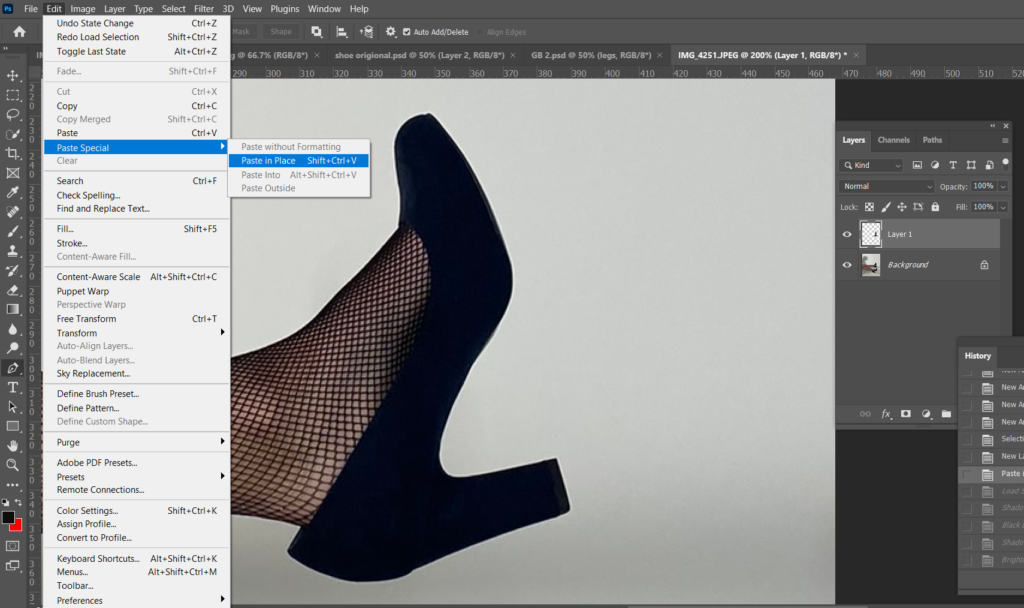
After this, I then selected Edit, Paste Special, Paste in Place onto a new layer so when I changed the colour of the shoe, the background is not effected.
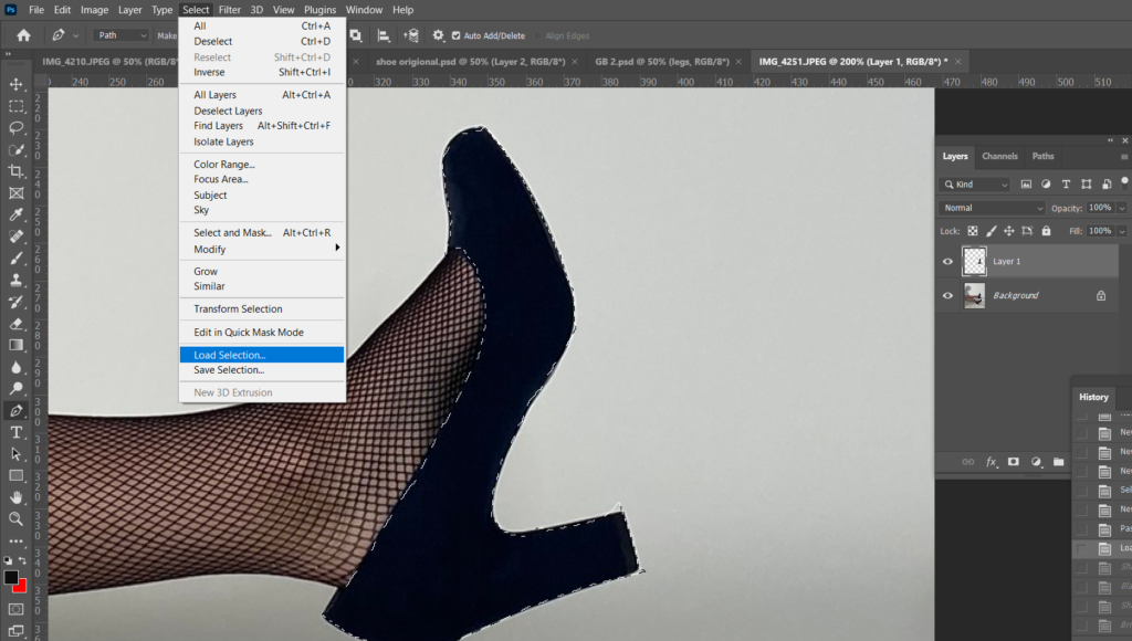
I then selected Load Selection to select the area I want to edit individually.
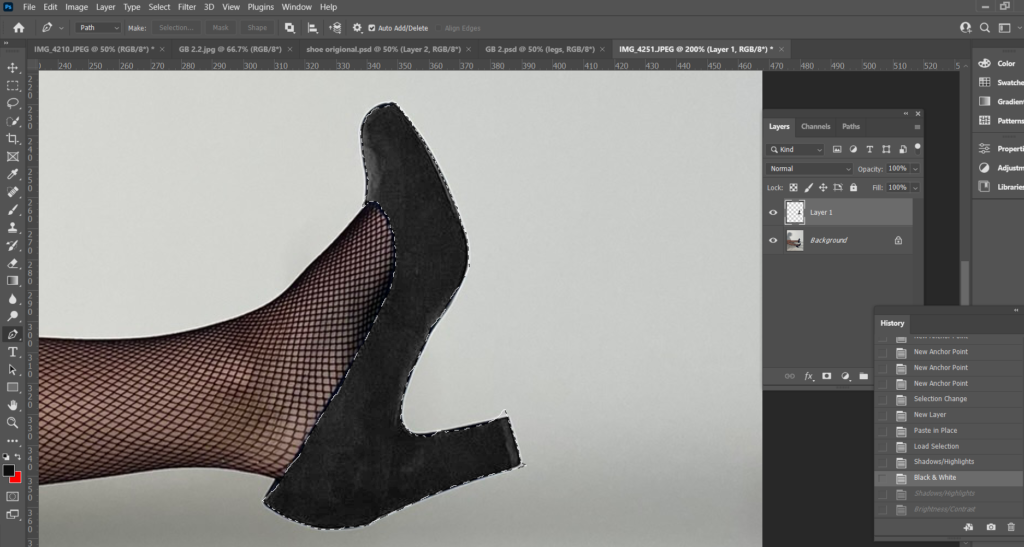
Before changing the colour of the shoe, I adjusted the Brightness, Shadows and Highlights to make the shoe lighter so the colour will turn out more pigmented.
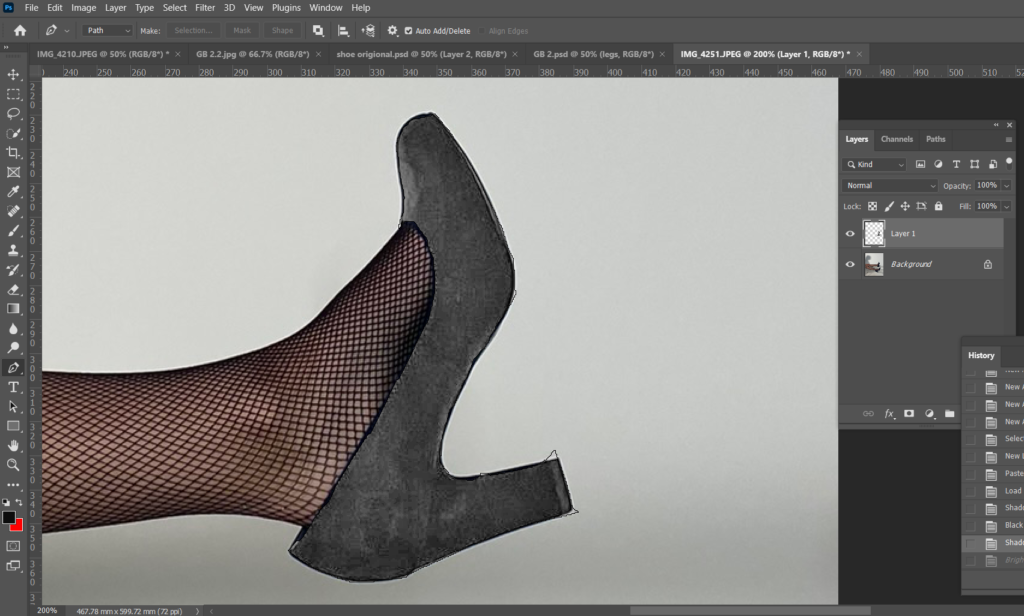
To change the colour I adjusted the Colour Balance.
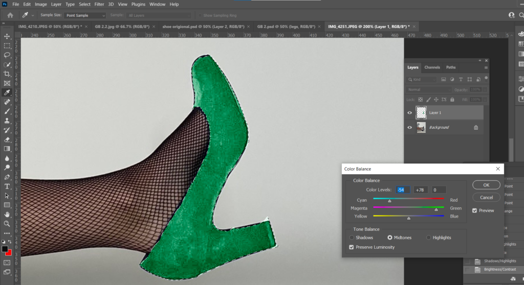
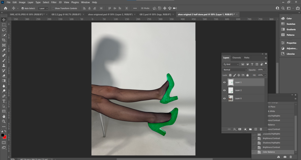
I used the same process for the legs.
I saved my first edit as a PSD so it saves with all the layers so I can go back and change the colour without having to cut out the shoes again.
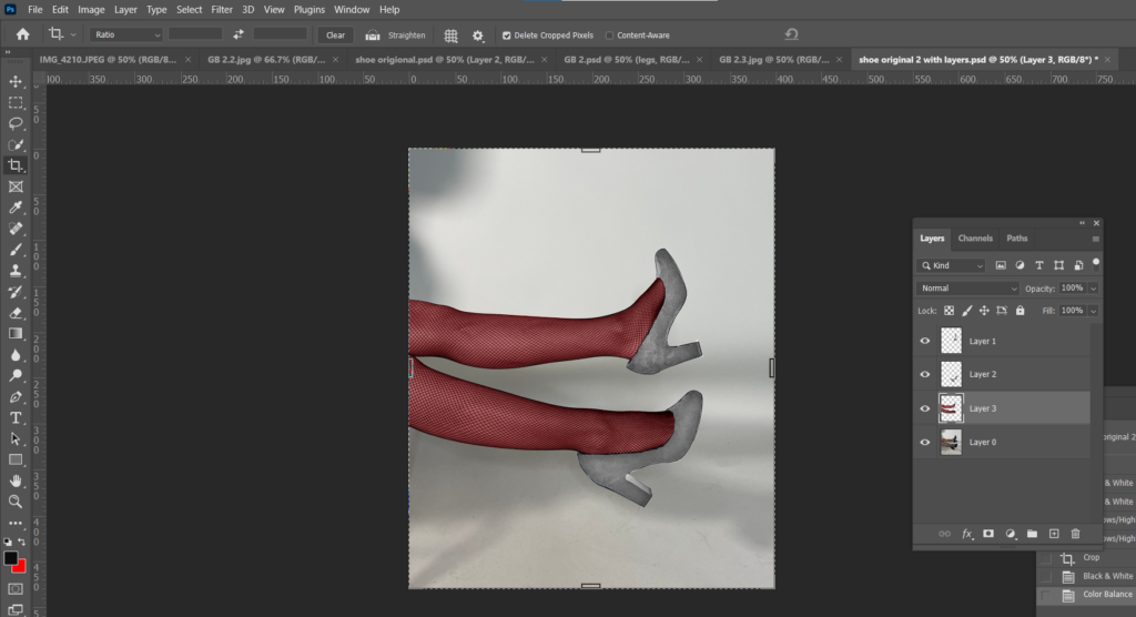
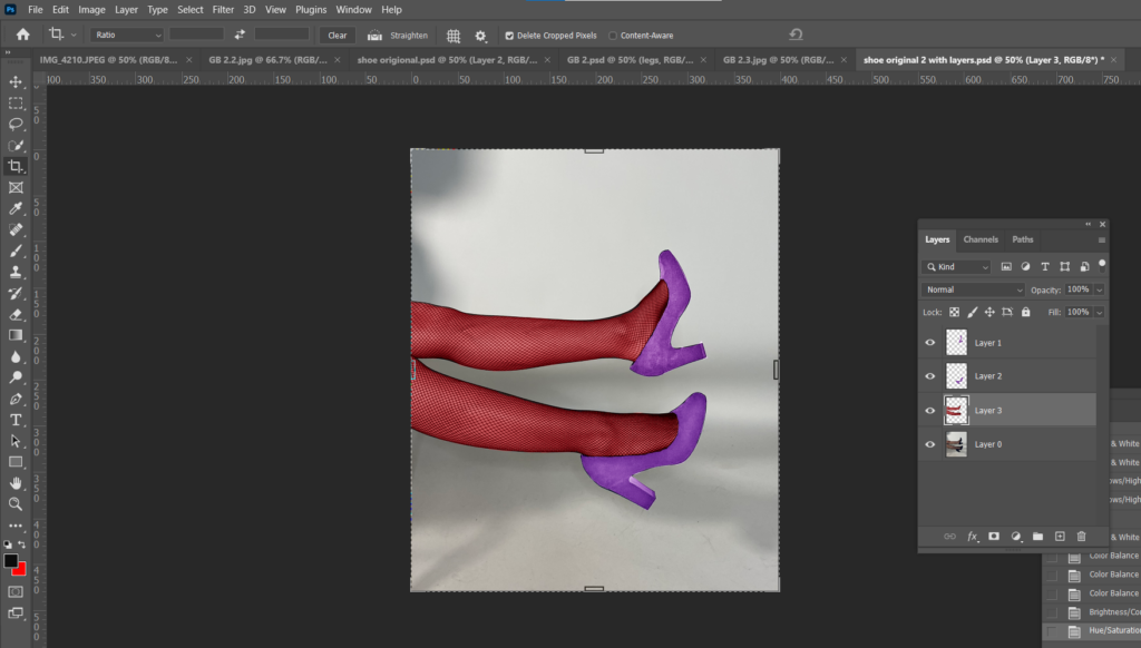
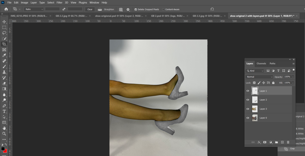
This next edit I needed 3 legs instead of 2 to match my edit to one of Bourdin’s photographs. To start, I used the Quick Selection Tool to select the leg and I cut and pasted it onto a new layer.
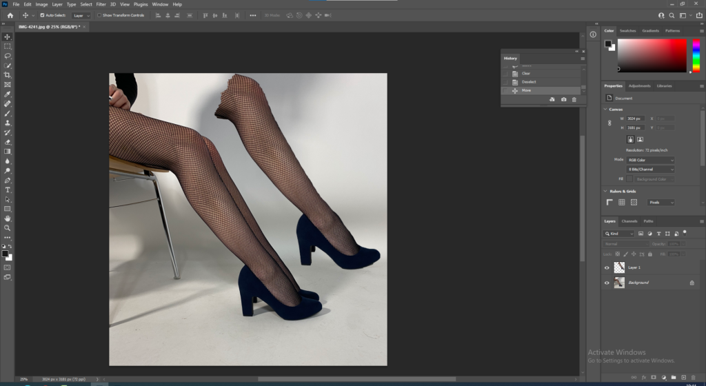
I then positioned it to where I wanted it to be.
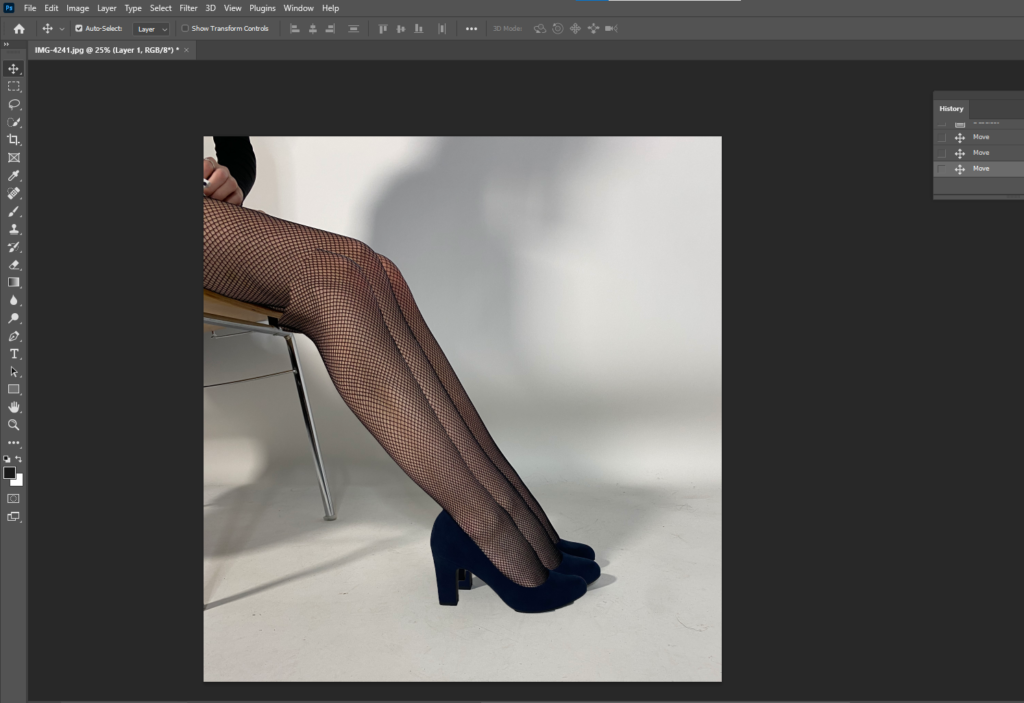
I used the Quick Selection Tool to select the background, then adjusted the brightness to make it brighter, but only the background.
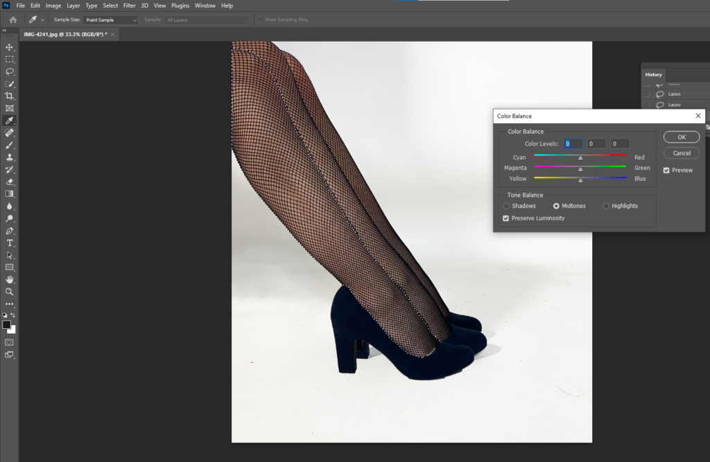
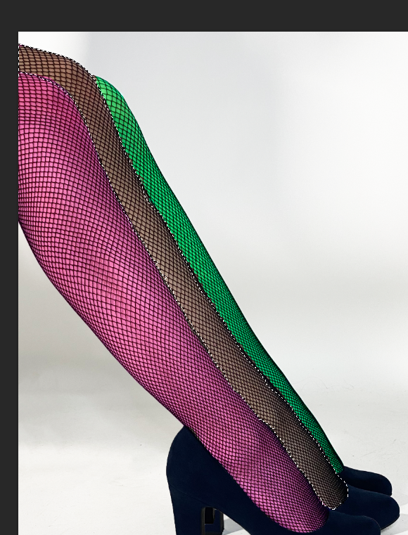
Then again I used the Quick Selection Tool to select the leg I wanted to change the colour of. Went up to Image, Adjustments, Colour Balance and changed the colours of all 3 legs.
Finally I used either the Spot Healing Tool or the Clone Stamp to clean up around the shoes.
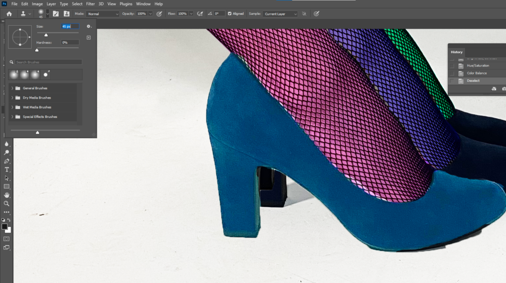
Final Edits inspired by Bourdin
Analysis
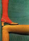
Bourdin explored with a lot of vibrant colours in his work for Charles Jourdan. Jourdan and Bourdin produced a large amount of work on shoe advertisements, I liked the range of bright colours throughout these images and decided to take inspiration and produce a version of my own. Both mine and Bourdin’s images have solid blocks of basic colour instead of pastel or deeper colours for example. The images are eye-catching and don’t require too much thought. They are very positive images but don’t have much narrative, however the 3- legged images to create a sense of curiosity.
Inspiration for the above edits – Guy Bourdin
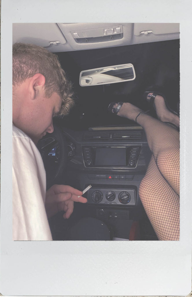
Bourdin Polariods
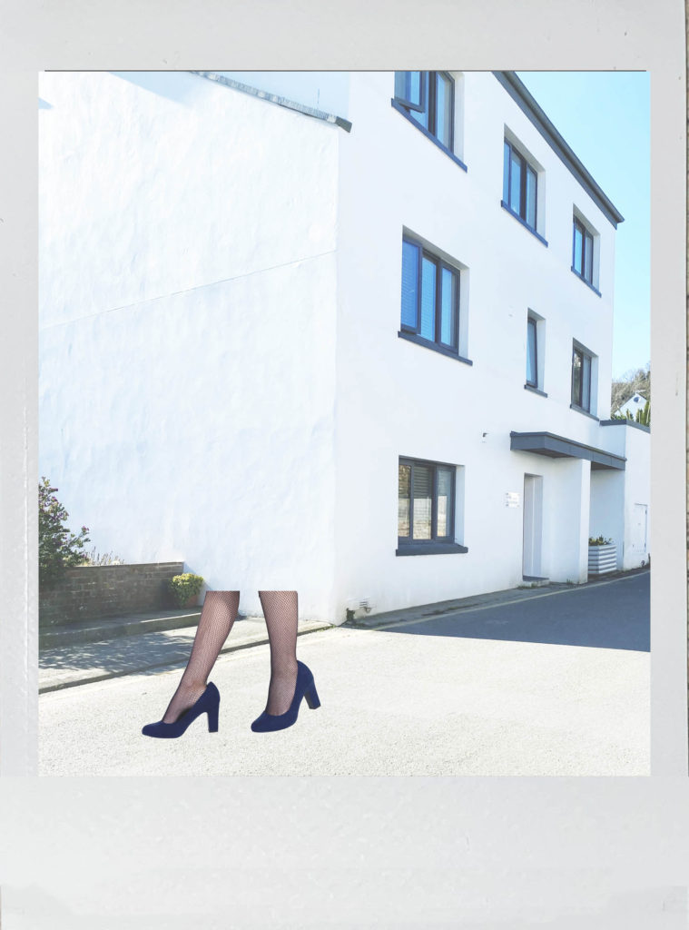
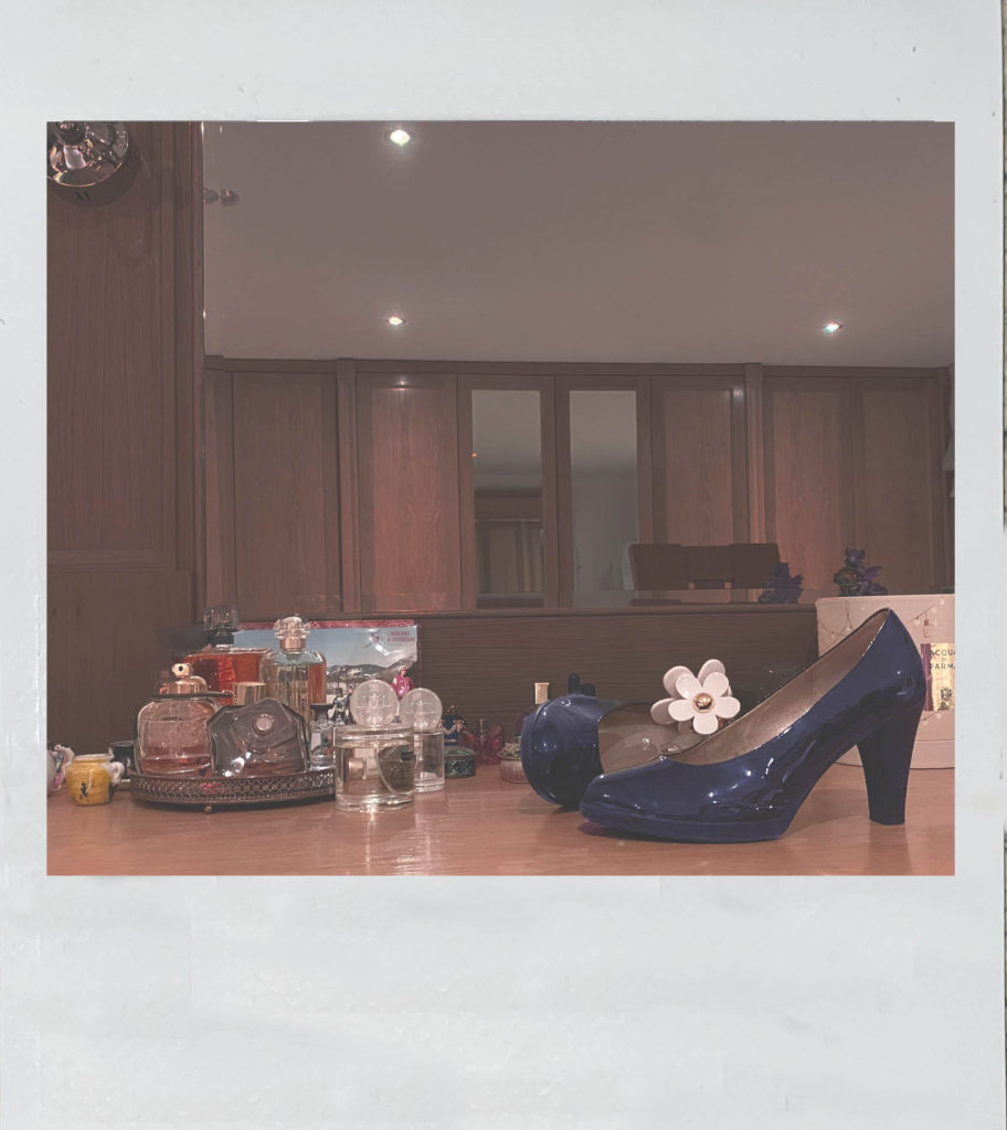
Edits Inspired by Bourdin’s Polaroids
Polaroid Editing Process
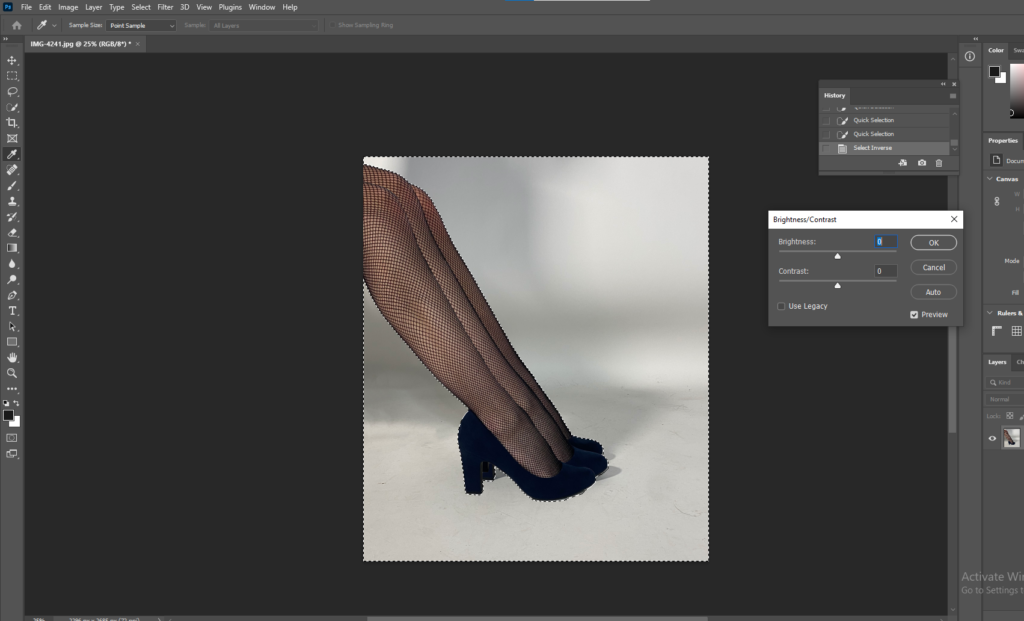
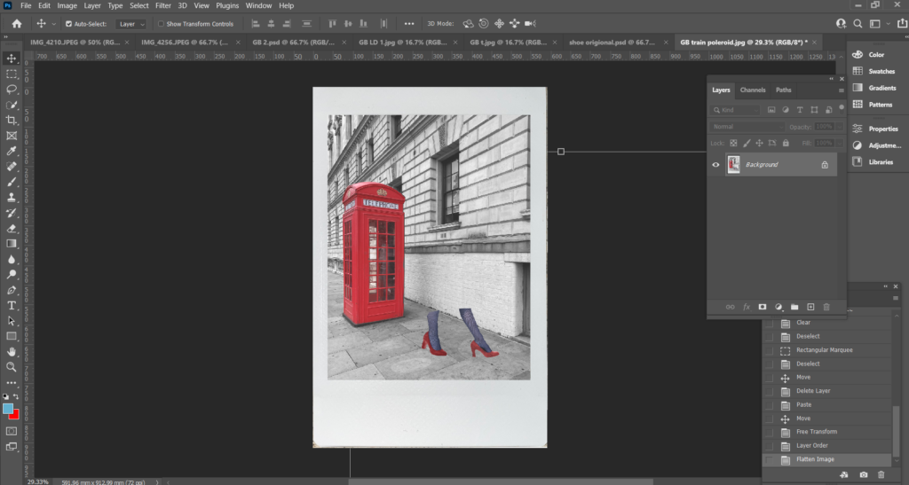
First I opened up my background image and used the Pen Tool to cut out the telephone box, once the box was cut out I went up to the menu and pressed Select, Inverse so everything but the telephone box was selected and changed the background to black and white and adjusted the brightness and contrast.
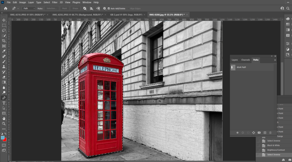
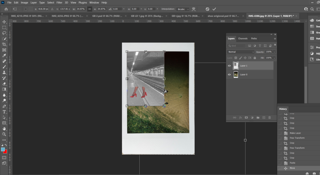
I opened up an image I had previously edited and used the Pen Tool to cut out the legs and cut and pasted it onto my background and adjusted them into the position I wanted by using either Edit, Transform, Scale or Edit, Transform, Rotate.
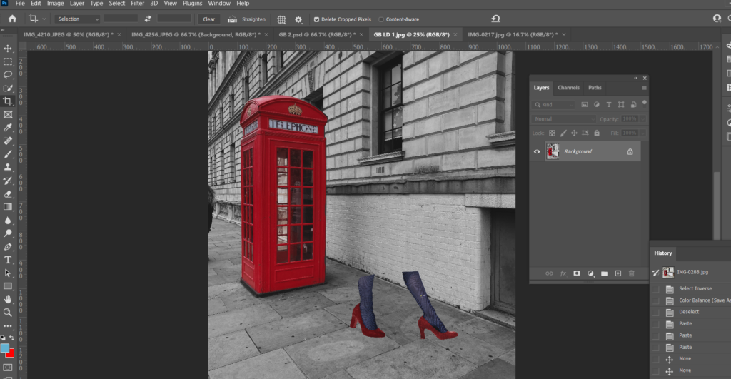
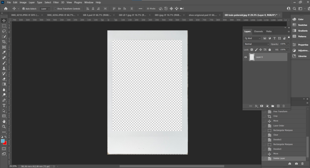
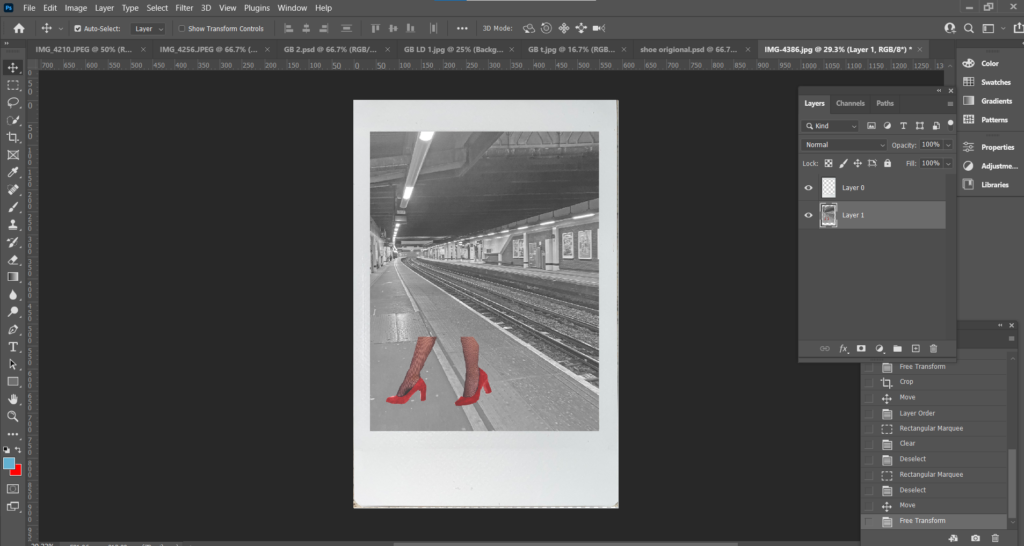
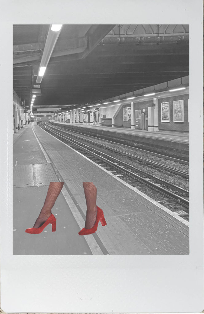
I then opened an image I had taken of a polaroid picture I had at home, I used the Rectangular Marquee Tool to cut out the image within the polaroid, cut and pasted my edited image onto my background, put my edited image on the bottom later and on top placed the polaroid frame.
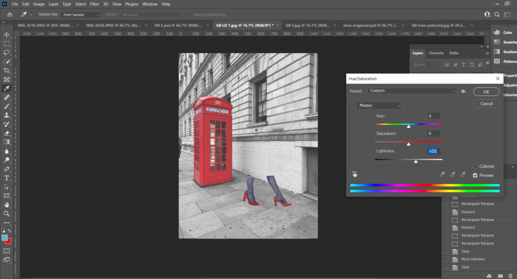
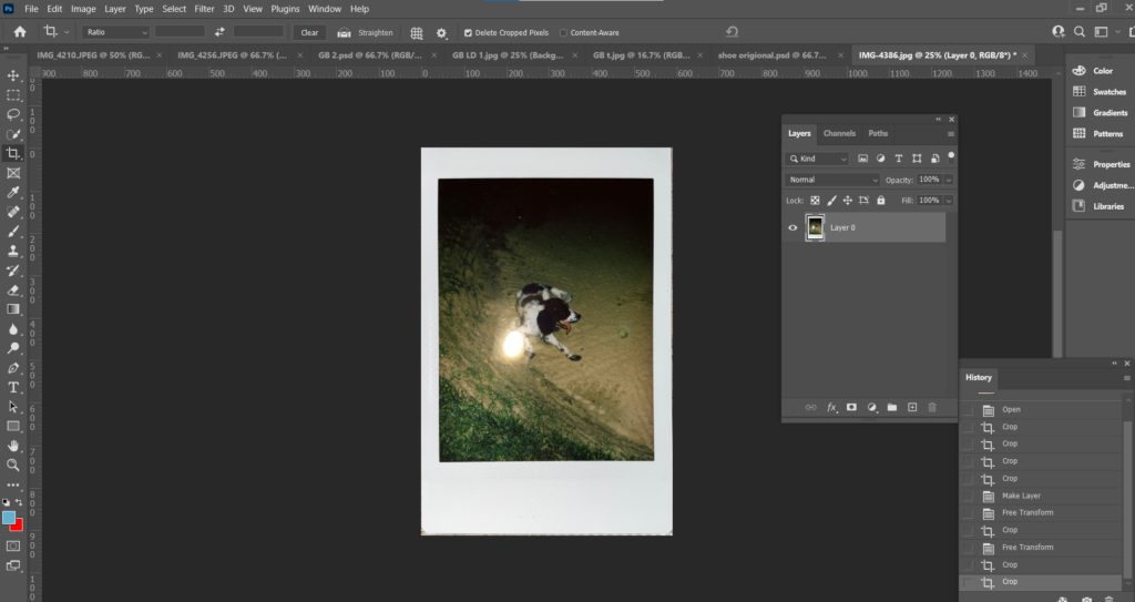
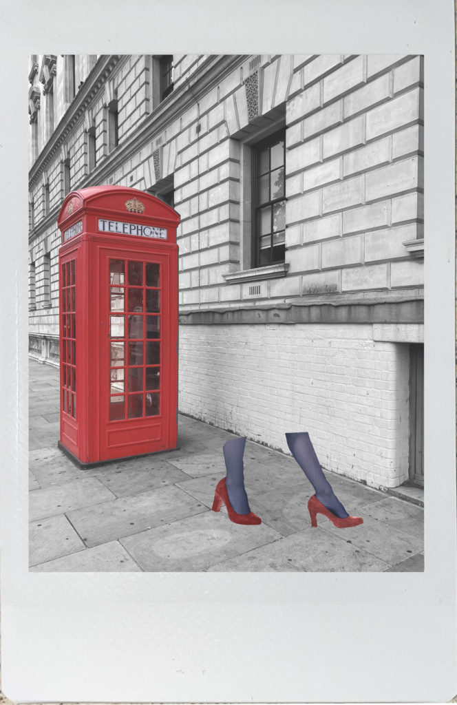
I then repeated this process again for a second image.
Analysis
What I like most about my polaroid images is the worn/ old fashioned effect they have. The photographs are edited to match Bourdin’s images which are faded with a slight coloured tint on top. I think polaroid photos are more gripping than just an ordinary photograph, they have more texture and character about them.
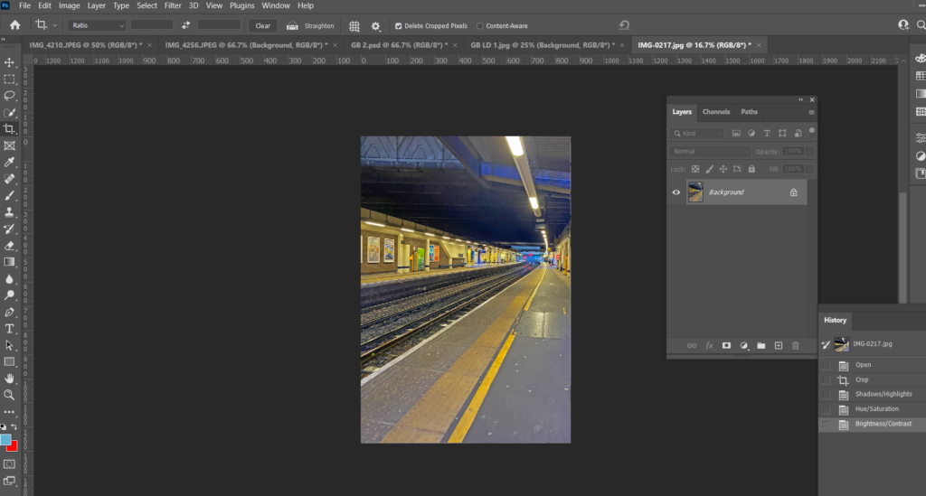
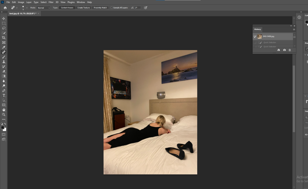
One of my final images had things in the background that I didn’t want in my image, to remove the canvases on the wall I used both the Spot Healing Tool and the Clone Stamp.
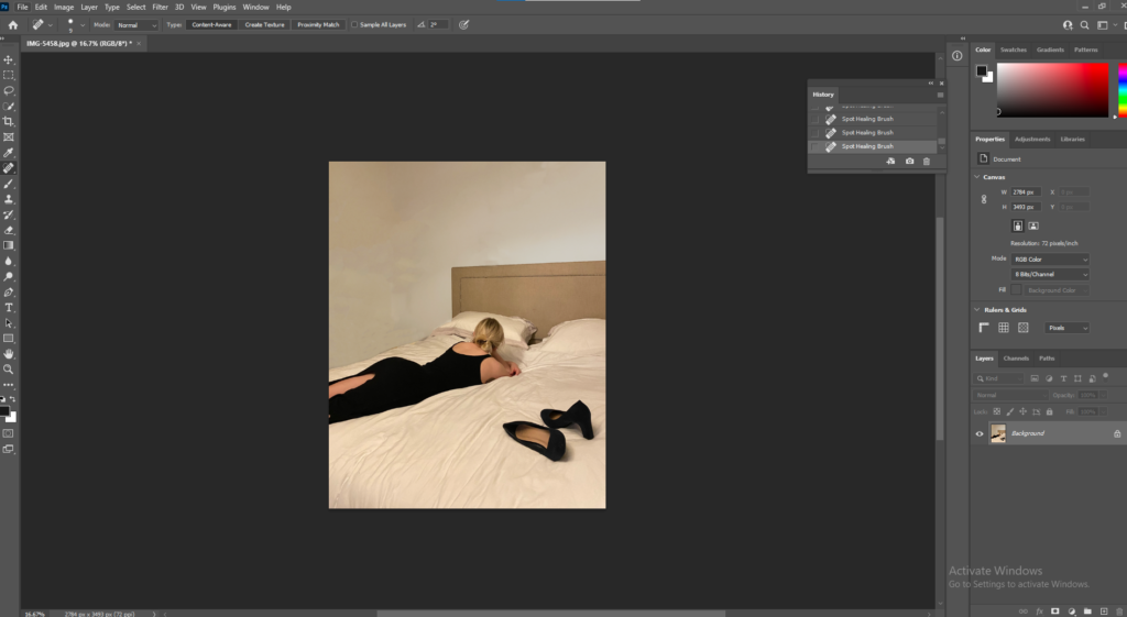
After the canvases had been removed I used the Quick Selection Tool, selected the background and adjusted the brightness to make it brighter.
Final Edits
Analysis
What I love most about black and white photographs is there is no colour to distract you from the structure and depth of the image. Black and white images are a good way of capturing dark shadows and bright highlights. These images have the greatest sense of narrative compared to the others in my photobook, however these images can be interpreted in several ways and have a strong sense of curiosity, for example, the worn dress and heels on the bed, make you wonder where the woman had been that night and did the night end good or badly. The idea that the shoes and dress are both black could be telling us that the night ended badly as black is seen as a fearful, negative shade. The black and white also create deep emotion, the woman on the bed in the first image for example, lays there looking lost, however you can’t see her face so your mind will make up a story about how she may be feeling.
Photobook Process in Lightroom
First I imported my edits into Lightroom.
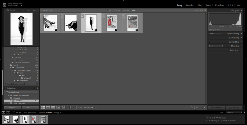
Selected book
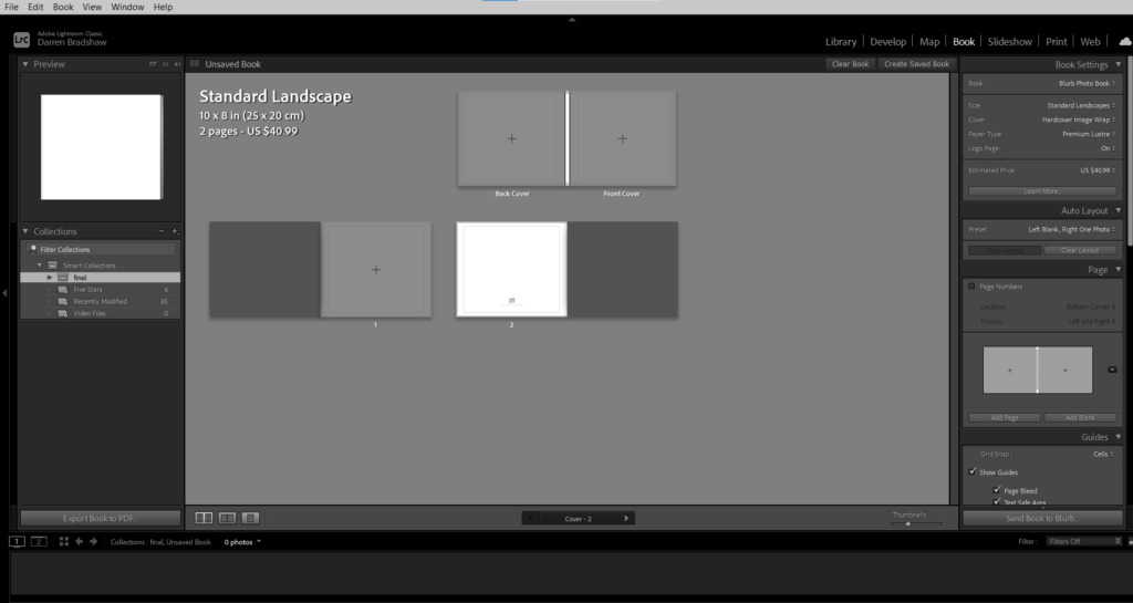
Began adjusting where I wanted my images
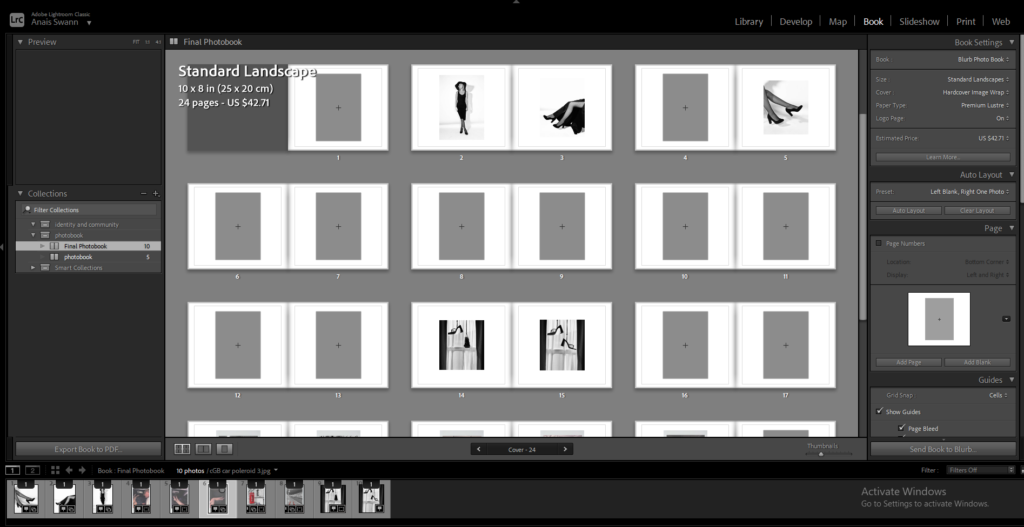
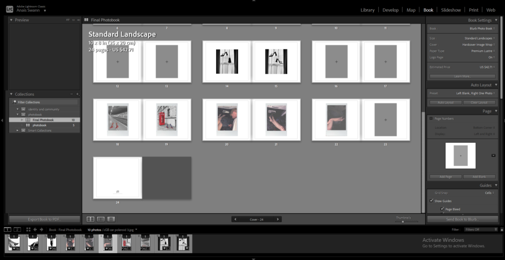
Titles
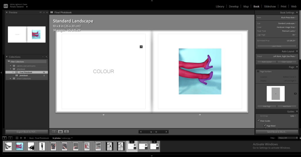
My titles in my photobook are inspired, again, by Charlotte Cotton’s book on Guy Bourdin.
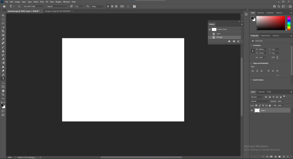
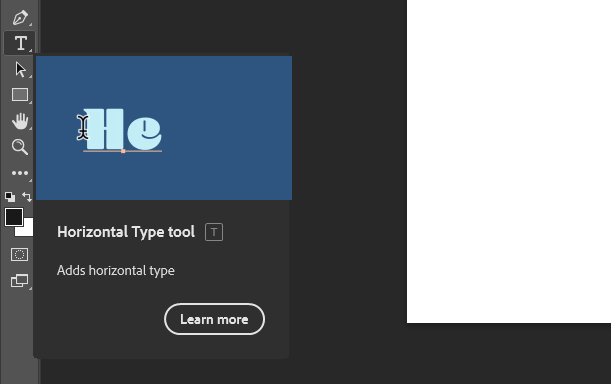
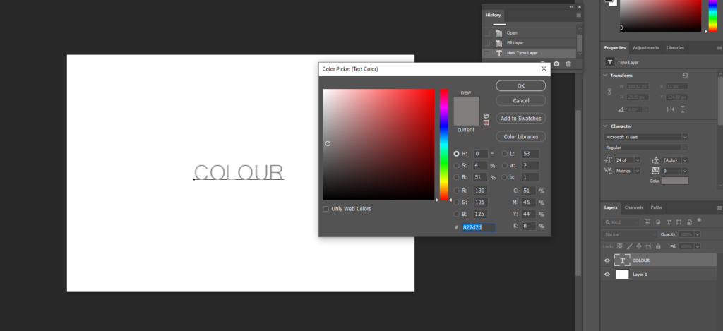
I started by opening a blank white document and selecting the Horizontal Type Tool and deciding on a font and adjusting the colour to a dark beige to match the one used in Cotton’s book.
Front and Back Cover
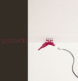
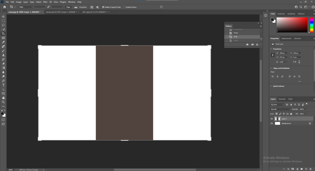
Cotton’s cover is one image that folds from the front cover around to the back. To start my front and back cover, I opened up a document in photoshop then layered the same brown colour I used for the first and last page in my book and placed it in the middle so it will fold from front to back.
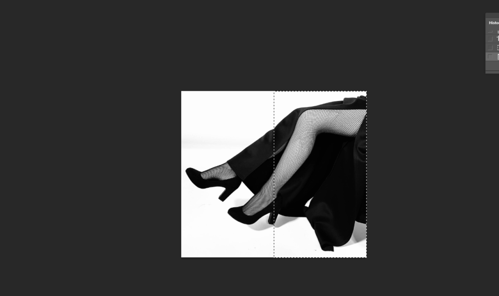
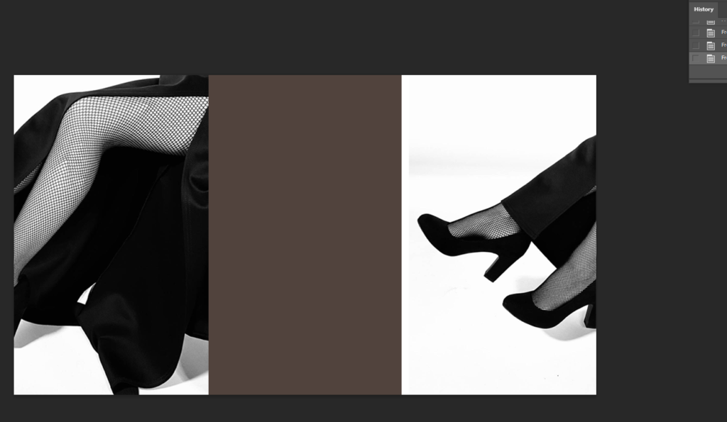
Next I opened the image I wanted to use for my cover and cut out half the image and pasted it onto one side of the brown strip. I then Select, Inverse, Delete so the other half of the image was cut exactly, and pasted it onto the other side of the brown strip.
To add the text onto my front and back covers I used the Horizontal Type Tool.
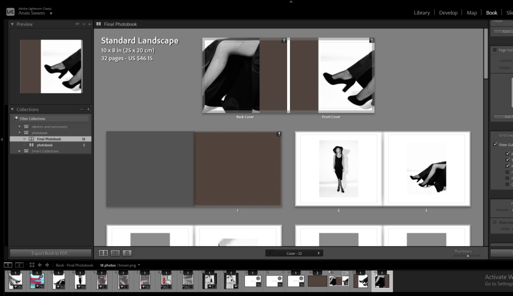
Main Title
All in Good Taste
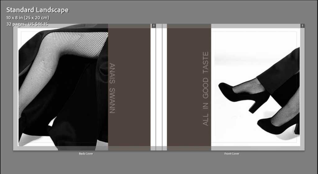
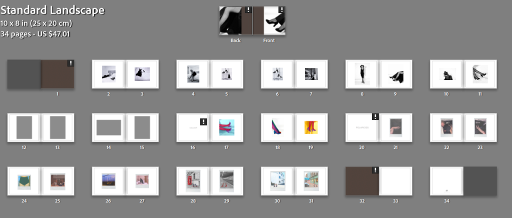
When the book is closed, the image will be folded around both pages.
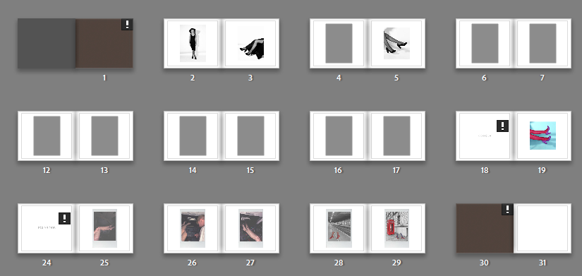
For the first and last page in my book, it will be a solid brown colour like Cotton did.
Comparison
Final Layout
This blog post below includes an artist reference on Guy Bourdin and his impact on the fashion industry and social identities.
Overall Evaluation
Altogether I am happy with the outcome of my personal study. I found the photographers I researched in relation to my study interesting which helped when writing my essay. Guy Bourdin, French artist and fashion photographer, influenced most of my work on the fashion industry and social identities. I found his work gripping and fun which inspired me when it came to taking my own photographs. The layout of my photobook is inspired my Charlotte Cotton’s book on Guy Bourdin, including the layout of the cover and inside pages. What I liked the most about Cotton’s layout is the simplicity of it, I like how the background is a pale white so there is no distraction from the photographs. I found the polaroid images fun to take and edit, as they aren’t an ordinary photo, they have a faded, old-fashioned look about them. Overall, I liked this project the most, mainly because of the freedom to do it on whatever you liked.


