Susan Meiselas
- Read interview, make notes and identify 3 quotes (that are thought-provoking, revealing or contentious
“Even when revisiting Carnival Strippers I had to think back to the context at the time – the debates in feminism about such women, the idea of giving voice to the women from the inside, and so on” I think this quote is thought-provoking because Meiselas uses her work to provide an alternative perspective on a group of women who many would argue project many negative stereotypes about women. However Meiselas proves these stereotypes wrong.
“I don’t go in with a concept; the concept evolves and becomes self-evident at a certain moment in the process.” I think Susan Meiselas’ method of production is interesting because she doesn’t necessarily plan her shoots before she does them, and it is more of an ‘in the moment’ process.
“Many of my projects live in more than one community simultaneously and the challenge becomes slightly different.” I liked this quote from Meiselas because she states that her work is rather universal and can be seen as relatable by different communities, which I think is a difficult process as you have to have a strong idea of other cultures or communities to do this.
- Select one image from the photographer and analyse in depth following this method: TECHNICAL, VISUAL, CONTEXTUAL, CONCEPTUAL – focus on the last two aspects of analysis to achieve highest marks

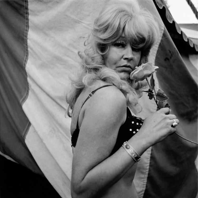
This image, titled “Lulu, Tunbridge, Vermont” was taken by Susan Meiselas in 1974 as part of her series; “Carnival Strippers”. This series became the spark of Meiselas’ photography career, and even became the reason that she fell in love with photography. She became intrigued by these women and wanted to know why they did what they did and how it affected their private life, so she began this series photographing the girls both on stage and off stage, including moments of their private lives.
The lighting in this image is harsh and intense. It creates dark, gloomy shadows compared to radiant highlights. The shadows can be seen in the sunken parts of the face, especially around the eyes and around the nose of the woman’s face. The lightest sections of the image can be seen in the highlights of the face, such as the cheekbones and tip of the nose, as well as the bright blonde hair. Despite the lighting producing harsh shadows and highlights, the lighting is natural daylight. Due to the lighting appearing predominantly on the high points of the face, the direction of the sunlight seems to be coming from above the model.
There is a sense of line within the photograph, with the thick, folded lines of the circus curtains behind the model. These lines create an upwards direction which influences the viewer to look at the model from bottom to top, these also create the leading lines for the photograph. There is also a sense of line with the direction and bending of the model’s arms, this bending sends the viewers eyes towards the direction the flower in the hands of the model, which then directs the viewers eyes to the face.
There is no real sense of repetition in this image, due to the organic and candid nature in which it has been taken in. The image is taken in black and white also, so it is impossible to tell whether there is a repetition of colour.
The shapes within this image are purely organic. Despite the image featuring artificial shapes, they are bent and folded in order to create curved and distorted lines rather than straight-edged, geometric lines.
There is a strong sense of depth within this image, as the model is in clear focus compared to the blurred background of the curtains. There is no negative space in this photograph, as all sections of the image contain a pattern or subject of some sort.
There is a range of tones from dark to light within this photograph. The darkest area of the image can be seen in the gaps of the curtains, as well as around the eyes of the model. The lightest areas of the image can be seen in the white segments of the curtain, the blonde hair of the model and the model’s fair skin. Overall, the image tends towards darkness, which creates a dark and almost sinister atmosphere.
There is a lack of colour in this image. Because of this, an intense juxtaposition has been created when comparing light and dark, and shadows and highlights.
The composition of the image can be said to follow the rule of thirds, as the model has been placed in between the three vertical thirds. The image is balanced due to the lack of negative space, and with the subject being placed central of the image. The distinctive focal point of the image is the model holding the flower to her face.
