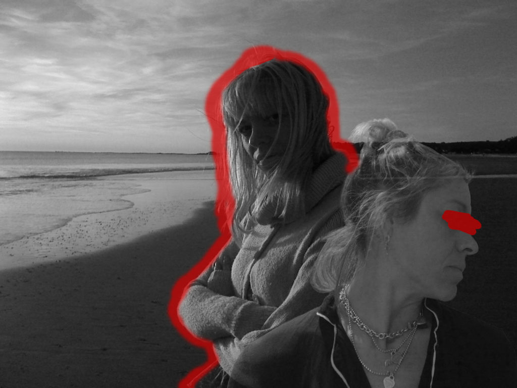
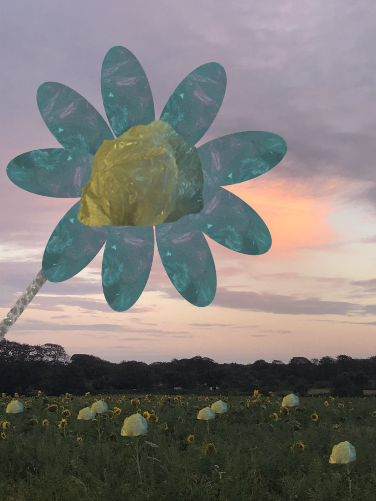
Throughout year 12, I have learnt how to use studio lighting, how to alter settings on a camera to achieve different results, and how to use photoshop and lightroom to edit my photographs. A theme I have found interesting this year is the study of Anthropocene. Within this theme I have studied multiple artists, including Darian Mederos and Naomi White, I also enjoyed making more creative edits on photoshop with these images. I found this project interesting because it combines human and nature in our current world. For this project I focused on landscape and abstract photography. I also combined the two in some of my edits to create a juxtaposition. I prefer the theme of identity over the theme of community as I can make a project that is more personal to me and my own identity, as well as my family or friends.

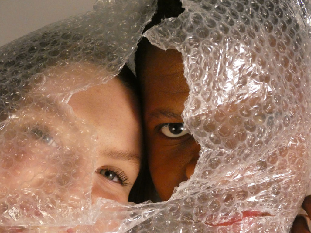
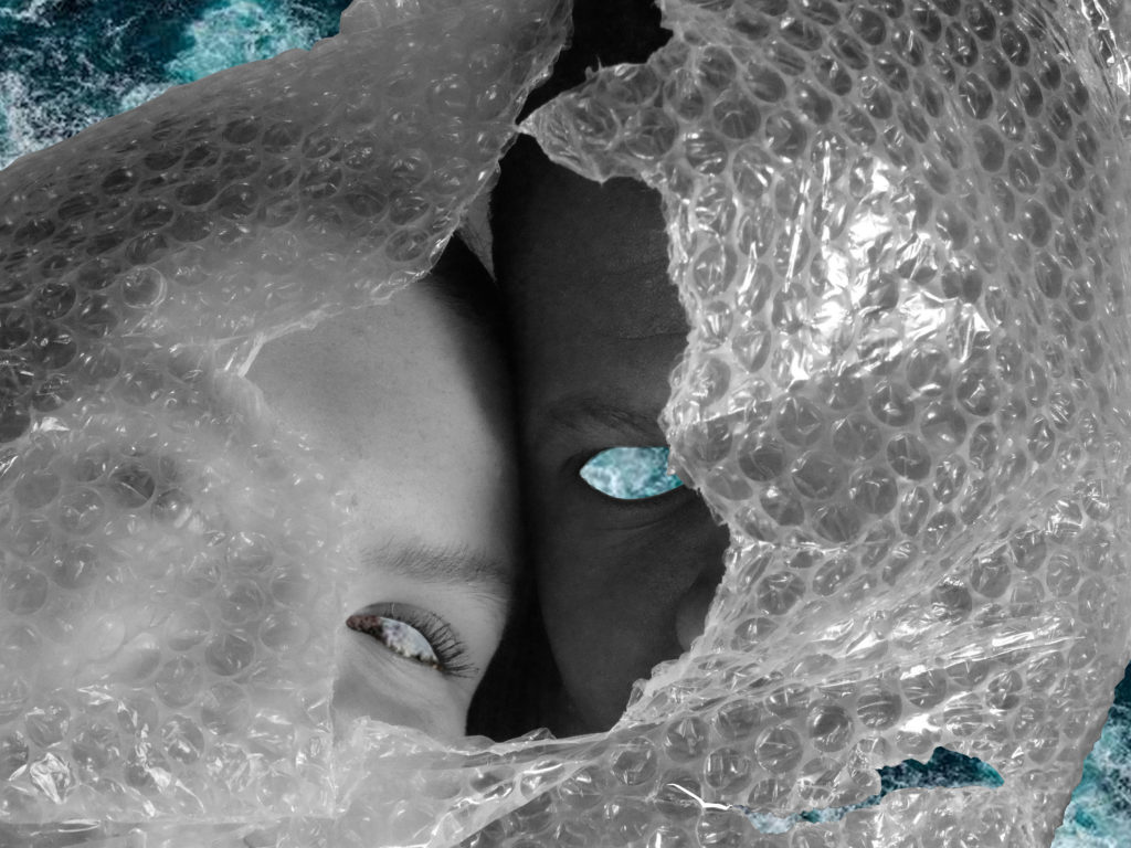
‘To edit these images I will enhance the muted tones in my photographs, in a similar way to the artwork by Mederos, and also darken the tones in order to provide a deeper, menacing message in relation to the theme of Anthropocene.‘
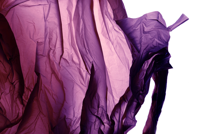
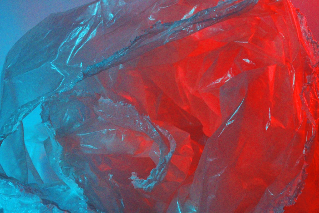
First, I lowered the brightness of my image and increased the contrast in order to create a stronger contrast between the different colours and provide darker tones to the image .I then altered the curves setting of the image to darken the shadows of the image, and to increase the brightness of the highlights within the photo. I increased the hue of the image to a blue-tone to enhance the blue hues of the image. I also increased the saturation and decreased the lightness to make the colours more vibrant and contrasting. To further bring out the blue and red tones of the image, I altered the colour balance to increase cyan-toned colours and magenta-toned colours. This makes both the blues and the reds more vibrant, creating a more juxtaposing contrast.
I also enjoyed making my final project in year 12, where I got to further explore my own identity within my family. I found it interesting to look through old family photo albums and comparing them to current times and showing the clear contrast in time. Because of this I want to make my photobook personal to me and my identity.
