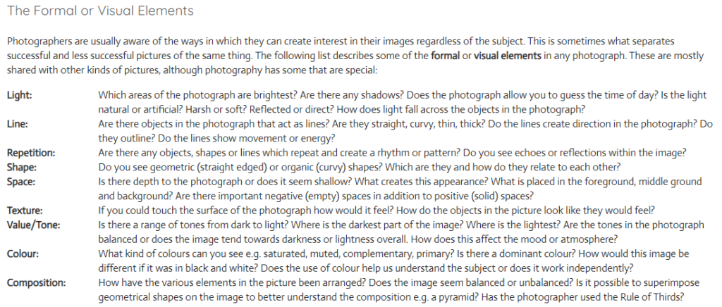
The formal elements are used by famous photographers all around the world. They are the parts that create some of the most praised images in the world. They help create interesting and professional images.
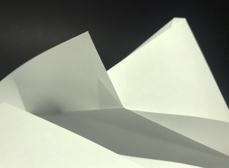
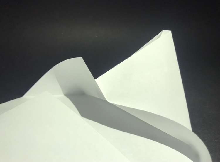
In class I took photos of paper shaped and folded in different ways using different backdrops and lighting.
Analysis
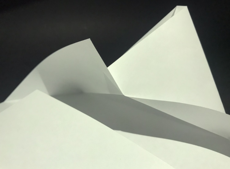
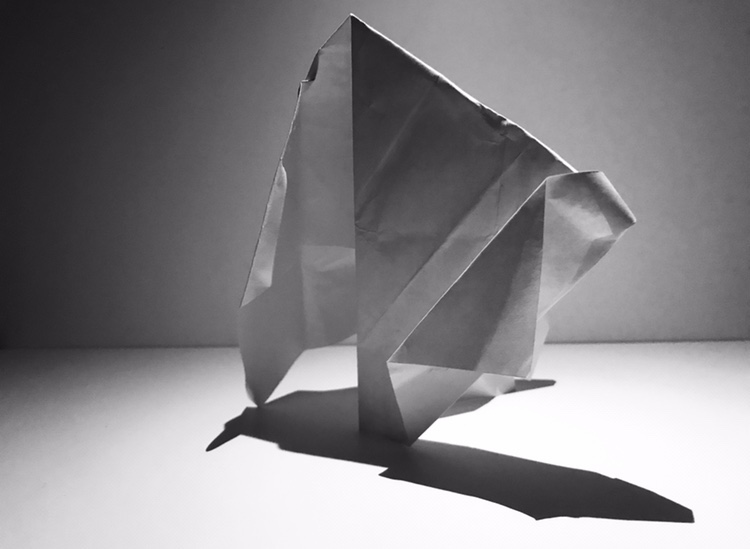
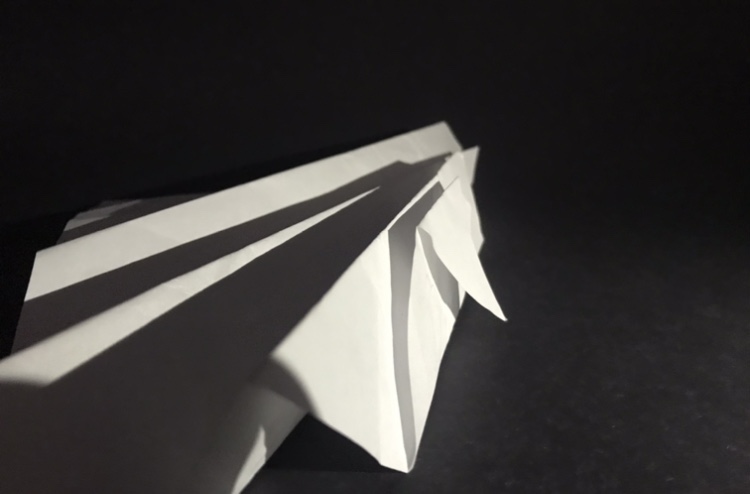
Light – In my second and third image the lighting is quite harsh and creates dark, contrasting shadows. This was done by using downward facing, close lighting. In my fifth image the lighting is softer creating less contrast in tones and fainter lines.
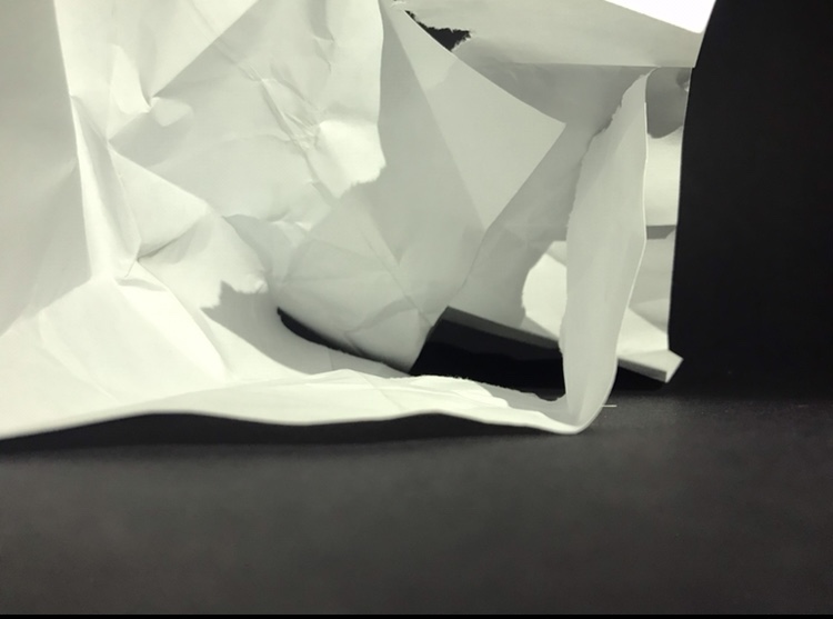
Line – In my fourth photo the lines are quite abstract and unnatural due to the way I crumpled the paper. This contrasts with the sharp, straight lines on the edges of the paper. In my first image the lines are very harsh and impactful. This is also due to the lighting coming from the side.
Repetition – There are repetition of triangular shapes in my second and third image and in my first image the lines repeat and are parallel.
Space – In my third photo there is a sense of depth due to the way it folds behind each other. I think all the photos have a depth to them because of the way they are set out and folded.
Texture – The lines in the photo would feel sharp and flat whereas some of the crumpled paper would feel more rough.
Tone – In all my photos a range of tones can be seen. In my first and second image the tone fades and is not as sharp as the other images. They also don’t contain as dark shapes and lines.
Colour – In my first and last image the dominant colour is black with hints of grey and white. This is different to the other photos where the dominant colour is white and grey.
Composition – In my second and last image the paper has been arranged into a sort of pyramid formation.

