
Design Drafts

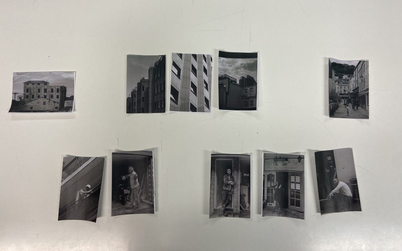
Here I produced quick arrangements of my photographs to see which images worked well together in a sequence, for example I tried placing portraits together and architectural ones separately. This helped me gain an idea of the order I will put my images in, as well as how they work together to tell a story. Ultimately I decided to place my images in a sequence that alternated between portrait and landscape, as I believe it will create a sense of balance in my zine.


Next I stuck down my images down onto a booklet template, in the order I had decided on, allowing me to see what it would look like once printed. Here I decided to place a black and white landscape photograph as a double page spread in the centre, as I believed it could further develop my idea of balance within the zine, whilst also creating a kind of symmetry between the start and end of the piece.

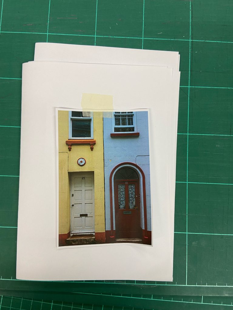
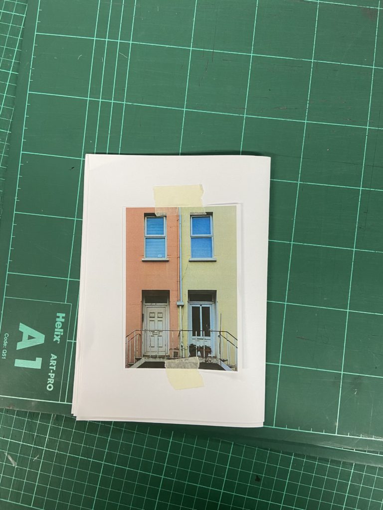
For my front and back cover I have chosen my images of doorways that are next to each other to show the duality of the communities existing throughout St. Helier. This also could be used as a metaphor for looking inside the lives and lifestyles of the people in this town. In addition it represents the polarised contents of the zine, that shows both the architecture and the people of who inhabit the different quarters.

For the first page of my zine I have chosen to display two images, one containing multiple sets of flats and housing, and the other a portrait of a lady standing in front of her restaurant. For every image of architecture, I have chosen to add a black background to further contrast with the vibrance of the portrait opposite it, additionally it also contrasts with the white sky in the photograph.
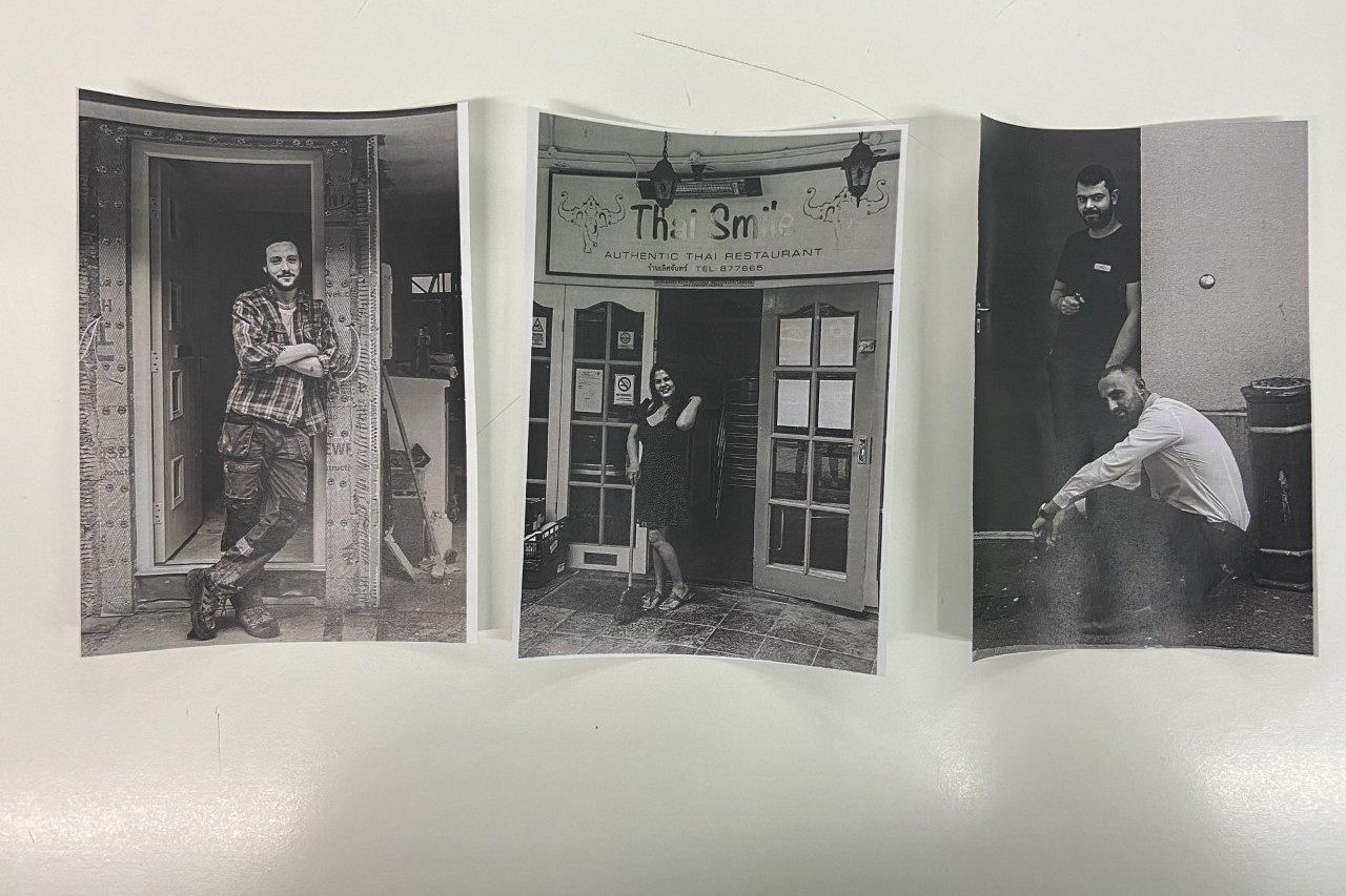
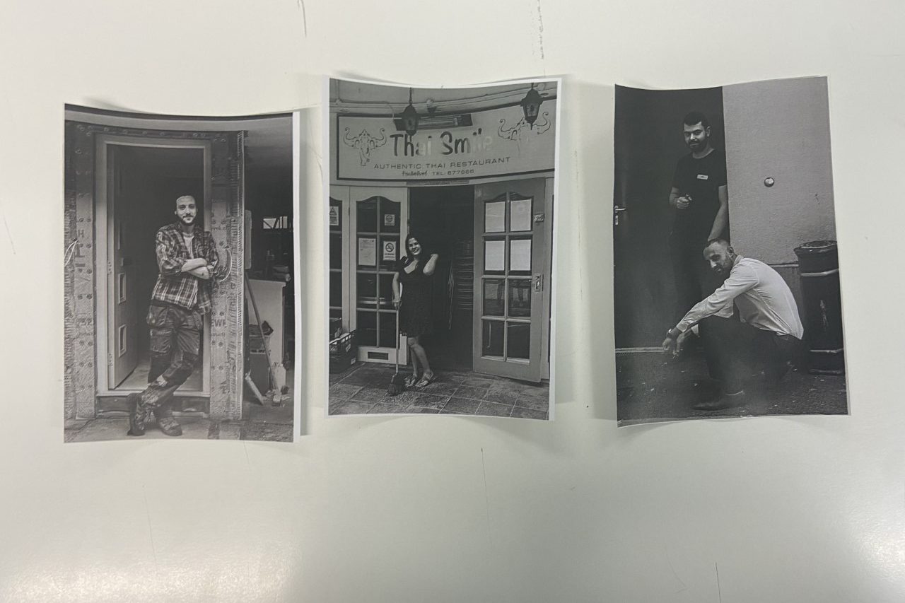
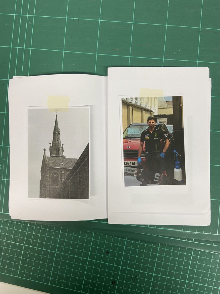
On the second page I have included again both a portrait and an architectural image with the same backgrounds and layouts as the previous page. The image on the left showcases St. Thomas’ Church accompanied with a portrait of a man at work in a garage on the right, both taken within the French/Portuguese quarters within town.

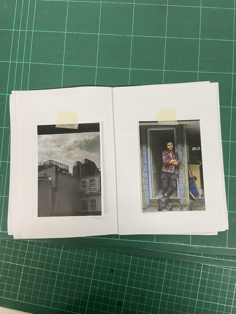
For the third page I have chosen to follow a similar layout to the previous pages with the exception of the portrait having a full bleed to the edge of the page, not allowing room for a white border. The photograph on the left displays the view from a courtyard in the centre of town. The portrait on the right shows a man, who appears to be a carpenter or builder, at work leaning in a doorway.

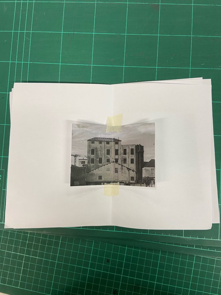
For the centre page I have placed my black and white landscape image of a run down building in town. Here I have chosen to make the image full bleed, as I think that it will be more impactful without a white border around it. This building is located around the centre of town, which I think ties together the theme of divisions as it provides a place of intersectionality.

For this next page I have swap around the order of the portrait and architecture photographs to continue the theme of alternating between black and white landscape and colour portrait. These pages reflect the pages before the centre page, with the portrait being full bleed instead of having a white border.

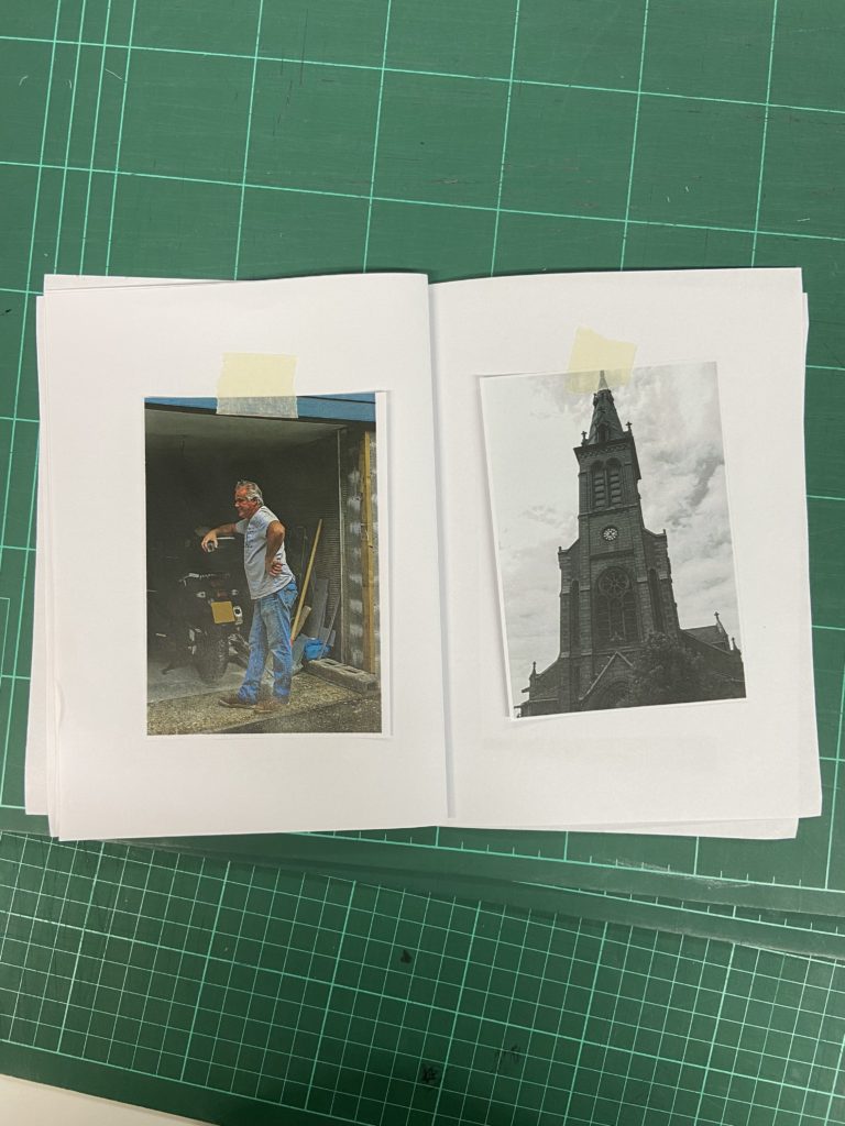
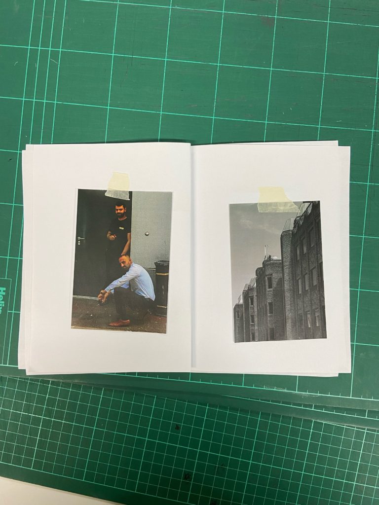
This page displays a portrait of two men who appeared to be on a break and standing outside the door of their workplace, next to a black and white image of St. Thomas’ church which is a strong signifier for this community, due to the large scale of the building and its towering over the rest of town.
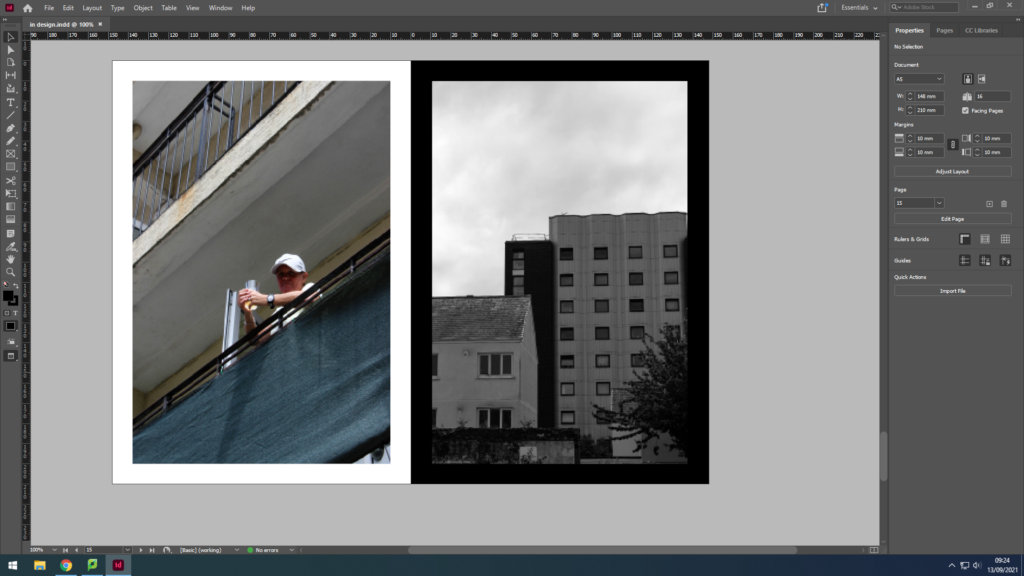
For the final double page I have showcases an image of a woman on her balcony looking down into the courtyard I was standing in, placed next to a block of flats that I thought looked similar to the exterior of the building this lady was in.
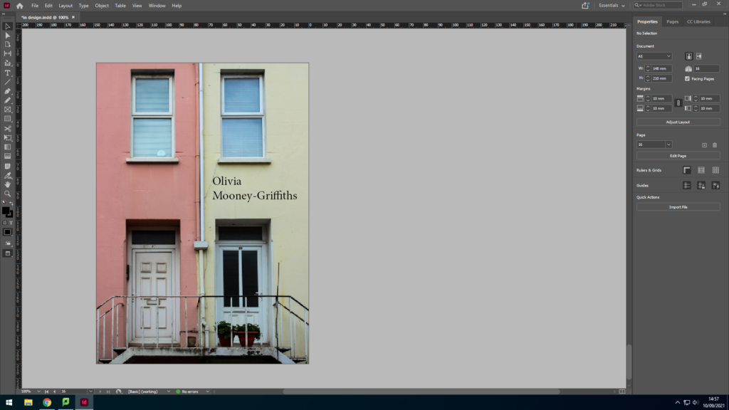
For the back cover, I have chosen another photograph of two houses and doors side by side in order to replicate the front cover. This creates a sense of symmetry within the zine. In addition, the two different colours of the house increase message of duality and separate communities within St. Helier.