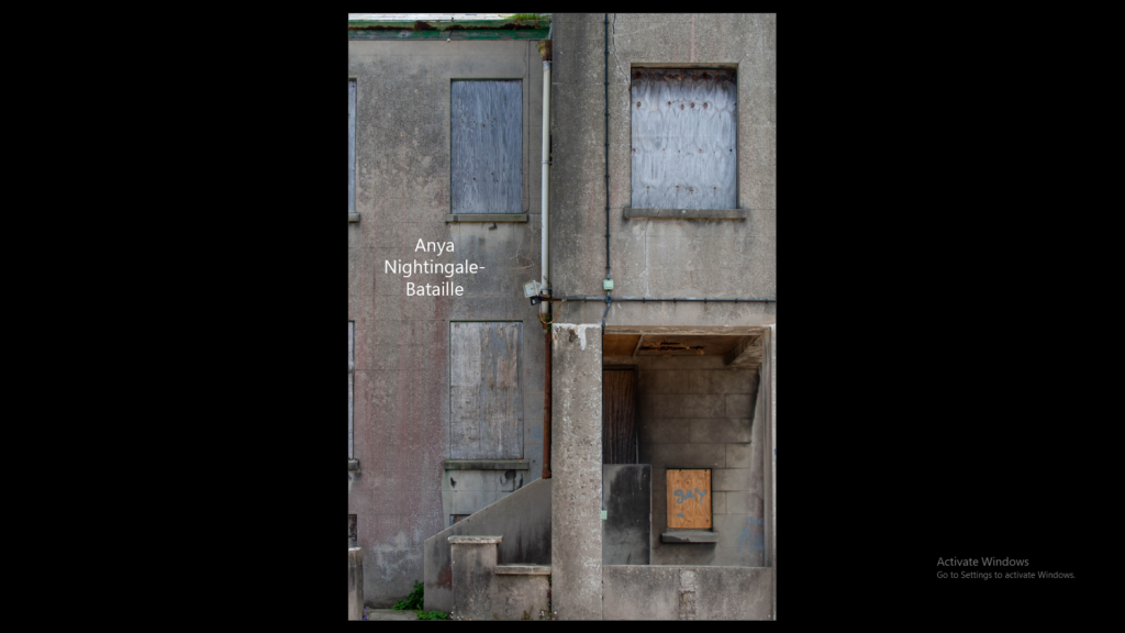
A photo zine is a collection of photographs laid out in a magazine style. It can include written text as well as photos. They are made to display a photo story.
Research + Analysis
Layout Ideas:
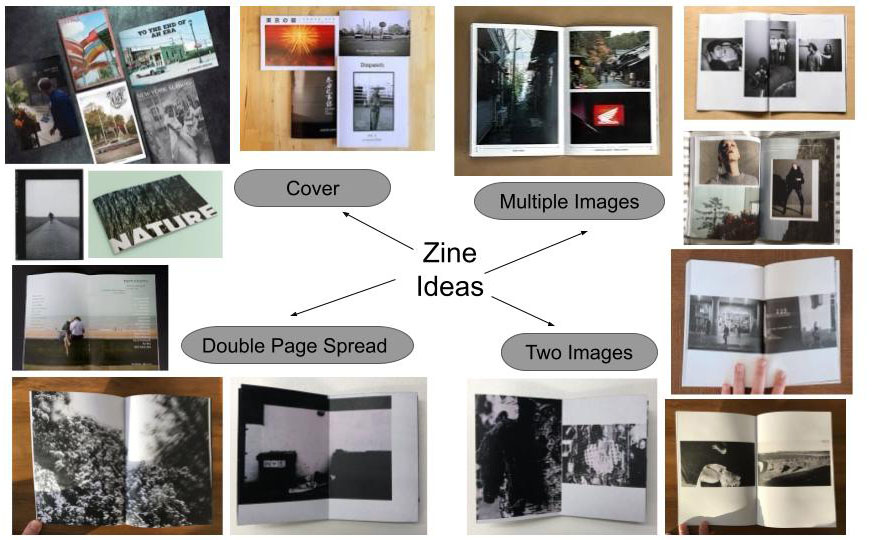
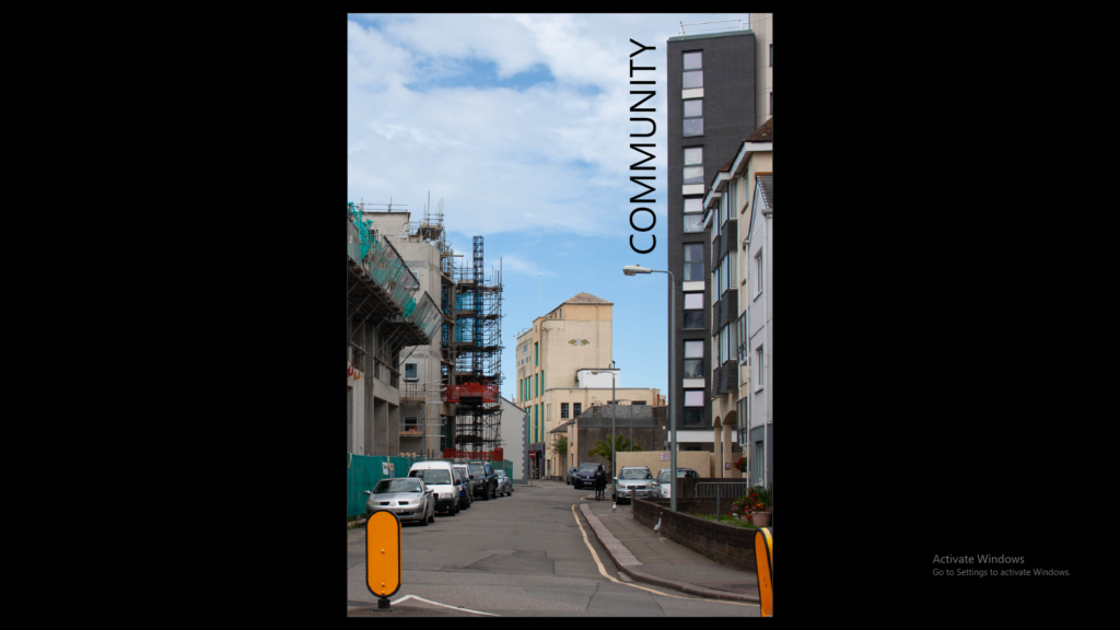
I want to focus on the idea of community and how people have different lives which they encounter different people around town (St Helier). I want to mix neutral tones with bright bold colours to create a contrast throughout the zine to emphasise both colour pallets. I will keep the zine background white.
I will include different sized images including double page spreads and square photos. I will keep a maximum of two images per page so the images are still large and it creates space in the zine.
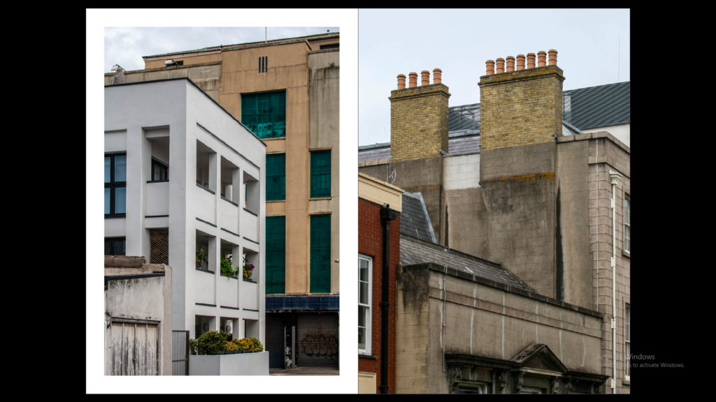
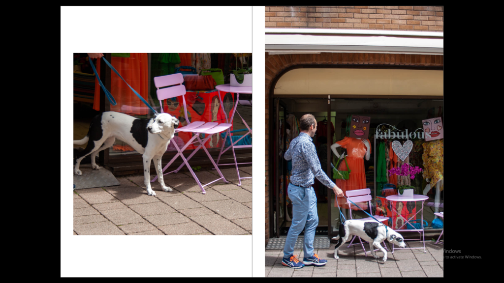
The images which will be sharing a double page spread will be sequences or different images portraying a similar story but perhaps contrasting.
I will not add any text throughout the zine but will add the title ‘community’ and my name on the back cover.
Using InDesign
I opened a new document and set the settings to:
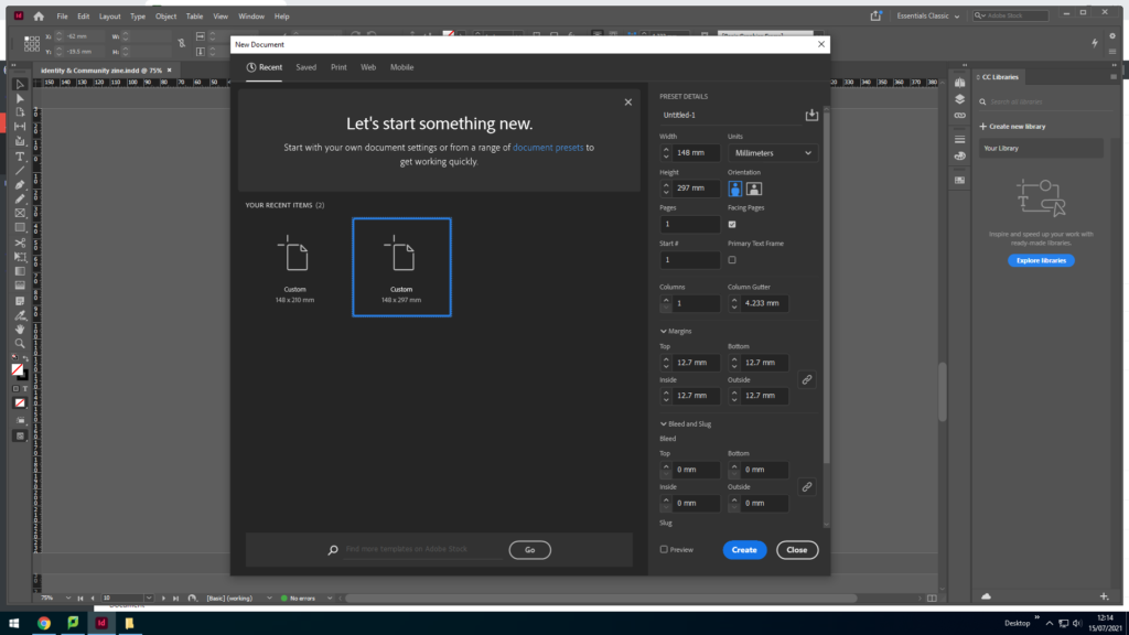
Width: 148mm
Height: 210
Pages: 16
Orientation: portrait
Columns: 2
Column gutter: 5mm
Margins: top, bottom, inside, outside: 10mm
Bleed: top, bottom, inside, outside: 3mm
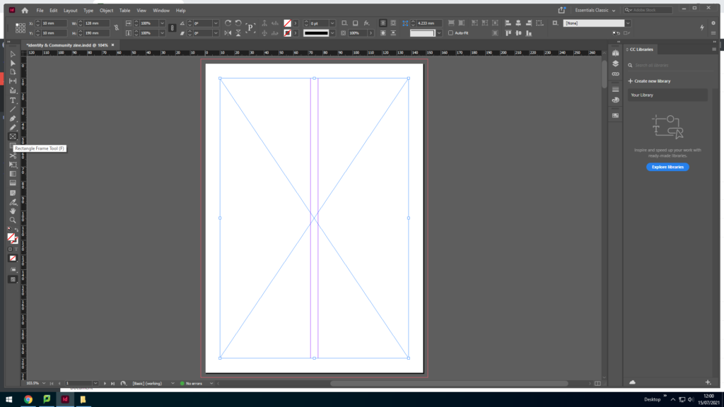
I used the rectangle frame tool to make a box for the image I am going to export.
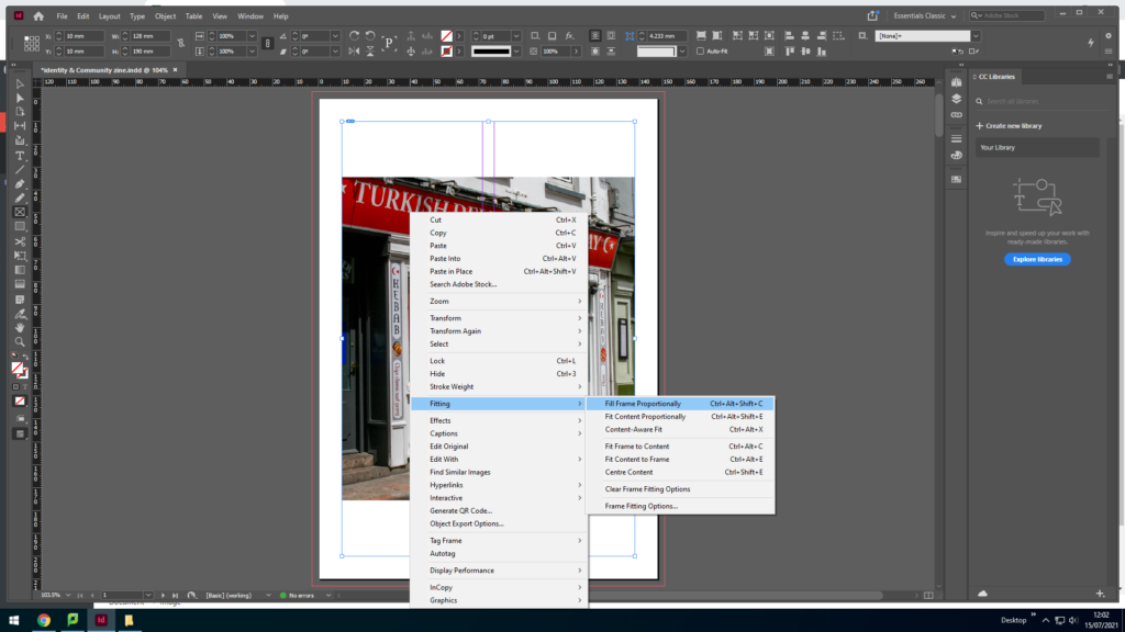
I pressed Ctrl D to export the image into the box then right clicked and pressed fitting to get the image to fit inside the box.
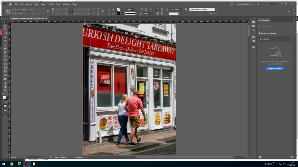
After fitting the image to the box I dragged the image edges to fit to the orange line (the bleed) so that there will be no white edges. To make the image fit I right clicked and went onto fitting and selected fit frame proportionally.
Experimenting + Designing
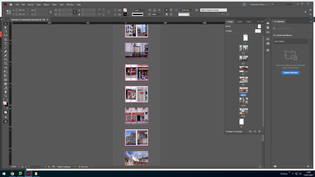
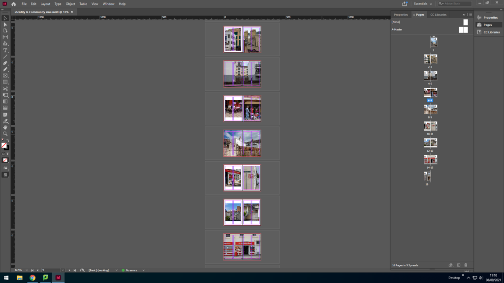
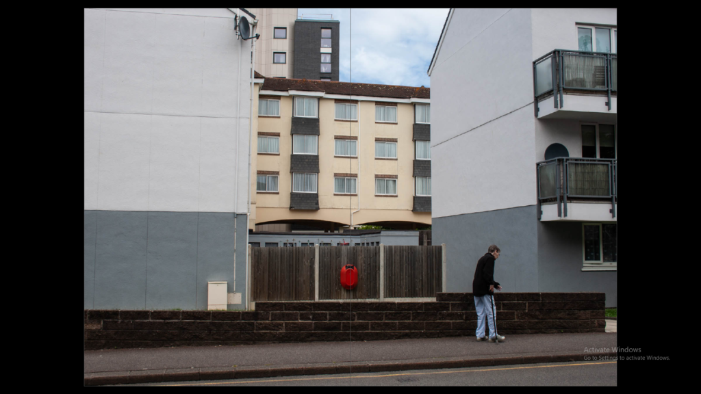
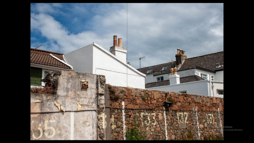
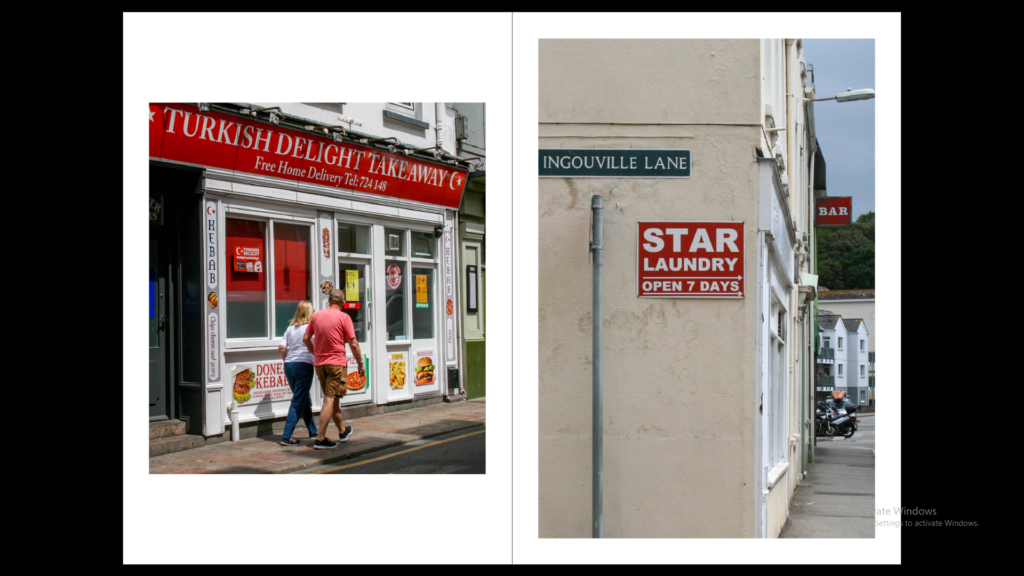
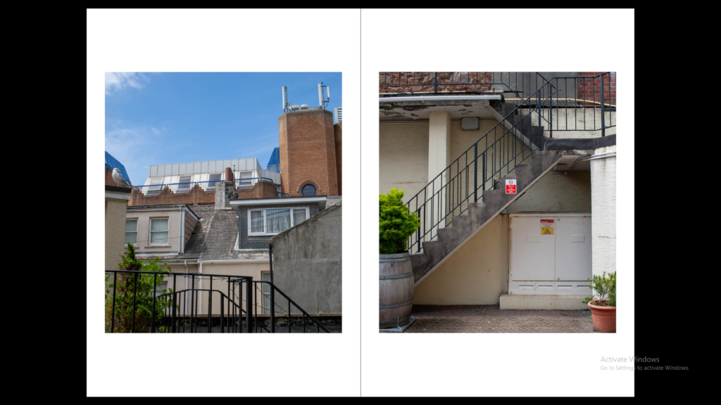
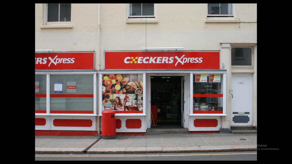
When planning the layout of the images I made sure to go for images which tell similar stories by having the same or similar settings. I focused on the title ‘community’ and went for mainly landscape pictures rather than people. The photos of people that I chose were street style photos which were not staged, catching them in their day.
The story I wanted to portray was an average day out in Jersey St Helier but also focusing on new and old. For example the first double page has two different old buildings but it contrasts with the newer buildings. the other pages focus more on landscapes and shops within our community and lifestyle.
Final Layout
