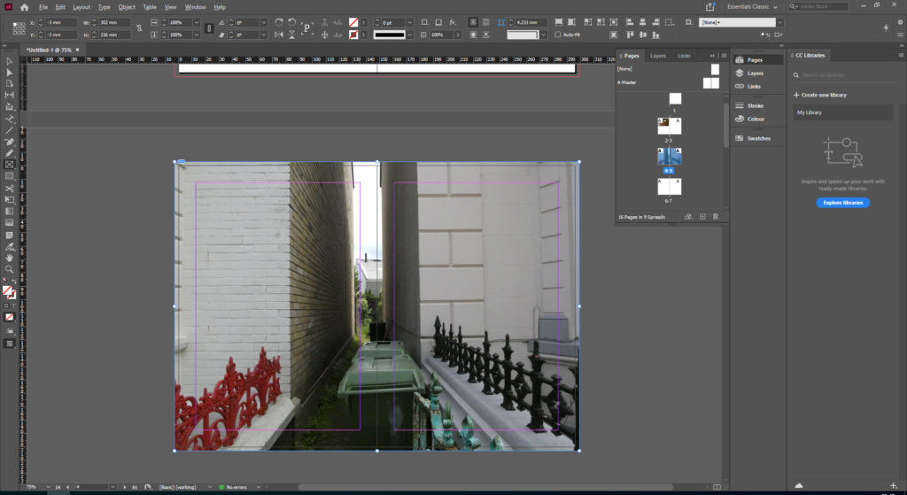
To make the ‘Zine’, we used InDesign to create a 16 page booklet to display our images based on the theme of identity and community. My images will be set out in landscape, with different sized images to create interest and contrast in both colour and size. The inside pages won’t have any text as I want the zine to focus purely on my images. I am still deciding on a title for my Zine.
InDesign Process
Zine Measurements –
Create new document
width: 148mm
height: 210
pages: 16
orientation: portrait
columns:2
column gutter: 5mm
margins: top, bottom, inside, outside: 10mm
bleed: top, bottom, inside, outside: 3mm

Once the basic zine is created, and the design and layout has been decided. Photos are then added. To do this, I used the rectangle frame tool and worked out the size of my image.
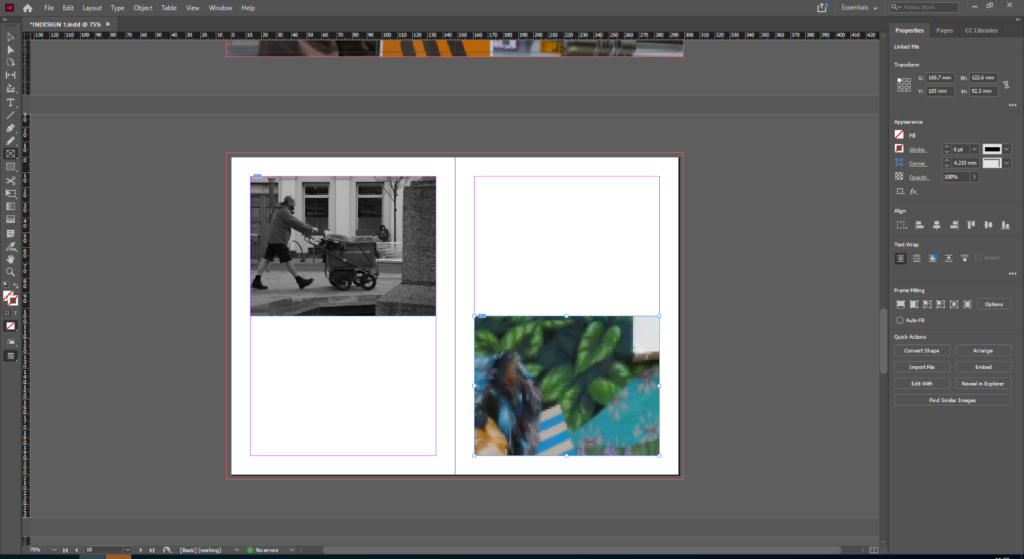
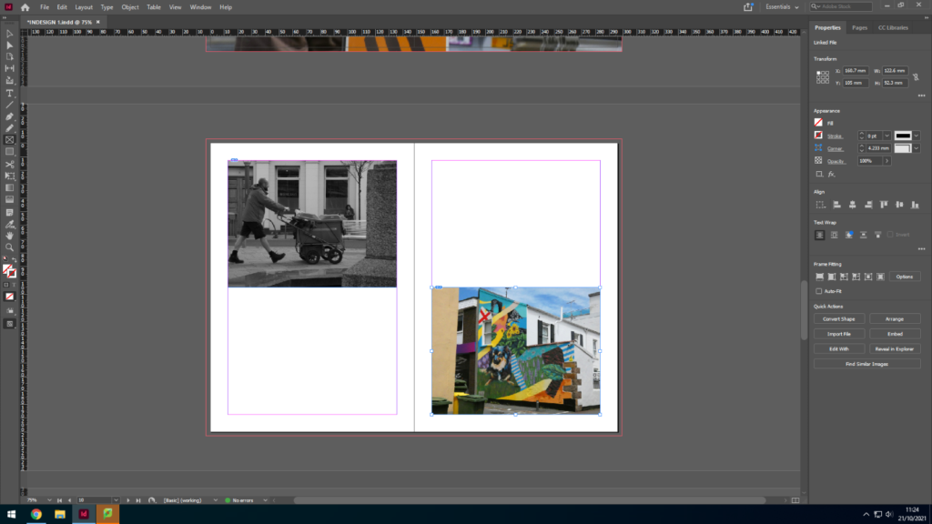
Once the frame for the photo has been correctly sized, I clicked import photo to add my image into the frame. For my zine I am alternating between the sizes and colours of the images, which is why I have paired black and white images with colour images. Also, each page contains different sized images, for example some pages have an image to the edge of the bleed, whilst others shave a page with another photo.

Once the image has been imported, the image must be resized to fit the frame. To do this, I pressed fitting, and fit content to frame. The fitting of the image depends on the size of the frame, therefore a bigger frame will display a larger image. Repeat this process until all 16 pages in the zine are filled.
