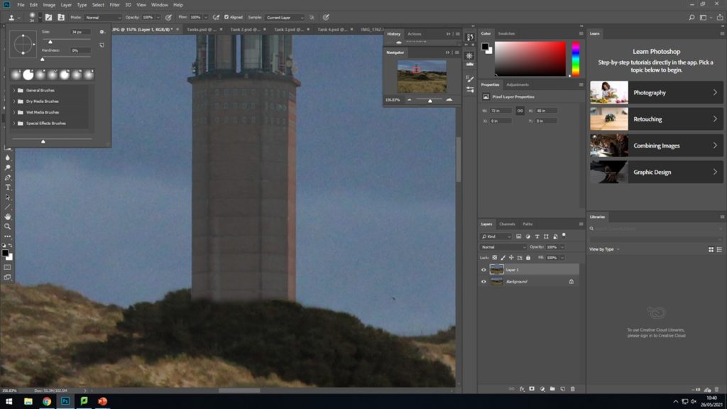
Edits in The Style of Felicity Hammond
Edit 1
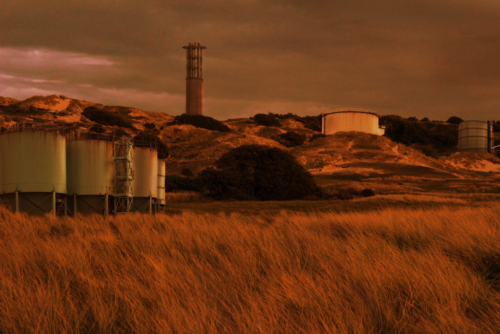
In order to produce this altered landscape edit, in the style of Felicity Hammond and through the lens of Anthropocene, I started off cutting out all of the structures I needed to use for that edit, from my urban landscape photo-shoot. After I had done this, I dragged the buildings onto my chosen photograph from my natural landscape photo-shoot one at a time. With each structure I adjusted the hue/saturation, brightness and contrast, and colour balance, to make sure the tones in that layer would match the tones and colours of the natural landscape, in order to make them fit in more with the landscape. Once I had done this, I then adjusted the perspective of the structure, meaning the angle of the layer would correspond with the angle at which I took the natural landscape from. Next I used the clone stamp tool to make sure the structure is embedded within the landscape, in the grass. Finally after doing this same process for the other three buildings I included in this edit, I added a solid orange colour as a layer and placed it over the flattened image, and selected the overlay option. This was done to cause the edit to look more similar to Hammond’s work. Then I also added a slight gradient overlay, starting from the bottom of the image.
Edit 2
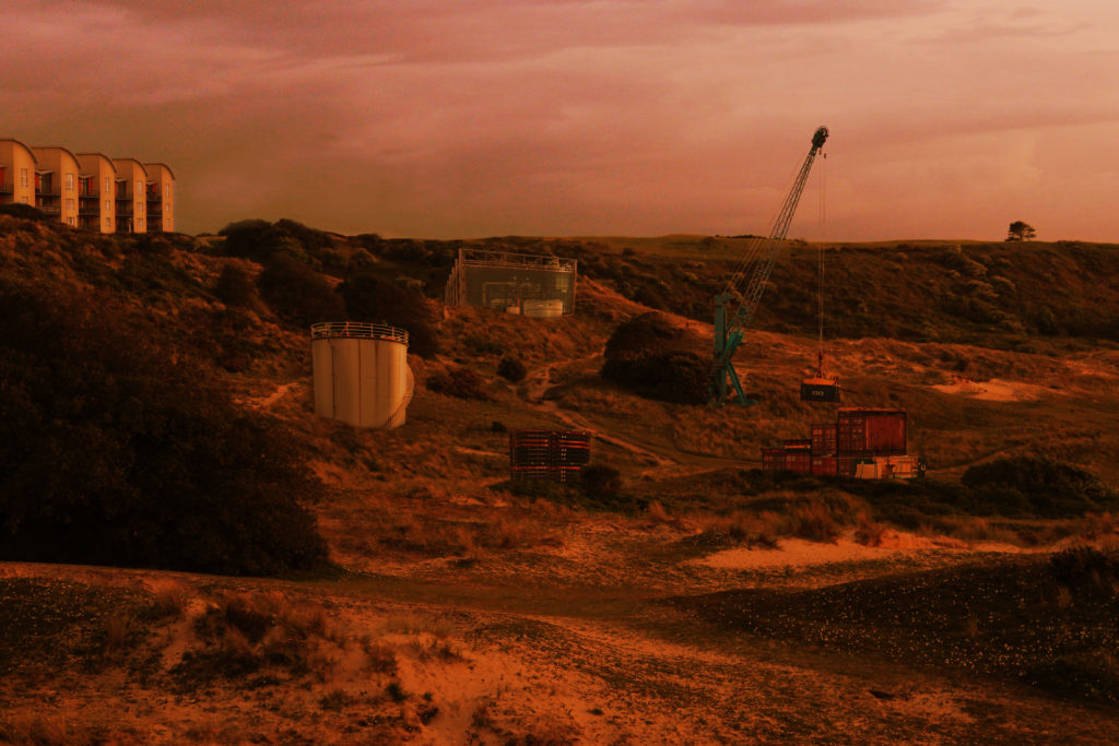
For this next edit I followed the same editing process as the image above, however using a different structures and a different base natural landscape.
Edits in The Style of Tanja Deman
Edit 1
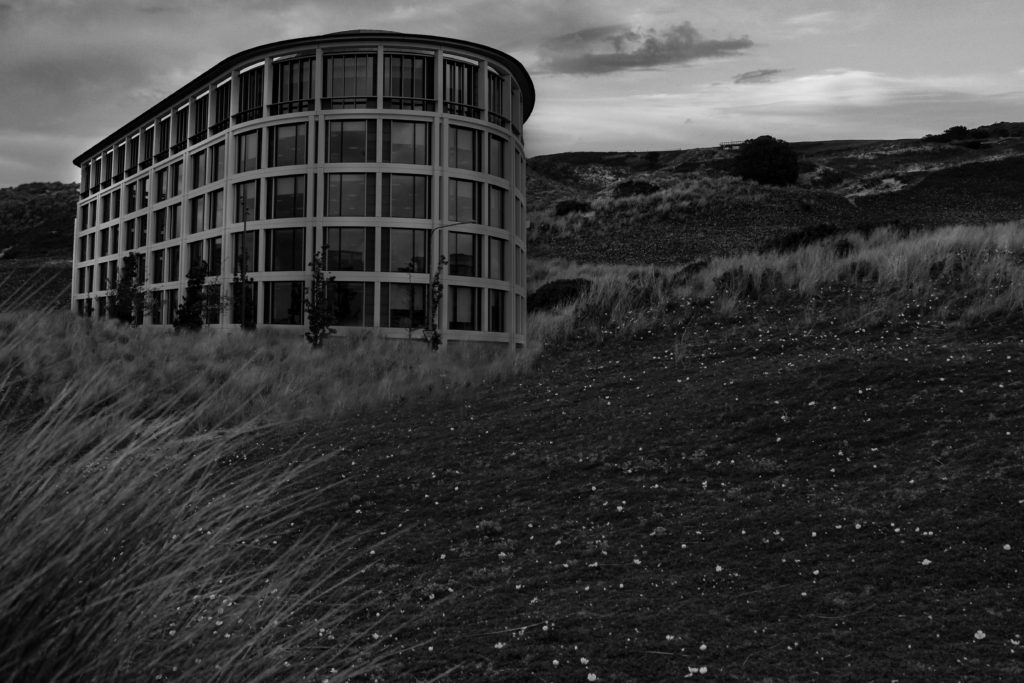
In order to create this altered landscape, in the style of Tanja Deman, I started off by cutting out the one structure I would need for this edit, from my urban landscape photo-shoot. With this edit I only used one building to replicate Deman’s work, as she usually has the focus on one structure instead of multiple. After this I then dragged the cut out image onto my chosen photograph, from my natural landscape photo-shoot. Next, I tried to match the tones and colours of both layers by adjusting the hue/saturation, brightness and contrast, and the colour balance. Once I had done this, I used the clone stamp tool to make it look as if the building was embedded in the grass. Then, after I flattened the image, I converted the image into black and white, whilst also adjusting the shadows and highlights. Finally, I used the dodge and burn tools to add slight adjustments, and highlight the side of the building that would have been facing the sun, if it were there .
Edit 2
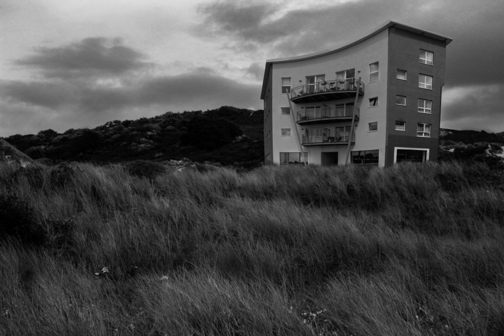
For this edit, also in the style of Tanja Deman, I followed the same editing process as the image above, although this time using a different structure and landscape.


