
Luigi Ghirri
Luigi Ghirri, born in Scandiano, Italy in 1943, was an Italian artist and photographer who gained recognition as a pioneer of contemporary photography. Ghirri began his career in the 1970’s, when he was heavily inspired by conceptual art. He went on to create his first two pieces, ‘Atlante’, in 1973, and ‘Kodachrome’, in 1978. Luigi Ghirri’s work was featured in many exhibitions around the world, as well as being invited to the ‘Photokina’ in Cologne in 1982, where he was acclaimed as one of the twenty most significant photographers of the 20th century for his series ‘Topographie-Iconographie’. He later died in 1992, due to a heart attack when he was 49.
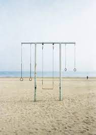
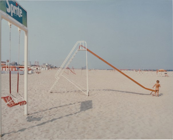
Examples of Luigi Ghirri’s work
Analysis of Luigi Ghirri’s work
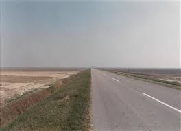
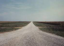
This photograph titled ‘Campagna emiliana‘ depicts a derelict Italian rural landscape. At first glance, there is a very muted colour palette and a very simple composition. This is an iconic combination for Ghirri’s work, as he captures the juxtaposition of nature and artificiality in a simplistic way. Ghirri’s use of subtle tones create an almost deadpan view of the world, as his contemporary lens produces an anthropological reaction to his surroundings.
The natural, soft lighting in this photograph forbids any prominent shadows or highlights from standing out, there is no true sense of direction to this lighting because of this as the angle of shadows indicate this, whereas there is a lack of this in the photograph. The lighting is evenly distributed for the most part in this image, although there is a slight sense of darkness towards the top right third of the photo.
There is a clue use of lines within this photograph which can be seen as a form of repetition. Due to the cropping of the image, the lining of the beach is very uniformed, as well as the thicker lining of the road and the juxtaposing thin lines of the walls separating the road and the sand. The use of thin lines can also be seen metaphorically as a separation between the natural world and the artificial world, which is shown as a fine line to separate the two. This could be said to prove the almost indistinct segregation between man and nature, and how they begin to merge in the modern world. There alternating lines also create the multiple leading lines for the viewer, to direct their eyes straight forward towards the horizon in the middle third of the image.
Repetition is represented in the form of lines in this image, however these lines are contrasted between each other with different sizes and colours, therefore the use of repetition in this photograph is contradicting. On the other hand, there is no representation of echo or reflection in this photograph.
Geometric shapes heavily influence this image as well as a lot of other works by Luigi Ghirri. This is proven once again by the repetition of straight-edged lines. The photo, for the most part, is made up of long squares that carry the viewers eyes to the horizon in the middle third of the image.
There is a slight shallow depth of field in this image as the image begins to fade towards the middle third of the image. This is due to the distance of the image paired with a lower f-stop of around 1.4. The majority of the image contains empty, negative space. However the bottom third of the image consists of positive space.
There is multiple contrasting textures within this image. For example, the smooth, even road is contrasted against the rough sand, which is then contrasted with the sharp-cut grass.
The darkest areas of the image would be the grey-toned road and the dim section around the horizon. These are juxtaposed against the lighter areas like the light yellow sand and the gleaming sky. Overall, the image tends towards the lightness, due to the muted, pastel colours in the photograph.
The colours in the photo are very muted and subdued, due to the use of natural daylight, which I believe was taken around midday as there is no sign of a sunset or sunrise. The dominant colour in this image, I would say, is the blue sky. This is because the light blue contributes to over half of the image. I think if this image was taken in black and white, the juxtaposing textures and tones would be increasingly exaggerated .
The image has a rather simple composition due to the repetition of lines as well as the image following the rule of thirds, as the leading lines simultaneously stop in the middle third of the image, and the horizon separated the top third and the bottom third. I would say the image is balanced as the positive space in the bottom third is evenly contrasted with the negative space of the top third.