How a simple plain A4 sheet of paper and be transformed into digital art, using formal elements.
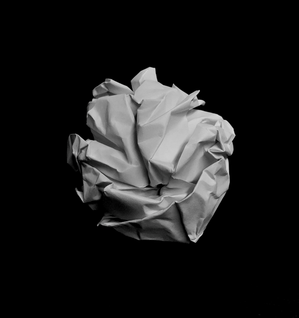
In this photo is scrunched up the paper into a ball shape, and then placed it on a black background and used a low exposure to blend the shadows on the ball into the background, which creates a higher contrast and brings the shadows out more.
I edited it black and white, to remove a yellow hint from the artificial light in the room.
The camera is positioned close to the subject to add more definition and to improve the image quality.
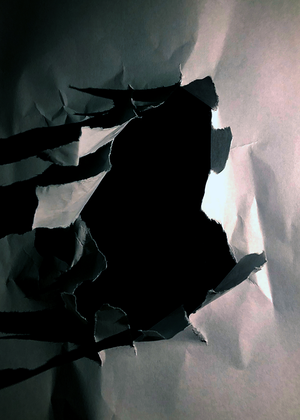
I ripped a hole in the centre of the piece of paper then put it on top of a black piece of card, to make it seem that the hole is deep.
The shadows add more detail as there is artificial light to the right of the hole. I pulled the tears up to create more depth and definition, as it increases the shadows as the light is at the same level as the subject.
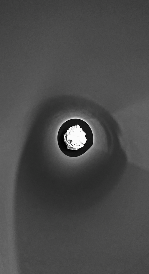
I used a piece of rolled up paper to frame the paper ball, by putting my camera at one end of the tube, and the ball at the other end. This focuses your eye on to the ball at the end of the tube.
This image has a lot of different emotion as there are curved lines, then sharper straight lines on the ball itself. The paper that I used to frame the ball softens the image, which is contrasted by the randomised, chaotic shadows on the paper ball.
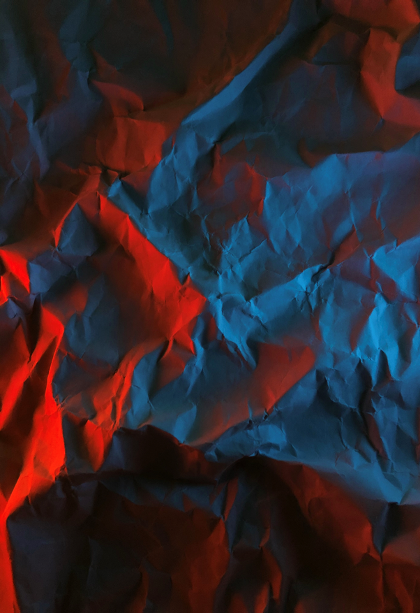
I creased up a sheet of paper and added two lights on the left and right, I used two phones and used the screen light on full brightness with two different colour pictures to create a coloured glow. The shadows show every small crease in the image, which adds more detail and definition.
The clash between the two colours creates unique shadows. It works well as red and blue as they aren’t complimentary colours.
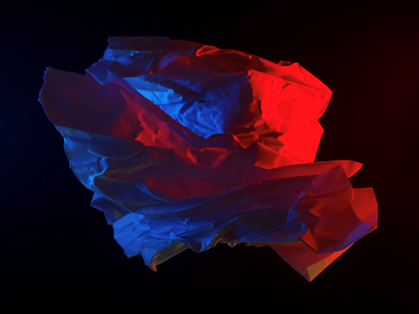
I randomly scrunched up a ball shaped object and lit it up with two phones. It created a random cast of shadows, and a nice depth with the red illuminated paper in front of the blue illuminated paper. It seems like the blue light is inside the subject but it is not, this created a layered effect, which i didn’t plan, but worked out well.
The random shape of the subject adds a unique effect as it can’t really be replicated.
The image is underexposed and has a high black point to create a gloomy effect.

Strong images. Try to relate them to the Formal Elements. You might want to include a relevant photographic reference.