
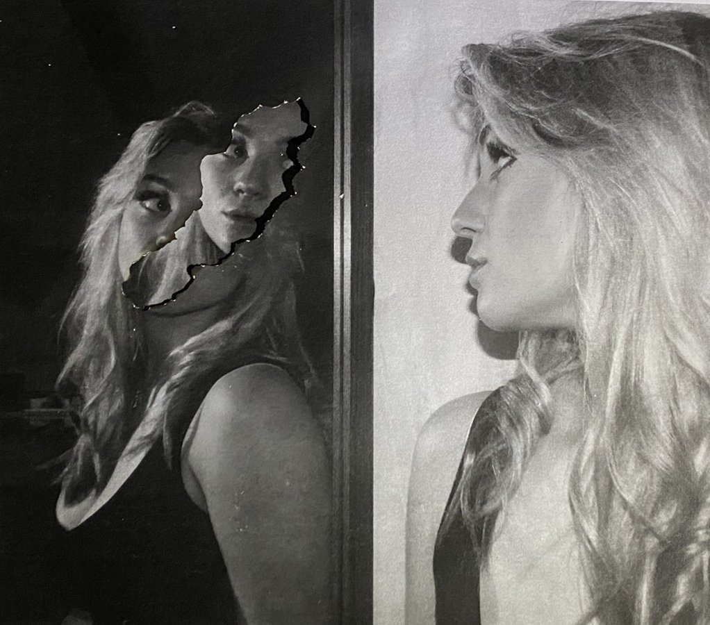
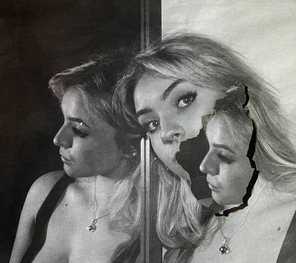
After going through my edited images, I decided that the two above were my most successful images. I wanted two images: One where the subject was facing the camera and one where she was facing the mirror. I think these two images would work well together placed vertically- and to achieve that I cropped both images and rotated them slightly to align the centre where the frame of the mirror divides both sides.
To explain the reasoning one last time, these photographs represent how everybody around you has a different perspective and different angle of how they see you in their mind to how you may see yourself, for example when you look into a mirror. However this is meaningless- you only look one way. Its all about perspective. In these images, the in the centre on this images is a frame (the mirror frame), which divides these two perspectives. One successful feature of these images is that the two sides completely contrast in tones. The background of one is very dark and the other is very light. As for the burns and parts of images coming through in Image 1 simply show a form of distortion. Part of the subjects face is cut out, but just replaced with the same image below just slightly moved. In image 2, it represents reality- the mirror image colliding with how others see you, this is because it can be true. People can see you the way you see yourself even if you don’t realise that. ‘There is dark in light and light in dark’. One thing I could have done is also printing and burning these photographs on photographic paper, this would have creating a melting effect, in addition some warmer colours around the burnt point.
When deciding how to display my images on paper, I though about some creative things, however this could distract the viewer and had no real meaning. I want my images to be clear and the focus point.
I took a photo of a plain picture frame and placed my images on using photoshop, however I didn’t like this outcome- there’s not enough contrast and depth bringing my images forward, they are also very close together making the viewer almost looking at these images as a whole rather than evaluating each them separately.
I liked this display a lot more than the previous one, It separates the images as well as making it clear that they are part of one idea. The small white border contrasts the black paper and makes my photographs pop, keeping the same black and white theme.
Strong and confident work Karina. Well done. Moving forward I suggest that you explore your ideas further with taking more photographs and experimenting. In addition you need to think about the quality of your final outcomes and refinement, ensure your development of ideas are sustained and informed by the work of other photographers.