photoshoot 2 plan-
who- I took photos of my friend as I wanted a student or a young individual in my photos. when and where– in the studio using normal lighting as I’m going to edit my photos anyways so I’m not depending on the light. why- I want my friend to cover her face with her hands to make her identity and I can link it to my chosen photographer.
contact sheet;
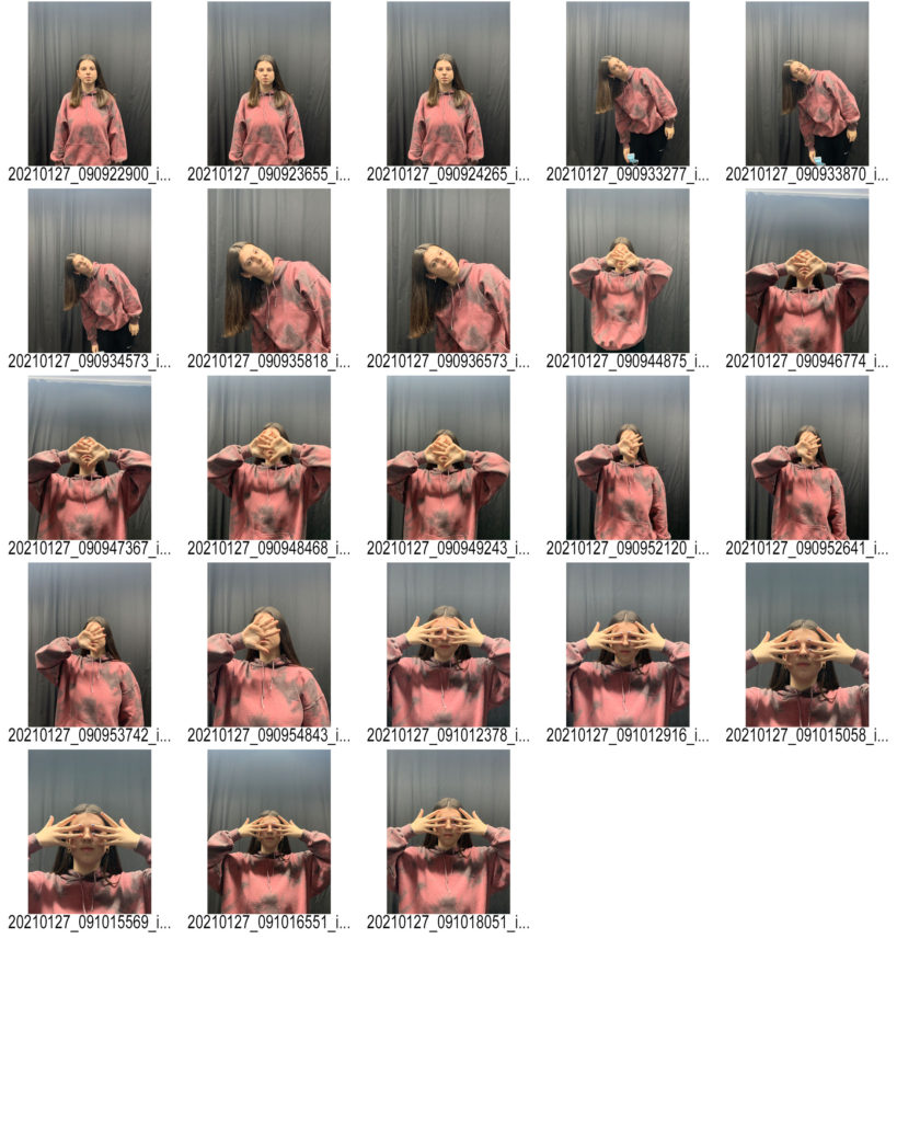
I used one big main light when taking these photographs I didn’t need to use any flash heads or extremely artificial lighting as when I’m editing my images the lighting is going to change completely anyways. I photographed my friend from a direct point of view and in line with her view point. I took some images from a much lower angle to make it look like the viewer is looking up towards her and it helped when I got to editing as I had different angles. I got her to use her hands as a way to hide her face(identity) because Jack Davison-my chosen photographer , presents lack of identity through that way. My last photo shoot was very based on editing and hiding the identity digitally whereas for my second shoot I wanted to use hands and make it more natural.
editing my images-
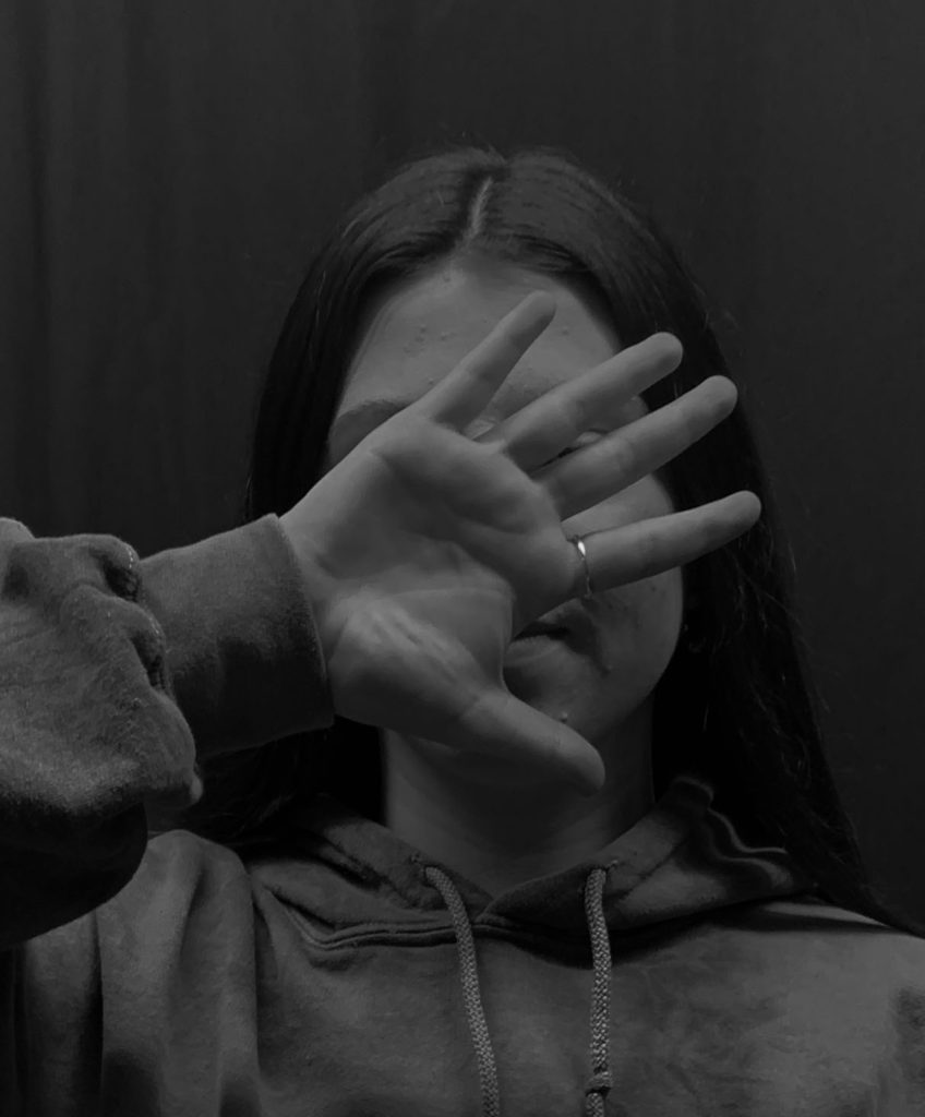
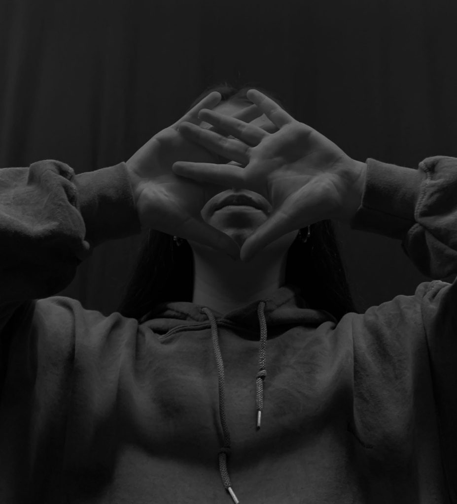
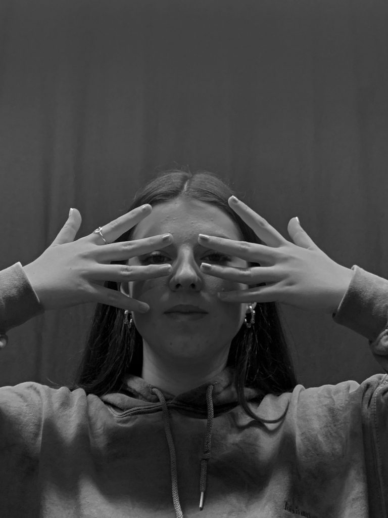
my 3 favourite images turned into black and white and that I’ll be working with to edit further.
I changed my images into black and white as that’s the style I want throughout this theme and I made sure the brightness was decreased by a lot as well as the contrast to create a variety of different black and white tones which all contrast well together. I cropped all my images down completely to get rid of most of the background as it wasn’t needed. By doing this is made her the focus of all images as the composition of the image changed – making her face in the direct center which draws attention.
using liquify tool to disguise the identity-
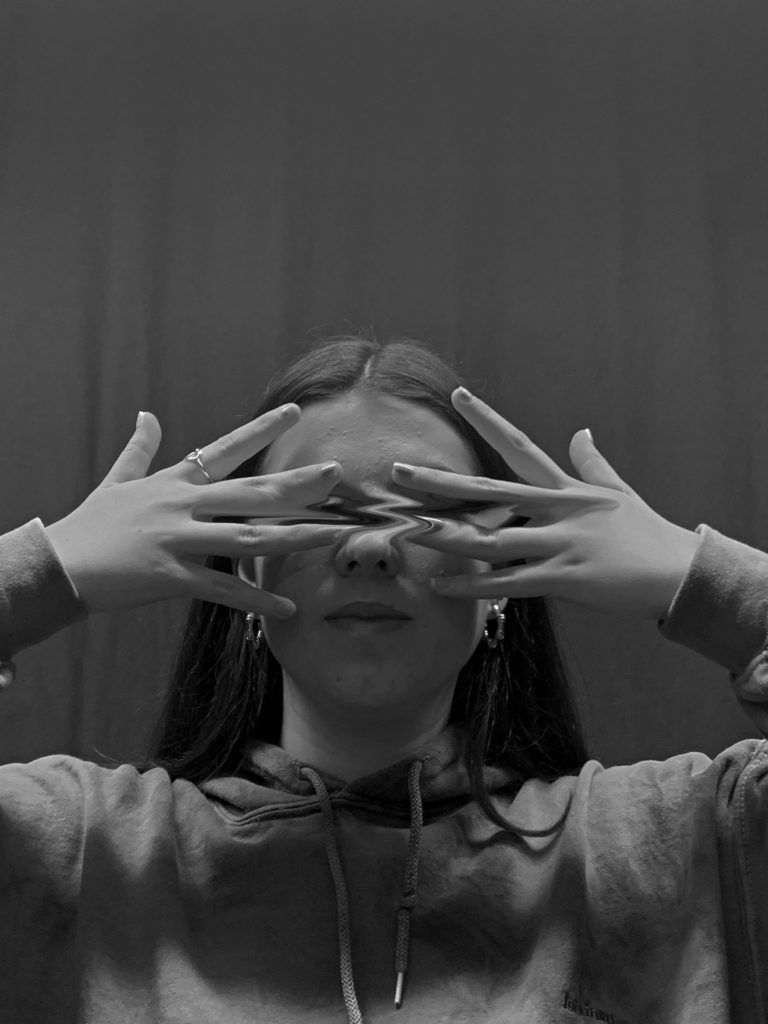
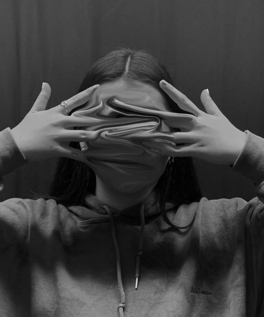
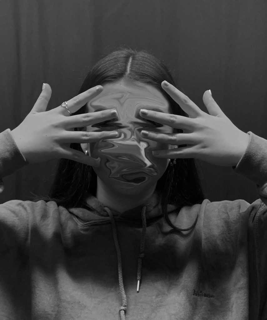
I used the ‘liquify tool‘ once again to smudge the eyes in the first image and then smudged all of her face in the 2nd and 3rd photo. I really like using this tool as it gets rid of her facial features in a very abstract way as well as erasing her identity. It creates a mysterious atmosphere as you cant tell what she looks like and I wanted to make the viewer question what he’s looking at.
cut outs-
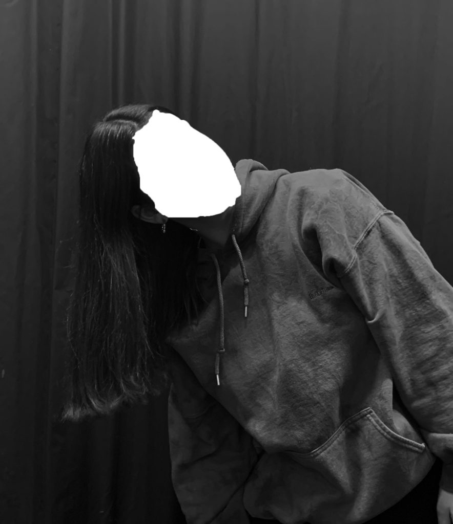
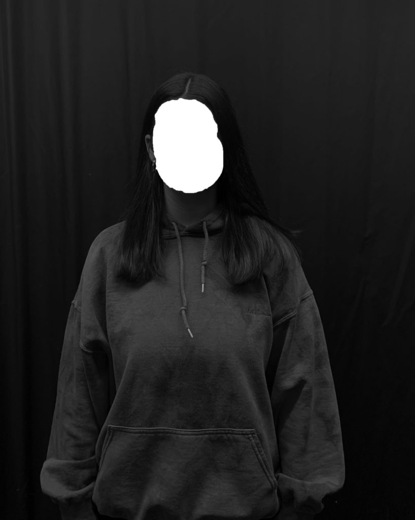
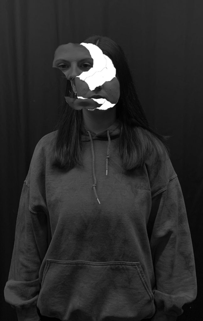
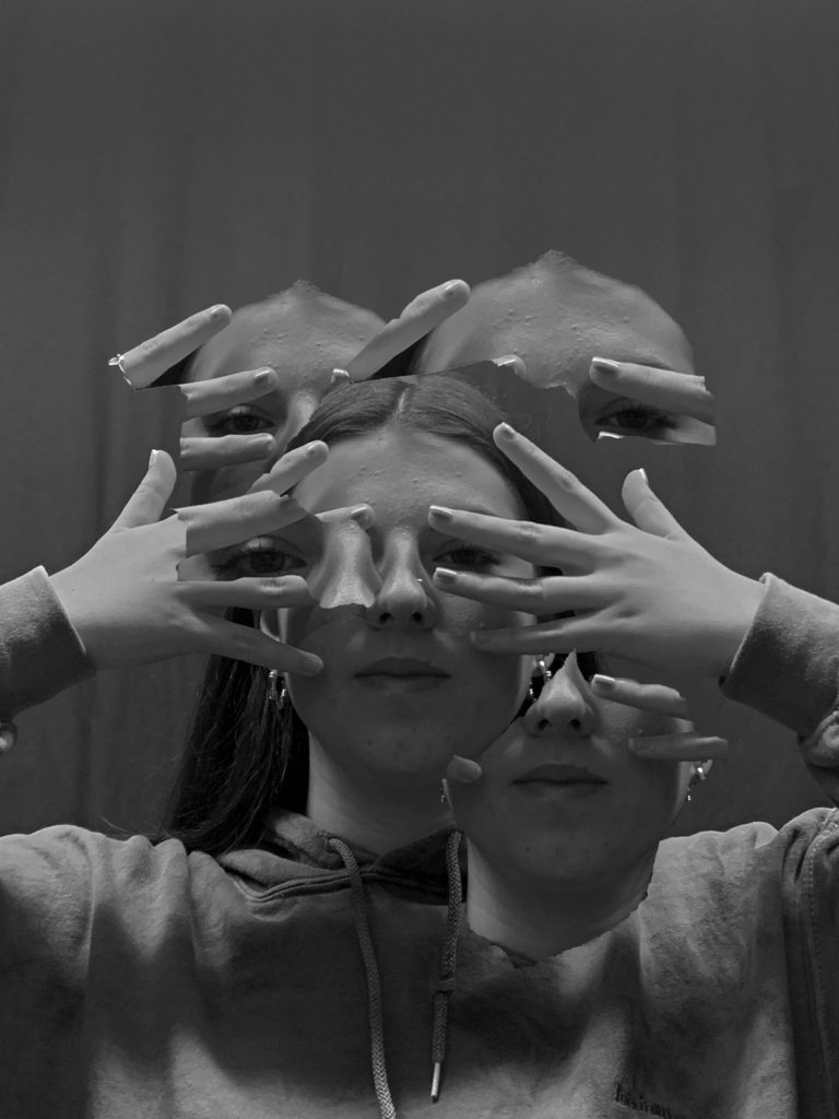
With the ‘quick selection tool’ I selected specific areas of her face that I wanted to cut out and drag out further across the image. I like how these edited images turned out because I think that by using the quick selection tool it completely gets rid of who she is whereas when I used the ‘liquify’ option you could still see something on her face but it was smudged around whereas on these images its just an empty face with nothing to look at. I left the cut out white as it stands out the most because the photo is in black and white. When you first look at the images the first thing you’re drawn to will be where I cut the face out as the white colour stands out so much in contrast. I wanted the edges to be slightly ragged and not perfect when selecting the shape of it because I wanted it to look as if the face was ripped out of the image rather than just perfectly circled out.
final images , analysis and personal response-
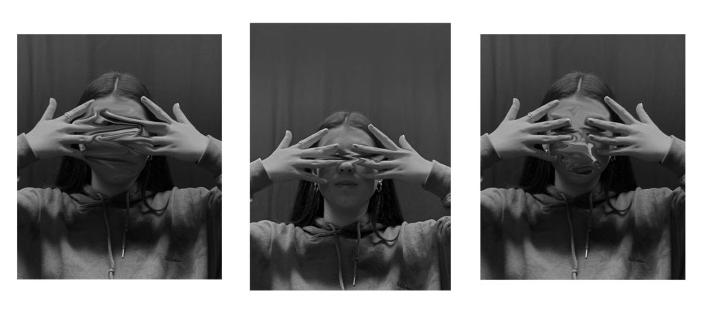
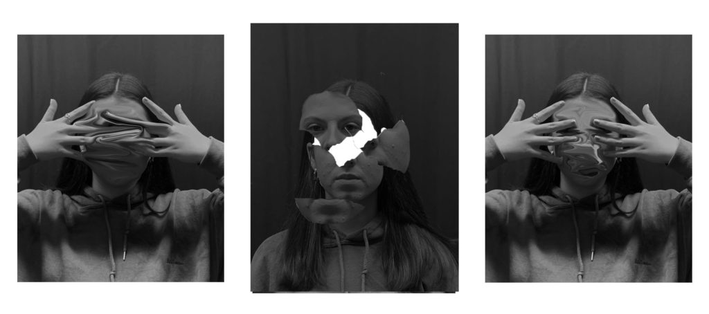
I selected 3 images once again for a final image. I wanted to pick 3 as I think it gives the viewer more to look at and analyse themselves. I also wanted to use 3 images because I knew that when I print them out they will look more clean and presentable rather than just one big image. Overall I think I achieved my ‘lack of identity’ idea very successfully and edited them in the way I wanted to. I changed them all into black and white which was inspired from my chosen photographer, Jack Davison, and I edited them in my own way with some inspiration from his work too. I wanted to use many different ways of editing my images so that I can select my favourite technique and make sure I have many different styles to pick out my favourite ones. I liked all the techniques I used but my least favourite were the cut out out ones which is why I didn’t use it for my final 3 , compared to my ones I liquified.
comparison-
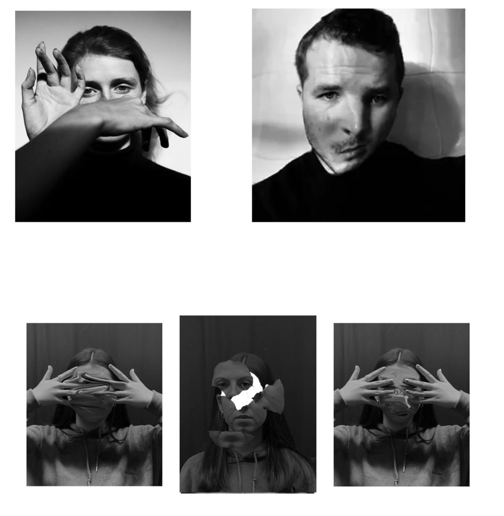
At the top is two photographs taken from Jack Davsion’s work, who was my chosen photographer, and at the bottom is one of my final photos. We both took our photos in black and white to create this contrast between the different tones, however Jack’s photos are more black and white whereas my images have a lot more grey tones and mid tones. This is because Jack’s models are wearing black clothing with a white background and I took my images in front of a black background which doesn’t achieve the same effect and the two tones can’ contrast as sharply. I took inspiration from his work by making my model cover her face with her hands too but I think my editing is a lot more advanced than what he did to his image which was just slightly distorting the face but still making it very easy to make out what the man looks like and I completely distorted my friends face.

A confident project Wiki. Well done. You could’ve developed your ideas further and could’ve responded to the work of an additional experimental photographer as shown in your initial mood board and combined their techniques (as discussed). In addition ensure that your final outcome realises your initial intentions and that you comment thoroughly on this in your evaluation.