Jaroslav Rossler

Jaroslav Rossler was born in Czechia, in 1902. Rossler is an example of a photographer who focuses his work on “The Formal Elements”, as he finds the beauty in the simplicity of objects. He started his journey in photography at 21 years old, as he used this skill in his career creating typographic layout for magazines. Jaroslav Rossler’s work was heavily influenced by futurism and cubism, this lead him into creating his art of abstract photography.
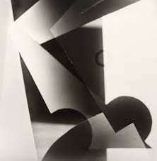
I took inspiration from this photograph titled: “Akt” by Jaroslav Rossler to approach the theme of “The Formal Elements”, as it perfectly represents the beauty of simple composition to focus on lighting and shadows. The geometric shapes of the paper create crisp, sharp shadows into the background to create a juxtaposition between light and dark.
My Response:
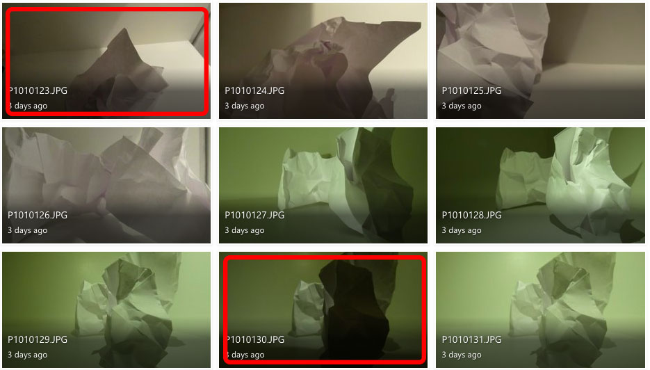
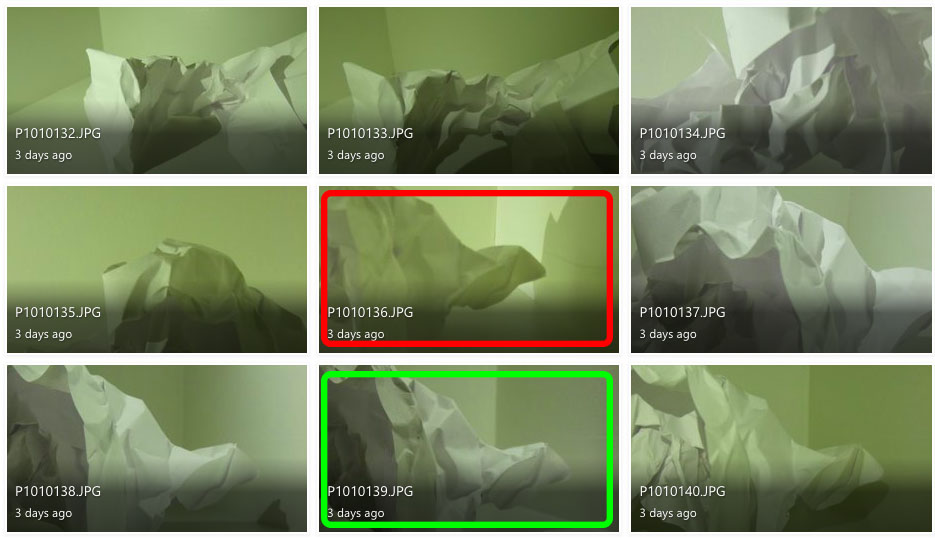
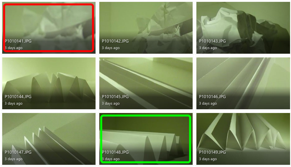
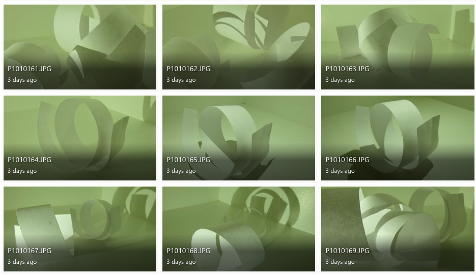
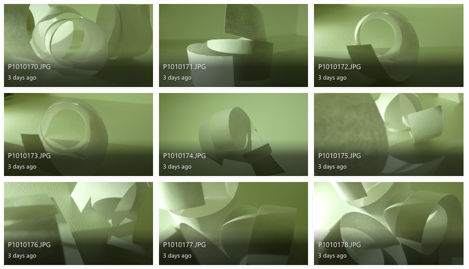
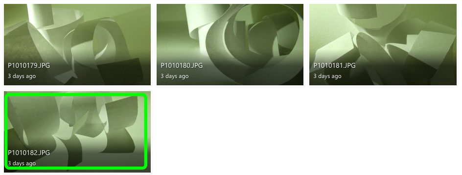
To explore “The Formal Elements” I photographed paper and explored lighting and texture by using artificial lighting to change the intensity and movement of shadows and distressed the paper in different ways to experiment with different shapes.
I don’t like the images in red because they are either out of focus or the lighting makes it difficult to define the creases and shadows.
I believe the images in green are my best photographs because they have distinct, contrasting shadows and shapes.
Photoshop development:
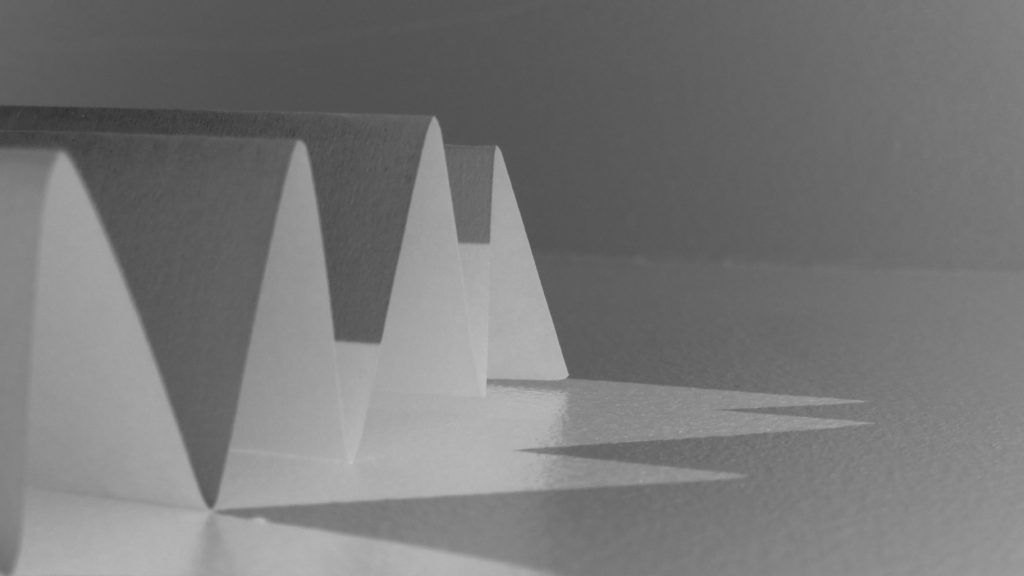
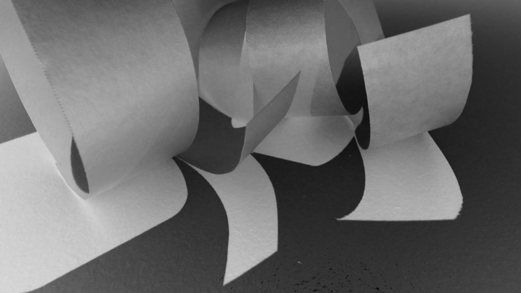
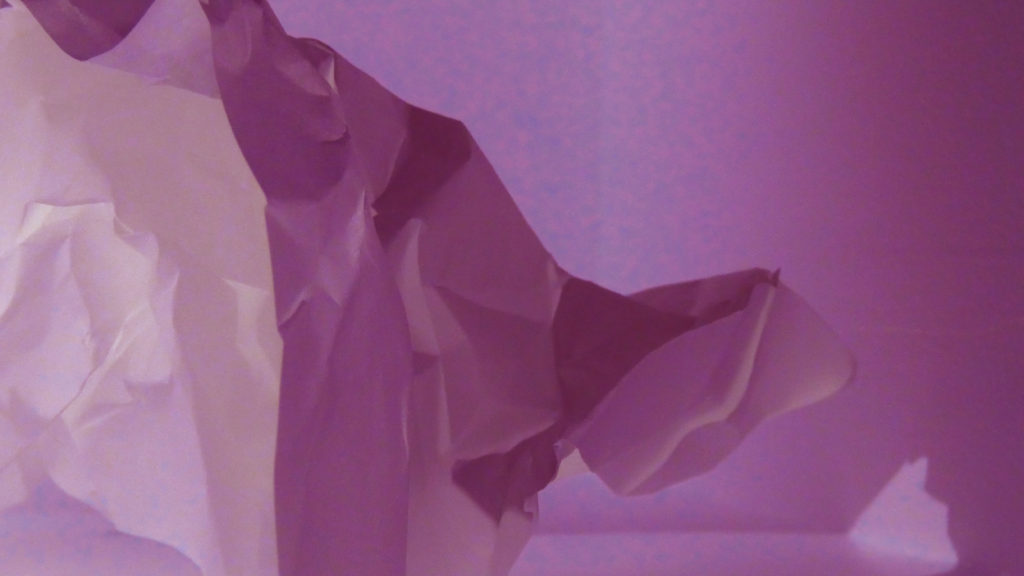
for the first two images, I used the invert adjustment and the monochrome filter to distort the images original shadows and lighting but still keep the same uniformed, lack of colour.
For the third image I used the invert filter again to switch the shadows and lighting but used colour hues and adjustments in order to achieve the pink-toned look of the photograph.
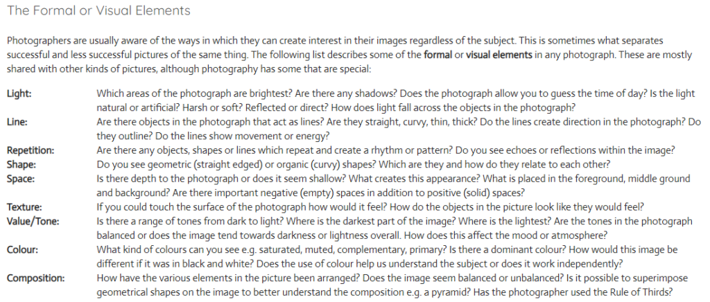
Using the Formal Elements to analyse my photographs:
Light: For this image I used artificial lighting. The light source is coming from the bottom left, behind the paper to create distorted shadows in front of the shapes.
Lines: The lines of the paper vary in size, however they all have the same, uniformed, triangular shape. I believe the leading lines are the straight bends at the top of each fold which directs the viewers eye to the almost pyramid-like shape of the paper.
Repetition: The form of repetition I used in this photograph is the repeated pattern of folds in the paper, that create the repetition of triangular shadows.
Shape: The folding of the paper creates a geometric repetition of triangular shapes leading to the centre of the image.
Space: Although the image is very organised and minimal, I believe the shadows add a sense of depth to the image. The negative space in the background allows the viewer to focus on the sharp shape of the folds, rather than the chaos behind.
Texture: The smooth texture of the paper is juxtaposed with the sharp folds to create a contrast of texture.
Value/Tone: There is a range of tones from dark to light in this image, with the top of the folds being the lightest part of the image and the sheltered area under the folds contrasting this with the brooding darkness. Overall, the photo tends towards lightness in the image.
Colour: Although there is minimal colour within this image, there is a slight green hue to the image. I think this is purely a reflection from the artificial lighting mixed with my current camera setting, however it gives the image an almost ominous tone.
Composition: The composition of the photo is very simplistic in order to showcase the simple geometric shape of the folds. the focal point of the folds is present from the bottom left third and into the middle third.

A competent task. Good choice of photographic reference. Great analysis.