Plan
Contact Sheets


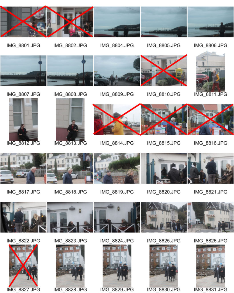
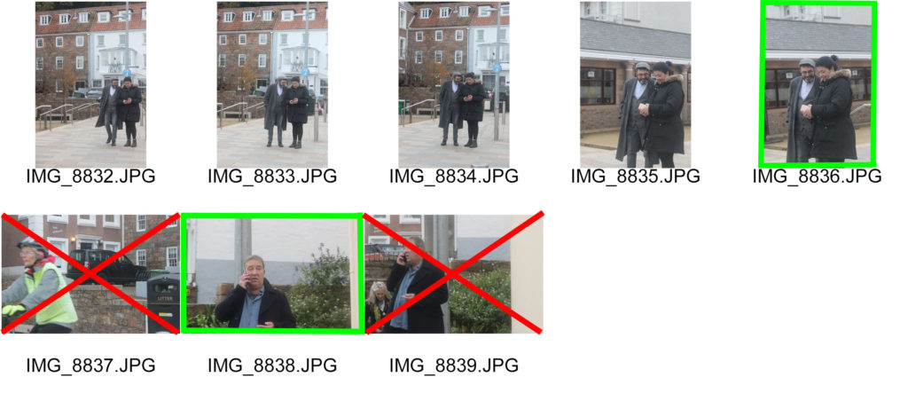
Edited Images
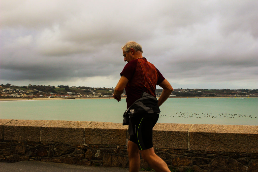
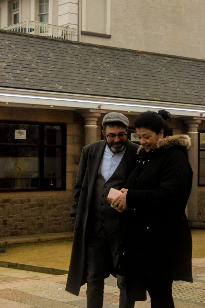
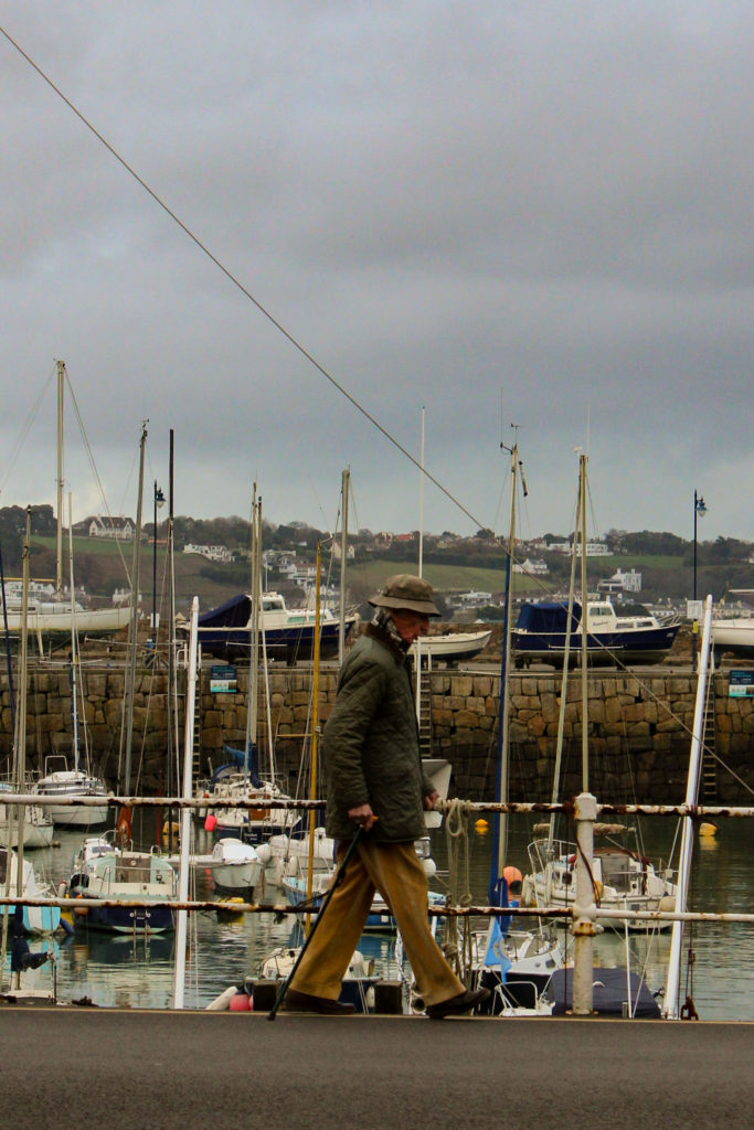
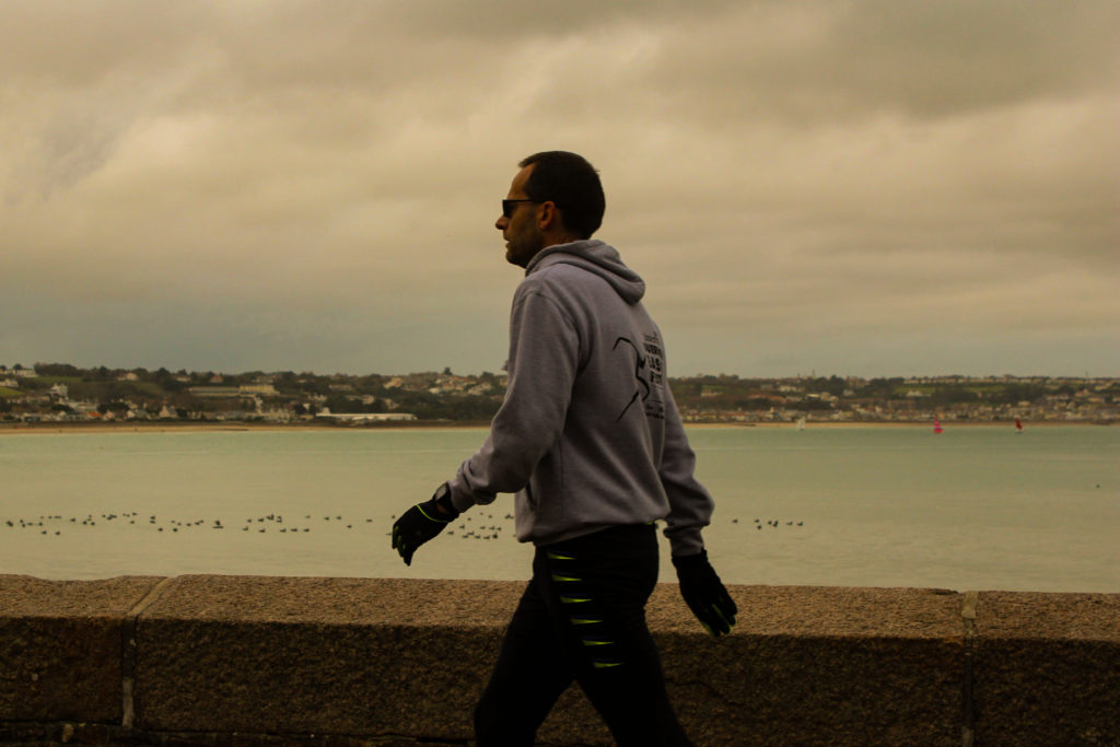
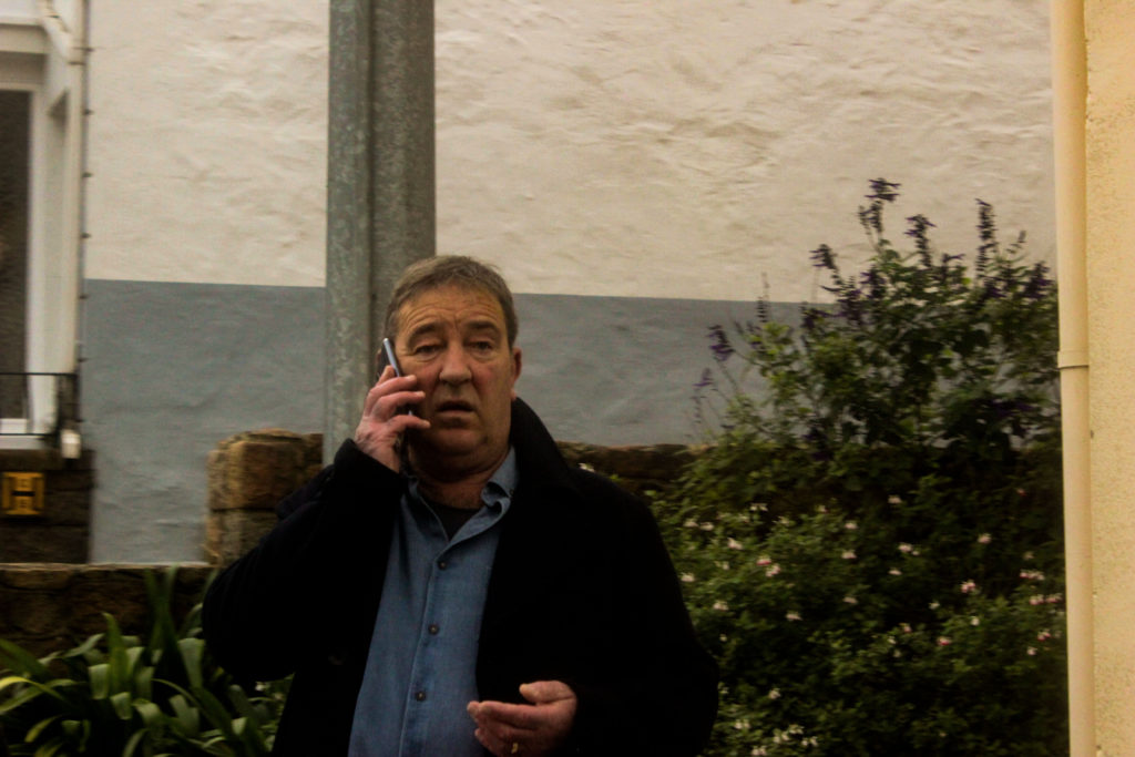
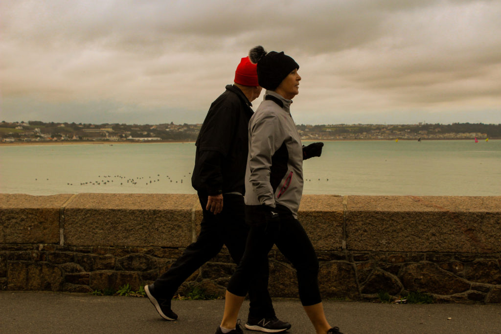
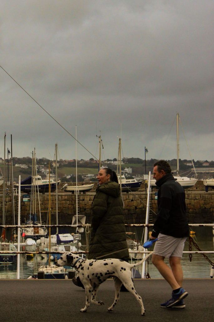
For these images I went about editing them focusing mainly on the tone and contrast of the images, using the previously studied photographer, Martin Parr as inspiration. I did this by first increasing the contrast, replicating Parr’s jarringly bold photographs. In addition, I also increased the warmth of the images, aiming to further embolden the seaside scene.
Final Image

I believe this photograph to be my best as the woman in the image is wearing very vibrant colours and also she is well framed by the two walls either side. These walls along with the horizontal railings and the road lines in front of the harbour, create quite a geometric image full of leading lines.


