
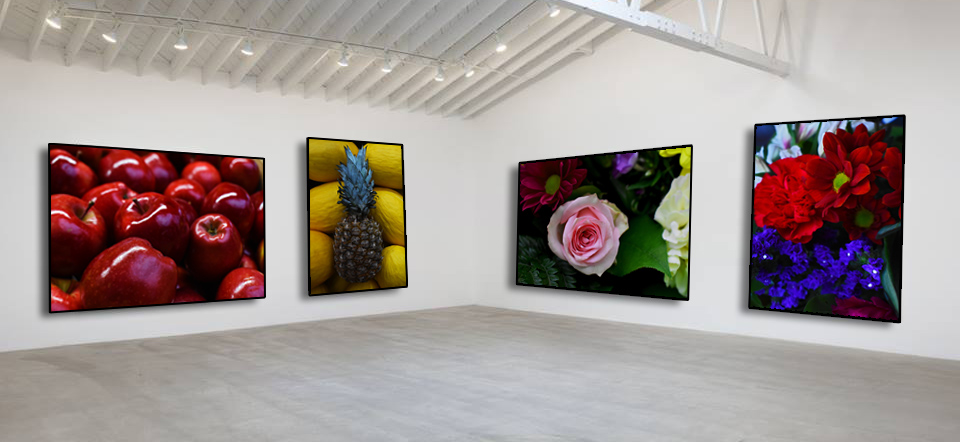
These images above are my best colourful abstract photographs and I have selected them to be in my final piece of the abstract unit as for there high quality , eye catching liveliness. They relate to each other in the sense that they all come from something living such as the flowers and the fruit which would have originated from a plant. These images with a little amount of editing such as increasing the vibrancy level on the colours and changing the levels with the highlights and shadows formed in the photographs , they are all displayed in a gallery (photoshopped).
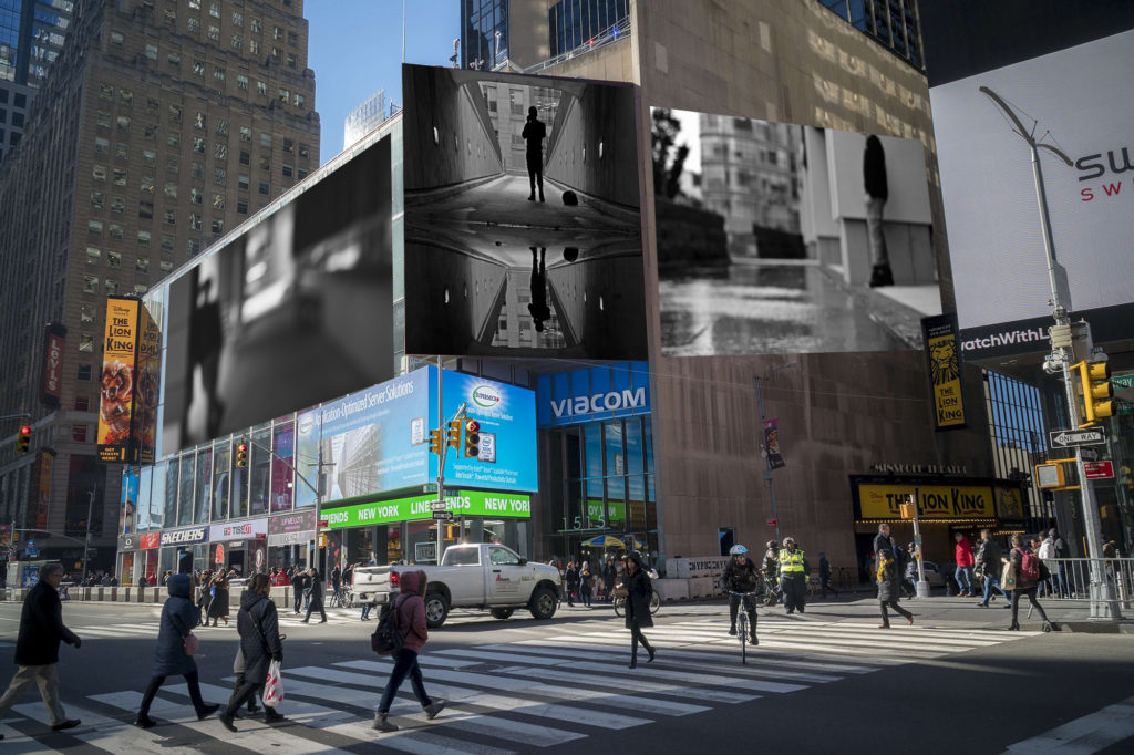
For my next selection of images used I have chosen a more street work style of photography and I have displayed my work on billboards in a city. The images selected relate to abstract photography as for the blurred backgrounds/foregrounds and the reflection work. They are effective in black and white in this scene to blend with alley ways in towns and cities and simply look better.
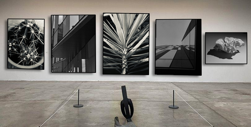
These black and white abstract photographs are all placed in a gallery with a more of a modern style of photography to them. They relate with the abstract work as for the tonal range of dark to light can be noticed almost instantly. With minimal editing these photos where the ones that caught my eye.

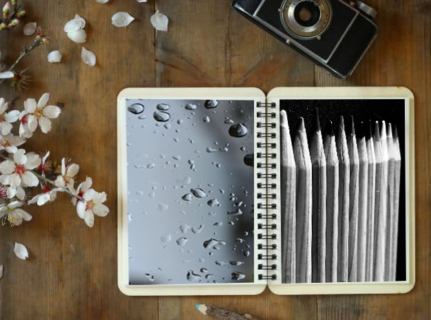
These last images I have chosen simply link with the abstract unit as for the repetition of the object that I have photographed. These images have been displayed in a sketchbook as photos. The black and white colour of the images creates a more abstract feel as there is a larger focus on the shapes of the objects as the colour is not apparent.