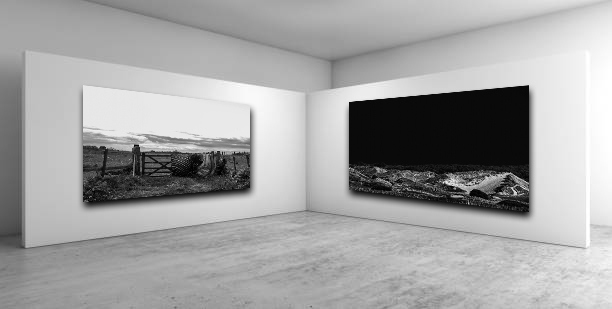
The following presents and explains the process of selecting and displaying my final prints.
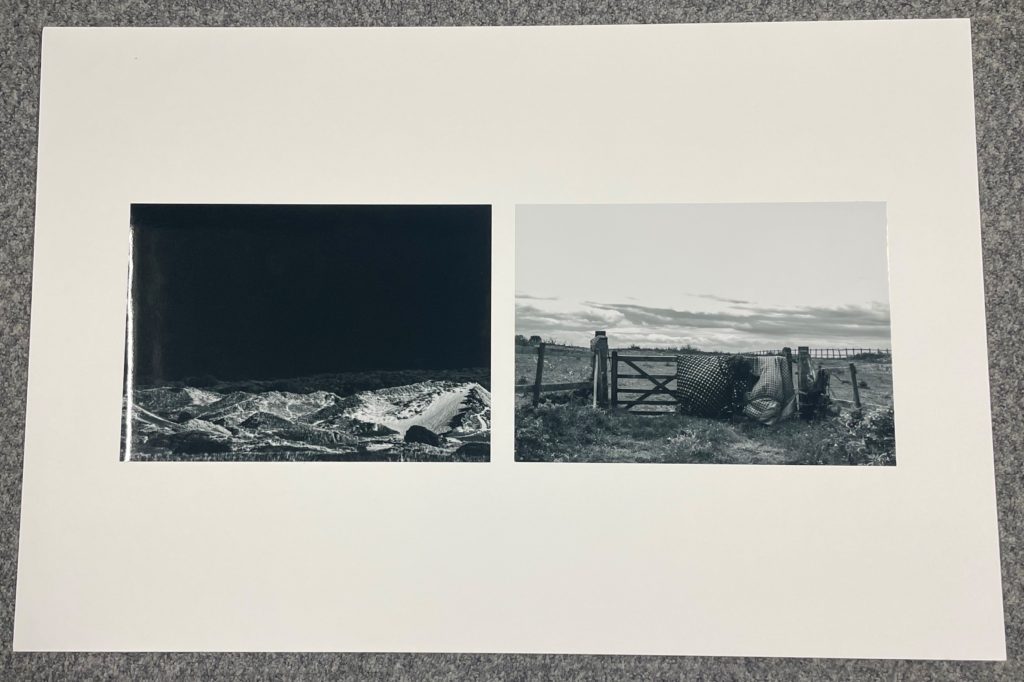
Two of my most compelling landscapes work well together side by side with a large boarder. I presented these images together the two images both complement and contrast each other at the same. They juxtapose with the black and white sky’s. They work well side by side with the leading horizontal line of the horizon staying mostly consistent and in line through both compositions.
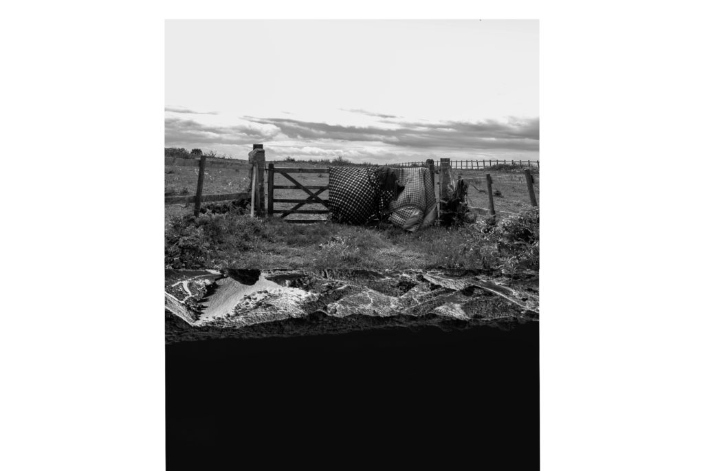
I did experiment with a different layout for these images before deciding on this one. I liked the obscurity of the experiment with the two pieces of land meeting in the middle creating a sort of kaleidoscopic illusion.
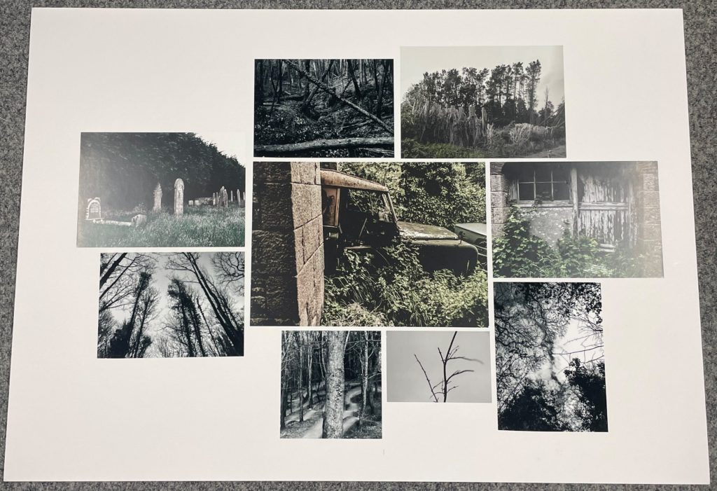
The following layout I decided to mount includes a collection of images sharing physical similarities with a clear theme of long vertical leading lines and eerie colour grading with all images sharing a navy green and low saturation. The random scattering of the layout makes it more impelling. I arranged them in an order where the central images share the same colour properties to create a seamless conjoined landscape while the greyscale images surround them and create a border around the larger central image.
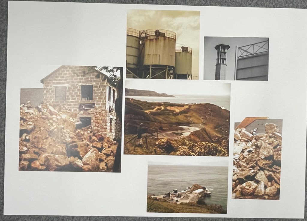
I then mounted prints that fit the theme of industrialisation and the Anthropocene. These images all share warm yet lifeless hues. This demonstrated an apocalyptic theme with these images. I once again decided that a scattered collage would work well the the images all having different orientations. I preformed photomontage with the photo of the construction sight with the rubble being split into two images on opposite sides of the layout.
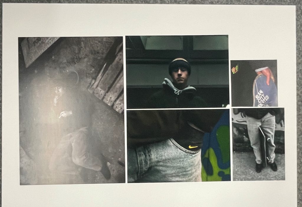
I then decided to make another large mount but this time followed a more symmetrical layout to satisfy the rule of thirds. I rotated the image on the left from an originally landscape image to portrait. The images all complement each other colour wise as well as all following the same contextual and conceptual theme.
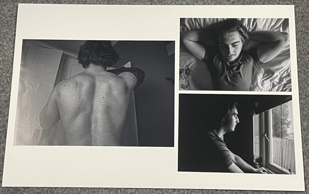
I then displayed a set of prints from my photobook in a simple triptych format.
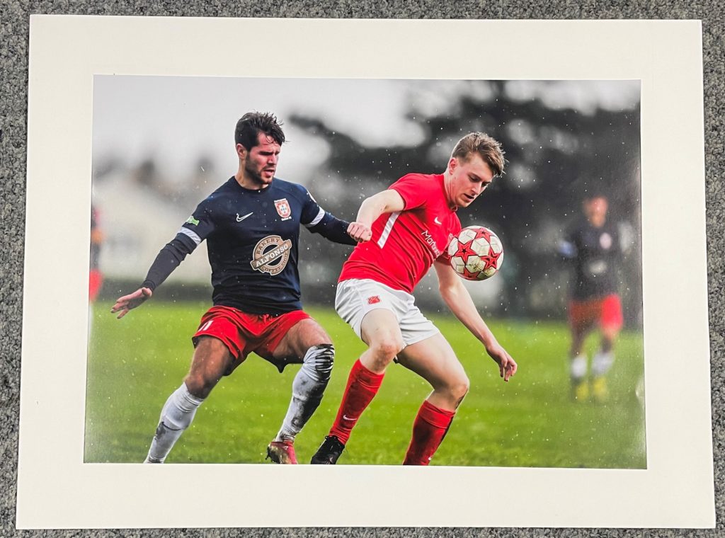
I then mounted images that work well on their own. The following image presents my photographic ability with sharp focus high clarity and a bokeh effect. Therefore I chose to present it by its self.
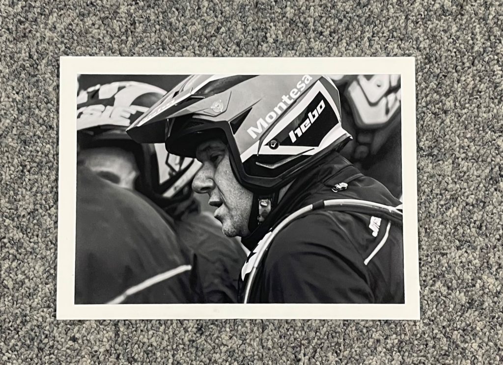
I then decided to complete the some variation into my final displays by mounting a small A3 headshot.
I finally decided to create a virtual gallery from my favourite diptych of the two landscape images.
