Experimentation
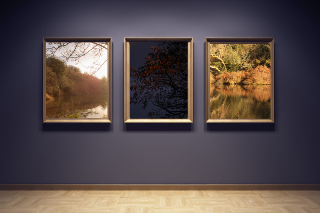
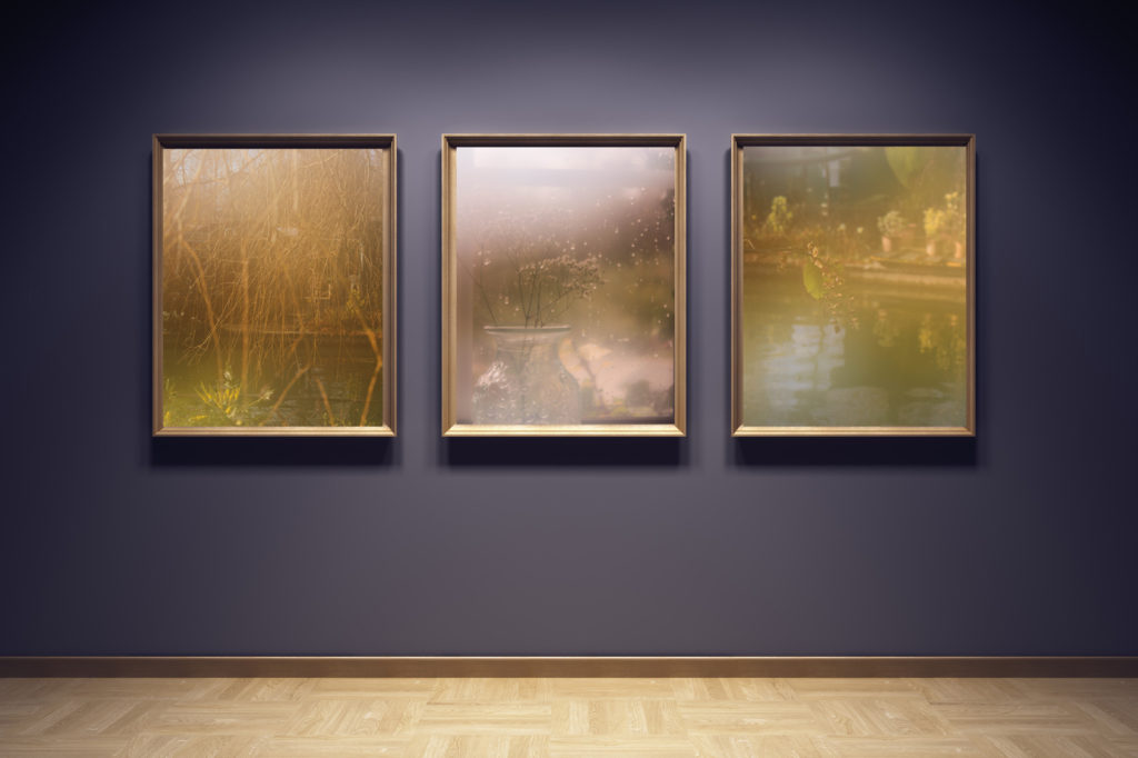
I first began by creating two virtual galleries after completing my ‘Identity Coursework Personal Investigation’, I wanted to experiment with using photoshop to see how my printed images may look when mounted up. I started by taking three images from my Robert Darch inspired shoot and exploring how different layout options may tell different narratives. I wanted there to be a synchronicity between images, as if they follow after each other in a similar location – possibly all taken in the same place but representing the different emotions of anxiety. I experimented with the sizes of each image also, seeing how when I changed the layout so one image was bigger than the other it created a contrasting atmosphere. Nevertheless, the image below is a final display of my first virtual gallery, where I decided to keep a synchronized and cohesive design which fit with the classic style of imagery, a symmetrical layout suited the images best. This was also the decision I came to when exploring my imagery from my Pictorialism/Josef Sudek inspired shoot, where I created a display using the same gallery format to compare how the different techniques of photography created a different mood when presented in the same setting. I think that when mounting up my final prints for this project I will explore a smaller size and layout of my Pictorialism images due to their delicacy and fragility, the images come across as soft and light, so I believe using a more compact layout will contrast the boldness of the Robert Darch imagery well.
Gallery 1:
Gallery 2:
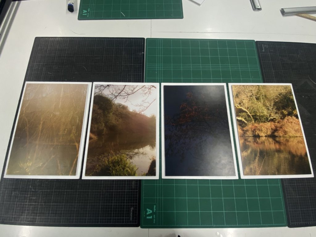
Final Personal Investigation Prints:
Sequence One 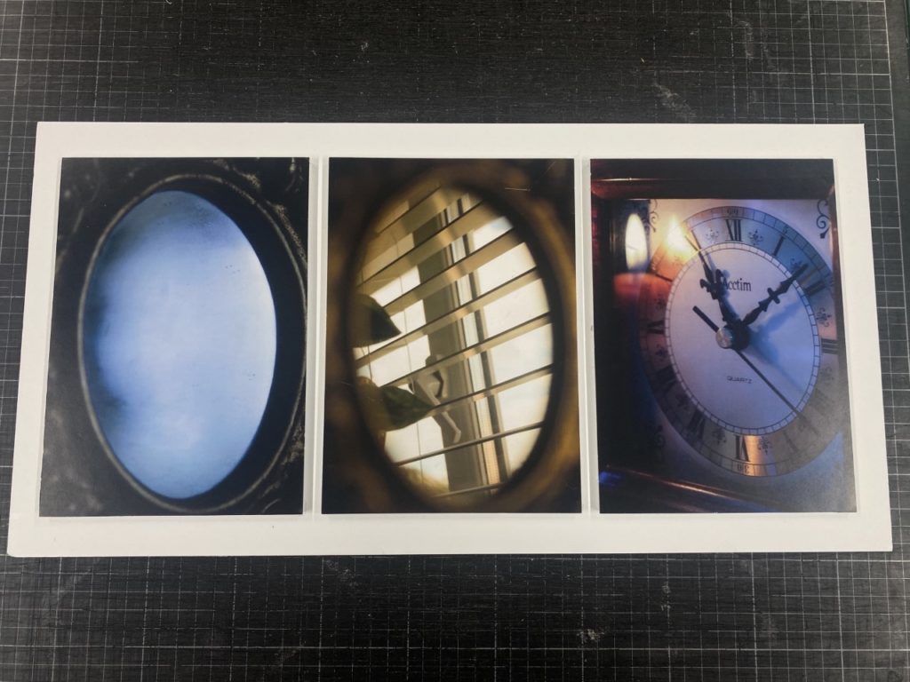
Sequence Two 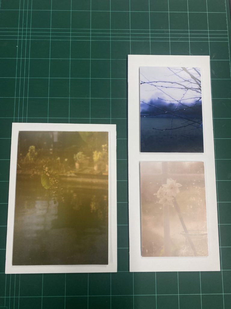
Sequence Three 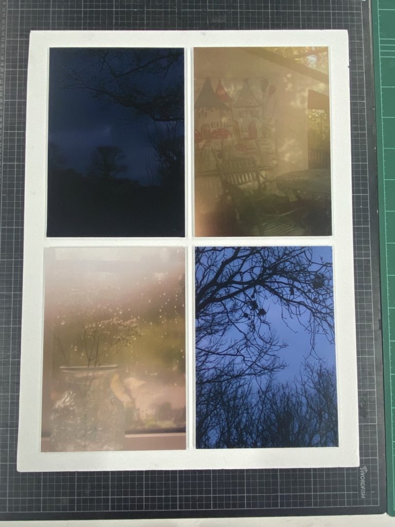
Sequence Four
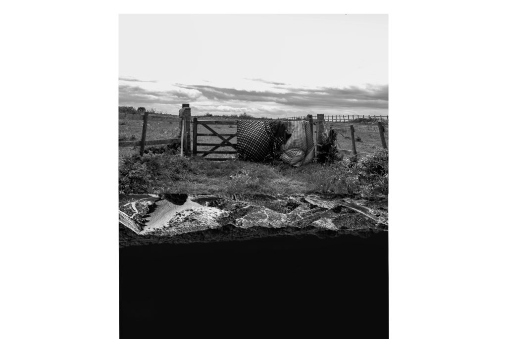
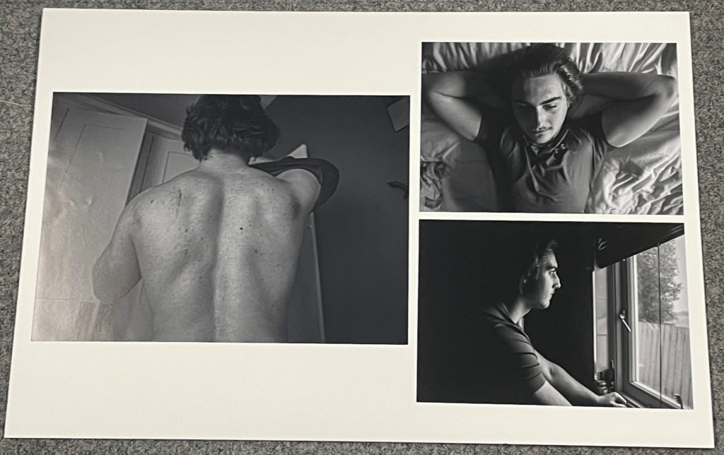
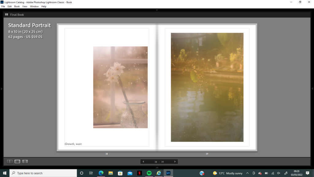
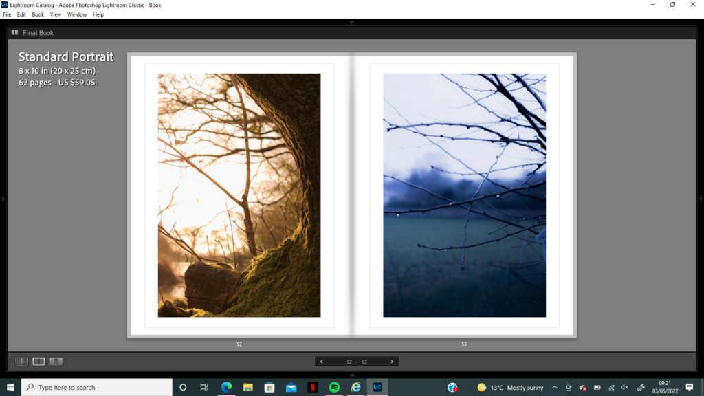
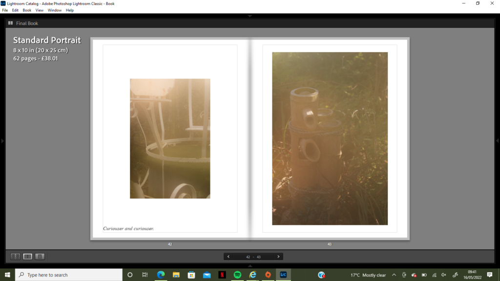
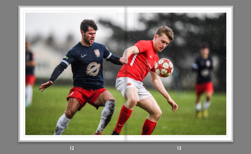
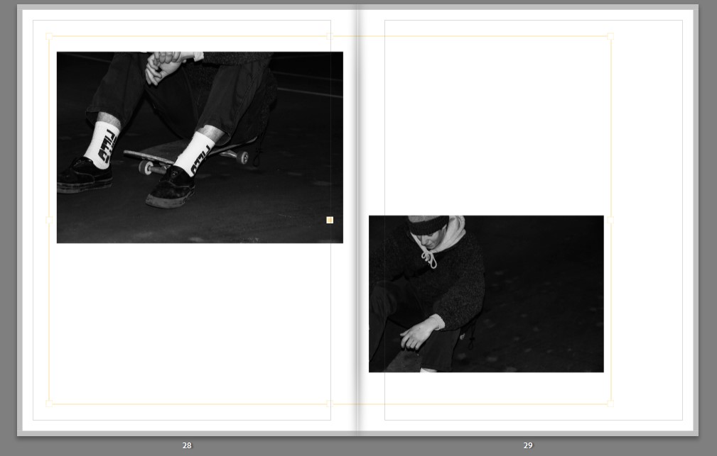
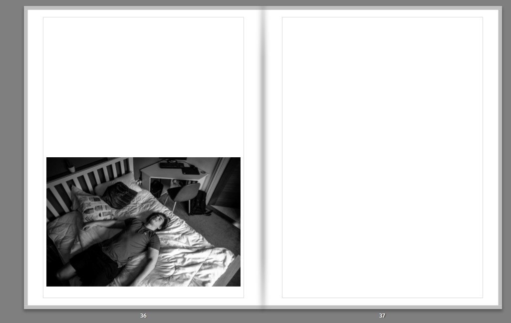
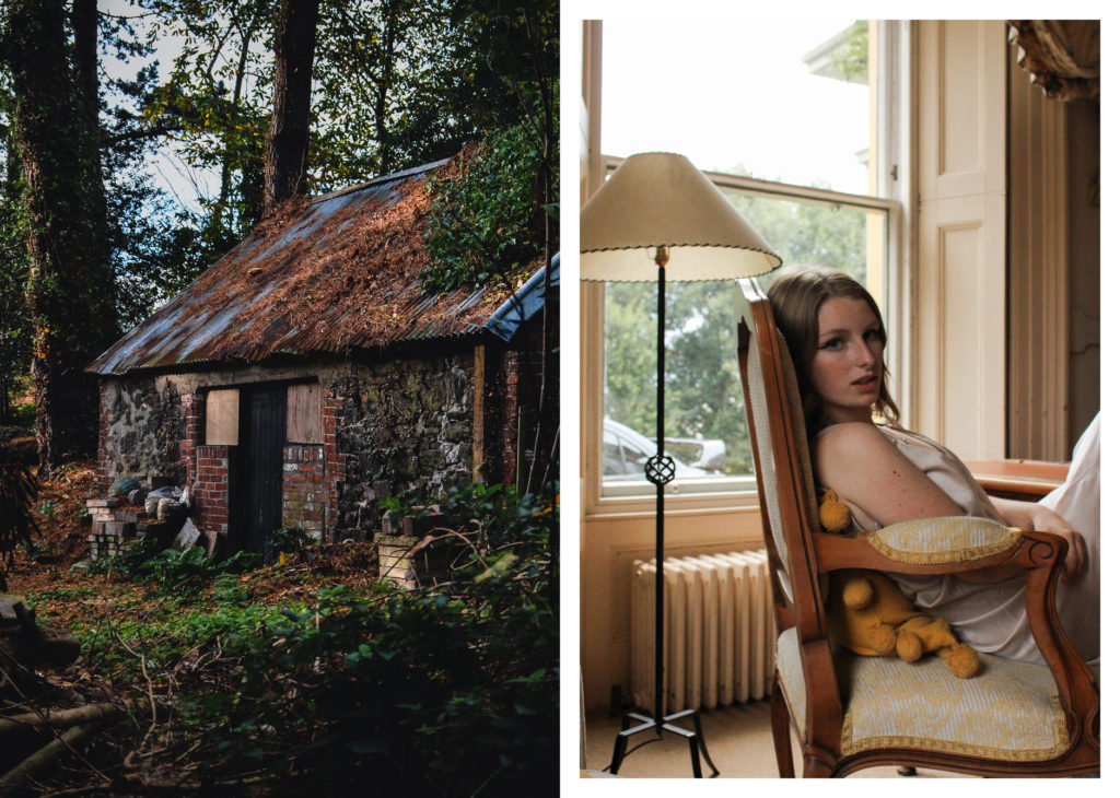
Sequence One: After creating and ordering my photobook I made a selection of my final images that I wanted to be printed for display. I planned on printing a range of A3 A4 and A5 sized photos that I could set out in sequences and narratives. I first planned how I wanted to set out some A3 prints; I knew I wanted to use my Robert Darch inspired imagery for my largest prints due to the amount of detail within them, therefore I decided to print four photos that each held different moods and atmospheres from this shoot. The first image was inspired by Darch’s photographic techniques of capturing the warmth and comfort of a surrounding that may otherwise be seen as unnerving, yet it also holds a link to Pictorialism with its soft blurred focus. I wanted to include this image as a contrast to the others, but also as a reminder of this idea of ‘seeing the world through rose-tinted glasses’ that features in the images to come – the perfect world that just doesn’t quite seem real. The other three images are sharply focused, holding small details from reflections and providing an atmosphere of escape and adventure – for me, this sequence is an introduction to ‘Wonderland’ in the way it hints at the anxiety to come, without giving away the completed book’s full narrative. I decided to mount up these images using foam board to create a 3D frame effect, first sticking my image on a piece and using Stanley knife to cut it out, and then sticking this piece on to a larger foam board rectangle which created this frame effect. When I display my images I hope to have them stuck on the wall one after the other, leaving a small amount of space between each one to separate them and keep this theme of a clean look.
Sequence Two: For my second sequence I wanted to create a display of the more ‘nightmare’ style images, having the idea to create a triptych of mirrors and clocks to introduce the idea of ‘anxiety creeping into Wonderland’. I began by choosing three images in an A5 format to print and experiment with, I then played around with the order of images and the layout, deciding to begin with the darkest image. I liked this layout due to its subtle hints towards hope, like a light at the end of a tunnel, with each image holding circular compositions that seem to lead into another world. The first image conveys clouded vision, seeing only part of a solution or problem that has been clouded over by anxiety and worry. The second is what can be seen once that fog has faded, what lies beyond the fear and doubt when we can see clearly into the future. The final part of the triptych is an image of a clock with the reflection of a candle on it, there is a dark blue hue which gets interrupted by the orange candle flame, hinting towards a brighter future or a flicker of hope in the distance. I wanted to print these images smaller than the others due to their boldness and vibrancy, I think that having this pop of true fantasy and this break from reality helps to convey a sense of fluidity between my other sequences, as if they are all somehow linked through the world they are set in. I mounted up this triptych using a long thin strip of foam board as the backing with my images also on foam board so they stuck out from the background. I really like this way of displaying photographs as I believe it gives the impression of a frame, but also allows for artistic expression as we can measure and decide how big or small, what size and orientation we want the frame to be.
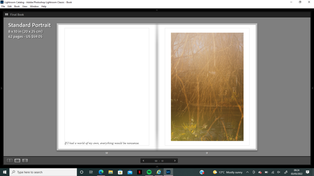
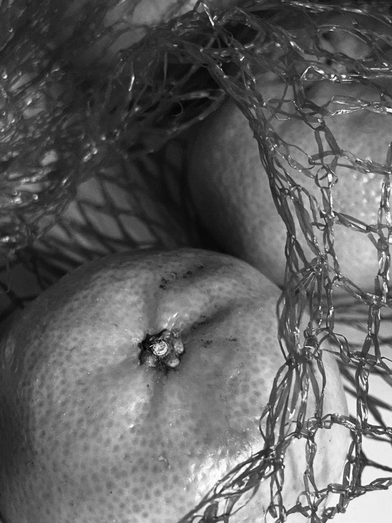
Sequence Three: My third sequence is the combination of a singular mounted image with a diptych juxtaposition layout. I wanted to create a separated narrative that holds themes of nature, growth and evolving – allowing me to experiment with how I wanted to display each theme. The sequence begins with a singular display of one of my Pictorialism inspired images, a flower growing over a pond surrounded by the natural environment. Next I wanted to layout a juxtaposition between nature, nature left untouched compared to nature in an unnatural environment – nevertheless I also recognised the juxtaposing ideas between how colder colours would go with the ‘unnatural’ and warmer with the ‘natural’, which is of course not how I edited these photos. I really loved how these ideas contrasted each other and each image, I want the truth to lie in the message of nature in the ‘unnatural’ environment is used to adapting to change, it is able to still thrive after being cut down (holding links to my struggles with anxiety and picking myself back up again etc). The juxtaposition is not necessarily about cold and warm, or sad and happy, but more to do with the change in mood between letting go and continuing to grow. I plan to present these three prints next to each other on the wall due to their similarities in colour, theme, subject and message – there is a softness and innocence that is disrupted by coldness which I believe to be ambiguous in meaning and observing. I mounted these images onto 3D foam board and experimented with whether the diptych should be presented on a landscape or portrait strip – due to my second sequence being on a landscape strip I decided to contrast it with this portrait orientation, also allowing me to set my images out in a cleaner shape.
Sequence Four: I have named my final sequence ‘A Window into Childhood’, having the idea to present four images in a rectangular sequence depicting childhood nightmares and fears. I chose to print these four images in A4 size to set them out on one of the larger pieces of foamboard, again I wanted to use the technique of sticking each image on foamboard before onto the background piece to create a 3D effect like the images are jumping off of the page. I believe this layout and technique worked well when presenting these images as the nightmare-style imagery contrasts the Pictorialism images so much it is useful for a clean and ordered layout to not distract from the chaos on each page. I started by laying out my dark blue images in each corner of the board to set out how I wanted the disruption to occur, next I chose two soft focus images that had connotations of childhood and calmness to juxtapose these images from above, below and on either side. Altogether I wanted to create contrasting ideas of the reality of childhood, anxiety was not a constant state I was in, it fluctuated between strong and weak and it was never something I knew was anxiety at the time. The nightmares are clouded with over-exposed highlights coming from the Pictorialism images and ideas of truth vs manipulation are created – there is a sort of comfort in knowing the extent of how anxiety is effecting the images, it disappears and reappears but it is never constant. I wanted to create a window-type layout as if the observer were looking into the past, nature can seem so different in the light and in the dark, I wanted to create an atmosphere of safety and fear opposing each other so strongly that it seemed unreal – questions as to whether childhood fears were all in our head or actually haunting us daily.
Final Prints – Previous Projects:
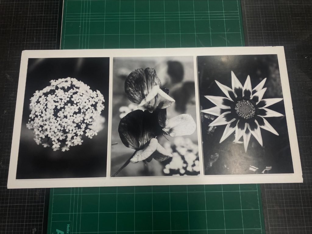
Close-up Abstract 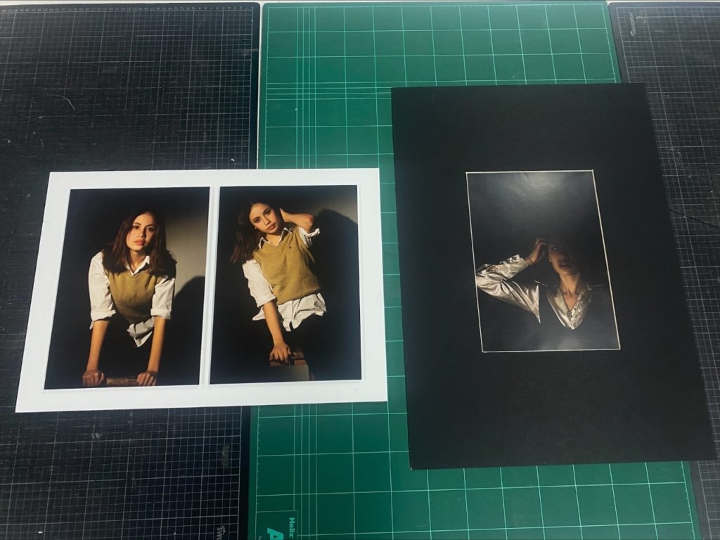
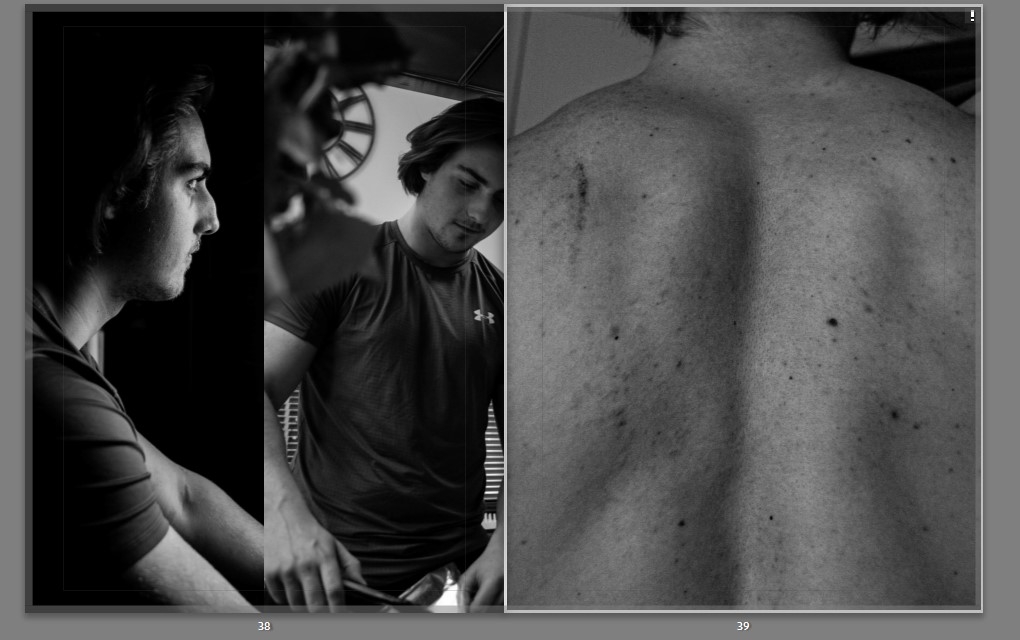
Chiaroscuro Portraits 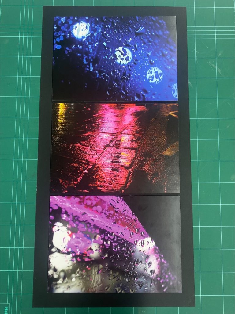
Abstract Saul Leiter Inspired 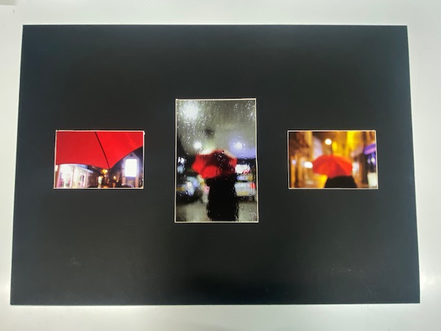
Abstract Saul Leiter Inspired
The presentation of my previous final prints was important to me as I wanted to create themed responses that related to the project’s themselves. For example the outcomes from my abstract unit, where I captured close ups of flowers and the natural environment, had quite a classic format and style – the black and white filter created a vintage atmosphere around the images. Therefore, when deciding how I wanted to mount up these final prints I experimented with how either a black or white background would make the images stand out – the black background was a similar tone the the darkness surrounding the subjects of each image, so using white foamboard was the obvious choice to create the best effect behind the prints. I explored how making some images more 3D with extra foamboard would contrast others that were flatter, however due to their symmetry and composition I made the final decision to keep every image the same distance of foamboard away from the background. I really like how the black and white of the foamboard frame to the shadows in the images contrast each other, the sharp edges create a triptych with a classic and original style. From my portrait project I chose 3 images that were captured during my experiments with chiaroscuro lighting, I believe they show photographic skill without the need for heavy editing or manipulation. I mounted the first diptych on several pieces of foamboard to create a 3D effect as it complimented the style of photography used and allowed both images to stand out against the bold white. The final image from my portrait project had a mysterious atmosphere surrounding it, I knew I wanted to experiment with creating a window mount for this image so after measuring it and deciding how much boarder I wanted around the image I created this final display. During my abstract unit I also studied the work of Saul Leiter, responding to his images capturing raindrops and experimenting with soft focus and blur. My final two print sequences are mounted on black boards due to their dark surroundings and mysterious atmospheres – I wanted to try and create a window mount display of my ‘umbrella’ images, sequencing the photos in an abstract narrative and using this classic mounting technique to reflect their style. Overall I am extremely happy with my final prints from each project, there is a range of technique and style that shows my strengths and best outcomes throughout the course – altogether I think the mounting up and framing of each image reflects its style and atmosphere successfully.