photoshoots

Plan

My plan for my photoshoots is to set up a black back screen I have in a separate, untouched room so I can leave the set up there to keep going back to with my models, this will improve the efficiency of the photoshoots as I won’t have to keep taking down and moving the equipment place to place. My aim is to use around 10 people within my project, this will give me a wider range regarding the styles of body art and also a wider range of meanings and reasonings. This may deeper my project.

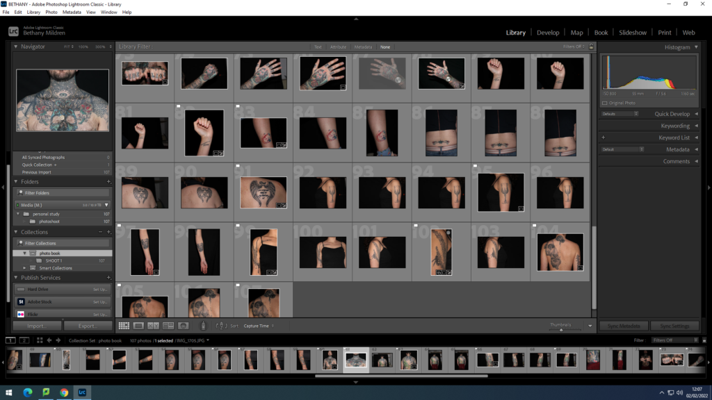
To start my photobook process, I uploaded all my images into Lightroom to start my editing. I transferred them all to their own collection I labelled photobook.
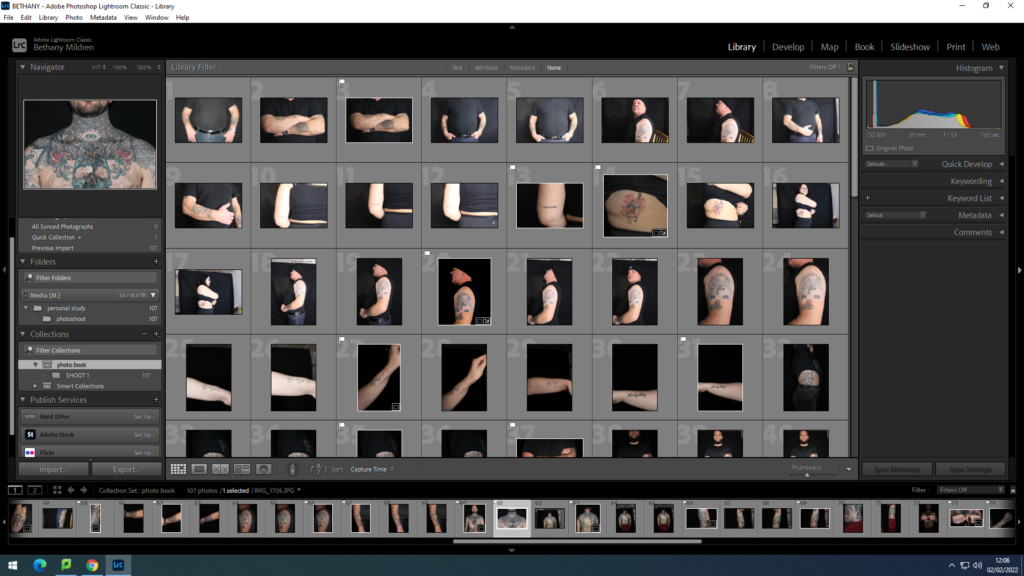
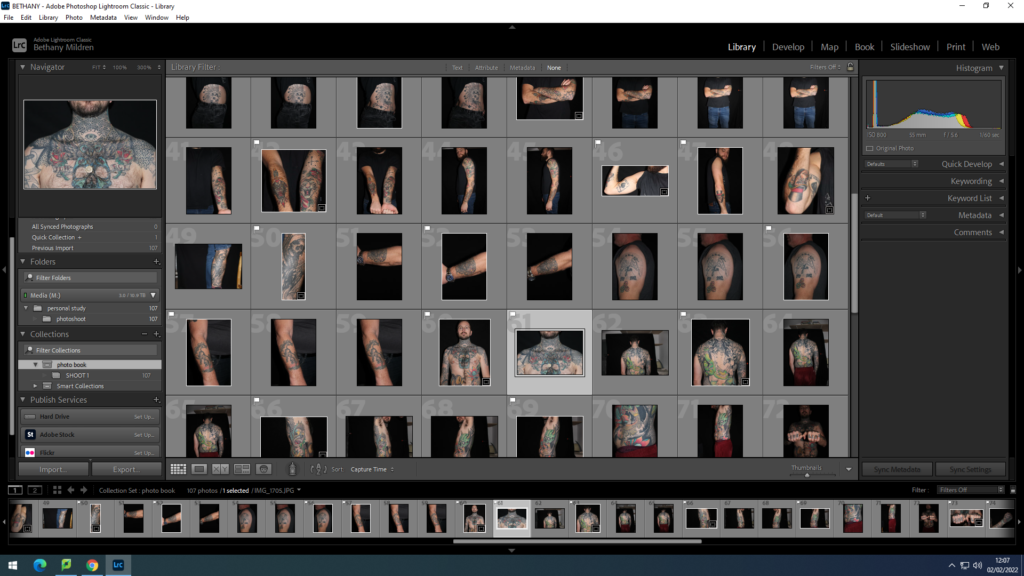
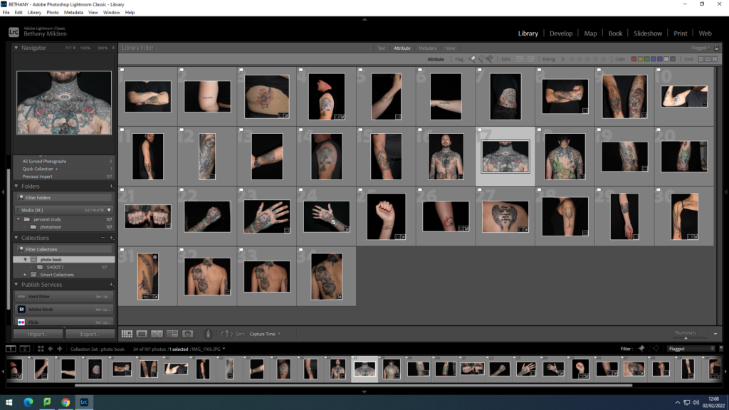
I started off the editing process by going through and ‘flagging’ the clearest and cleanest photos of from the shoot. I chose the ones that I felt extenuate and display the tattoos firmly, presenting them clearly. `This will benefit the clarity of showing the images in a book as I have experiences in the past, photos look different when not on the computer screen and sometimes unseen shadows or distortments can arise. This process took a lot of time due to taking care for how to avoid those possibilities.
Experimenting

Instead of adjusting the photos through shifting exposure, shadows etc. , I wanted to experiment on more abstract ways to present my added materials in with my photos, cooperated and intertwined with the images. Testing in both black/white and colour to see which version of the image if more powerful.
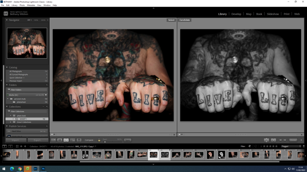
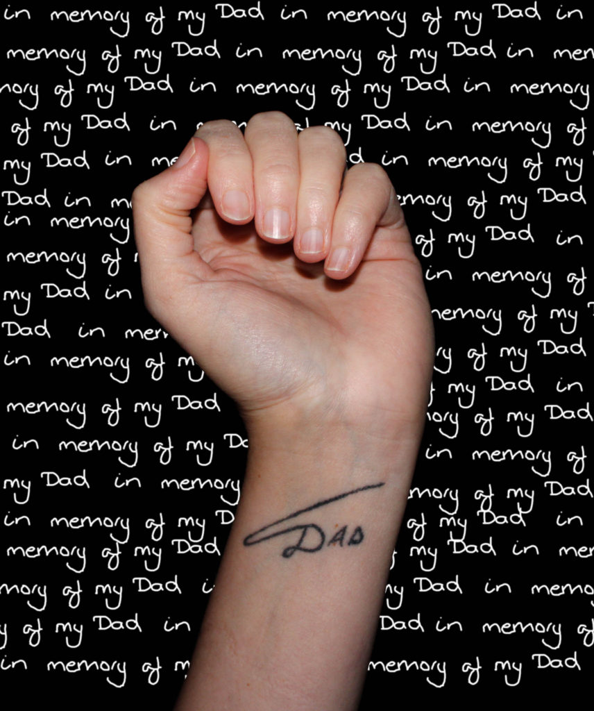
The process of this image started by tracing the few words off of the note given to me on photoshop, then pasting the phase and positioning them until they covered the whole of the black background. Next, I cut out the image of the hand using the lasso tool so then the hand and arm were isolated from the background. Then pasted it into the words. Once I was happy with the final image, I flattened it, ready to be saved.

I feel that this image is very successful and the writing in the background brings a captivating power to the image. Showing the importance of the tattoo with the repetition of ‘memory’.

For these images, I decided to experiment with archive images I collected from the models and hand written notes about the meaning of the tattoos, layering them on top of each other. This benefits reducing the amount of materials I have to include in the photobook, allowing more negative space around the images. Although this method makes the archive images quite busy as there is a lot of information the image holds, the space will become useful to break up the page.

This collection shows my original images with external materials imprinted onto them.

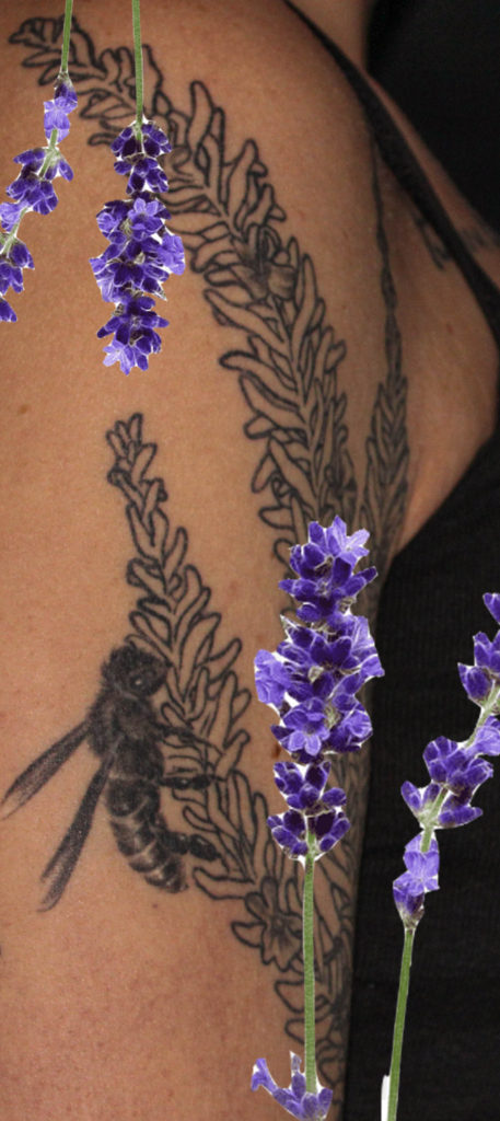
One of the images shows the models shoulder with a lavender plant tattooed, this led me to layer an image of the plant on top to bring some bold, bright and happy colour to the image as the model said that lavender bring joyful memories of her childhood with her brother.

The next image was created through me not knowing whether I preferred the image in colour or black and white, so I decided to see what it would look like half and half. This version happened to become my favourite as it seems to present the present and the past through the colours. I see this in this edit as the tattoo is of Marcus Aurelius, whose philosophies are still used current day.

The final image I decided to take the album cover that the tattoo was influenced by and paste pieces of it on top of the image, however I feel that the image alone is stronger than the edit.
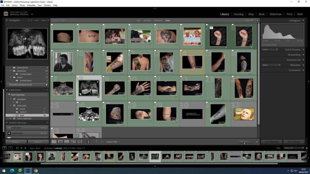
After my selection and editing process, I moved all the images I will be using in the photobook into separate subfolder to section them away from any unwanted images. I then started the book, moving the images around to fit the narrative.

final print layout experiments

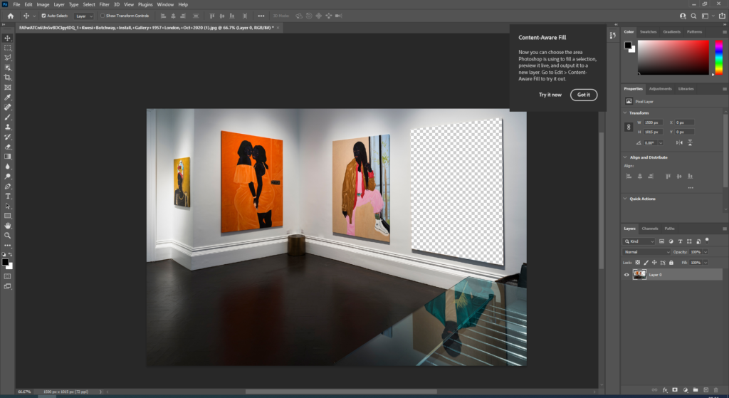
Virtual Gallery Experiments

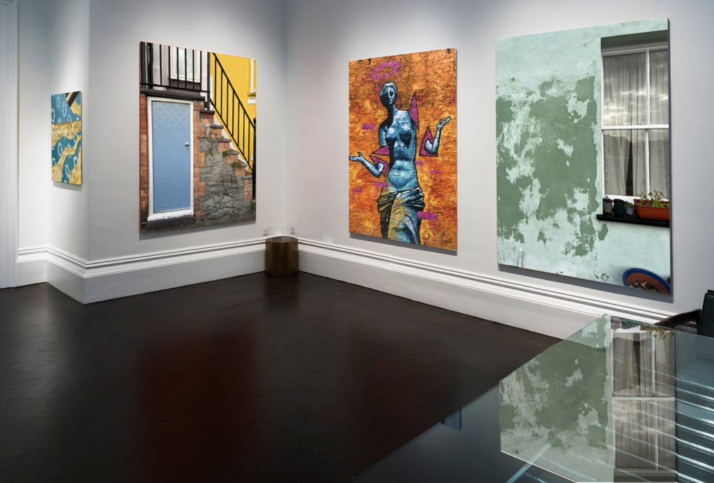
For this layout I simply got an image of a plain gallery off of google and placed my images onto the same tab on photoshop. I then resized them to how I wanted them and placed them in the order that I wanted.

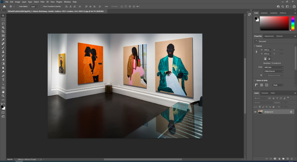
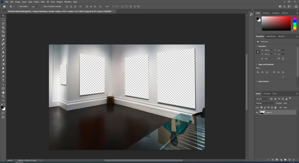
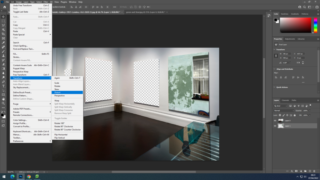
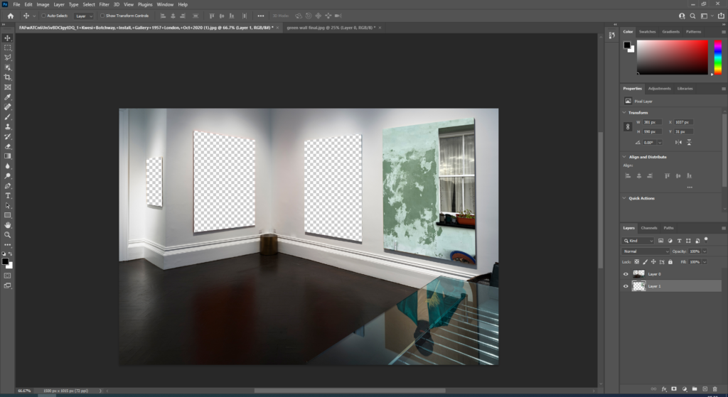
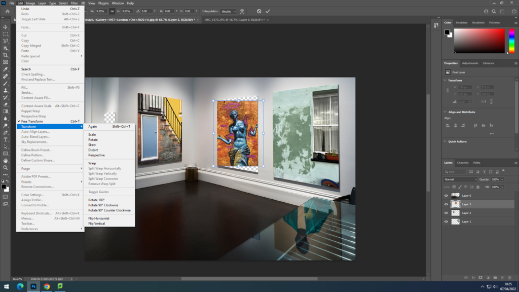
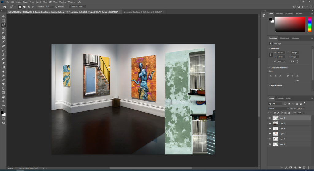
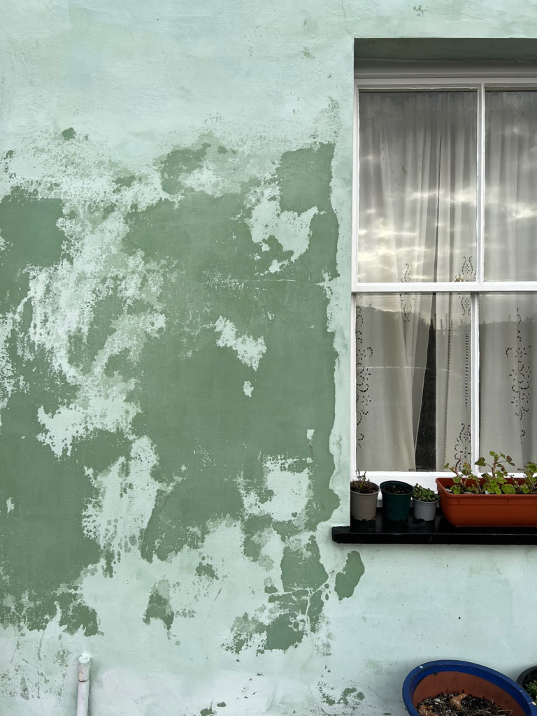
For this layout idea I started by opening an image of a gallery off google onto photoshop, I then used the polygonal lasso tool to cut out the images that were on the canvases. After that I copied the images I want and placed them underneath the original layer. I then went to edit, transform and clicked distort, which I then used to fit the images onto the wall at the right angle. After placing all of the images onto the wall I copied the image of the green wall and turned it upside down, I then flipped the image, turn down the opacity and cut off the parts of the image I didn’t want so that I could create the look of the reflection on the table like in the original image.

Final Print Ideas

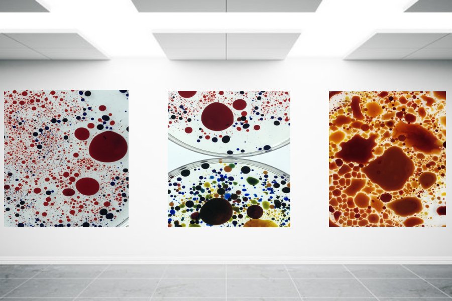
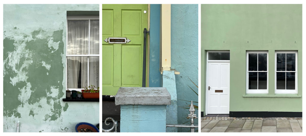
For this final piece I want to print off these three images and then mount them onto a white background in this layout of them in a row.

With this image I want to print it A3 and mount it onto black card, as a simple final idea.

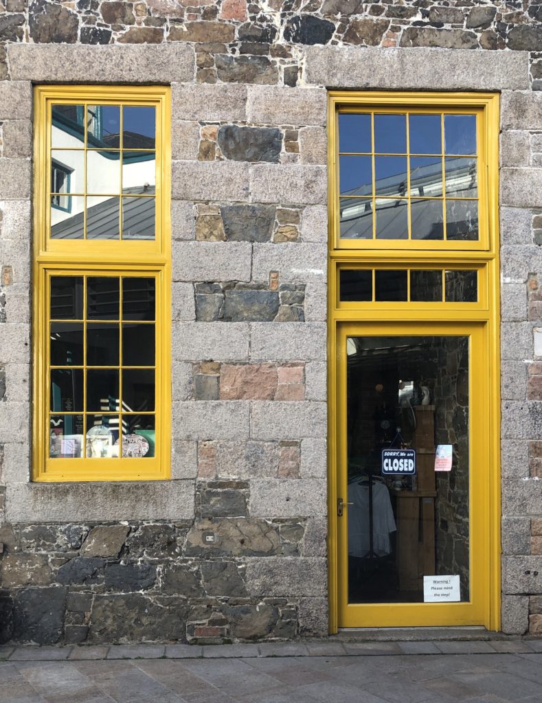
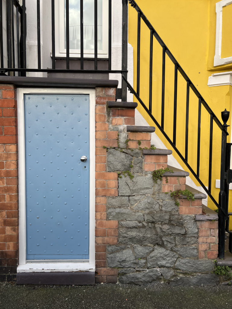
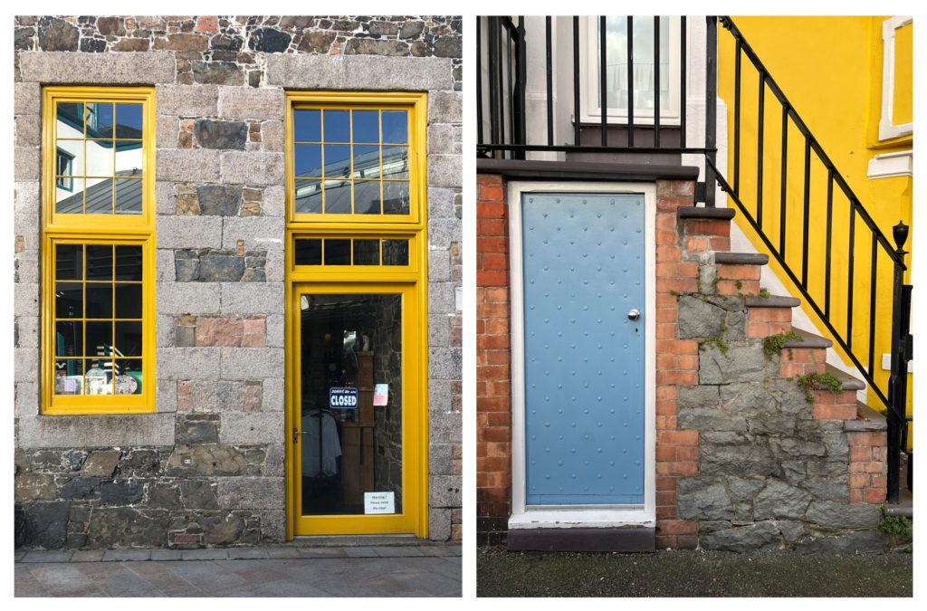
With these two images I like how there is yellow in both pictures and like how they look next to each other, I am going to print these two images in A4 and mount them next to each other.

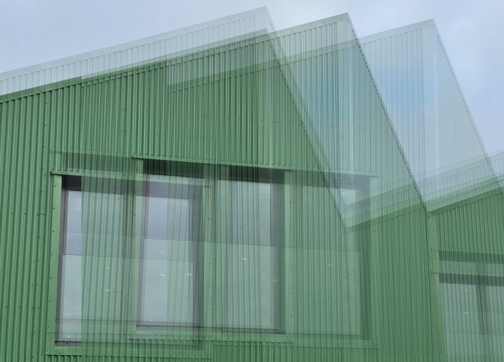
For this final print I opened the image on photoshop and copied the layer 3 times, I then lowered the opacity and moved the images around to get my desired effect.

essay planning

  • Essay question:
  • Opening quote
  • Introduction (250-500 words): What is your area study? Which artists will you be analysing and why? . How will you be responding to their work and essay question?
  • Pg 1 (500 words): Historical/ theoretical context within art, photography and visual culture relevant to your area of study. Make links to art movements/ isms and some of the methods employed by critics and historian
  • Pg 2 (500 words)Analyse first artist/photographer in relation to your essay question. Present and evaluate your own images and responses.
  • Pg 3 (500 words): Analyse second artist/photographer in relation to your essay question. Present and evaluate your own images and responses.
  • Conclusion (250-500 words): Draw parallels, explore differences/ similarities between artists/photographers and that of your own work that you have produced
  • Bibliography: List all relevant sources used

Structure plan

Introduction

  • 250-500 words
  • Opening quote
  • lead with my initial idea for the project and personalise it to my experience. Introduce the artists I will be analysing with a brief summary of why I chose them.

Paragraph 1

  • 500 words
  • Talk about the history of tattooing, including the value of the art to cultures to lead in Jono Rotman.
  • History of portraiture, including dates and locations of where this medium was first seen.

Paragraph 2

  • 500 words
  • Analysis of Jono Rotman’s relevant project, including his own heritage, background context on the Mongrel mob.
  • include quotes from critiques and comment on them, either supporting them or going against them.
  • Choose one image from the project to analyse

Paragraph 3

  • 500 words
  • Analysis of Danny Alexander’s relevant project.
  • Comment on quotes from critiques and Alexander himself.
  • Choose one image from the project to analyse.

Conclusion

  • 250-500 words
  • Comment on similarities and differences between the two artists
  • Relate points made to the historical context
  • My work in relation to the artists (similarities/differences)

Possible essay questions:

How does Richard Todd and Danny Alexander use portraiture to represent different identities?

How does Richard Todd and Danny Alexander use portraiture to explore a persons identity?

How is intimacy created in the work of….

Can personality and identity be expressed in a portrait?

How does Richard Todd and Danny Alexander use and manipulate lighting to emphasise focus?

How to reference: Harvard system of referencing

Wolf, N (2007). Romanticism Koln ; Taschen

In text referencing ‘I did not paint to be understood, but I wished to show what such scene is like’ (Wolf, 2007, p7)

book specification

Narrative: What is your story?

  • 3 words: Documentation, Memories, expression
  • A sentence: A story of peoples’ body art and what they mean to them through a documentary style.
  • A paragraph: I wish for my photobook to display and take viewers through a series of images showing my families’ and friends’ body art. Expressing what these pieces’ importance to to them. I will mix in some images without any explanation or further imagery to still give my photobook a sense if subjectivity, alike my artist I studied, Danny Alexander.

Design: Consider the following

  • How you want your book to look and feel: hard back
  • Paper and ink: My photobook will use a glossed paper as I feel that for my project, it will extenuate the quality of the images better. I don’t have any large bodies of text other then the essay so there will be no negative effect on the ability viewers have on the book. I also feel that having a glossy finishes on my photos will give them more of a professional feel.
  • Format, size and orientation: My photobook is 20*25 cm, in portrait orientation, which is just short of an A4 paper, however not all images will fill up the page as a bleed, some will take a smaller section of the page to break up the similarities throughout.
  • Binding and cover: as my book revolves around such a graphicly designed topic, I will over exaggeratedly edit one of my images and use it as a image wrap.
  • Title: inked
  • Design and layout: I want the layout to be basic and spread as the images themselves have a lot to say and project to the viewer.
  • Editing and sequencing: pair added materials of symbols with their tattoo representation.
  • Images and text: I will use quotes from the models as text in or on their photos.

isms and movements

Pictorialism

TIME PERIOD: Pictorialism dates back to the late 19th century, specifically thriving during the years 1880-1920.

AIM: Pictorialism was the movement revolved around taking the essence of photography away from only being used for scientific logs and develop it into a respected artform.

INFLUENCE: Photos seen from this time period look to have been influenced by the Italian renascence and have a biblical or spiritual atmosphere. The collection of pictoriality also fit in with romanticism.

METHOD: Artists added to their scenes through many methods. Vaseline was used to smear the lens prior to photographing, scratched were added to negatives later on in the dark room and painting chemicals on the photos to add a painting like feel to the photos.

ARTISTS ASSOCIATED: Paul Strand, Alfred Stieglitz, Peter Henry Emerson.

Realism/ Straight

TIME PERIOD: Realism was first pictured around 1915 and has continued to be used to this day.

AIM: To except reality and to show what is seen through the lens without any manipulation.

KEY FEATURES: Photographs during this style usually incorporated geometrical shapes, high contrast, rich tonalities and a pointy focus. These photographs often showcased seemingly mundane objects and landscapes, with the aim of the photograph to supply an accurate and descriptive record of the visual world. Photographers of this art movement didn’t want to treat photography as a sort of monochrome painting.

ARTISTS ASSOCIATED: One of the pioneers of this photographic movement was Paul Strand, said to possess brought new perspectives to often overlooked subjects, who studied under photographer Stieglitz . These two photographers were said to be influenced by European avant-garde art movements, which may be seen in there abstract and geometric images. Walker Evans also helped to develop this genre, instead that specialize in portraits containing detached and disinterested expressions from the themes.

METHODS : Most of the time these photographs aren’t manipulated and believe the attention of the photographer. These images were often taken in an abstract manner and from unique angles. so as to require these images, photographers used crisp focus with a good depth-of-field, contrasting with the design of Pictorialism.

Modernism

TIME PERIOD: Early decades of the twentieth century

INFLUENCE: Modernism is often identified as a term that encompasses the broadness of all the avant-garde isms that were seen within the beginning of the 20th century. This new movement was a reaction to ‘the enlightenment’, which saw science and reason become more prevalent in society than spiritualistic beliefs. This dramatic change of thought cause many artists seeking answers concerning fundamental questions on the character of art and human experience. Many came to the conclusion that art needed to renew itself by confronting and exploring its own modernity. Works during this style were often supported idealism and a utopian vision of human life, also as society and a belief ongoing .

ARTISTS ASSOCIATION: Ansel Adams is often described as an early modernist photographer, together with his dramatic photographs of North America’s vast landscapes that showcased large contrast in tones. Stieglitz was known to even be a modernist photographer also , taking photographs that displays striking architecture with a pointy focus, after moving faraway from his soft edge pictorial style.

METHODS: There were not many key defining techniques that were in constant use throughout this movement, however modernist artist usually experimented with form, technique and process. This was in contrast to purely that specialize in subjects, believing they were ready to find how of reflecting the fashionable world.

Editing and developing

Digital Edits

When creating digital edits of my images to go into my photo book, I first used Adobe Lightroom to adjust the image qualities such as the contrast, exposure, tone, shadows and highlights. After doing this, I then exported my images out of Lightroom, making sure they had a large image size, and then used photoshop to rework them. I altered these images in a style similar to Carole Benitah, although making sure that the adjustments I made made sense and improved my photo book narrative in particular. I did this using both newly produced photographs as well as archival material. On photoshop I edited the images in order to make products such as photo montages, as well as using ideas from my experimentation with this style to create pieces that I believed would appear better if altered digitally opposed to stitching or other handmade alterations.

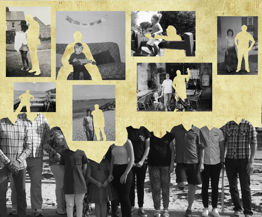
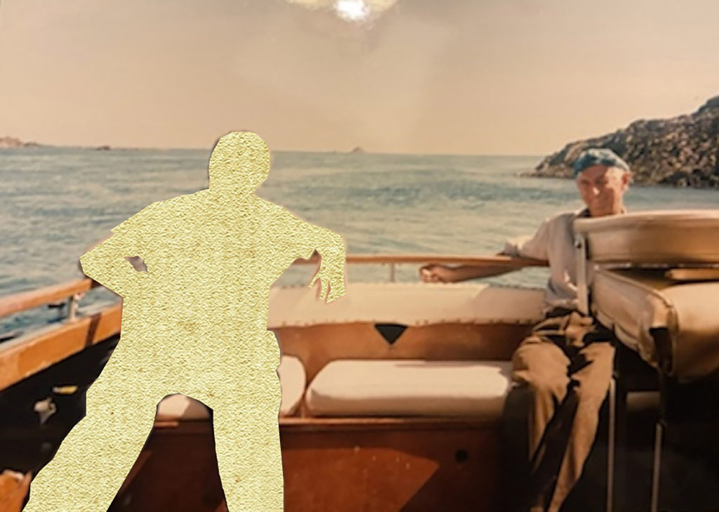
Using Photoshop, I digitally altered the images using different techniques to create singular edits. For example, in one edit I made multiple, red hexagonal shapes around an archival image of my grandparents. I then traced over an image of the Manchester worker bee, making it into a PNG, and then placed these around the photograph as well. I chose to do this as my family is from Manchester and the worker bee is one of the best known symbols for Manchester, representing the population’s hard work ethic and the city being a hive of activity. This symbol is often seen in mosaics around the city, which I believe the broken apart hexagons help represent also. In another edit I used Photoshop to erase sections of my great-grandparents. I did this by using samples of the gold-leaf texture from Carolle Benitah’s work, in order to create this appearance digitally without the material. To copy this texture digitally I used the clone stamp tool to create a silhouette of their upper halves. I believe that this texture adds to my narrative as it resembles a faded image and can be said to represent a faded memory of the people in the image, unable to fully recall their character. This also applies to my personal connection with them as I never met them however know of their memory through photographs.

Handmade Edits

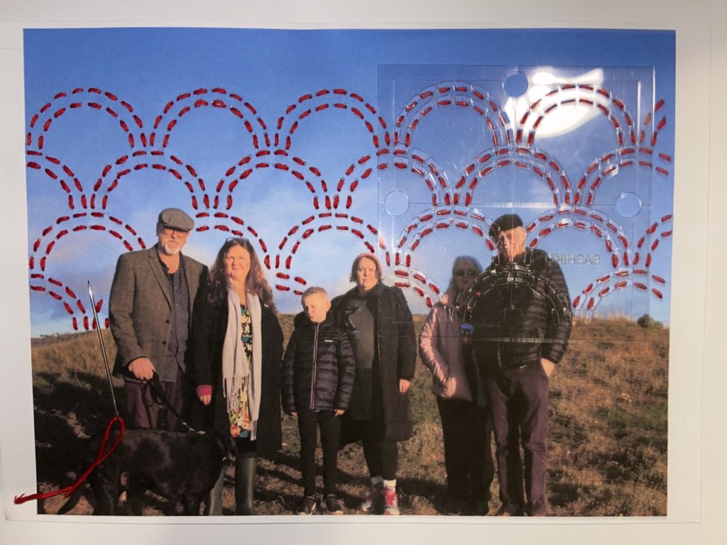
When creating edits of my images by hand I first printed off images that had been slightly edited in Lightroom, with qualities such as contrast, exposure, tone, shadows and highlights. Here I used a mixture of both archival material as well as my newly produced photographs. With these, I decided that the method of stitching would work best to improve the narrative function of the images. To ensure that when stitching into the photographs that they didn’t rip I printed them off on card, providing a sturdier material than paper but still containing the levels of detail and saturation that may not have appeared if transferred onto fabric. When stitching, I stuck to the colour scheme of red, white and black thread, with red being the main colour used to symbolise blood lines and family. I used larger needles and thread to create the more basic patterns and create bolder shapes, and used a smaller needle and thread for the more intricate and smaller patterns, using a back stitch to achieve all of these pieces.

With this method, I made similar designs to my digital edits making sure they were coherent. For example, for one of the images I stitched into I created red hexagonal shapes and embroidered bees around the image, resembling the digital edit displayed above. I did this using a medium size needle for the hexagons and a small needle with smaller thread for the bees, as they were smaller and harder to stitch. I also used patterns to alter my photographs, such as using an arch template to plan my stitches, allowing them to be uniform and neat. For all of my stitched images, I first punctured holes into the card for where I would embroider. This ensured that the stitches were similar lengths.

newspaper

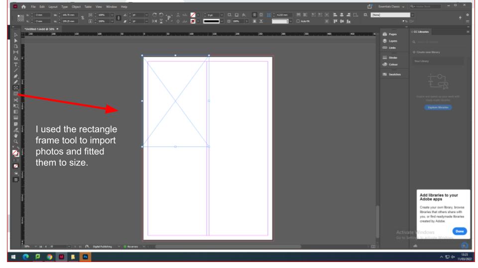
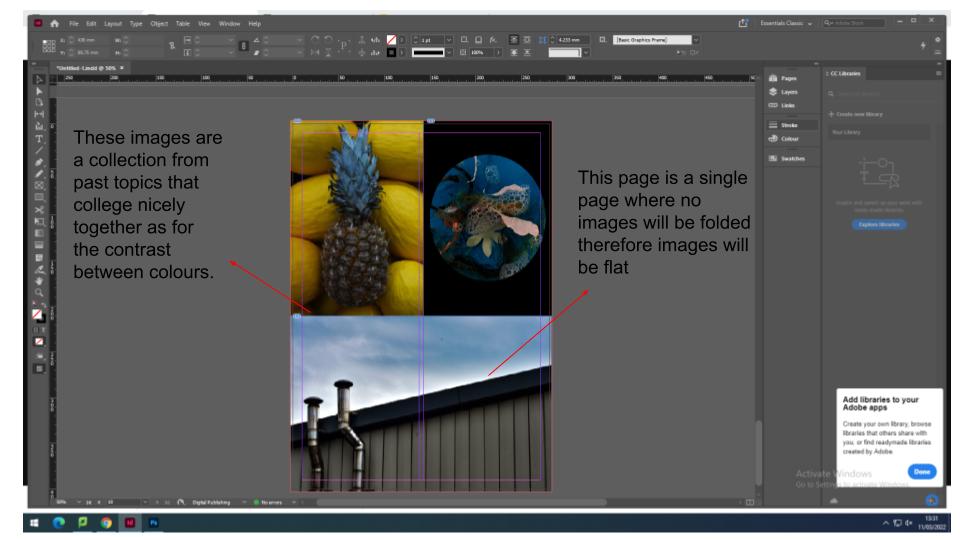
for the newspaper i have decided to add images for current topics and past topics. Firstly i created a spread sheet on InDesign that had the proportions of a Jersey Evening Post newspaper with multiple pages.

IDENTITY & COMMUNITY Newspaper

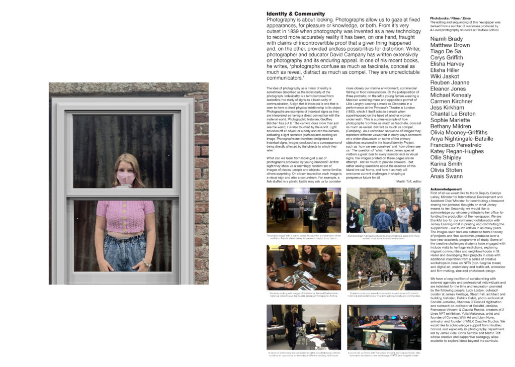
The images seen on the pages of this newspaper supplement are extracted from a variety of projects and final outcomes produced over a two-year academic programme of study by a group of A-Level photography students at Hautlieu School. In their final year the themes of Identity and Community offered a specific focus and through a series of creative challenges students developed a body of work that were inspired, partly from visiting heritage institutions to learn about aspects of Jersey’s unique history of immigration and exploring migrant communities and neighbourhoods in St Helier in a series of photo-walks. In the classroom additional inspiration was provided from workshops on NFTs (non-fungible token) and digital art, embroidery and textile art, animation and film-making, zine and photobook design led by professional artists, designers and teachers.

As part of the research and contextual studies students were asked to engage with some of the key questions raised by the Government of Jersey’s Island Identity project and explore through their own photographic studies how they interpret and identify distinctive qualities of island life. What can we learn from looking at a set of photographs produced by young islanders? At first sight they show us a seemingly random set of images of places, people and objects – some familiar, others surprising. On closer inspection each image is a visual sign and also a conundrum. For example, a fish stuffed in a plastic bottle may ask us to consider more closely our marine environment, commercial fishing or food consumption. As a combined sequence of images they represent different views that in many ways comment on a wider discussion on some of the primary objectives explored in the Island Identity project, such as ‘how we see ourselves’ and ‘how others see us.’

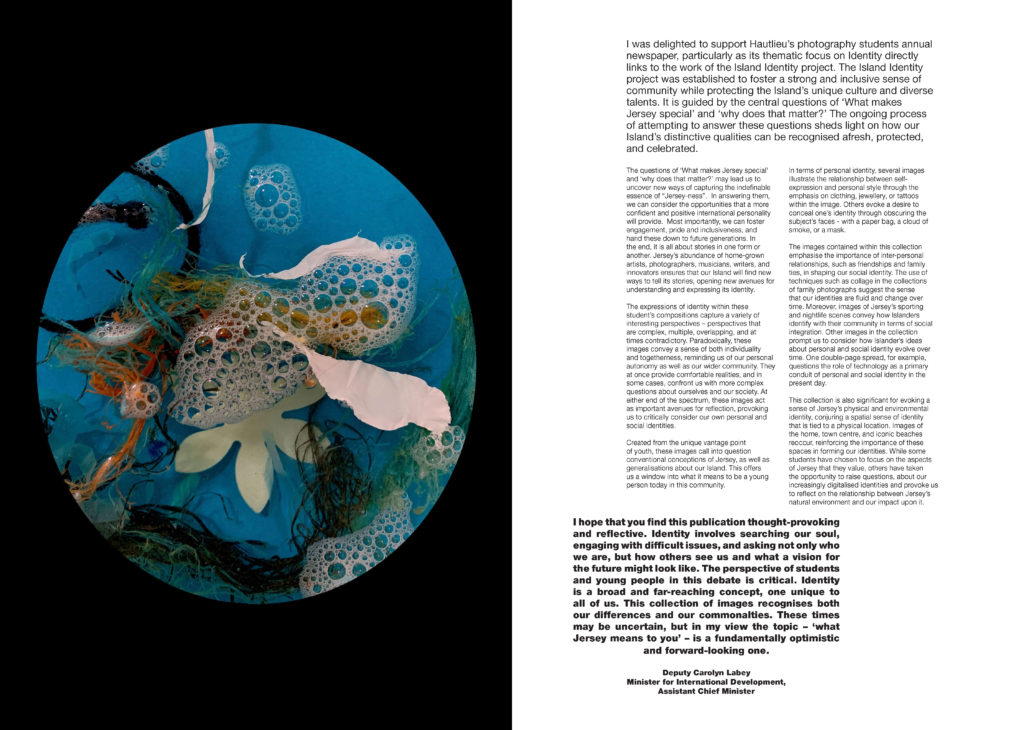
The newspaper was kindly sponsored by Deputy Carolyn Labey, Minister for International Development and Assistant Chief Minister who in her foreword shares her personal thoughts on what makes Jersey special to her in context of the Island Identity project led by her department. She says, ‘identity involves searching our soul, engaging with difficult issues, and asking not only who we are, but how others see us and what a vision for the future might look like. The perspective of students and young people in this debate is critical. Identity is a broad and far-reaching concept, one unique to all of us. This collection of images recognises both our differences and our commonalties. These times may be uncertain, but in my view the topic – ‘what Jersey means to you’ – is a fundamentally optimistic and forward-looking one.’

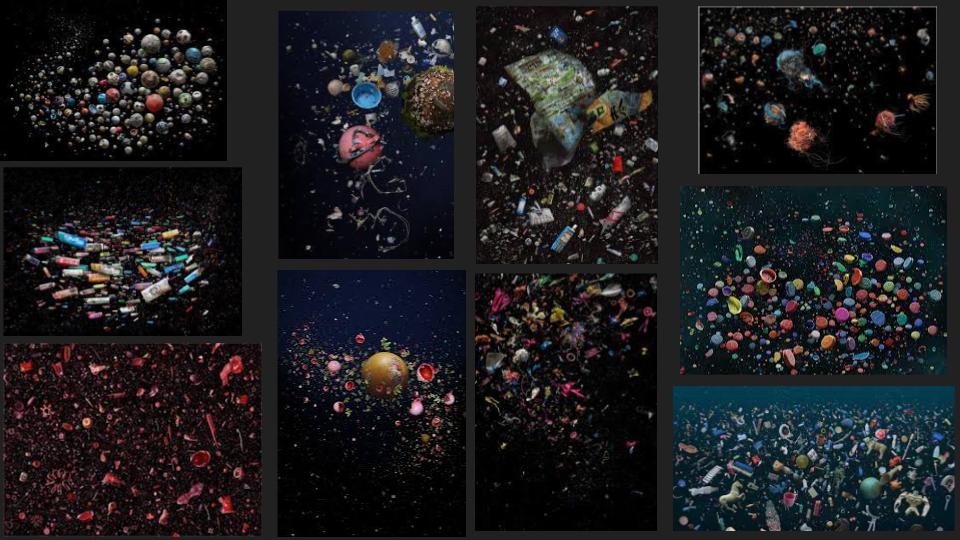
This is my image from a topic in year 13 were I based my photography around the photographer Mandy Barker. She invested her time in plastic that was released into the sea. She created chaotic scenes of abandoned plastic seeming to float in the vast open sea. Here is an example of her work….

This image has an empty alt attribute; its file name is mandy-2.jpg

I found being part of a local newspaper very exciting and interesting as I knew my work will be out for the public to view. As for my work relating to Mandy Barker’s work, this is a clear message of plastics used wrongly within the oceans. Expressing world wide situations and difficulties such as plastic wastage through photography will bring more awareness to the public.

The Identity and Community newspaper is the fourth supplement produced in collaboration between Hautlieu School Photography Department and Jersey Evening Post. In 2018 the first issue was The Future of St Helier and last year the themes of Love & Rebellion explored experiences of isolation and lockdown during the coronavirus pandemic. Photographer and teacher Martin Toft, comments: ‘The question of ‘what makes Jersey special’ matters a great deal to every islander and as visual signs, the images printed on these pages are an attempt – not so much to provide answers – but rather asking questions about the essence of this island we call home, and how it actively will overcome current challenges in shaping a prosperous future for all.’

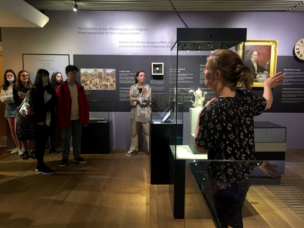
Various workshops and school trips for inspirations, recording and experimenting with new images and ideas of making

Final print layout experiments

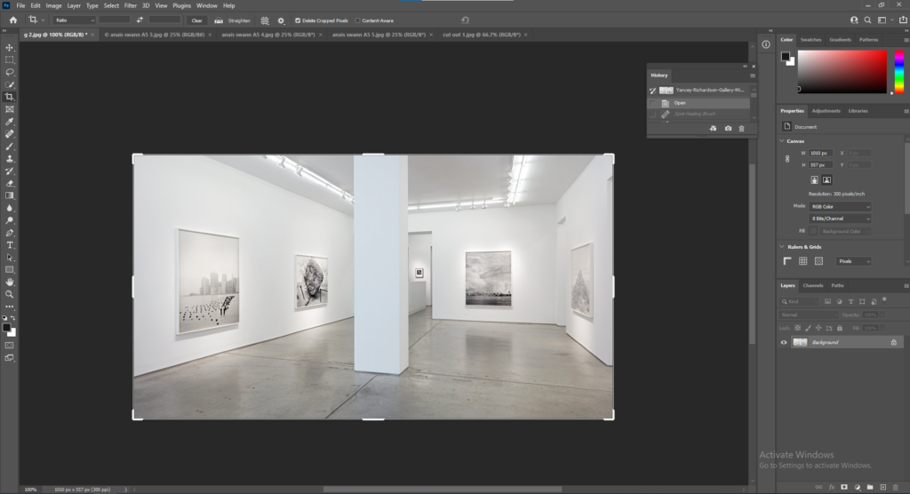
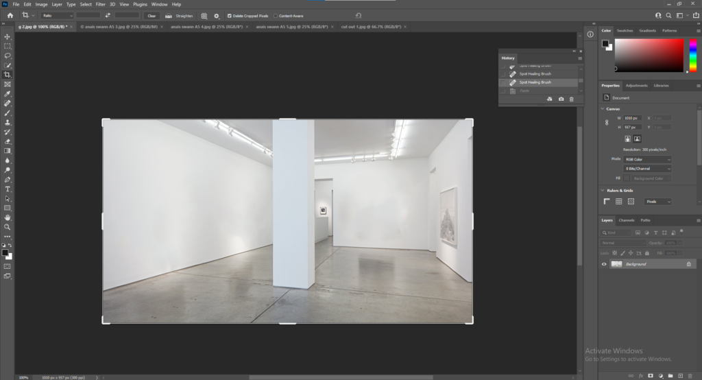
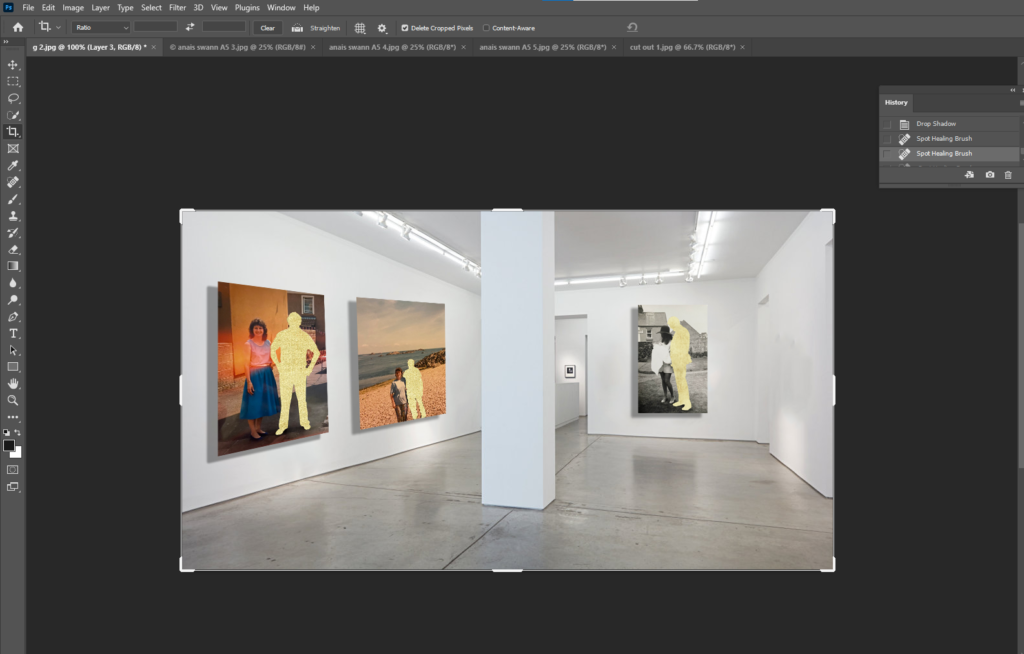
First I opened a picture into Photoshop of an art gallery I found on Google.

I used the Spot Healing Brush Tool to remove the canvases in the picture so I can add my own.

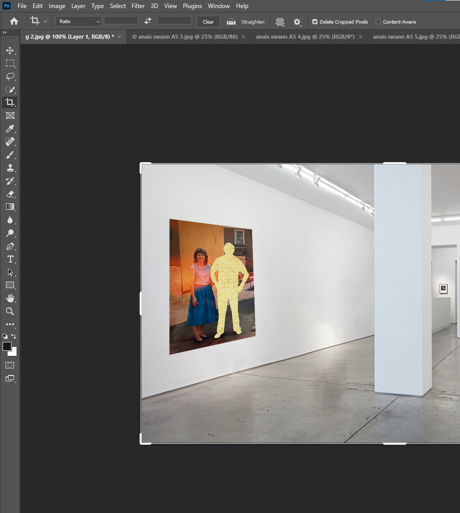
I opened the image I wanted to used and went up to Edit, Transform, Scale and Distort to fit the image correctly onto the wall at the right angle.

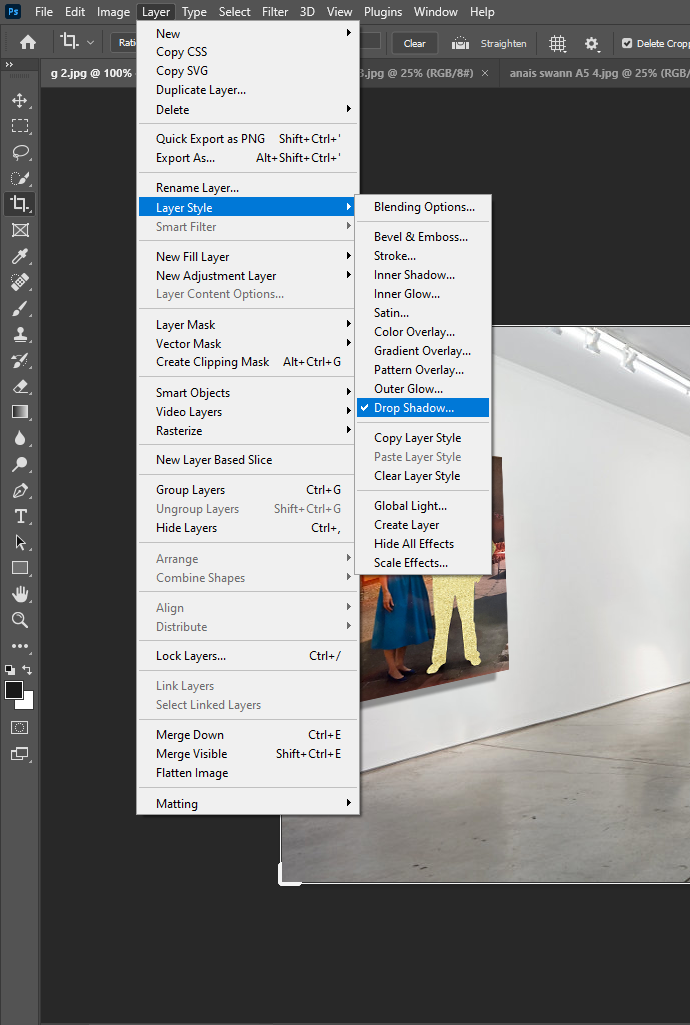
Next I wanted to add a shadow to make the gallery look more realistic. To do this I went up to Layers, Layer Style, Drop Shadow.

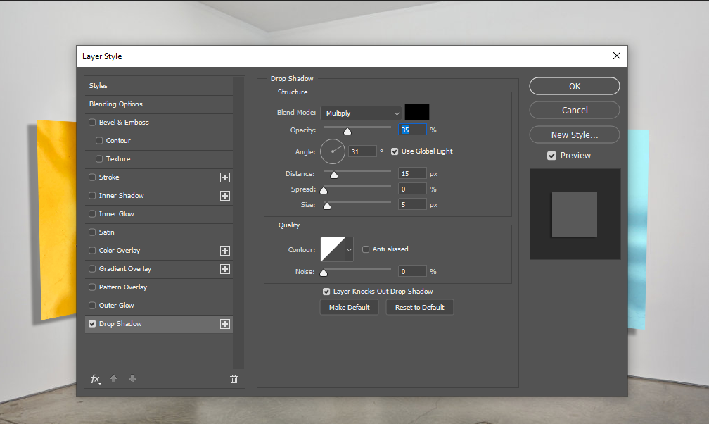
I adjusted the Distance, Speed and Size of the shadow.

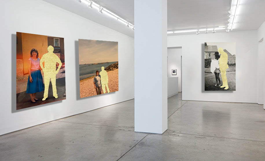
This is the final outcome.

Final Edits

Final images for Printing

I chose the images above for my final prints because I think they are strong edits with a strong narrative. I took photographs of old family photos, the yellow cut-outs are to represent a loss in the family. The top edit is particularly my favourite, the yellow covering their heads is filled with memories we all had with the person we lost. I like how the warm yellow contrasts against the tones in the back and white image, along with the coloured images, they have a variety of warm tones that go well with the yellow which will look good as a series of 3 in my portfolio.

These 2 images I chose because they are fun and have a lot of life to them. They are filled with bright, positive colours and will add vibrancy to my portfolio.

I really liked these images, especially in black and white as there is no colour to distract from the deep shadows and bright highlights within the image. These 2 images fit well together and create a sense of curiosity, the viewer will create a narrative of their own to these images and everyone’s will be different, either positive or negative.

Overall these 3 sets of images contrast against each other and show a variety of my skills within my portfolio, the depth of the black and white images, the bright colours and the edits.

photobook layout

Photobook Process

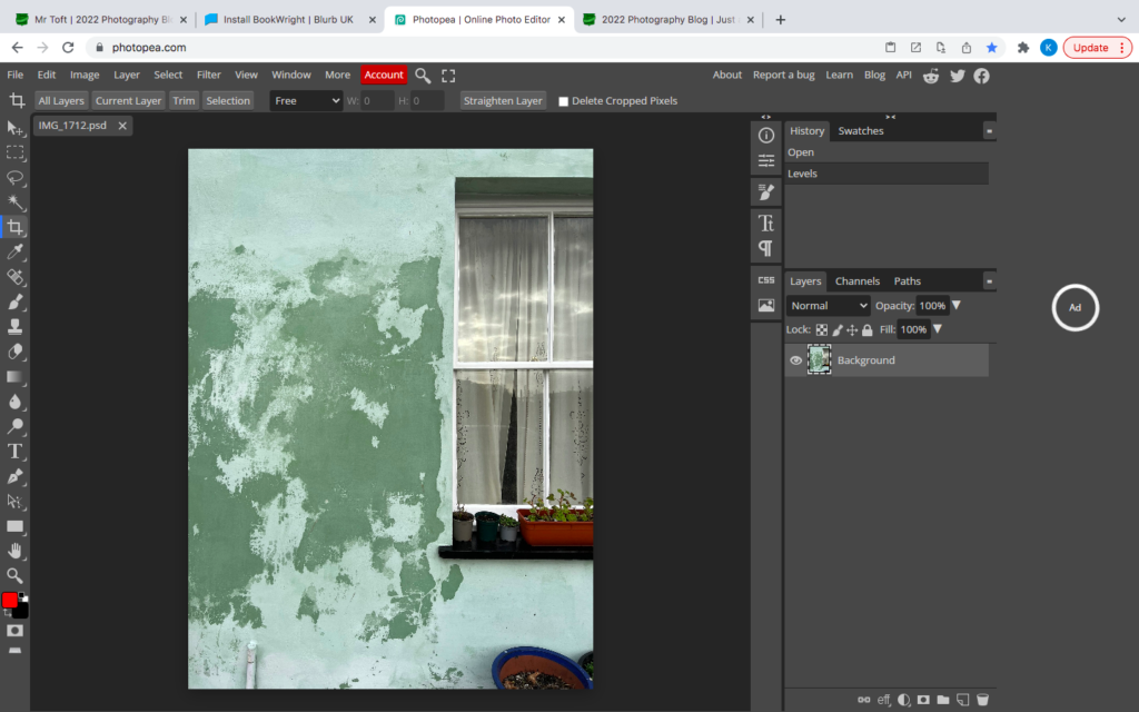
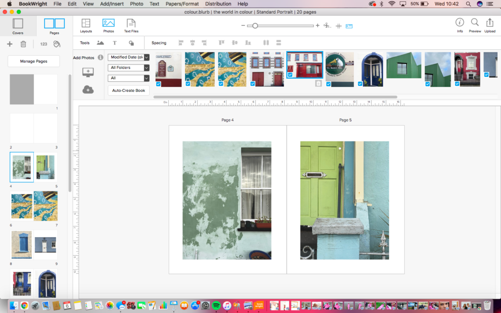
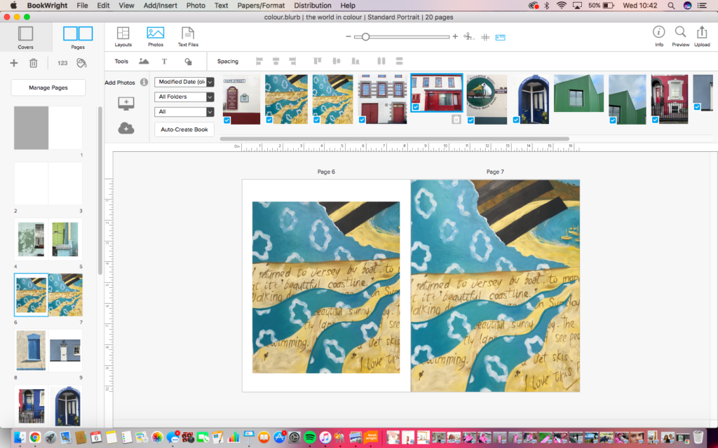
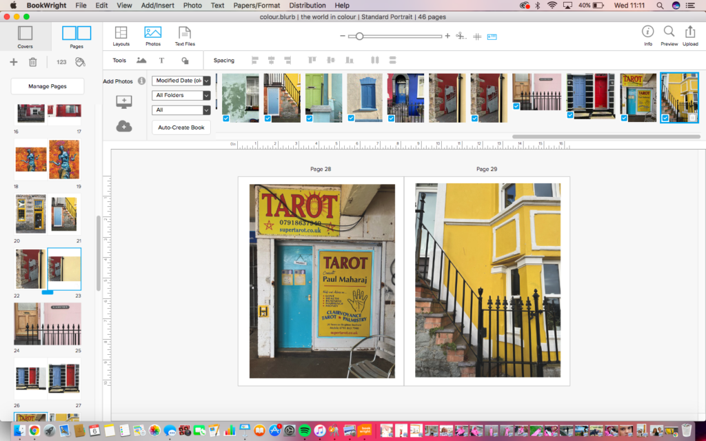
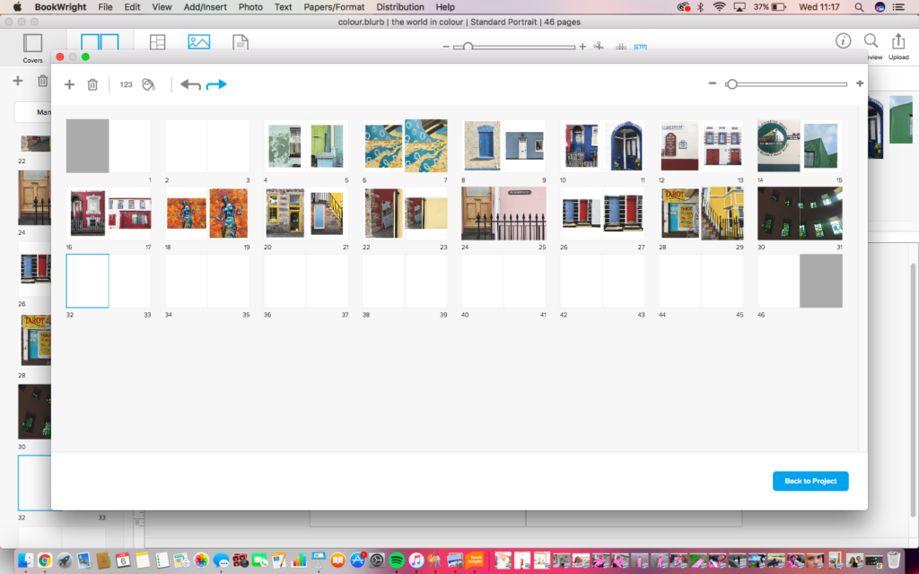
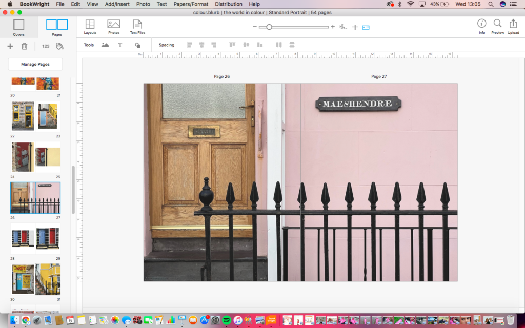
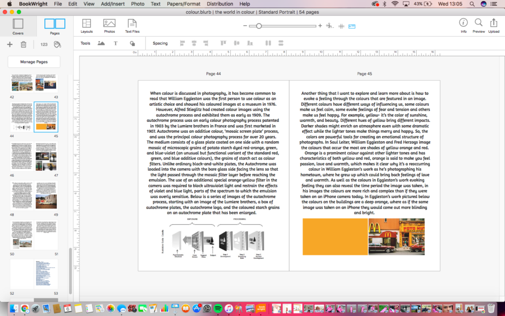
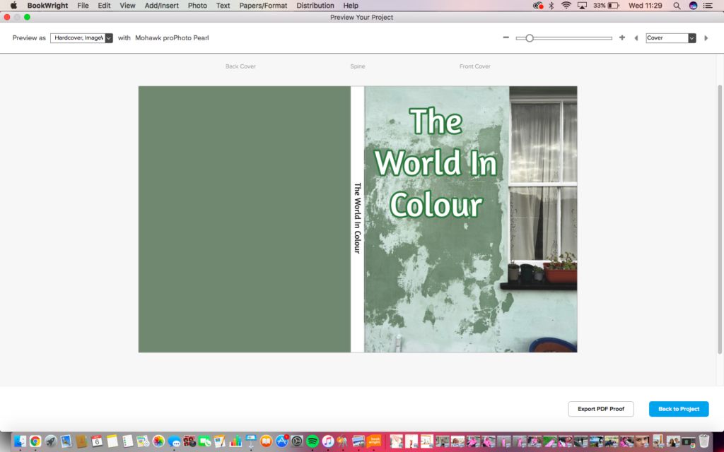
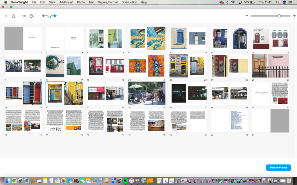
I started making my photobook on blurb by selecting the book type I wanted and the number of pages. I originally had 20 pages but ended up having to add around 30 more. I edited my images on photoshop before and decided which images I wanted to use by placing them on the photobook and moving them around to see if they fit the look I wanted. Most images that I placed next to each other were similar in colour as I liked the way it looked. To make the front cover of my photobook I chose one of my favourite images and enlarged it to fill the page, I then used the eyedropper tool on photoshop to match the colour of the dark green paint on the wall for the back cover. With the title I placed it to the side as I like the way the window frames the title.
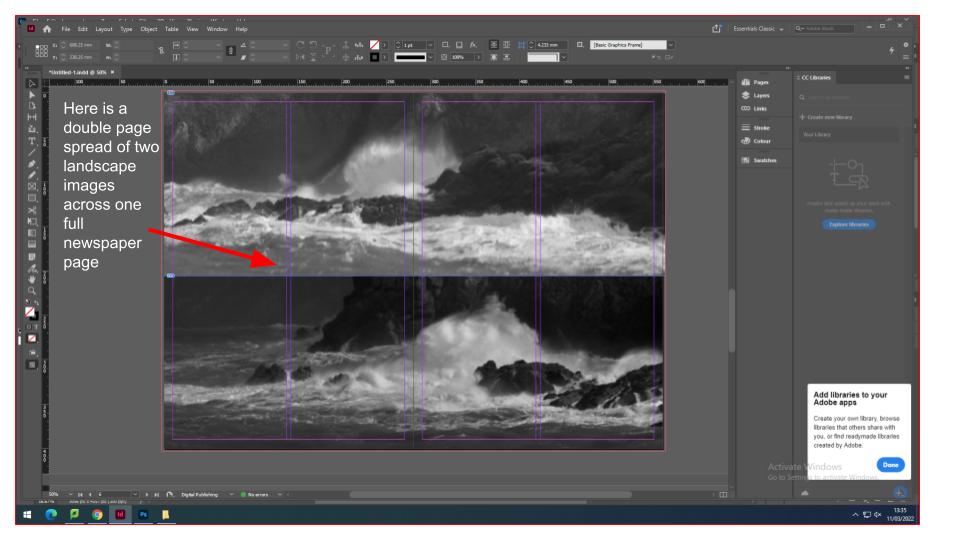
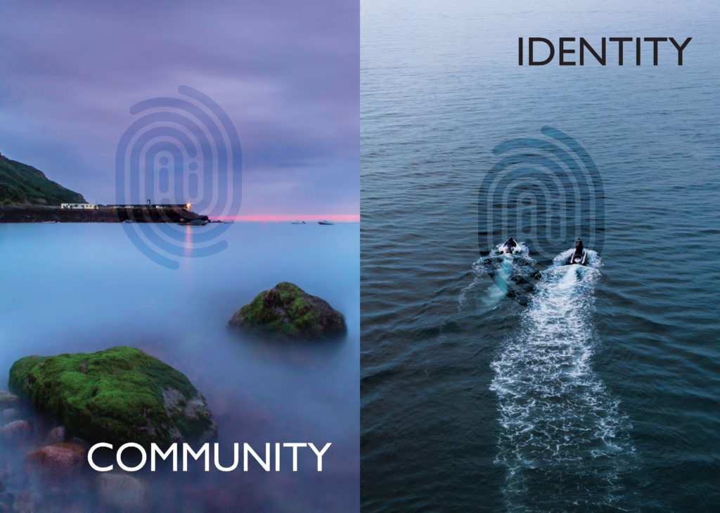
Photo Book – Process

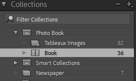
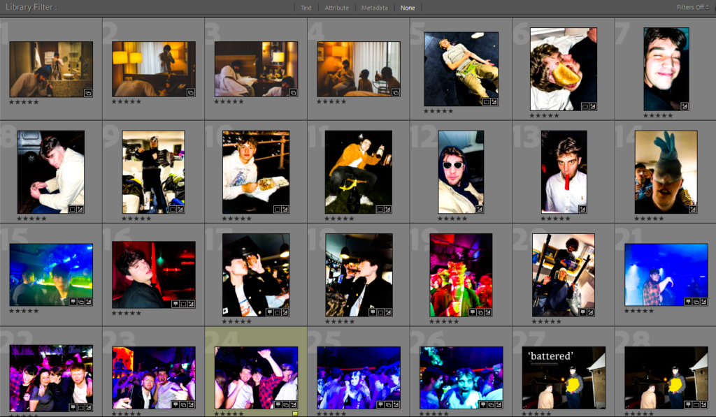
I created my photo book using Adobe Lightroom Classic. Firstly I created a collection named ‘Photo Book’ and put all of the images I wanted to include in that collection folder:

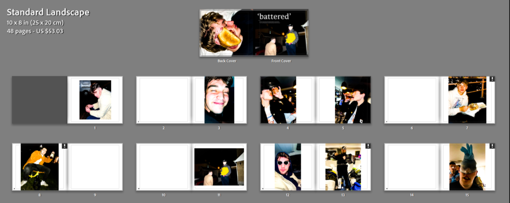
Next I put all these images into the ‘Book’ tab and ordered them in an aesthetic flowing order. I positioned the images in different places and in different sizes, as well as multiple and ingle images per double page to create variation throughout the photo book: