Overall, I think I presented my ideas and topic very well through using many editing processes to achieve my final outcome and showing mental health through photographs.
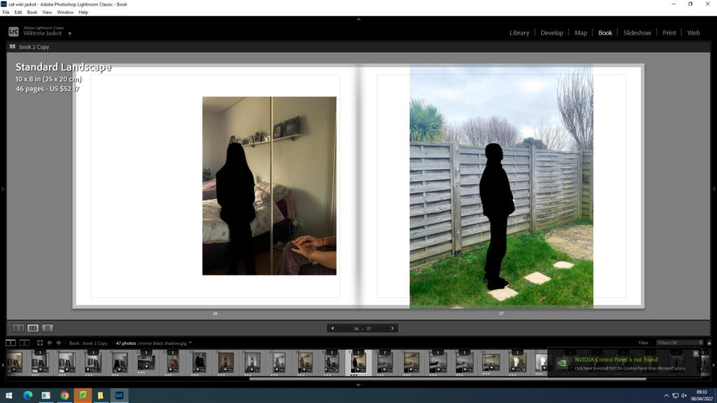
Here are some images of how my final photobook design turned out to look like;


I used about 2-3 different template designs and tried to keep them consistent throughout my book and change the order of them around to create a good contrast of layouts going in my book. I mostly stuck with using full bleed spreads, photo being in the centre or photo being slightly to the right of the double page. As well as changing the layouts I also changed the page colour to black on some images that I thought the image would contrast well with if being placed onto a black page. I did this to show how some days can be better or worse with using coloured pages and the colour black is there to represent sadness and a dark atmosphere.
I kept changing my images around to avoid having the same ones on the same pages or on the next spread. I used photos I thought either went really well together or images that contrast with each other to create juxtaposition in my book. However I did repeat some of my images to create the illusion of how everyday can feel the same when struggling with your mental state as you do the same things everyday just experience different emotions
Comparing my work to my chosen photographers;

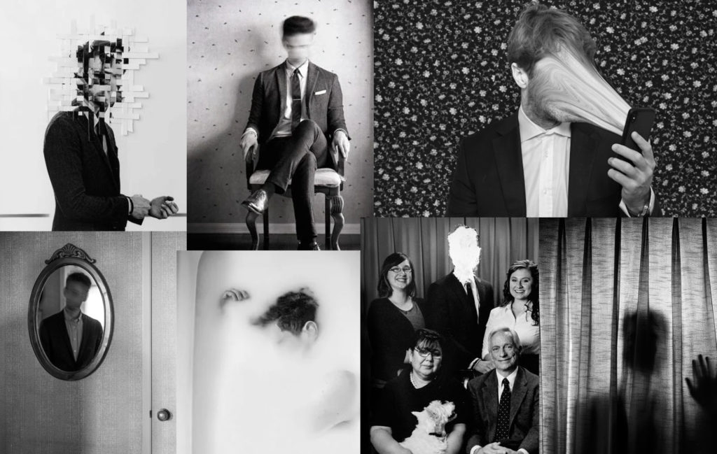
Overall, I achieved my first photo shoot by taking inspiration from Edward. It gave me ideas on how to edit my images and edit them in a way that presents my topic – mental health. It allowed me to use the blur tool as well as the wrap tool and select certain features such as the face to crop it out or blur it out. I was inspired by the photos of looking at yourself into the mirror as I think it shows how you’re looking at your own reflection and you dont even know who you are anymore as well as there being two sides of you- one looking into the mirror and the blurry reflection of yourself.
Here are some examples of my images that I took being inspired by Edward.


I tried to keep the overall images simple and natural as I wanted to create an everyday life effect apart from the studio photos. I got my model to face a mirror and then lay on her bed and face a mirror as well. I though that these images would be perfect for my topic as I can work with them and edit with them. I also got my model to sit on chairs and stairs to create everyday natural settings. I also edited most of these images in black and white to create a sad atmosphere and show the mood of the images.

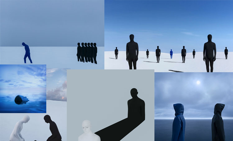
The other photographer that inspired me with my photo shoot and editing process was Isaak. I was very intrigued by his editing style and when you read more about his work you realise how his story matches his images and how he presents his experience with mental health through photography. This helped me to understand how you can show mental health in a visual way and inspired me for my second and third photoshoot. He created individual silhouettes and shadows to represent himself and his mental state through loneliness and using cold colours such as blue which creates a sad atmosphere. This helped me to use many photoshop tools and transform my images and creating a different meaning which presented my topic very clearly.
my photos;


I also decided that I wanted to add my essay onto the end of my photobook as I think my essay links really closely into my photobook and explains a lot about the topic I chose to portray- mental health.


I then realised that it would be better to have my essay in columns instead of a big text as it looked more clear and was easier to read , I also included the images that I used in my essay to give some examples of the work I was looking at and my photographers work examples.

The last thing I did was adding a front and back cover, I wanted it to be all black like I have planned from the beginning as my topic is quite dark and serious I wanted my book to look the theme. I then thought of a title and named it “mind.” as mental issues happen inside someone’s mind and its about what goes inside everyone’s head.
Evaluation- overall, I think I presented my topic very clearly in my photobook and achieved the final outcome that I wanted. I used a mix of simple portrait photos as well as many editing processes such as blurring, selection tool, cutting out images and filling them in as well as the quick selection tool. All of this helped me to present mental health visually which I took inspiration from my two chosen photographers. As Edward focuses on simple , black&white ,self portraits and blurring out his face, whereas Isaak uses editing software’s and creates an abstract representation of mental health.
