Personal Study – Final Essay on Photo Therapy

In what way have Robert Darch and Josef Sudek used their photography as a form of therapy? 

“Photographs, which cannot themselves explain anything, are inexhaustible invitations to deduction, speculation, and fantasy.” – Susan Sontag, On Photography, 1977. 

The concept of escapism; the tendency to seek distraction and relief from unpleasant realities, running away to a world where sorrows are only distant memories. Photographers Robert Darch and Josef Sudek explore this idea within their work, questioning how they can use photography as a form of therapy to convey their mental/physical illness through still-lives and landscapes. The use of photo therapy has grown substantially in recent years, pioneers of the style Rosy Martin and Jo Spence have worked together since 1984 exploring its concepts and benefits. In ‘The Photography Reader; Liz Wells’, a collection of essays from Martin and Spence describe how “out of the myriad fragments thus mirrored to us, first unconsciously as babies, then as we are growing into language and culture, aspects of our identities are constructed.” They use photo therapy as a method of coming to terms with and accepting themselves, in their essay ‘Psychic Realism as a Healing Art?’ it is stated that “what photo therapy engages with is primarily the ‘needy child’ within all of us that still needs to be seen and heard. The therapist has to become the advocate of this ‘child’ and to encourage her to recreate and witness her own history, to feel safe enough to protest, and then learn to become her own inner nurturer.”   

In my personal investigation I aim to use photography as a medium to explore how I have coped with anxiety throughout my life, focusing on the idea of finding safety and comfort in certain places around my home, family member’s homes and areas around the island that have always made me feel calm. The whole concept of anxiety has been quite normalised in today’s society, having both positive and negative effects, as some feel less alone while others feel less seen. Highlighting this topic, by studying the positive areas of life where I have felt most safe, is very important to me; what matters to me most is creating a truthful display on a personal topic. Analysing the work of Robert Darch and Josef Sudek reveals the methods of photo therapy that I wish to reflect, juxtaposing images of flowers cut down from their mother plant (adapting to their environment in vases), with pictorialism inspired natural landscapes. These photographers have the ability to convey deeper meanings, ambiguous stories and ideas in their work; locations and places that tell the stories of their lives, Darch especially revealing his pain and want for an escape. One must consider the subject’s relationship with themself, for instance the links between past and present, and how locations shape a person’s true self, exploring photography as a means of healing.  

How can a Pictorialist style demonstrate an atmosphere of nostalgia and comfort? Aspects of the Pictorialism movement have been reflected in several photographic works long after the movement ‘ended’, nevertheless have morphed and adapted to fit our changing times. During the 1880’s, when Pictorialism first begun, it was a reaction against mechanization and industrialization, dismayed at increasing industrial exploitation of photography through commercialisation. Writer and lecturer Stephen Bull describes Pictorialism as “the imitation of painting in an attempt to raise photography up to the same status as art that characterises the Pictorialist movement”. Photographs resembled paintings, being manipulated in the dark room by scratching and marking their prints to imitate the texture of a canvas – photographers used a soft focus to capture landscapes and portraits by smearing Vaseline onto their camera lens. This method allowed for the creation of dream-like artwork on spiritual subject matters, taking inspiration from Allegorical paintings which personified envy, love and glory. It was a means of exploring the unreal, the weird and the mystical – though photo therapy was not a concept during the time, there are links to its ability of escaping the banal of everyday life into another world. In her 1977 collection of essays ‘On Photography’, Susan Sontag describes how “photographs are a way of imprisoning reality…One can’t possess reality; one can possess images–one can’t possess the present, but one can possess the past.” I believe this can relate strongly to the values of Pictorialism, reality is presented in a fanciful style, ‘imprisoning reality’ that has been manipulated into fantasy which results in possession of an altered reality. One may question whether Pictorialism can even be considered as reality at all?  

Photography can be a freeing medium, much like painting in the way it can cleanse the soul of creative ideas that need to be reflected on paper. The extent of the freedom of the camera all depends on what the photographer wishes to reveal; they have the ability to hide certain truths, or in contrast have complete unfiltered honesty. British photographer Robert Darch explores how to reveal the truths of his past through landscape photography. Darch’s website states “his practice is motivated by the experience of place, in which the physical geography and material cultures of places merge with impressions from contemporary culture that equally influence perception. From these varied sources, both real and imagined, he constructs narratives that help contextualise a personal response to place.” When Darch was just 22 years old he suffered from a minor stroke which has had an impact on his life ever since. Completing his Photographic Arts degree at the time, he had to continue his studies from home when his health did not improve – his home was as much a prison as a safe space. Darch viewed his illness as a space, a location he could not escape physically; so, he had to do so mentally. In 2020, Robert Darch published his second photobook which he titled ‘Vale’ – a name with many meanings such as letting go, or even a hidden valley tucked away in the mountains. Ambiguity is something that first drew me to Darch’s work, his ability to capture the most idyllic ethereal landscapes but make them appear almost eerie in their solitude makes observers question whether this world is real. Are these areas from Darch’s childhood that we are getting a glimpse of all they seem to be? Do these locations hold more hurt than hope, always being there for Darch through such a low point in his life? An extract from ‘The Vale of Despond’, by Curator Dan Cox, reads “The fictional worlds into which Darch escaped, exhibited characteristics which were at once benign and threatening…Vale is a result of this percolation and loss. It is the fictional space where Darch can relive and re-imagine a lost period in his life, journeys with friends both through physical spaces and through time.” What Darch is able to encapsulate is a feeling of dream-like nostalgia, his work in ‘Vale’ is persuasive and welcoming but as the book goes on, the flickers of discomfort creep in.  

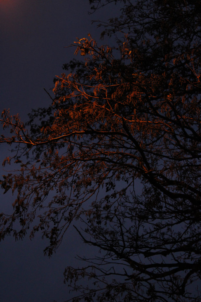
In regard to photo therapy, Darch’s use of photography to escape from the harsh reality of his past allows him to heal from it, seeing it in a different perspective to truly understand his feelings and emotions. I want to use this idea of ‘photographic healing’ to reflect on my experience of anxiety, documenting the locations where I feel safe and secure within myself to understand how they’ve shaped my personality and life. Darch’s use of light in his ‘Vale’ work conveys a sense of optimism, like the sun beams are rays of joy or hope; artificial light can only be seen in the last few images in his photobook, perhaps hinting towards closing this fake reality. Natural landscapes are dream-like in Darch’s photographic eyes, soft focus and light tones compliment the misty woodlands and sunlight reflects off ponds and lakes to create a world of picturesque fantasy. Pain and suffering are escaped from; the warm hues that cover each image fill the landscapes with comfort and peace, Darch’s use of colour (bold oranges, yellows and greens) reveals his desire for security and safety within this rural atmosphere. A quote from Darch, in an interview with FotoRoom, reads “the warmth of the summer is tempered by an internal melancholy of loss, and the poetic narrative is in direct response to the emotions, feelings and thoughts cultivated during the period of isolation I experienced.” The confessional tone and atmosphere created in ‘Vale’ was therapeutic to Darch, he was able to physically show other people this world of fantasy that he would escape to – what once was his secret, could now be seen by the rest of the world; honesty and truth revealed. As I responded to Darch’s work, I wanted to convey the same sense of intimacy and imagination. Taking inspiration from Pictorialism, my aim was to create similar sepia blurred landscapes using Vaseline to create the iconic dream-like mood – however, I had the idea to steam up my camera lens with my breath, as if physically breathing life into my personal story. Using this technique allowed me to form deeper connections with my work, it was remedial to physically create this escapism that my youthful anxiety craved.  

Why do some photographers focus their energy and photographic art on one specific location? Perhaps it holds a happy memory, or maybe it is the only place they can get inspired, whatever the reason; it’s therapeutic. Concentrating on one singular place, similar to Josef Sudek’s work ‘The Window of my Studio’, allows the photographer to experiment with changing what they can see, healing can come from changing your perspective on the truth. Czech photographer Josef Sudek is well-known for his still-life photography, he captures orchestrated scenes of flowers, vases and abstract objects on the windowsill of his studio in Prague. Sudek’s images are mysterious and eerie, they hold an atmosphere of loss, but at the same time show hint towards hope for a brighter future. Looking into Sudek’s past it is clear that this photographic style was healing, he served in the Austro-Hungarian Army during the First World War, when he was wounded and subsequently lost his right arm to amputation. After this sudden change to how he lived his life every day, Sudek turned to Photography and became a member of the Prague Club for Amateur Photographers from 1920-24, nevertheless he struggled with feeling isolated form the rest of the world. Russell Lord, from the New Orleans Museaum of Art, described Sudek as follows; “for Sudek, who grew increasingly reclusive over the decades, his studio, the window, and the small garden beyond became an important sanctuary, and a way to express his own tentative relationship with the external world. Sometimes perfectly transparent, sometimes coated with frost or water droplets, the glass window both frames the outside world and serves as a barrier from it.” Seclusion: Sudek struggled with this most, ‘The Window of my Studio’ served as a retreat from the judgement and staring eyes of 20th century society, he created a series of images from the only place he felt safe and at one with himself. Though at the time Sudek may not have intended on creating imagery holding themes of anxiety, I can recognise similarities to the feeling of loneliness and uncertainty as if his window is his foggy, misconstrued version of the outside world.  

Susan Sontag describes how “photographed images do not seem to be statements about the world so much as pieces of it, miniatures of reality that anyone can make or acquire” – to me, Sudek’s photography reveals his small corner of the world, his small corner of reality. It is clear that throughout Sudek’s work there has been a strong influence from Pictorialism, his work holds the same dream-like, soft atmospheres that many other Pictorialist photographers captured, for example the work of Alfred Stieglitz and his study of clouds in ‘Equivalents’. Sudek’s use of windows, documenting overcast murky days through frosted glass, additionally adds to his Pictorialist style – his use of light and aperture settings creates this soft blur around his flower subjects, almost replicating that of an oil painting. As Sudek was creating and photographing during the change of an art movement from Pictorialism to Modernism throughout the 1930’s and 1940’s, his work holds an almost vintage feel when compared to those being created during the same time period. Delicacy contrasted with harsh shadows is an element of Sudek’s work that beguiles the observer, is it an image of hope or a reminder of tragedy? Are we meant to focus on the survival of nature in an unnatural environment, or the looming enigma behind the glass? Twisted shadows of trees, the misty soft texture, repetitive streams of rain drops; it’s the creation of the fantasy world where Sudek wished to escape from. We can look through, but also look beyond his subject – the negative space that surrounds each flower could be symbolic of Sudek’s past woes and struggles – each element is subjective. My response to Sudek’s work has been very experimentational, I wanted to take a similar abstract approach using a large aperture setting to create a high depth of field however still breathing onto the lens to create a mystical Pictorialist quality. Furthermore, I wanted to take advantage of the natural light source which formed many golden highlights over my images, taking a colourful but gentle palette instead of monochromatic allowed me to explore how colour affected the mood of my images. The fanciful escapist themes that I wanted to present were emphasised by such pastel warm colours, Sudek’s work provided the concept of how one can explore serenity juxtaposed with confinement.  

We are led to believe that imagery can bear witness to reality, sometimes that reality is twisted and manipulated, forming what could be seen as an entirely different world; yet who’s to say this is a bad thing? Both photographers have gone through difficult points in their lives, with Darch suffering from a stroke at a young age and Sudek losing his arm during the war. Creating these fantasy realities has helped them to escape, to heal and to learn. In respect to my Personal Investigation, both artists have used photography as a method of escapism from an illness/disorder that had impaired them throughout their life – I have explored how elements of their images may have deeper meanings in regards to symbolism of weakness or hope. Although Sudek’s images are not known to have been made with his impairment in mind, I can still recognise themes of optimism in a time of isolation through his project; as if the flowers are symbols of life continuing, adapting in a new environment – they are still able to survive in a singular glass of water. Nevertheless, Darch’s work noticeably conveys a sense of escaping from reality through vibrant colours, dream-like compositions and golden hues that relay this idea of ‘the light at the end of the tunnel’. Though Darch reflects his sickness throughout his project, it is done subtly, with Darch himself stating “during the illness I no longer wanted to turn the camera inwards, to linger on the reality of my situation, preferring to lose myself in fictional constructs of the mind”. This fictionality in his work is honest and raw, giving the observer a glimpse into his own imaginative mind. In my own work I wanted to use locations from my past as a catalyst for a tribute to my childhood escapes, the worlds I would create to get away from anxious thoughts and feelings. Nevertheless, to interject moments of reflection and calmness, I wanted to use Sudek inspired imagery of flowers, some wilted, others blooming wilding – all to relay the concept of hope, of carrying on and taking a moment to revaluate my perspective. In her essay ‘Frames of Mind; Photography, Memory and Identity’, Patricia Marcella Anwandter questions “what do we choose to remember and how do we reinforce it? Who are we in relationship to who we were?” – I have mimicked the work of Darch and Sudek’s photo therapy to answer and heal from these questions.  

My Response:

Bibliography:  

Wells, L. (ed), Martin, R & Spence, J (2003), The Photography Reader. London. Routledge; Taylor & Francis Ltd 

Martin, R & Spence J. (1988), Psychic Realism as a Healing Art. London. Ten8, No 30   Spellbound 

Bull, S. (2009), Photography. London: Routledge; Taylor & Francis Ltd 

Sontag, S. (1977), ‘In Plato’s cave’ in On Photography. London: Penguin Books 

Darch, R. (2020), Vale. Devon. LIDO Books 

Cox, D. (2020), The Vale of Despond. London. LIDO Books 

FotoRoom. (2020), Beauty & Unease Coexist in Robert Darch’s Vale Series. [Online] at; Beauty and Unease Coexist in Robert Darch’s Vale Series | FotoRoom 

Balcar, M (ed), Sudek, J. (2007), The Window of my Studio. Torst. 

Lord, R. (2018), Analysis of The Window of my Studio. [Online] New Orleans Museum of Art at: Object Lesson: The Window of My Studio by Josef Sudek – New Orleans Museum of Art (noma.org) 

Stieglitz, A. (1925-1934), Equivalents. [Online] at: https://archive.artic.edu/stieglitz/equivalents/ 

Marcella Anwandter, P. (2006), Frames of Mind; Photography, Memory and Identity. CUREJ: College Undergraduate Research Electronic Journal, University of Pennsylvania.

Personal Study – Essay Plan

Essay Question Ideas:

Artists – Robert Darch & Josef Sudek

How can reality be presented and altered through the medium of photography?

How can the concept of escapism be represented through the medium of photography?

In what way have Robert Darch and Josef Sudek explored the concept of escapism in their work/ photography?

In what way have Robert Darch and Josef Sudek used their photography as a form of therapy?

In what way have Robert Darch and Josef Sudek explored the concept of ‘the real world’ in their photography? 

Essay Structure Plan:

Introduction (250-500 words): What is your area study? Which artists will you be analysing and why? How will you be responding to their work and essay question?

  • Discuss the concept of escapism, what does it mean to me/to the world?
  • Area of study = anxiety shaping identity, celebrating the locations I would escape to/the worlds I would create to feel safe and calm in etc.
  • Responding using still life and landscape photography.
  • Taking inspiration from Robert Darch and Josef Sudek – describe summary of their work.
  • Discuss Rosy Martin and Jo Spence ideas on Photo Therapy, use extracts from their essay ‘Psychic Realism as a Healing Art?’.

Pg 1 (500 words): Historical/ theoretical context within art, photography, visual and popular culture relevant to your area of study. Make links to art movements/ isms and some of the methods employed by critics and historian. 

  • Explore how Pictorialism has impacted my project, how I think it links to both Darch and Sudek’s work.
  • Historical facts and ideas on Pictorialism – what influenced it? What’s its main concepts/message? How are Pictorialist images created, discuss use of Vaseline/manipulation in dark room etc.
  • Themes of Pictorialism that I want to replicate, eg; dream-like atmosphere/fantasy, altering reality similar to how I would alter my reality to escape to different worlds, escaping anxious thoughts etc.
  • Bring in idea of Susan Sontag opinions of photography, use quotes from series of essays ‘On Photography’ .

Pg 2 (500 words): Analyse first artist/photographer in relation to your essay question. Present and evaluate your own images and responses.

  • Discuss freedom of photography, how photographers can show us what they want to show us.
  • Robert Darch information, who is he? What’s his backstory? Why did he inspire me?
  • Use quotes from his website/from essays written on his work, eg; Dan Cox.
  • Analyse why Darch takes the photos he takes, what do they mean to him? Explore how his work has deeper meanings to do with childhood and past memories.
  • Analyse Darch’s photography style, his compositions/tone/lighting/shadows etc – why do they matter?
  • What did I do to respond to Darch’s work, how did I use him as inspiration>

Pg 3 (500 words): Analyse second artist/photographer in relation to your essay question. Present and evaluate your own images and responses.

  • Discuss use of location in photography, question the values of a place connecting to photographers memories or life story.
  • Introduce Josef Sudek, his series ‘The Window of my Studio’ – how does it relate to my project? What do I see when I analyse his work?
  • Give Sudek’s background, who is he/what did he do/what was he famous for?
  • Talk about how Sudek’s injury and amputation may have hindered his life both physically and mentally, perhaps photograph was his escape from the outside world.
  • Use quote from critics of Sudek eg; Russell Lord discussing how Sudek isolated himself from society and became completely interested in capturing scenes from his window.
  • Analyse what techniques he uses, his links to Pictorialism and use of soft focus.
  • How I respond with my project, what similar styles did I use etc?

Conclusion (250-500 words): Draw parallels, explore differences/ similarities between artists/photographers and that of your own work that you have produced

  • Conclude by comparing both photographers use of photography as a healing art, how do they do it? Why did they do it?
  • Draw points together by mentioning photographer’s pasts, and how this influenced their imagery.
  • Discuss how I have responded with my work, what techniques I used and what they all mean to me, use ideas from critics and photographers to discuss similarities between artists.
  • Historical factors and movements (Pictorialism) that have been inspirations throughout project.
  • Close with idea from Patricia Marcella Anwandter about how photography reflects memory, and is therefore healing to the photographer.

Bibliography: List all relevant sources used

  • List online websites
  • List essays I have read and quoted
  • Photobooks that inspired me throughout
  • Use Harvard System of Referencing to create bibliography

How to format references;

Photography book used = Zanele Muholi.

How to set out Bibliography –

Muholi, Z. (2020). Zanele Muholi, Tate. London: Tate Publishing.

In your text cite author’s surname, the year of
publication and the page reference immediately
after the quoted material e.g. Where a section of
your main text directly quotes another source, or
else uses ideas which have been drawn from
another source, the end of that quote should have
an entry like this
…which is the point that Liz Wells’ makes when she
says ‘one of the central principles of the
documentary aesthetic was that a photograph
should be untouched, so that its veracity, its
genuineness, might be maintained’ (Wells 1998:40)

Themes and Ideas to Discuss:

Symbolism and metaphors

Windows = light, wellbeing, to grow, opening to another world

Mirrors = reflections of past, future etc

Comparison – Vale shows the idyllic escapism from anxiety, into different realities/worlds as one would in childhood imagination, whereas Sudek’s images, to me, represent the present hopes towards escaping – flowers and nature are cut down from their original source however they still thrive using a vase of water as a new way of living, its adapting to surroundings just like I have had to do when finding places to feel safe with anxiety.

Changes; possibly edit my Sudek inspired image in colour but softer vibrancy and clarity – inspiration from pictorialism – could mention in essay about the inspiration Sudek has taken from the pictorialism movement.

Quotes of Possible Use?

“It’s hyperreal and dreamlike,” Darch says. “I daydreamed a lot as a kid, I still do as an adult, and definitely in those years when I was isolated, I was inside, I was in my mind all the time.”

‘So successful has been the camera’s role in beautifying the world that photographs, rather than the world, have become the standard of the beautiful.’ Susan Sontag

“To suffer is one thing; another thing is living with the photographed images of suffering, which does not necessarily strengthen conscience and the ability to be compassionate. It can also corrupt them. Once one has seen such images, one has started down the road of seeing more – and more. Images transfix. Images anesthetize.”
― Susan Sontag, On Photography

“In the real world, something is happening and no one knows what is going to happen. In the image-world, it has happened, and it will forever happen in that way.”
― Susan Sontag, On Photography

“Photographs, which cannot themselves explain anything, are inexhaustible invitations to deduction, speculation, and fantasy.”
― Susan Sontag, On Photography

Photobook layout, design and experimentation

Experimentation with layout and images

The magazine is called “More Than Two” because there is always more than two people in a situationship apparently.

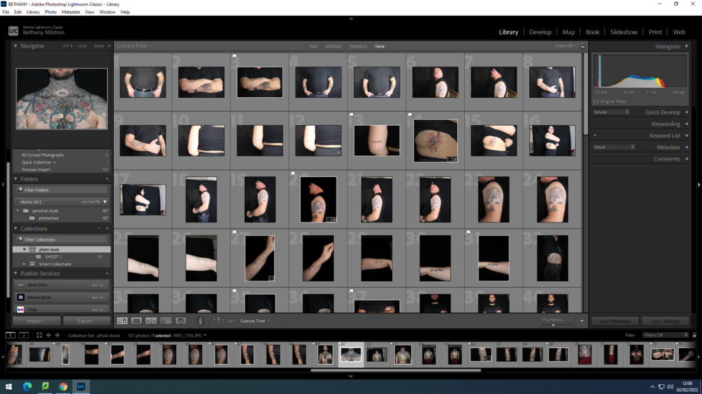
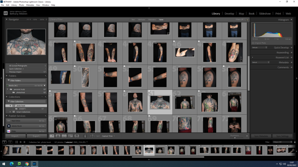
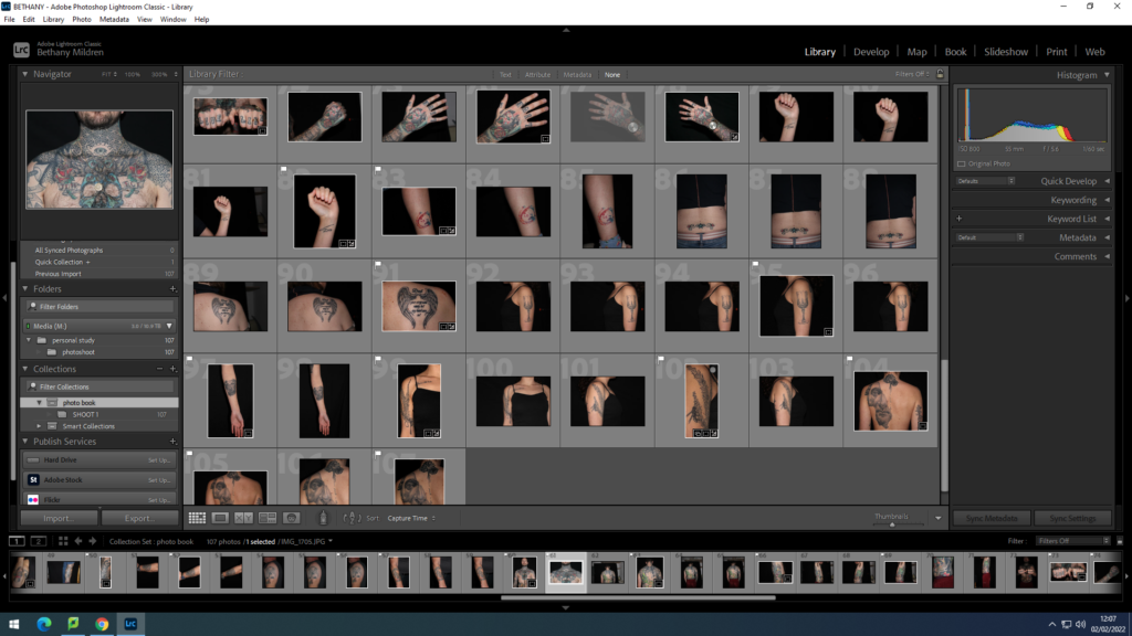
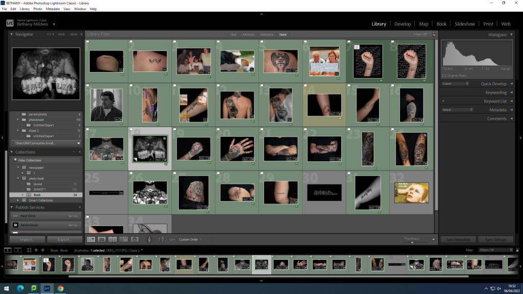
Using Adobe Lightroom, I uploaded all of my final images from my folder and gave them colours to show which ones I think are best and which images aren’t as good. For example:

As you can obviously see I experimented with the images on different pages seeing which images work best together. I also adjusted the size of the photograph and experimented with making some images full bleed and white borders. What I gathered was having the Bible texts as a full bleed gives a Bible book feel as well as having the front and back cover full bleed looks more aesthetically pleasing. Also, having a full bleed bible passage with a white-bordered image looks better on my layout and perfectly shows the juxtaposition between the two.

I also experimented with the order of the pages to test which order portrayed my story best and found that it was best to start off the book with the bible quote which was constantly being repeated in my mind when I was with my second ex; “For the lips of the adulterous woman drip honey, and her speech is smoother than oil; but in the end, she is bitter as gall, sharp as a double-edged sword.” – Proverbs 5:3-4. This quote, to me, at the time, was like a warning, or a reminder that this guy, may be sweet but will soon become toxic which was indeed the case, sort of… We broke up because I wasn’t ready to take things deeper with him.

The book then proceeds to show same-sex partners getting intimate together, right at the start. This was actually done on purpose for if you know anything about Grindr and hookups, you get quite intimate scarily quickly.

Moving forward, we then have a landscape image to try and show the reader that this couple has been going on dates, getting to know each other, and acting like a couple. Also shown through the upcoming images. Some images are blurry on purpose; to give a sense of memory since in many cases, these cute moments end really quickly and you’re left with nothing but memories.

My book then goes on through a new twist; a bible passage. Ironically every bible passage within my book is the passages that talk about homosexuality, and in red are some of the gay stories and experiences that I had to go through. These texts are joined by some images to help the viewer better imagine these scenarios.

photoshoots

Plan

My plan for my photoshoots is to set up a black back screen I have in a separate, untouched room so I can leave the set up there to keep going back to with my models, this will improve the efficiency of the photoshoots as I won’t have to keep taking down and moving the equipment place to place. My aim is to use around 10 people within my project, this will give me a wider range regarding the styles of body art and also a wider range of meanings and reasonings. This may deeper my project.

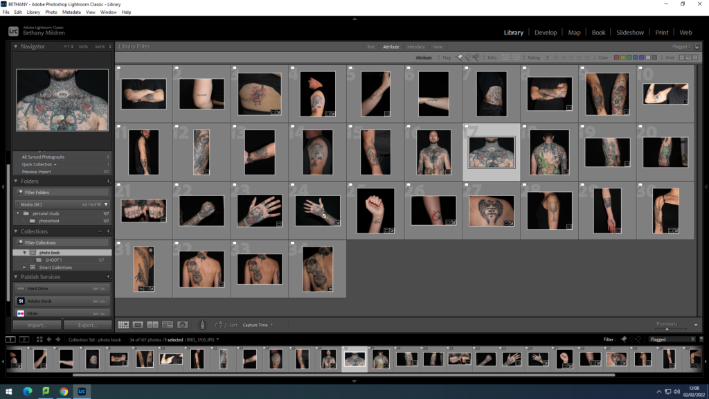
To start my photobook process, I uploaded all my images into Lightroom to start my editing. I transferred them all to their own collection I labelled photobook.

I started off the editing process by going through and ‘flagging’ the clearest and cleanest photos of from the shoot. I chose the ones that I felt extenuate and display the tattoos firmly, presenting them clearly. `This will benefit the clarity of showing the images in a book as I have experiences in the past, photos look different when not on the computer screen and sometimes unseen shadows or distortments can arise. This process took a lot of time due to taking care for how to avoid those possibilities.

Experimenting

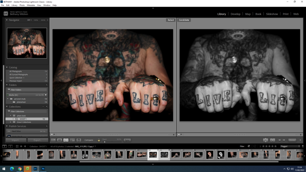
Instead of adjusting the photos through shifting exposure, shadows etc. , I wanted to experiment on more abstract ways to present my added materials in with my photos, cooperated and intertwined with the images. Testing in both black/white and colour to see which version of the image if more powerful.

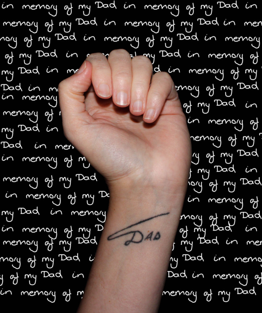
The process of this image started by tracing the few words off of the note given to me on photoshop, then pasting the phase and positioning them until they covered the whole of the black background. Next, I cut out the image of the hand using the lasso tool so then the hand and arm were isolated from the background. Then pasted it into the words. Once I was happy with the final image, I flattened it, ready to be saved.

I feel that this image is very successful and the writing in the background brings a captivating power to the image. Showing the importance of the tattoo with the repetition of ‘memory’.

For these images, I decided to experiment with archive images I collected from the models and hand written notes about the meaning of the tattoos, layering them on top of each other. This benefits reducing the amount of materials I have to include in the photobook, allowing more negative space around the images. Although this method makes the archive images quite busy as there is a lot of information the image holds, the space will become useful to break up the page.

This collection shows my original images with external materials imprinted onto them.

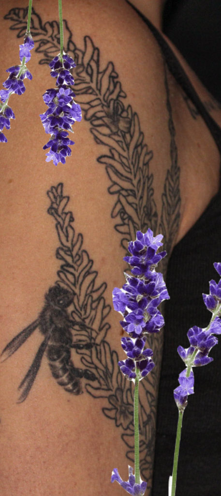
One of the images shows the models shoulder with a lavender plant tattooed, this led me to layer an image of the plant on top to bring some bold, bright and happy colour to the image as the model said that lavender bring joyful memories of her childhood with her brother.

The next image was created through me not knowing whether I preferred the image in colour or black and white, so I decided to see what it would look like half and half. This version happened to become my favourite as it seems to present the present and the past through the colours. I see this in this edit as the tattoo is of Marcus Aurelius, whose philosophies are still used current day.

The final image I decided to take the album cover that the tattoo was influenced by and paste pieces of it on top of the image, however I feel that the image alone is stronger than the edit.

After my selection and editing process, I moved all the images I will be using in the photobook into separate subfolder to section them away from any unwanted images. I then started the book, moving the images around to fit the narrative.

final print layout experiments

Virtual Gallery Experiments

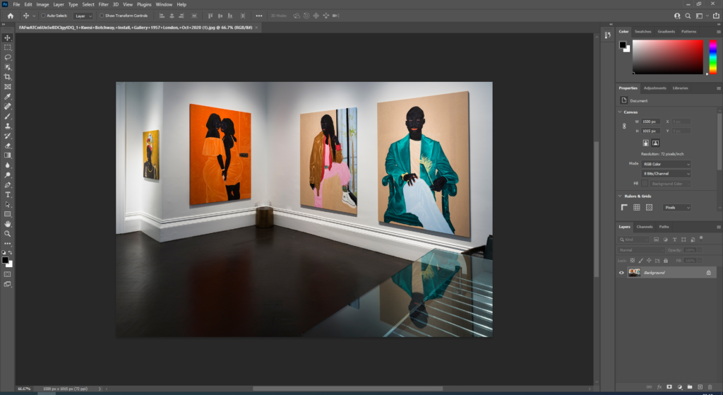
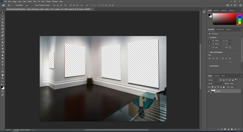
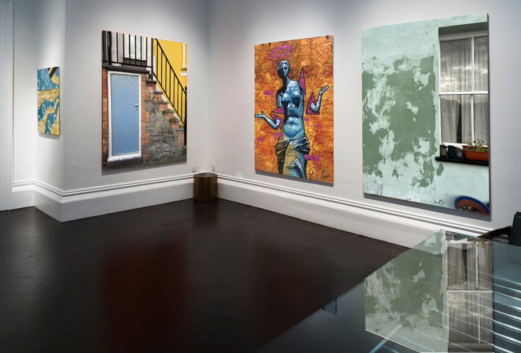
For this layout I simply got an image of a plain gallery off of google and placed my images onto the same tab on photoshop. I then resized them to how I wanted them and placed them in the order that I wanted.

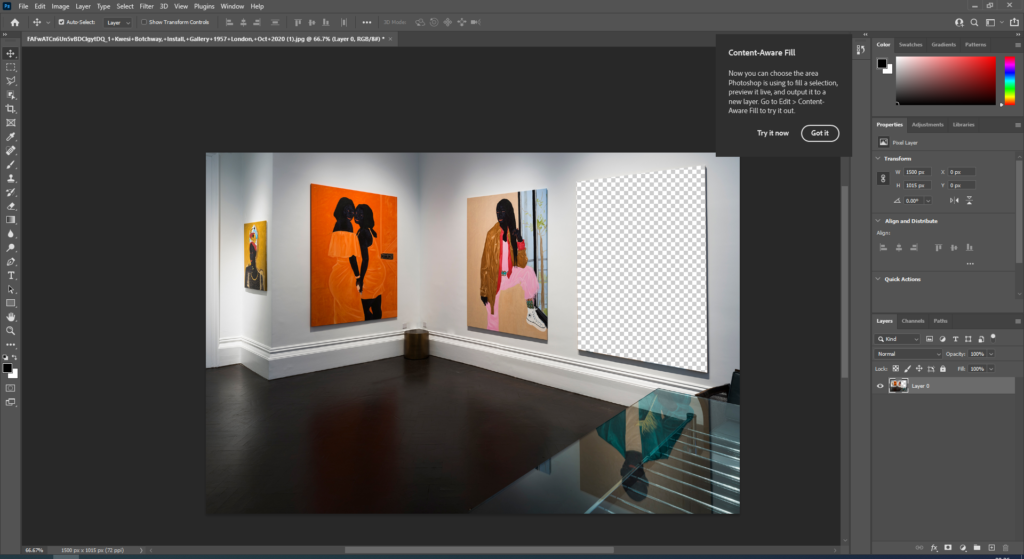
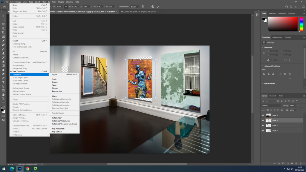
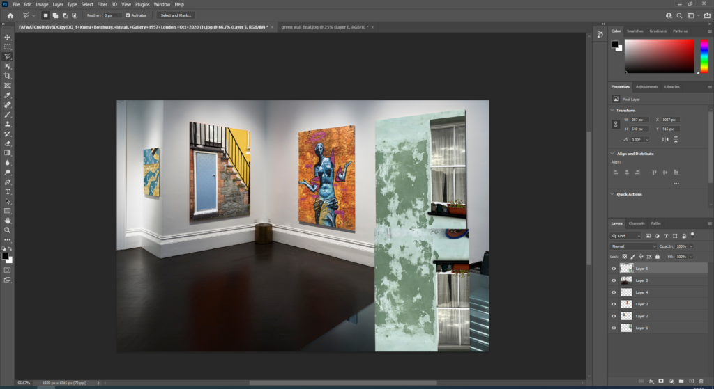
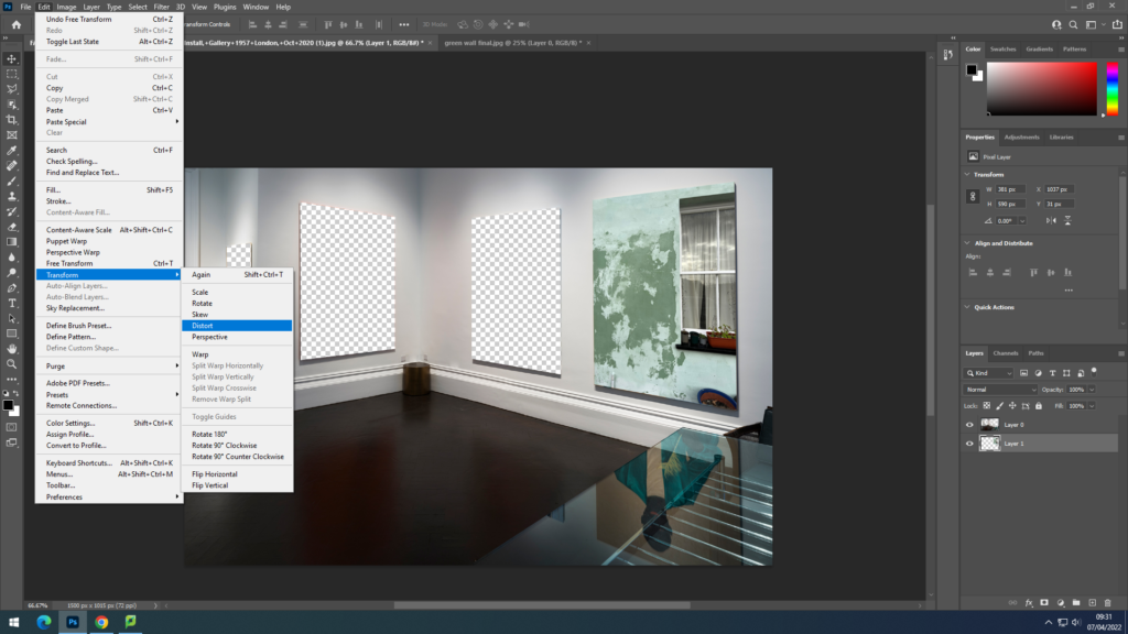
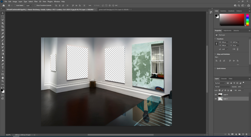
For this layout idea I started by opening an image of a gallery off google onto photoshop, I then used the polygonal lasso tool to cut out the images that were on the canvases. After that I copied the images I want and placed them underneath the original layer. I then went to edit, transform and clicked distort, which I then used to fit the images onto the wall at the right angle. After placing all of the images onto the wall I copied the image of the green wall and turned it upside down, I then flipped the image, turn down the opacity and cut off the parts of the image I didn’t want so that I could create the look of the reflection on the table like in the original image.

Final Print Ideas

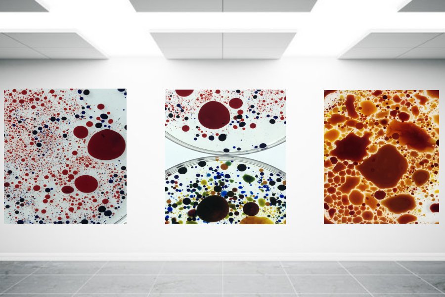
For this final piece I want to print off these three images and then mount them onto a white background in this layout of them in a row.

With this image I want to print it A3 and mount it onto black card, as a simple final idea.
With these two images I like how there is yellow in both pictures and like how they look next to each other, I am going to print these two images in A4 and mount them next to each other.
For this final print I opened the image on photoshop and copied the layer 3 times, I then lowered the opacity and moved the images around to get my desired effect.

essay planning

  • Essay question:
  • Opening quote
  • Introduction (250-500 words): What is your area study? Which artists will you be analysing and why? . How will you be responding to their work and essay question?
  • Pg 1 (500 words): Historical/ theoretical context within art, photography and visual culture relevant to your area of study. Make links to art movements/ isms and some of the methods employed by critics and historian
  • Pg 2 (500 words)Analyse first artist/photographer in relation to your essay question. Present and evaluate your own images and responses.
  • Pg 3 (500 words): Analyse second artist/photographer in relation to your essay question. Present and evaluate your own images and responses.
  • Conclusion (250-500 words): Draw parallels, explore differences/ similarities between artists/photographers and that of your own work that you have produced
  • Bibliography: List all relevant sources used

Structure plan

Introduction

  • 250-500 words
  • Opening quote
  • lead with my initial idea for the project and personalise it to my experience. Introduce the artists I will be analysing with a brief summary of why I chose them.

Paragraph 1

  • 500 words
  • Talk about the history of tattooing, including the value of the art to cultures to lead in Jono Rotman.
  • History of portraiture, including dates and locations of where this medium was first seen.

Paragraph 2

  • 500 words
  • Analysis of Jono Rotman’s relevant project, including his own heritage, background context on the Mongrel mob.
  • include quotes from critiques and comment on them, either supporting them or going against them.
  • Choose one image from the project to analyse

Paragraph 3

  • 500 words
  • Analysis of Danny Alexander’s relevant project.
  • Comment on quotes from critiques and Alexander himself.
  • Choose one image from the project to analyse.

Conclusion

  • 250-500 words
  • Comment on similarities and differences between the two artists
  • Relate points made to the historical context
  • My work in relation to the artists (similarities/differences)

Possible essay questions:

How does Richard Todd and Danny Alexander use portraiture to represent different identities?

How does Richard Todd and Danny Alexander use portraiture to explore a persons identity?

How is intimacy created in the work of….

Can personality and identity be expressed in a portrait?

How does Richard Todd and Danny Alexander use and manipulate lighting to emphasise focus?

How to reference: Harvard system of referencing

Wolf, N (2007). Romanticism Koln ; Taschen

In text referencing ‘I did not paint to be understood, but I wished to show what such scene is like’ (Wolf, 2007, p7)

book specification

Narrative: What is your story?

  • 3 words: Documentation, Memories, expression
  • A sentence: A story of peoples’ body art and what they mean to them through a documentary style.
  • A paragraph: I wish for my photobook to display and take viewers through a series of images showing my families’ and friends’ body art. Expressing what these pieces’ importance to to them. I will mix in some images without any explanation or further imagery to still give my photobook a sense if subjectivity, alike my artist I studied, Danny Alexander.

Design: Consider the following

  • How you want your book to look and feel: hard back
  • Paper and ink: My photobook will use a glossed paper as I feel that for my project, it will extenuate the quality of the images better. I don’t have any large bodies of text other then the essay so there will be no negative effect on the ability viewers have on the book. I also feel that having a glossy finishes on my photos will give them more of a professional feel.
  • Format, size and orientation: My photobook is 20*25 cm, in portrait orientation, which is just short of an A4 paper, however not all images will fill up the page as a bleed, some will take a smaller section of the page to break up the similarities throughout.
  • Binding and cover: as my book revolves around such a graphicly designed topic, I will over exaggeratedly edit one of my images and use it as a image wrap.
  • Title: inked
  • Design and layout: I want the layout to be basic and spread as the images themselves have a lot to say and project to the viewer.
  • Editing and sequencing: pair added materials of symbols with their tattoo representation.
  • Images and text: I will use quotes from the models as text in or on their photos.

isms and movements

Pictorialism

TIME PERIOD: Pictorialism dates back to the late 19th century, specifically thriving during the years 1880-1920.

AIM: Pictorialism was the movement revolved around taking the essence of photography away from only being used for scientific logs and develop it into a respected artform.

INFLUENCE: Photos seen from this time period look to have been influenced by the Italian renascence and have a biblical or spiritual atmosphere. The collection of pictoriality also fit in with romanticism.

METHOD: Artists added to their scenes through many methods. Vaseline was used to smear the lens prior to photographing, scratched were added to negatives later on in the dark room and painting chemicals on the photos to add a painting like feel to the photos.

ARTISTS ASSOCIATED: Paul Strand, Alfred Stieglitz, Peter Henry Emerson.

Realism/ Straight

TIME PERIOD: Realism was first pictured around 1915 and has continued to be used to this day.

AIM: To except reality and to show what is seen through the lens without any manipulation.

KEY FEATURES: Photographs during this style usually incorporated geometrical shapes, high contrast, rich tonalities and a pointy focus. These photographs often showcased seemingly mundane objects and landscapes, with the aim of the photograph to supply an accurate and descriptive record of the visual world. Photographers of this art movement didn’t want to treat photography as a sort of monochrome painting.

ARTISTS ASSOCIATED: One of the pioneers of this photographic movement was Paul Strand, said to possess brought new perspectives to often overlooked subjects, who studied under photographer Stieglitz . These two photographers were said to be influenced by European avant-garde art movements, which may be seen in there abstract and geometric images. Walker Evans also helped to develop this genre, instead that specialize in portraits containing detached and disinterested expressions from the themes.

METHODS : Most of the time these photographs aren’t manipulated and believe the attention of the photographer. These images were often taken in an abstract manner and from unique angles. so as to require these images, photographers used crisp focus with a good depth-of-field, contrasting with the design of Pictorialism.

Modernism

TIME PERIOD: Early decades of the twentieth century

INFLUENCE: Modernism is often identified as a term that encompasses the broadness of all the avant-garde isms that were seen within the beginning of the 20th century. This new movement was a reaction to ‘the enlightenment’, which saw science and reason become more prevalent in society than spiritualistic beliefs. This dramatic change of thought cause many artists seeking answers concerning fundamental questions on the character of art and human experience. Many came to the conclusion that art needed to renew itself by confronting and exploring its own modernity. Works during this style were often supported idealism and a utopian vision of human life, also as society and a belief ongoing .

ARTISTS ASSOCIATION: Ansel Adams is often described as an early modernist photographer, together with his dramatic photographs of North America’s vast landscapes that showcased large contrast in tones. Stieglitz was known to even be a modernist photographer also , taking photographs that displays striking architecture with a pointy focus, after moving faraway from his soft edge pictorial style.

METHODS: There were not many key defining techniques that were in constant use throughout this movement, however modernist artist usually experimented with form, technique and process. This was in contrast to purely that specialize in subjects, believing they were ready to find how of reflecting the fashionable world.

Editing and developing

Digital Edits

When creating digital edits of my images to go into my photo book, I first used Adobe Lightroom to adjust the image qualities such as the contrast, exposure, tone, shadows and highlights. After doing this, I then exported my images out of Lightroom, making sure they had a large image size, and then used photoshop to rework them. I altered these images in a style similar to Carole Benitah, although making sure that the adjustments I made made sense and improved my photo book narrative in particular. I did this using both newly produced photographs as well as archival material. On photoshop I edited the images in order to make products such as photo montages, as well as using ideas from my experimentation with this style to create pieces that I believed would appear better if altered digitally opposed to stitching or other handmade alterations.

Using Photoshop, I digitally altered the images using different techniques to create singular edits. For example, in one edit I made multiple, red hexagonal shapes around an archival image of my grandparents. I then traced over an image of the Manchester worker bee, making it into a PNG, and then placed these around the photograph as well. I chose to do this as my family is from Manchester and the worker bee is one of the best known symbols for Manchester, representing the population’s hard work ethic and the city being a hive of activity. This symbol is often seen in mosaics around the city, which I believe the broken apart hexagons help represent also. In another edit I used Photoshop to erase sections of my great-grandparents. I did this by using samples of the gold-leaf texture from Carolle Benitah’s work, in order to create this appearance digitally without the material. To copy this texture digitally I used the clone stamp tool to create a silhouette of their upper halves. I believe that this texture adds to my narrative as it resembles a faded image and can be said to represent a faded memory of the people in the image, unable to fully recall their character. This also applies to my personal connection with them as I never met them however know of their memory through photographs.

Handmade Edits

When creating edits of my images by hand I first printed off images that had been slightly edited in Lightroom, with qualities such as contrast, exposure, tone, shadows and highlights. Here I used a mixture of both archival material as well as my newly produced photographs. With these, I decided that the method of stitching would work best to improve the narrative function of the images. To ensure that when stitching into the photographs that they didn’t rip I printed them off on card, providing a sturdier material than paper but still containing the levels of detail and saturation that may not have appeared if transferred onto fabric. When stitching, I stuck to the colour scheme of red, white and black thread, with red being the main colour used to symbolise blood lines and family. I used larger needles and thread to create the more basic patterns and create bolder shapes, and used a smaller needle and thread for the more intricate and smaller patterns, using a back stitch to achieve all of these pieces.

With this method, I made similar designs to my digital edits making sure they were coherent. For example, for one of the images I stitched into I created red hexagonal shapes and embroidered bees around the image, resembling the digital edit displayed above. I did this using a medium size needle for the hexagons and a small needle with smaller thread for the bees, as they were smaller and harder to stitch. I also used patterns to alter my photographs, such as using an arch template to plan my stitches, allowing them to be uniform and neat. For all of my stitched images, I first punctured holes into the card for where I would embroider. This ensured that the stitches were similar lengths.