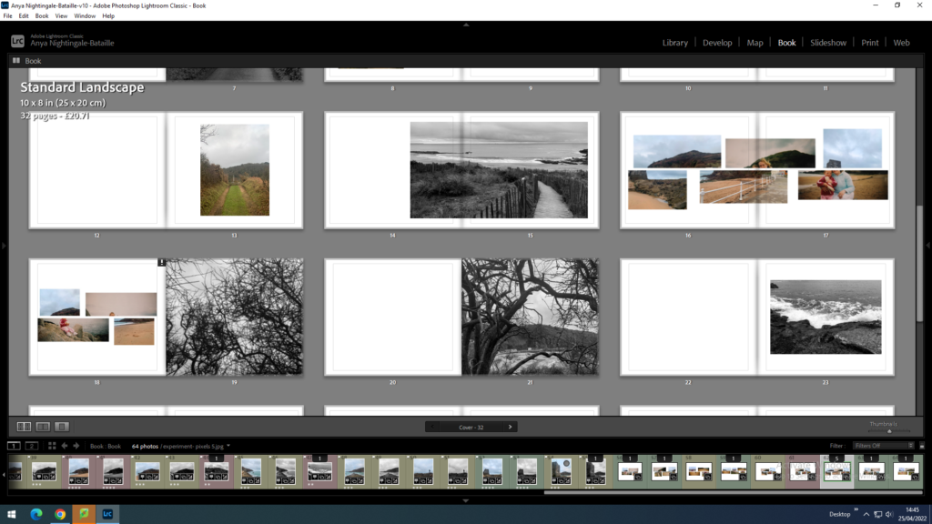
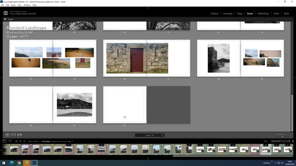
When making my photobook I want to make sure the images flow into each other. I will make sure they do this by looking for things in common between images such as things that are inside the image, colour or textures. I will also look for contrasting attributes such as composition and the main subject of the image.
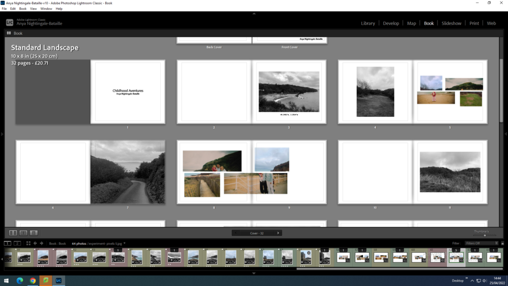
For the layout I want to create a balanced book which has double page spreads, singular images and pages with two individual images fitting the pages differently, some being full bleed and the rest with a white boarder.
Changing the page layouts:
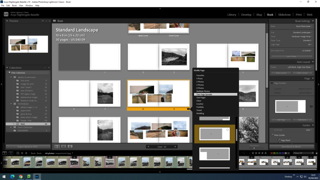
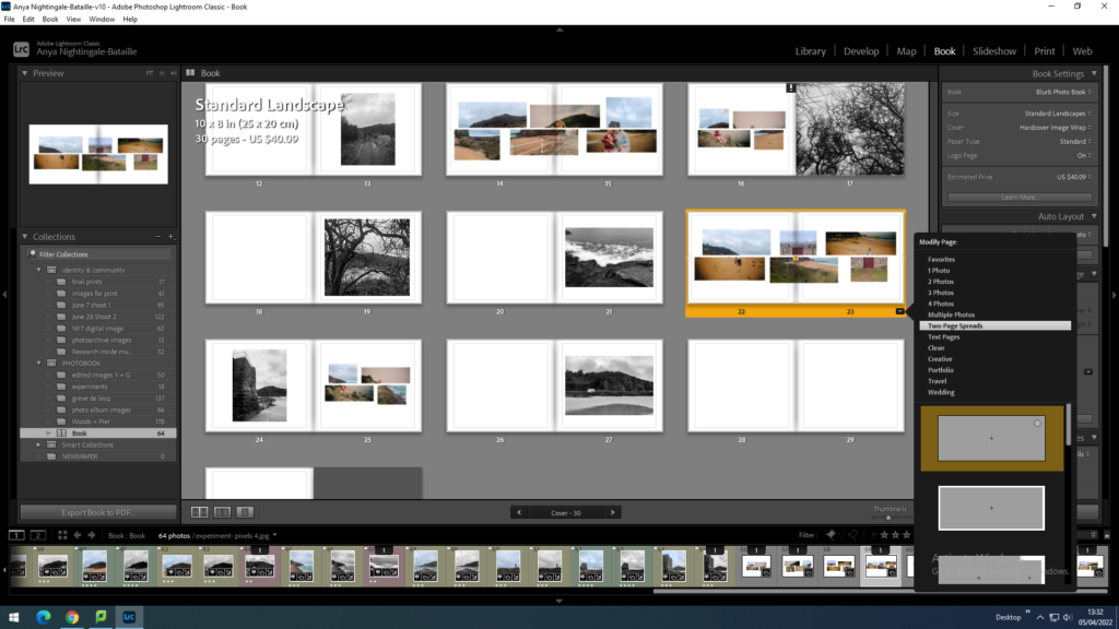
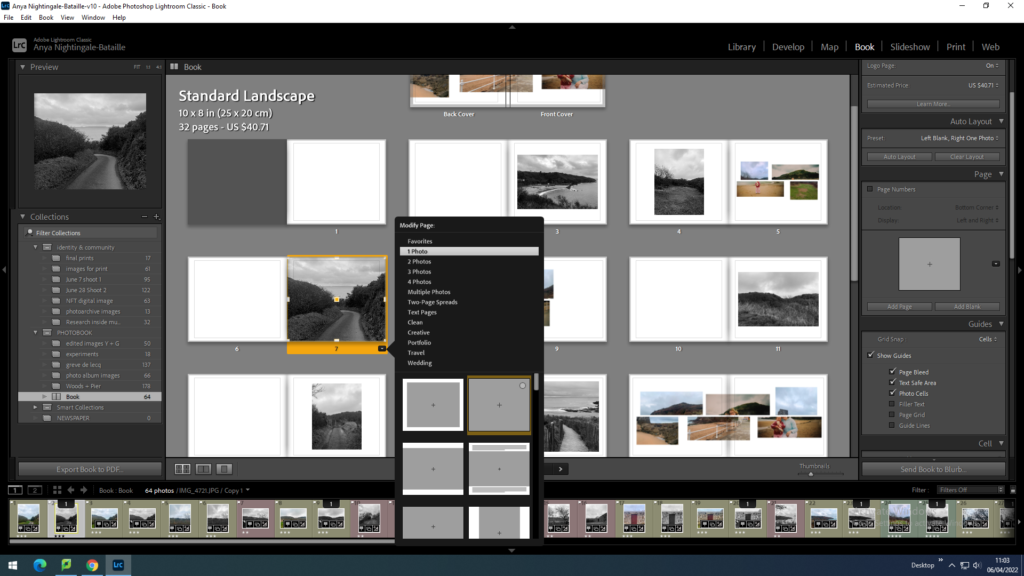
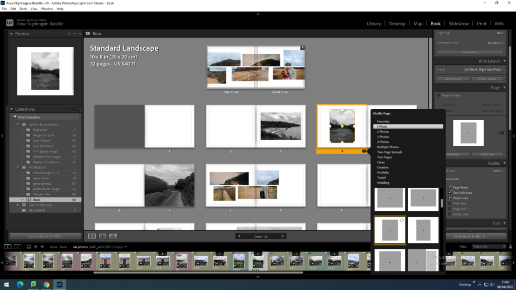
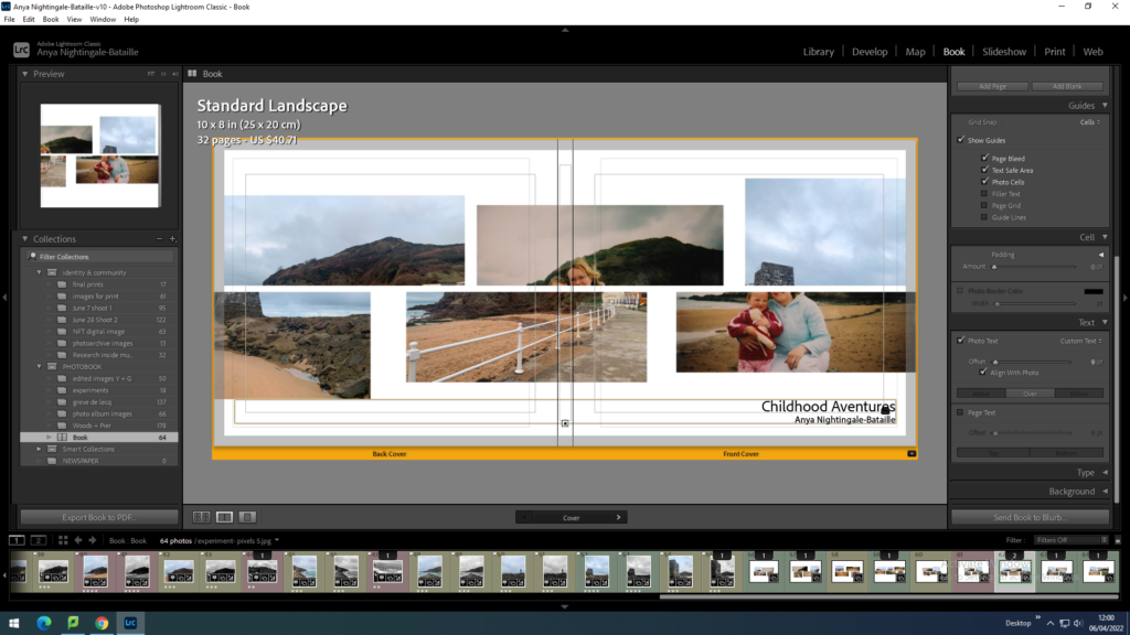
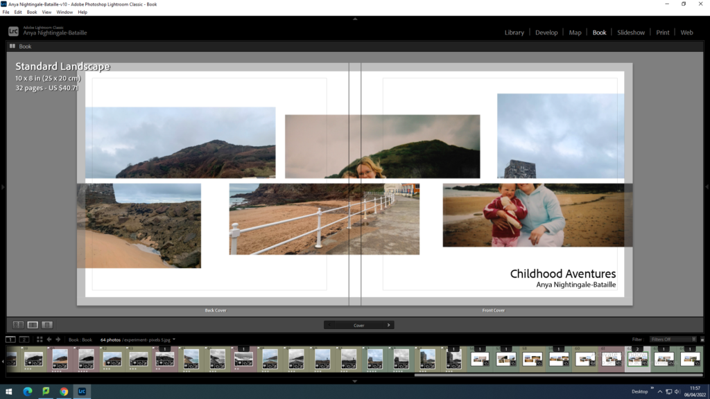
When constructing the front cover I wanted to make a wrap around cover meaning the image will follow onto the back cover too. I also wanted to have the cover image in the middle page of the photobook to link it together.
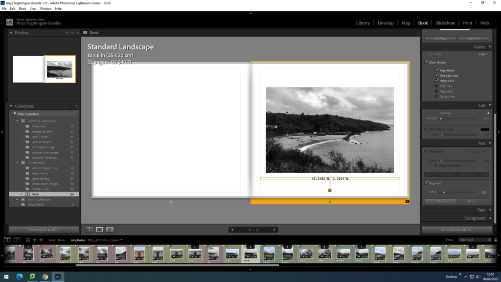
I added the title and my name to the front cover of the photobook. I also added the coordinates of Greve de Lecq to the first page under the image which sets the scene for the entire book.
Adding texts:
Final book layout
Evaluation
I think that the photobook looks how I intended it to with different layouts and a clear flow of images throughout that link to each other. The images used are clear of where they are but also have different views of Greve De Lecq that is not photographed as much. The black and white contrasting the colour images works well with the look and message because the colour images include the old images from my childhood and black and white is often linked to the idea of old times which links to my project about re-visiting places I visited as a child and seeing things from a different perspective.
