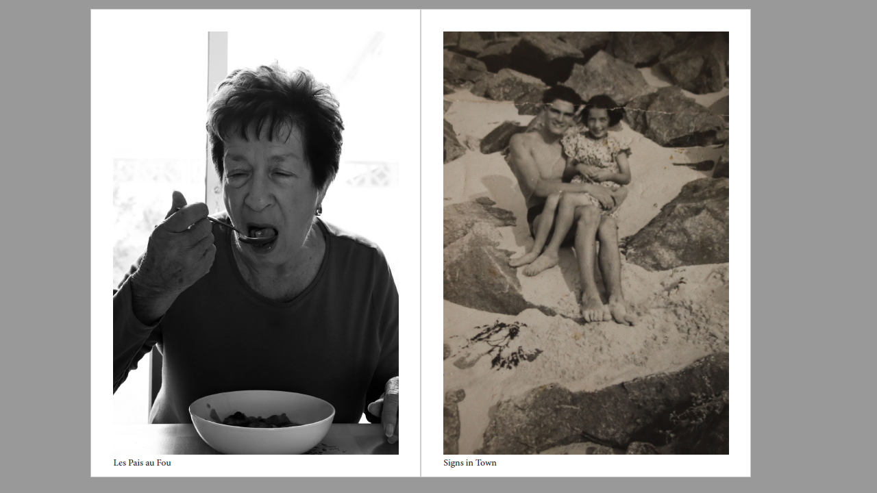
In the end I had two zines focusing on similar themes of family. Some images were shared by both zines as they followed the same central device of community but both end results being very different.


This was the first zine I made. Although I liked how the candid photos provided an intimate insight into family dynamics at family gatherings and dinners, I felt that they seemed to clumsy and not as put together as I would have liked as I also refrained from editing them too much which made the photos seem too amateur, which perhaps considering the nature and context of the concept of the zine is on brand. To amend this I remade the zine with more polished images and more of a plan on how to layout the images to create better syntagma.


Out of both zines this is my favourite. It is more polished than the first and is realistically better for a newspaper than a zine which is why I used it as my draft for our class island identity newspaper project. This project has been beneficial in educating me on my own family’s history, as well as teaching me new skills on media software such as InDesign.
