I took all the photos that I wanted to use and, that I have already edited from the photoshoots in Photoshop, then I created a new collection set in Lightroom Classic to import the photos into.
The editing process is shown on the photoshoots blog posts.
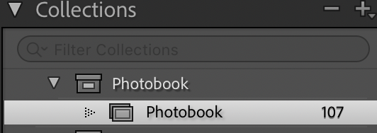
After importing the photos into the photo-book collection I used the “pick” and “reject” method using the “P” and “X” keys.
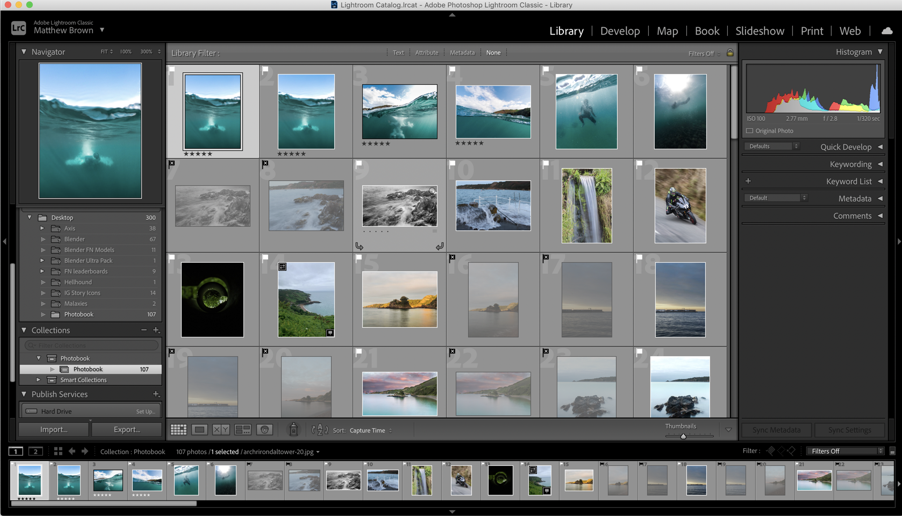
Next, I used the different colours to visualise what type of photo each image was, e.g. aerial (yellow), underwater (blue), hillclimb (green), etc.
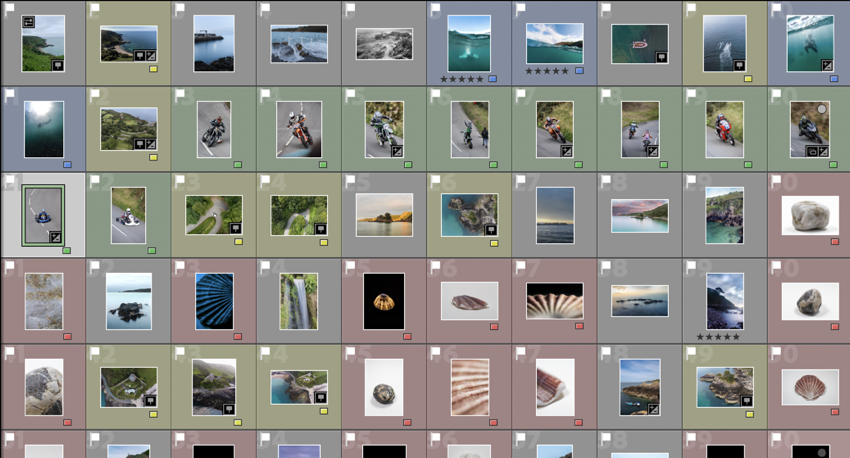
These are all of the images that I plan to use in the final book design.
My Book Specifications
Before I design the book I need to decide the specifications and think about the design.
This is information about how I will make the book and about the materials and requirements it needs.
How you want your book to look and feel.
Ideally, a hardback book would be nicer as it has a more genuine feel to it, and it lasts longer. However, it is more expensive compared to a regular, softback book.
Paper and ink
The premium paper will make the images better and isn’t to different to the standard paper, price wise.
Format, size and orientation
I will use a normal A4 book. (8×10 in)
Binding and cover
I will use a hardcover with an image wrap, with Mohawk proPhoto Pearl 140#.
Title
Bouley Bay
Design and layout
- Single image full bleed
- Single page image with white borders
- Double page full bleed
- Double page spread
- Double page single image.
Editing and sequencing
I will try and create a zoom effect with the images and use certain objects to carry to flow of the book.
Images and text
There won’t be any text except for the essay at the back of the book.
2. Produce a mood-board of design ideas for inspiration. Look at BLURB online book making website, photo books from photographers or see previous books produced by Hautlieu students on the table in class.
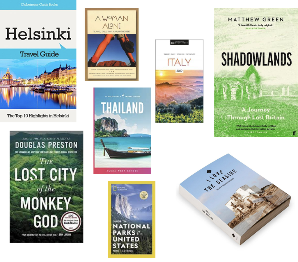
This is a mood board of books that have inspired my design process. I found them Blurb’s bookshop page on their website.
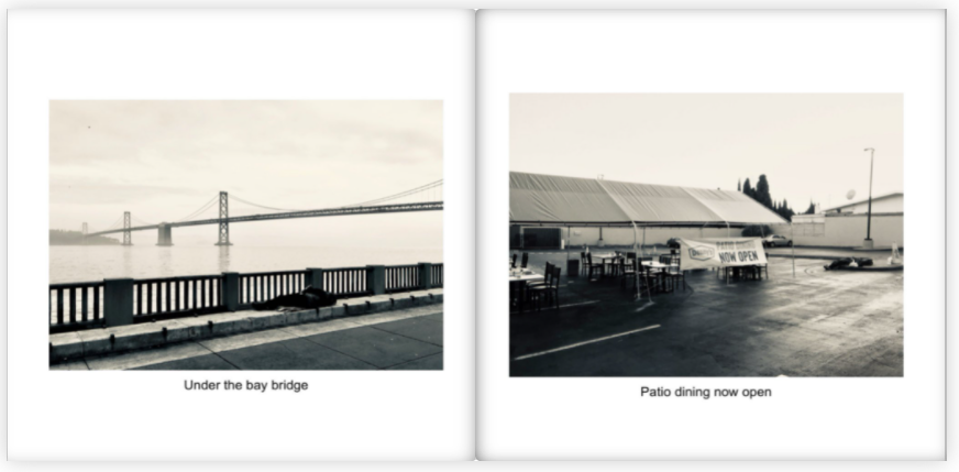
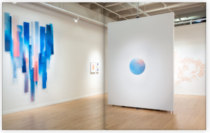
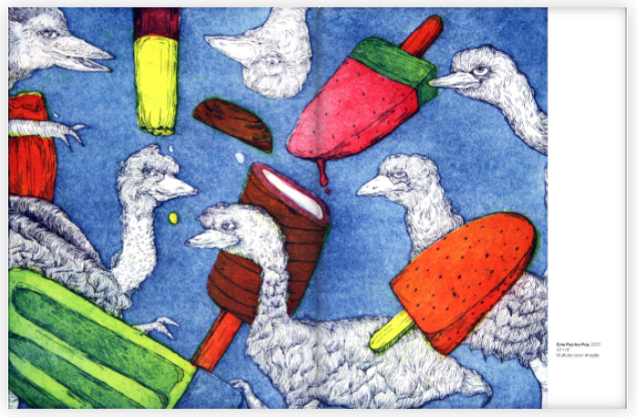
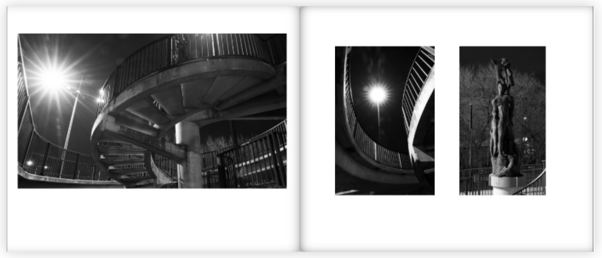
I mostly chose these pages from these books as the display the images in a unique way that engages with the user.
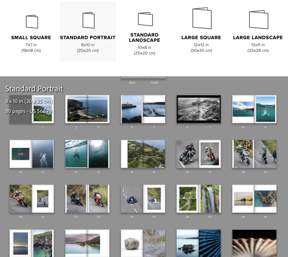
I reorganised the order which I the photos would be in, in the photo-book. Then I clicked the book button where I chose to use the “Standard Portrait” book, then put the images in the order that looked the best.
I made use of the page setups to arrange the images to create an interesting composition. I mainly had two images on the double page spread and, they either linked with each other or were opposites.
To create a narrative I tried to create a zoom effect. I started by getting images that where of a general overview of the bay, then I focused on the pier, the water coming on to the pier, then I focused on the long exposure shots of the water on the rocks, which transitions to underwater photos. Once there is a brief introduction to the bay there it focuses on the hill climb which brings in the areas “character”. After I introduce the bay again by using the greens hill and the green around the waterfall in the bay, which shifts the focus back to the bays features like the L’Islet, and the heritage site. I often compared close ups of objects and match colours to create an interesting concept and presentation.
My favourite images are these below, I chose them as they are unique and interesting, and showcase great camera skills.
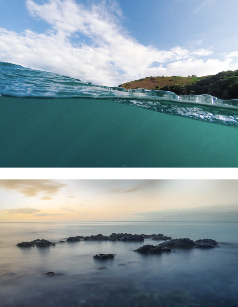
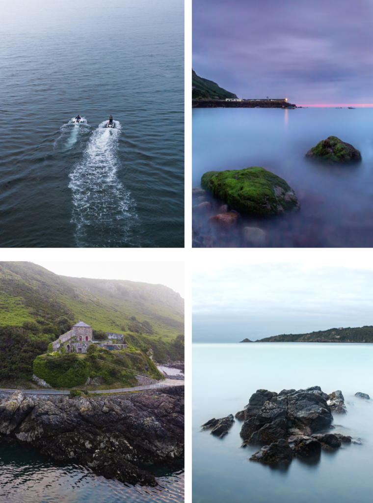
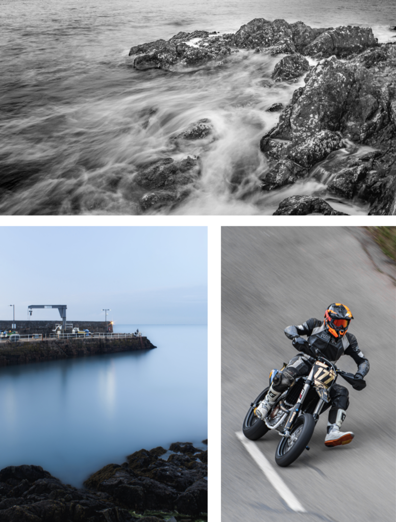
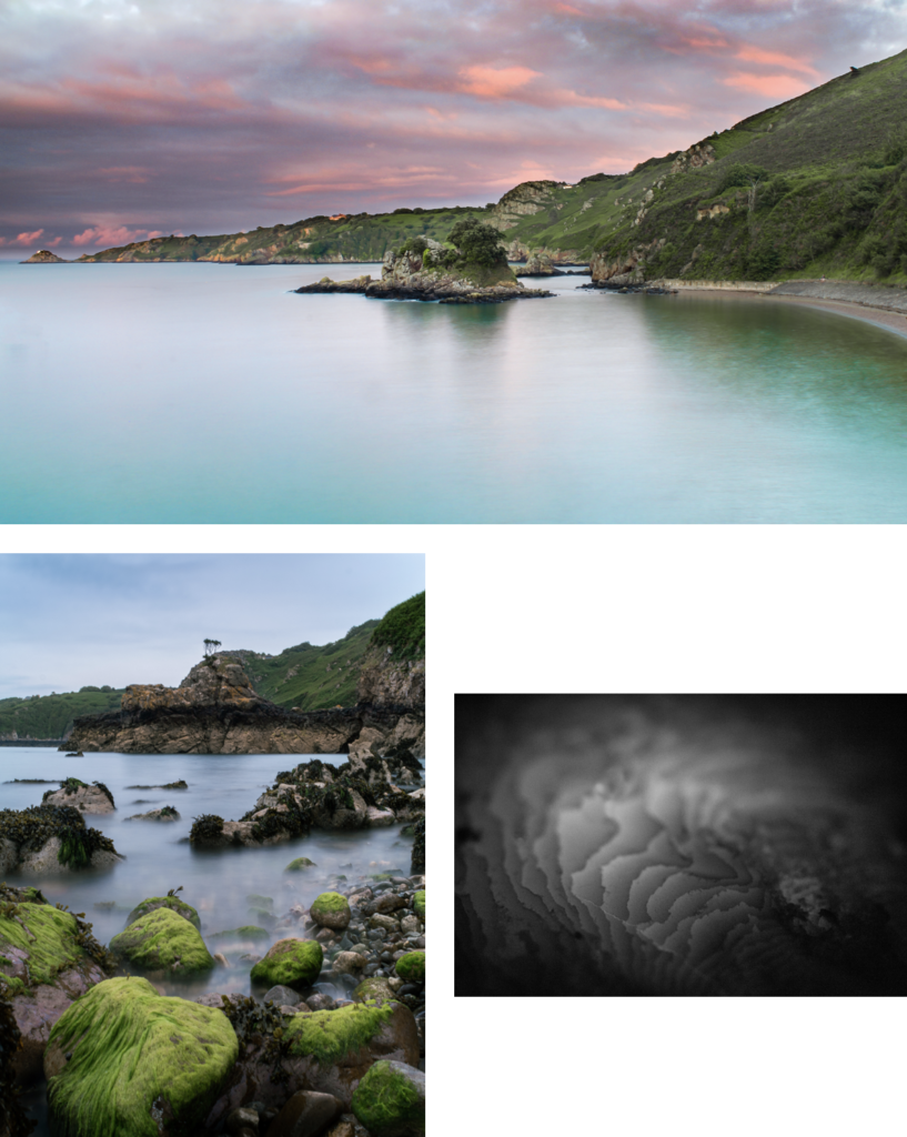
I achieved my goal, which was to accurately recorded a physical location through images. These images above are the strongest images I have taken which help showcase the environment that is Bouley Bay.
Unfortunately, I deleted all of my work, which meant the pervious book design disappeared. Therefore, I had to redesign the book, which isn’t necessarily a bad thing a I had too many images. This helped me reduce the size of the book and add more contrast, as the pervious version was more illustrative.
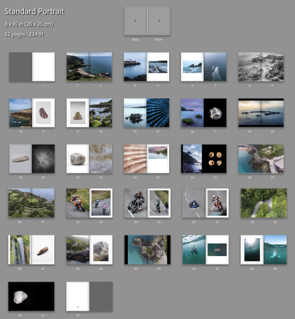
This result is more balanced as there is a greater mix of content and I feel that I have used a wide range of different page layouts to shift the viewers focus whilst looking a different images. My favourite pages are, 8-9, 14-15, 16-17, and 32-33.
I decided to add 2 more images. One would be a 2 page spread using full bleed and, then second would be a single image, which would probably be on a double page however, it would only use up one page. I plan to do this to a few more images earlier on in the book and eliminate some of my weaker images.
Creating the book cover
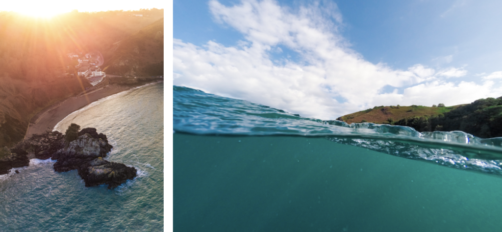
I decided to use an image that had a wide view of the bay which clearly shows where and what the book is about. I am using the image from the extra photoshoot I made with my drone. For the back of the book I wanted to have an abstract image where it is hard to work out where it was taken. Doing this makes lets the front cover have all of the attention. These are the two images I’m using for the book cover:
I needed to create a design for the spine, I thought I would blend the edges of the two images above to create a fade between them. After, I would add text to the front cover, and the spine.
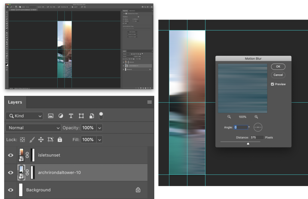
I used layer masks to create a gradient fade on the edges that meet with the opposite image. Then used motion blur to smoothen the transition between the images. This will look better when I add the text to the image.
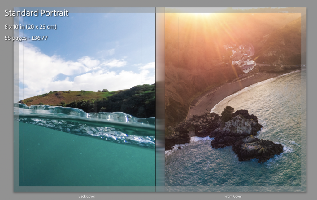
This is what it looks like without the text on the cover. As you can see it looks good, even without the text.
I have created a mood-board to gather inspiration on books about places to decide how to design a title. These are the designs that inspired me:
Using Photoshop I have made 3 different front cover designs, and just needed to chose with one I wanted to use. I used clipping and laying masks to help me design and layout my process throughout creating the cover.
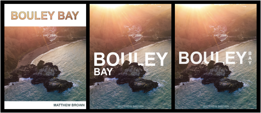
I decided to use the design on the right as it is more ascetically pleasing than the others as, it is on one line and incorporates a more complex design whilst keeping it simple.
The design on the right I used blending option on the text such as, stroke and inner shadow, with a clipping mask of the image to let the image show through.
For the two similar covers, I used a layer mask to remove parts of the text to show the island, to give the simple look and complex effect.
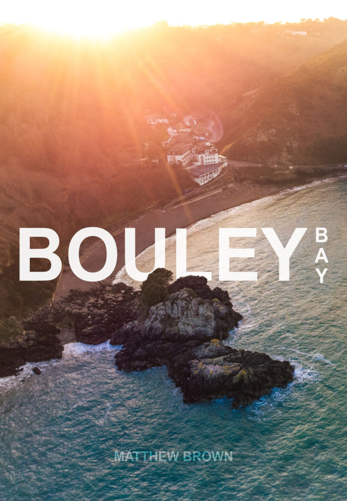
I changed a few small details, such as moving the text up a bit. Then I added and replaced the image on the front of my book and on the spine to see what it looked like completed.
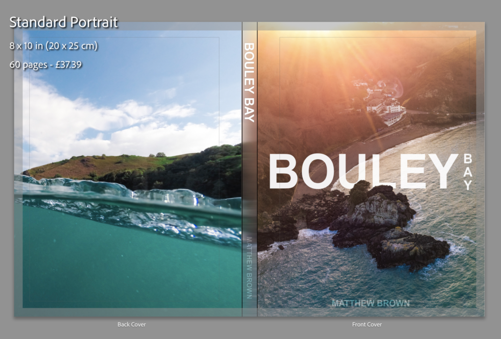
I added the text to the 2 files (spine image and front cover image) that I had open in Photoshop to my the final cover images.
I quickly made an inside cover page with just text on, which is the same as on the front cover.
Final design and layout
These are the rest of the pages in my photo book:
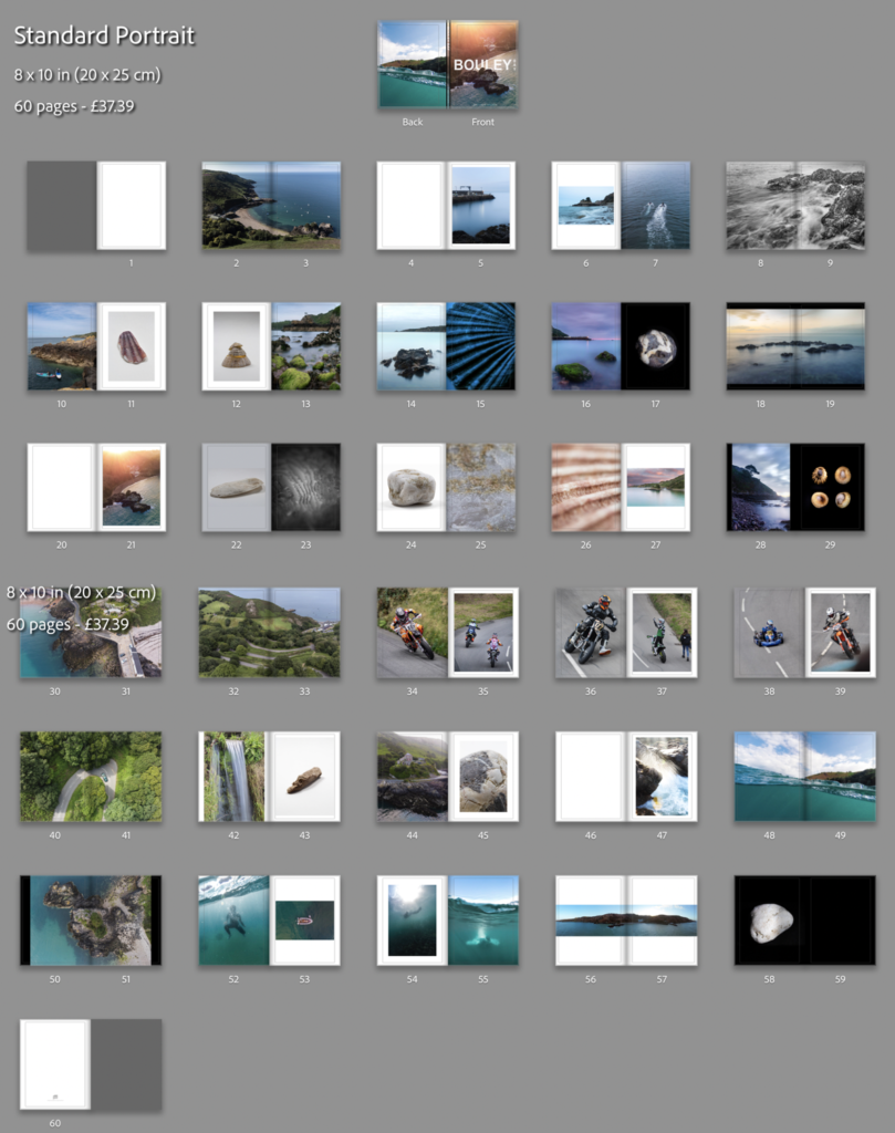
After some last small adjustments, I’ve come to my final presentation of the photo book. I removed the panorama of the bay, the image on page 54 (underwater image), and I change the bleed on some of the images to removed some of the borders, you can see the before (above) and after (below) of the changes that I’ve done.
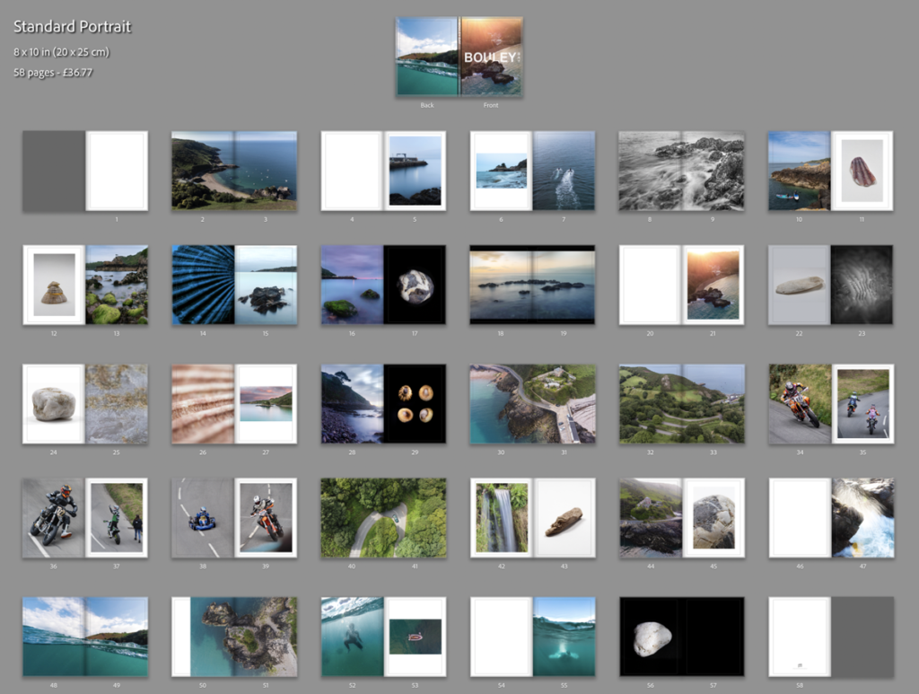
I feel that this is the best design and layout, as it includes multiple double page spreads, 2 image layouts with borders, full bleed pages and single page spreads. I decide not to add my essay into the back of the book as I feel that it would ruin the “professional” look.
