For this project i have decided to create a photobook relating to Jersey Identity involving seascapes. Firstly i will be designing my photobook in Adobe Lightroom. I will be aiming to include roughly 50-80 images of Jerseys coastal areas, bays, and out to oceans horizons etc. My photoshoots will be based around the west coast of Jersey during the hours of dusk and dawn and occasionally midday depending on the light source.
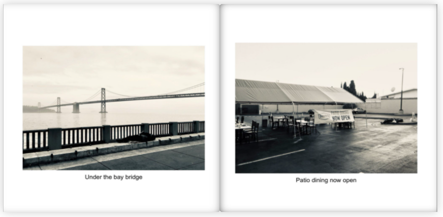
During the rainy days of march, i took a quick photoshoot midday in a range of areas down st ouens bay. Firstly i will use these images to create a draft photobook to inspire my ideas when completing my final shoots. I opened these image in lightroom and took a few of the best ones to make up a book…
With the tided being out when the photoshoot took place, I will be needing to revisit the same areas with the tide being in to capture more detailed images of seascapes. I then selected the best images I wanted to edit in “develop” and put them in a separate folder to use when finishing of the final book.
here is a final look at how the final layout of my photobook will look like…
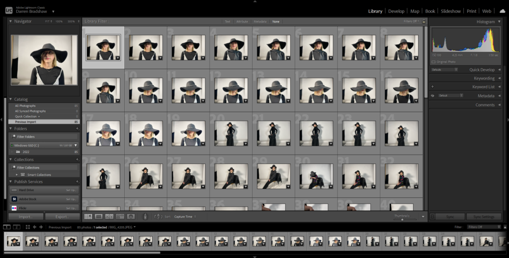
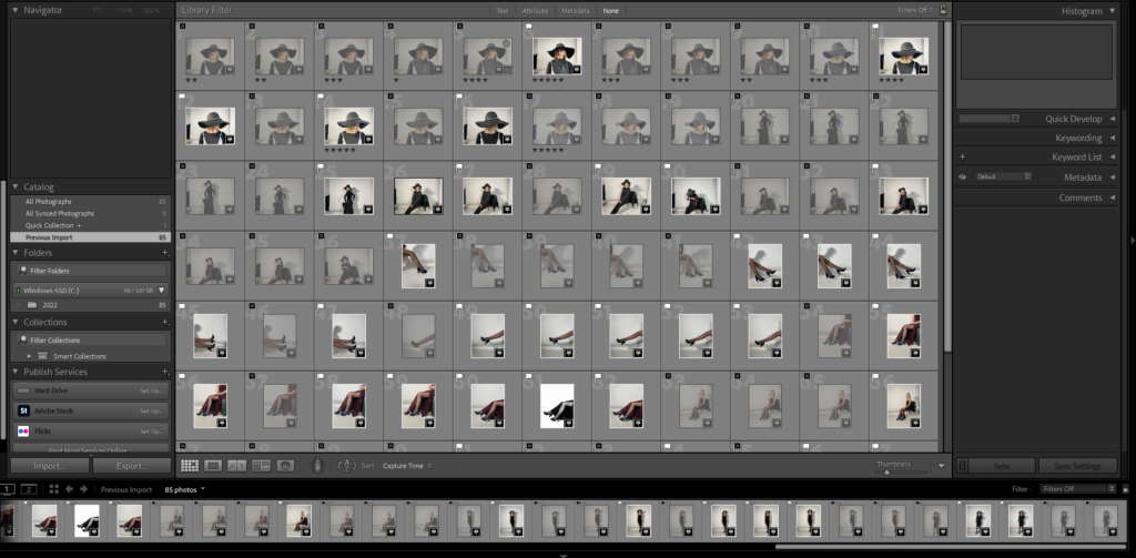
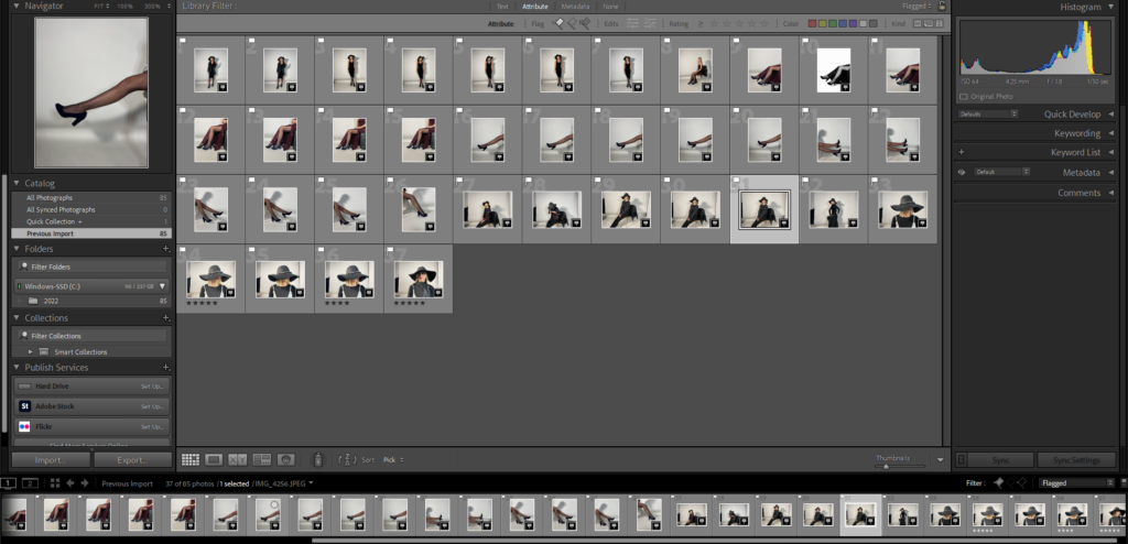
I started my editing process by importing my photos into Lightroom.
Once imported, I went through my images and flagged the ones I wanted to use in my photobook.
Editing process, images inspired by Guy Bourdin
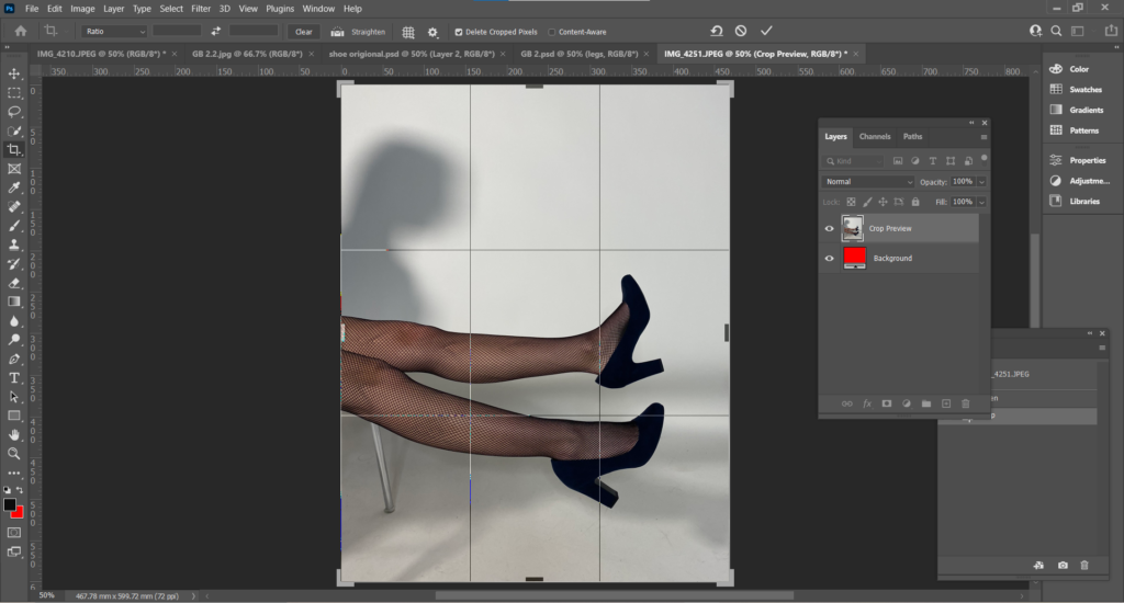
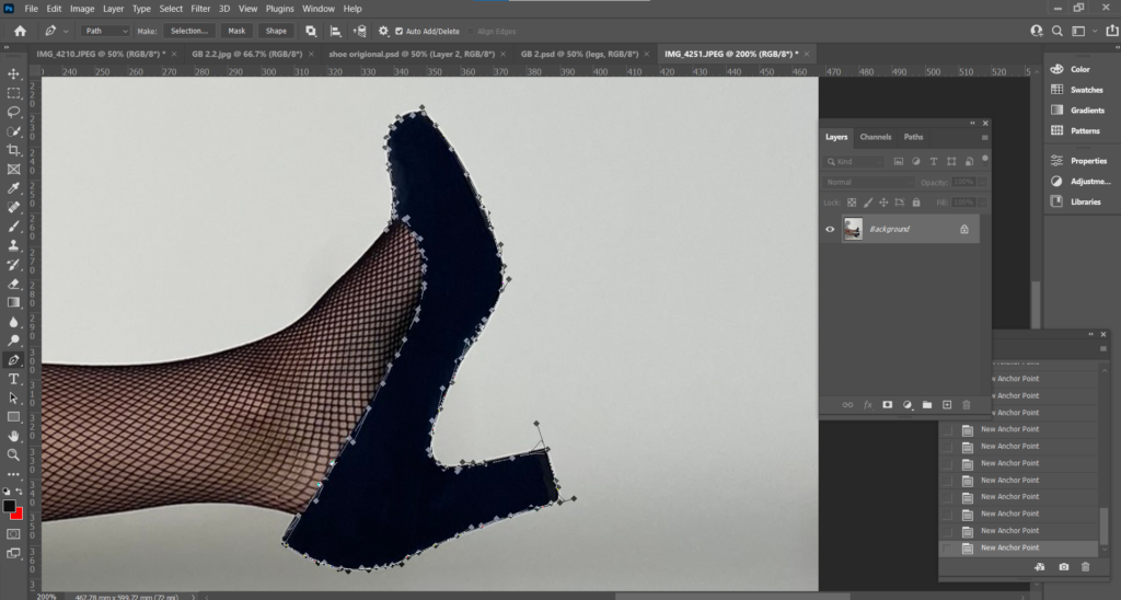
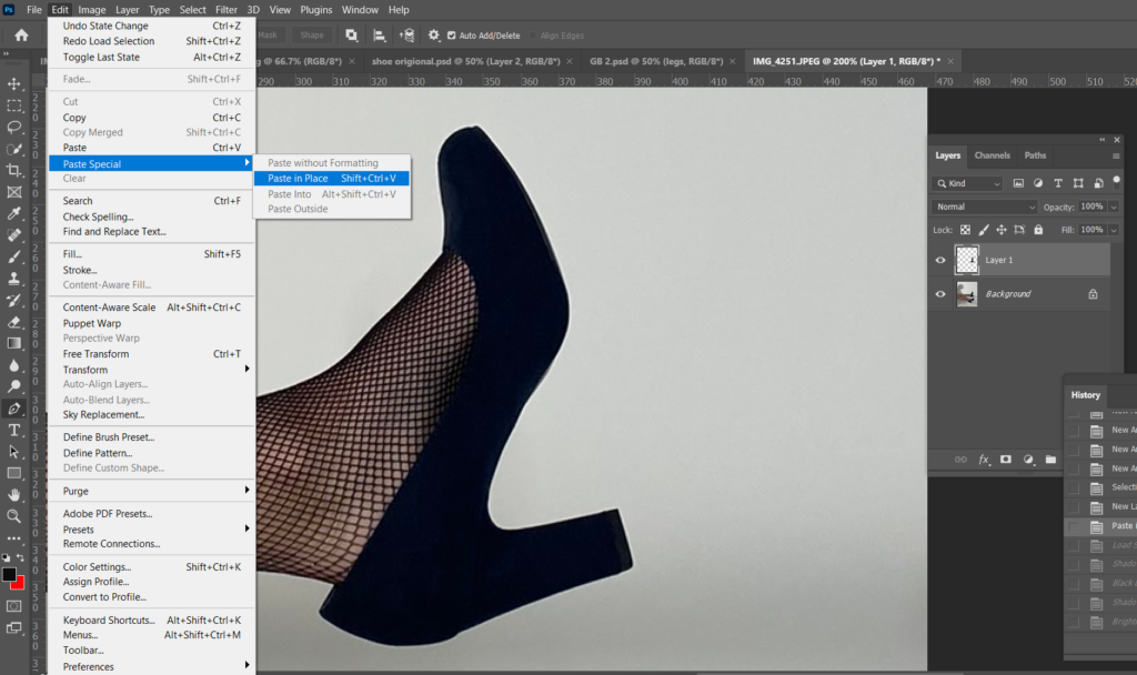
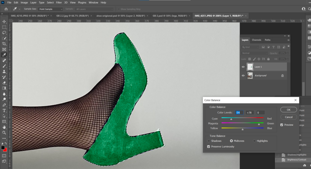
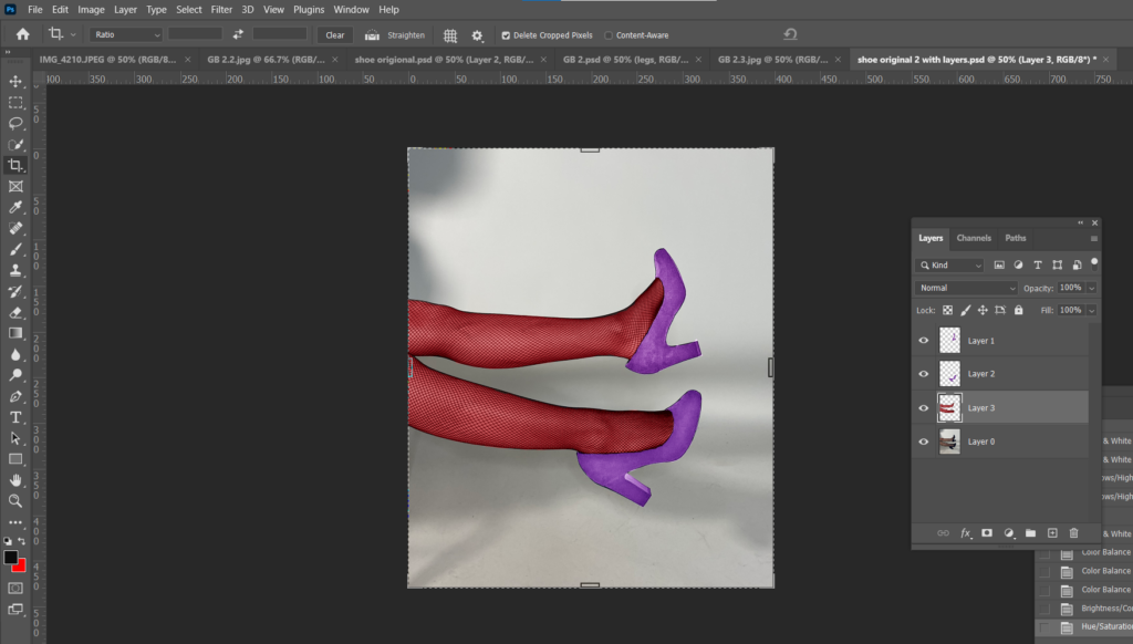
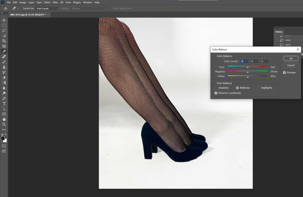
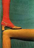
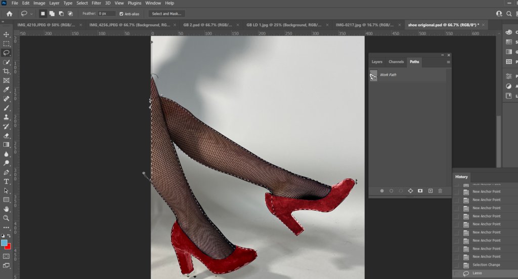
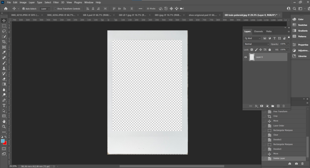
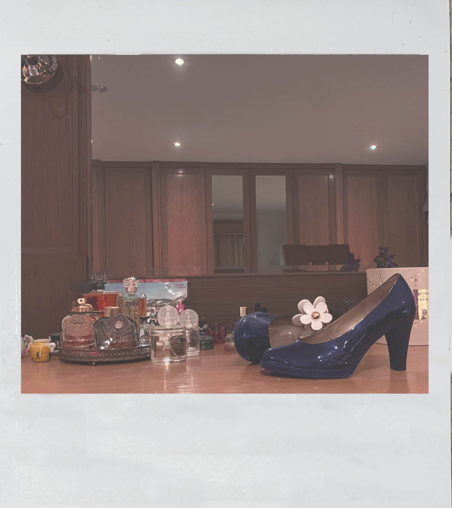
For my first image, I opened it up in Photoshop and cropped and adjusted it to how I wanted. My aim was to change the colour of the shoe to match Bourdin’s images. To do this, I used the Pen Tool and carefully cut out around the shoe.
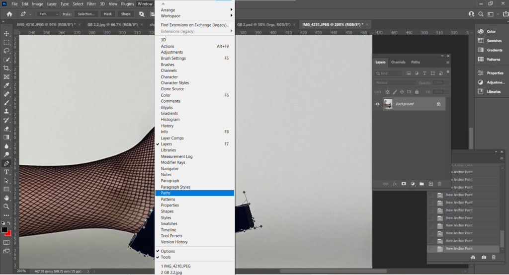
After I outlined the shoe with the Pen Tool, I went up to the menu, under Window and selected Paths.
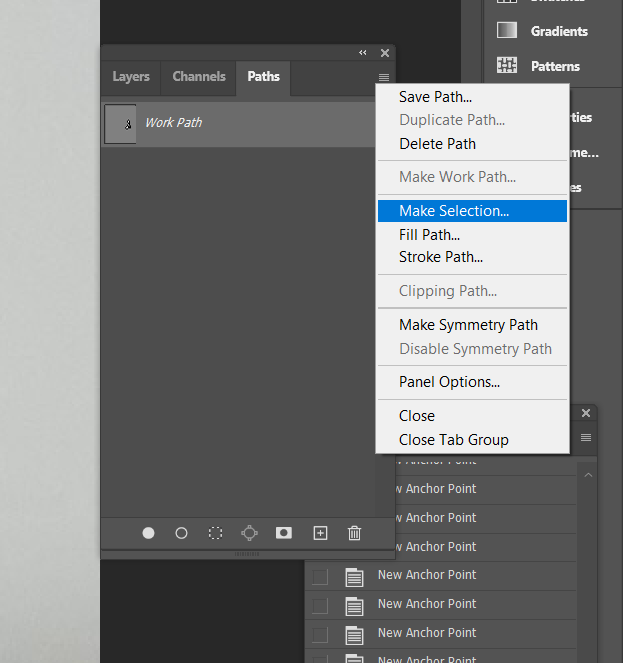
Within Paths, I selected Make Selection under the 3 small lines, this converts an outline drawn by the Pen Tool, to a dotted outline.
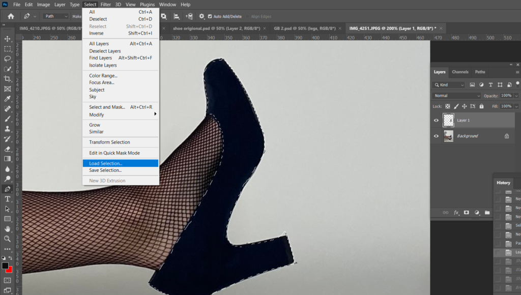
After this, I then selected Edit, Paste Special, Paste in Place onto a new layer so when I changed the colour of the shoe, the background is not effected.
I then selected Load Selection to select the area I want to edit individually.
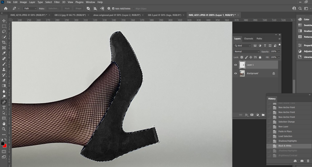
Before changing the colour of the shoe, I adjusted the Brightness, Shadows and Highlights to make the shoe lighter so the colour will turn out more pigmented.
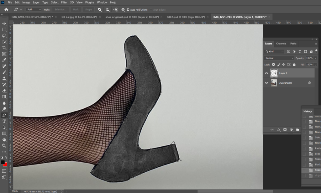
To change the colour I adjusted the Colour Balance.
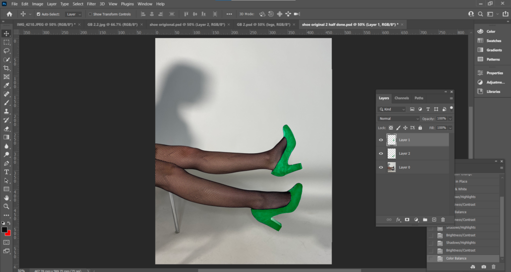
I used the same process for the legs.
I saved my first edit as a PSD so it saves with all the layers so I can go back and change the colour without having to cut out the shoes again.
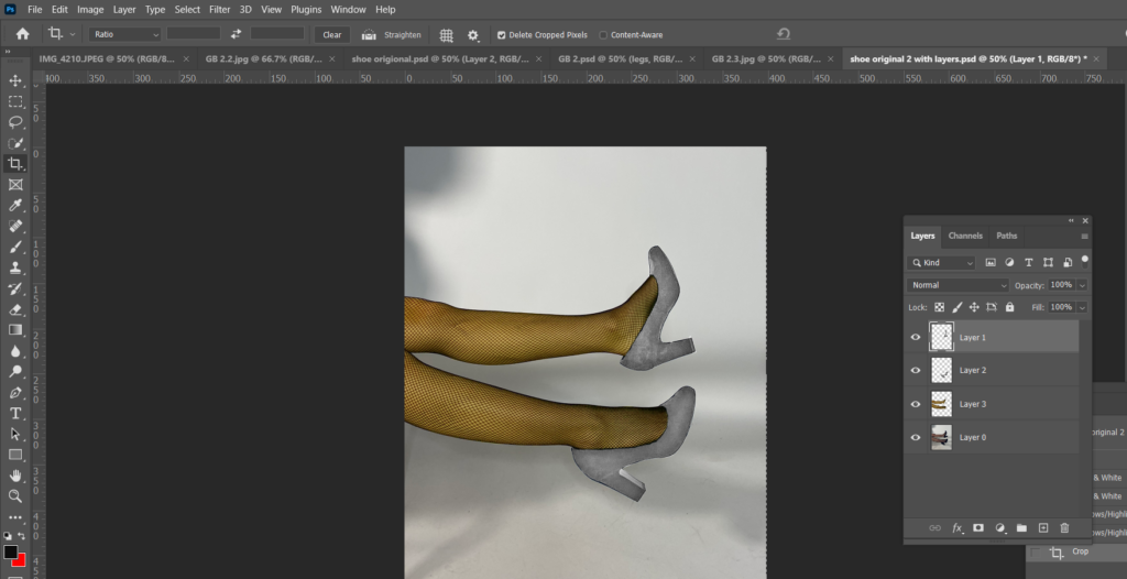
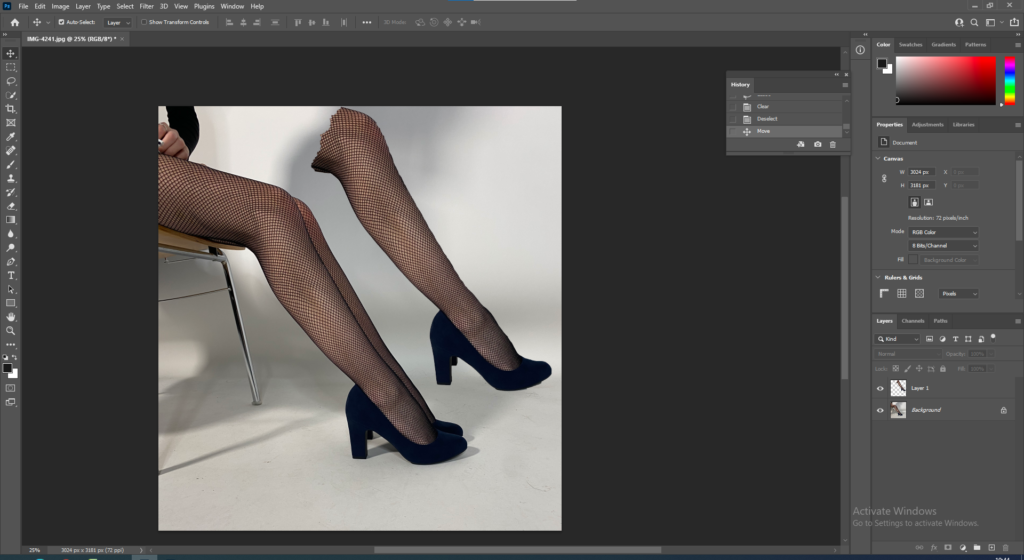
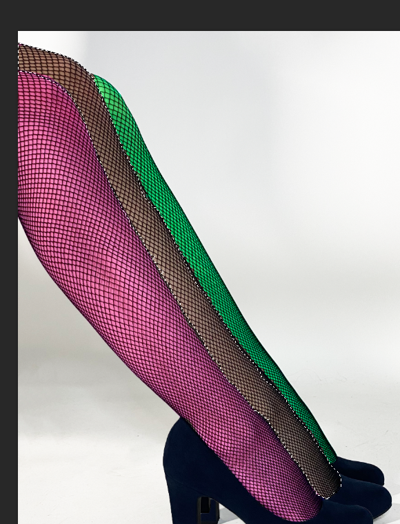
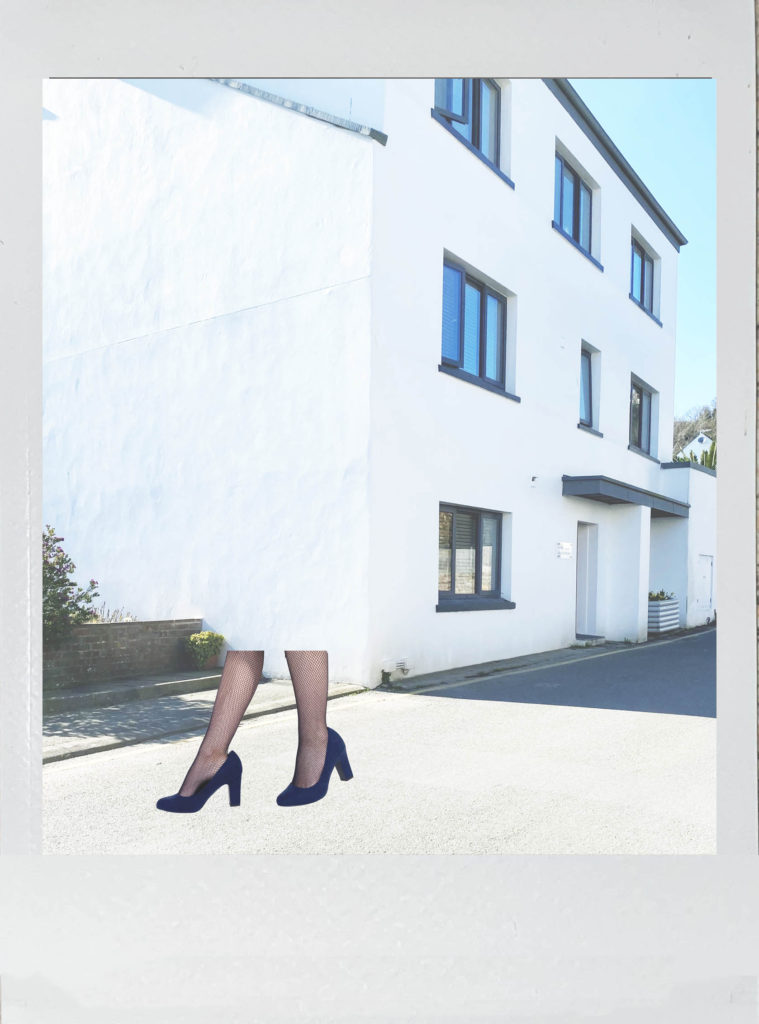
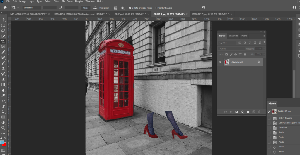
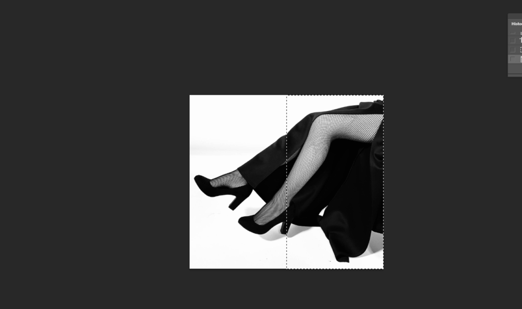
This next edit I needed 3 legs instead of 2 to match my edit to one of Bourdin’s photographs. To start, I used the Quick Selection Tool to select the leg and I cut and pasted it onto a new layer.
I then positioned it to where I wanted it to be.
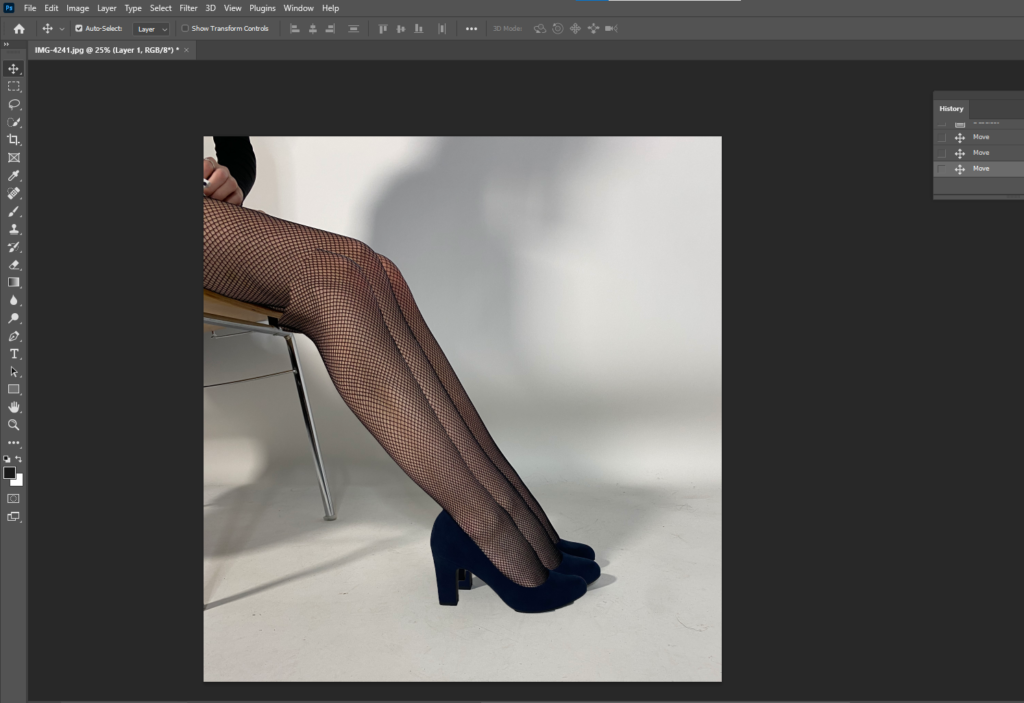
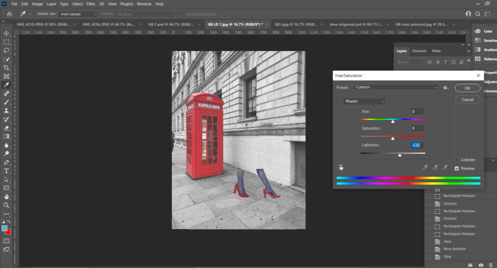
I used the Quick Selection Tool to select the background, then adjusted the brightness to make it brighter, but only the background.
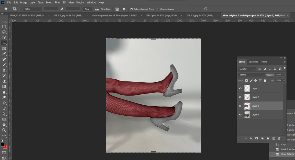
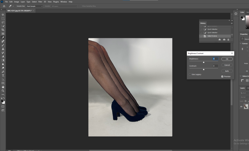
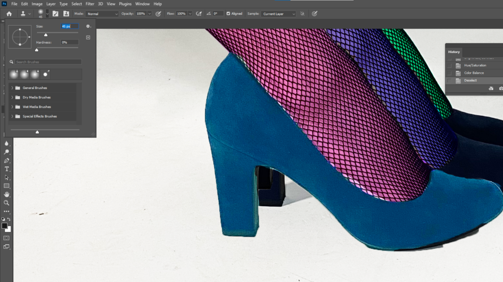
Then again I used the Quick Selection Tool to select the leg I wanted to change the colour of. Went up to Image, Adjustments, Colour Balance and changed the colours of all 3 legs.
Finally I used either the Spot Healing Tool or the Clone Stamp to clean up around the shoes.
Final Edits inspired by Bourdin
Analysis
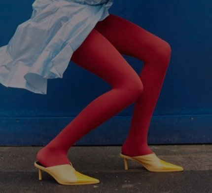
Bourdin explored with a lot of vibrant colours in his work for Charles Jourdan. Jourdan and Bourdin produced a large amount of work on shoe advertisements, I liked the range of bright colours throughout these images and decided to take inspiration and produce a version of my own. Both mine and Bourdin’s images have solid blocks of basic colour instead of pastel or deeper colours for example. The images are eye-catching and don’t require too much thought. They are very positive images but don’t have much narrative, however the 3- legged images to create a sense of curiosity.
Inspiration for the above edits – Guy Bourdin
Bourdin Polariods
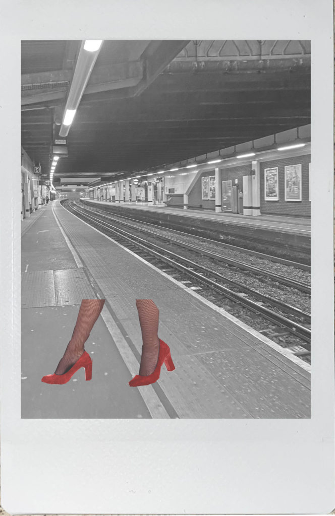
Edits Inspired by Bourdin’s Polaroids
Polaroid Editing Process
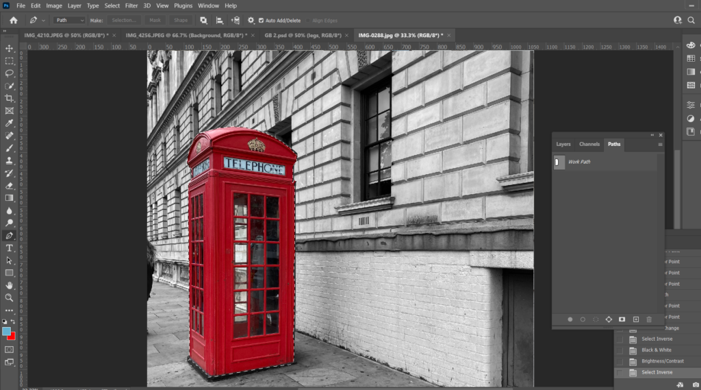
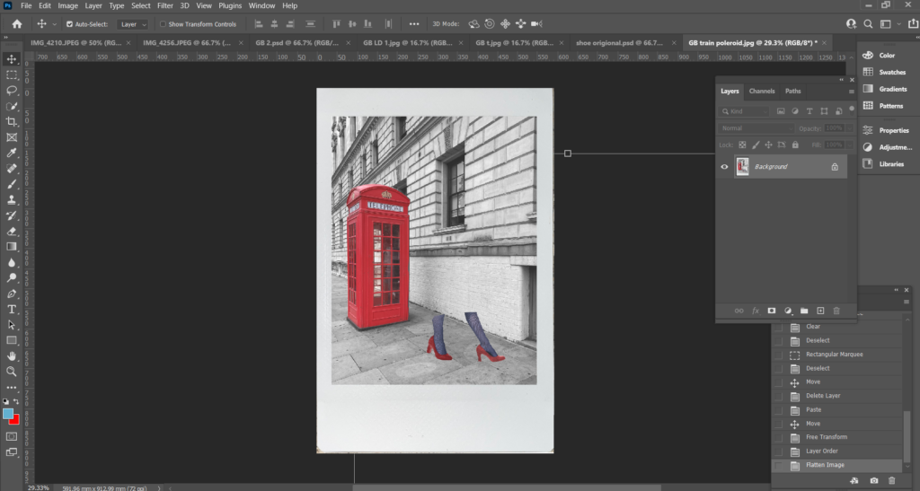
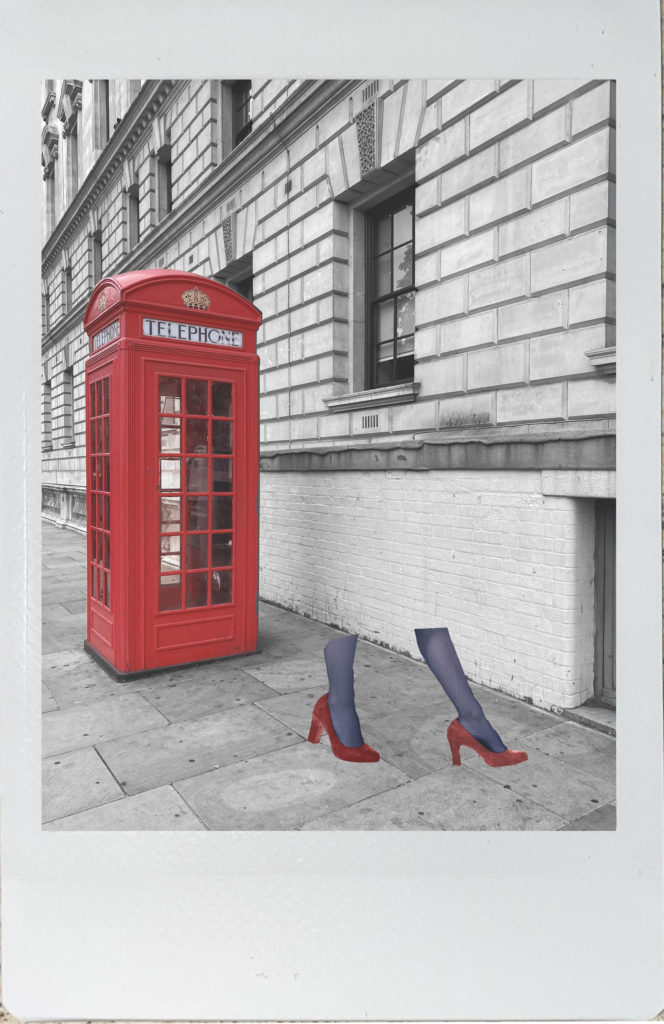
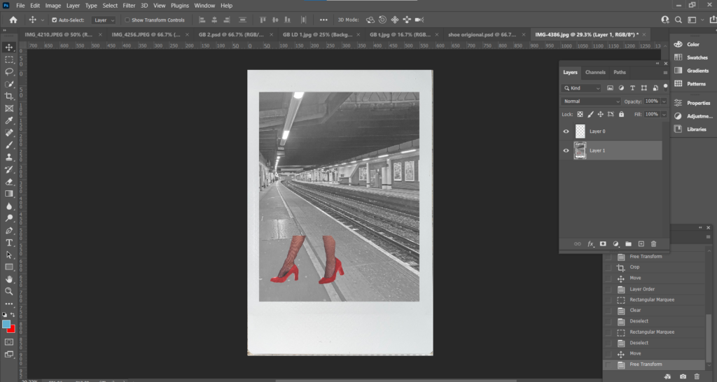
First I opened up my background image and used the Pen Tool to cut out the telephone box, once the box was cut out I went up to the menu and pressed Select, Inverse so everything but the telephone box was selected and changed the background to black and white and adjusted the brightness and contrast.
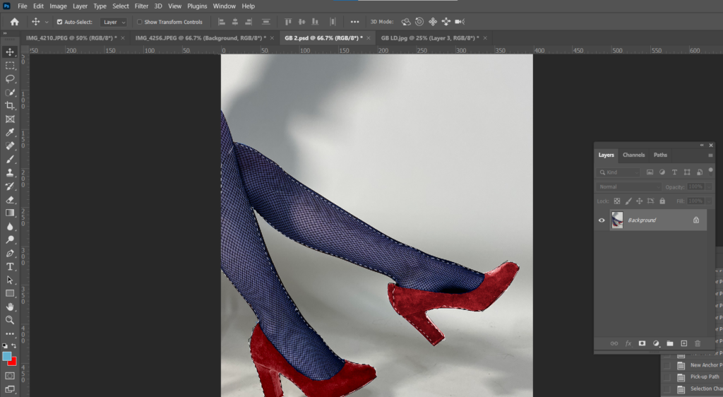
I opened up an image I had previously edited and used the Pen Tool to cut out the legs and cut and pasted it onto my background and adjusted them into the position I wanted by using either Edit, Transform, Scale or Edit, Transform, Rotate.
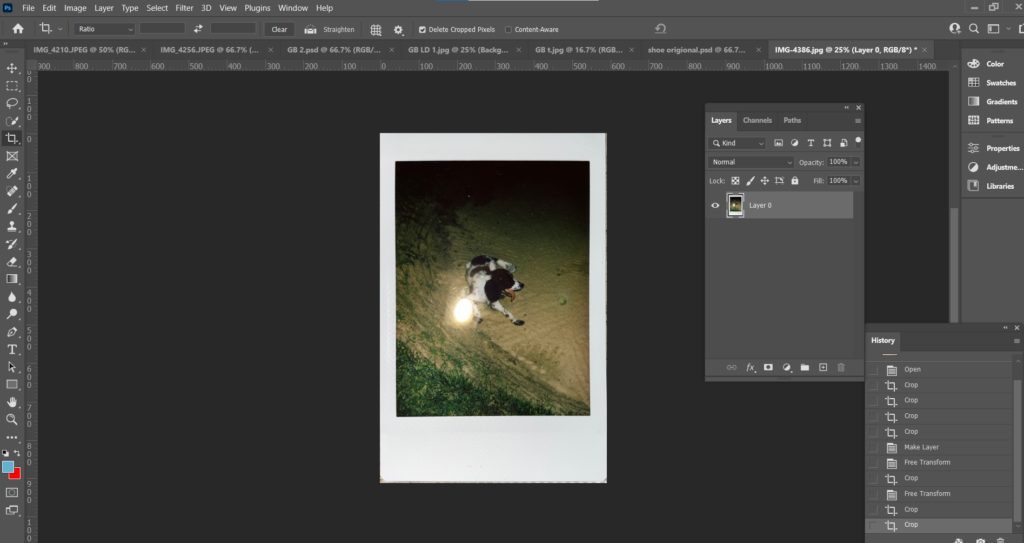
I then opened an image I had taken of a polaroid picture I had at home, I used the Rectangular Marquee Tool to cut out the image within the polaroid, cut and pasted my edited image onto my background, put my edited image on the bottom later and on top placed the polaroid frame.
I then repeated this process again for a second image.
Analysis
What I like most about my polaroid images is the worn/ old fashioned effect they have. The photographs are edited to match Bourdin’s images which are faded with a slight coloured tint on top. I think polaroid photos are more gripping than just an ordinary photograph, they have more texture and character about them.
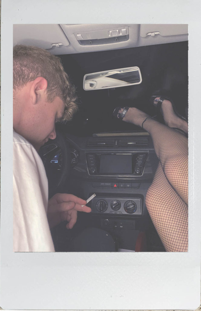
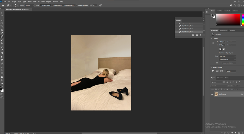
One of my final images had things in the background that I didn’t want in my image, to remove the canvases on the wall I used both the Spot Healing Tool and the Clone Stamp.
After the canvases had been removed I used the Quick Selection Tool, selected the background and adjusted the brightness to make it brighter.
Final Edits
Analysis
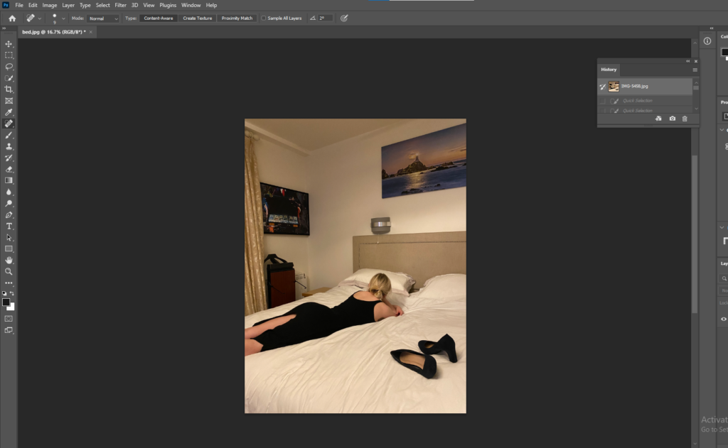
What I love most about black and white photographs is there is no colour to distract you from the structure and depth of the image. Black and white images are a good way of capturing dark shadows and bright highlights. These images have the greatest sense of narrative compared to the others in my photobook, however these images can be interpreted in several ways and have a strong sense of curiosity, for example, the worn dress and heels on the bed, make you wonder where the woman had been that night and did the night end good or badly. The idea that the shoes and dress are both black could be telling us that the night ended badly as black is seen as a fearful, negative shade. The black and white also create deep emotion, the woman on the bed in the first image for example, lays there looking lost, however you can’t see her face so your mind will make up a story about how she may be feeling.
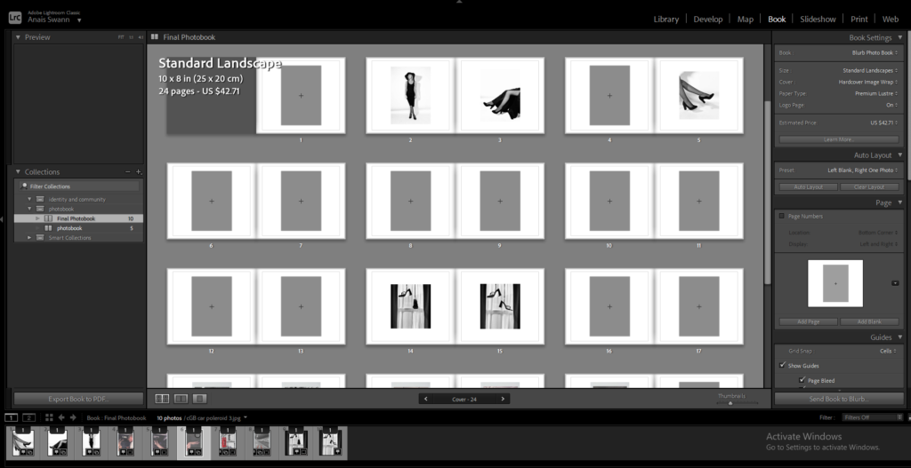
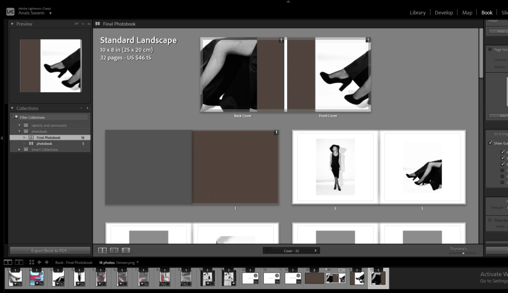
Photobook Process in Lightroom
First I imported my edits into Lightroom.
Selected book
Began adjusting where I wanted my images
Titles
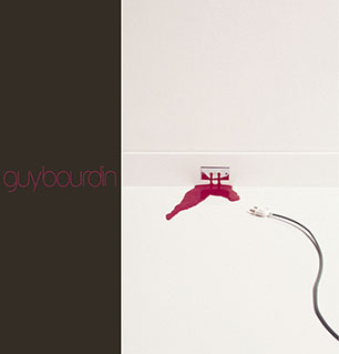
My titles in my photobook are inspired, again, by Charlotte Cotton’s book on Guy Bourdin.
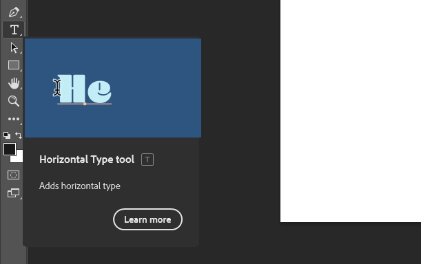
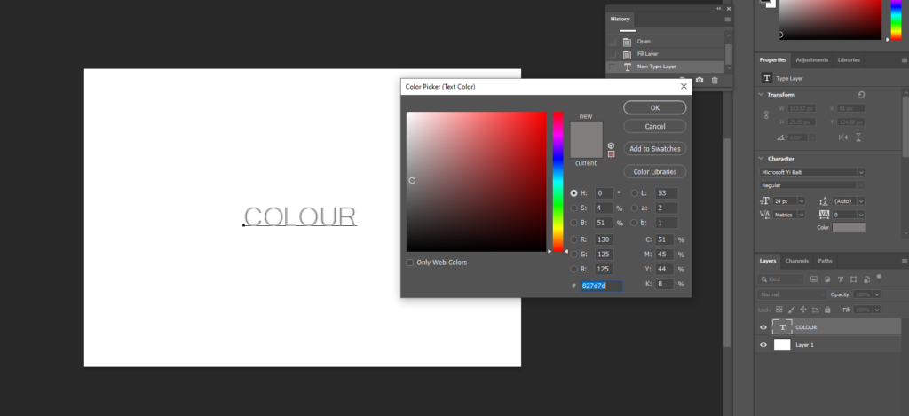
I started by opening a blank white document and selecting the Horizontal Type Tool and deciding on a font and adjusting the colour to a dark beige to match the one used in Cotton’s book.
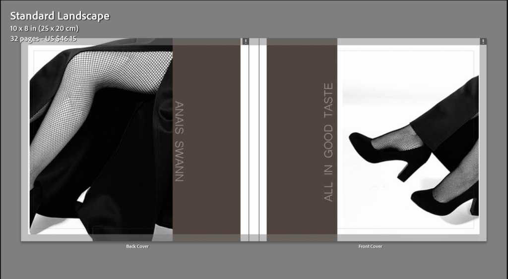
Front and Back Cover
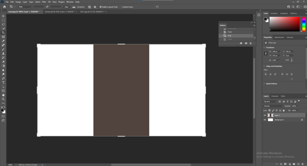
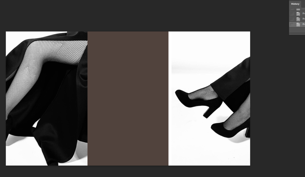
Cotton’s cover is one image that folds from the front cover around to the back. To start my front and back cover, I opened up a document in photoshop then layered the same brown colour I used for the first and last page in my book and placed it in the middle so it will fold from front to back.
Next I opened the image I wanted to use for my cover and cut out half the image and pasted it onto one side of the brown strip. I then Select, Inverse, Delete so the other half of the image was cut exactly, and pasted it onto the other side of the brown strip.
To add the text onto my front and back covers I used the Horizontal Type Tool.
Main Title
All in Good Taste
When the book is closed, the image will be folded around both pages.
For the first and last page in my book, it will be a solid brown colour like Cotton did.
Comparison
Final Layout
This blog post below includes an artist reference on Guy Bourdin and his impact on the fashion industry and social identities.
Altogether I am happy with the outcome of my personal study. I found the photographers I researched in relation to my study interesting which helped when writing my essay. Guy Bourdin, French artist and fashion photographer, influenced most of my work on the fashion industry and social identities. I found his work gripping and fun which inspired me when it came to taking my own photographs. The layout of my photobook is inspired my Charlotte Cotton’s book on Guy Bourdin, including the layout of the cover and inside pages. What I liked the most about Cotton’s layout is the simplicity of it, I like how the background is a pale white so there is no distraction from the photographs. I found the polaroid images fun to take and edit, as they aren’t an ordinary photo, they have a faded, old-fashioned look about them. Overall, I liked this project the most, mainly because of the freedom to do it on whatever you liked.
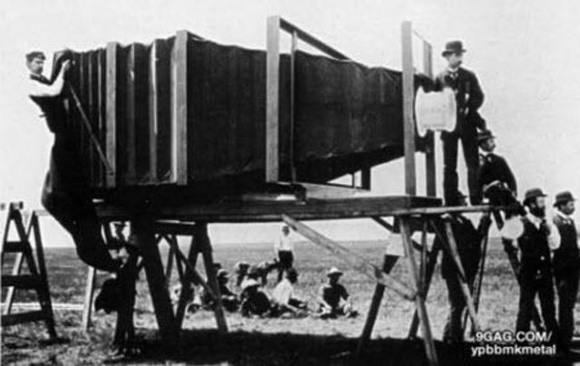
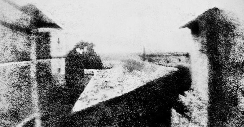
The word photography comes from the Greek words phos “light” and graphos “written” or “recorded”, so it is a writing with light or a recording made with light. The history of photography spans from the 19th to the 20th century, but has many antecedents in earlier times. It is one of the most revolutionary technologies that man has developed. Photography has made an impact on the sciences, the arts, and historical documentation. It also gave rise to other technologies, such as cinema, among others. The idea of capturing images and preserving them is something that humans have wanted since ancient times. It is what gave the appearance of painting, sculpture and, later, photography. There were old attempts to capture an image automatically, especially by means of the camera obscura principle, which is the same as that of photographic cameras. The camera obscura is a closed space, totally dark, in which light penetrates through an opening in one of its sides and projects an up side down image of what happens outside. This technique was known from the time of Aristotle or later from the Arab scholar Alhazén. From that work, scientists such as Giovanni Battista della Porta or Gerolamo Cardano experimented with the camera obscura in 1558. In the 16th century, the German Johann Zahn developed this technique in a wooden device, which was ready to become a camera. The first image obtained in history was made by the French scientist Nicephorus Niepce. He achieved results by prolonging exposure to light of pewter plates covered in bitumen, inside a dark room. The first image was in 1826 and took eight hours of exposure in broad daylight. In 1827 Niepce met Louis Daguerre and they signed a work agreement that left the latter with all the knowledge of Niepce’s photographic techniques after his death in 1833. Daguerre added to the mechanism a polished silver plate, on which the impressions, thus greatly reducing the exposure time. Later the daguerreotype appeared. This new technique allowed portraits to be taken, and was the best-known form of photography for a long time. However, other inventors were studying their own methods to obtained similar prints.
In the end I had two zines focusing on similar themes of family. Some images were shared by both zines as they followed the same central device of community but both end results being very different.
This was the first zine I made. Although I liked how the candid photos provided an intimate insight into family dynamics at family gatherings and dinners, I felt that they seemed to clumsy and not as put together as I would have liked as I also refrained from editing them too much which made the photos seem too amateur, which perhaps considering the nature and context of the concept of the zine is on brand. To amend this I remade the zine with more polished images and more of a plan on how to layout the images to create better syntagma.
Out of both zines this is my favourite. It is more polished than the first and is realistically better for a newspaper than a zine which is why I used it as my draft for our class island identity newspaper project. This project has been beneficial in educating me on my own family’s history, as well as teaching me new skills on media software such as InDesign.
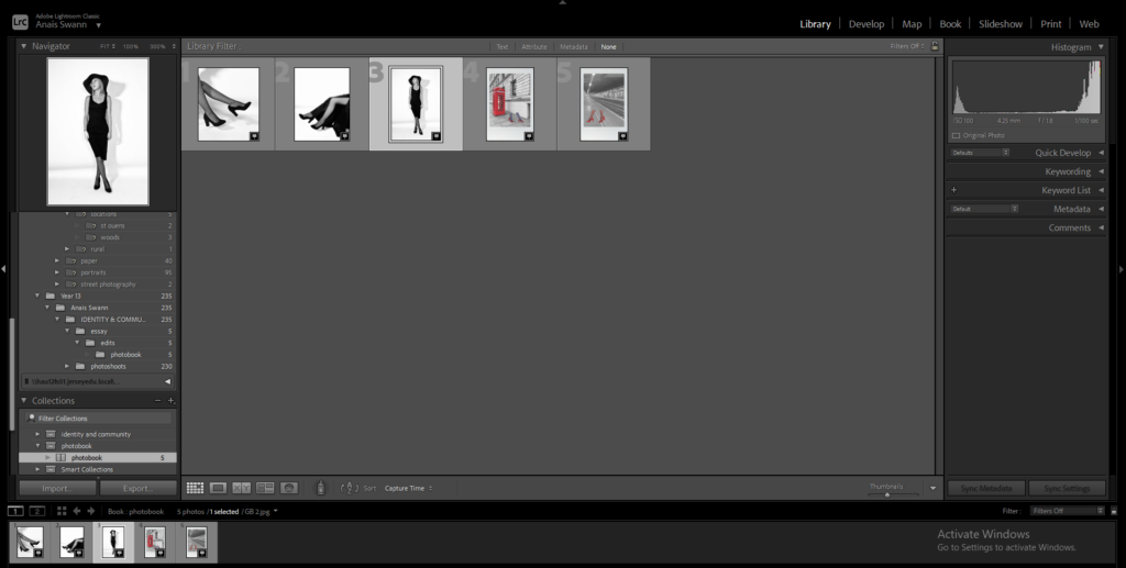
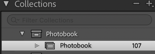
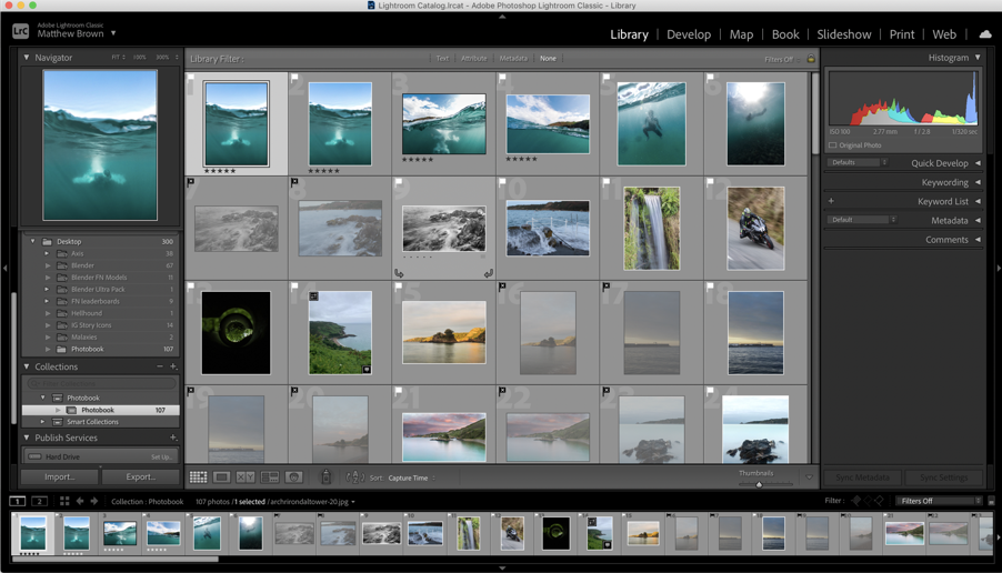
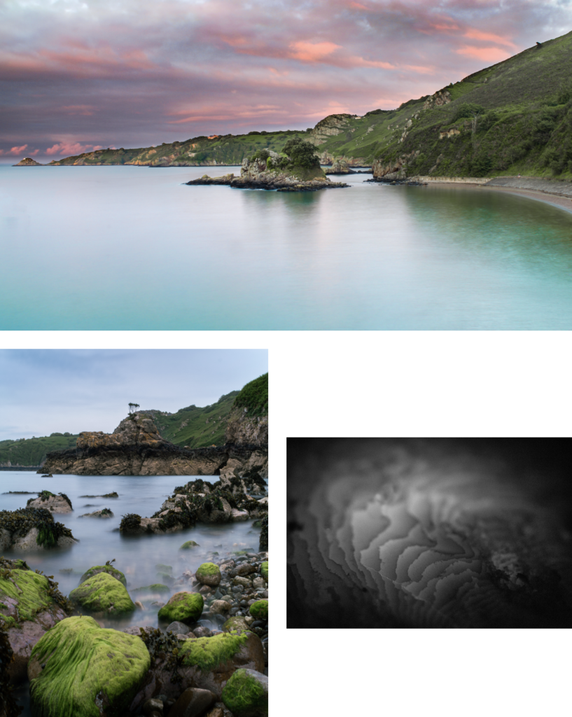
I took all the photos that I wanted to use and, that I have already edited from the photoshoots in Photoshop, then I created a new collection set in Lightroom Classic to import the photos into.
The editing process is shown on the photoshoots blog posts.
After importing the photos into the photo-book collection I used the “pick” and “reject” method using the “P” and “X” keys.
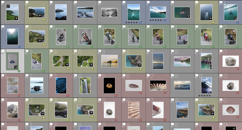
Next, I used the different colours to visualise what type of photo each image was, e.g. aerial (yellow), underwater (blue), hillclimb (green), etc.
These are all of the images that I plan to use in the final book design.
My Book Specifications
Before I design the book I need to decide the specifications and think about the design.
This is information about how I will make the book and about the materials and requirements it needs.
How you want your book to look and feel.
Ideally, a hardback book would be nicer as it has a more genuine feel to it, and it lasts longer. However, it is more expensive compared to a regular, softback book.
Paper and ink
The premium paper will make the images better and isn’t to different to the standard paper, price wise.
Format, size and orientation
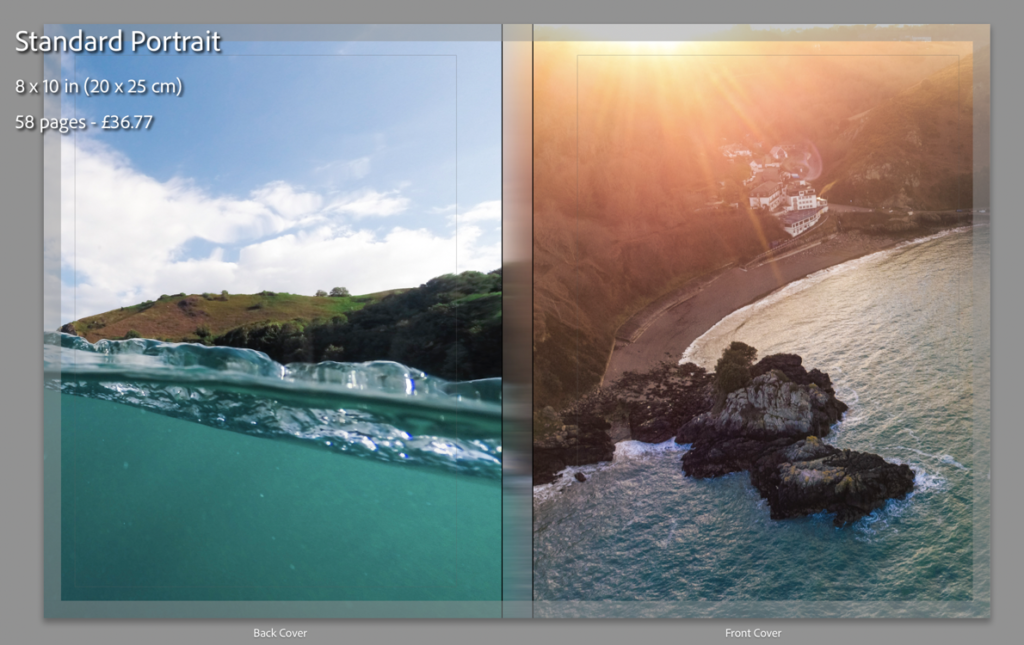
I will use a normal A4 book. (8×10 in)
Binding and cover
I will use a hardcover with an image wrap, with Mohawk proPhoto Pearl 140#.
Title
Bouley Bay
Design and layout
Single image full bleed
Single page image with white borders
Double page full bleed
Double page spread
Double page single image.
Editing and sequencing
I will try and create a zoom effect with the images and use certain objects to carry to flow of the book.
Images and text
There won’t be any text except for the essay at the back of the book.
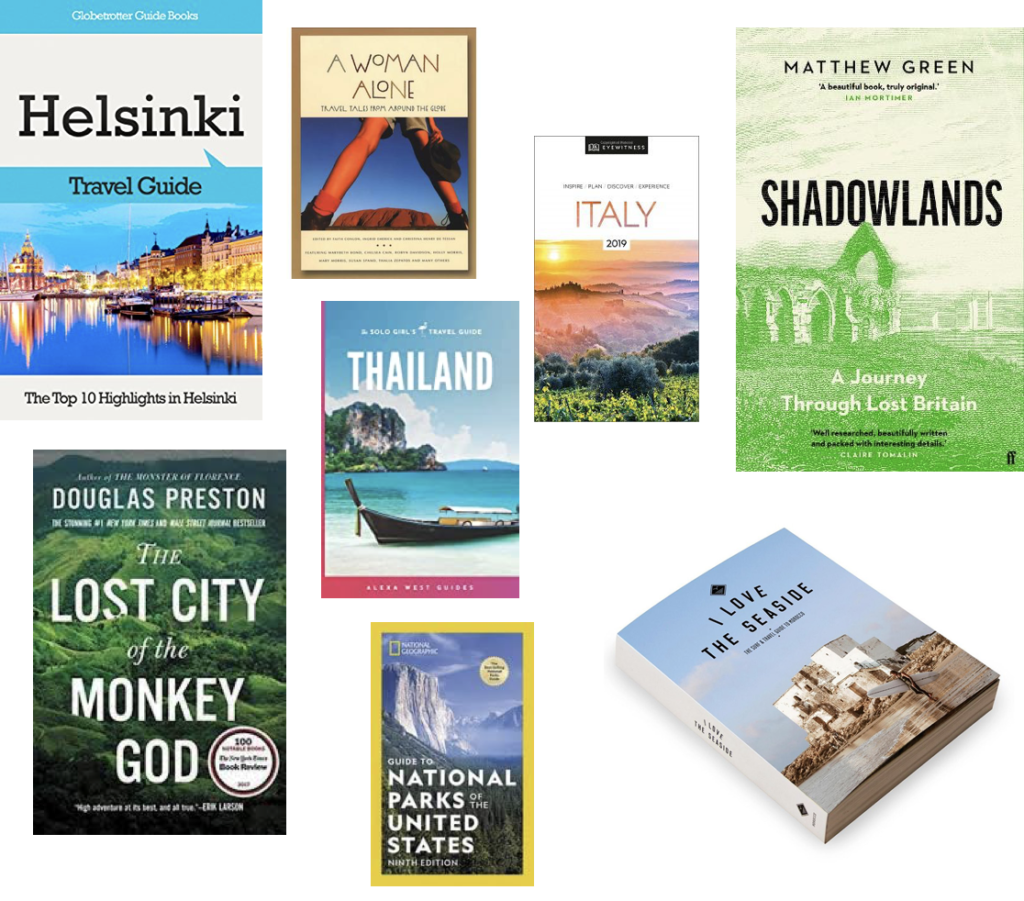
2. Produce a mood-board of design ideas for inspiration. Look atBLURB online book making website, photo books from photographers or see previous books produced by Hautlieu students on the table in class.
This is a mood board of books that have inspired my design process. I found them Blurb’s bookshop page on their website.
I mostly chose these pages from these books as the display the images in a unique way that engages with the user.
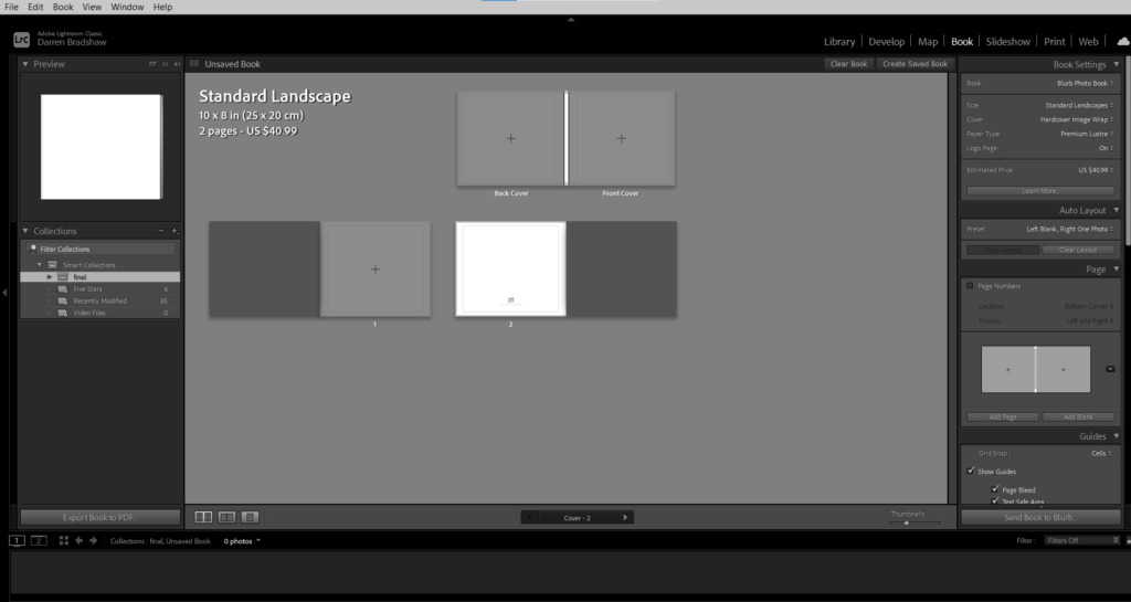
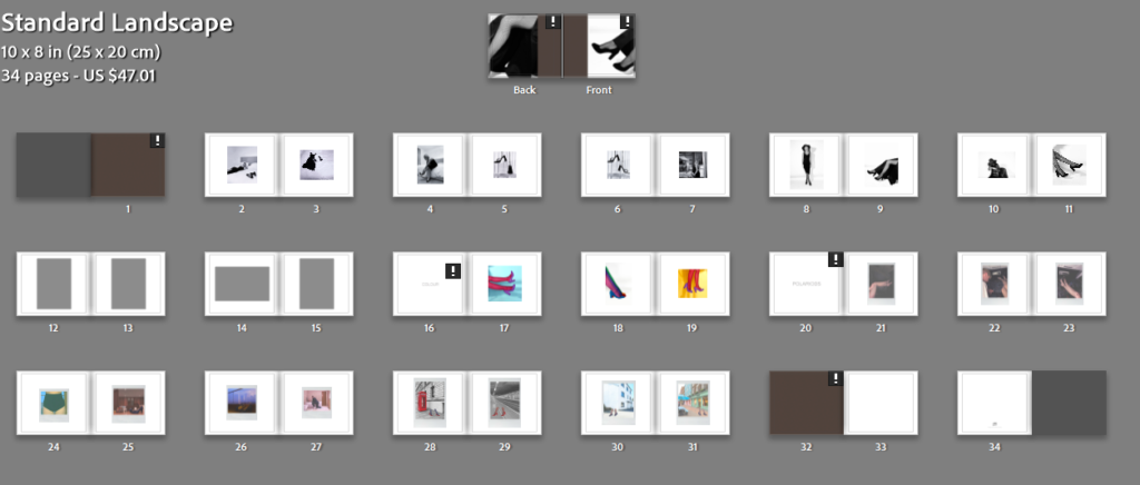
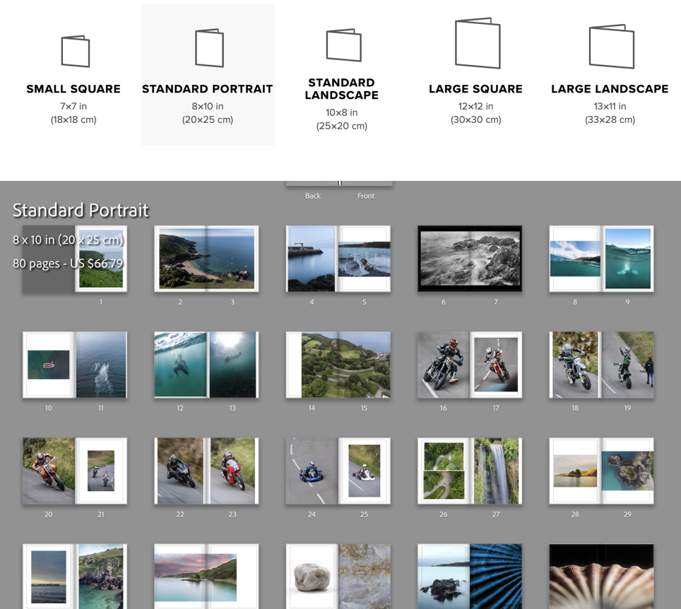
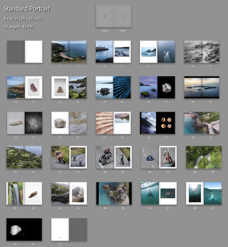
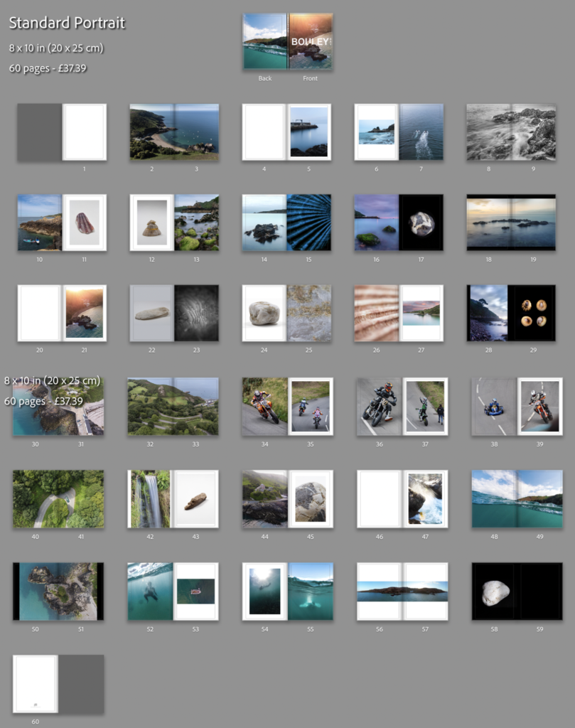
I reorganised the order which I the photos would be in, in the photo-book. Then I clicked the book button where I chose to use the “Standard Portrait” book, then put the images in the order that looked the best.
I made use of the page setups to arrange the images to create an interesting composition. I mainly had two images on the double page spread and, they either linked with each other or were opposites.
To create a narrative I tried to create a zoom effect. I started by getting images that where of a general overview of the bay, then I focused on the pier, the water coming on to the pier, then I focused on the long exposure shots of the water on the rocks, which transitions to underwater photos. Once there is a brief introduction to the bay there it focuses on the hill climb which brings in the areas “character”. After I introduce the bay again by using the greens hill and the green around the waterfall in the bay, which shifts the focus back to the bays features like the L’Islet, and the heritage site. I often compared close ups of objects and match colours to create an interesting concept and presentation.
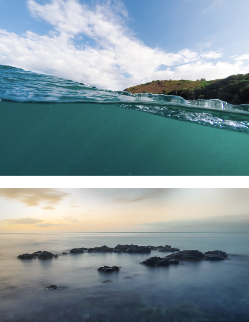
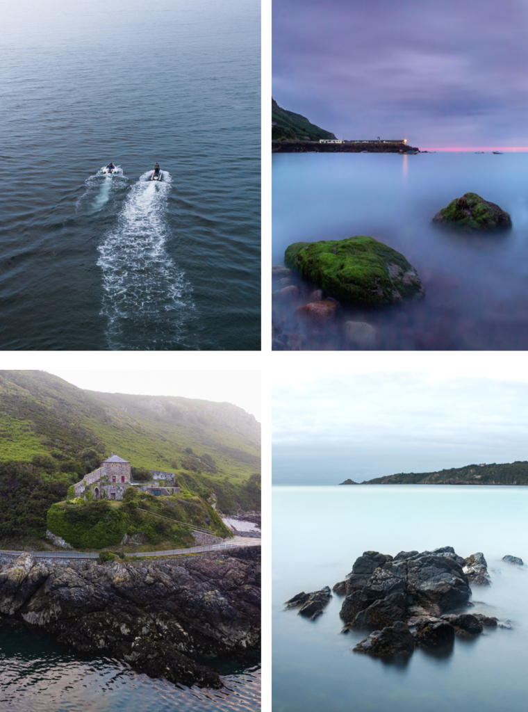
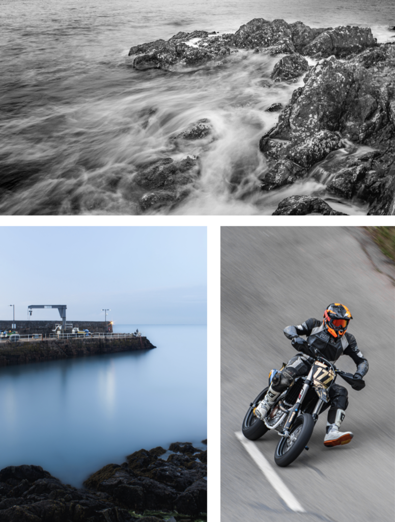
My favourite images are these below, I chose them as they are unique and interesting, and showcase great camera skills.
I achieved my goal, which was to accurately recorded a physical location through images. These images above are the strongest images I have taken which help showcase the environment that is Bouley Bay.
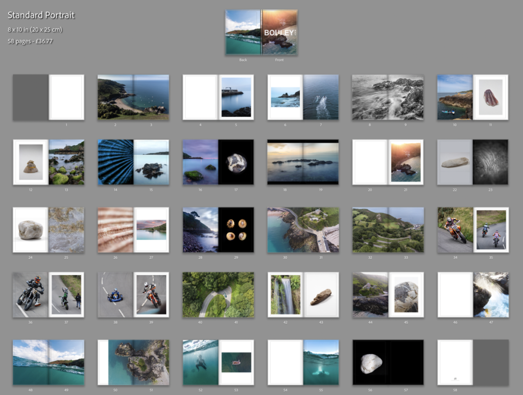
Unfortunately, I deleted all of my work, which meant the pervious book design disappeared. Therefore, I had to redesign the book, which isn’t necessarily a bad thing a I had too many images. This helped me reduce the size of the book and add more contrast, as the pervious version was more illustrative.
This result is more balanced as there is a greater mix of content and I feel that I have used a wide range of different page layouts to shift the viewers focus whilst looking a different images. My favourite pages are, 8-9, 14-15, 16-17, and 32-33.
I decided to add 2 more images. One would be a 2 page spread using full bleed and, then second would be a single image, which would probably be on a double page however, it would only use up one page. I plan to do this to a few more images earlier on in the book and eliminate some of my weaker images.
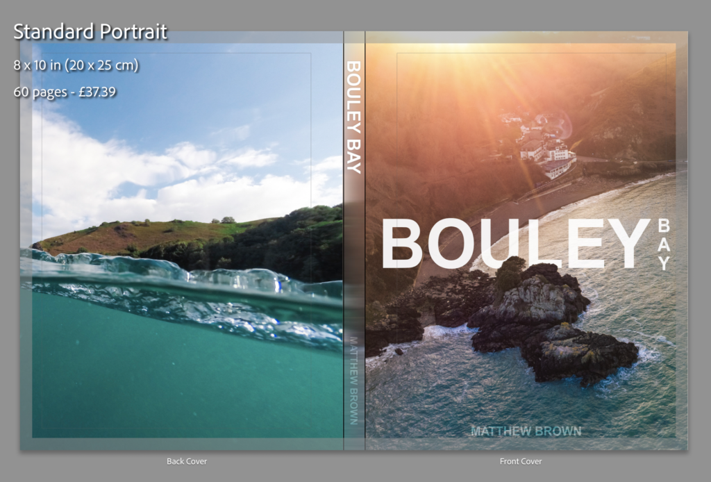
Creating the book cover
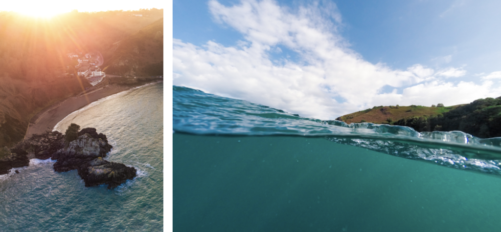
I decided to use an image that had a wide view of the bay which clearly shows where and what the book is about. I am using the image from the extra photoshoot I made with my drone. For the back of the book I wanted to have an abstract image where it is hard to work out where it was taken. Doing this makes lets the front cover have all of the attention. These are the two images I’m using for the book cover:
Left: Front Cover, Right: Back Cover
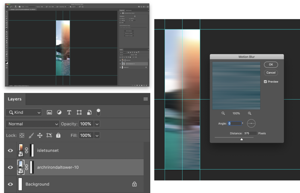
I needed to create a design for the spine, I thought I would blend the edges of the two images above to create a fade between them. After, I would add text to the front cover, and the spine.
I used layer masks to create a gradient fade on the edges that meet with the opposite image. Then used motion blur to smoothen the transition between the images. This will look better when I add the text to the image.
This is what it looks like without the text on the cover. As you can see it looks good, even without the text.
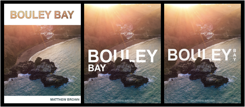
I have created a mood-board to gather inspiration on books about places to decide how to design a title. These are the designs that inspired me:
Using Photoshop I have made 3 different front cover designs, and just needed to chose with one I wanted to use. I used clipping and laying masks to help me design and layout my process throughout creating the cover.
I decided to use the design on the right as it is more ascetically pleasing than the others as, it is on one line and incorporates a more complex design whilst keeping it simple.
The design on the right I used blending option on the text such as, stroke and inner shadow, with a clipping mask of the image to let the image show through.
For the two similar covers, I used a layer mask to remove parts of the text to show the island, to give the simple look and complex effect.
I changed a few small details, such as moving the text up a bit. Then I added and replaced the image on the front of my book and on the spine to see what it looked like completed.
I added the text to the 2 files (spine image and front cover image) that I had open in Photoshop to my the final cover images.
I quickly made an inside cover page with just text on, which is the same as on the front cover.
Final design and layout
These are the rest of the pages in my photo book:
After some last small adjustments, I’ve come to my final presentation of the photo book. I removed the panorama of the bay, the image on page 54 (underwater image), and I change the bleed on some of the images to removed some of the borders, you can see the before (above) and after (below) of the changes that I’ve done.
I feel that this is the best design and layout, as it includes multiple double page spreads, 2 image layouts with borders, full bleed pages and single page spreads. I decide not to add my essay into the back of the book as I feel that it would ruin the “professional” look.
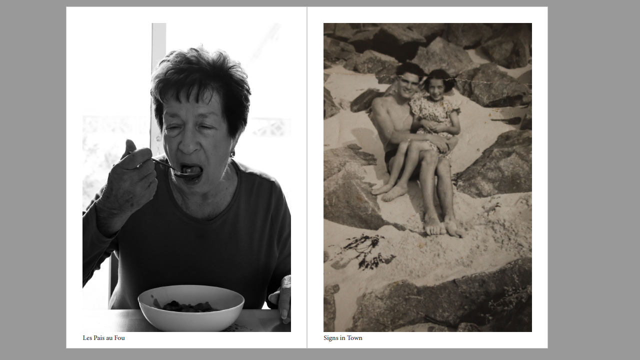
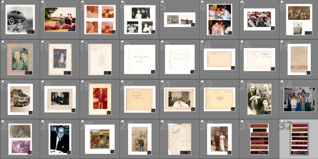
Below are the images I am using for the photobook. Most of these are old family photos from my grandmother and mum and dad. There are also some recreations of old family photos at the end and some title pages including the front and back covers.
Write a book specification and describe in detail what your book will be about in terms of narrative, concept and design with reference to the same elements of bookmaking as above.
Narrative:What is your story? Describe in:3 words
My Family Story
A sentence
Where my family comes from and who came before me
A paragraph
I want to find out about where I came from and who came before me. I was never able to make many memories with my grandfathers from both my Dad’s and Mum’s side of the family. I want to get an idea of who they were and get to know them through the images I find.
Design: Consider the following
How you want your book to look and feel
I want it to be dull on the outside but colourful on the inside. I want it to feel like a hard back photobook
Paper and ink
I want the ink and paper to be faded so it has a very retro album look. I want it to look like an album that was made years before
Format, size and orientation
I want it to be an A4 size and portrait orientation
Binding and cover
I want the cover to have an image of the negatives that my family photos were developed with
Title
Decouverte Du Moi. My family has French heritage so I decided to name it something French which translates to discovering myself
Design and layout
Single full bleed images
Single images non full bleed with white border
Editing and sequencing
I want to sequence the images like a family time line from the first images I have of my great grand parents to my parents and me.
Images and text
Above is the front and back cover of my photo book. To make it, I used the title Decouverte Du Moi and included my name and title again on the spine of the book. The covers are made up of all of the dates from the photos I used in the photo book. I added a light yellow filter to allow the dates to be seen clearly.
Above is the finalised layout of my photo book with the additions of the few recreations of images that I have made. I have experimented with different layouts of pages for example, instead of two photos just next to each other, I put one photo bigger than the other below or above the other one. I think this looks better than the draft I had before.
Above is my first recreation that I finished. I recreated an image of my uncle when he was a baby next to a car. It is not an exact copy however I wouldn’t want it to be a replica as I want the images to be inspirited recreations rather than replicas.
The next inspirited recreation was an image of my mum and uncle on the hood of a car. I recreated it in front of my uncles house as the original was taken in front of my great uncles house. I used my mums car in the image and I think it is a good outcome.
The last recreation is of an image of my uncle and mum when they were children. The image has a blue/ grey colour to it so I applied a colour scheme to the image in photoshop to make it more accurate. I cropped the image and I think it is another good outcome.
Above are some examples of different layouts for photos to make the pages look more exciting versus two photos next to each other.
Outcome
The outcome from the photo book project is a book which reflects me and my family. It shows moments from my family’s history in which happy moments have been made, as well as sad moments. From the best to the worst moments family carries on and i believe that shows a real power to do with photography as a way of recording moments as well as how together, family is strong and overcomes the toughest of challenges.