PERSONAL PROJECT PHOTOSHOOT 6 – Drone IMages #2

The main reason I wanted to create another photo shoot was because I needed a strong image for the front cover. My plan was to get a wide drone shot of the whole bay mainly focusing on the L’Islet.

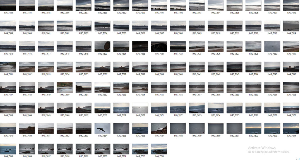
This is a contact sheet of all the images I got for the shoot:

These are my favourite images after images after editing:

The first image has the most potential for a front cover. Whereas, the panoramic photos would be good for a double page spread. There was a panoramic setting on the drone which I utilised. I add to merge them together in Photoshop using the merge feature to create one image. After, I used my normal editing techniques, which includes a camera-raw filter.

I edited all my images in Photoshoot after choosing what images I wanted to use by marking them with tags on my laptop. This image was a landscape, however I cropped it to make a more interesting composition and remove all of the distractions. Then a used a Camera-RAW filter to colour grade the image and do basic adjustments to contrast, temperature, and shadows. I also used 2 gradual filters to emphasis the orange form the sun and, blue for the water. I used a radial filter on the L’Islet to increase the shadows to that the L’Islet is more prominent.

Overall, this photoshoot was successful, as I got a good front cover image, however it can’t be a full wrap image only a front cover image. Although by doing this extra photoshoot I was able to produce an extra page in my photo-book. The final outcome was different to what I imagined in my head. I planned to go when it was high tide, sunny, and not windy or rainy. However after waiting a few weeks the conditions were never prefect so I decided to go during a mid tide and at sunset. This actually worked out better than I expected, as the orange and blue contrast is really strong and one of my favourite colour combinations.

PERSONAL PROJECT PHOTOSHOOT 5 – General Images/Bouley Bay Hill Climb

This blog post is for the images that I took whilst on other photoshoots that don’t fit into the category of the shoot, and general images of Bouley Bay.

I think these two images fit in with the project, I really like how the right image shows the playful, fun aspect of the bay. Plus, the composition works well as the rocks create a good “frame” around the paddle boarders.

Bouley Bay Hill Climb

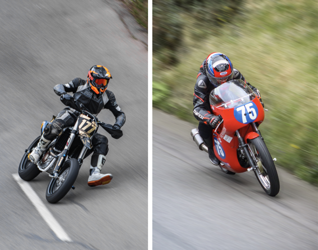
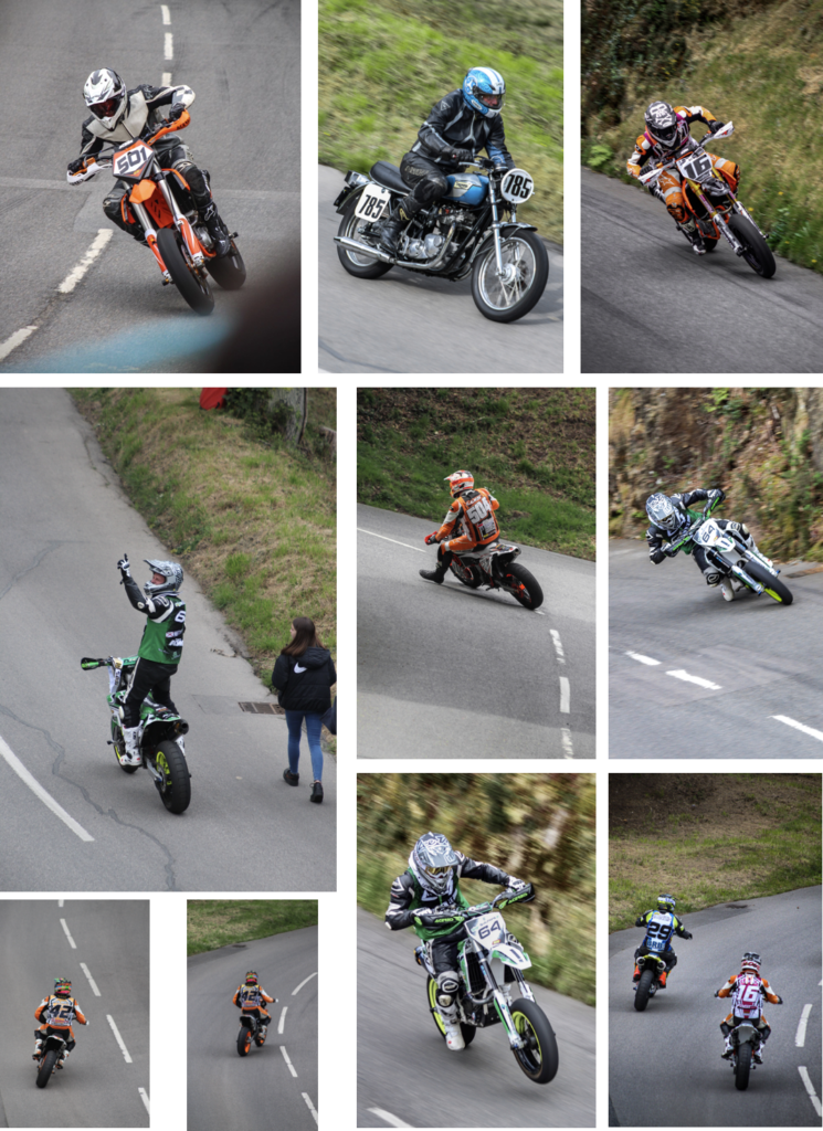
For these photos I used a 100-300mm telephoto lens to allow me to fill the frame with the subject. I used a technique called panning to create motion blur.

These are the best edited images that I produced during the photoshoot. I made this extra photoshoot so that I could introduce character of the are into the photo-book, as Bouley Bay Hill Climb is an event which most people in Jersey know about.

Overall, this photoshoot was very successful. I was able to produce strong images and I managed to capture a panning image, which I had to match the shutter speed to the speed of the bike, whilst doing a panning motion.

Personal Study – Book Specification

Narrative

Identity, Pressure, Masculinity

Tell the story of an hypermasculinity in sports and the pressure it puts on young men and how it effects life off the playing ground.

A story about how the pressures of sport can effect individuals off the playing grounds. The story delves into how a young man finds a sense of identity on the field however struggles with the overbearing nature of masculinity within sport and the need to always put on a brave face as a young man. The narrative will begin by introducing sportsmen in action followed by juxtaposing images of them out of action. The story then follows on by introducing the main protagonist who is a young rugby player. It follows him around his life, around his home environment and begins revealing the emotions this individual feels. The story concludes by settling on this side of the narrative and lets the notion of the bleak condition linger and leaves reader with this stale sentiment.

Design

I want my book to feature a minimalist front cover possibly with an inconspicuous portrait or an object. I want this minimalist design to continue through the colour scheme on my front cover, this being no more than two earth tone colours. I want the book to have a matte texture on the exterior with the pages being Mohawk proPhoto Pearl paper. The format will be A4 portrait and will have a hard cover and be case bound and section stitched. The title for my book is ‘Big boys don’t cry’. The book will be structured with a combination of single images on one page as well as multiple collages and double page spreads with blank pages being included to create an interlude in the narrative. The images will be sequentially placed to create the narrative I intend to convey. The use of epilogues and text captions will aid in conveying this narrative.

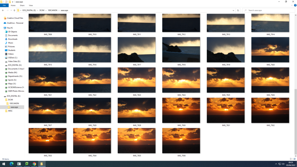
photoshoot 4 (seascape)

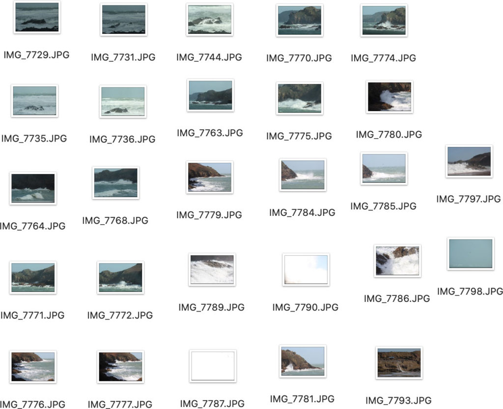
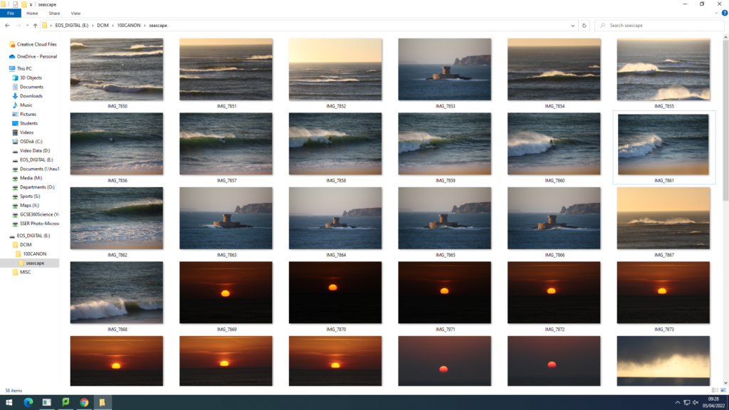
For this photoshoot I decided to base myself down Plemont bay. Using midday lighting and sunny/cloudy weather, I was able to capture more images relating to Jerseys identity involving seascapes. Plemont Bay is a good location to take images as for the cliff faces, caves, and swell. A slight on shore wind created choppy waves and white spray. Here is a contact sheet of the majority of images taken.

When photographing waves I always angle myself lower to the ground to create the illusion of the wave being above the camera. After arranging the best images from the shoot I started to edit in light room. Adjustments such as exposure levels, vibrancy, saturation, contrast, highlights and shadows where all heightened or lowered to create a much stronger and powerful image .

photoshoot 1/2/3 for seascape project (photobook)

Photo-shoot 1 and 2

For my first two photo-shoots I have decided to take images down st.ouens bay and grev. I chose these places as for the biggest swell can be found in these areas. I used midday lighting as both days weather wise were not great but plan to take more photoshoots using the prime time of light being sunset and sunrise. My camera settings were known as a low IOS and fast shutter speed to capture the best quality of the quickly moving sea. My editing process so far has enhanced the beauty and colour found within the seascape images. Here are some contact sheets from the shoots…

Throughout the photoshoots I tried to capture the power and roughness that the sea had to provide. Whether that be against a cliff or simply the camera lens looking straight out, this would create a more successful seascape image as there is an intriguing foreground and background. It was difficult to keep the camera steady and in focus when using a larger lens as for the strong winds and spray from the waves. The storm at the time brought messy sets of waves which made it hard to have the correct exposure levels with a lot of movement surrounding the sea.

For my editing process of these images I have decided to use many tools and techniques within photoshop and Lightroom to make my photographs more inviting and noticeable to viewers. So far this is what I have come to…

Original photo before editing…

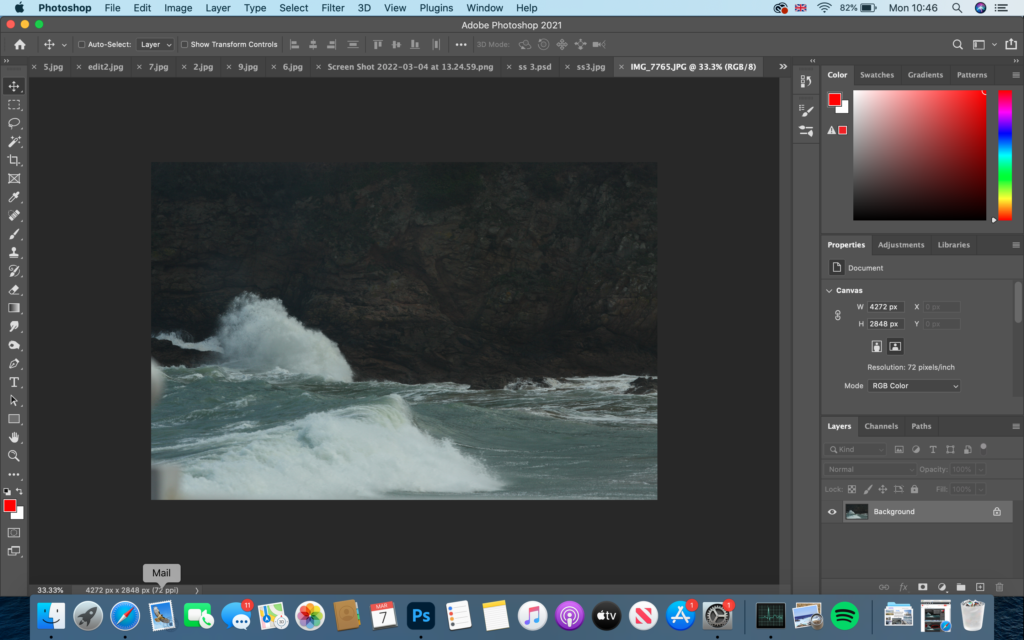
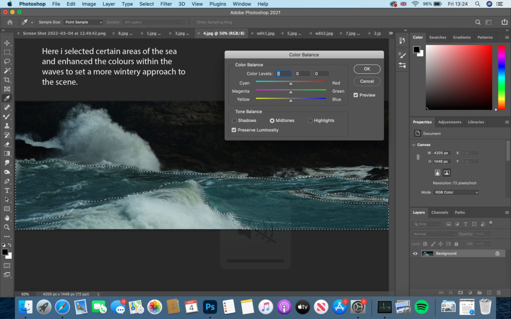
firstly, I decided to crop most of the bottom and up of the image off like I do with many of my own images to create a more panorama effect of the lens. I slightly changed the brightness and contrast levels then began on focusing on the colour use.

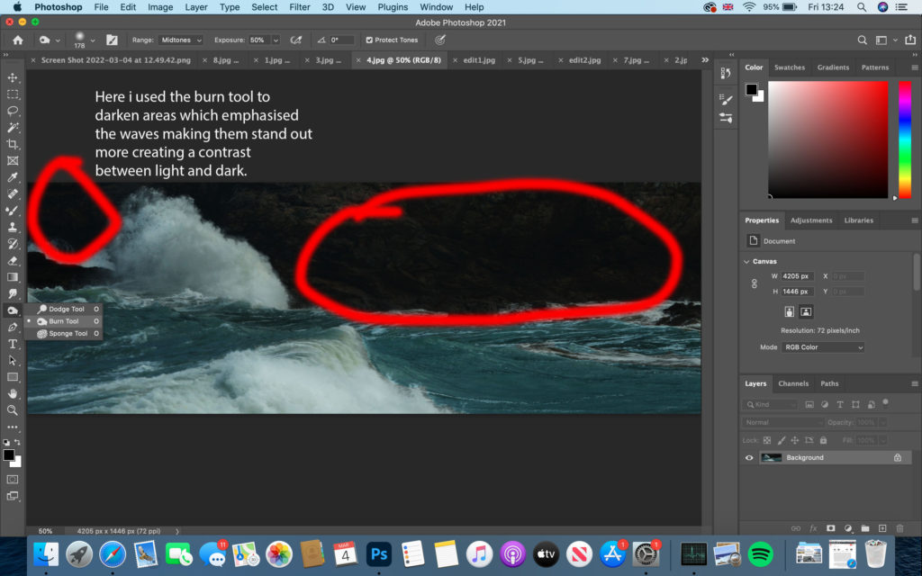
As well as using the burn tool I included the lighting tool to brighten up the white spray released by the waves and white web structure that floats on the surface. This creates a dynamic contrast between the cliff face and sea.

Photoshoot 3


For my 3rd photo-shoot I based myself in the same areas down St.Ouens bay as for the weather conditions being sunny rather than rainy and tidal range being high. I decided to capture some sunsets to make my photobook have a more abstract approach. these subtle images being relevant or not to my topic will fit in well against more powerful and moody images.


This image has an empty alt attribute; its file name is image-67-1024x576.png
This image has an empty alt attribute; its file name is image-68-1024x576.png

Essay 2

Is God dead/does he exist?

No one can disprove the existence of God.  

One reason for this is because in the beginning there was an explosion and within minutes, 98% of the matter that there is or ever will be was produced; we had a universe.  

For 2500 years most scientists agreed with Aristotle’s theory of a steady state universe; that the universe has always existed, with no beginning and no end.  

However, the Bible disagreed. In the 1920s, Belgian astronomer, George Lemaitre, a theist (someone who believes in the existence of God), said that the entire universe jumping into existence in a trillionth of a trillionth of a second, out of nothingness, in an unimaginably intense flash of light, is how he would expect the universe to respond if God were to actually utter the command in Genesis 1:3, “Let there be light.” All of which points to a God that created it. For example, in the real world, we never see things jumping into existence out of nothingness. But atheists, want to make one small exception to this rule, namely the universe and everything in it.  

You may argue that in the book, The God of Delusion, Richard Dawkins says, “if you tell me God created the universe, then I have the right to ask you who created God.” But Dawkin’s question only makes sense in terms of a God who has been created, it wouldn’t make sense to apply that question to an uncreated God which is what Christians believe in. Even leaving God out of the equation, I then have a right to turn Mr. Dawkins’ own question back around on him and ask, “if the universe created you, then who created the universe?”  

As you can powerfully see both the theist and the atheist are both burdened with answering the same question of how things started.  

You may argue that Stephen Hawking, the world’s most famous scientists, and who is not a theist, has come out in favour of a self-designing universe. This is clearly shown in the quote, “Because there’s a law such as gravity, the universe can and will create itself from nothing. Spontaneous creation is the reason there is something instead of nothing. It’s why the universe exists, why we exist. It is not necessary to invoke God to set the universe in motion.”  

But, Professor John Lennox, who teaches mathematics and philosophy, has demonstrated that there are 3 errors of logic contained in that one simple sentence which all boils down to circular reasoning. Hawkins is basically saying that the universe exists because the universe needed to exist and since the universe needed to exist it therefore created itself. For example, imagine I come to you and say, “I can prove that spam is the best-tasting food that ever existed because in all of history, no food has ever tasted better”, you’d probably look at me strange and say that I haven’t proven anything. And you’d be right, all I’ve done was restate my original claim.

But when Hawkins claims that the universe created itself because it needed to create itself and offers that as to how and why it was created, we don’t immediately recognise that he’s doing the same thing. But he is, promoting Lennox to further comment, “Nonsense remains nonsense, even when spoken by famous scientists. Even though the general public assume they’re statements of science.”

I’m not trying to say that Stephen Hawking is wrong, I’m saying that John Lennox, a professor of mathematics and philosophy, has found Professor Hawking’s reasoning to be faulty, and I agree with his logic.

On the other hand, if you can’t bear to disagree with Hawkings thinking, then I suggest you turn to page 5 of his book, “The Grand Design”, where he insists, “philosophy is dead.” And if you’re so sure of Professor Hawking’s infallibility, and philosophy really is dead, then there is really no need for people to ever study philosophy and this argument is useless. 

Another point to consider is that for the last 150 years, Darwinists have been saying that God is unnecessary to explain man’s existence and that evolution replaces God. But evolution only tells you what happens once you have life. So, where did that something that’s alive come from? Well, Darwin never really addressed it. He assumed that maybe some lighting hit a stagnant pool full of the right kind of chemicals and bingo, a living something. But it’s not that simple.  

Darwin claimed that the ancestry of all living things came from that one single, simple organism, which reproduced and slowly modified over time into the complex life forms we view today. Which is why, after contemplating his own theory, Darwin uttered his famous statement, “Natura non facit saltum”, which means, “Nature does not jump.” Well, as noted, author Lee Strobeck pointed out, that if you can picture the entire 3.8 billion years that scientists say life has been around as one 24-hour day, in the space of just 90 seconds, most major animal groups suddenly appear in the forms in which they currently hold. Not slowly and steadily as Darwin predicted, but in evolutionary terms, almost instantly. So, “nature does not jump” becomes “nature makes a giant leap.”

So, how do theists (someone who believes in the existence of God) explain this sudden outburst of new biological information? “And God said, “Let the water teem with living creatures and let the birds fly above the earth across the expanse of the sky. So, God created the great creatures of the sea and every living and moving thing with which the water teems according to its kind. And God saw that it was good” – Genesis 1:20.  

Put simply, creation happened because God said it should happen. And even what looks to our eyes to be a blind, unguided process could be divinely controlled from start to finish.  

People have the right to believe what they want to believe but, it’s easy to dismiss what you don’t understand or what you don’t want to understand.  

Another argument could be said that evil is atheism’s most potent weapon against the Christian faith, and it is. After all, the very existence of evil begs the question, “if God is all-good, and God is all powerful, why does he allow evil to exist?” The answer at its core is quite simple: free will. God allows evil to exist because of free will. From the Christian standpoint, God tolerates evil in this world on a temporary basis so that one day, those who choose to love him freely will dwell with Him in heavily, free from the influence of evil, but with their free will intact. In other word, God’s intention concerning evil, is to one day destroy it.  

Contrastingly, others may argue that “one day, I will get rid of all the evil in the world. But until then, you just have to deal with all the wars, and Holocausts, tsunamis, poverty, starvation, and AIDS. Have a nice life.” You may assume that next I’ll talk to you about moral absolutes. But why not?  

Someone who’s an atheist, doesn’t believe in moral absolutes, but let’s say that you find someone cheating in the same exam you’re taking and gets a good grade. I bet you’ll suddenly start sounding like a Christian, insisting it’s wrong to cheat, that the person should have known that. And yet, what basis do you have? If the actions of others are calculated to help them succeed, then why shouldn’t they perform them?  

For Christians, the fixed point of morality, what constitutes right and wrong, is a straight line that leads directly back to God. And I’m not saying that you need God to be moral, that a moral atheist is an impossibility. But with no God, there’s no real reason to be moral. There’s not even a standard of what moral behaviour is. For Christians, lying, cheating, stealing, in my example, someone stealing a grade they didn’t earn is a form of theft. But if God does not exist, as Dostoyevsky famously pointed out, “if God does not exist, then everything is permissible.” And not only permissible, but pointless. If this is right, then all of our struggles, our debate, whatever we decided to do is meaningless. Our lives and ultimately our deaths have no more consequence than that of a goldfish.  

In conclusion, it all comes down to choice of believe or don’t believe, that’s all there is. That’s all there’s ever been.   

Additionally, James Warner Wallace – homicide detective was the author of the book ‘Cold Case Christianity’. In his book, a subtitle he writes was, “A homicide detective investigates the claims of the gospel.” He was an atheist at the time of his research which reduces bias. Obviously, his duties as a homicide detective includes investigating cold case homicides. He states that ZERO of his cold cases were solved through the use of DNA evidence. He states that the cases got solved by examining eyewitness claims, even ones made many years earlier. This is possible through the number of techniques that they use to test the reliability of an eyewitness such as, forensic statement analysis.

Forensic statement analysis is a discipline where researchers scrutinize the statements of eyewitnesses while looking at what they choose to minimise, emphasize and omit altogether, how they expand or contract time. By examining these eyewitness accounts, researchers can tell who’s lying and who’s telling the truth, and even who the guilty party is.

Interestingly, as a former atheist, he applied his expertise to the death of Jesus at the hand of the Romans while also looking at the Gospels as he would any other forensic statement. The fact he was a non-Christian at the time means there was zero bias or influence for his findings to support or disprove that Jesus was not a real person. Within a matter of months, he determined that the 4 gospels, all written from different perspectives, contained the eyewitness accounts about the life, ministry, death and resurrection of Jesus. Also, he considered that the 4 accounts may be part of a conspiracy, designed to promote belief in a fledgling faith. However, he states that successful conspiracies often involve the fewest number of people. For example, it is a lot easier for 2 people to lie and keep a secret than it is for 20. That is where the problem with the conspiracy theories related to the apostles in the 1st century; there are just far too many of them trying to hold this conspiracy for far too long a period of time. And far worse, they’re experiencing pressure like no other.

Everyone one of these people were tortured and died because of what they claimed to see, and none of them ever recanted their story. Therefore, the idea that this is a conspiracy in the 1st century is really unreasonable. Instead, what was found in the gospels was something James called, “unintended eyewitness support statement”. For example, the Gospel of Matthew, the passage states that Jesus is in front of Caiaphas at a hearing, “Then they spit in his face and struck him with their fists. Others slapped him and said, ‘prophecy to us. Christ. Who hit you?'”. At first, it seems like a simple request given that the people who hit him are standing right in front of him which makes no sense. Why would it be prophecy to be able to tell you who hit you? But it’s not until you read Luke that you get an answer to this. He says, “the men who were guarding Jesus began mocking and beating him. They Blindfolded him and demanded, ‘Prophecy, who hit you?'”. So, now we know why this was a challenge, the gospel of Luke tells us the thing that Matthew left out, that he was actually blindfolded at the time this took place. This kind of unintentional eyewitness support that fills in a detail that the first witness left out is very common.

After years of scrutinizing these gospels using the template that James uses to determine if an eyewitness is reliable. He concluded that the four gospels in the Bible contained the reliable accounts of the actual words of Jesus on the other hand, it may be argued that there are numerous discrepancies between these accounts. But James Warner Wallace says that that is exactly what we should expect. This is because reliable eyewitness accounts always differ slightly in the way they recall a story. “They’re coming to it from different geographic perspectives, their history, even where they are located in the room.” When Wallace examined the gospels, he was trying to determine if these were accurate, reliable accounts in spite of any differences there might be between the accounts.

Finally, he states that when he began his study, he was a devout atheist. He began examining the gospel as a committed sceptic, not as a believer. He wants raised in a Christian environment even though he does have an unusually high regard for the value of evidence. He says that the reason why he’s a Christian now is not because he was nurtured into it or because he hoped it would satisfy some need or accomplish some goal. He says he’s a Christian because it is evidently true.  

Bibliography

Solomon, C. and Konzelman, C. (2014). God’s not dead. 1st film, Greg Jenkins Productions, Pure Flix Entertainment, Red Entertainment Group.

Solomon, C. and Konzelman, C. (2016). God’s not dead. 1st film, Greg Jenkins Productions, Pure Flix Entertainment, Red Entertainment Group.

book design-

Once I had all my images edited through using Lightroom to select my favourite images by rating them and comparing them, I then moved onto photoshop and edited them to make them all finalised. Once I had everything ready, i exported th final edits back into Lightroom and this where I worked on my book design.
On Lightroom, there’s an option called ‘Book’, this turned all my images into a book template which was really helpful as it allowed me to see all my images laid out on a virtual representation of a book.

This is how my first layout looked;

This was just how my book was laid out when I selected the feature, all my images were randomly allocated. I then began to sequence my images in the order I felt right and conceptual.

There were many template options to choose from so I had to make sure to select about 3-4 frames/templates to keep my layout consistent throughout the book.

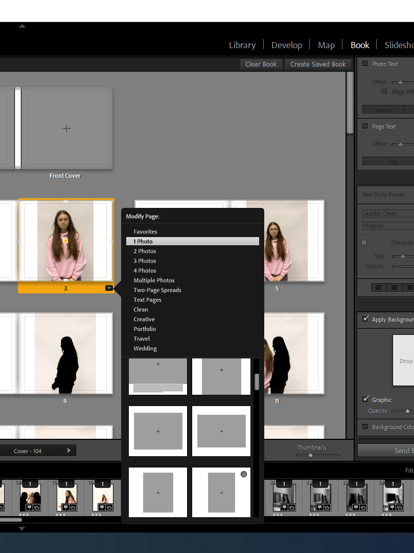
These were the types of templates I had an option of picking, there was lots of choices however as most of my images were portrait , I mostly used the portrait templates and a double bleed which I could use of my few landscape images for.

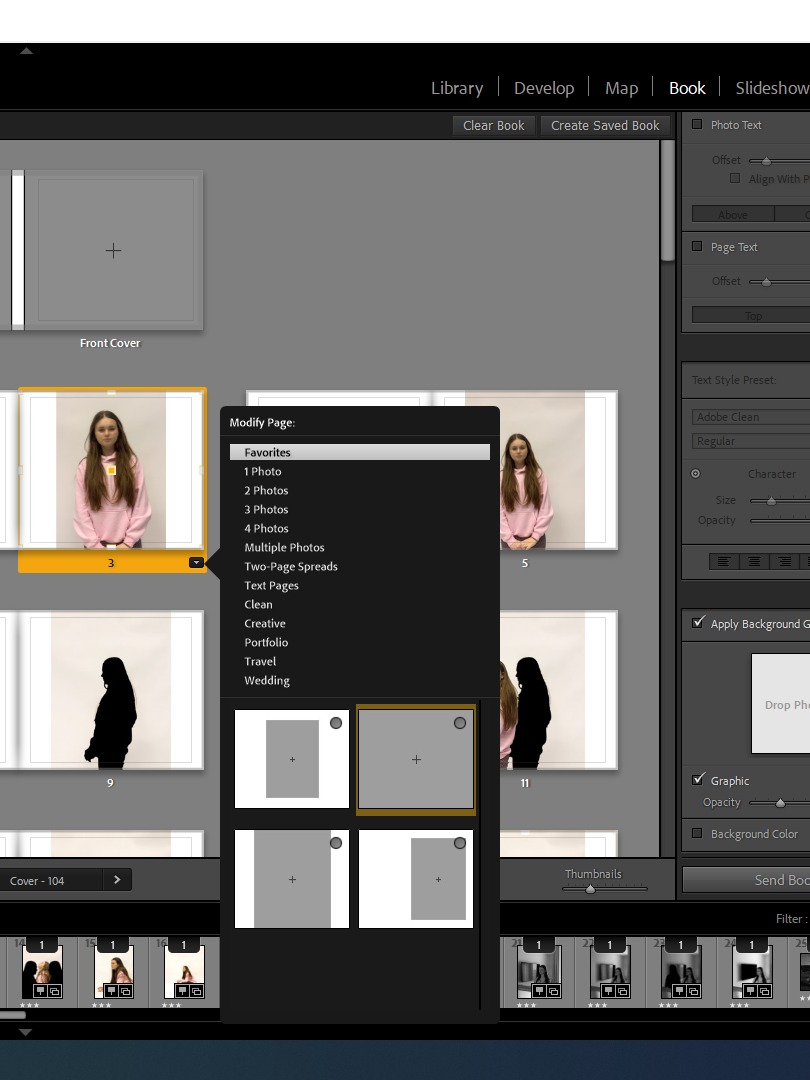
These were the templates I had as my favourites and wanted to keep it consistent with these templates throughout my book design.

This was very first and basic re arrangement of my images, I just started to pair specific images together that I thought would maybe work well, I didnt select any templated yet and I left the front and back cover blank in order to think about it at the end

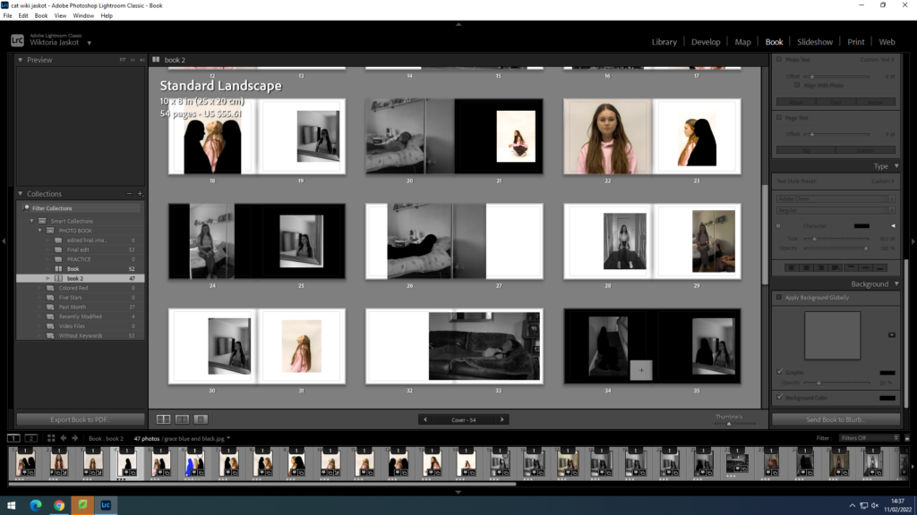
I spent some time choosing the templates for each page, I used 4 of the same templates each time to keep it consistent and in a good layout and I also included a few full doubles spread bleeds as I think this creates a bigger impact on some photos and really gets the viewers attention.

I used many different templates such as a full bleed which took up both pages and 3 different templates throughout my book such as a small template , one slightly to the right and one that was filled in from the top to the bottom of the page but the sides had a white border. I decided to not use any outlines around the images as I didnt think it fit in with my concept for this book.

I also made some of my pages have a black background colour as I thought a dark colour around the images would work much better than white pages as it fits much more naturally with the mood of this book and makes the topic come across more sad and darker which is what you consider with mental health. I also repeated some of images to create a sense of a routine and how everyday you wake up and feel differently , its almost like youre re living the same routine.

book specification-

My book will be about mental health and the narrative will show how mental illnesses can make you feel and affect your everyday life. The narrative of my story shows a lot of repetition to show how everyday feels the same however you just feel different and experience different emotions.

narrative; 3 words; health, wellbeing, feelings

Sentence; Story about how mental health affects someone’s life

Paragraph; My story shows how have a mental illness can make you feel on an everyday basis and how it affects your lifestyle. I did this through editing my images and making them more conceptual exploring different feelings that come along with having a mental illness. I used the studio and a natural home environment to try get both achieve the best outcomes and make my editing better.

Design; I want my book to have a simple look with a hard cover with just one main colour most likely black. Im not going to add any text in my book apart from my essay and I want my book to have a variety of colour and black and white images, which is how I’ve edited my images. I’m going to use the same type of paper throughout my book with no different textures. I want the format of my book to include both portraiture and landscape images to have a variety of different formats that create nice contrasts , all pages being A4 with a maximum of 40 pages. I want my book to be a hard cover and the binding to be an image wrap as a dust jacket usually gets ruined. I want the cover to be a card graphic cover. I want the title of my book to be relevant and intriguing making sure it goes with my topic- mental health. I include many different editing designs throughout my book and repeat a few of the same editing designs as well as some images to create the idea of everyday feeling the same but dealing with different emotions. The image sizes throughout my book are a variety of different sizes, I used small templates, full zooms where one image takes up a whole page and a few double bleeds where one image takes up two full pages. I also include some images that have a small template on one page and one small square image right next to it to create a nice contrast. I have chosen my images to have a specific sequences where the images either link together or have a good juxtaposition and contrast between to ideas. I repeat some of my images to give the idea of everyday feeling the same but with different emotions. My essay is completely linked with my images as my essay is about how photographers use photography to represent mental health and different ways to illustrate it through processes such as editing.

Newspaper

Historically, photography students at Hautlieu School have acquired a reputation for making work beyond the confines of Edexcel syllabus and their work have been recognised both locally and internationally through exhibitions, competitions and publications. For example, in the last couple of years we have produced three separate newspaper supplements, FUTURE OF ST HELIER (2019), LIBERATION & OCCUPATION (2020) and last year LOVE & REBELLION (2021), all published and distributed in the Jersey Evening Post.

NEWSPAPER SPREADS: Design 3-4 versions of a newspaper spreads based on images from both your current and previous projects, including zine project based on historical migrant neighbourhoods in St Helier and work you did in Yr 12 too (Identity, Anthropocene, Landscape). Use your Review and Reflect blog post you did earlier to identity the work that responds best to the themes of IDENTITY & COMMUNITY.

You must design the following spreads:

  • FULL-BLEED: Select one image as a full-bleed spread.
  • JUXTAPOSITION: Select 2 images and experiment with different combinations.
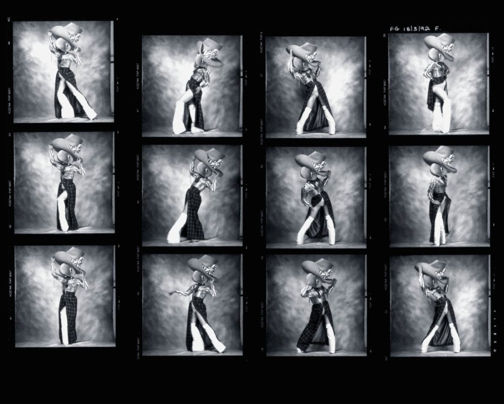
  • SEQUENCE: Select a series of images (between 4 – 12) and produce a sequence either as a grid, story-board, contact-sheet or typology.
  • MONTAGE: Select an appropriate set of images and create a montage of layered images. You may to choose to work in Photoshop for more creativity and import into InDesign as one image (new document in Photoshop 400mm(h) x 280.5mm(w) in 300 dpi)

Follow these instructions:

  • Create new document in InDesign with these dimensions: 400mm(h) x 280.5mm(w), 10 pages, Orientation: Portrait, 2 columns, Column gutter 5mm, Margins: 10mm, Bleed: 3mm 
  • Only use in high-res TIFF/JPEG files (4000 pixels)
  • Use design ideas and layouts from your zine/ newspaper research as well as taking inspiration from artists listed here as a starting points for your spreads.
  • Incorporate texts and typography where appropriate.

Once you have completed pagespreads, double check: 

  • All images are high-res file
  • Check links in InDesign (if Red Question mark appears re-point to image in your folder)
  • Package your layout and save in your name into this shared folder: M:\Radio\Departments\Photography\Students\Image Transfer\IDENTITY & COMMUNITY\Newspaper

INSPIRATIONS

FULL-BLEED: Image goes across two pages to the edge

Page-spread from FUTURE OF ST HELIER
Page-spread from LIBERATION / OCCUPATION

JUXTAPOSTION

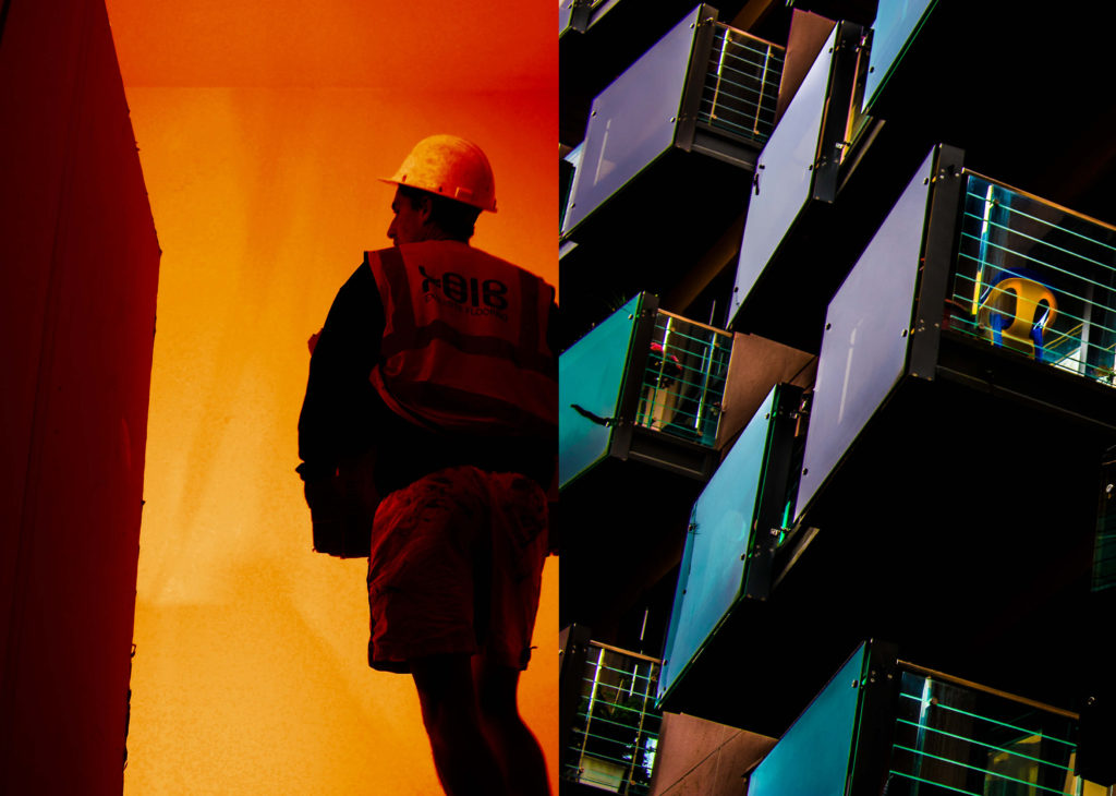
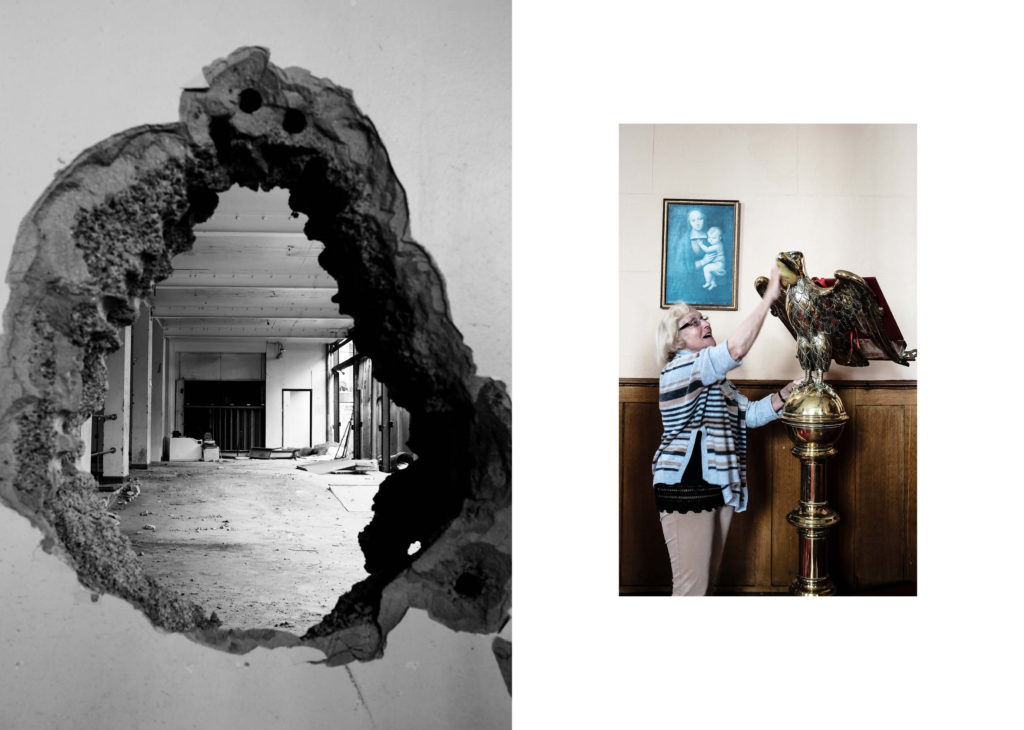
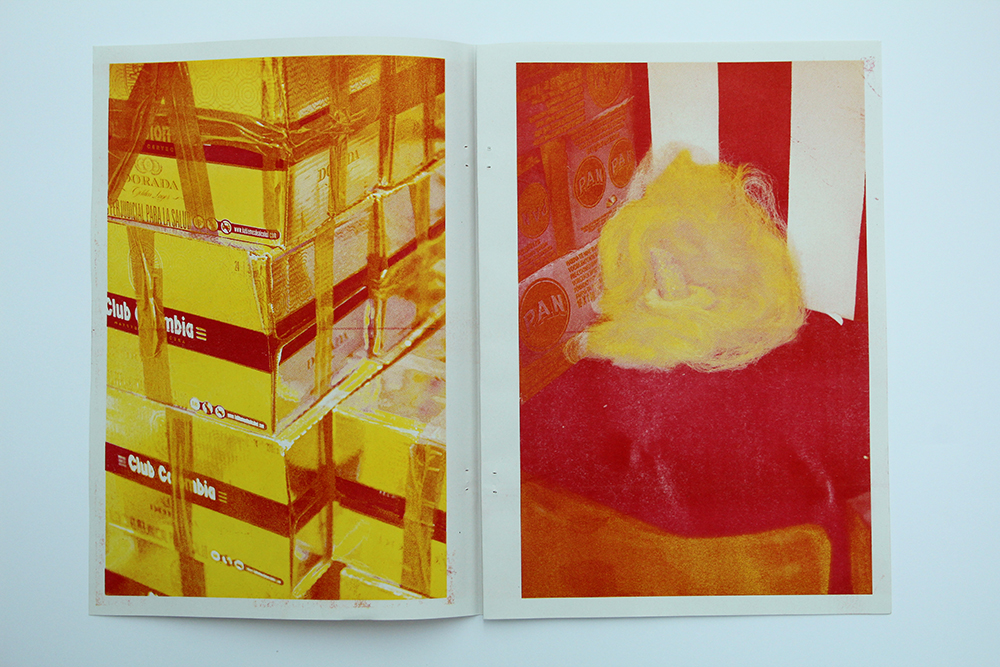
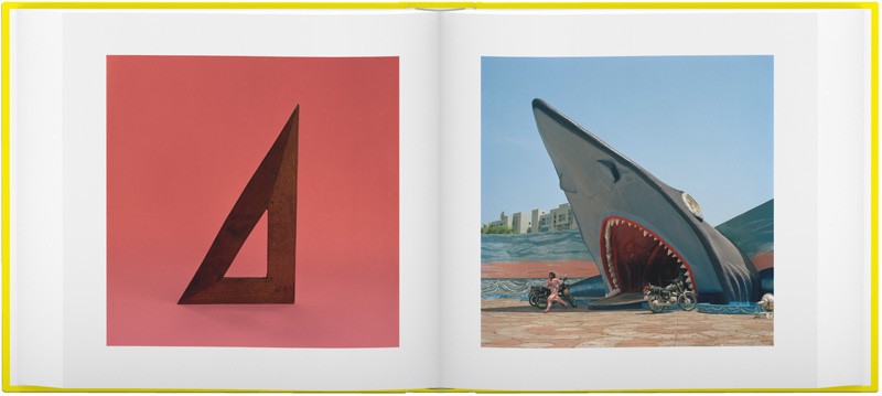
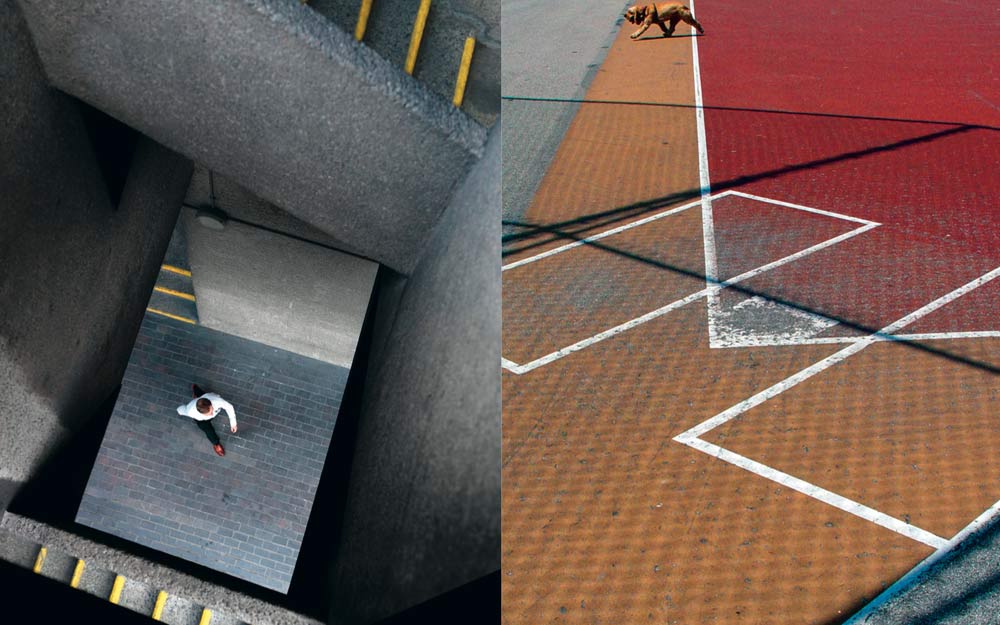
Juxtaposition is placing two things together to show contrast or similarities.Look at the newspapers: LIBERATION / OCCUPATION and FUTURE OF ST HELIER produced by past students and the publication GLOBAL MARKET on the table by ECAL students for inspiration. 

Spreads from Global Market
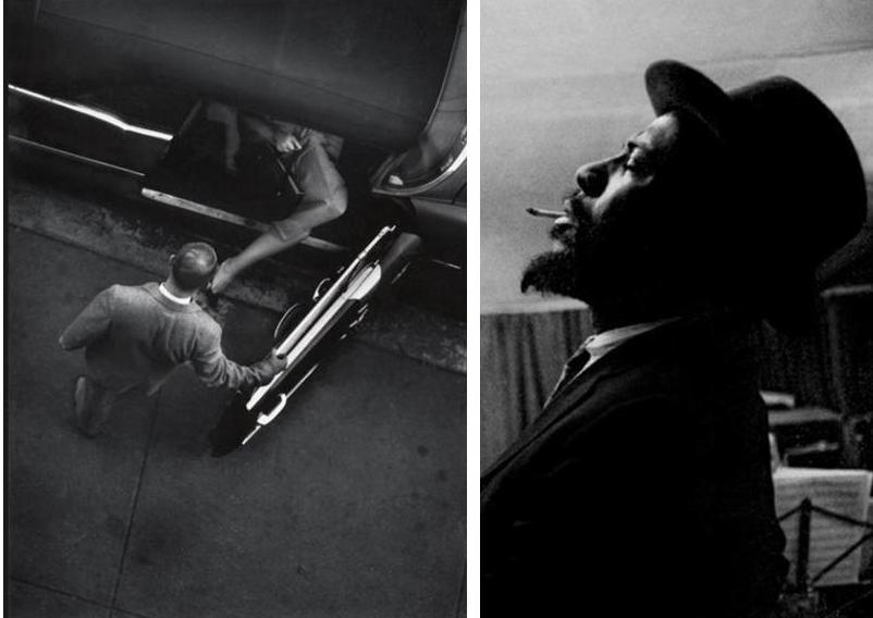
W. Eugene Smith. Jazz Loft Project
COLOUR – SHAPES
This image has an empty alt attribute; its file name is fb4.jpg
SHAPES – GEOMETRY
Repetition
This image has an empty alt attribute; its file name is Where-Mimosa-Bloom_03-1024x682.jpg
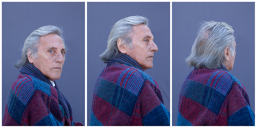
OBJECT – PORTRAIT

SEQUENCE

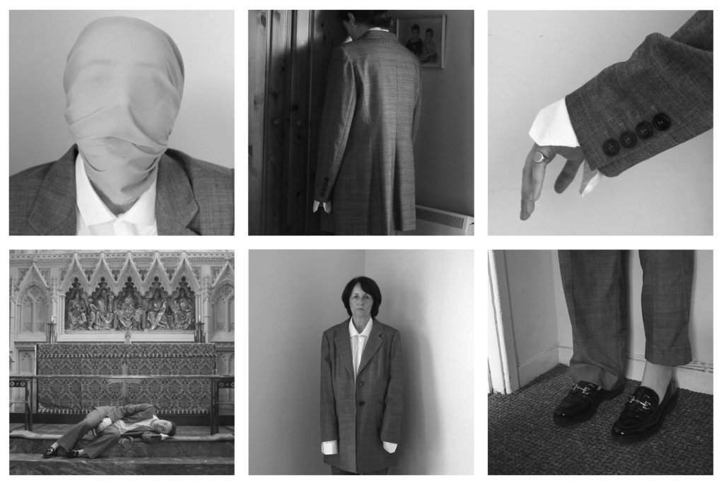
Shannon O’Donnell: That’s Not The Way The River Flows (2019) is a photographic series that playfully explores masculinity and femininity through self-portraits. The work comes from stills taken from moving image of the photographer performing scenes in front of the camera. This project aims to show the inner conflicts that the photographer has with identity and the gendered experience. It reveals the pressures, stereotypes and difficulties faced with growing up in a heavily, yet subtly, gendered society and how that has impacted the acceptance and exploration of the self.

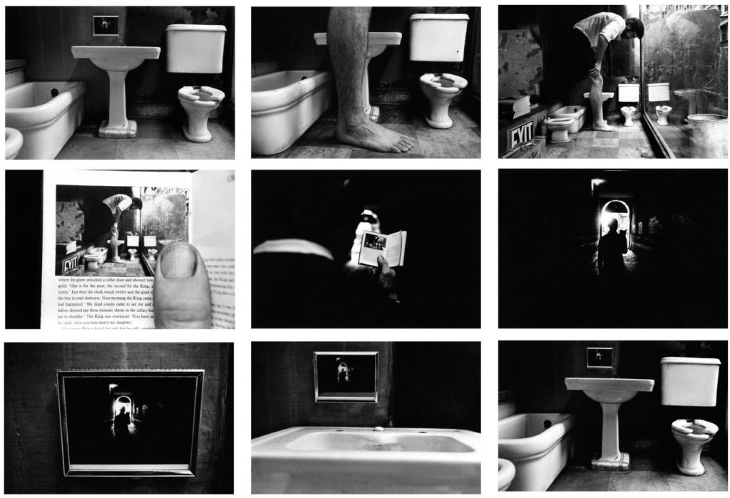
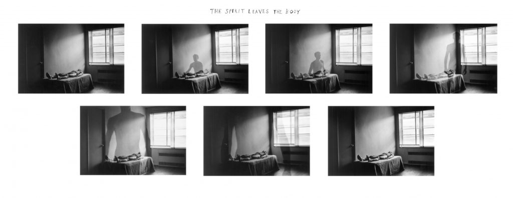
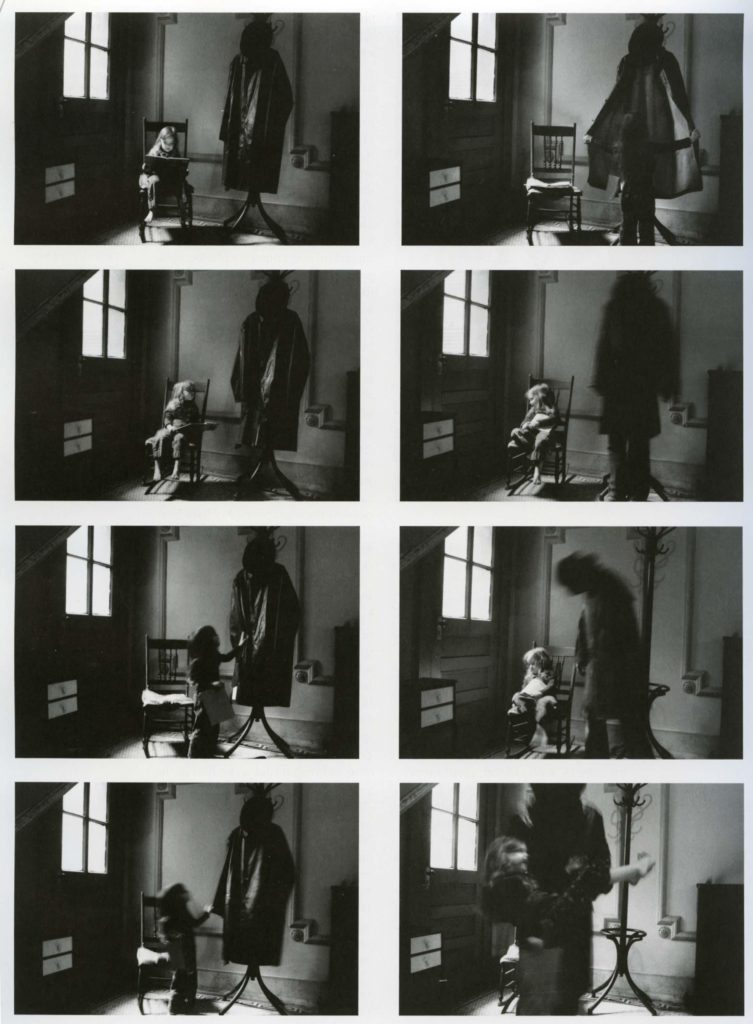
Duane Michals (b. 1932, USA) is one of the great photographic innovators of the last century, widely known for his work with series, multiple exposures, and text. Michals first made significant, creative strides in the field of photography during the 1960s. In an era heavily influenced by photojournalism, Michals manipulated the medium to communicate narratives. The sequences, for which he is widely known, appropriate cinema’s frame-by-frame format. Michals has also incorporated text as a key component in his works. Rather than serving a didactic or explanatory function, his handwritten text adds another dimension to the images’ meaning and gives voice to Michals’s singular musings, which are poetic, tragic, and humorous, often all at once.

Things Are Queer, 1973
Nine gelatin silver prints with hand-applied text
3 3/8 x 5 inches 
The Spirit Leaves the Body, 1968
Seven gelatin silver prints with hand-applied text
3 3/8 x 5 inches (each image)
Death Comes to the Old Lady, 1969
Five gelatin silver prints with hand-applied text
3 3/8 x 5 inches (each image)
Tracy Moffatt: Something More, 1989

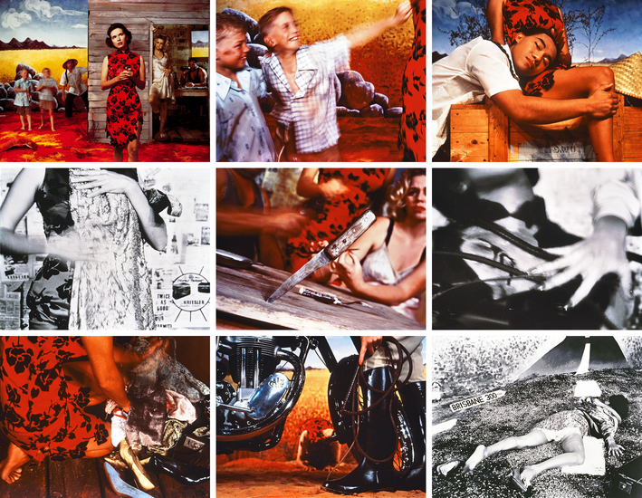
Tracy Moffatt: The nine images in Something More tell an ambiguous tale of a young woman’s longing for ‘something more’, a quest which brings dashed hopes and the loss of innocence. With its staged theatricality and storyboard framing, the series has been described by critic Ingrid Perez as ‘a collection of scenes from a film that was never made’. While the film may never have been made, we recognise its components from a shared cultural memory of B-grade cinema and pulp fiction, from which Moffatt has drawn this melodrama. The ‘scenes’ can be displayed in any order – in pairs, rows or as a grid – and so their storyline is not fixed, although we piece together the arc from naïve country girl to fallen woman abandoned on the roadside in whatever arrangement they take. Moffatt capitalises on the cinematic device of montage, mixing together continuous narrative, flashbacks, cutaways, close-ups and memory or dream sequences, to structure the series, and relies on our knowledge of these devices to make sense and meaning out of the assemblage.

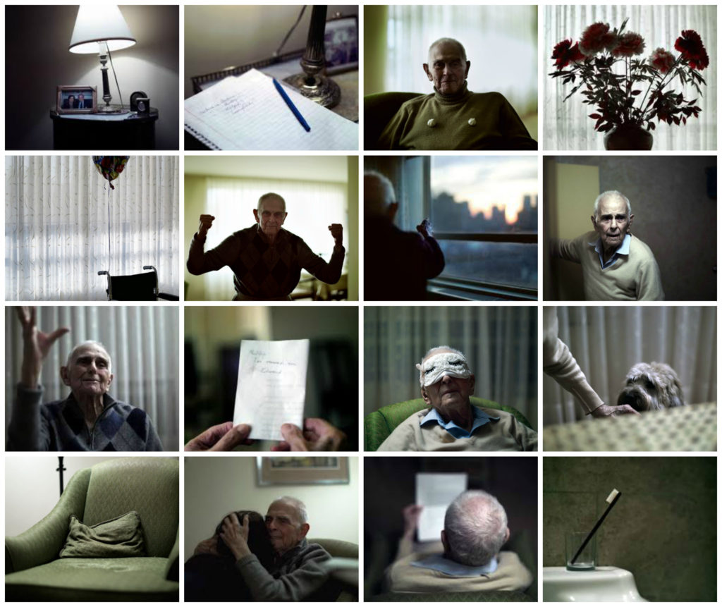
Philip Toledano: Day with my father, 2010

Philip Toledano: DAYS WITH MY FATHER is a son’s photo journal of his aging father’s last years. Following the death of his mother, photographer Phillip Toledano was shocked to learn of the extent of his father’s severe memory loss.

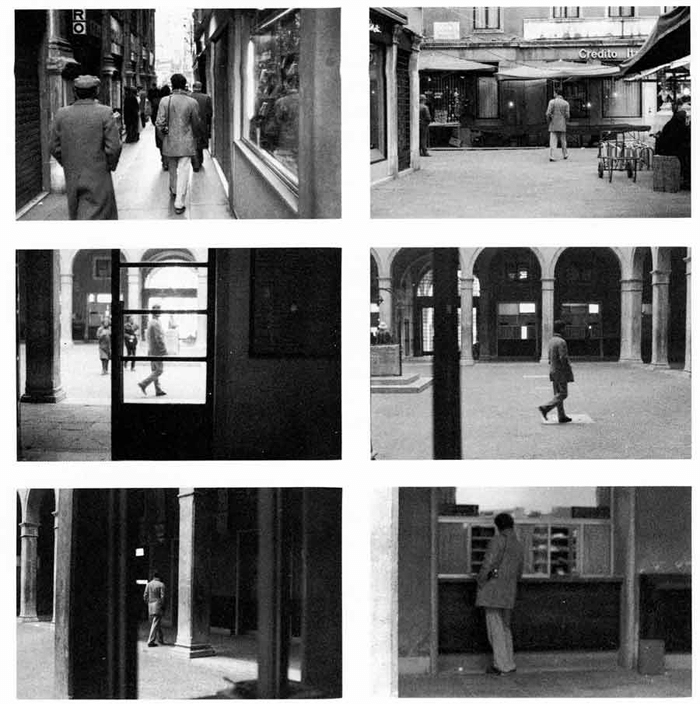
Sophie Calle’s practice is characterised by performances using rule-based scenarios, which she then documents. Venetian Suite consists of black and white photographs, texts and maps that document a journey the artist made to Venice in order to follow a man, referred to only as Henri B., whom she had previously briefly met in Paris. Although Calle undertook the journey in 1979, the texts describe the actions as taking place in 1980. Venetian Suite records Calle’s attempts to track her subject over the course of his thirteen-day stay in Venice. She investigates and stalks him, enlisting the help of friends and acquaintances she makes in the city. Eventually Henri B. recognises Calle, and they share a silent walk. Even after this encounter Calle continues her project, shadowing Henri B. from a distance until his arrival back in Paris.

The work was initially produced in book form in 1983; the same year Calle also presented the work as a sound installation in a confessional booth. In 1996 she configured Venetian Suite as a gallery-based work, the appearance of which deliberately recalls a detective casebook, with texts written in a style that mimics and deconstructs the narrative tension typical of detective novels or film noir. The text begins as follows:

For months I followed strangers on the street. For the pleasure of following them, not because they particularly interested me. I photographed them without their knowledge, took note of their movements, then finally lost sight of them and forgot them. At the end of January 1980, on the streets of Paris, I followed a man whom I lost sight of a few minutes later in the crowd. That very evening, quite by chance, he was introduced to me at an opening. During the course of our conversation, he told me he was planning an imminent trip to Venice. I decided to follow him.
(Calle and Baudrillard 1988, p.2.)

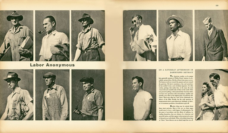
Walkers Evans and Labour Anonymous

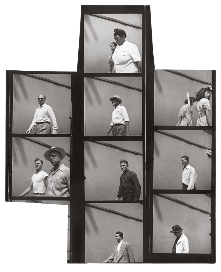
Walker Evans: One of the founding fathers of Documentary Photography Walker Evans used cropping as part of his work.  Another pioneer of the photo-essay, W. Eugene Smith also experimented with cropping is his picture-stories

Read more here on Walker Evans and his magazine work and  his series Labour Anonymous.

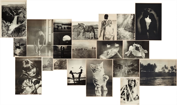
Hans-Peter Feldmann, Sonntagsbilder (Sunday Pictures). 1976
The complete set of 21 offset lithographs, on thin wove paper, with full margins,
all I. various sizes

Hans-Peter Feldmann: (b. 1941 Duesseldorf). The photographic work of Hans-Peter Feldmann began with his own publications in small print-runs between 1968 and 1975. Often using reproductions of photographs from magazines or private snapshots, which he mixed with his own photographs, Feldmann, like Ed Ruscha, undermined the aura of the unique, “authentic” work of art. With his laconic imagery he seeks to break down conventional notions of art.

MONTAGE

Photomontage is the process and the result of making a composite photograph by cutting, gluing, rearranging and overlapping two or more photographs into a new image. 

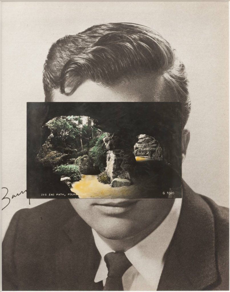
Mask XIV 2006 

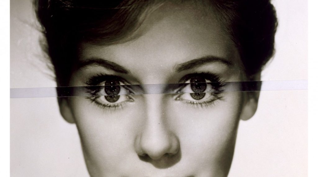
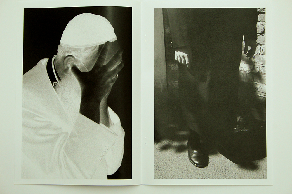
John Stezaker: Is a British artist who is fascinated by the lure of images. Taking classic movie stills, vintage postcards and book illustrations, Stezaker makes collages to give old images a new meaning. By adjusting, inverting and slicing separate pictures together to create unique new works of art, Stezaker explores the subversive force of found images. Stezaker’s famous Mask series fuses the profiles of glamorous sitters with caves, hamlets, or waterfalls, making for images of eerie beauty.

His ‘Dark Star’ series turns publicity portraits into cut-out silhouettes, creating an ambiguous presence in the place of the absent celebrity. Stezaker’s way of giving old images a new context reaches its height in the found images of his Third Person Archive: the artist has removed delicate, haunting figures from the margins of obsolete travel illustrations. Presented as images on their own, they now take the centre stage of our attention

Thomas Sauvin and Kensuke Koike‘No More, No Less’
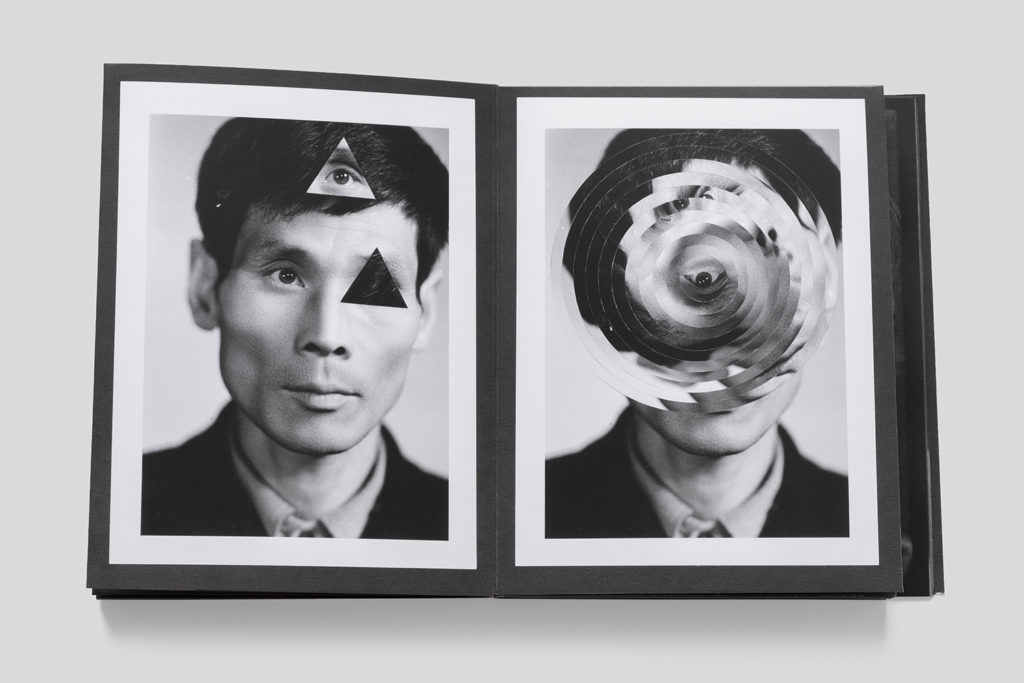
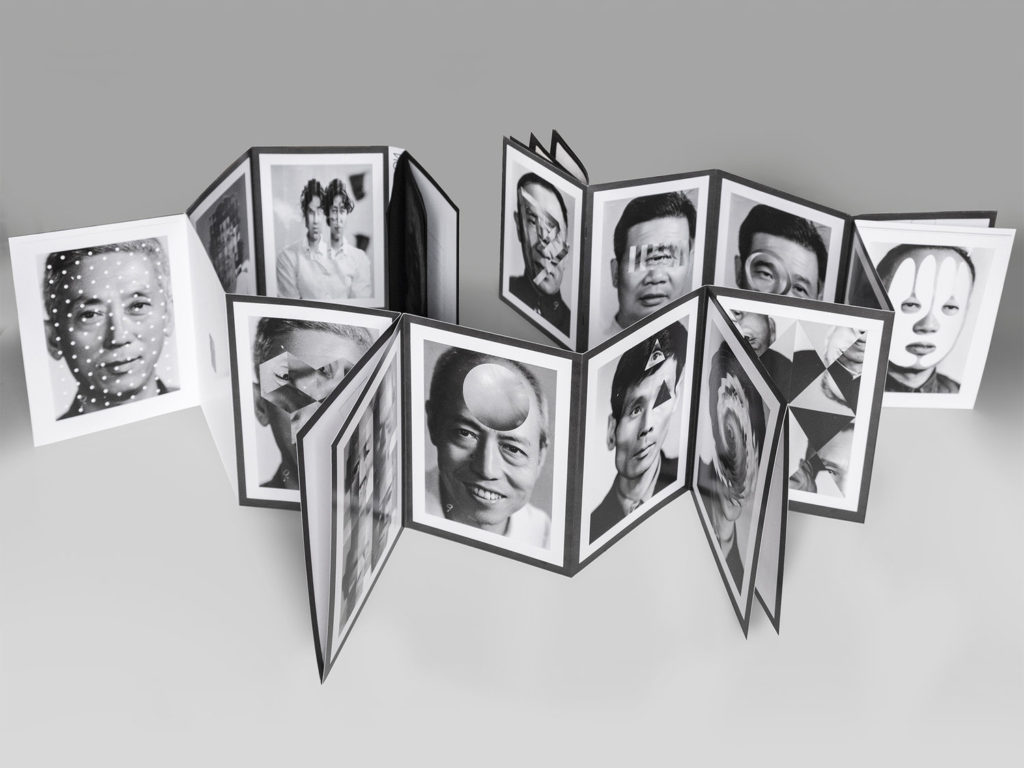
In 2015, French artist Thomas Sauvin acquired an album produced in the early 1980s by an unknown Shanghai University photography student. This volume was given a second life through the expert hands of Kensuke Koike, a Japanese artist based in Venice whose practice combines collage and found photography. The series, “No More, No Less”, born from the encounter between Koike and Sauvin, includes new silver prints made from the album’s original negatives. These prints were then submitted to Koike’s sharp imagination, who, with a simple blade and adhesive tape, deconstructs and reinvents the images. However, these purely manual interventions all respect one single formal rule: nothing is removed, nothing is added, “No More, No Less”. In such a context that blends freedom and constraint, Koike and Sauvin meticulously explore the possibilities of an image only made up of itself.

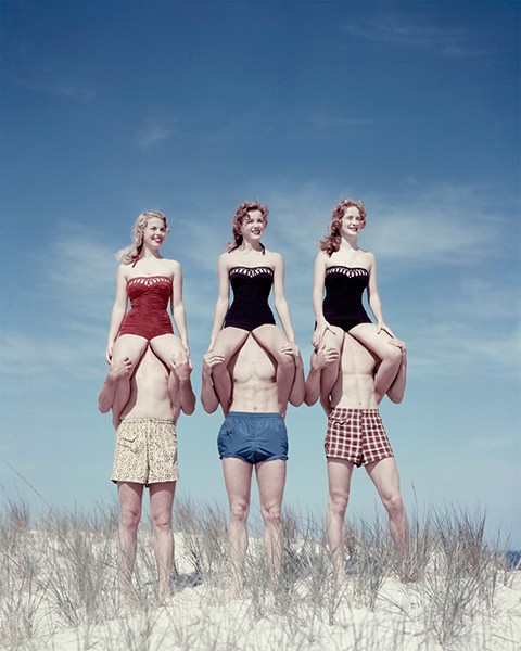
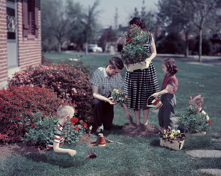
Veronica Gesicka Traces presents a selection of photomontages created by Weronika Gęsicka on the basis of American stock photographs from the 1950s and 1960s. Family scenes, holiday memories, everyday life – all of that suspended somewhere between truth and fiction. The images, modified by Gęsicka in various ways, are wrapped in a new context: our memories of the people and situations are transformed and blur gradually. Humorous as they may seem, Gęsicka’s works are a comment on such fundamental matters as identity, self-consciousness, relationships, imperfection.

Personal Investigation – Decontructing Photobooks

Dragana Jurisic ‘YU; The Lost Country’

1. Research a photo-book and describe the story it is communicating  with reference to subject-matter, genre and approach to image-making.

The book I have chosen to look at, in terms of design and composition, is Dragana Jurisic ‘YU; The Lost Country’. The story Jurisic is communicating guides the viewer through a pilgrimage, unfolding before them a myriad of lives and emotions onto the map of where Yugoslavia once lay. Through-out the series of photographs documenting new life and the remnants of past atrocities in the former conglomerate, Jurisic rhythmically inserts with almost Wes Anderson-like technicolour shots of her travel reading, where sprawling diary notes live in the margins telling of the encounters which shook, infuriated and moved her.

2. Who is the photographer? Why did he/she make it? (intentions/ reasons) Who is it for? (audience) How was it received? (any press, reviews, awards, legacy etc.)

The creator of ‘The Lost Country’ is Dragana Jurisic, a photographer from the former Yugoslavia now based in Dublin. She decided to create ‘The Lost Country’ as she knew her homeland would soon be only a memory and she did not want to forget anything about it; she also wanted to preserve this memory for millions of Yugoslavs who would later live in exile. She thought of art as a reliving of experience.

Reviews – “It is a haunted, as well as haunting book; the fallout of the past buried, rather than faced.” (Sean O’Hagan for The Guardian)

The idea of art based on other bits of art in not a new one and a lot of current work seems to relate to pre-existing works by other people. But this is different. The show has an emotional charge that is antithesis of academicism. The exhibition uses the language of contemporary art to achieve something that is rare in a lot of contemporary art: it is emotional, frank, autobiographical and honest. (Andy Parson for Visual Artist Ireland News-sheet, January 2014)

The result of this ambitious journey is the wonderful exhibition YU: The Lost Country, a visual journey into the past and present punctuated by West’s prose and Jurisic’s own words. The attempt to answer the universal question about identity in a very personal way. And since Jurisic herself follows Roland Barthes’ assertion that “photography is more akin to magic than to art”, it is no surprise that many of the photos have an otherworldly feel to them and leaves the viewer wondering about their own memories and identity. (Jensine-Bethna Wall for Irish News Review, September, 2014)

Between the silences which seem to envelope the older generation and the ennui of the young, Jurisic’s YU is the landscape of still and mournful places, in which the weight of the past forces itself upon everything. Rebecca West valiantly fought to believe in the future of Yugoslavia. Dragana Jurisic traces the effects and aftershocks of its disintegration in the subtlety of her colours, her capacity for intimacy and the intelligence and empathy with which she sees what was once Yugoslavia. Jurisic’s YU is still a place which, in West’s words, can induce a ‘bad, headachy dream’. (Colin Graham for SOURCE Photographic Review, July 2013)

Jurisic’s work utilises style and form that resonates truthfully, yet transcends photo-journalism by creating subjective metaphors too profound to be considered objective […] This works brilliantly for Jurisic; her feelings about the disconnection from the land seem justified, merely by being photographed. Some of her works hold such movingly profound metaphors, her genius is in the relationship of what was discovered ‘as it were’ and the artists construction of what lies in front of the camera. (Sandy O’Dune for TRI-HARD, November, 2014)

3. Deconstruct the narrative, concept and design of the book and apply theory above when considering: Book in hand: how does it feel? Smell, sniff the paper. Paper and ink: use of different paper/ textures/ colour or B&W or both. Format, size and orientation: portraiture/ landscape/ square/ A5, A4, A3 / number of pages.

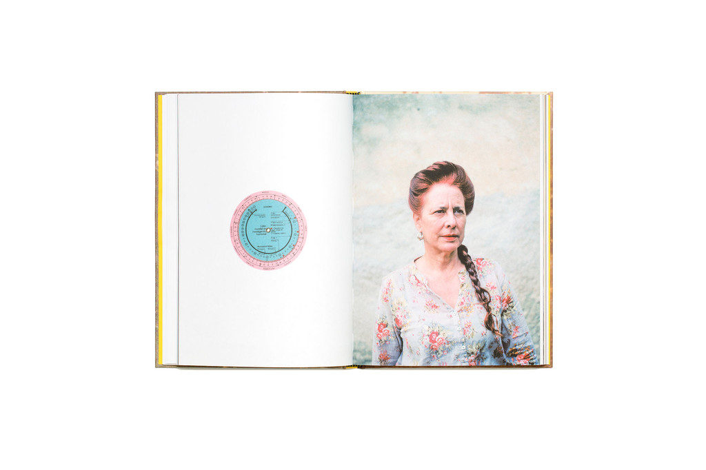
The book is around an A5 size, easy to hold and flick through; the cover feels rough as it is lined with a cotton material, with small ridges creating a disrupted texture. The paper smells stale and feels thin with a slight glossy quality; the edges of each page are coloured with a dark blue paint-like material that creates an overall darkness around the book. All images inside the book are in colour, with a misty theme of blues and whites – disrupted by flashes of colourful street photography dotted about between pages. Most images are formatted in the same square orientation on the right side of a double spread, the other side holds an extract of text which is usually a quote from Jurisic herself, or just showing the location in which the image was captured. This traditional layout makes the book appear clean and pure – possibly hinting towards Jurisic’s message on the opposition between how now her hometown is being neglected and destroyed.

Binding: soft/hard cover. image wrap/dust jacket. perfect binding/saddle stitch/swiss binding/ Japanese stab-binding/ leperello

Jurisic’s book is a hardcover, without any dust jacket, lined with a rough cotton that has a printed image of trees on the front, and a blank dark blue fabric on the back. There is a use of saddle stitch binding, with five stitches up the centre of the book, joining each page together. The hardcover is of a medium thickness and is rounded at the edges due to the fabric lining, the printed image on the front appears ambiguous and sombre – a possible hint to the message inside to come.

Title: literal or poetic / relevant or intriguing.

The title ‘YU: The Lost Country’ is exciting and conveys a sense of adventure/fantasy for the audience as if it were an action video game like ‘The Lost City’, nevertheless its meaning is dark and holds links to themes of war, poverty and ruin. Jurisic has titled her photobook with a relevant phrase, literally telling her audience they are about to see the reminisce of her memories from a country that now no longer exists.

Structure and architecture: how design/ repeating motifs/ or specific features develops a concept or construct a narrative.

Each page in Jurisic’s photobook has quite a cleanly, pristine feel to it, with plain white boarders making a constant feature which surround her sharp-focused images. Additionally, her layering of text intertwining throughout the pages is always positioned on the bottom left hand side of each double spread, creating a theme of systematicity and order. This conveys Jurisic’s narrative of highlighting the devastation brought onto her country from an ever growing world of regulations, showing a continuation of both memories and identity.

Images and text: are they linked? Introduction/ essay/ statement by artists or others.  Use of captions (if any.)

Jurisic documents her journey, retracing the steps of Rebecca West’s 1937 novel Black Lamb and Grey Falcon, through what was Yugoslavia, where she was born, but a “country” which no longer exists. The text used throughout the book is a combination of phrases from West’s novel and Jurisic’s own memories, examples of the photobook’s texts; “I have learned now that it might follow, because an empire passed, that a world full of strong men and women and rich food and heady wine might nevertheless seem like a shadow-show.” (Rebecca West). “It was a flat-topped rock, uneven in shape, rising to something like six feet above the ground, and it was red-brown and gleaming, for it was entirely covered with the blood of the beasts that had been sacrificed on it during the night.” (Rebecca West). As West’s novel gets told, Jurisic links her own past to these events, her images reflect and respond to West’s ideas while still staying true to what Jurisic remembers of her own childhood in Yugoslavia.

YU: The Lost Country — Dragana Jurišić

Further information links;

Dragana Jurisic; on ‘The Lost Country’

The Backstory – ‘YU; The Lost Country’

Vimeo link – Photobook Presentation