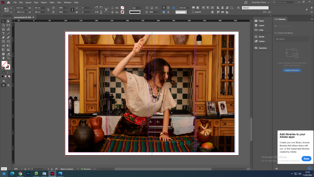
- FULL-BLEED: Select one image as a full-bleed spread.
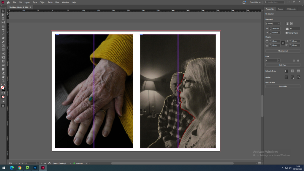
- JUXTAPOSITION: Select 2 images and experiment with different combinations.
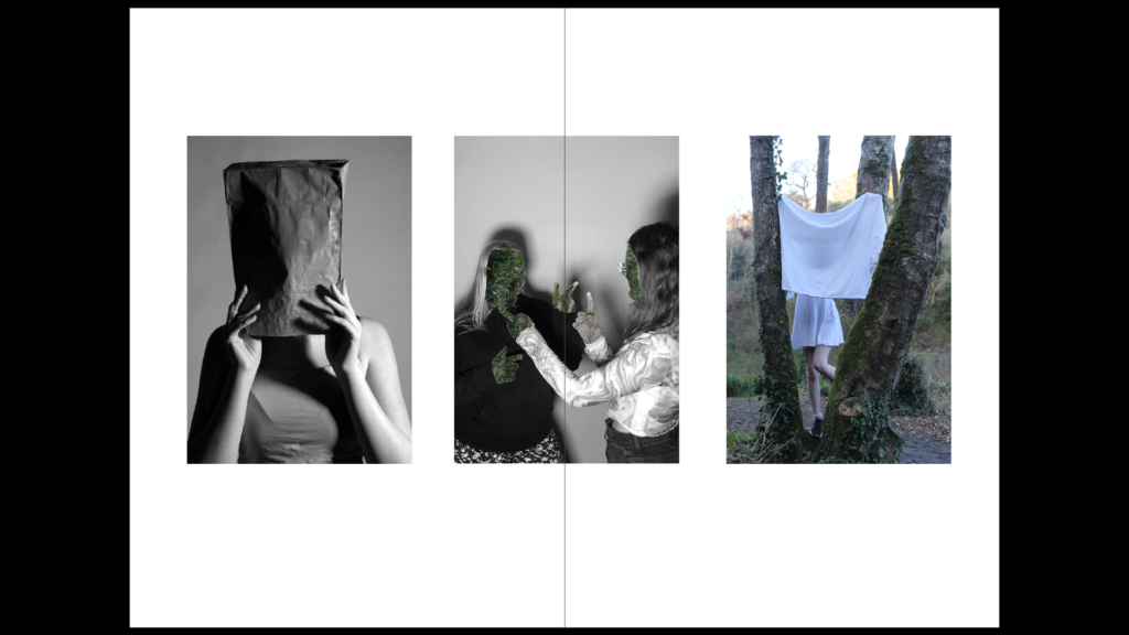
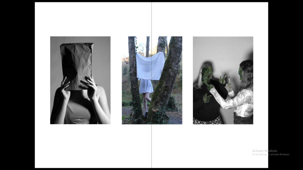
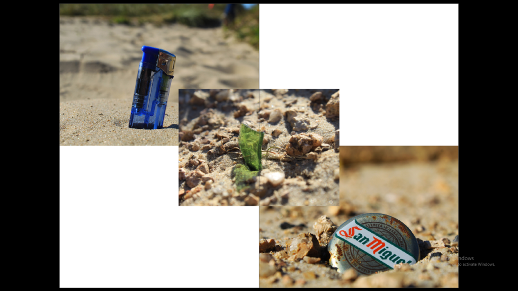
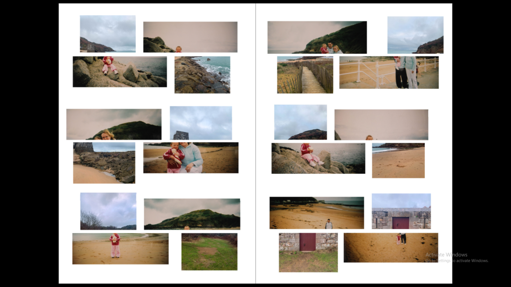
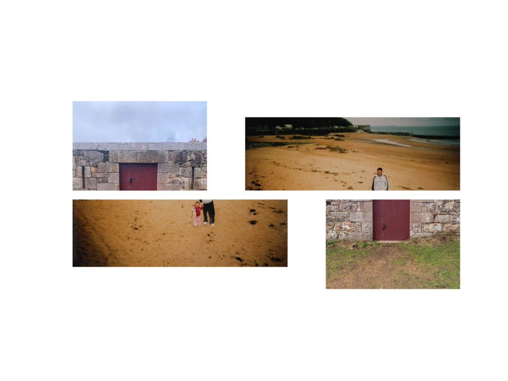
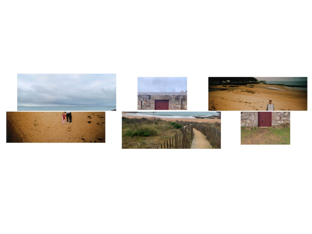
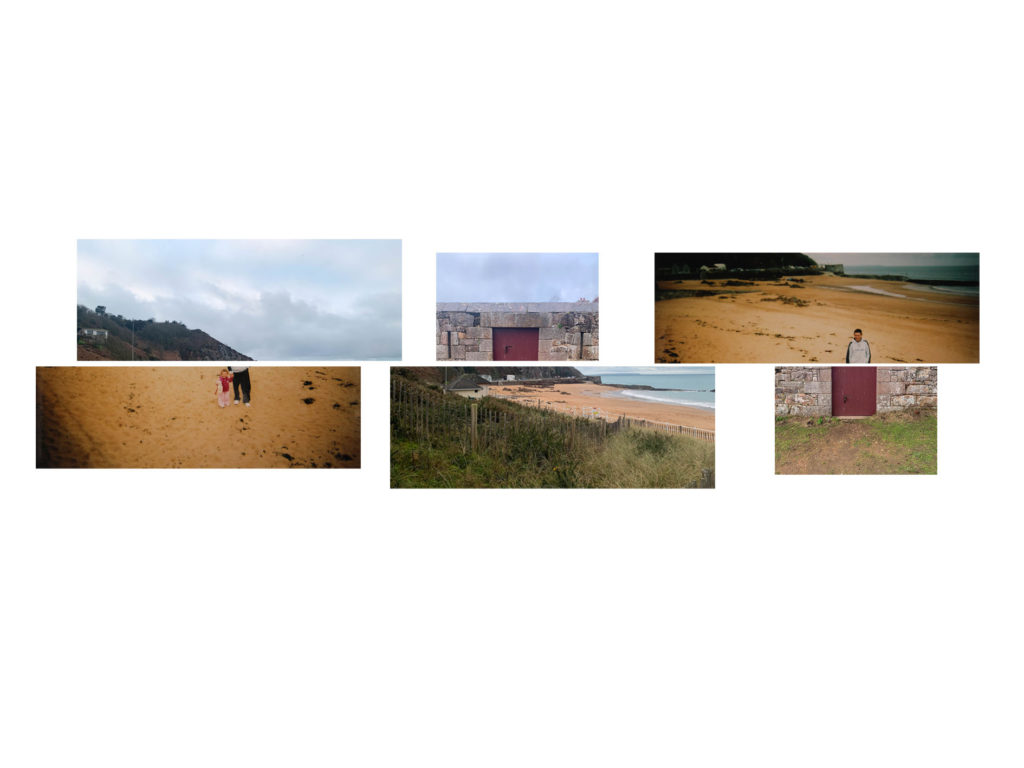
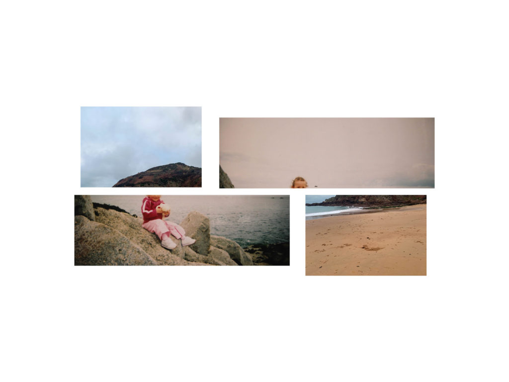
- SEQUENCE: Select a series of images (between 4 – 12) and produce a sequence either as a grid, story-board, contact-sheet or typology.
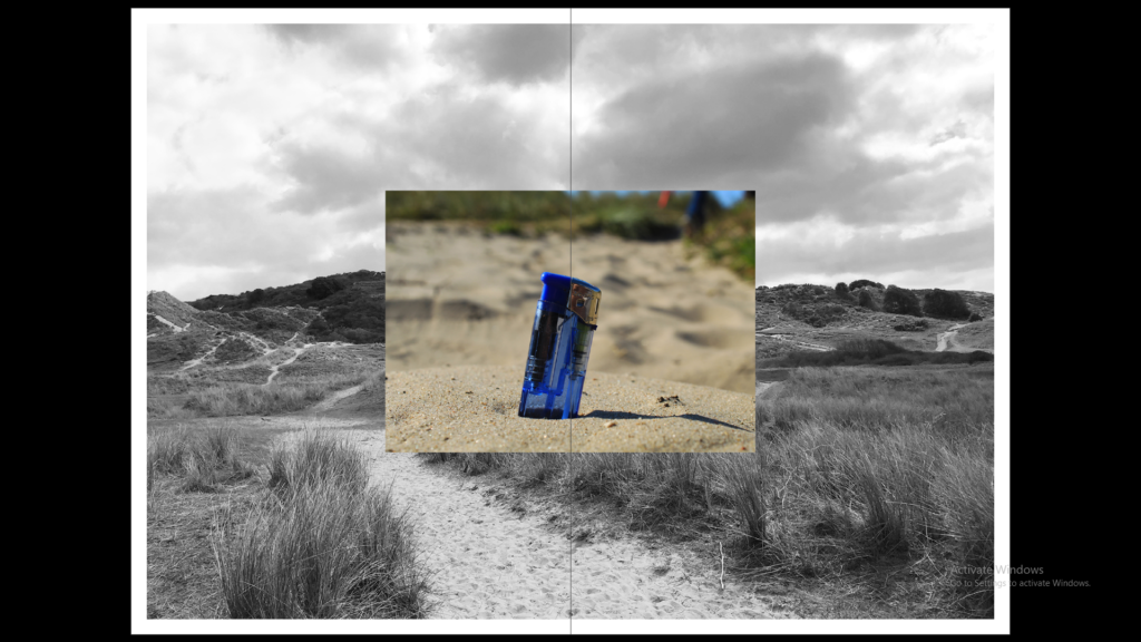
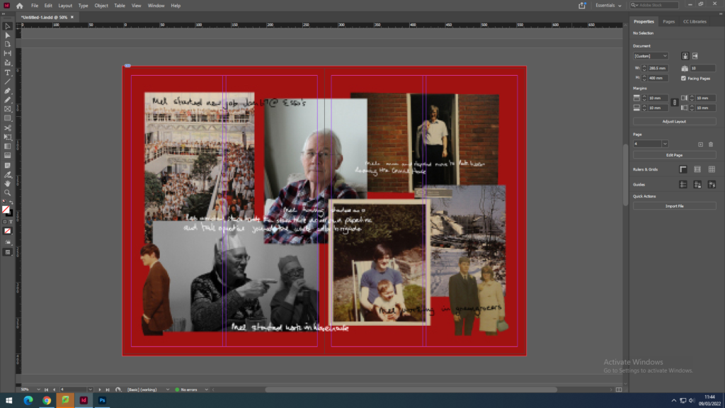
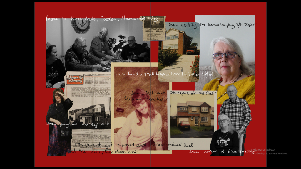
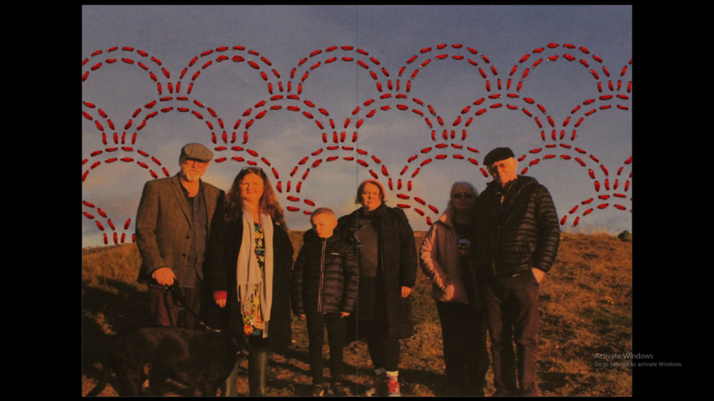
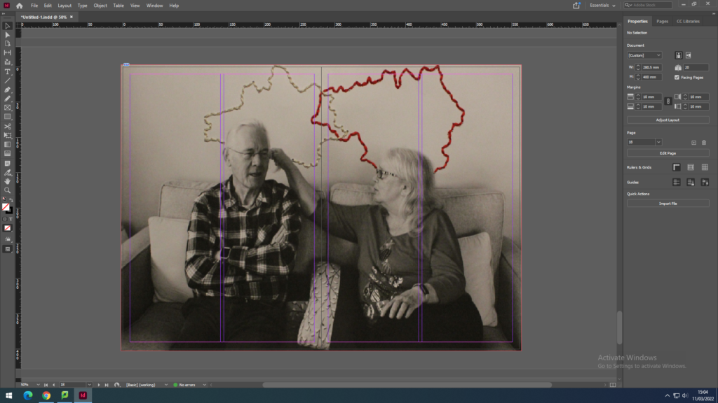
- MONTAGE: Select an appropriate set of images and create a montage of layered images. You may to choose to work in Photoshop for more creativity and import into InDesign as one image (new document in Photoshop 400mm(h) x 280.5mm(w) in 300 dpi)
we have decided to make a newspaper full of our old coursework and previous images and use them. I have decided to include images from my zine, summer project and natural landscapes.
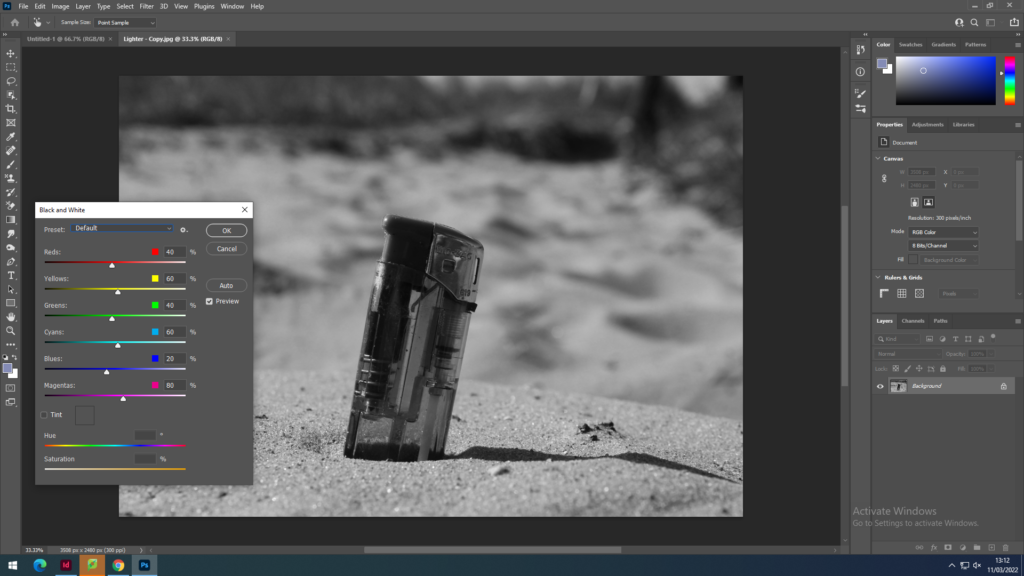
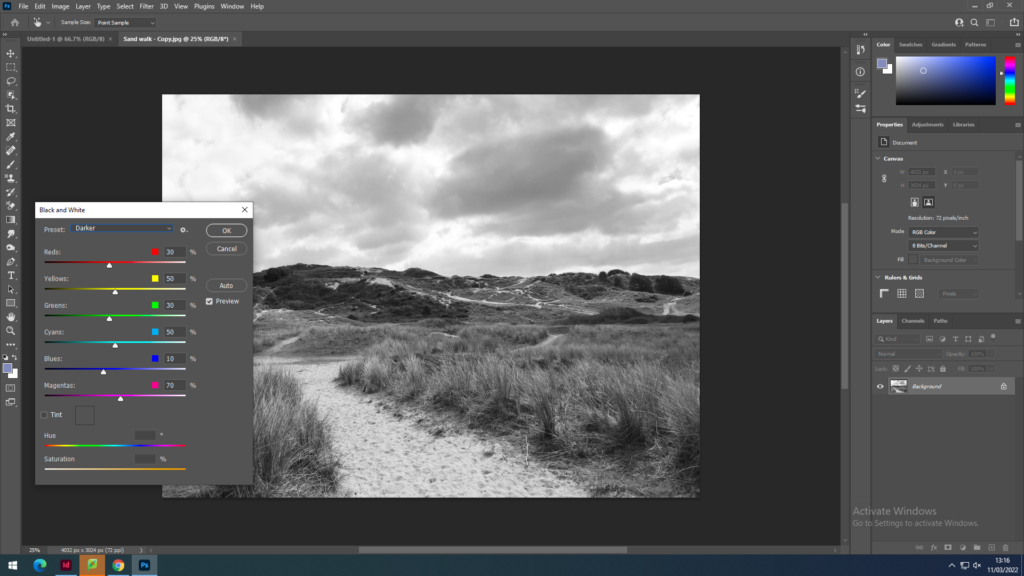
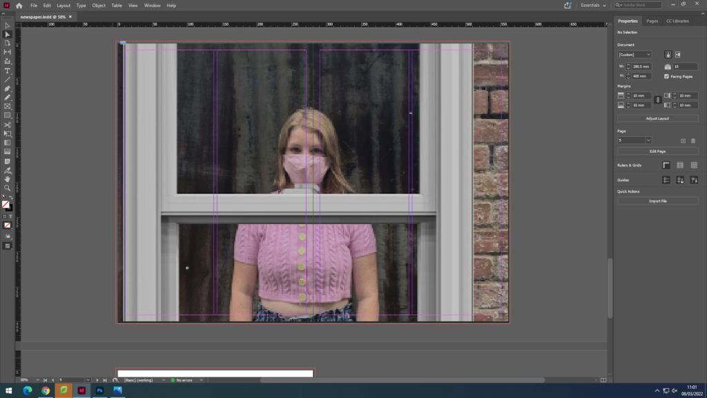
I set up InDesign to start exporting my images and set out my layout for the newspaper. I will include a full-bleed, juxtaposition and a montage.
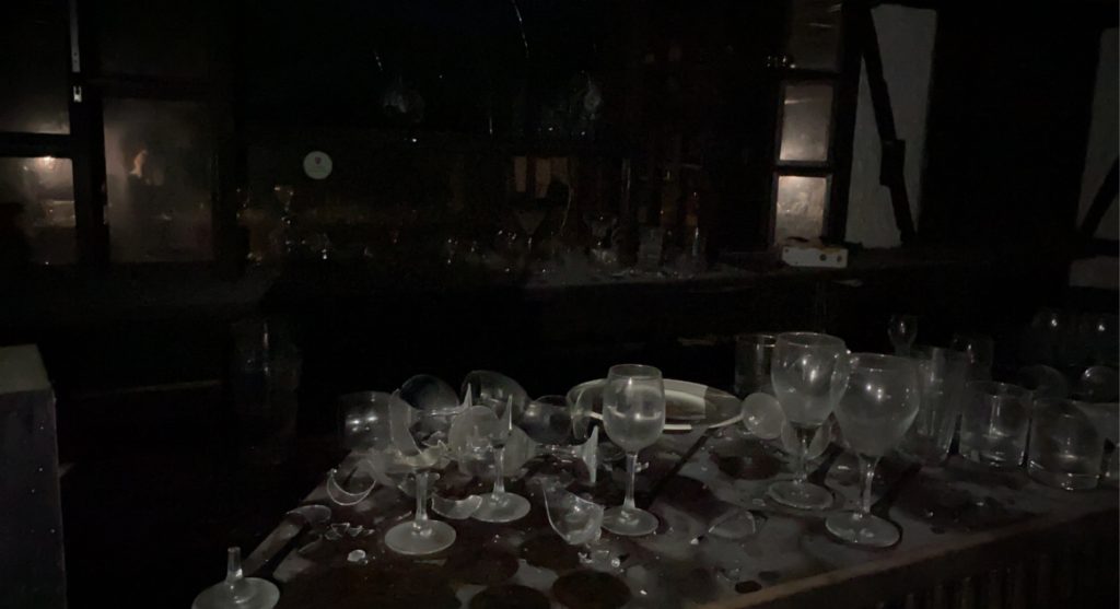
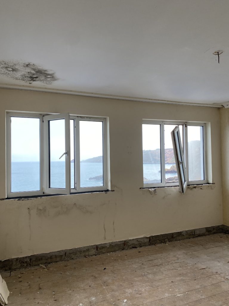
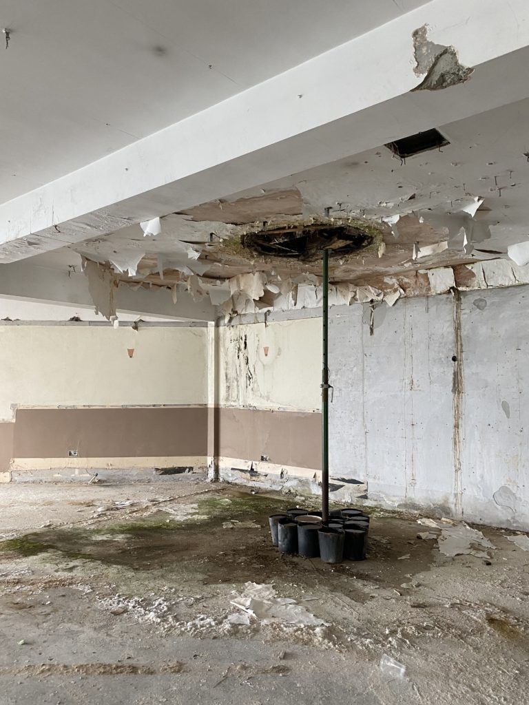
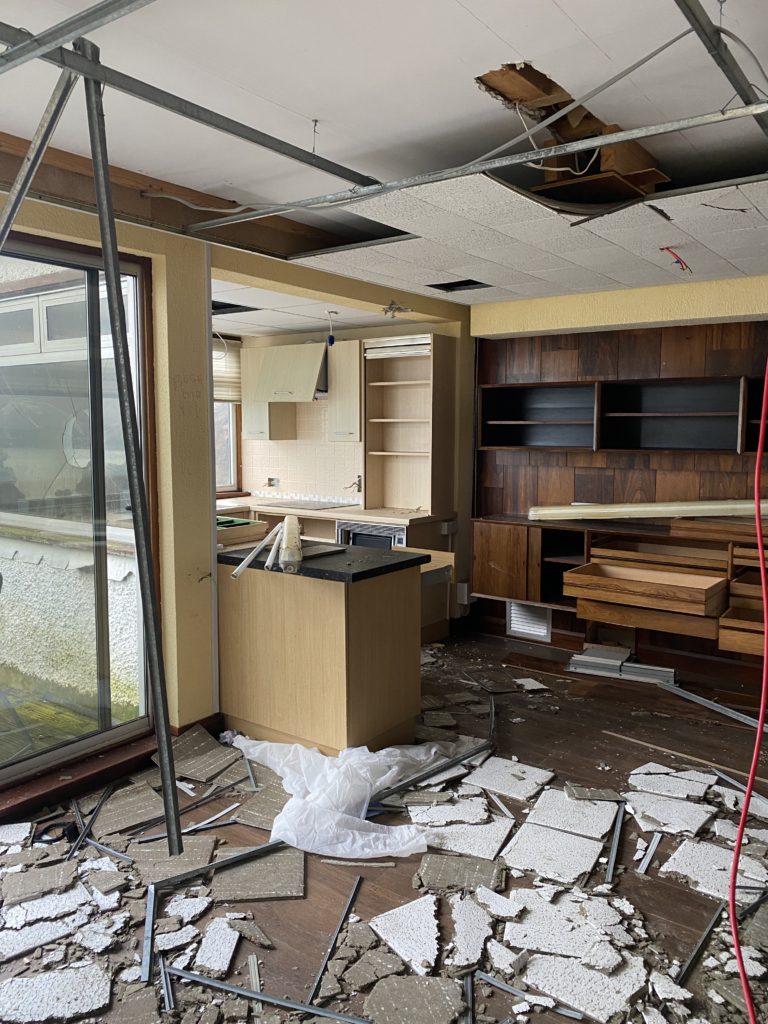
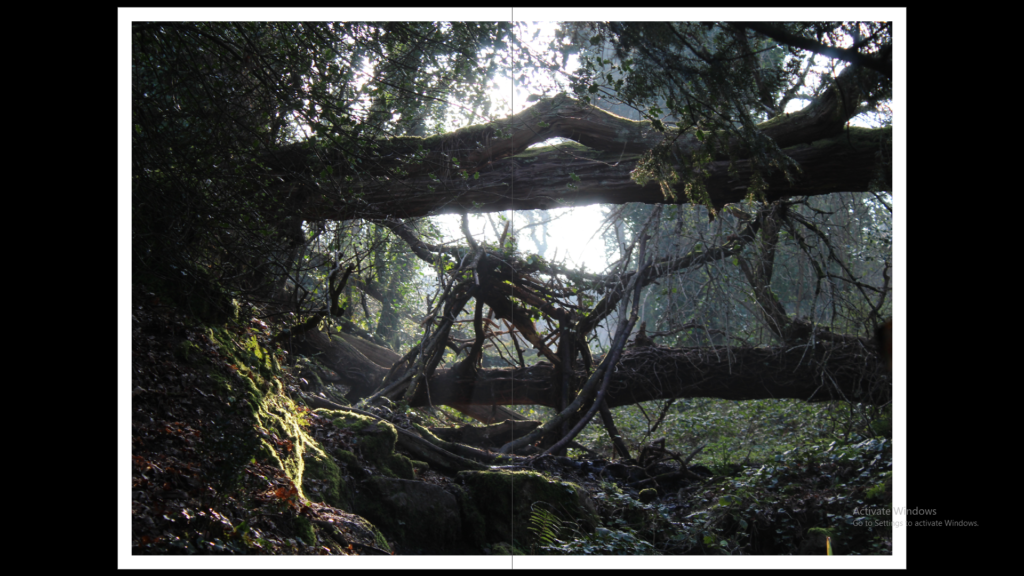
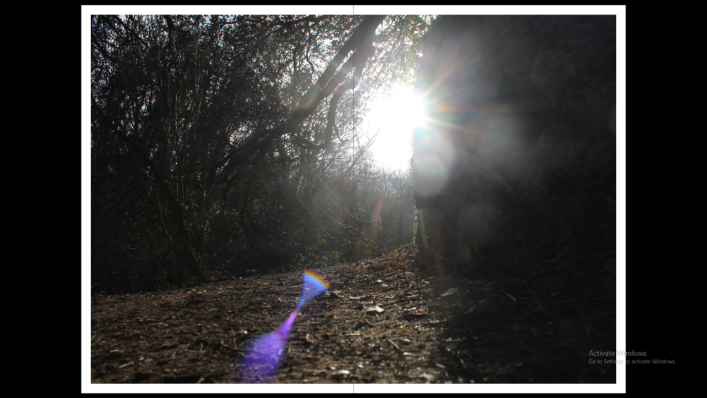
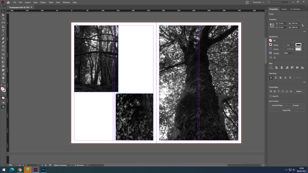
I found my previous work that I have used when exploring landscape photography, I used these three final images and wanted to include them together as they all set a mood and atmosphere by the use of dark tones, I thought these three would work well together so I decided to keep the best one and strongest image as one image on one page then put the two smaller ones together on the left page.
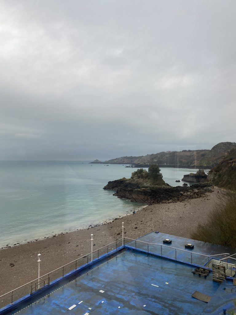
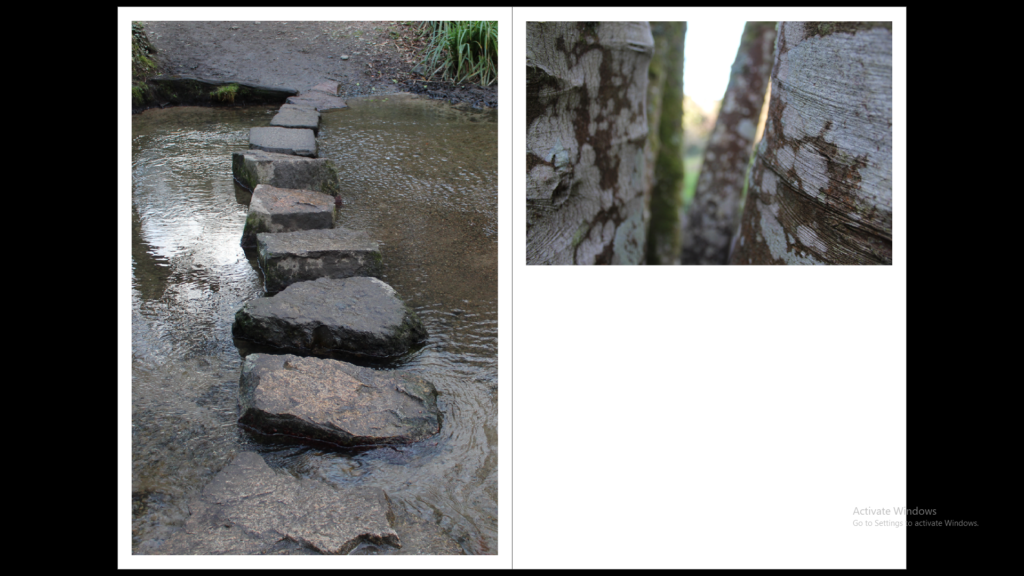
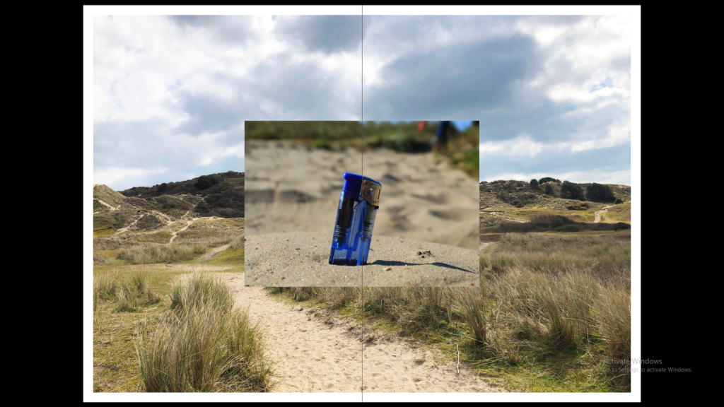
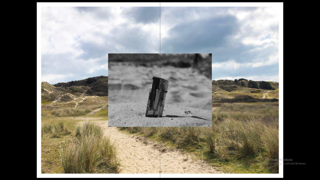
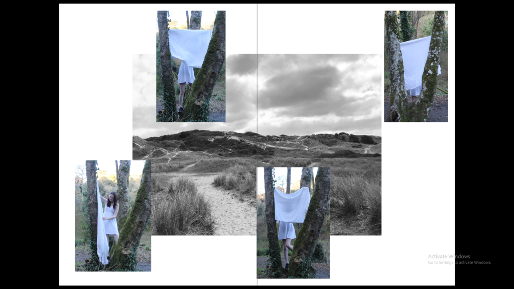
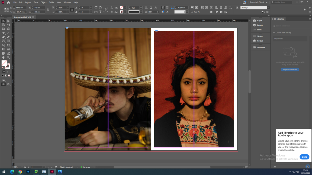
For my juxtaposition images I wanted to include two completely opposite images. Therefore I decided to use a very colourful image of the beach with very warm colours and tones and pair it with a very dark and gloomy image of the woods , both contrast very well between each other.
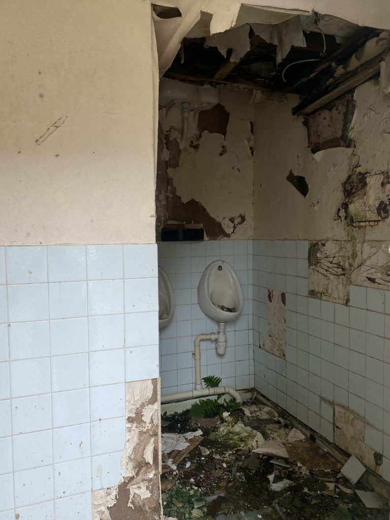
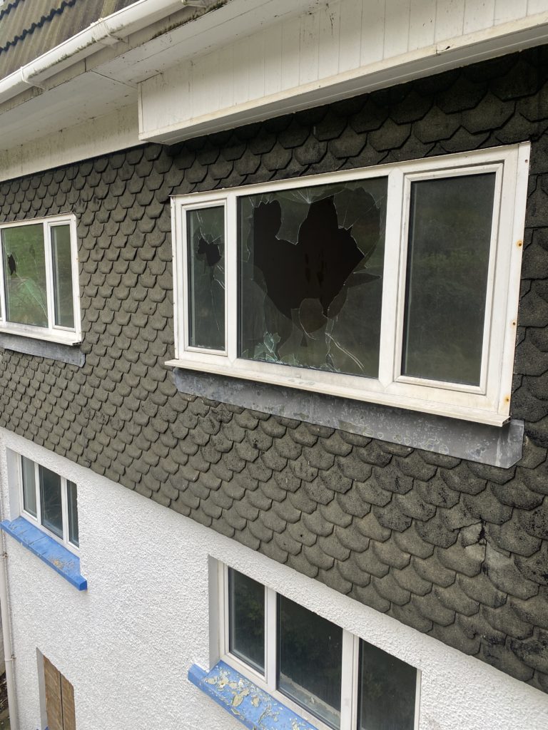
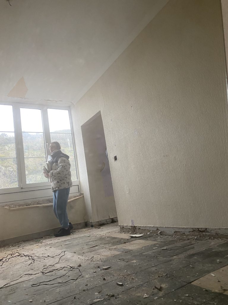
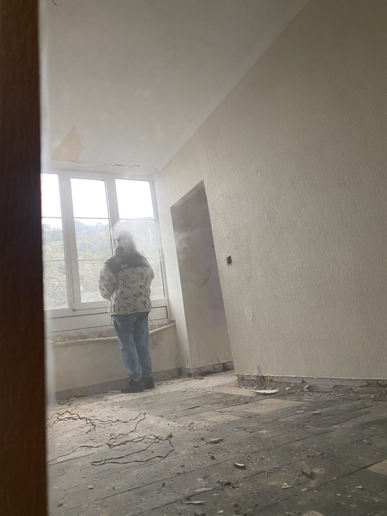
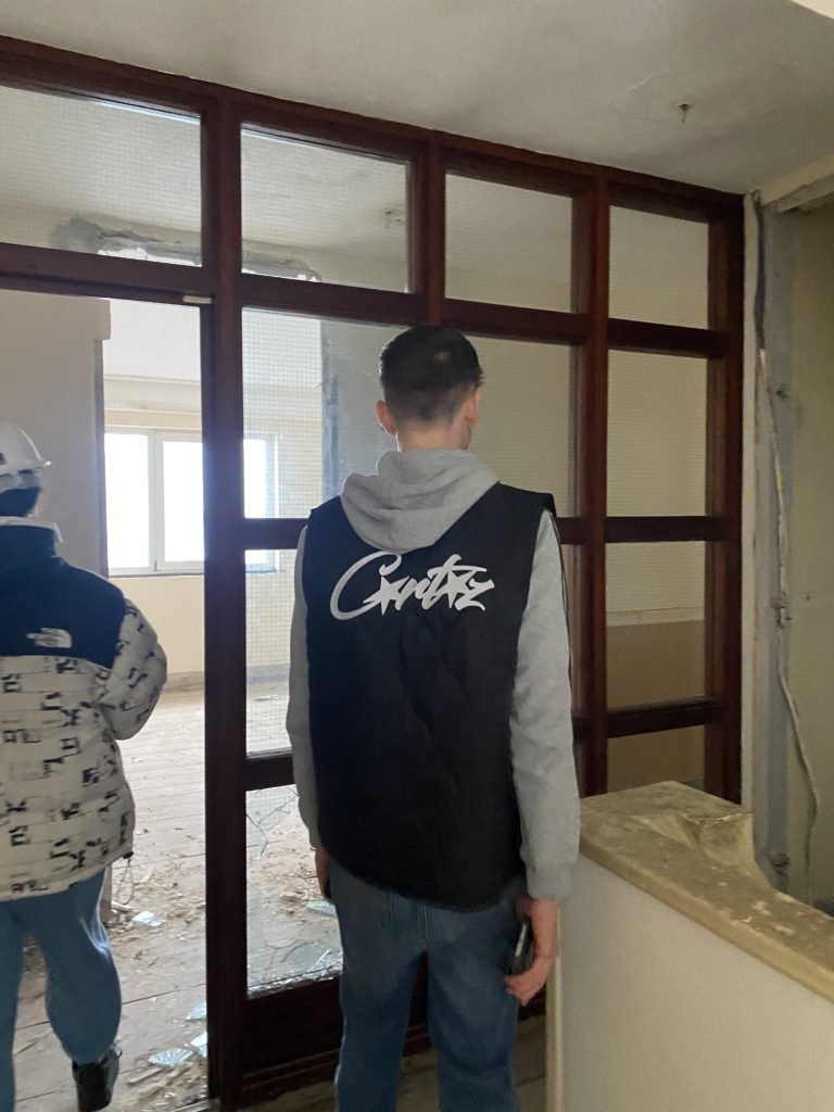
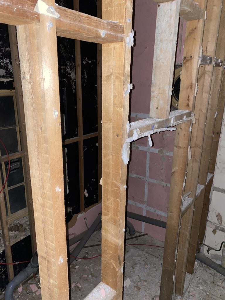
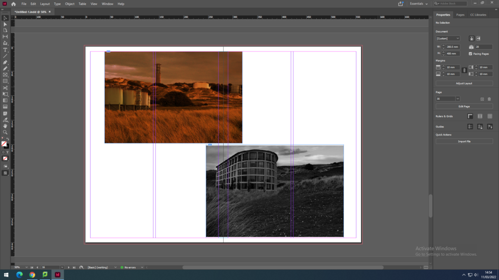
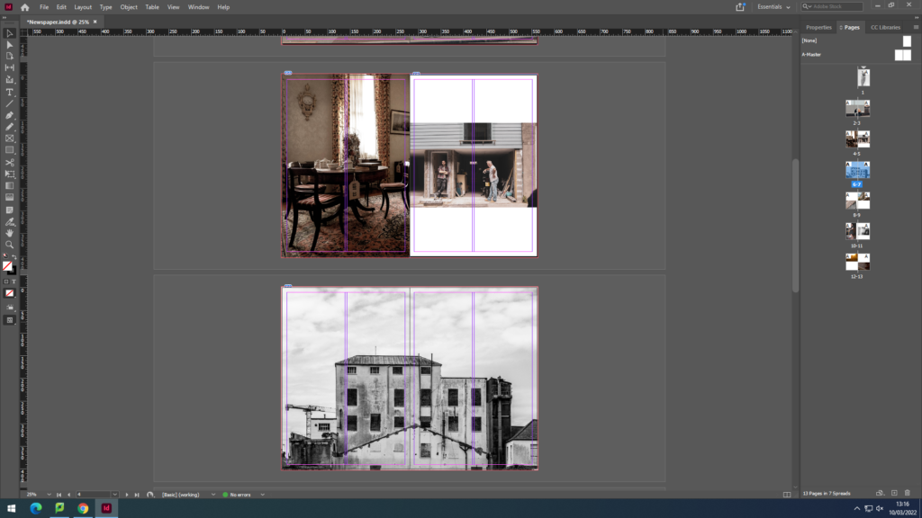
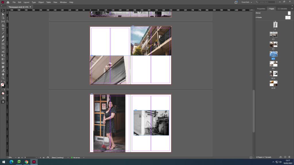
For my grid pages , I wanted to use my zine and jersey community photos as I had a few of them so I wanted to at least include four images. I chose my favourite ones mostly of tall buildings and old back streets with construction as I like how it shows how Jersey has both, very open and new office buildings as well as uncared roads and old broken houses.
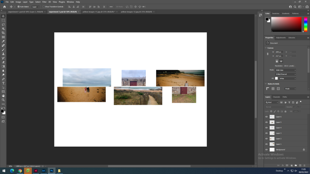
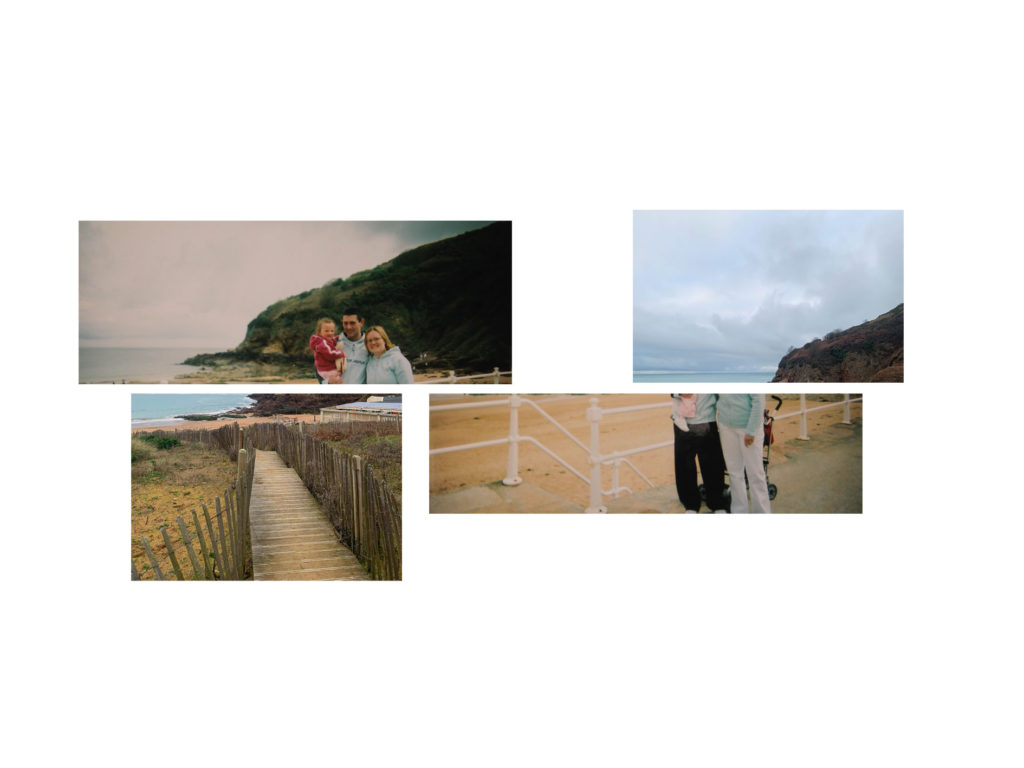
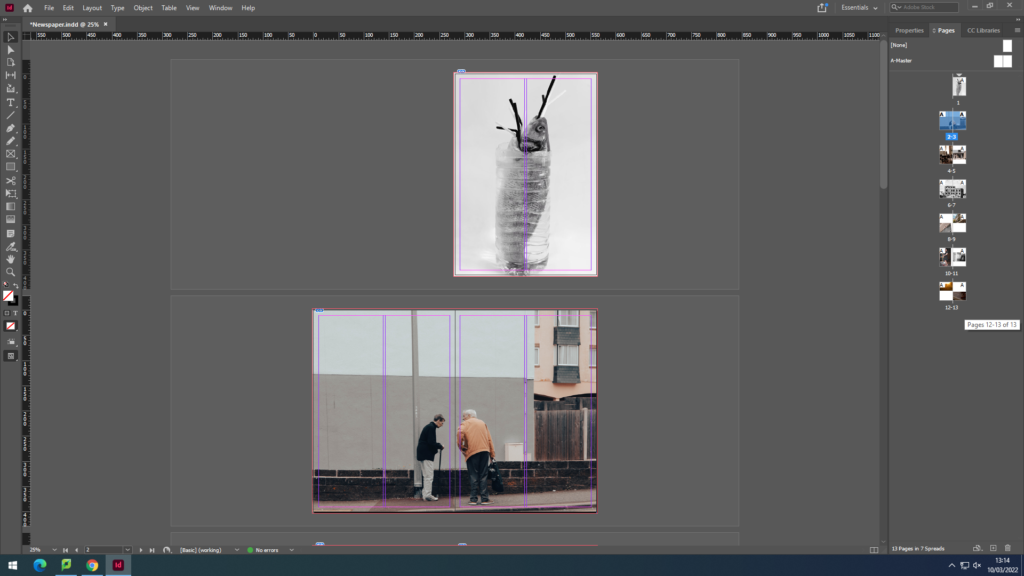
Finally, for my last page I wanted to use a double bleed and use images I took from the summer project at the start of year 12, the purpose of this shoot was to show how covid affected everyone’s lives.
Once I was done with my layout, I packaged my layout out and it was ready to go in the newspaper.