newspaper montage

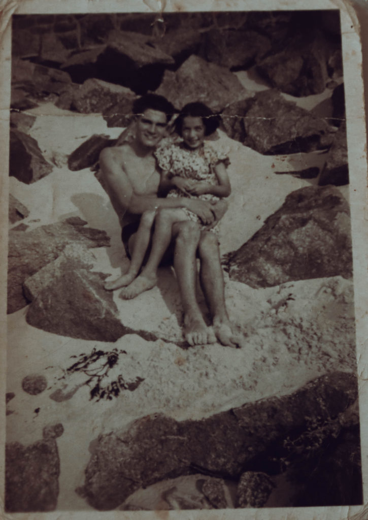
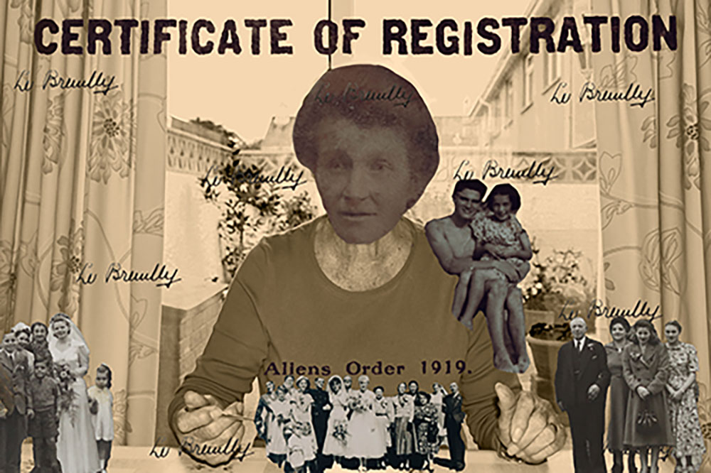
After putting together these photos I decided that there was not enough variety and although I really wanted to include the archival documents and photographs, they did not seem to fit in. To combat this issue I created a montage based on the portrait of my grandmother with a bricolage of her family photos and her own grandmothers immigration papers and documents.

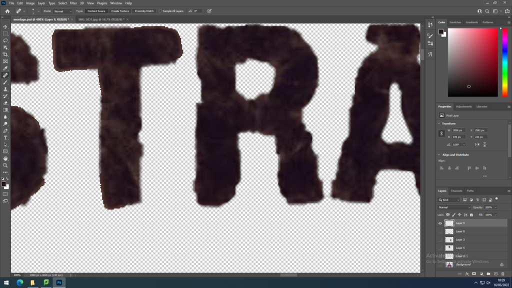
Using photoshop and the object selection tool I took key components from the archival subjects and pasted them over the initial portrait of my grandmother which I edited into black and white with a sepia wash to fit within the zeitgeist of the time period the other images came from. I replaced my grandmothers’ head with her grandmothers and scattered images from family weddings to create an image of unity and fit the prompt of identity as family is an important aspect of identity. To further stick to this identity prompt I used the typography from my great-great grandmothers certificate of registration that was taken from her alien identity card on her arrival from France to Jersey. The letters were severely damaged sue to being over a century old so I had to fix them on photoshop using the spot healing brush as well as redrawing some of the letters utilising the eyedropper and brush tool.
This image has an empty alt attribute; its file name is image-255-1024x576.png
corrective editing of the letters from the identity card

To re-establish the connection between family I pasted in the signature from the identity card. I intended to make the writing lighter and have it blend in more but was unable to do so, instead keeping it bold to make the family connection stronger. To create a link between the old and young identities of my grandmother, I included a photo of her as a child on her shoulder to show the importance of sticking to your roots, this is a very important message for my grandmother who grew up in abstract poverty raising her younger siblings and still works hard to take care of her family
Identity & Community – Newspaper

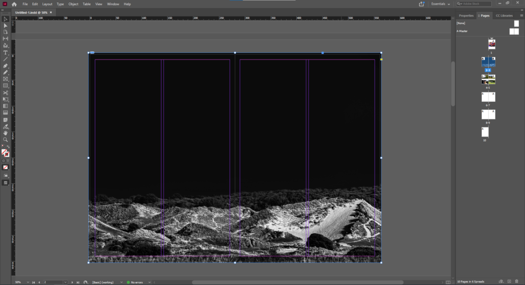
The above is the first image I chose due to its powerful use as a double page spread. This is because the landscape can fill the page and create an immersive experience when this page is opened. The negative space is also powerful as it splits the page horizontally and also presents an obscure aesthetic.

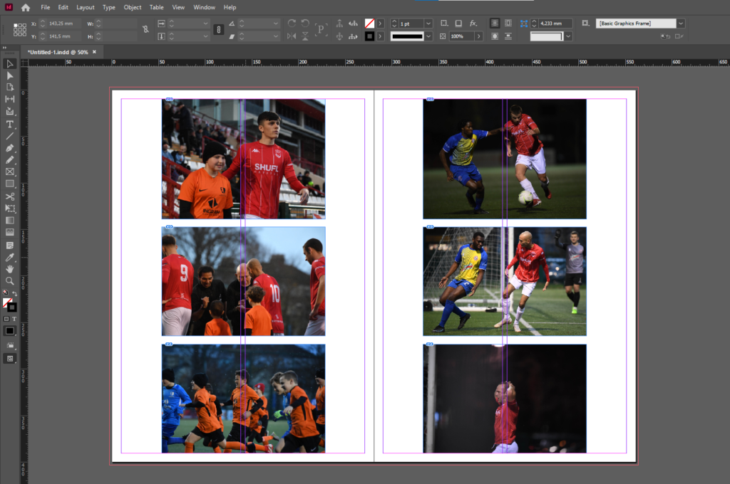
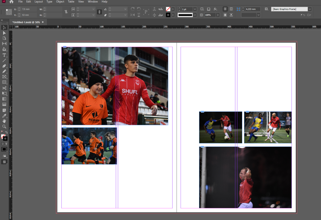
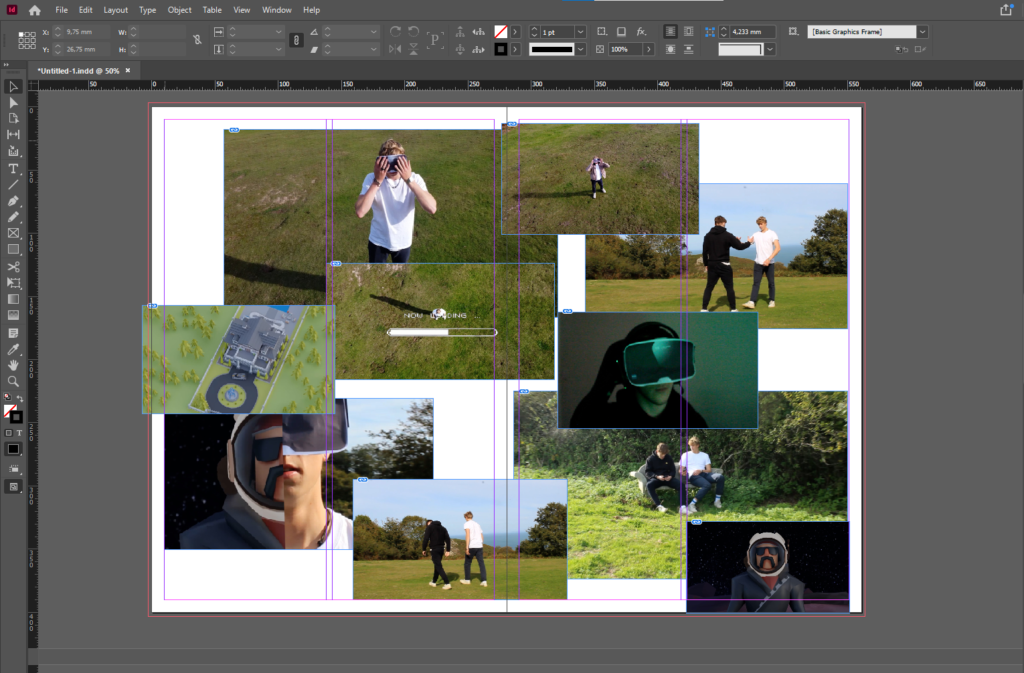
I then gathered related images and laid them out to create a photo-story. I chose theme images as they feature good framing, focus and balance while presenting the emotion of the subjects. After presenting them in this way I decided to configure them in a more traditional fashion suitable for a newspaper, with some images bigger than others and set out where a readers eye would easily follow down the page from left to right.

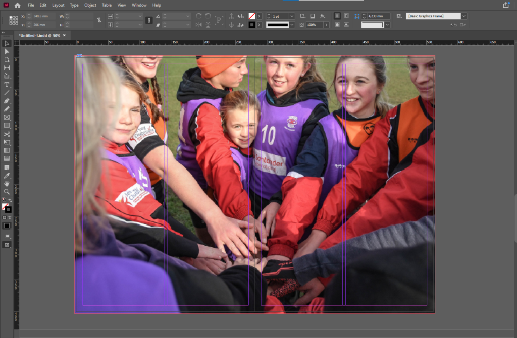
I then decided on another full double page spread using the below image as it presents the idea of identity and community well. With the girl staring into the lens it confronts whoever is looking at at the image and evokes emotion. This images is effective as a double page spread as it it immersive with depth of field created by the subjects in the foreground being out of focus while the subject in the background staring into the lens, makes it feel like you are part of the team huddle. The girls head is placed just before the middle of the spread so her head is not split in half.

Finally I presented a montage of screenshots from the NFT film.

newspaper design

For my newspaper spread I decided to incorporate work from various different projects and topics we have covered throughout our 2 year photography course, including studio portraits, landscape, and object photography. I chose what I think were my best work from these projects and experimented with different ways of laying them out in various sequences and narratives. To begin this process, I went through all of my published blog posts and selected the images that I thought best represented my progress and effort throughout photography. I tried to use images that were not too similar to each other, in order to keep the viewer interested. I then had to check that all the photographs were high quality, and that they had the appropriate number of pixels each. After that I imported all the images into InDesign and began to experiment with different layouts until I found one that I was happy with.

FINAL LAYOUT

newspaper design and layout

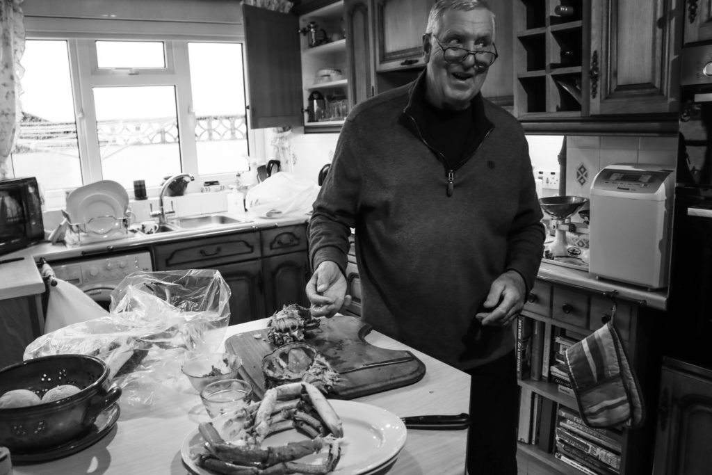
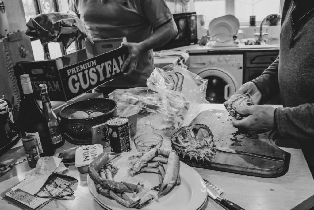
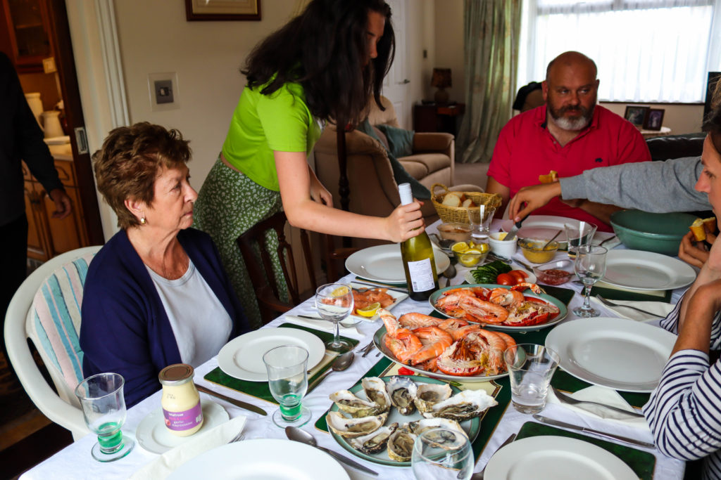
As many of my projects are connected with the subtopic of food I decided to continue that topic of study for my segment in the newspaper using a collection of photographs taken for previous projects. To achieve this I used InDesign, which I had previously used in my Zine project and set to work curating my favourite images to present my work over the last year. I used a mix of full bleed spreads as well as juxtaposition sots which include my great great grandmothers alien identity card contrasted by a portrait of my grandmother. I edited my photos on light room with a range of black and white and others with cinematic and vintage filters to create deep meaningful colours and imagery relating to vintage cookery books. Initially, when searching for my photos I realised that a vast majority were compressed low quality images so had to do further searching to find the raw images on my SD card to ensure the photos would be high quality with minimum pixilation and blurriness.

After putting together these photos I decided that there was not enough variety and although I really wanted to include the archival documents and photographs, they did not seem to fit in. To combat this issue I created a montage based on the portrait of my grandmother with a bricolage of her family photos and her own grandmothers immigration papers and documents.

I designed the layout for my first zine by matching silhouetted shapes unconventionally, The photos contrasting between portraits and landscapes taken in town between candid’s taken at a family dinner. With the second zine I followed a less conceptual idea with all photos being centred around the family and the only photographs not on a family member being archival documents of family members and a platter of seafood which I used to represent the central theme of food that brought my family together.

Image adaptation 1

Photoshoot 1 – Water Edge Hotel

For the photographs that I took at the Waters Edge Hotel I’m going to adapt them to take out the bright tones and add darker, and harsher tones as I feel this will add more details to the photographs overall. Furthermore I also believe that this may change the opinions within the photograph in which people are seeing, as negative tones may affect the overall mood of the photo.


Editing process:

I decided to use the software on my laptop to edit and adapt the photographs I have taken. I first started by desaturating the images and then change the levels of the photograph to what each photo suits. Additionally I also adapted the white balance of each photo which added further contrast and detail.


I personally feel that these photos are the best outcomes of the waters edge hotel photoshoot, this is because each photo has specific detail. However although I have stated that I want three photos to have harsh and dark tones I also feel that several of my photographs may look better if they are in colour as they show different contrasts than to if they were black and white.


Photoshop ideas:

For this idea I decided that I’m going to use photoshop ti develop the levels of the photographs as well as change the overall colour. Im going to do this by using specific features in photoshop to create a “3D” effect. Furthermore I feel that I may also decide to experiment with photomontage and create a collage using photoshop.


I feel as these four images work well together as all the colours blend together as well as the image which I used as an extra layer adds significant details; as you can see the stairs at a different angle which creates a more interesting photograph overall. I think I’m going to include these four images across a page in my photo book or one print in my final outcomes.