I plan to use 4-8 images which strongly summarise my work. Mainly from my recent project of Bouley Bay, the castle in the woods near Bouley Bay, and the two black and white photos from the Jersey Museum trip, of the staircase and the pigeons. And depending on how much space I have left I might include some screenshots of the NFT film.
These are the images that I plan to use:

They are all high definition which is needed to print in the newspaper. (The long edge must be 4000+ pixels)


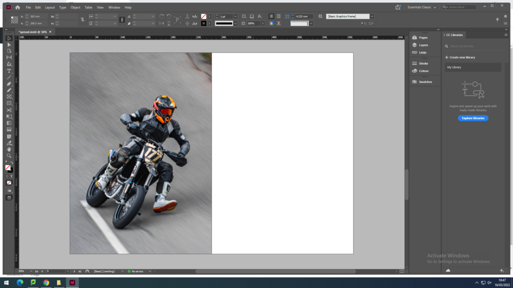
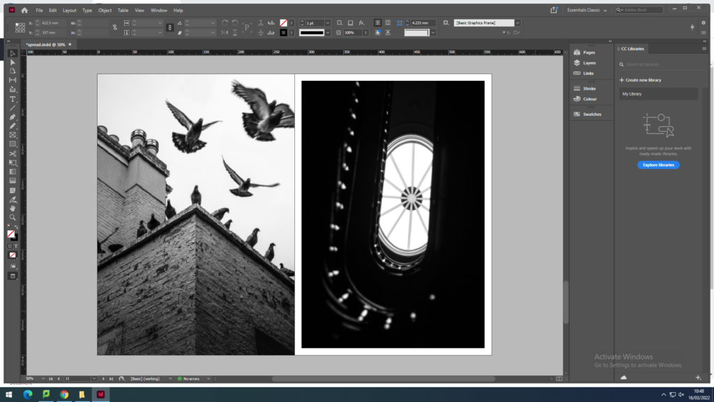
To create the newspaper composition in InDesign. I used some the images above to make two pages of a newspaper
I made an InDesign document with the correct dimensions for a newspaper the imported the images into the area I selected with the x tool.


Above I have thought about a wide range of different design layouts which includes, one page full-bleed image (sunset at Bouley Bay), a sequence of images (multiple images of Bouley Bay), large scale image with a border (Hill Climb Motorcyclist), and a juxtaposition between two images (inside/outside town images).
After rethinking my design layout, I remade the pages so that the images were bigger and had more juxtaposition to create a stronger spread layout.


I removed one of the biker images, as it was too small because it was less then 4000 pixels on the long edge, so I replaced it with a rock to create a focus on the close up studio shoots I got of small features of Bouley Bay. I ended up contrasting it with a granite heritage building.
However, I still thought I could include more contrast between the landscapes and objects.


I felt that there was a good amount of varity and juxtaposition between my images.
So I decided to package the document and save it into the shared folder where the newspaper editor (Mr Toft) can access it.
