Set up:


Juxtaposition: 2 images which contrast each other

I have used these two images to contrast each other by the lighting and the overall atmosphere, but also compliment each other through composition and structure.
Sequence: A series of images (4-12) to create a sequence as a grid, story-board, contact sheet or typology.


I have included 3 different versions of a sequence because the first image may print out too small but I like the gap around the images and the shape this gives. The last composition has the images bigger on the page but the shape is lost and there is no white boarder on the edges of the page.
Montage: layering a set of images to create a new outcome.


I chose to layer these to images as they are taken from the same location but in different years and with a different view and different photographic styles, one focusing on the land scape and one focusing on a person. Also the path in the image below matches with the shape of the rocks creating a synergy with the two.
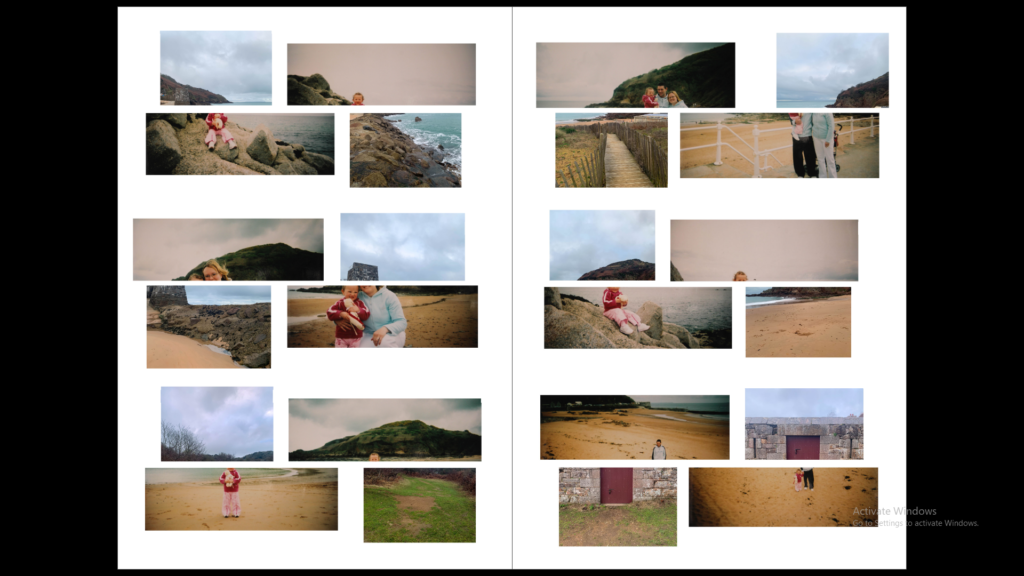
Other Spreads


When creating these spreads I wanted to fill the pages with more images as it is for a newspaper. The previous spreads would have a lot of empty space which works well with the images but not for a newspaper.
