Newspaper Spreads

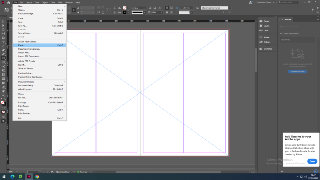
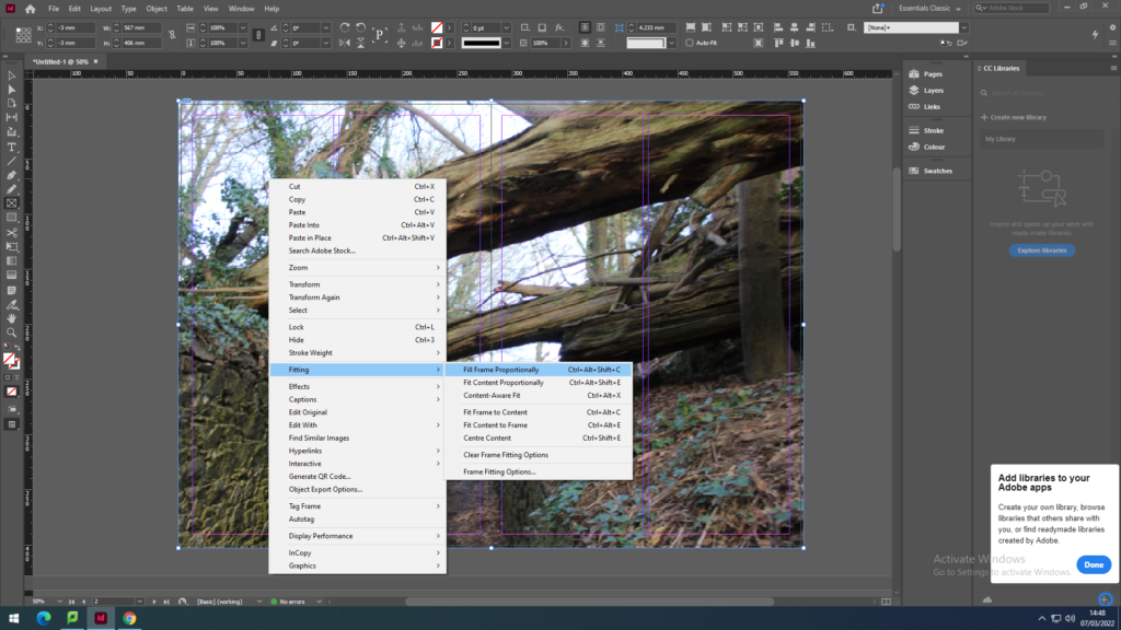
First we recapped on how to place the images on the page spreads by using the Rectangle Frame Tool to create the frame for the image I want to place. Then going into File, Place and with my media drive I pick out the photo to place in the frame. As the image won’t fit the frame proportionately I have to click on the image then go onto Fitting to click on Fit Content Proportionately to make the image fit the frame then to click on the other option Fill Frame Proportionately to have the image fit centre and contextually.

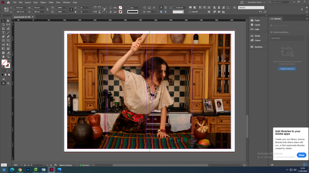
FULL-BLEED

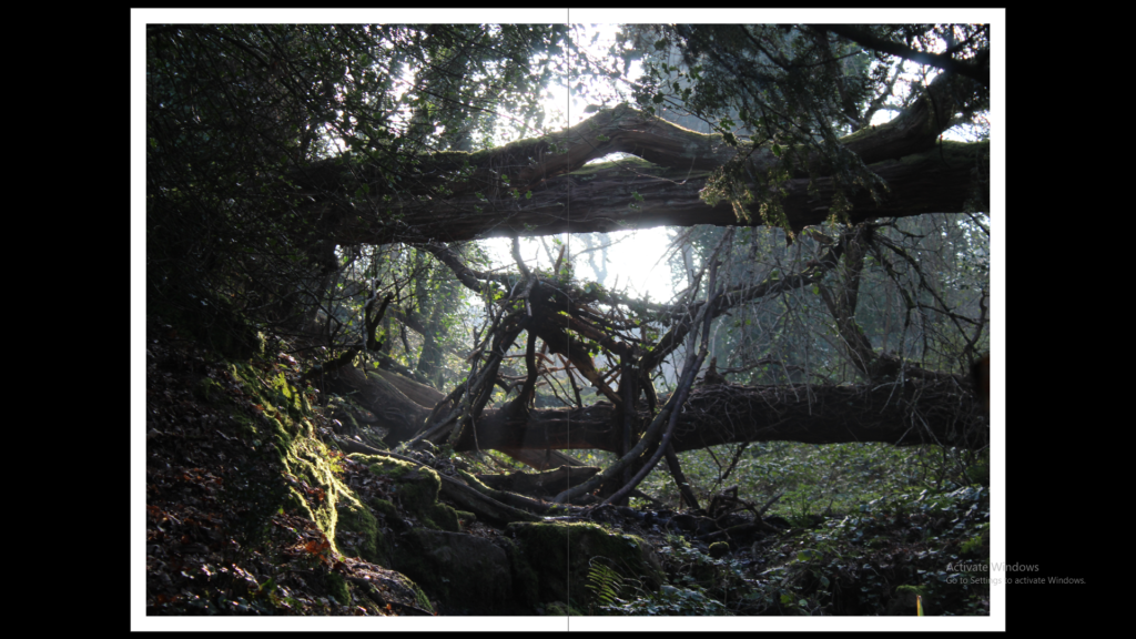
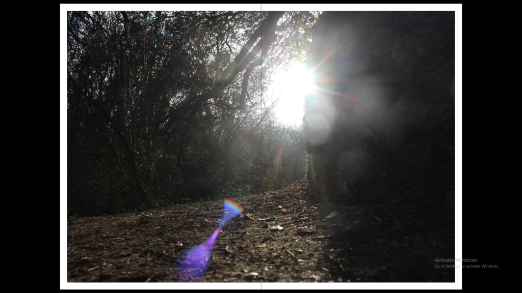
I first explored full-bleed images by making the frame of the image full size with a small boarder going around the edges. I used busy images with a lot layers in the photo to show some depth in these spreads.
JUXTAPOSITION

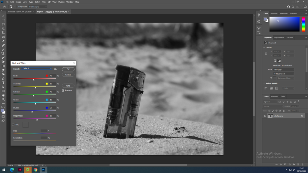
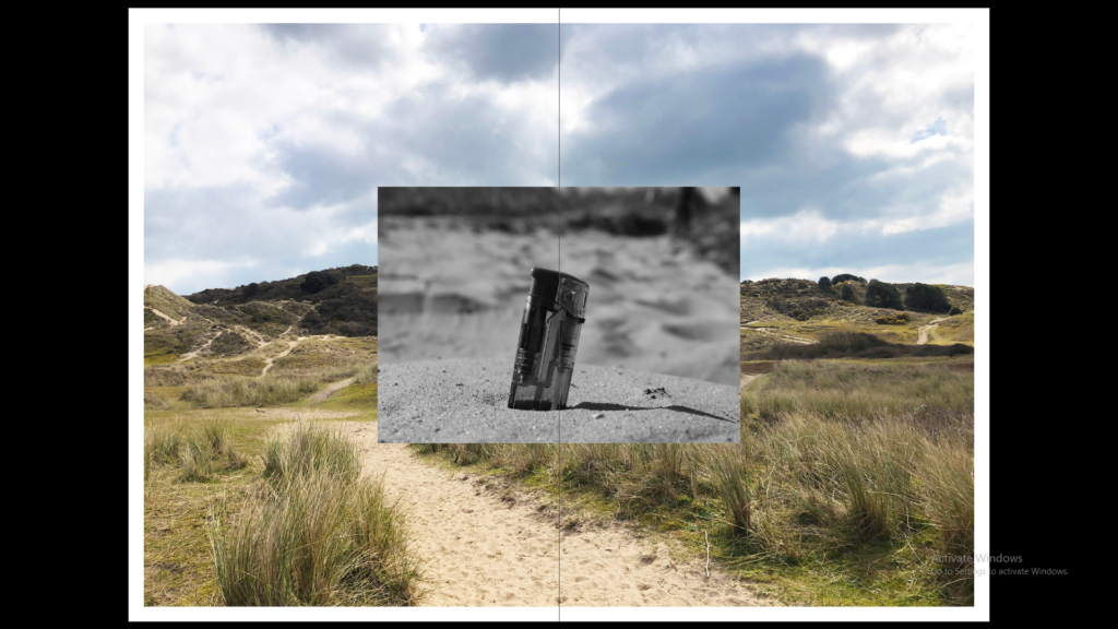
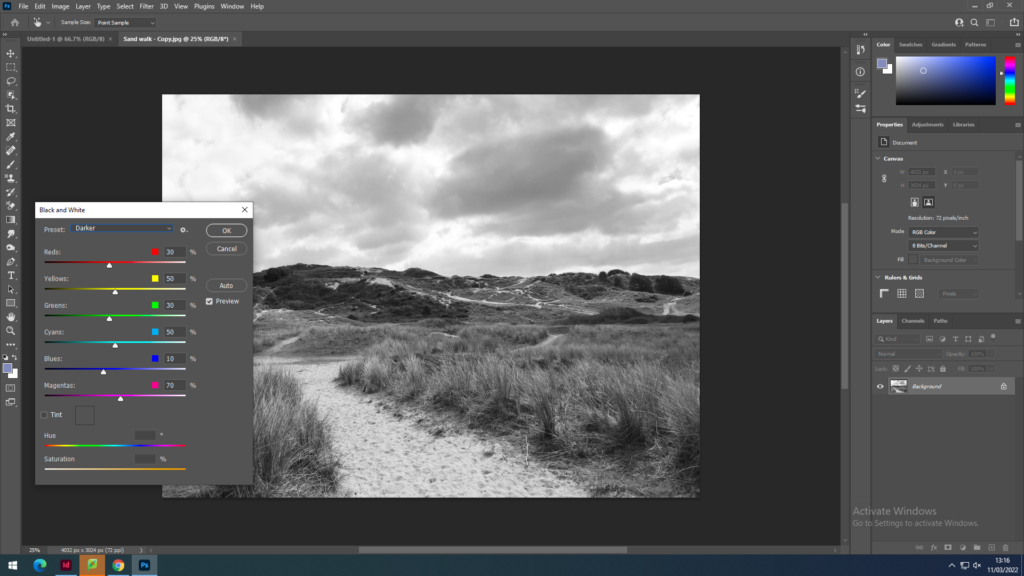
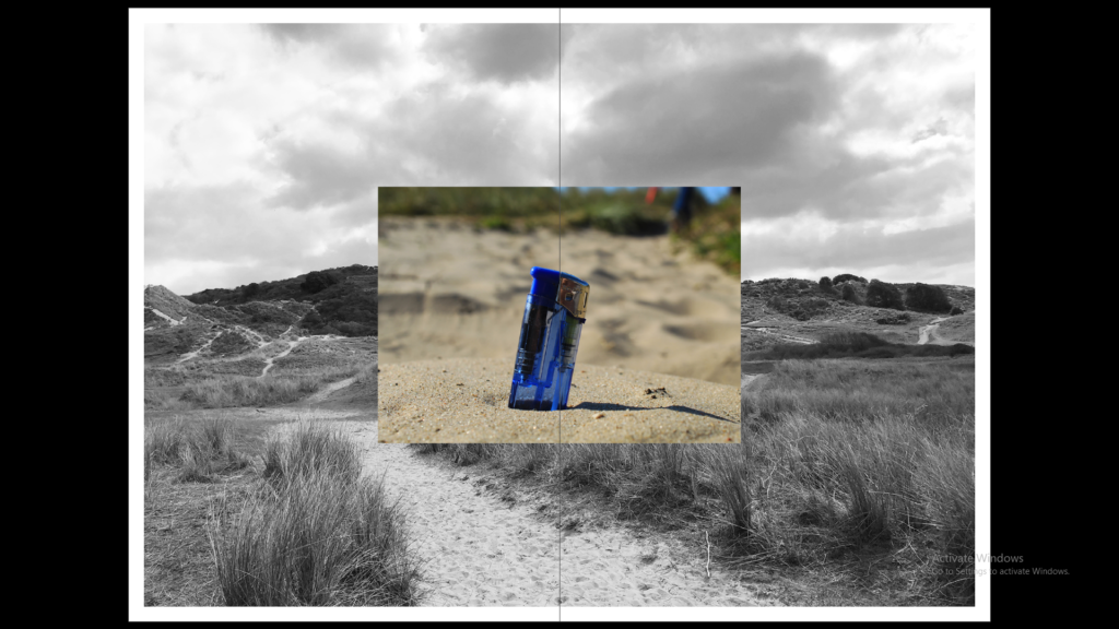
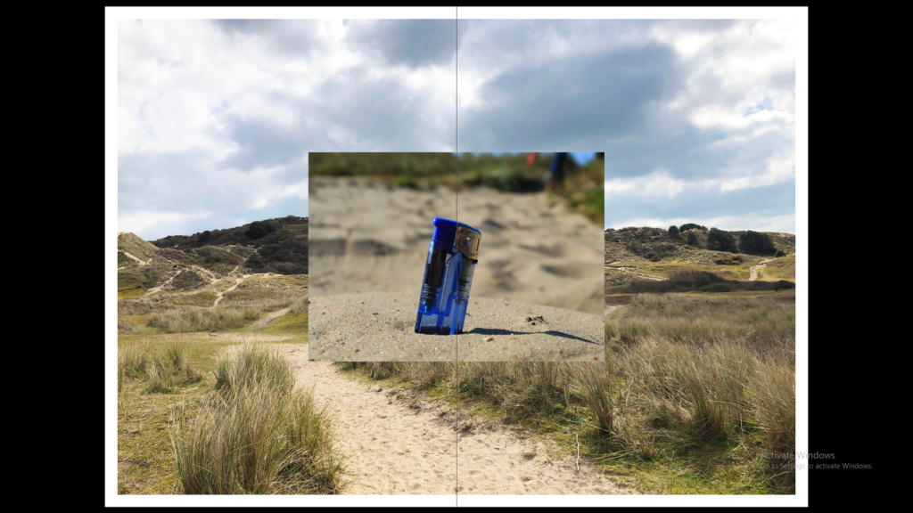
I also tried juxtapositions with two different size images next to each other to then try two images layered on top of each other and this that I then tried having the background image black and white or the foreground image black and white. To create these images black and white I used photoshop.
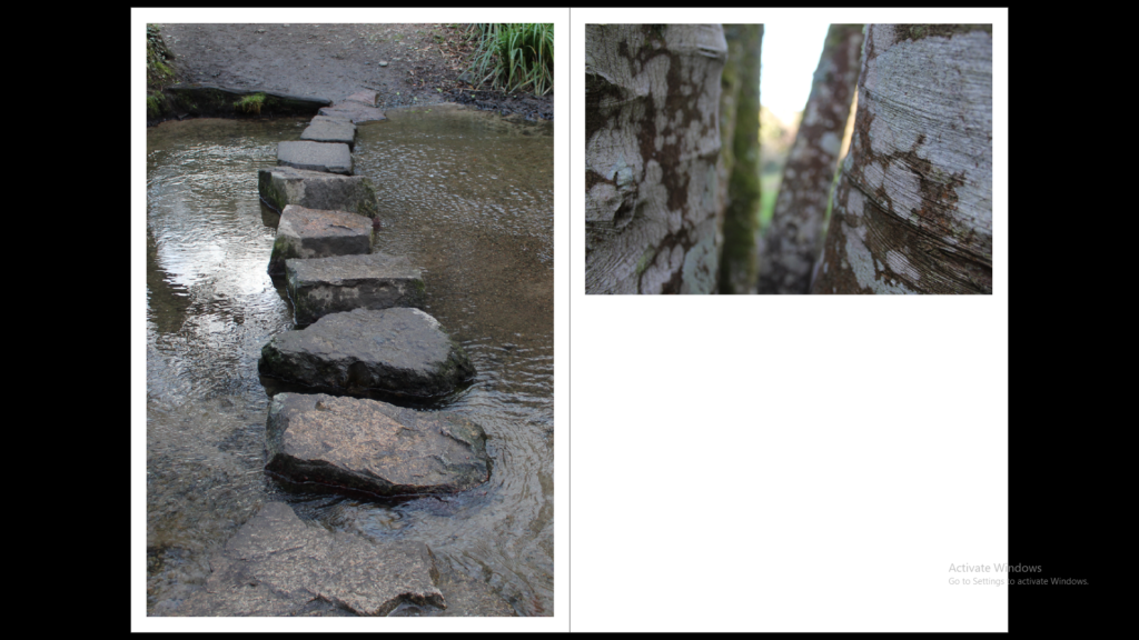
SEQUENCE

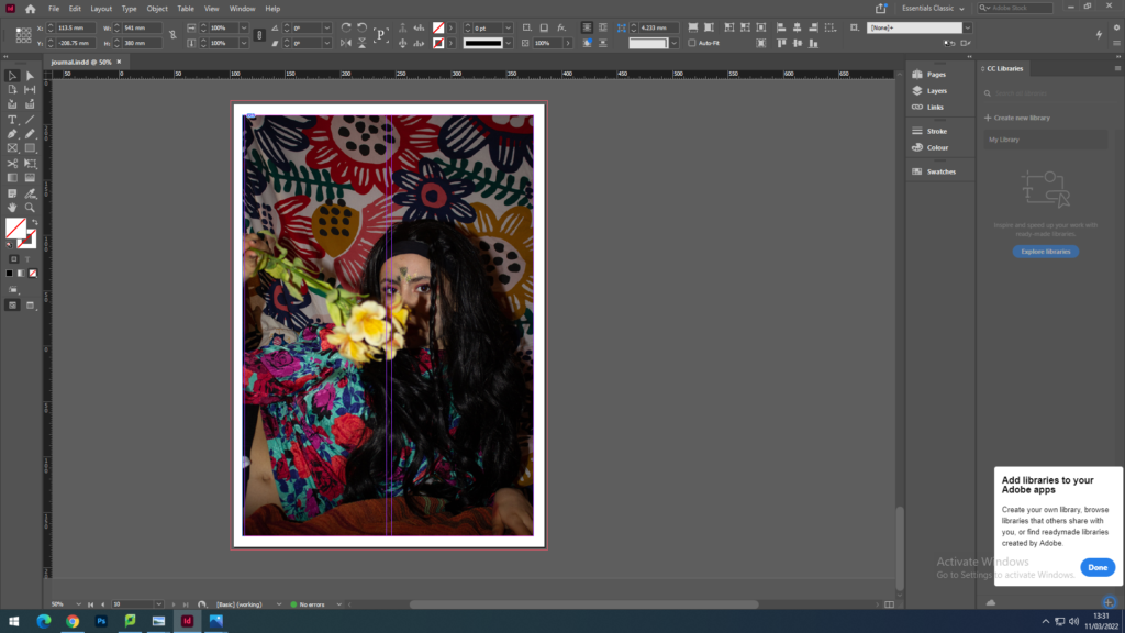
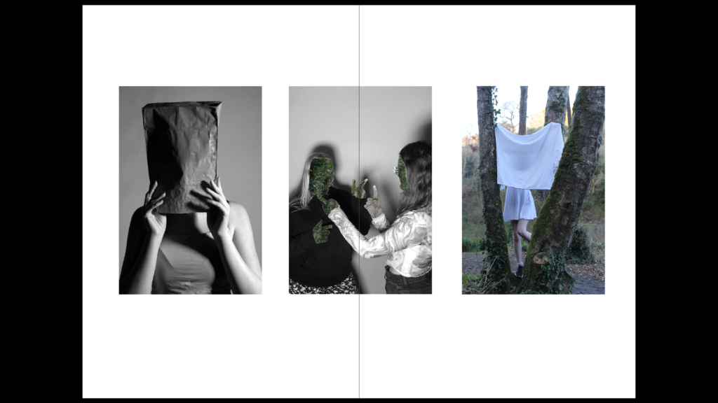
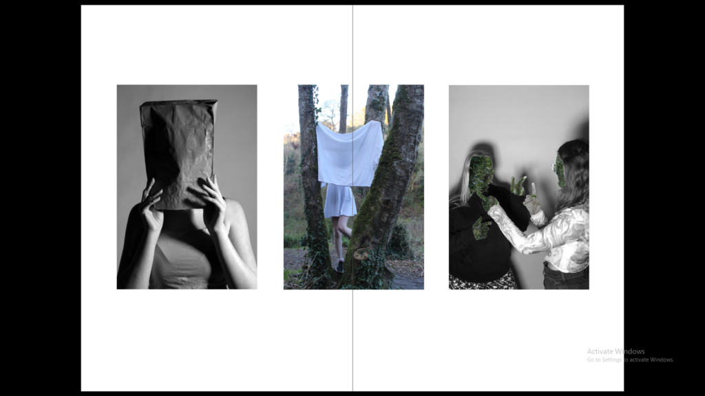
With the sequence I used 3 images with 2 black and white portraits and 2 that have the use of nature in them. These images create a sequence as they are all portrait images with the faces covered creating mood and atmosphere without the use of facial expressions.
MONTAGE

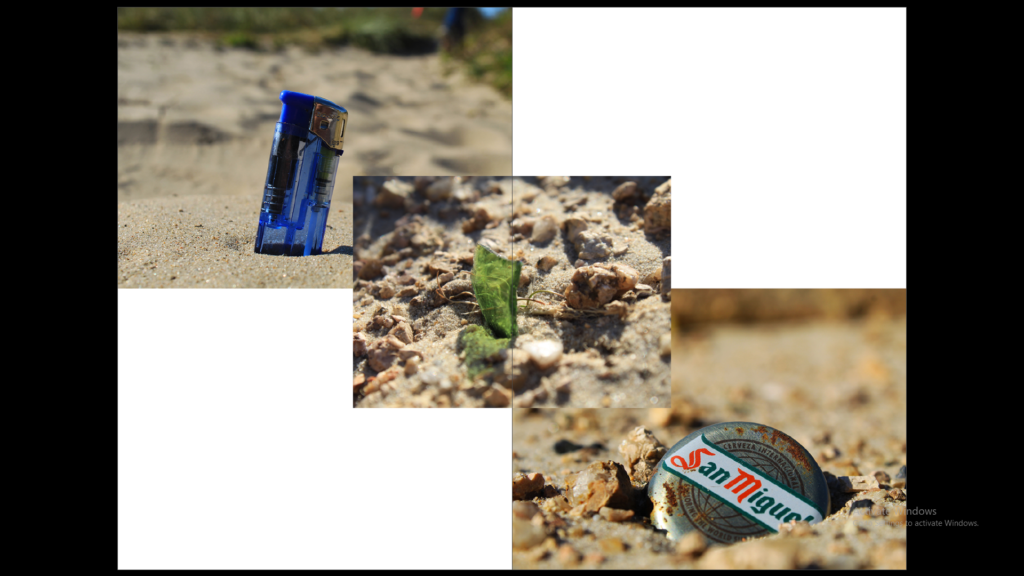
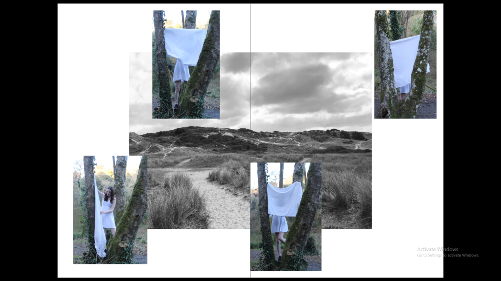
The montage was created with images which with the first montage all show litter being thrown away by people on the beach, the second shows a black and white image of the beach and then some portraits overlapping it.
newspaper design

Our next project is newspapers. We choose photos to put on the newspaper based on images from both our current and previous projects, including zine project based on historical migrant neighbourhoods in St Helier or work we did in Yr 12 too (Identity, Anthropocene, Landscape) and select the best images. We then need follow these instructions to create our zine:

  1. Create new document in InDesign with these dimensions: 400mm(h) x 280.5mm(w), 10 pages, Orientation: Portrait, 2 columns, Column gutter 5mm, Margins: 10mm, Bleed: 3mm 
  2. Only use in high-res TIFF/JPEG files (4000 pixels)
  3. Use design ideas and layouts from your zine/ newspaper research as well as taking inspiration from artists listed here as a starting points for your spreads.
  4. Incorporate texts and typography where appropriate.

The images I have chosen to use our from my identity project nd Mexican stereotypes photos. I think both intresting photos and topics to discuss and I think they are the best work i have done. I had a lot of fun making them and is a topic that is important to me, is part of who I am.

we must design the following spreads:

  1. FULL-BLEED
  2. JUXTAPOSITION
  3. SEQUENCE
  4. MONTAGE

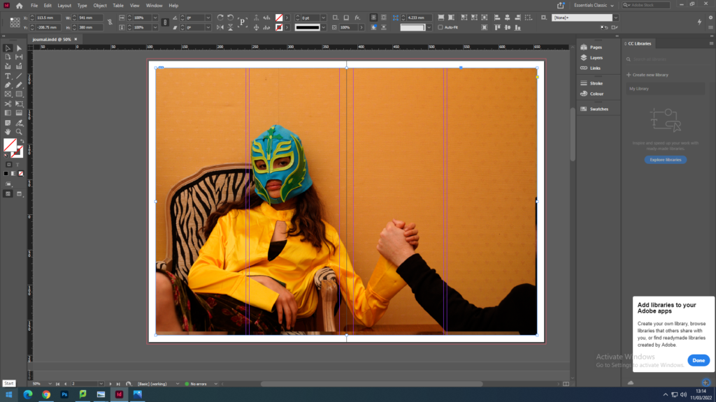
I decided to put my image full-bleed wich means selecting one image as a full-bleed spread because my image is an in landscape and I thought the image in full-bleed had a good balance on itself.

For created a montage on the left image and the other one is the same shoot but with none editing. To create a montage I choose to work in Photoshop for more creativity and the I import it into InDesign as one image.

Newspaper Spreads

Set up:
Dimensions: 400mm(h) x 280.5mm(w), 10 pages, Orientation: Portrait, 2 columns, Column gutter 5mm, Margins: 10mm, Bleed: 3mm
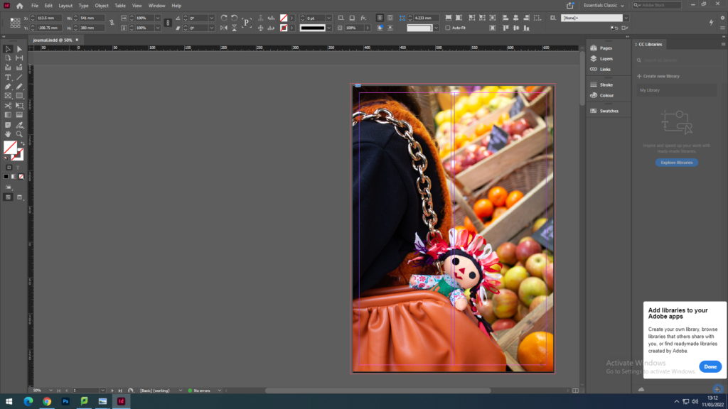
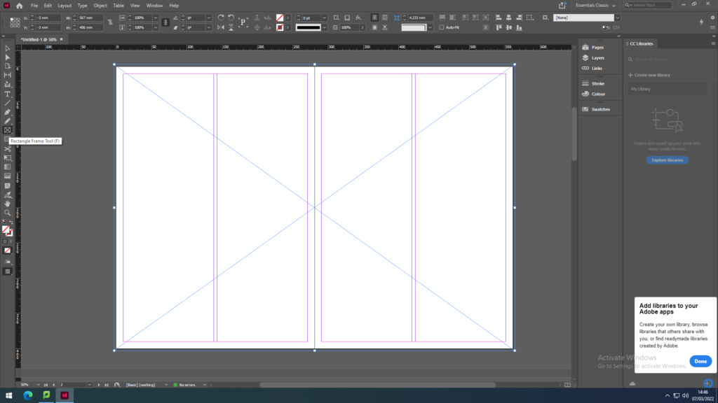
I used the rectangle frame tool to make the box so that I can import an image onto the page by pressing Ctrl D and selecting from files.

Juxtaposition: 2 images which contrast each other

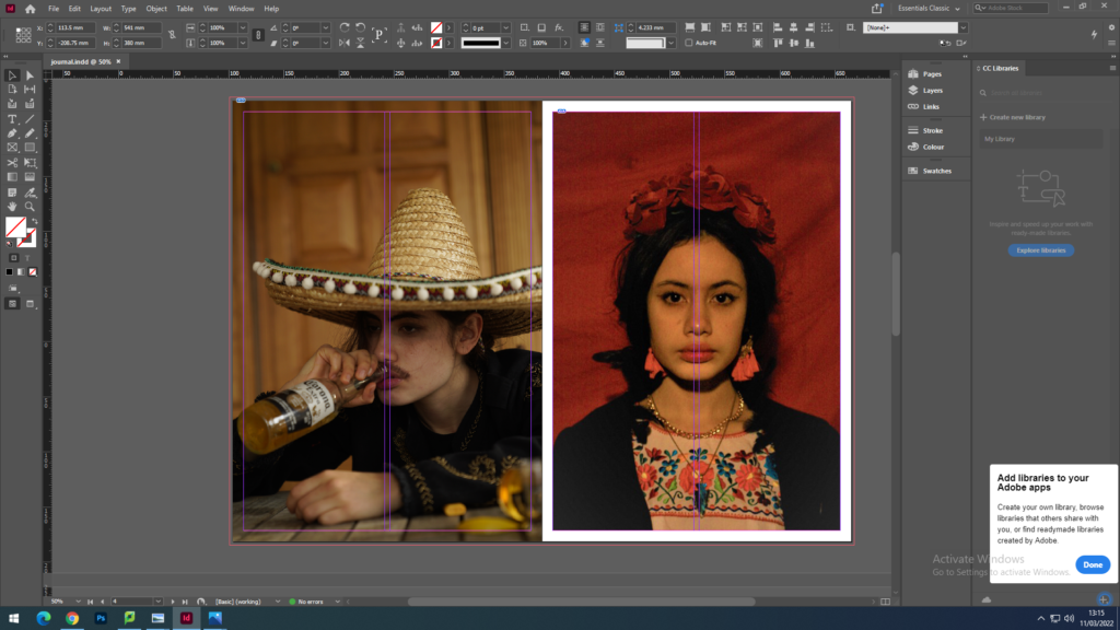
I have used these two images to contrast each other by the lighting and the overall atmosphere, but also compliment each other through composition and structure.

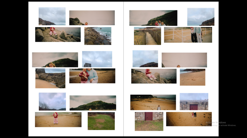
Sequence: A series of images (4-12) to create a sequence as a grid, story-board, contact sheet or typology.

1
2
3

I have included 3 different versions of a sequence because the first image may print out too small but I like the gap around the images and the shape this gives. The last composition has the images bigger on the page but the shape is lost and there is no white boarder on the edges of the page.

Montage: layering a set of images to create a new outcome.

I chose to layer these to images as they are taken from the same location but in different years and with a different view and different photographic styles, one focusing on the land scape and one focusing on a person. Also the path in the image below matches with the shape of the rocks creating a synergy with the two.

Other Spreads

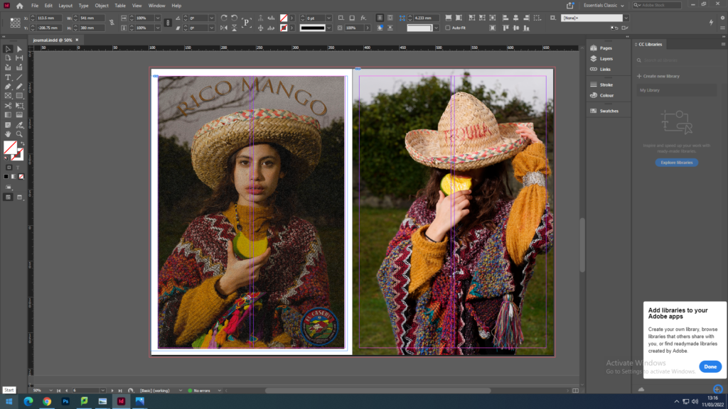
When creating these spreads I wanted to fill the pages with more images as it is for a newspaper. The previous spreads would have a lot of empty space which works well with the images but not for a newspaper.