Experimenting With Layout
Montage
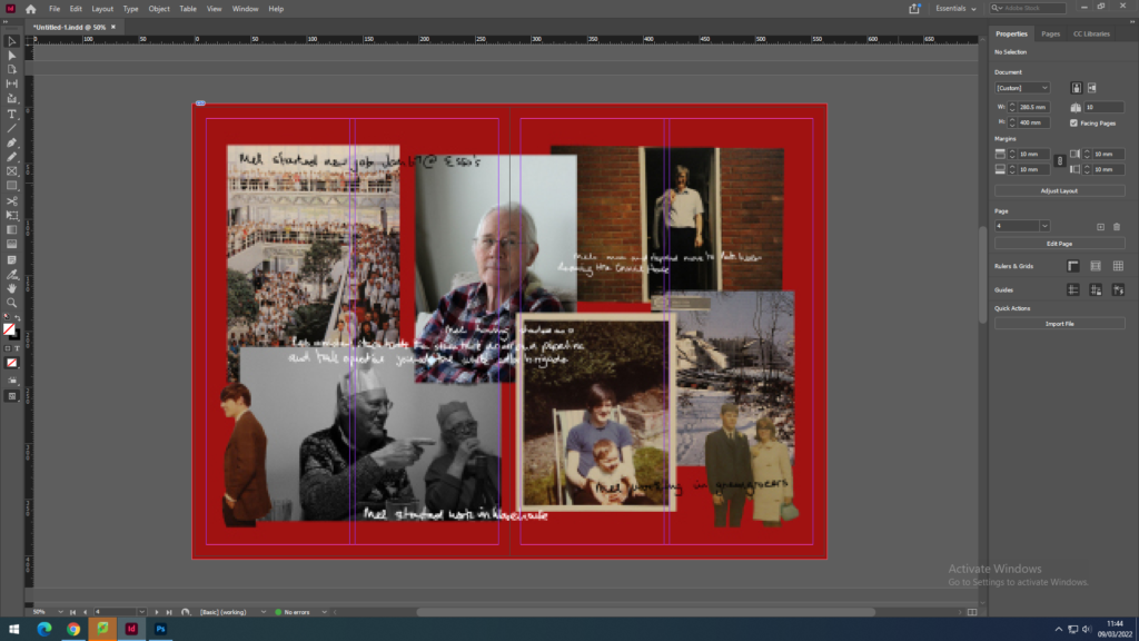
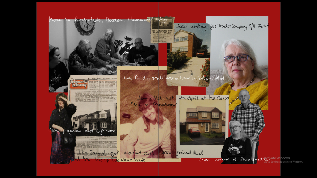
These montages I have created showcases various images of my grandad and grandma along with some pieces of text that contextualise their lives and work throughout the years. I created this using Photoshop, cutting out sections of some images, as well as tracing over images of my grandma’s handwriting to create the text. These pieces will also feature in my photobook as part of my personal study project. I have also laid them out on the page to be a full bleed, meaning the image will go to the edge of the page with minimal borders.
Juxtaposition
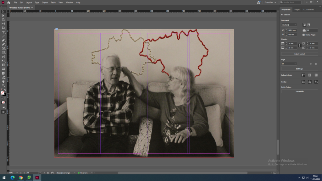
Here I have used again images from my personal study project and photobook to create a juxtaposing spread. Here, these two images contrast with each other due to the left image being in colour whilst the right is in black and white, excluding the stitching. However they are still relating in the way that they both part of the same project and feature my grandparents in different forms. The photograph on the left displays the hands of my grandma and grandad, showing a ring my grandad gave my grandma many years ago. On the right is also features both grandparents although with embroidery using white thread to highlight their strong relationship with each other and red thread to represent the bloodlines and family they have created.
Here I tried using images from my Anthropocene project that show contrast through one image being in black and white and one being a colour image with a bold orange hue. These link together as well, due to them both displaying what St. Ouens bay would look like if it was not a protected piece of land.
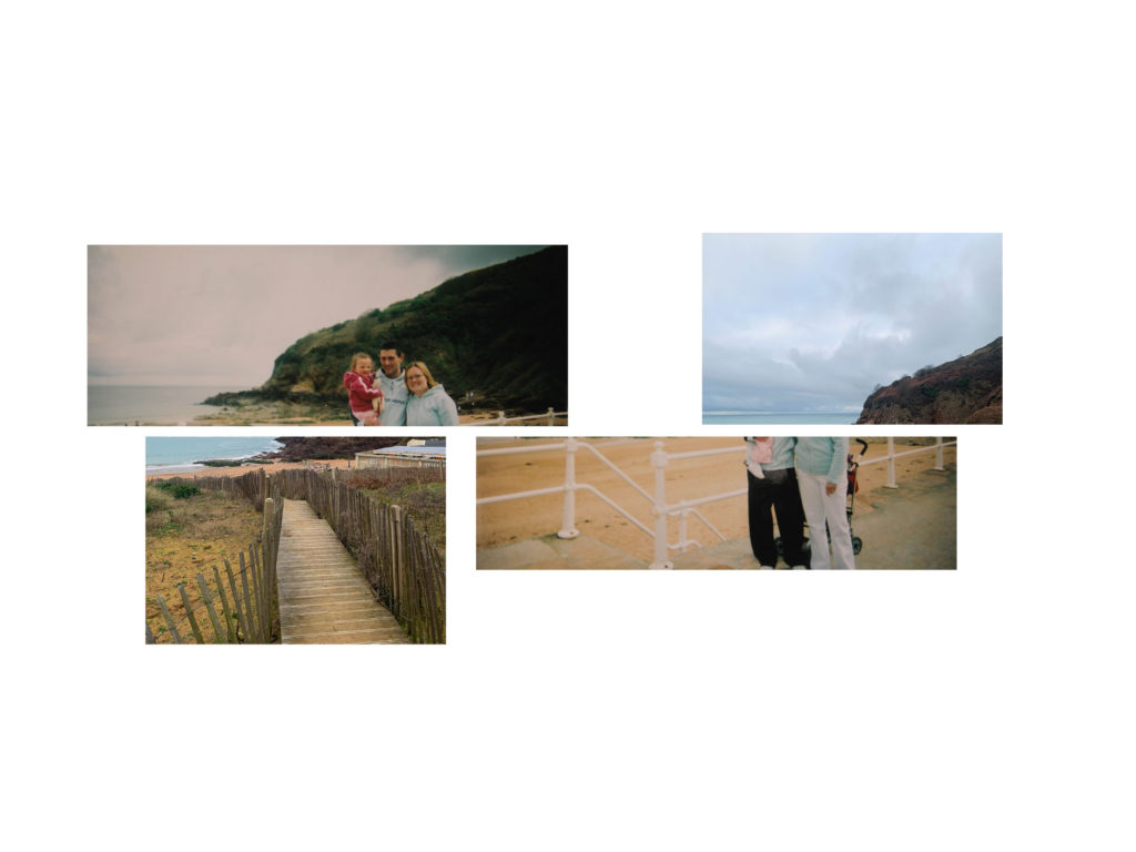
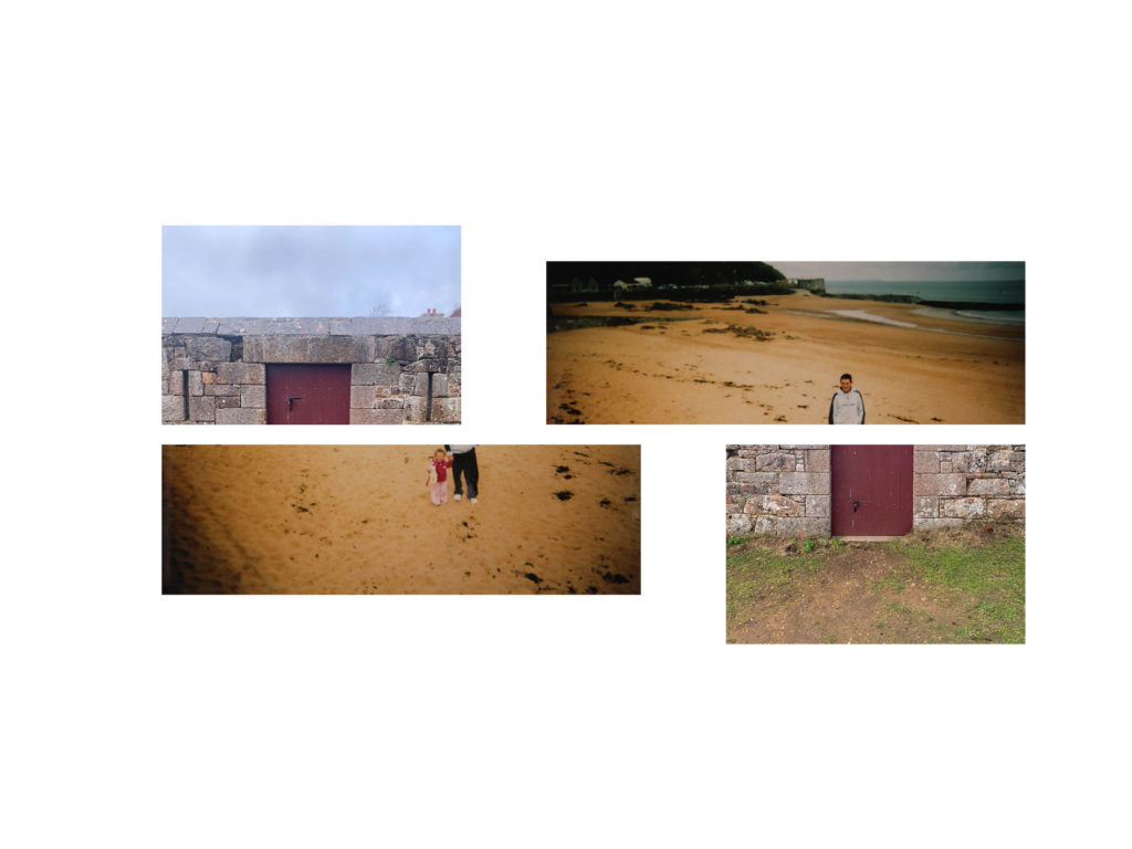
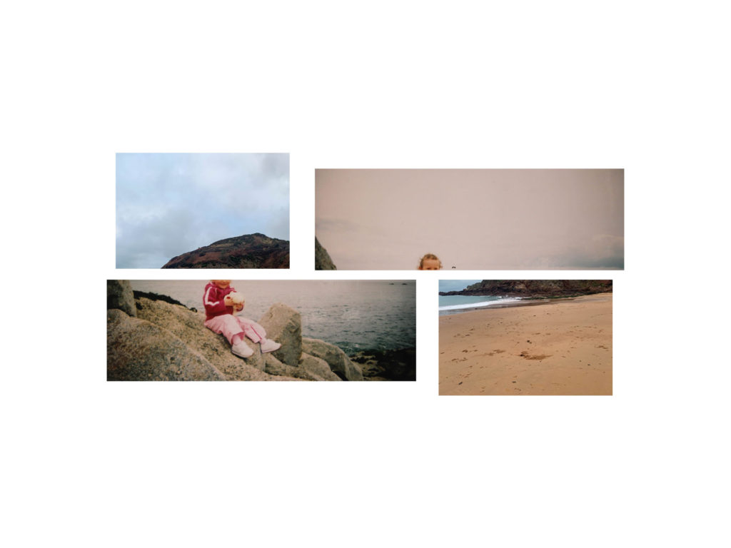
Sequence
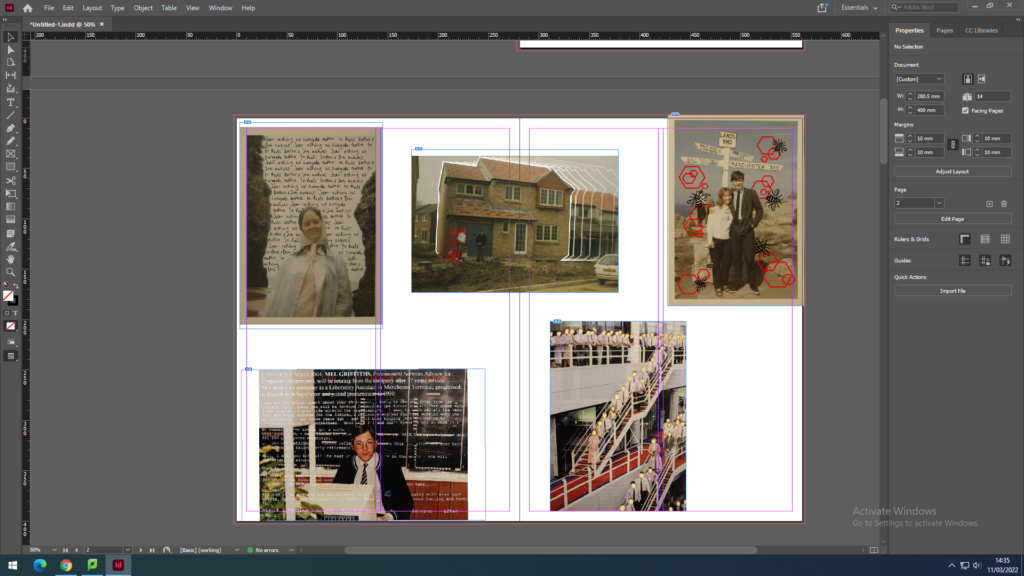
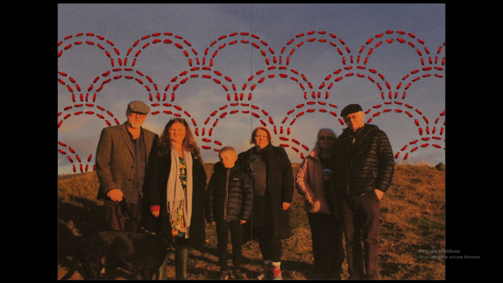
This sequence showcases various digital edits I have made using archival images of my grandparents. These display the story of my grandparents hard work ethic that my personal study is based on, touching on subjects such as my grandads job and my grandma’s caregiving nature.
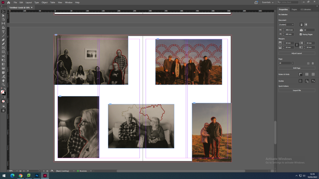
I have also created another spread of sequential images instead featuring reworked pieces I have created by hand, using techniques such as embroidery. These images in particular are taken from recent photoshoots also made for my personal study project.
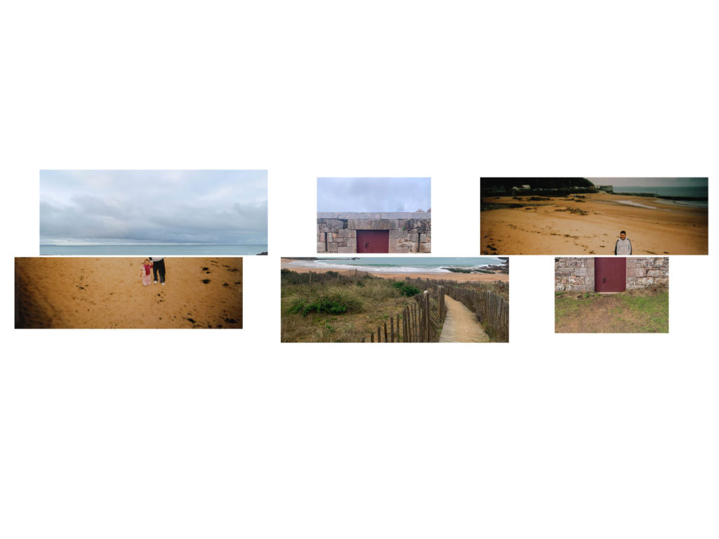
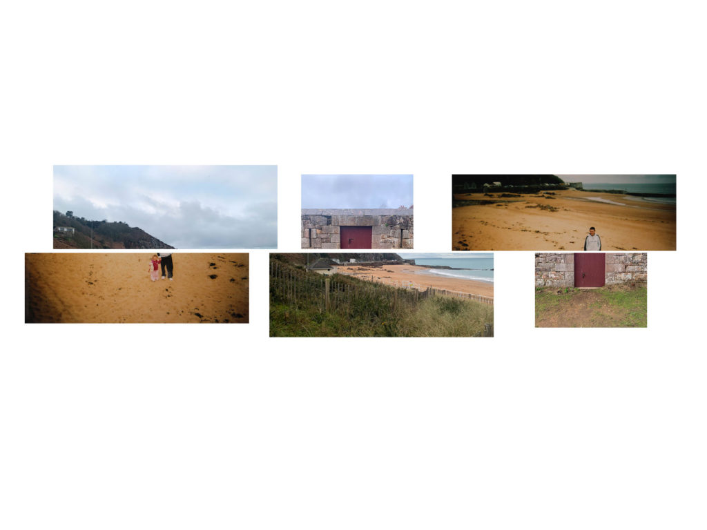
Full bleed
In addition to potentially having one of my montage pieces I could also use the embroidered pieces from my personal study project.