Newspaper Design

For this project I was required to:

 NEWSPAPER SPREADS: Design 3-4 versions of a newspaper spreads based on images from both your current and previous projects.

You must design the following spreads:

  • FULL-BLEED: Select one image as a full-bleed spread.
  • JUXTAPOSITION: Select 2 images and experiment with different combinations.
  • SEQUENCE: Select a series of images (between 4 – 12) and produce a sequence either as a grid, story-board, contact-sheet or typology.
  • MONTAGE: Select an appropriate set of images and create a montage of layered images. You may to choose to work in Photoshop for more creativity and import into InDesign as one image (new document in Photoshop 400mm(h) x 280.5mm(w) in 300 dpi)


Here we can see the start of my work:
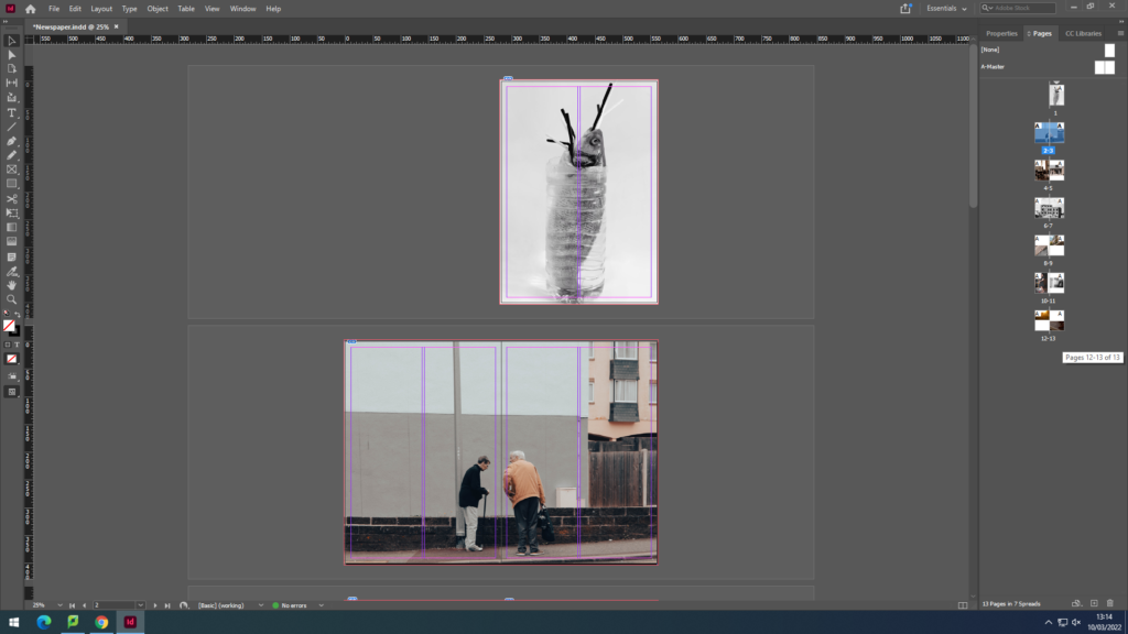
This was done by adding pages and inserting the Rectangle Frame tool and drag and drop the images into the frame. This was done so that the image was fitted inside the box which saves time having to resize.

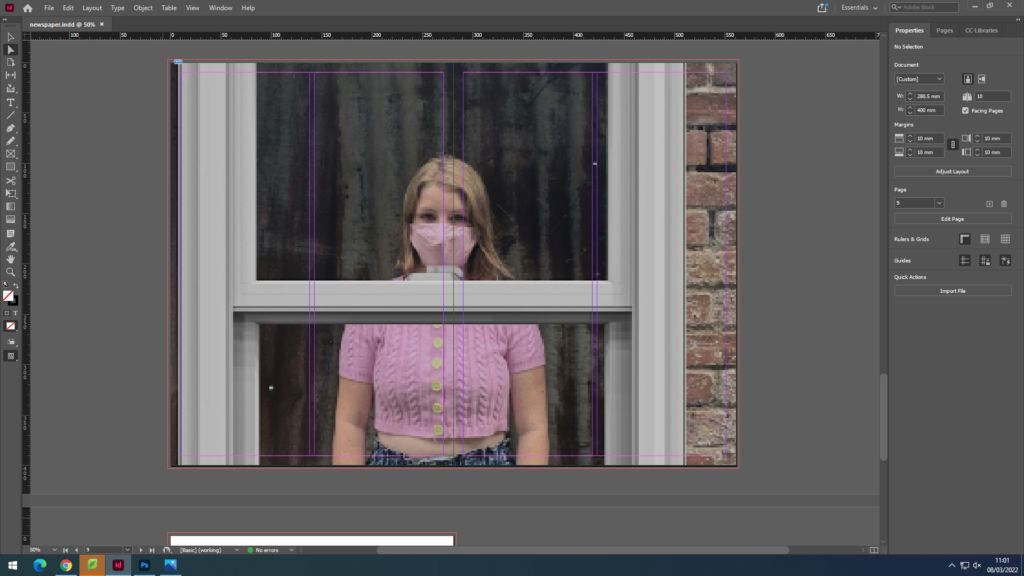
We can see that I have made the first 2 full bleed with one taking over 2 pages since it is landscape.
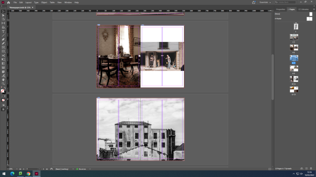
Here we can see I have got more creative with the layout having an image be full bleed on one side and having another on the other side smaller. In addition, consistency was shown through the double page spread image again.
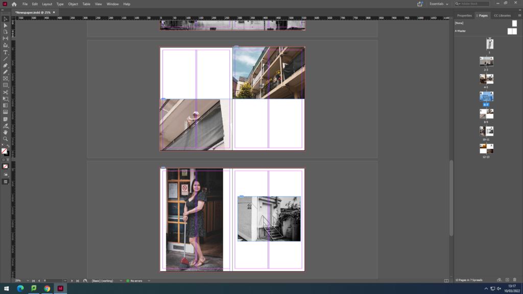
Similar creative approach was produced here having the images juxtapose each other in different ways; black and white vs colour and populated vs inhabited.

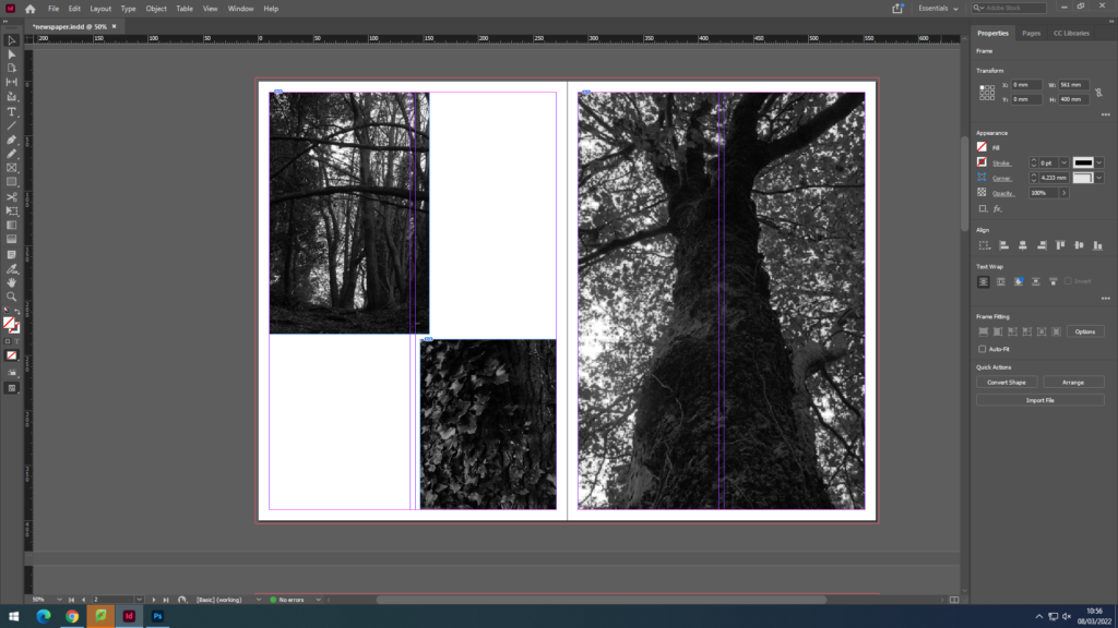
newspaper design-

  1. FULL-BLEED: Select one image as a full-bleed spread.
  2. JUXTAPOSITION: Select 2 images and experiment with different combinations.
  3. SEQUENCE: Select a series of images (between 4 – 12) and produce a sequence either as a grid, story-board, contact-sheet or typology.
  4. MONTAGE: Select an appropriate set of images and create a montage of layered images. You may to choose to work in Photoshop for more creativity and import into InDesign as one image (new document in Photoshop 400mm(h) x 280.5mm(w) in 300 dpi)

we have decided to make a newspaper full of our old coursework and previous images and use them. I have decided to include images from my zine, summer project and natural landscapes.

I set up InDesign to start exporting my images and set out my layout for the newspaper. I will include a full-bleed, juxtaposition and a montage.

I found my previous work that I have used when exploring landscape photography, I used these three final images and wanted to include them together as they all set a mood and atmosphere by the use of dark tones, I thought these three would work well together so I decided to keep the best one and strongest image as one image on one page then put the two smaller ones together on the left page.

For my juxtaposition images I wanted to include two completely opposite images. Therefore I decided to use a very colourful image of the beach with very warm colours and tones and pair it with a very dark and gloomy image of the woods , both contrast very well between each other.

For my grid pages , I wanted to use my zine and jersey community photos as I had a few of them so I wanted to at least include four images. I chose my favourite ones mostly of tall buildings and old back streets with construction as I like how it shows how Jersey has both, very open and new office buildings as well as uncared roads and old broken houses.

Finally, for my last page I wanted to use a double bleed and use images I took from the summer project at the start of year 12, the purpose of this shoot was to show how covid affected everyone’s lives.

Once I was done with my layout, I packaged my layout out and it was ready to go in the newspaper.

PERSONAL PROJECT PHOTOSHOOT 6 – Drone IMages #2

The main reason I wanted to create another photo shoot was because I needed a strong image for the front cover. My plan was to get a wide drone shot of the whole bay mainly focusing on the L’Islet.

This is a contact sheet of all the images I got for the shoot:

These are my favourite images after images after editing:

The first image has the most potential for a front cover. Whereas, the panoramic photos would be good for a double page spread. There was a panoramic setting on the drone which I utilised. I add to merge them together in Photoshop using the merge feature to create one image. After, I used my normal editing techniques, which includes a camera-raw filter.

I edited all my images in Photoshoot after choosing what images I wanted to use by marking them with tags on my laptop. This image was a landscape, however I cropped it to make a more interesting composition and remove all of the distractions. Then a used a Camera-RAW filter to colour grade the image and do basic adjustments to contrast, temperature, and shadows. I also used 2 gradual filters to emphasis the orange form the sun and, blue for the water. I used a radial filter on the L’Islet to increase the shadows to that the L’Islet is more prominent.

Overall, this photoshoot was successful, as I got a good front cover image, however it can’t be a full wrap image only a front cover image. Although by doing this extra photoshoot I was able to produce an extra page in my photo-book. The final outcome was different to what I imagined in my head. I planned to go when it was high tide, sunny, and not windy or rainy. However after waiting a few weeks the conditions were never prefect so I decided to go during a mid tide and at sunset. This actually worked out better than I expected, as the orange and blue contrast is really strong and one of my favourite colour combinations.

PERSONAL PROJECT PHOTOSHOOT 5 – General Images/Bouley Bay Hill Climb

This blog post is for the images that I took whilst on other photoshoots that don’t fit into the category of the shoot, and general images of Bouley Bay.

I think these two images fit in with the project, I really like how the right image shows the playful, fun aspect of the bay. Plus, the composition works well as the rocks create a good “frame” around the paddle boarders.

Bouley Bay Hill Climb

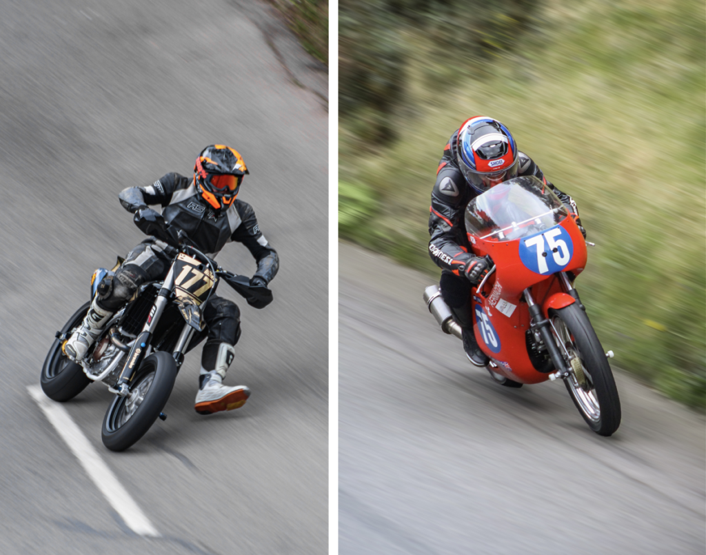
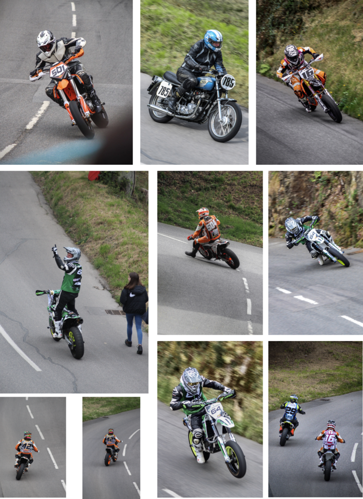
For these photos I used a 100-300mm telephoto lens to allow me to fill the frame with the subject. I used a technique called panning to create motion blur.

These are the best edited images that I produced during the photoshoot. I made this extra photoshoot so that I could introduce character of the are into the photo-book, as Bouley Bay Hill Climb is an event which most people in Jersey know about.

Overall, this photoshoot was very successful. I was able to produce strong images and I managed to capture a panning image, which I had to match the shutter speed to the speed of the bike, whilst doing a panning motion.