Once I had all my images edited through using Lightroom to select my favourite images by rating them and comparing them, I then moved onto photoshop and edited them to make them all finalised. Once I had everything ready, i exported th final edits back into Lightroom and this where I worked on my book design.
On Lightroom, there’s an option called ‘Book’, this turned all my images into a book template which was really helpful as it allowed me to see all my images laid out on a virtual representation of a book.
This is how my first layout looked;

This was just how my book was laid out when I selected the feature, all my images were randomly allocated. I then began to sequence my images in the order I felt right and conceptual.
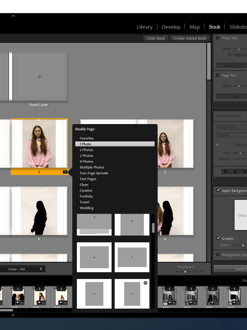
There were many template options to choose from so I had to make sure to select about 3-4 frames/templates to keep my layout consistent throughout the book.

These were the types of templates I had an option of picking, there was lots of choices however as most of my images were portrait , I mostly used the portrait templates and a double bleed which I could use of my few landscape images for.
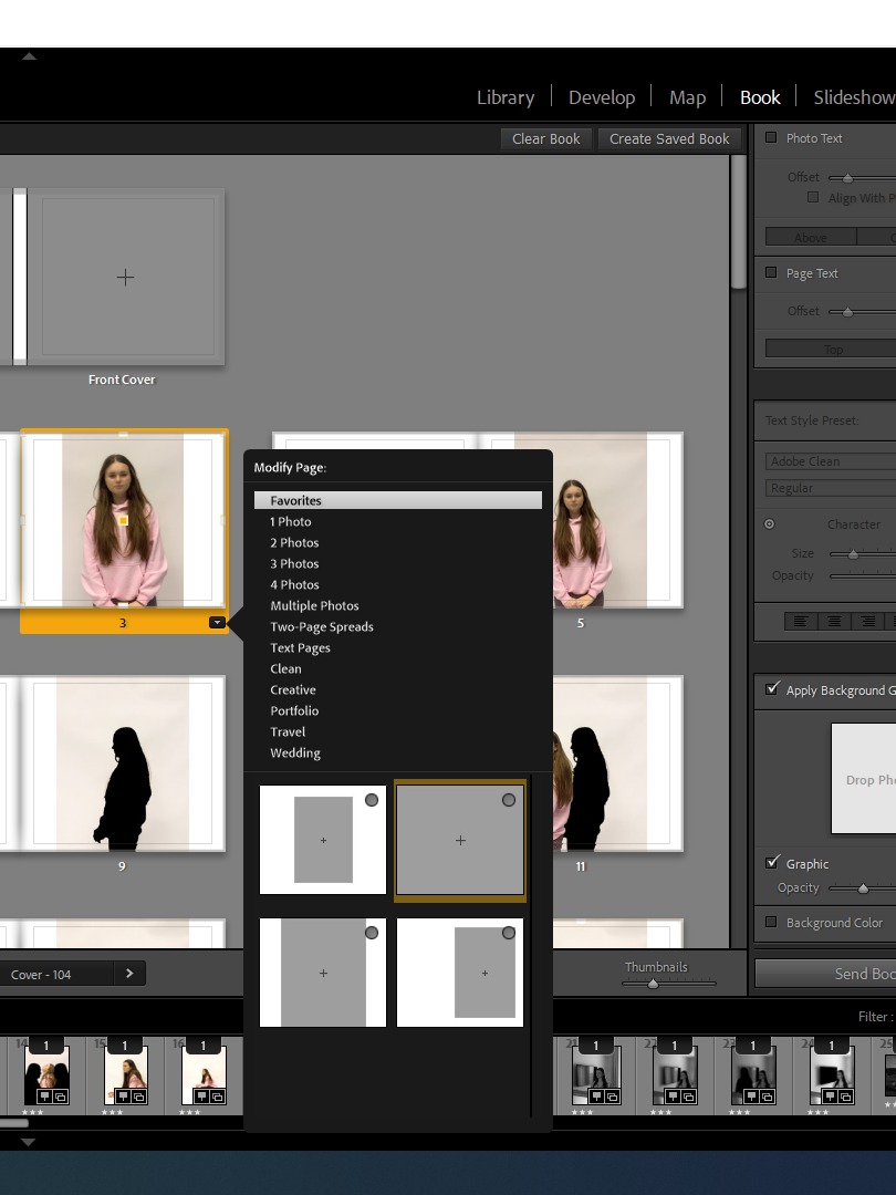
These were the templates I had as my favourites and wanted to keep it consistent with these templates throughout my book design.


This was very first and basic re arrangement of my images, I just started to pair specific images together that I thought would maybe work well, I didnt select any templated yet and I left the front and back cover blank in order to think about it at the end

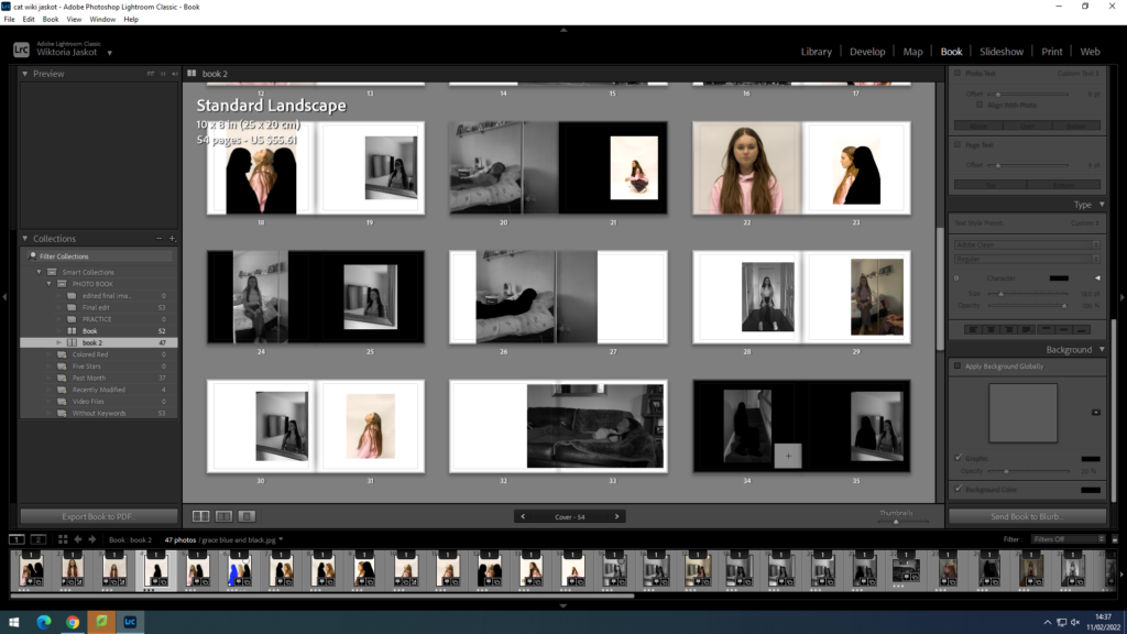
I spent some time choosing the templates for each page, I used 4 of the same templates each time to keep it consistent and in a good layout and I also included a few full doubles spread bleeds as I think this creates a bigger impact on some photos and really gets the viewers attention.

I used many different templates such as a full bleed which took up both pages and 3 different templates throughout my book such as a small template , one slightly to the right and one that was filled in from the top to the bottom of the page but the sides had a white border. I decided to not use any outlines around the images as I didnt think it fit in with my concept for this book.

I also made some of my pages have a black background colour as I thought a dark colour around the images would work much better than white pages as it fits much more naturally with the mood of this book and makes the topic come across more sad and darker which is what you consider with mental health. I also repeated some of images to create a sense of a routine and how everyday you wake up and feel differently , its almost like youre re living the same routine.
