Historically, photography students at Hautlieu School have acquired a reputation for making work beyond the confines of Edexcel syllabus and their work have been recognised both locally and internationally through exhibitions, competitions and publications. For example, in the last couple of years we have produced three separate newspaper supplements, FUTURE OF ST HELIER (2019), LIBERATION & OCCUPATION (2020) and last year LOVE & REBELLION (2021), all published and distributed in the Jersey Evening Post.

NEWSPAPER SPREADS: Design 3-4 versions of a newspaper spreads based on images from both your current and previous projects, including zine project based on historical migrant neighbourhoods in St Helier and work you did in Yr 12 too (Identity, Anthropocene, Landscape). Use your Review and Reflect blog post you did earlier to identity the work that responds best to the themes of IDENTITY & COMMUNITY.
You must design the following spreads:
- FULL-BLEED: Select one image as a full-bleed spread.
- JUXTAPOSITION: Select 2 images and experiment with different combinations.
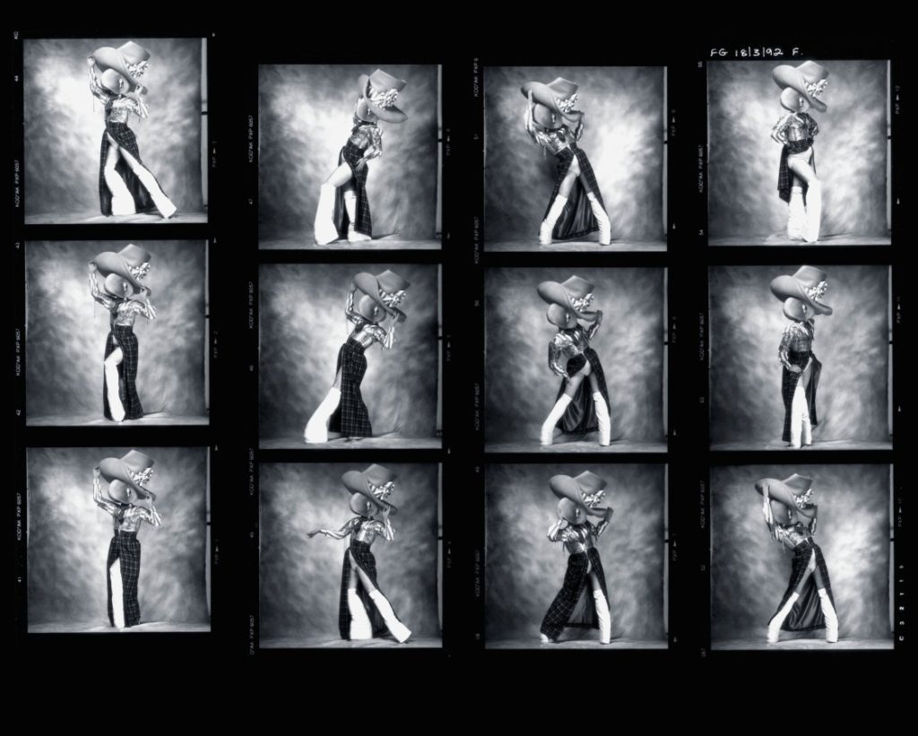
- SEQUENCE: Select a series of images (between 4 – 12) and produce a sequence either as a grid, story-board, contact-sheet or typology.
- MONTAGE: Select an appropriate set of images and create a montage of layered images. You may to choose to work in Photoshop for more creativity and import into InDesign as one image (new document in Photoshop 400mm(h) x 280.5mm(w) in 300 dpi)
Follow these instructions:
- Create new document in InDesign with these dimensions: 400mm(h) x 280.5mm(w), 10 pages, Orientation: Portrait, 2 columns, Column gutter 5mm, Margins: 10mm, Bleed: 3mm
- Only use in high-res TIFF/JPEG files (4000 pixels)
- Use design ideas and layouts from your zine/ newspaper research as well as taking inspiration from artists listed here as a starting points for your spreads.
- Incorporate texts and typography where appropriate.
Once you have completed pagespreads, double check:
- All images are high-res file
- Check links in InDesign (if Red Question mark appears re-point to image in your folder)
- Package your layout and save in your name into this shared folder: M:\Radio\Departments\Photography\Students\Image Transfer\IDENTITY & COMMUNITY\Newspaper
INSPIRATIONS
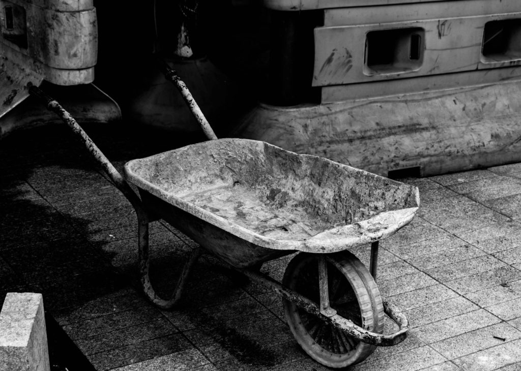
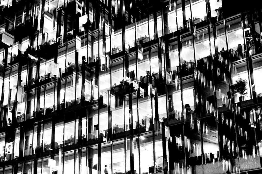
FULL-BLEED: Image goes across two pages to the edge
JUXTAPOSTION
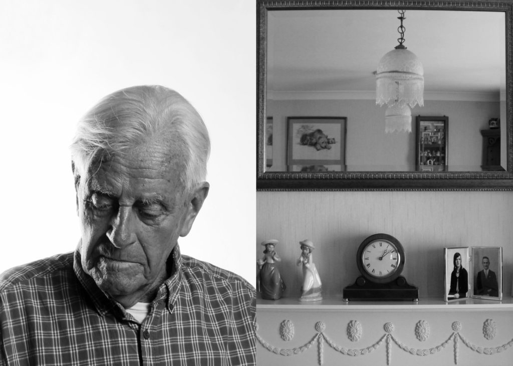
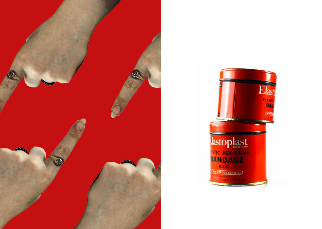
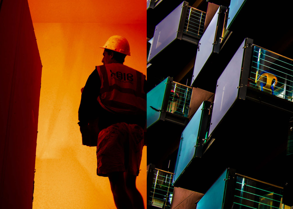
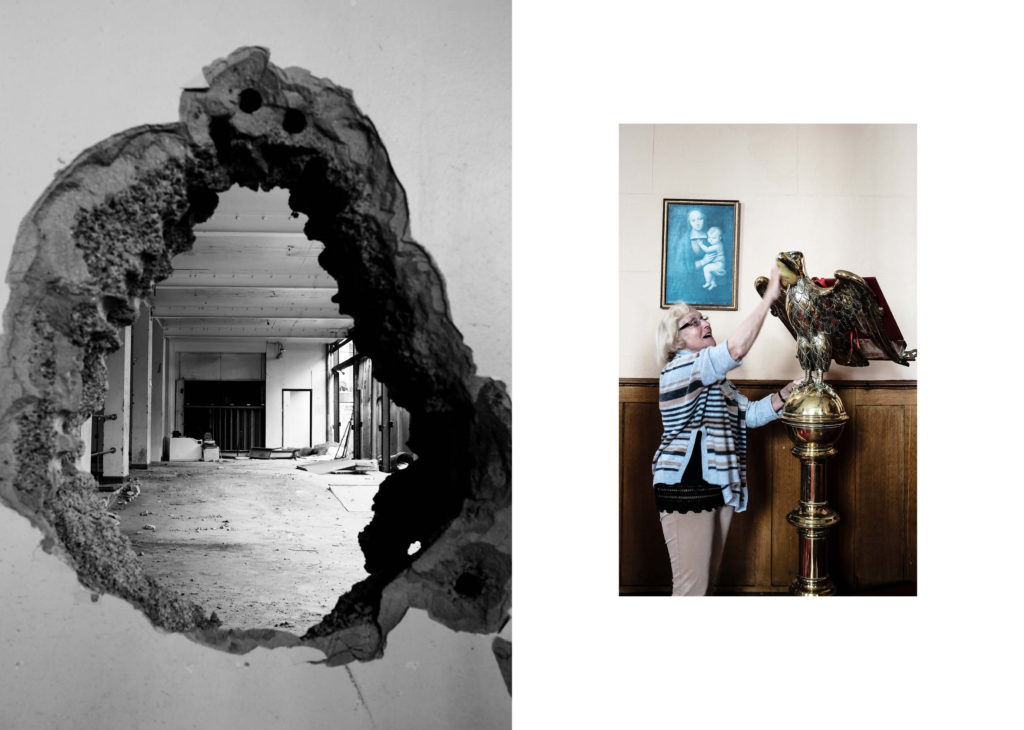
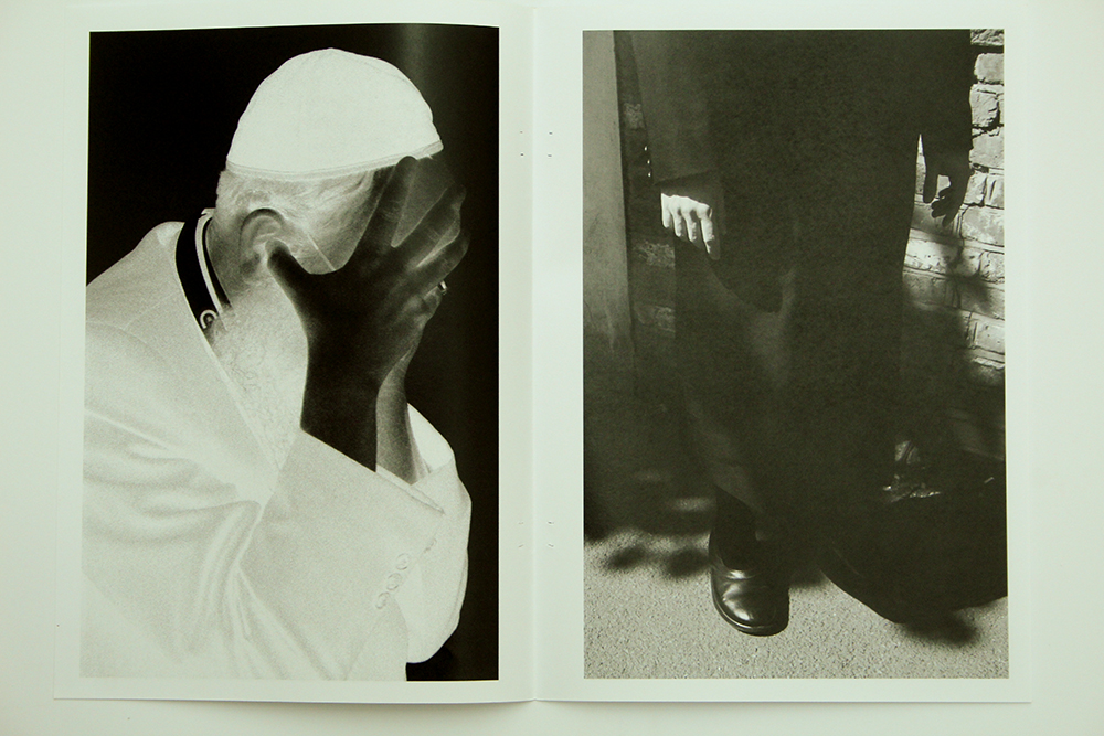
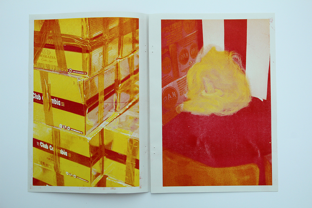
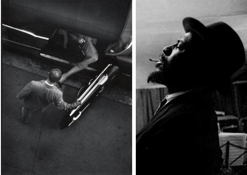
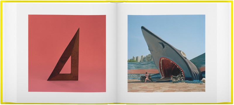
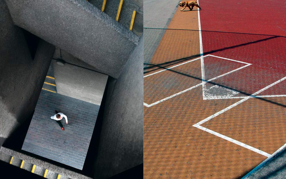
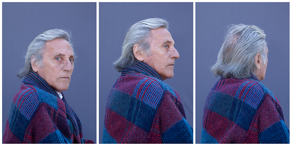
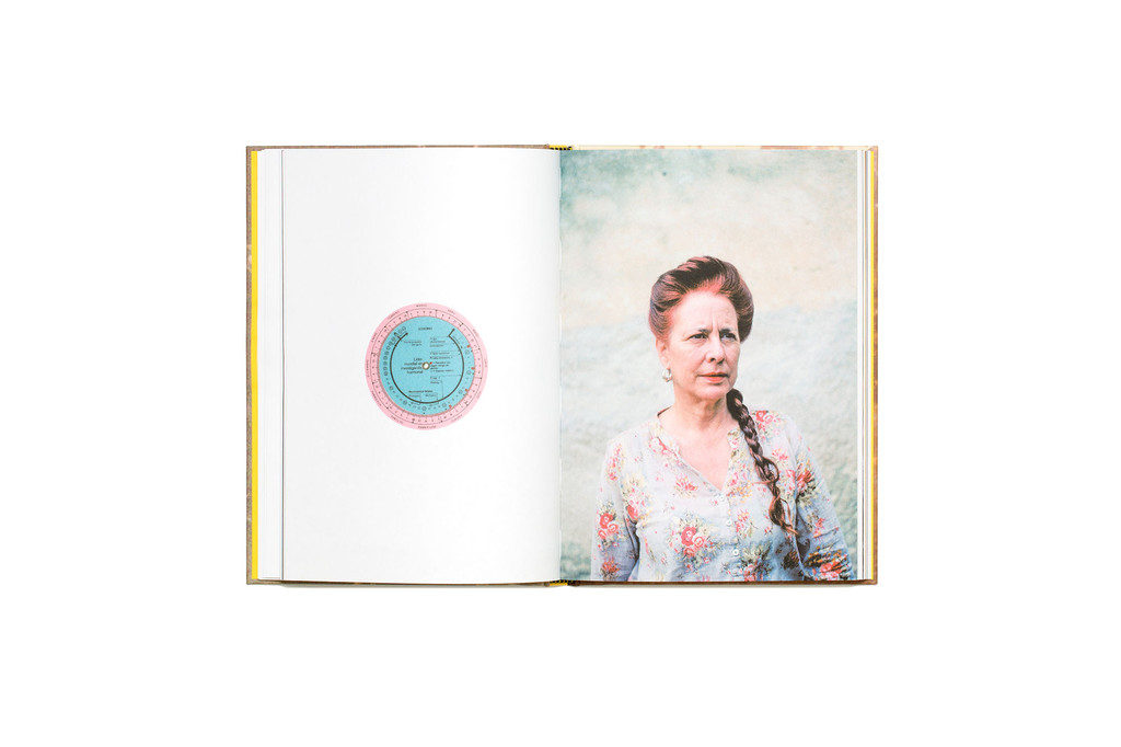
Juxtaposition is placing two things together to show contrast or similarities.Look at the newspapers: LIBERATION / OCCUPATION and FUTURE OF ST HELIER produced by past students and the publication GLOBAL MARKET on the table by ECAL students for inspiration.
SEQUENCE
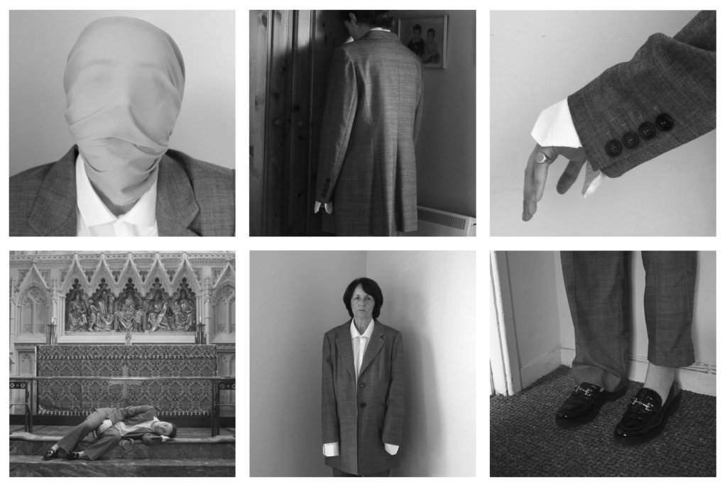
Shannon O’Donnell: That’s Not The Way The River Flows (2019) is a photographic series that playfully explores masculinity and femininity through self-portraits. The work comes from stills taken from moving image of the photographer performing scenes in front of the camera. This project aims to show the inner conflicts that the photographer has with identity and the gendered experience. It reveals the pressures, stereotypes and difficulties faced with growing up in a heavily, yet subtly, gendered society and how that has impacted the acceptance and exploration of the self.
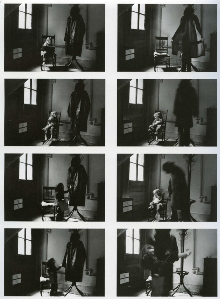
Duane Michals (b. 1932, USA) is one of the great photographic innovators of the last century, widely known for his work with series, multiple exposures, and text. Michals first made significant, creative strides in the field of photography during the 1960s. In an era heavily influenced by photojournalism, Michals manipulated the medium to communicate narratives. The sequences, for which he is widely known, appropriate cinema’s frame-by-frame format. Michals has also incorporated text as a key component in his works. Rather than serving a didactic or explanatory function, his handwritten text adds another dimension to the images’ meaning and gives voice to Michals’s singular musings, which are poetic, tragic, and humorous, often all at once.
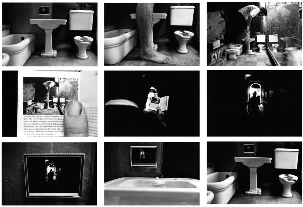
Nine gelatin silver prints with hand-applied text
3 3/8 x 5 inches
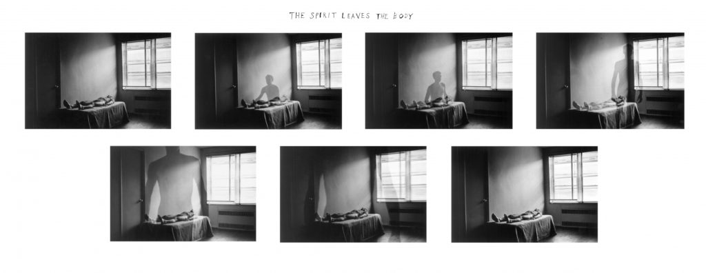
Seven gelatin silver prints with hand-applied text
3 3/8 x 5 inches (each image)

Five gelatin silver prints with hand-applied text
3 3/8 x 5 inches (each image)
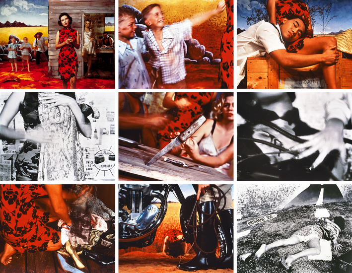
Tracy Moffatt: The nine images in Something More tell an ambiguous tale of a young woman’s longing for ‘something more’, a quest which brings dashed hopes and the loss of innocence. With its staged theatricality and storyboard framing, the series has been described by critic Ingrid Perez as ‘a collection of scenes from a film that was never made’. While the film may never have been made, we recognise its components from a shared cultural memory of B-grade cinema and pulp fiction, from which Moffatt has drawn this melodrama. The ‘scenes’ can be displayed in any order – in pairs, rows or as a grid – and so their storyline is not fixed, although we piece together the arc from naïve country girl to fallen woman abandoned on the roadside in whatever arrangement they take. Moffatt capitalises on the cinematic device of montage, mixing together continuous narrative, flashbacks, cutaways, close-ups and memory or dream sequences, to structure the series, and relies on our knowledge of these devices to make sense and meaning out of the assemblage.
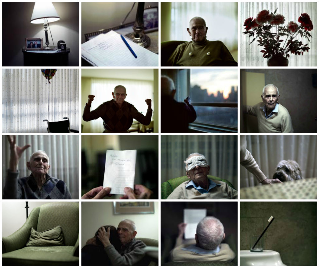
Philip Toledano: DAYS WITH MY FATHER is a son’s photo journal of his aging father’s last years. Following the death of his mother, photographer Phillip Toledano was shocked to learn of the extent of his father’s severe memory loss.
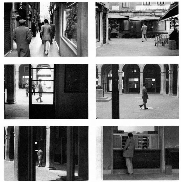
Sophie Calle’s practice is characterised by performances using rule-based scenarios, which she then documents. Venetian Suite consists of black and white photographs, texts and maps that document a journey the artist made to Venice in order to follow a man, referred to only as Henri B., whom she had previously briefly met in Paris. Although Calle undertook the journey in 1979, the texts describe the actions as taking place in 1980. Venetian Suite records Calle’s attempts to track her subject over the course of his thirteen-day stay in Venice. She investigates and stalks him, enlisting the help of friends and acquaintances she makes in the city. Eventually Henri B. recognises Calle, and they share a silent walk. Even after this encounter Calle continues her project, shadowing Henri B. from a distance until his arrival back in Paris.
The work was initially produced in book form in 1983; the same year Calle also presented the work as a sound installation in a confessional booth. In 1996 she configured Venetian Suite as a gallery-based work, the appearance of which deliberately recalls a detective casebook, with texts written in a style that mimics and deconstructs the narrative tension typical of detective novels or film noir. The text begins as follows:
For months I followed strangers on the street. For the pleasure of following them, not because they particularly interested me. I photographed them without their knowledge, took note of their movements, then finally lost sight of them and forgot them. At the end of January 1980, on the streets of Paris, I followed a man whom I lost sight of a few minutes later in the crowd. That very evening, quite by chance, he was introduced to me at an opening. During the course of our conversation, he told me he was planning an imminent trip to Venice. I decided to follow him.
(Calle and Baudrillard 1988, p.2.)
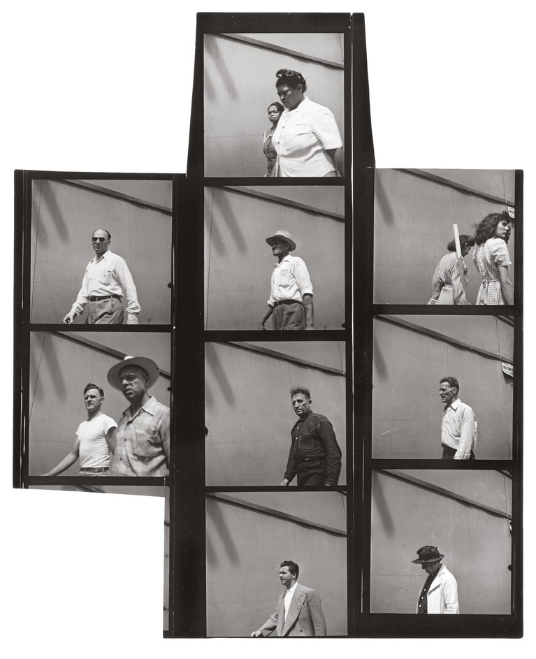
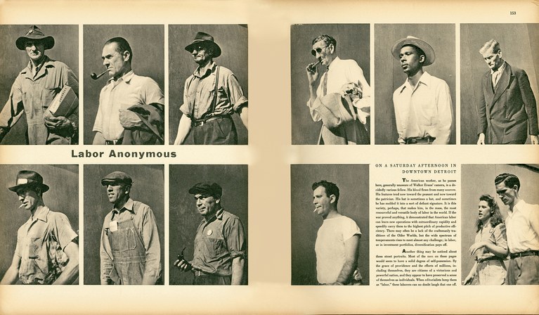
Walker Evans: One of the founding fathers of Documentary Photography Walker Evans used cropping as part of his work. Another pioneer of the photo-essay, W. Eugene Smith also experimented with cropping is his picture-stories
Read more here on Walker Evans and his magazine work and his series Labour Anonymous.
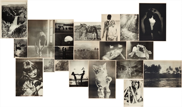
The complete set of 21 offset lithographs, on thin wove paper, with full margins,
all I. various sizes
Hans-Peter Feldmann: (b. 1941 Duesseldorf). The photographic work of Hans-Peter Feldmann began with his own publications in small print-runs between 1968 and 1975. Often using reproductions of photographs from magazines or private snapshots, which he mixed with his own photographs, Feldmann, like Ed Ruscha, undermined the aura of the unique, “authentic” work of art. With his laconic imagery he seeks to break down conventional notions of art.
MONTAGE
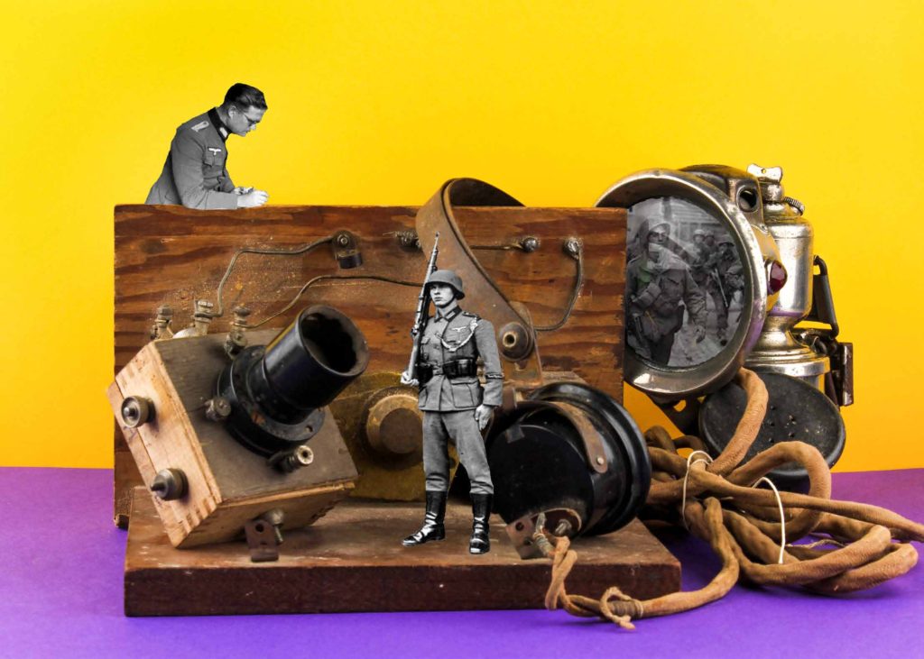
Photomontage is the process and the result of making a composite photograph by cutting, gluing, rearranging and overlapping two or more photographs into a new image.
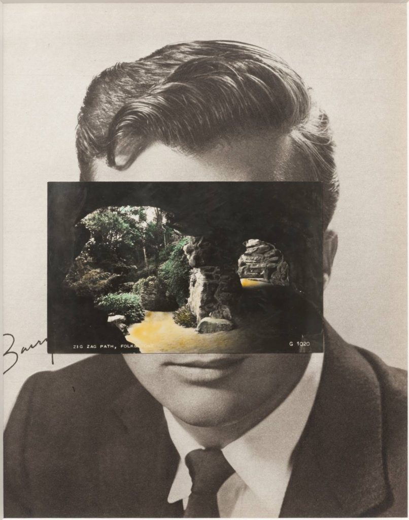
John Stezaker: Is a British artist who is fascinated by the lure of images. Taking classic movie stills, vintage postcards and book illustrations, Stezaker makes collages to give old images a new meaning. By adjusting, inverting and slicing separate pictures together to create unique new works of art, Stezaker explores the subversive force of found images. Stezaker’s famous Mask series fuses the profiles of glamorous sitters with caves, hamlets, or waterfalls, making for images of eerie beauty.
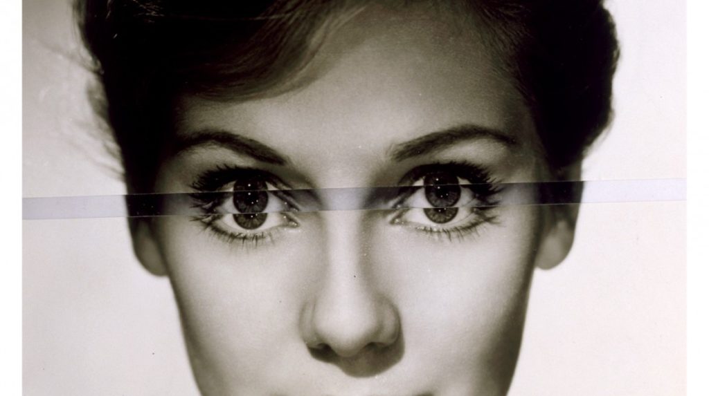
His ‘Dark Star’ series turns publicity portraits into cut-out silhouettes, creating an ambiguous presence in the place of the absent celebrity. Stezaker’s way of giving old images a new context reaches its height in the found images of his Third Person Archive: the artist has removed delicate, haunting figures from the margins of obsolete travel illustrations. Presented as images on their own, they now take the centre stage of our attention
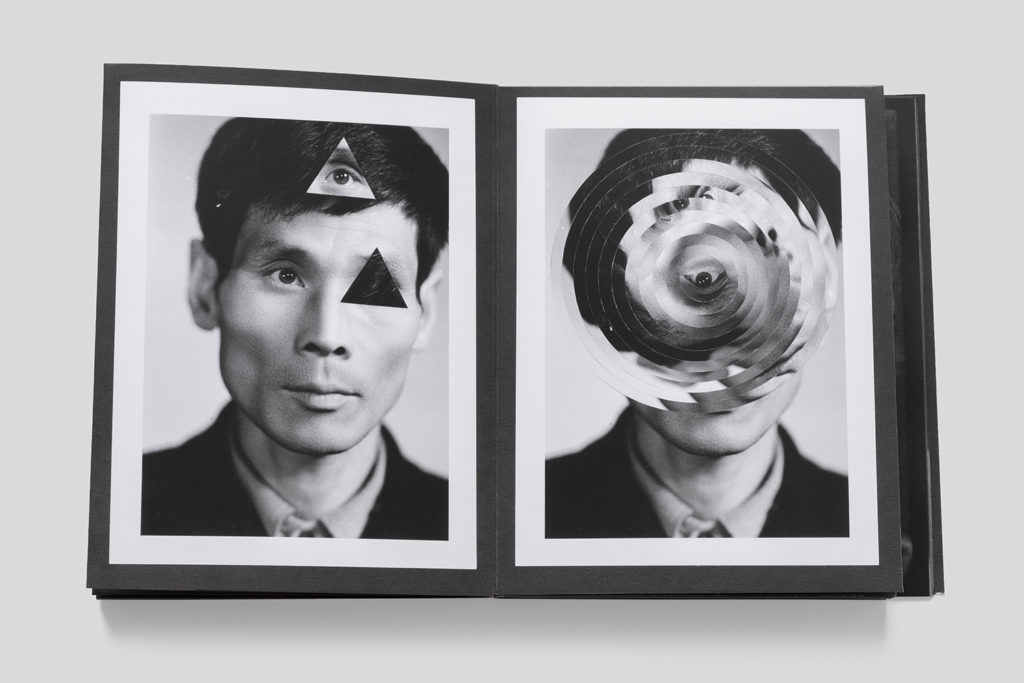
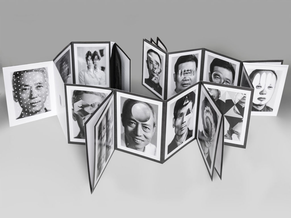
Thomas Sauvin and Kensuke Koike: ‘No More, No Less’
In 2015, French artist Thomas Sauvin acquired an album produced in the early 1980s by an unknown Shanghai University photography student. This volume was given a second life through the expert hands of Kensuke Koike, a Japanese artist based in Venice whose practice combines collage and found photography. The series, “No More, No Less”, born from the encounter between Koike and Sauvin, includes new silver prints made from the album’s original negatives. These prints were then submitted to Koike’s sharp imagination, who, with a simple blade and adhesive tape, deconstructs and reinvents the images. However, these purely manual interventions all respect one single formal rule: nothing is removed, nothing is added, “No More, No Less”. In such a context that blends freedom and constraint, Koike and Sauvin meticulously explore the possibilities of an image only made up of itself.
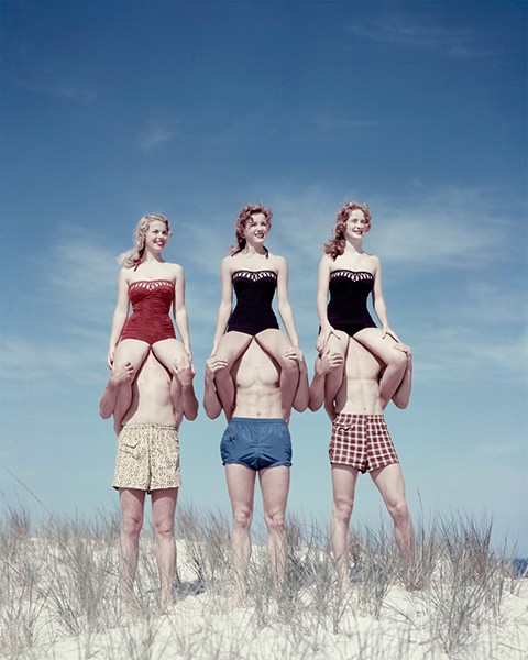
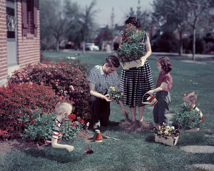
Veronica Gesicka Traces presents a selection of photomontages created by Weronika Gęsicka on the basis of American stock photographs from the 1950s and 1960s. Family scenes, holiday memories, everyday life – all of that suspended somewhere between truth and fiction. The images, modified by Gęsicka in various ways, are wrapped in a new context: our memories of the people and situations are transformed and blur gradually. Humorous as they may seem, Gęsicka’s works are a comment on such fundamental matters as identity, self-consciousness, relationships, imperfection.


