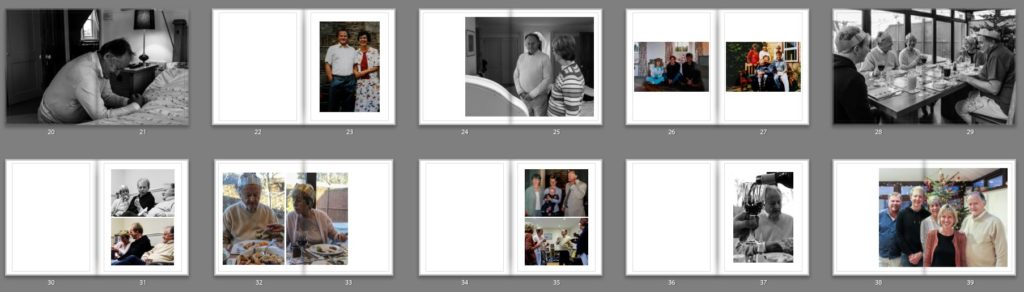
Martine Gutierrez is an American artist born 1989. She has become a published musician and producer, featured by several fashion houses including Dior and Acne. As a photographer, Martin explores the relationship between gender, identity, and perception, redefining and reshaping boundaries through the staged photograph.
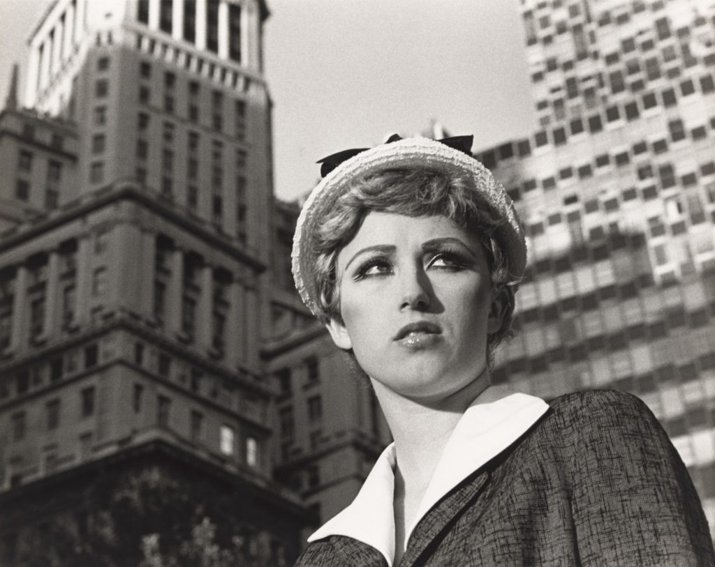
Cindy Sherman was born in 1954 in New Jersey. She is an American photographer. She is best known for her imagery, particularly her “disguised” self-portraits, which generally criticize social role-playing and sexual stereotypes. Sherman presents viewers with an ambiguous portrayal of women as sex objects. Sherman stated that the series was “about the fakeness of role-playing as well as contempt for the domineering ‘male’ audience who would mistakenly read the images as sexy.” She is her own model in her photographs, using wigs and costumes that evoke images from the realms of advertising, television, film, and fashion and that, in turn, challenge the cultural stereotypes supported by these media.
Feminism?
Sherman and Gutierrez both participate in making image which reflects femenism.In 2014 Martine Gutierrez created a series called Girlfriends. Girlfriends is a series of black-and-white images in which Martine Gutierrez poses with a single mannequin, They were composed and taken in upstate New York at Gutierrez’s grandmother’s cabin. It is evident that Gutierrez’s use of mannequins is as girlfriends, as in many of her works of art. But Gutierrez also uses the mannequin to soulign the mannequin’s idealistic appearance. Especially in its artificiality, it is the “perfect” body, comparing with the reality of the imperfect human body. Despite the hundreds of portraits toying with female stereotypes that Cindy Sherman has produced throughout her career, Sherman’s big artistic break came with the “Untitled Film Stills.” To make the series, the artist served as both photographer and subject, transforming herself with makeup, wigs, and elaborate costumes into figures that recalled the movie stars of an earlier generation. With the series Serman explains how ridiculous it is that women in movies are always young, thin and pretty.
Image analysis
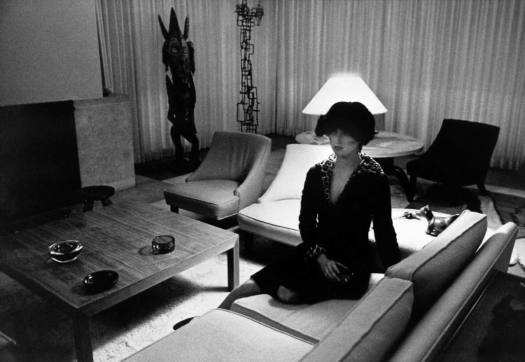
Girlfriends anita and marie 7 (2014)
In the image of Gutierrez there are two female characters, the two characters look identical but when you look closely you can realize that one of them is actually a mannequin. The outdoor environment makes me think of a scene in Forest Gump that happens in the southwestern United States. But the sitting seems to be a Mise in Scene, it is clear that this is not reality or the artist is using a background. We can say by the fact that you can see in the background at the top of the sky some undulating parts. Including the mannequin and using a background are the choices the artist made. She make us wonder who or what in this image are real. What are we defining real? Cindy Sherman is also in what we might consider the American Southwest. She’s sitting in a tree, which would be an unusual thing to discover out there, that makes it seem like it could also be taken in a studio. Like in Martine Gutierrez image we wonder what’s real or is the setting real? But this time Cindy Serman chose to just use her as a model in her image.
Key characteristics/ conventions; Reacted against mechanization and industrialization, dismayed at increasing industrial exploitation of photography through commercialisation. Championed evocative photographs and individual expression, constructed images looking for harmony of matter, mind and spirit – subjective and spiritual motive. Pictorialism is an approach to photography that emphasizes beauty of subject matter, tonality, and composition rather than the documentation of reality. Images had a foggy, mystical-type quality of fantasy that highlighted the aesthetically pleasing elements of an image.
Influences; Allegorical paintings – figurative mode of representation conveying meaning other than the literal. Communicates through symbolic figures, actions or symbolic representation – the underling meaning has moral, social, religious or political significance.
Artists associated; Alfred Stieglitz (Equivalent; clouds study), Peter Henry Emerson, Hugo Henneberg, George Davidson (Reflections 1899), Charles Job (Pulborough Bridge), Alvin Landon Coburn, Henry Peach Robinson, F. Holland Day, Robert Demachy, Edward Steichen.
Key works; Alfred Horlsey Hinton (Fleeting and Far 1903), George Davidson (Reflections 1899), Joseph Gale (Cottage Garden 1890), H P Robinson (He Never Told His Love 1884), Alfred Stieglitz (Equivalent; clouds study).
Methods/ techniques/ processes; Making photographs that resembled paintings, manipulating images in the darkroom, scratching and marking their prints to imitate the texture of the canvas, using soft focus, blurry or fuzzy imagery based on allegorical and spiritual subject matter. Photographers smeared Vaseline onto their camera lens to create a dream-like effect over their images, making them look like hand-made art.
Allegorical Paintings
An allegory is the description of a subject in the guise of another subject. An allegorical painting might include figures emblematic of different emotional states of mind – for example envy or love – or personifying other abstract concepts, such as sight, glory, beauty, Revolution, or France. These are called allegorical figures. The interpretation of an allegory therefore depends first on the identification of such figures, but even then the meaning can remain elusive. Allegorical subjects were frequently painted from the Renaissance until around 1800, although they were probably most often used in medals and engraved frontispieces to books. Single allegorical figures were also painted, sometimes in series, each figure representing, for example, one of the Liberal Arts or the Virtues.
Pictorialism Photography
Straight Photography/ Realism
Time period; Began in 1915
Key characteristics/ conventions; Photographers believed in the intrinsic qualities of the photographic medium, making use of its ability to provide accurate and descriptive records of the visual world. These photographers strove to make pictures that were ‘photographic’ rather than ‘painterly’, they did not want to treat photography as a kind of monochrome painting. They abhorred handwork and soft focus and championed crisp focus with a wide depth of field. Realism, which is closely associated with Straight Photography, has claims of having a special relationship with reality and it’s premise, that the cameras ability to record objectively the actual world as it appears in front of the lens was unquestioned. The key characteristic of this style was to reflect a person/landscape/object with complete honesty and ‘realism., without heavy editing or manipulation.
Influences; Social Reform Photography – he rural poor or the urban environment were not subjects for Pictorial photographers. But when a Danish immigrant, Jacob Riis, published his book ‘How the Other Half Lives’ about the slums of Manhattan, a new kind of realism was born with a socialist dimension. A number of photographers such as Dorothea Lange and Lewis W Hine began to document the effects of industrialisation and urbanisation on working-class Americans. This work influenced what we now call photojournalism.
Artists associated; Walker Evans (1903-1975) was often considered to be the leading American documentary photographer of the 20th century. He rejected pictorialism and wanted to establish a new photographic art based on a detached and disinterested look. His most celebrated work is his images of three Sharecropper families in the American South during the 1930’s depression. Paul Strand, Jacob Riis, Dorothea Lange.
Key works; Frederick Henry Evans; ‘A Sea of Steps’, Wells Cathedral, Steps to Chapter House (1903). Paul Strand; Bowls (1917), Ansel Adams; Monolith, the Face of Half Dome (1927), László Moholy-Nagy; Funkturm Berlin (Berlin Radio Tower, 1929), Manuel Alvarez Bravo; Ladder of Ladders (1931).
Methods/ techniques/ processes; Straight photographers visualized the image before taking the photo. Edward Weston defined this term in 1921 and stated: “Get your lighting and exposure correct at the start and both the developing and printing can be practically automatic.” The aim is to create an image which is not manipulated, either in the taking of the image or by darkroom or digital processes, but sharply depict the scene or subject as the camera sees it.
Straight Photography
Modernism
Time period; 1900-1960’s
Key characteristics/ conventions; Some things that were questioned in modernist photography, art and literature is what is the difference between wrong and right, what will America’s future be, what is truth, and what does it mean to be an American. One of the major changes in the modernist era is a break from tradition which focuses on being bold and experimenting with new style and form and the collapse of old social and behavioural norms. Practitioners of each new style were determined to develop a visual language that was both original and representative of the times.
Influences; Modernists drew inspiration from the philosophical investigations of 19th century writers, in addition to experimental forerunners in their own mediums. An investigation into the key areas of Modernism reveals influences among a variety of 19th and early 20th century thinkers and artists. The American poet Walt Whitman revolutionized the concept of poetic form, and his “Leaves of Grass” served as a foundational text for Modernist poetry. French writer Arthur Rimbaud inspired Modernists with his symbolic poems and unconventional, obscene subject matter.
Artists associated; Alfred Stieglitz, Dora Maar, Edward Steichen, André Kertész, Man Ray, Otto Umbehr (Umbo), Walker Evans, Iwao Yamawaki, Hannes Meyer, Richard Neutra, Paul Strand, Tina Modotti.
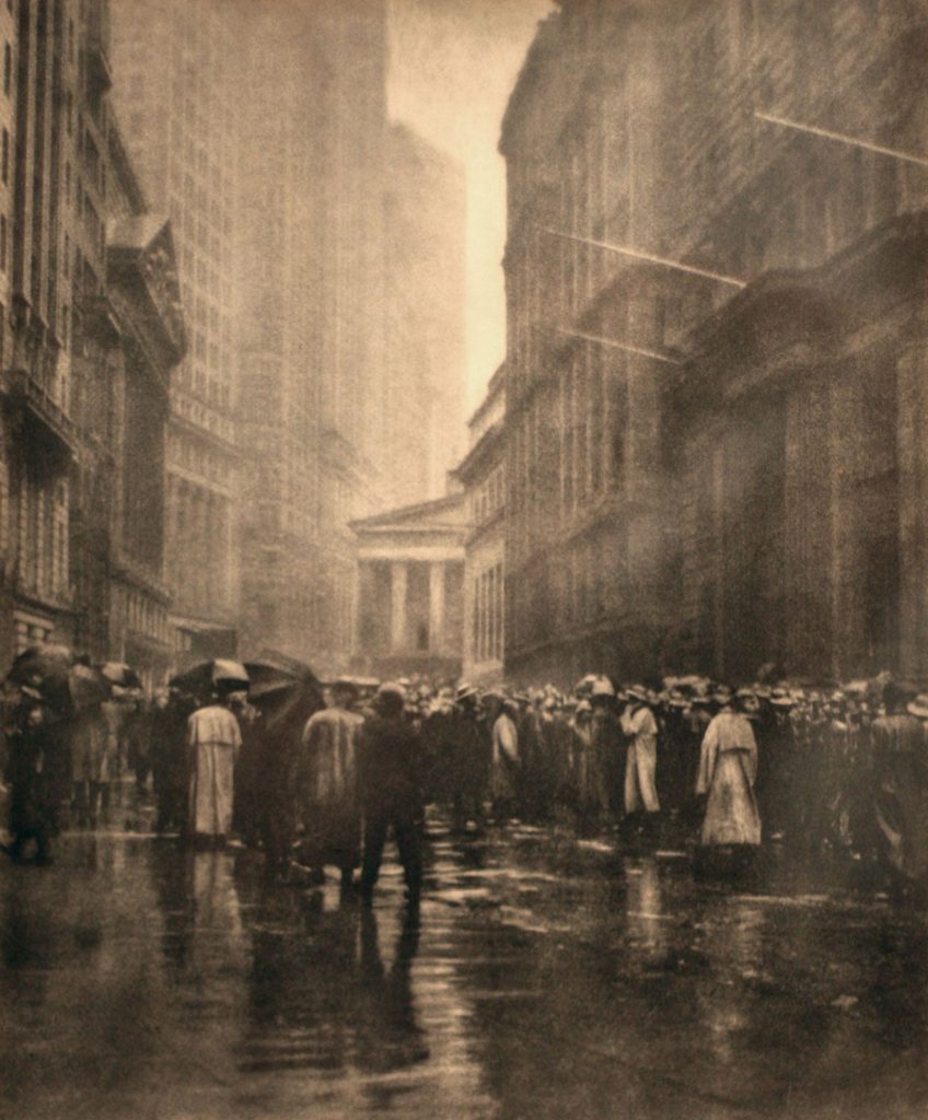
Key works; Salvador Dali (Metamorphosis of Narcissus), Raoul Haussmann (The Art Critic), Wall Street (1915), Abstractions (Twin Lakes, Connecticut 1916), Blind (Paul Strand 1916), The Steerage (Alfred Stieglitz), Workers Parade (Tina Modotti 1926).
Methods/ techniques/ processes; Although many different styles are encompassed by the term, there are certain underlying principles that define modernist art: A rejection of history and conservative values (such as realistic depiction of subjects); innovation and experimentation with form (the shapes, colours and lines that make up the work) with a tendency to abstraction; and an emphasis on materials, techniques and processes. Modernism has also been driven by various social and political agendas. These were often utopian, and modernism was in general associated with ideal visions of human life and society and a belief in progress.
Modernism Photography
Post-Modernism
Time period; Began during 1960’s/1970’s
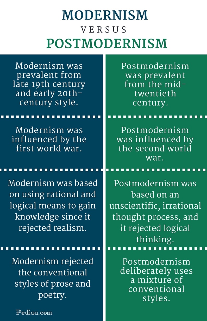
Key characteristics/ conventions; Postmodernism can be seen as a reaction against the ideas and values of modernism, as well as a description of the period that followed modernism’s dominance in cultural theory and practice in the early and middle decades of the twentieth century. The term is associated with scepticism, irony and philosophical critiques of the concepts of universal truths and objective reality. While modernism was based on idealism and reason, postmodernism was born of scepticism and a suspicion of reason. It challenged the notion that there are universal certainties or truths. Postmodern art drew on philosophy of the mid to late twentieth century, and advocated that individual experience and interpretation of our experience was more concrete than abstract principles. While the modernists championed clarity and simplicity; postmodernism embraced complex and often contradictory layers of meaning.
Influences; Jacques Lacan (1901–1981), was a prominent French psychoanalyst and theorist. His ideas had a huge impact on critical theory in the twentieth century and were particularly influential on post-structuralist philosophy and the development of postmodernism. Lacan re-examined the psychiatry of Sigmund Freud, giving it a contemporary intellectual significance. He questioned the conventional boundaries between the rational and irrational by suggesting that the unconscious rather than being primitive, is just as complex and sophisticated in its structure as the conscious. He proposed that the unconscious is structured like a language which allows a discourse between the unconscious and conscious and ensures that the unconscious plays a role in our experience of the world.
Artists associated; William Eggleston, Cindy Sherman, Jeff Wall, Guy Bourdin, Goran Sekulovski, Lee Friedlander, Andreas Gursky, Jacky Redgate, Robyn Stacey, Yasumasa Morimura.
Key works; Untitled Films Stills (Cindy Sherman), Ice (Robyn Stacey 1989), A requiem: spinning a thread between the light and the earth 1946 (Yasumasa Morimura), Campbells Tomato Juice Box (Andy Warhol).
Methods/ techniques/ processes; Its main characteristics include anti-authoritarianism, or refusal to recognize the authority of any single style or definition of what art should be; and the collapsing of the distinction between high culture and mass or popular culture, and between art and everyday life. Postmodern art can be also characterized by a deliberate use of earlier styles and conventions, and an eclectic mixing of different artistic and popular styles and mediums.
Mon 4 – Wed 6 April: Class 13B Wed 6 – Fri 8 April: Class 13C
DEADLINE: LAST DAY OF YOUR EXAM PHOTOBOOKS / FILM > FINAL PRINTS > PORTFOLIO > BLOG POSTS
IN PREPARATION FOR EXAM MAKE SURE THE FOLLOWING IS READY IN ADVANCE OF YOUR FIRST DAY:
Upload new photoshoots and edit in Lightroom – make sure to produce blog posts showing selection process and experimentation of images.
A draft layout of your photobook/ rough cut of film edit before your Mock Exam begin (that time is used to fine tune design with teacher)
Review your PORTFOLIO folder and make sure you have a good selection of final outcomes incl: previous Yr 12 projects, zine, NFT film + image, final prints and final essay (published on the blog as a separate post). If there are any gaps, or if you wish to re-do window mounts/ foamboard – make sure you save high-res images in PRINT FOLDER – EXAM
Make sure you monitor and track your progress by Fri 1 Dec and complete blog posts from previous tasks.
Structure your 3 day Exam as follows:
DAY 1: Photoshoots/ recordings: Complete final editing images or recordings for your photobook / film + produce blog posts showing selection process and experimentation of images. Use a combination of print screens + annotation. Write an evaluation about what went well and compare/ contrast with artists references and inspirations.
DAY 2 Photobook/ film: Complete photobook design/ edit film + produce blogpost showing a clear design process and evaluate. Use a combination of print screens + annotation. Compare and contrast with photobook artist/ inspiration.
DAY 3 Prints: Select 5-7 prints and consider presentation producing mock up in Photoshop and/or create virtual gallery. Make sure to produce a good blog post evidencing the above.
PORTFOLIO: Review your folder and make sure you have a good selection of final outcomes incl: zine, NFT film + image, final prints, essay (published as a separate blog post) and photobook/ film. If there are any gaps, or if you wish to re-do window mounts/ foamboard – make sure you save high-res images in PRINT FOLDER MOCK EXAM.
PHOTOBOOK Make sure you have a made a blog post that charts your design decisions, including prints screens of layout with annotation and write an ongoing evaluation. If you complete it; final book design must be checked and signed off by teacher.
For more help and guidance editing, process and evaluation go to blog post below.
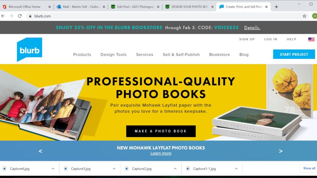
BLURB – ORDER BOOK Inside Lightroom upload book design to BLURB, log onto your account on their website, pay and order the book.
Consider spending a few extra pounds on choosing better paper, such as Premium Lustre in check-out, change colour on end paper or choose different cloth/ linen if needed.
FILM Make sure you have a made a blog post that charts your editing process, including prints screens with annotation and write an evaluation. If you complete it; final film must be checked and signed off by teacher.
For more help and guidance on editing, process and evaluation go to blog post below.
Export final film as mp4 file and upload to Youtube / Microsoft Streams and embed on Blog. Follow these steps:
In Premier: Click on Sequence > Render IN/OUT
File > Export > Media
Export Settings: Format H.264
Output Name: use title of your film and save to V:Data drive
Click Export at bottom
Using Microsoft Stream: Open up Office 365
Go to All Apps and select Stream
Create > Upload Video
Browse to upload your exported film from V:Data drive
Write a short description, choose thumbnail and publish
My Content > Videos > embed film into Blog post with evaluation.
In Youtube: Set up an account at home (www.youtube.com)
Click Create (top right corner) > Upload video
Select file > your exported film from V:Data drive
Write a short description and choose thumbnail
Once uploaded, embed film into Blog post with evaluation.
BLOGPOSTS All blog posts in relation to the above must be published, including any other posts missing from previous work modules since the beginning of A2 academic year, including Zines which must be printed & bound, and NFT film and digital image, including a statement, uploaded to both blog and folders here ready for the exhibition:
FINAL PRINTS Select your final prints (5-7) from photobook/ film and make a blog post showing ideas about how to present them.
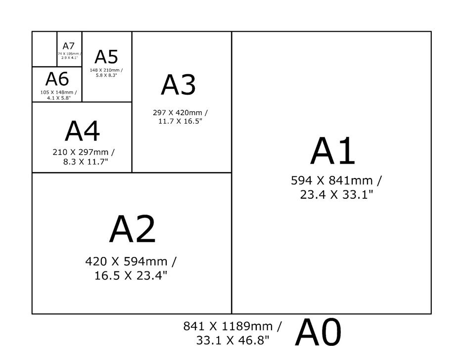
In photoshop produce a mock display (create new document size A1: 594 x 841mm) using different image sizes, for example: A3 x 2, A4 x 2, A5 x 3
PREPARE AND SAVE IMAGES FOR PRINTING:
Add your images to the print folder here…M:\Radio\Departments\Photography\Students\Image Transfer\PRINTING YR 13 MOCK EXAM
Complete any unfinished work from last term if you have time, For example: select images for print form Zine and NFT projects.
File Handling and printing...
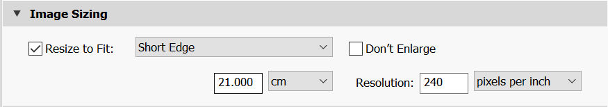
Remember when EXPORTING from Lightroom you must adjust the file size to 1000 pixels on the Short edge for “blog-friendly” images (JPEGS)
BUT…for editing and printing when EXPORTING from Lightroom you must adjust the file size to Short edge for “high resolution” images (JPEGS) like this…
A5 Short Edge = 14.8 cm
A4 Short Edge = 21.0 cm
A3 Short Edge =29.7 cm
This will ensure you have the correct ASPECT RATIO
Ensure you label and save your file in you M :Drive and then copy across to the PRINT FOLDER / IMAGE TRANSFER
For a combination of images, or square format images you use the ADOBE PHOTOSHOP > NEW DOCUMENT + PRINT PRESETS on to help arrange images on the correct size page (A3, A4, A5)
You can do this using Photoshop, Set up the page sizes as templates and import images into each template, then you can see for themselves how well they fit… but remember to add an extra 6mm for bleed (3mm on each side of the page) to the original templates. i.e. A4 = 297mm x 210 but the template size for this would be 303mm x 216mm.
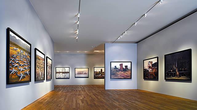
Making a Virtual Gallery in Photoshop
Download an empty gallery file…then insert your images and palce them on the walls. Adjust the persepctive, size and shape using CTRL T (free transform) You can also add things like a drop shadow to make the image look more realistic…
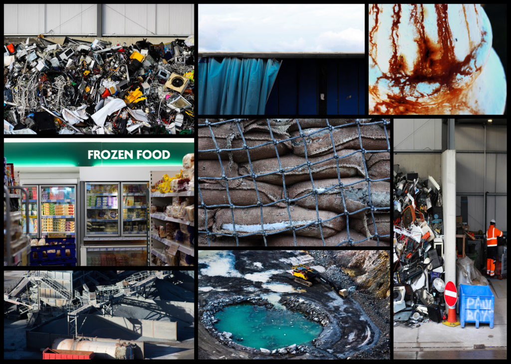
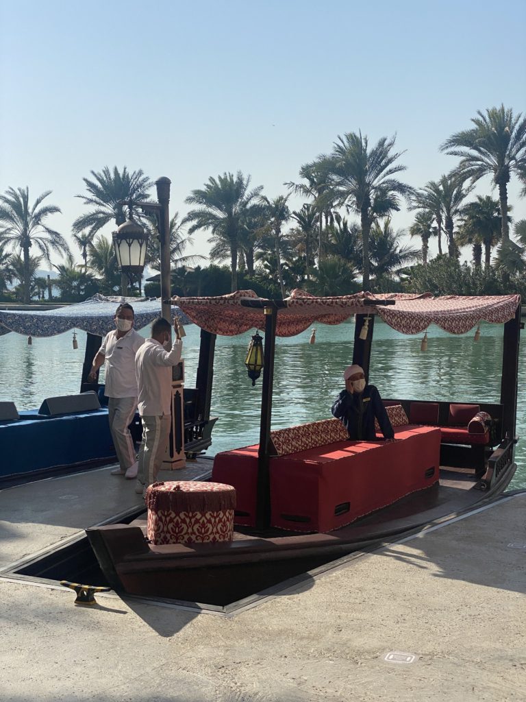
For this photoshoot I have decided to base part of my work on Nick Hannes as I feel that his set of images ‘garden of delight’ may show a clear and strong effect on ones opinions on the way in which different lifestyles; as Nick Hannes captured people doing their daily activities which shows the different ways in which people live in the community. To some extent I feel that Nick Hannes work has a powerful meaning to his viewers as each photograph he has taken is very different with a different meaning behind the photo.
Contact Sheet
My best photos from shoot 1 –
I feel that these are my best images at they clarity reflect the lifestyle in which someone who lives in Dubai may have. Additionally I also enjoy that these set of photographs all have specific connections and relations throughout. Nick Hannes work inspired my work as his worked helped develop my ideas and thoughts.
My Best Photos from shoot 2 –
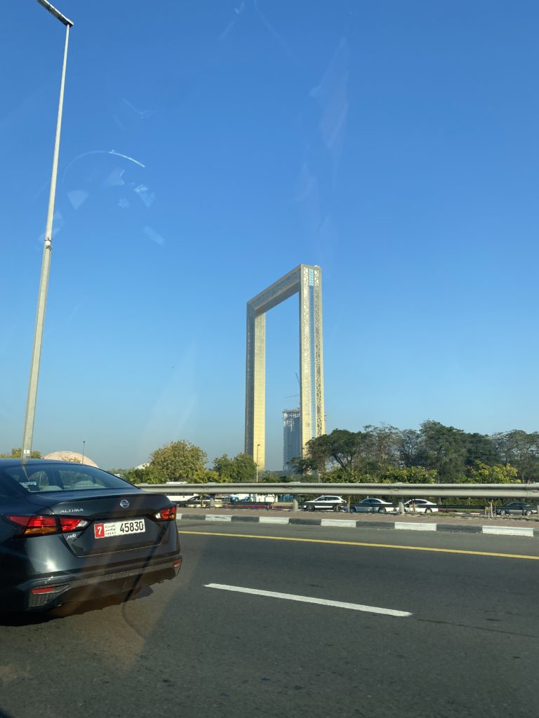
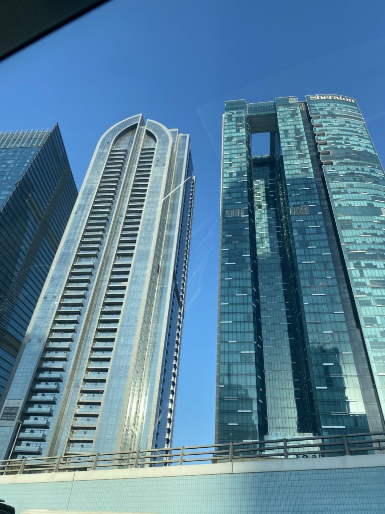
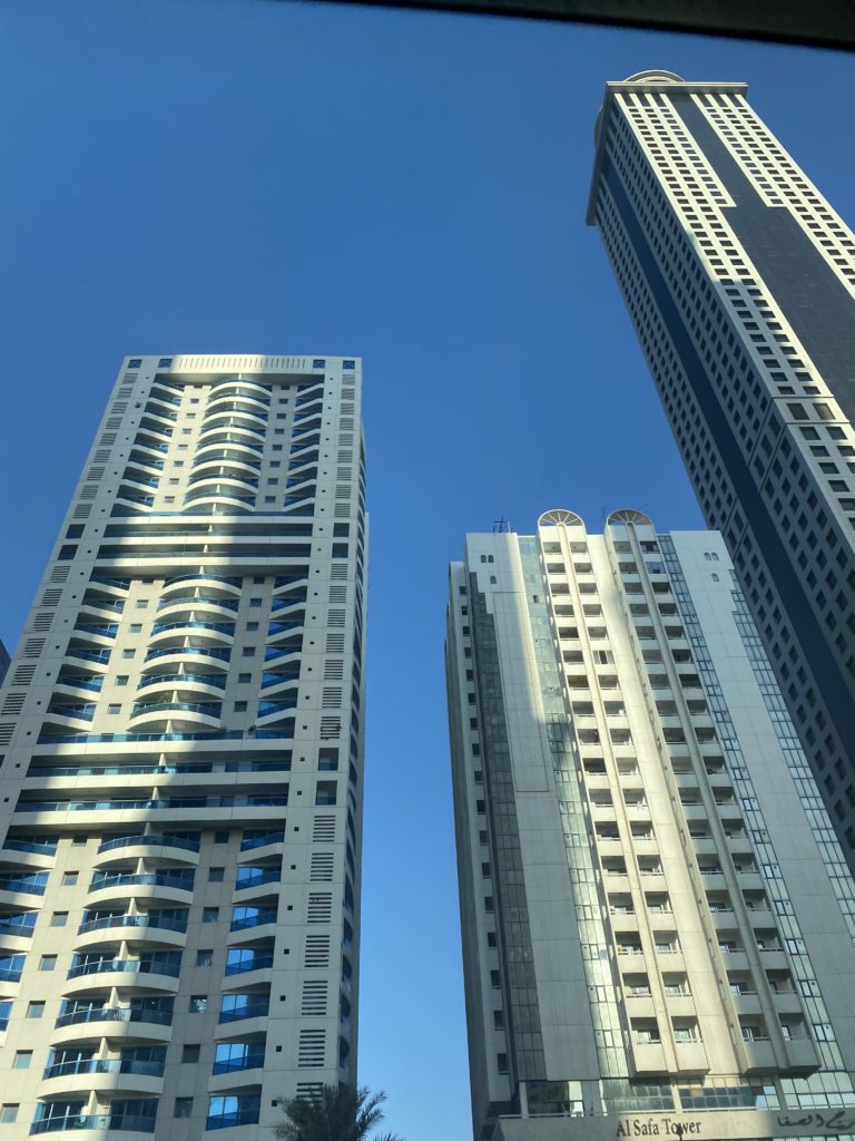
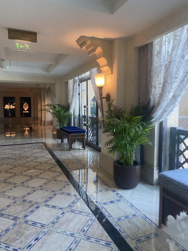
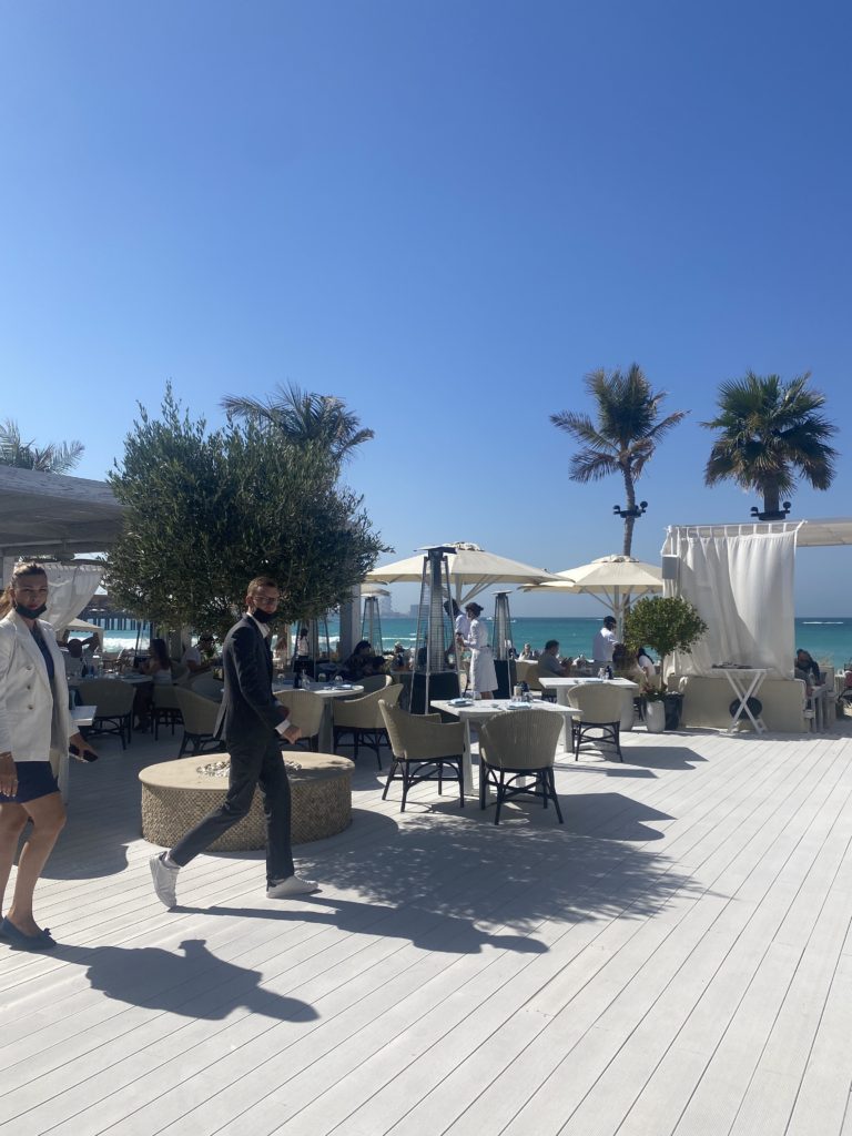
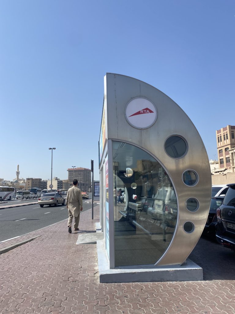
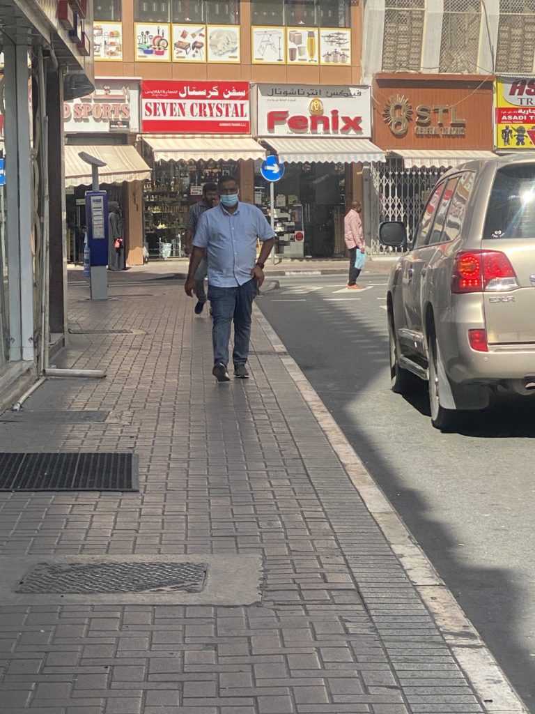
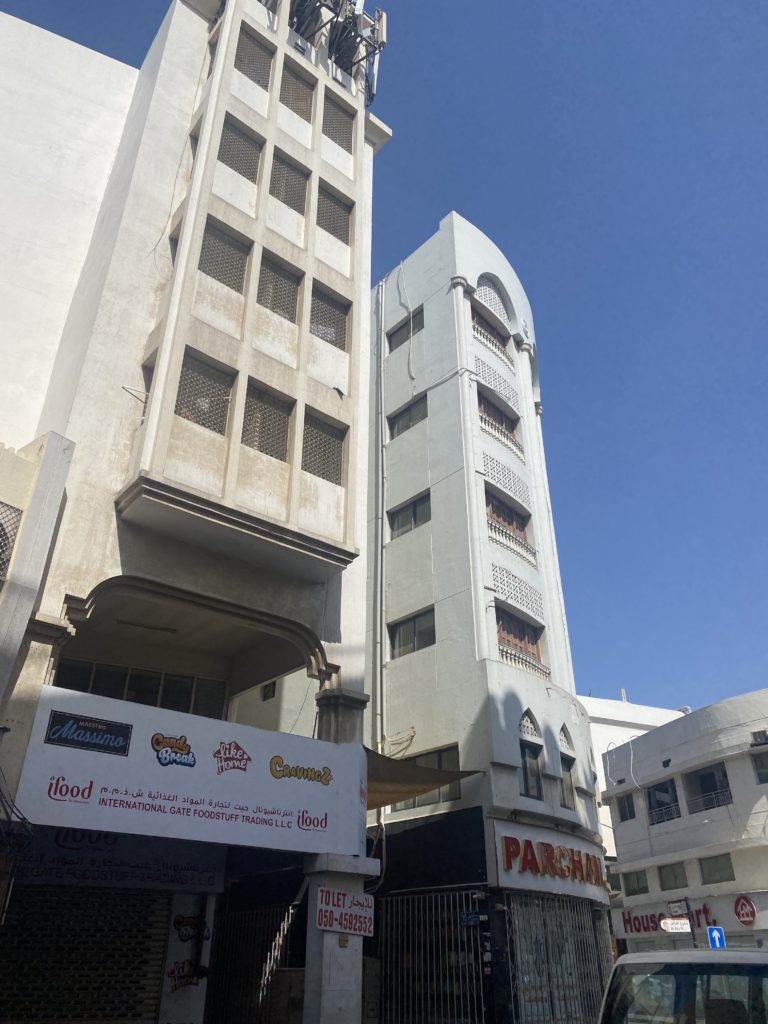
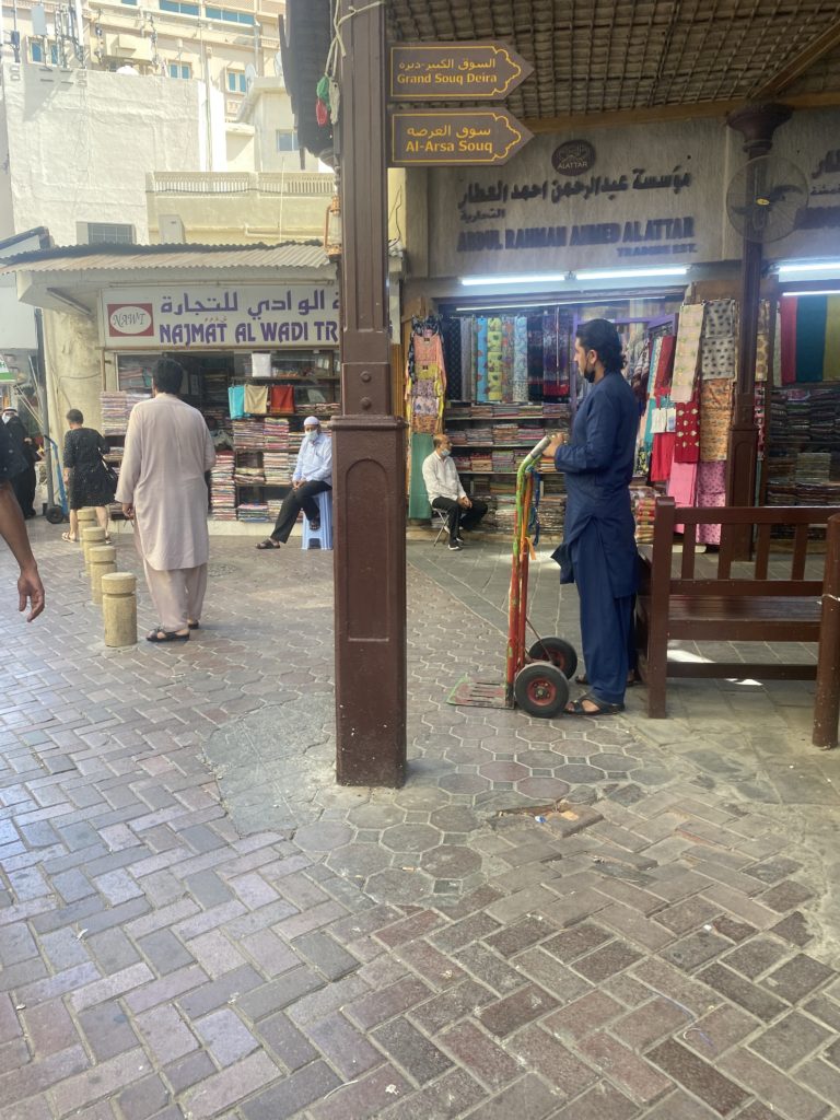
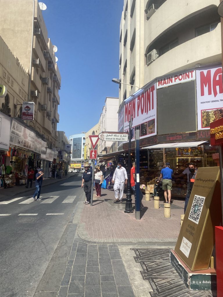
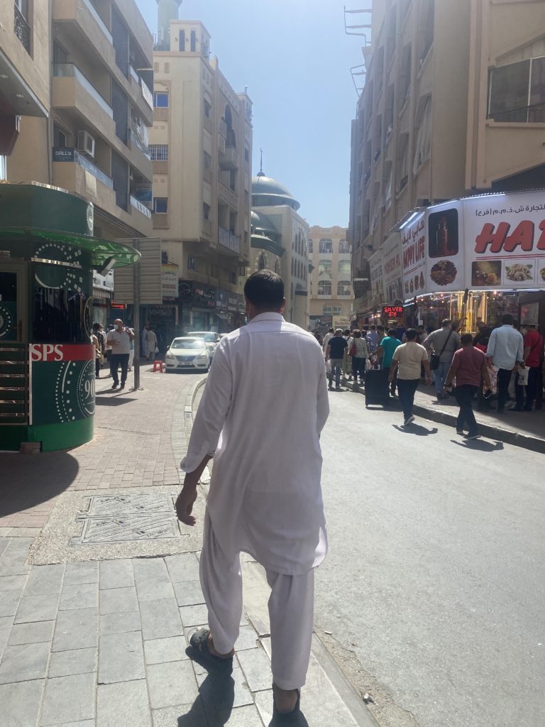
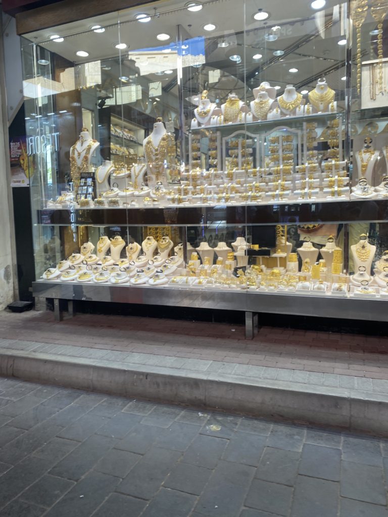
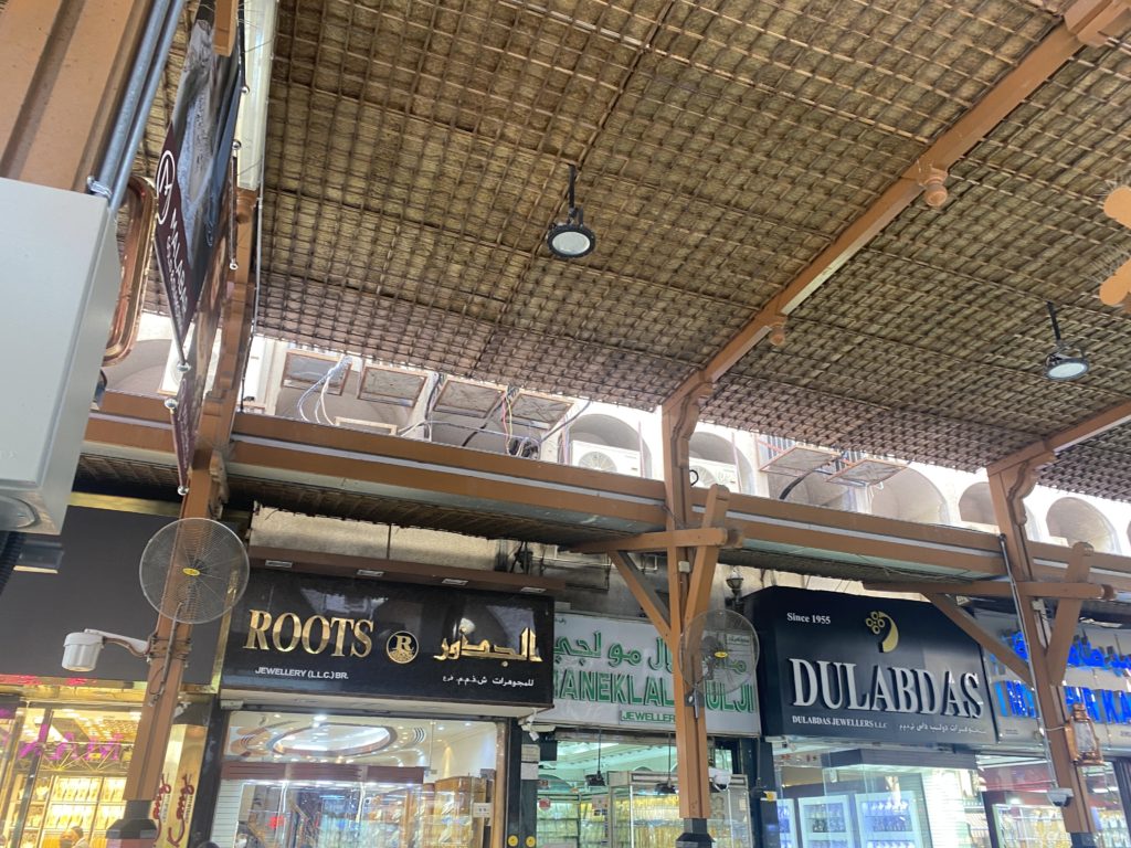
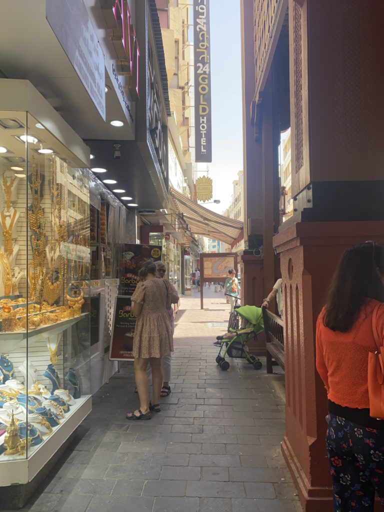
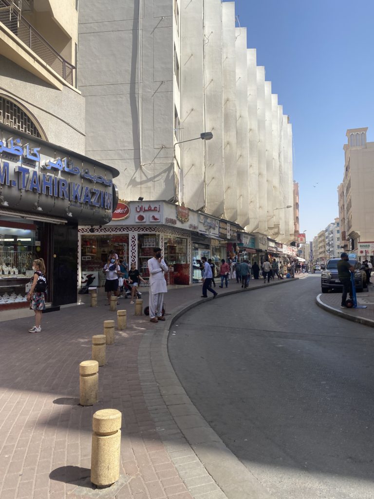
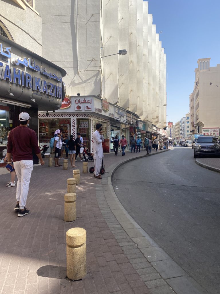
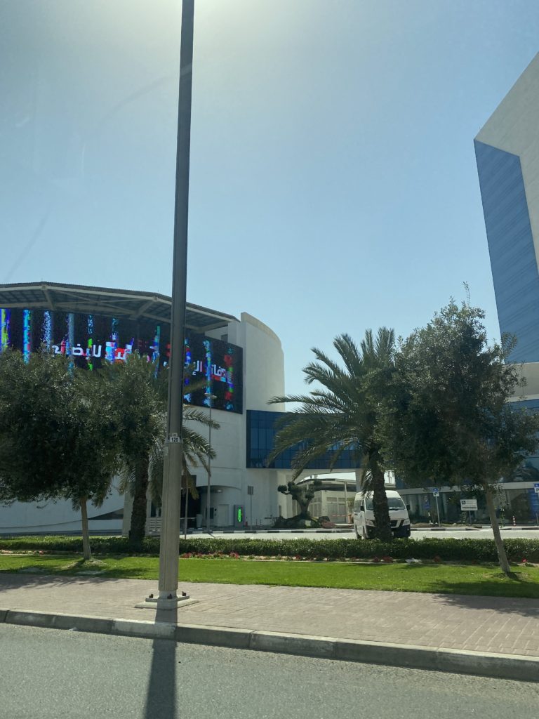
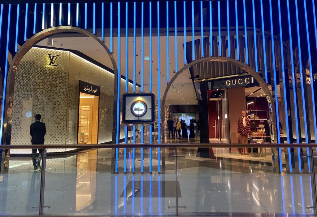
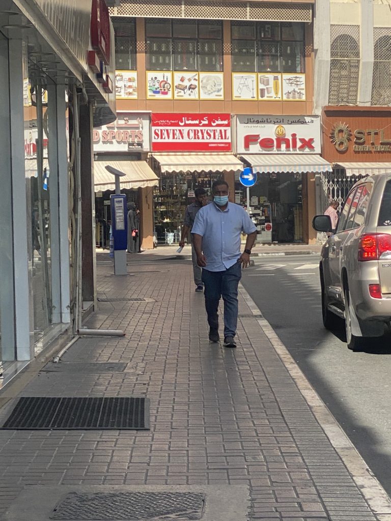
These photos completely juxtapose the other images in which I took as they show that in Dubai although it can seem that there’s not much poverty due to the fancy cars you see, skyscrapers as well as numerous other shopping malls. These photos reflect a different community to the other photo shoot as they show different cultures as well as what one may call the “traditional Dubai’ / “The Old Town”.
Overall I feel that this photoshoot went significantly well as I manneged to explore different communities in which Dubai has as well as portray `Nick Hannes ideas. I decided to experiment to see if these photos would look better in black and white; however I felt that that was not the case because you couldn’t see the main details of the photographs as well as the different contrasts and tones throughout.
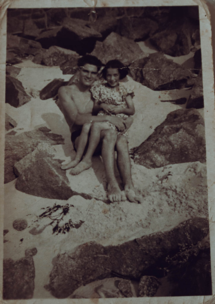
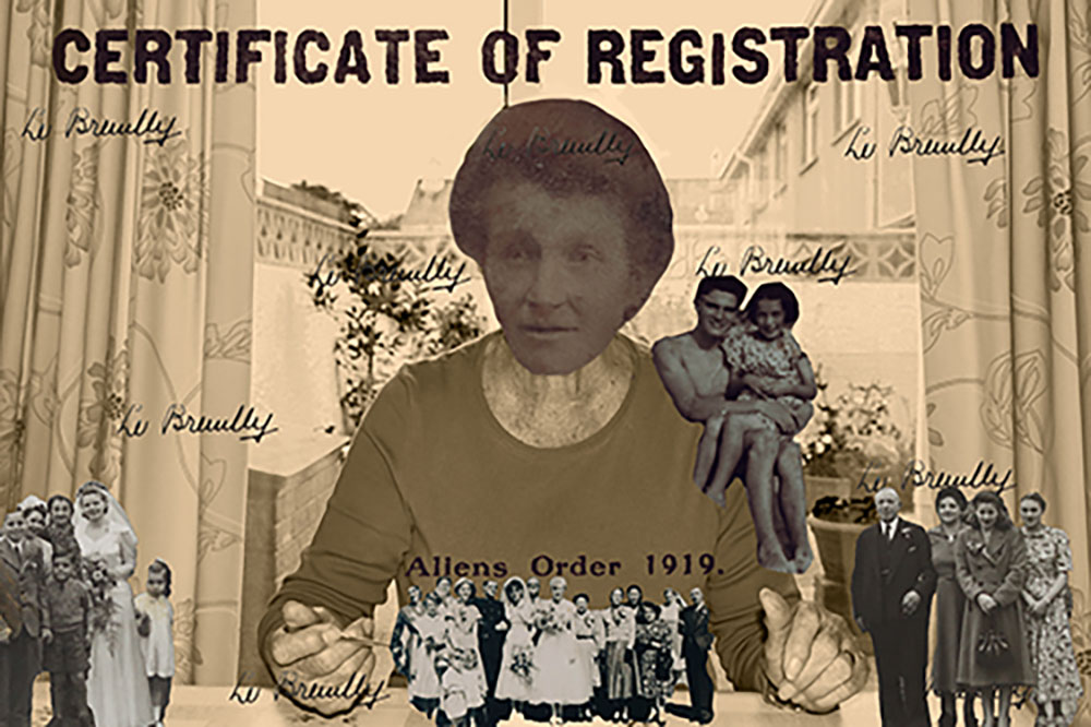
After putting together these photos I decided that there was not enough variety and although I really wanted to include the archival documents and photographs, they did not seem to fit in. To combat this issue I created a montage based on the portrait of my grandmother with a bricolage of her family photos and her own grandmothers immigration papers and documents.
the archival images I wanted to include
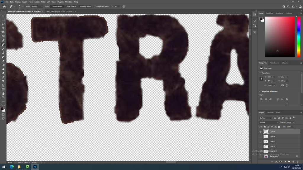
Using photoshop and the object selection tool I took key components from the archival subjects and pasted them over the initial portrait of my grandmother which I edited into black and white with a sepia wash to fit within the zeitgeist of the time period the other images came from. I replaced my grandmothers’ head with her grandmothers and scattered images from family weddings to create an image of unity and fit the prompt of identity as family is an important aspect of identity. To further stick to this identity prompt I used the typography from my great-great grandmothers certificate of registration that was taken from her alien identity card on her arrival from France to Jersey. The letters were severely damaged sue to being over a century old so I had to fix them on photoshop using the spot healing brush as well as redrawing some of the letters utilising the eyedropper and brush tool.
corrective editing of the letters from the identity card
To re-establish the connection between family I pasted in the signature from the identity card. I intended to make the writing lighter and have it blend in more but was unable to do so, instead keeping it bold to make the family connection stronger. To create a link between the old and young identities of my grandmother, I included a photo of her as a child on her shoulder to show the importance of sticking to your roots, this is a very important message for my grandmother who grew up in abstract poverty raising her younger siblings and still works hard to take care of her family
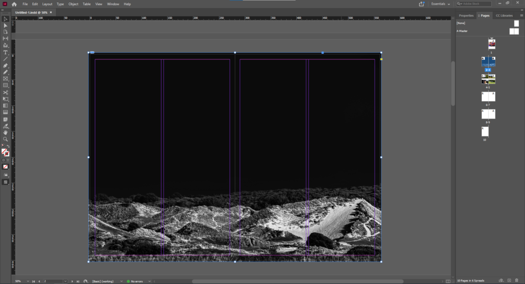
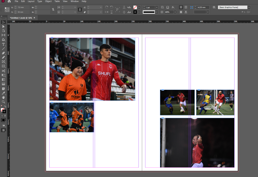
The above is the first image I chose due to its powerful use as a double page spread. This is because the landscape can fill the page and create an immersive experience when this page is opened. The negative space is also powerful as it splits the page horizontally and also presents an obscure aesthetic.
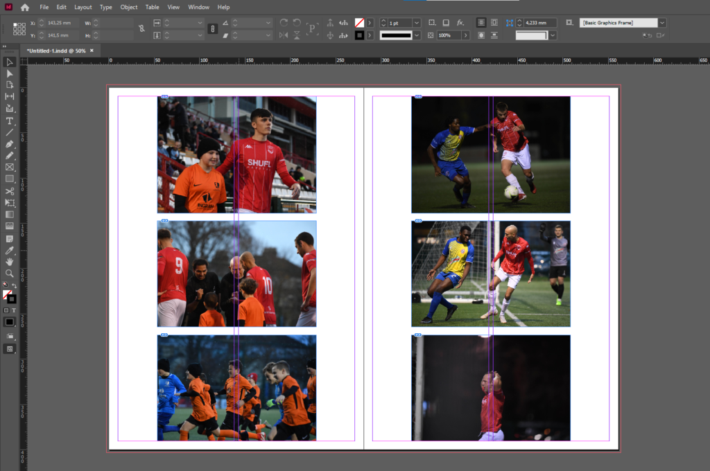
I then gathered related images and laid them out to create a photo-story. I chose theme images as they feature good framing, focus and balance while presenting the emotion of the subjects. After presenting them in this way I decided to configure them in a more traditional fashion suitable for a newspaper, with some images bigger than others and set out where a readers eye would easily follow down the page from left to right.
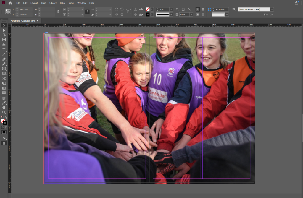
I then decided on another full double page spread using the below image as it presents the idea of identity and community well. With the girl staring into the lens it confronts whoever is looking at at the image and evokes emotion. This images is effective as a double page spread as it it immersive with depth of field created by the subjects in the foreground being out of focus while the subject in the background staring into the lens, makes it feel like you are part of the team huddle. The girls head is placed just before the middle of the spread so her head is not split in half.
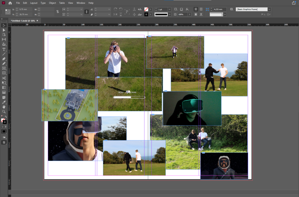
Finally I presented a montage of screenshots from the NFT film.
For my newspaper spread I decided to incorporate work from various different projects and topics we have covered throughout our 2 year photography course, including studio portraits, landscape, and object photography. I chose what I think were my best work from these projects and experimented with different ways of laying them out in various sequences and narratives. To begin this process, I went through all of my published blog posts and selected the images that I thought best represented my progress and effort throughout photography. I tried to use images that were not too similar to each other, in order to keep the viewer interested. I then had to check that all the photographs were high quality, and that they had the appropriate number of pixels each. After that I imported all the images into InDesign and began to experiment with different layouts until I found one that I was happy with.
As many of my projects are connected with the subtopic of food I decided to continue that topic of study for my segment in the newspaper using a collection of photographs taken for previous projects. To achieve this I used InDesign, which I had previously used in my Zine project and set to work curating my favourite images to present my work over the last year. I used a mix of full bleed spreads as well as juxtaposition sots which include my great great grandmothers alien identity card contrasted by a portrait of my grandmother. I edited my photos on light room with a range of black and white and others with cinematic and vintage filters to create deep meaningful colours and imagery relating to vintage cookery books. Initially, when searching for my photos I realised that a vast majority were compressed low quality images so had to do further searching to find the raw images on my SD card to ensure the photos would be high quality with minimum pixilation and blurriness.
After putting together these photos I decided that there was not enough variety and although I really wanted to include the archival documents and photographs, they did not seem to fit in. To combat this issue I created a montage based on the portrait of my grandmother with a bricolage of her family photos and her own grandmothers immigration papers and documents.
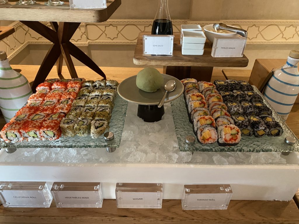
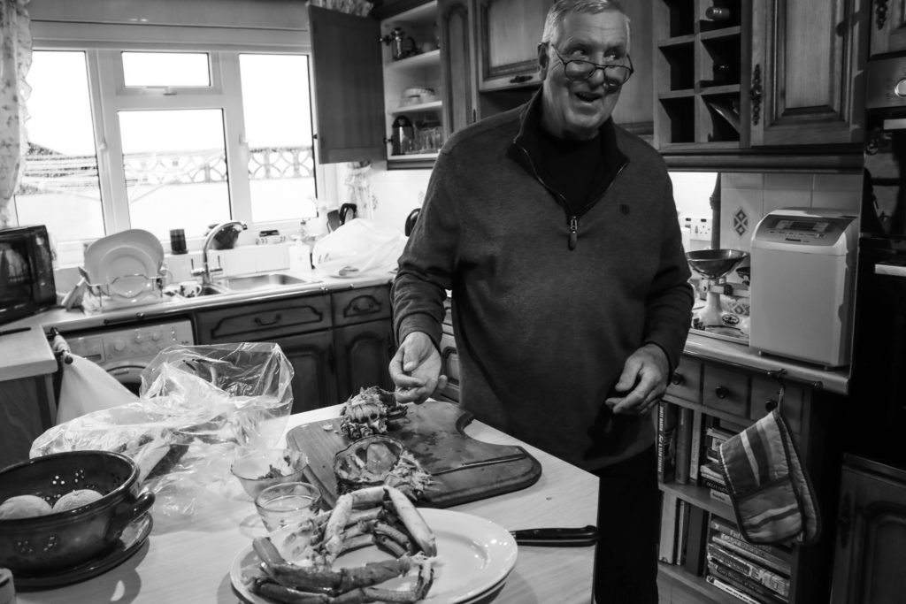
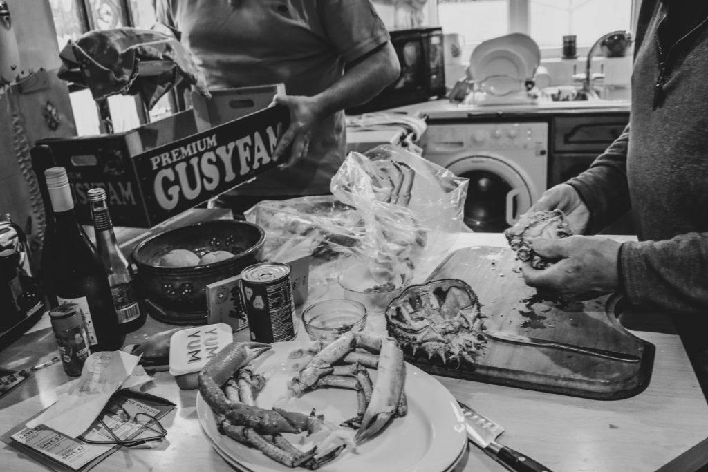
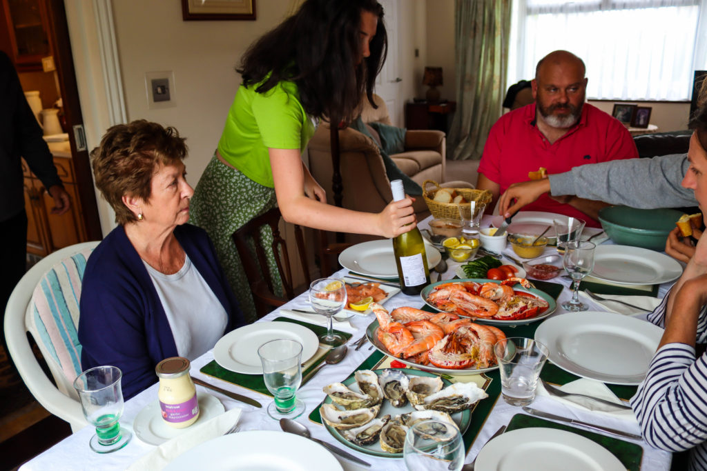
I designed the layout for my first zine by matching silhouetted shapes unconventionally, The photos contrasting between portraits and landscapes taken in town between candid’s taken at a family dinner. With the second zine I followed a less conceptual idea with all photos being centred around the family and the only photographs not on a family member being archival documents of family members and a platter of seafood which I used to represent the central theme of food that brought my family together.
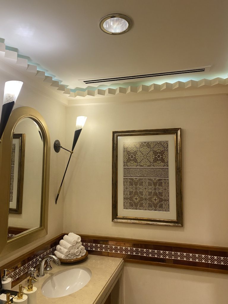
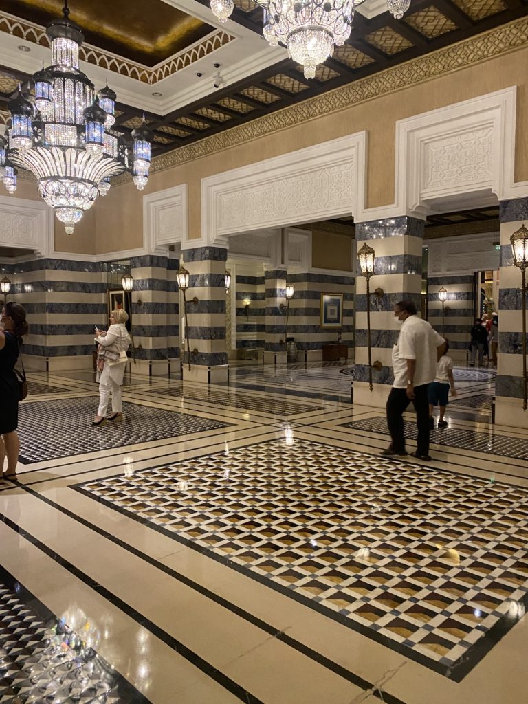
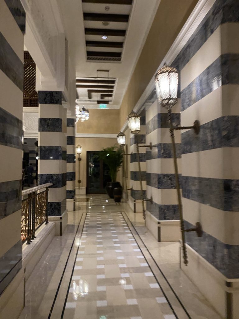
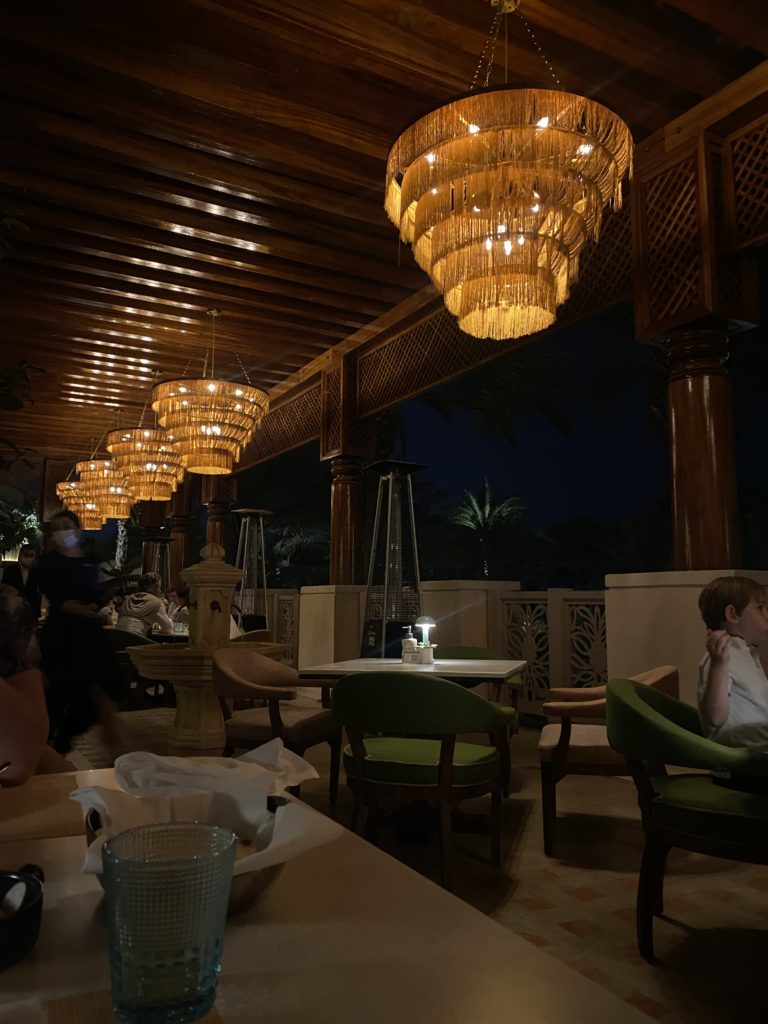
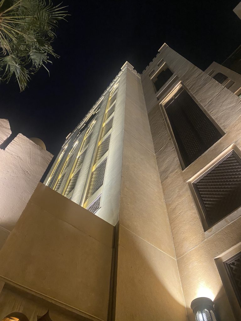
For the photographs that I took at the Waters Edge Hotel I’m going to adapt them to take out the bright tones and add darker, and harsher tones as I feel this will add more details to the photographs overall. Furthermore I also believe that this may change the opinions within the photograph in which people are seeing, as negative tones may affect the overall mood of the photo.
Editing process:
I decided to use the software on my laptop to edit and adapt the photographs I have taken. I first started by desaturating the images and then change the levels of the photograph to what each photo suits. Additionally I also adapted the white balance of each photo which added further contrast and detail.
I personally feel that these photos are the best outcomes of the waters edge hotel photoshoot, this is because each photo has specific detail. However although I have stated that I want three photos to have harsh and dark tones I also feel that several of my photographs may look better if they are in colour as they show different contrasts than to if they were black and white.
Photoshop ideas:
For this idea I decided that I’m going to use photoshop ti develop the levels of the photographs as well as change the overall colour. Im going to do this by using specific features in photoshop to create a “3D” effect. Furthermore I feel that I may also decide to experiment with photomontage and create a collage using photoshop.
Process
I feel as these four images work well together as all the colours blend together as well as the image which I used as an extra layer adds significant details; as you can see the stairs at a different angle which creates a more interesting photograph overall. I think I’m going to include these four images across a page in my photo book or one print in my final outcomes.
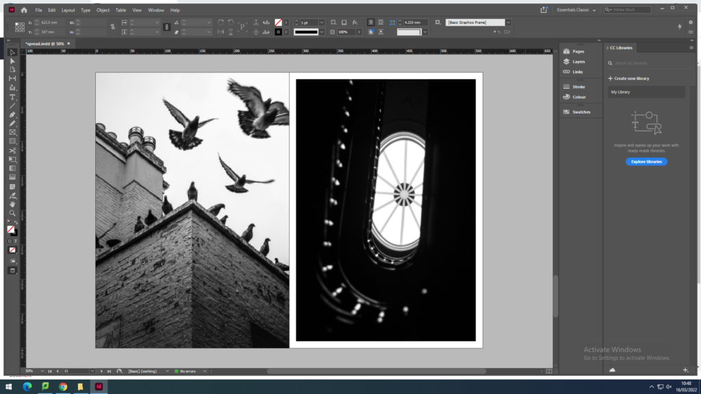
I plan to use 4-8 images which strongly summarise my work. Mainly from my recent project of Bouley Bay, the castle in the woods near Bouley Bay, and the two black and white photos from the Jersey Museum trip, of the staircase and the pigeons. And depending on how much space I have left I might include some screenshots of the NFT film.
These are the images that I plan to use:
They are all high definition which is needed to print in the newspaper. (The long edge must be 4000+ pixels)
page 1
page 2
page 3
page 4
To create the newspaper composition in InDesign. I used some the images above to make two pages of a newspaper
I made an InDesign document with the correct dimensions for a newspaper the imported the images into the area I selected with the x tool.
double page spread (featuring Bouley Bay)
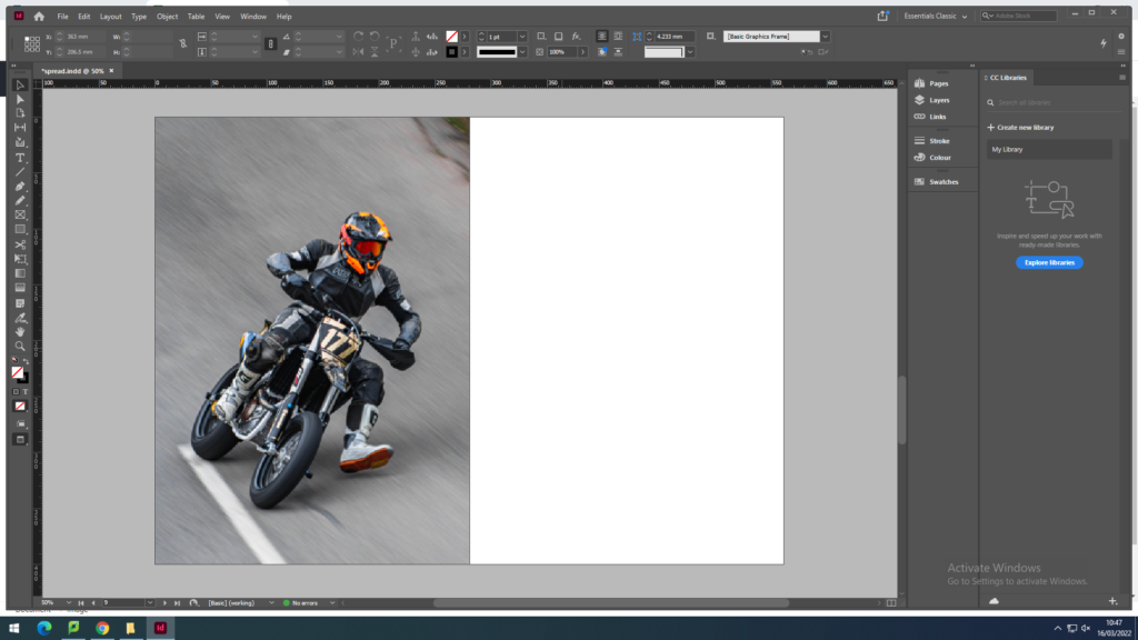
1 page of a motorcyclist at Bouley Bay Hill Climb. 1 page of town life in St. Helier.
Above I have thought about a wide range of different design layouts which includes, one page full-bleed image (sunset at Bouley Bay), a sequence of images (multiple images of Bouley Bay), large scale image with a border (Hill Climb Motorcyclist), and a juxtaposition between two images (inside/outside town images).
After rethinking my design layout, I remade the pages so that the images were bigger and had more juxtaposition to create a stronger spread layout.
I removed one of the biker images, as it was too small because it was less then 4000 pixels on the long edge, so I replaced it with a rock to create a focus on the close up studio shoots I got of small features of Bouley Bay. I ended up contrasting it with a granite heritage building.
However, I still thought I could include more contrast between the landscapes and objects.
I felt that there was a good amount of varity and juxtaposition between my images.
So I decided to package the document and save it into the shared folder where the newspaper editor (Mr Toft) can access it.