essay

How does Marchand and Meffre explore how wealth and power create divides within communities? 


Almost 90% of the world’s wealthiest adults live in North America, Europe, and Japan. A wealthy individual, community, or nation has more resources than a poor one, while having access to resources can be a personal bonus for the rich and powerful, for others it is not. We are now living in the Anthropocene age- which means human influence on the planet is so profound and terrifying it will leave a lasting impact on the planet for thousands of years to come. Emissions from flights stay in the atmosphere and will warm it for several centuries, meaning the excessive travel of wealthy, known individuals are a main contributor to the ongoing global warming issue. Donald Trump; has been dubbed, “the person responsible for the most carbon emissions in the world.” With the power that Donald Trump possessed while president he not only enacted policies that negatively affect the environment, but his personal choices are also wildly anti-environmental. Wealth and power are one of the things that divides us most as humans, while people can argue that having money does not make you powerful- the wealthiest people in the world, are not running countries and creating laws, like many world leaders, who’s wealth barely scrapes the surface of the sort of wealth Jeff Bezos has, wealth does make you powerful. By being wealthy, you have something that others want, that is where the power lies. Jeff Bezos spent 5.5 billion dollars to go to space for 4 minutes; this same amount of money could have saved 37.5 million people from starving in 2021. For the practical side of this project, I have decided to take pictures that I believe show Anthropocene and abandonment to communities as well as the divide of rich and poor communities.


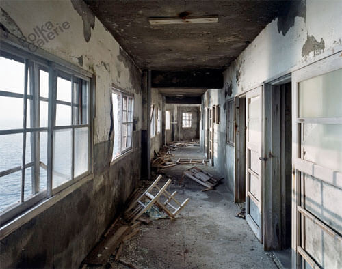
I chose the style of Yves Marchand and Romain Meffre to take inspiration from while taking images for this project. They are two French photographers who met through a mutual interest in contemporary ruins. They began their collaboration in 2002 by exploring Parisian urban remains before their interest took them to Detroit, where a thorough exploration of the city lasting five years resulted in their seminal work, ‘The ruins of Detroit’. Their other projects after that include ‘Theatres’ where they discovered and documented the sorry state of theatres they came across while travelling around America. Their work responds well to Anthropocene as it is filled with dull colours, mostly neutral tones like beige and creams. Their images show Anthropocene well as it mainly focuses on buildings that has been built from wood and such materials that have been sourced from the Earth and then abandoned to rot and ruin the landscape. This has a massive impact on landscapes and the Earth as people are cutting away nature and ruining habitats to build homes and buildings that are abandoned and left to decompose. There are over 19 million vacant buildings in America where the land could have been left untouched. I have chosen these photographers to discuss as I believe that I may be able to find vacant buildings in Jersey that I can take images of. It is no secret that Jersey is the home of many wealthy individuals, this can be seen first-hand through the images I have taken for this project. For my first photoshoot I decided to photograph The Water’s Edge Hotel a vacant hotel at Bouley Bay, what was once a beautiful hotel just metres from the beach is now an eyesore on the landscape. While the hotel has been sitting vacant since 2013 there have now been controversial plans to convert the 50-room, 4750sq-m hotel into one home for a wealthy individual. Not only is this taking away what was once a place where families to spend days together and tourists to visit the island, it is also going to make the beach surrounding the hotel uninhabitable whilst the demolishment of the building takes place. Senator Sam Mezec said, “I think this is sad. It’s essentially the commoditisation of our coastline for the benefit of an extremely small number of rich people, rather than for the benefit of all the people who want to enjoy this area and we’re seeing this in other parts of the island too like Greve de Lecq and at some point, we’ve got to say no and say our coastline is one of our most beautiful assets.” This is just a small instance of wealth and power dividing the community of Jersey however it is still controversial. Water’s Edge Hotel (first image) Computer generated image of new plans (second image).


I decided to mainly focus on Yves Marchand and Romain Meffre’s project ‘The ruins of Detroit’ as I think that the images, they captured in that project tell a lot of stories from just an image of an abandoned room and can be left open to interpretation. I also thought that I would be able to likely recreate and be inspired by these images more than the images from their project ‘Theatre’ as the images in Ruins of Detroit possess more similarities to buildings that I am able to capture images of in Jersey than their Theatre project. For my photoshoots of abandoned buildings, I focused on taking images in a similar style, by taking my images in a natural lighting and focusing on the dull tones in the images, another key similarity between our images is that the interior of the building I focused on are very derelict and falling apart a lot like the images in ‘The ruins of Detroit’ you can tell they have all been vacant for a long time and taken a lot of damage over the years from people intruding.

Yves Marchand and Romain Meffre are two French photographers who explore and question ruins. Through their photography, they show the vestiges of an era and the evolution of our societies. In an interview they described why they photograph what they photograph. “To give a rather broad definition of what we do, we are interested in buildings that strongly embody an era and a society and we observe their metamorphosis. The 19th and 20th century buildings often reflect the great transitions that are still underway today, like our series on the American theatres, which are examples of entertainment architecture produced on an industrial scale. These auditoriums, with their eclectic decorations, provided an attractive form of self-staging of the identity of a country that is still young. We then observed the city center movie palaces, huge assembly places, which declined due to suburbanization, the mass arrival of television – of individualized leisure basically – and to see some of these movie halls turned into churches, shops, shopping centers, etc. Through the prism of a type of place, we see an entire alternative modern history of our societies. That’s probably what makes us interested in these “modern” ruins, because they resonate directly with what we know.” I believe that throughout my work I also explore how once lively buildings turn derelict and then end up converted into something more modern and self-serving than a place that was once built for a community. That is why I have chosen these photographers to take inspiration from. 


Furthermore I have also decided to look at Jacob Riis he was a Danish-American social reformer, journalist and social. Within his work he contributed to multiple things; one which stood out to me was ‘How The Other Half Lives ‘ this is because his photographs have a strong and clear impact which adds key specific detail and also leaves his photographs left open to interpretation. Jacob Riis was one who decided that within his work he is going to publicized the serious crisis in housing, as well as the lack of good eduaction and poverty at the height of European immigration to New York City in the late nineteen century. In 1911 Riis stated in the San Jose Mercury that he was “I was a writer and a newspaper man, and I only yelled about the conditions which I saw. My share in the work of the slums has been that. I have not had a ten-thousandth part in the fight, but I have been in it.” As his work was so successful he was able to befriended President Theodore Roosevelt and later managed to change the law and create societal improvement for some the poorest in America. This clearly demonstrates how clear and strong the impact that his photographs had on individuals as he was able to have a strong enough impact for one to change laws and regulation to improve the overall quality of life.


As well as those photographers I also chose to focus on Robert Adams. Robert Adams was born in New Jersey and moved to Colorado. He was a professor of English literature for several years before fully committing to his photography career in the mid 1970s. He also released multiple books such as The New West, Summer Nights, Los Angeles Spring as well as several others. In 2009 Adams was awarded the Hasselblad foundation international award in photography. Robert Adams bought a 35mm reflex camera in 1963 and this is when he began to take pictures mostly of nature and architecture. Personally, I find Robert Adams work very inspiring due to the fact that each photograph in which he has taken is very unique in their own particular ways and has different morals behind each photograph. However, they are all very similar to each other due to the minimalistic contrasts within the photos and the mutual tones used. Additionally, I also feel that you can clearly see the main focus in each photograph as well as the non-focus which is mainly based on the backgrounds. In my opinion I feel that the photographs which he has taken involving architecture are highly more interesting for one to look at as each building may portray a different story of who may coincide there. For my photoshoot, I took images in the style of Robert Adams, I went into the side streets in St Helier and captured images of buildings that interested me, I then converted all of my images into black and white to match Robert Adams photography style. To a degree, all of Adams’ work is simple, but deceptively so. Since he first came to public attention in the mid-1970s as part of the New Topographic movement, his subject has been the American west: its vastness, its sparse beauty, and its ecological fragility. You could say that Adams was a pioneer of eco-conscious photography, but that would be a very reductive way of describing an artist whose vision has remained constant, and constantly rigorous, and whose work demands close attention – and a degree of patient attentiveness – from the viewer. I enjoy the simplicity of Robert Adams images (pictured below) as whilst being sparse there is a captivating feel to the way they have been taken which makes you want to see more. The photographs below are very similar this is due to the light dark tones which he has used to maybe add contrasts and details. Additionally I enjoy the way that he decided to not just capture the houses and also capture the people that may live there as this adds to the story of the photographs.

I like these images a lot as I feel the monochromatic colouration of them match Robert Adams images well. While in some of his images he has darker shades in they are mostly filled with light greys and white shades and I feel these images are a good representation of how he has inspired my practical work for this project. 


Additionally, I have researched an artist named Nick Hannes as he took photos of the rapid change in which Dubai has had over several years. This includes photographing luxury cars, nightlife as well as also portraying the way in which the lower class people live and the lifestyle in which they have. The photograph below shows several construction workers waiting for the collective bus transport to take them back ‘home’ to their labour camps. The wall behind them may suggest that they could be separated from ‘wealthier’ community as you can see the sky scrappers behind them which may either be offices or apartments of wealthy people. Furthermore another factor to why I think that this wall creates a clear divide is that there’s graffiti on it which states ‘FREE YOUR MINDS’ this may suggest that the workers may believe that social status does not matter to them. I feel that Nick Hannes kept this photograph in colour as if he was to adapt it to black and white it may not have had such a strong impact on the viewer, in addition the use of natural lighting is very effective as I feel the tones and shading would be very different and not as achieving if it was taking using artificial light.


In my own practical work, I have taken equal inspiration from both Yves Marchand and Romain Meffre as well as Robert Adams. I have taken photoshoots in both of their styles, first photographing derelict buildings and then moving onto buildings that are inhabited. The differences between my two photoshoots is that I left my first set of images that are inspired by Romain Mefree and Yves Marchand in colour as the dull colours in the image create a more abandoning and vacant feeling than when they are in black and white. However, after taking a closer look at the images I captured for my Robert Adams inspired photoshoot I decided to not only convert them to black and white to match his images but to also bring out the simplicity of them without overbearing colours. Finally I’m also going to take photographs that I have been in inspired by Nick Hannes as I feel that all his photos have different interpretations making the photographs genuinely more interesting for the viewer overall; one would say his work passes a strong message that money and power may create a divide within the communities. This may be due to the variety of income in which different people earn as people who are of higher income may feel more empowered when this shouldn’t be the case.


Bibliography:

Do wealth and power go hand in hand? – Quora 

https://www.quora.com › Do-wealth-and-power-go-hand-… 

Study Proves Power and Money Go Hand-in-Hand | Inc.com 

https://www.inc.com › susan-greenberg › study-proves-po… 

Wealth, Income, and Power – Who Rules America? 

https://whorulesamerica.ucsc.edu › power › wealth 

Air travel and climate change – David Suzuki Foundation 

https://davidsuzuki.org › what-you-can-do › air-travel-cli. 

The impact of air travel on our climate – atmosfair 

https://www.atmosfair.de › climate_impact_air_traffic 

Where are US emissions after four years of President Trump? 

https://www.climatechangenews.com › 2020/10/06 › us. 

Water’s Edge Hotel conversion under way – Jersey Evening Post 

https://jerseyeveningpost.com › news › 2020/01/21 › w… 

Luxury home plans on site of Water’s Edge Hotel officially … 

https://jerseyeveningpost.com › news › 2021/06/29 › lu… 

Debate over controversial plans for Jersey’s Bouley Bay hotel … 

https://www.itv.com › news › channel › debate-over-co… 

Yves Marchand & Romain Meffre Photography 

http://www.marchandmeffre.com

Vestiges of a Dream Society by Yves Marchand and Romain … 

https://www.cerclemagazine.com › … › Articles Magazine 

Robert Adams | Fraenkel Gallery 

https://fraenkelgallery.com › Artists 

Robert Adams (photographer) – Wikipedia 

https://en.wikipedia.org › wiki › Robert_Adams_(photo… 

https://www.loc.gov/exhibits/jacob-riis/overview.html

https://nickhannes.be/garden-of-delight.html

Photoshoot Plan

Recreating shoots

For my photobook shoot, I want to recreate iconic images of Lillie Langtry but in a more modernised way. I may use more modern settings or change the costume in a way that still relates to historic fashion, but with modern elements.

Here is a mood board of some of the images I am aiming to recreate.

I want to find an old fashioned or antique dress from a charity shop to recreate the costume. I may take some photos out of the studio for the images with the sofa or in nature. I will use simple makeup on my model and put their hair up as seen in the photos of Lillie Langtry. The images have a high contrast of light and shadows, so in the studio I will use harsh lighting directed from one side of the face. I may also use props such as chairs, fake flowers and hats.

Essay

In what way have Mary Ellen Mark and Laia Abril portrayed women’s mental and physical health. 

“I remember learning that society had mandated that getting my period should remain a secret. The same ritual that was supposed to symbolize that I had “become a woman,” came with an unbearable pain that was normalized.”  
Abril, L. (2021) Menstruation Myths.  

Menstruation is an example of one of the many things that women must go through; yet keep it concealed due to society’s opinion on it. Women have been stereotyped to be accommodating and emotional, this could easily be interpreted as weak. Women grow up with this stigma and therefore have been known to be victimised by others. This has been proven with statistics provided by the UK government, let alone the rest of the world.  Laia Abril is known for focusing on things that women could go through at some point in their life. Her project History of Misogyny include the topics: rape, abortion, periods, eating disorders and sexuality. Her images are always raw to show the true feelings and experiences of going through these situations; for rape she focused solely on objects that can be connected to the subject. This form of photography helps engrave the reality of things in people’s minds. Mary Ellen Mark has done a range of work, including being an associate producer for the film American Heart in 1992 as well as creating many photo books, all seemingly focusing on social minorities. Her work over the years has helped her accumulate many awards which she began to receive in 1980 for her work Mother Theresa to her most recent award in 2014 for an outstanding contribution to photography award. Both women have showed the public what life is like for others who could be counted as less fortunate than themselves. They have inspired my work and I have tried to adopt their techniques and themes throughout my personal study. I want my work to be more informative than emotional. I want to reveal the realities of life for women.  

The feminist movement took off when the Suffragettes began to fight for women being able to vote in the UK in the 1870s, this was known as first wave feminism. Once the First World War began, the men went off to war and the women had to stay behind and help work in factories and build bombs rather than staying in the house doing domestic work. This meant that when the war was over, women wanted to have more independence and get their own job away from the house, and their husbands. This became a popular opinion, the fact that women over the age of 30 in the UK in 1918 may have had a part in it also. The second wave in the feminist movement began in the 1960s and led to the 1990s during the anti-war protests. Instead of focusing purely on the gender inequalities, the second wave of feminists broadened those ideas onto sexuality, reproductive rights, domestic violence, marital rape etc. This was a huge deal as this time it was not only women protesting, but men also joined in as they saw the injustice in the world. This wave helped enforce the criminalisation of marital rape in 1994 (UK) as well as in 1965 (USA) the Griswold v. Connecticut Supreme Court ruling of 1965 prevented anyone from limiting a woman’s access to contraception or other methods of birth control. This ground breaking work done by historical movements has allowed Mary Ellen Mark and Laia Abril to create the work they wanted without anyone questioning whether they are the right people for the job.  

Emmeline Pankhurst getting arrested in the streets of Manchester (1910)

The Oxford dictionary definition of documentary is “to document or record”.  Documentary photography has been used to keep record of major events that happen worldwide. This includes civil wars, world wars, coronations, and even natural disasters. Photography is a way for information to be held in the mind without needing to remember key information such as dates and times, all you need to remember is the details of the image itself. It’s scientifically proven that images are registered better than words by the brain, this means that if an image is attached to a news article, you are more than likely going to remember the story because they remember the contents of the images and not necessarily the paragraphs of information that they just read. Therefore, photography is such an important part of life, we can process valuable information a lot easier, and it is often enjoyable unlike reading pages and pages of information. The term Documentary Photography can be seen as contradictory. Images can be interpreted in different ways which is the opposite of a documentary which states purely facts from whatever topic it is based on. For example, the image above of Miss Pankhurst being arrested could be interpreted in many ways. Her facial expression is not as emotive as someone would expect when being arrested for something you believe in. One would expect more of a commotion when someone is being arrested for fighting for basic human rights. She seems as though she is at peace with the fact that she is going to be locked up for an unknown amount of time. This contradicts with the fact that she is being held at the wrist by the police officer. He seems to be gripping her so tight that she is having to latch on to her pair of gloves. This is the danger of documentary photography, everything that was just explained was an opinion. No one knows what the circumstances of the situation unless they were there themselves. “We no longer believe that the photograph directly replicates the circumstances” (Wells 2003:16). 

Laia Abril’s work is what some would deem abstract for the subjects that she is addressing. For example, On Rape has images of different uniforms, this helps explain to the world that what a woman or man wears is not the issue; it is the people who think it’s acceptable to do it that are the issue. You don’t need to be doing anything specific to be found in that situation, it’s solely the rapist that can tell you when it’ll happen; often it’s too late. In addition to this, Menstruation Myths is an amazing collection of images which help raise awareness of the stigmatism of the natural menstruation cycle. The colour theme of her images is red to symbolise blood. Blood in most circumstances is seen as one of the most important parts of the body, this is due to its lifesaving roles in the body. Yet when a woman is on her period it is seen as disgusting and something that shouldn’t be spoken about openly, even though almost every woman must go through it for forty plus years of their life. My favourite image she made is a silhouette of a woman and there are white dots going down the centre of her body as though it’s her spine and at the bottom of those dots, a female reproductive system highlighted. I feel as though the image had helped highlight the fact that every woman has a uterus, and almost every woman goes through it in their lifetime. 

Taken from Laia Abril’s Menstruation Myths.

Abril’s work mainly consists of objects rather than people. I feel like she has done this so more people are able to relate to certain situations, rather than setting out a whole scenario for only a few people to link to. She did this because she knows that “the repercussions are most of the time psychological, so it’s very difficult to visualise it.” (Abril 2019) in response to the fact that rape is difficult to capture due to it being stigmatised. This shows that she is conscious of how she composes her images, to prevent any unnecessary pain towards the viewer. While doing this, she manages to show the fact that the women who are represented in her images are not victims, but survivors who are strong and able to take back control of their lives. She helps those who are viewing her images that nothing can stop you from being who you are and no matter what has happened in your life, you are strong enough to fight back.  

“There is only one reason I’ve stayed a photographer for so many years. Photography is always challenging” Ellen Mark, M. (1998) American Photo

Ward 81 is a book that haunts the minds of its viewers. The images have no notes which leaves the viewer predicting what has happened to the person on the page. The books itself is very monotone and simple and this was shown with a white border as the images displayed were often mounted. However, the images throughout are varied sizes and seem to have no pattern, this could have been done intentionally to help represent the instability of the women in the ward. As you flick through the book, the images become progressively more graphic and traumatic. Once the final images have been shown, the editing notes can be seen, this helps the viewer understand Ellen Mark’s thought processes when bringing all the images together. Her main inspiration was W. Eugene Smith, he is seen by many as one of the most important photographers in the development of the editorial photo essay. The work that inspired Mark was the Country Doctor, one of Smith’s famous pieces of work.

The doctor taped a patient who broke some ribs after a horse rolled over him.
W. E. Smith’s “Country Doctor”

Mary Ellen Mark herself, was an inspiration to many. The only reason that Ward 81 happened was because she was a photographer on the set of One Flew Over the Cuckoo’s Nest; it was filmed on an empty ward in Oregon State mental institute. Once the film had been released, Mary Ellen Mark returned there in 1976 and stayed in the hospital for six weeks in an abandoned ward next to the women’s metal ward. The women who were in there, were a danger to either themselves or someone else and needed to be under strict supervision. Mark was able to highlight the fact that the brain is a mysterious organ, and it only takes one person’s opinion to be deemed insane. Ward 81 was created to show the world how the supposedly insane live from an outsider’s opinion. The raw images highlight the fact that the women were sometimes shocked with electrical currents when their behaviour wasn’t up to someone’s standards. Everything in that ward was created because of someone’s opinion. Mary Ellen Mark allowed people to see the true story of life. She wanted people to see the model’s true self and not the barrier they put up for everyone else. The most amazing thing about Ward 81, is the unpredictability of it; this is due to the fact even she didn’t know what the women would be doing that day. This is since their own brain has taken over, they could no longer function as a stereotypically normal person, and became a danger not only just to themselves but also society.  However, there is a sense, as you get further into the book, of familiarisation and a connection between the camera and the women.  

Mary Ellen Mark- ” Ward 81″ (300B-016-035)

As well as Ward 81, Mark created her book, STREETWISE as well as a book about Indian women who had gone into the occupation of prostitution, called Falkland Road: Prostitutes of Bombay. These books were created and further showed the true lives of others. Mark doesn’t censor her images unlike the press, this helps show the world that the human body is beautiful, and no two bodies are identical. The world nowadays only highlights the supposed perfections in life and hides the things women having to go through, such as prostitution, just so they can have food and water and pay bills. Mark showed the world that no woman is the same, as well as showing a joint injustice the world shows to women because of our sex. Although documentary photography is never created in a malicious way, some people, such as Martha Rosler, believe that the fact that some people who do not intervene with what was happening in the images they took is a crime against humanity. “The site of victim photography in which the victims, insofar as they are now victims of the camera” (Rosler 1981). This highlights the fact that when people are being photographed in certain situations, they could be seen as trapped. For example, in Falkland Road, there are images of teens who are prostituting their bodies, which is illegal and can be seen as immoral if not stopped. In addition to this, in Ward 81, the image 300B-069-011 is of a woman surrounded by nurses with what seems to be a lollipop stick in her mouth, this suggests that she is going through pain, surely one would assume that, that moment in time was not the best to be interfering in whatever the patient was going through.  This supports Rosler’s opinions, Mary Ellen Mark could have tried to stop the young girls putting themselves in danger by selling their own bodies to people who could potentially put them in danger both physically as well as mentally.  

“FALKLAND ROAD:PROSTITUTES OF BOMBAY”- Mary Ellen Mark (300D-001-016)

For my personal study, I have worked mainly in portraiture. I have focused on the theme of secrecy and wanted to incorporate the phrase “see no evil, speak no evil, hear no evil”. I wanted this to symbolise the deafening silence of assault victims who are too afraid to speak up. Most of my images are in black and white, like Mary Ellen Mark’s work. Black and white is often used as a phrase which has connotations of simplicity and history as historical images are stereotypically in black and white. This contradicts the topic of my project.  Mental and physical health is complex, there is rarely a definitive answer to most queries that are brought forward. In addition, I have taken inspiration from Laia Abril’s work by taking images of objects which may seem simple but the more you look at it, the more meaning the object begins to have. Both Ellen Mark and Abril take images that, at first glance, may not seem like they have much meaning, but the longer they are looked at, the true meaning of the images becomes clearer.  

I addition to Ellen Mark and Abril, Jo Spence is an inspiration to my work. She used photography as therapy, and this started because she was diagnosed with breast cancer. She documented the stages of her life whilst living with the disease as well as fighting against the stereotypes of what a woman’s body should look like. This is important to note as she had to make the decision on whether she would have a mastectomy or not. A mastectomy is a major operation for a woman to go through as breasts are always associated with the female image. In the end she only had tissue removed from the breast yet still wanted to show that you do not need to have a certain body part to be seen as a woman. At the end of the day, a breast is just tissues and fat that is stored in the body, not a symbol of femininity. 

Libido Uprising Part I and Part II Jo Spence (1989)

Both Abril and Mark help show their audience, that women are strong individuals and no matter what they go through, they are still women. This is especially important to them; their work have shown different sides of individuals who have gone through different things but still convey the same message of power and control. Both artists show some form of control whether it be positive, when the women regain confidence and go back to what they counted as normal before whatever happened to them occurred. Or negative, like the women in Ward 81 when sadly their own minds had taken over and trapped them in a mental institution for their own safety. Both points highlight the fact that Mary Ellen Mark and Laia Abril wanted to show their audience that the female body and mind are powerful. The female body will in one way, or another save itself from pain and grief and help mend itself, even if added help is needed in the process.  

Although both Abril and Ellen Mark have shown the power that women have, neither have shown women in a positive way. They both focused on why women must be strong due to negative situations rather than how women are strong in normal situations, like being mums and grandparents. The injustices shouldn’t be used to show the good in the world. The good in the world should be able to shine through without the need for bad things. Jo Spence used photography to show how much she grew; she took a bad thing that happened to her and made it positive. Photography is a powerful invention. It can be used for good but can also be manipulated into something it is not. It’s subjective yet provides facts. We need to use it to show the world that we are strong, not that we are weak.        

Experimentation and development

Before creating my final pieces with the photoshoots I have produced, I have experimented with different materials and methods to gain a sense of the best way I could rework both my archival and new photographs to produce new meaning, whether it is in photoshop or by hand.

Here I printed off some of the images I intend to include in my photobook and experimented with the medium of stitching. With this I used red thread, once again taking inspiration from Benitah’s work, to create both a running stitch and back stitch through my images. To develop my ideas, I looked at Benitah’s embroidery pieces, seeing how she had incorporated this element. Firstly, I tried tearing through and image and then stitching it back together, however if I were to do this again I would make the tear more obvious and messy to create a more dramatic outcome, as it is hard to see that the image has been torn in my replication. Next, I used a back stitch to outline a portrait of my grandparents, emphasising the message of togetherness and family. I believe I would like to incorporate this style into my photobook, although next time I would use this method on a black and white version of the image, to further separate the subjects from the background. Finally, I did attempt this again on a black and white image, but this time dissecting the photograph with the red thread, separating my grandparents within the portraits. Though this style did work well on the black and white image shown above, I don’t think I will use it to create and image that suggests ideas of emotional struggle, as I wish to instead promote ideas of familial bond and admiration.

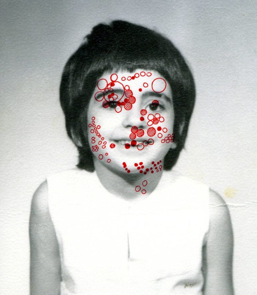
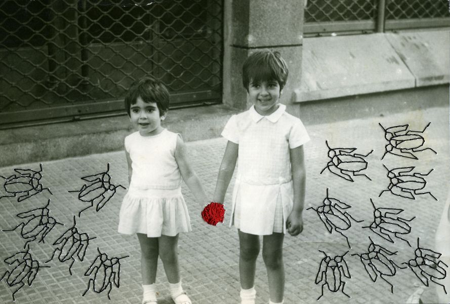
In addition, I also experimented with Posca pens by drawing over the top of my images, using designs from Benitah’s work to do attempt this. Firstly, I started with a simple design by drawing a series of circles over a portrait of my grandad. I liked the appearance of this alteration, although I don’t believe it added that much conceptual meaning to my photograph. After this, I attempted using a gold Posca pen to cover some of the faces in an image of mine, replicating the circles of gold leaf seen in Benitah’s reworked archival pieces. I did like the appearance of this piece and would consider including this design in my photobook, however using a less saturated gold to do this. I also was able to create a piece that related to my narrative, using these pens. This was as I took inspiration from an image of Benitah’s which included embroidered bugs surrounding two girls in a photograph. With this I had the idea of drawing on the Manchester bee, as well as hexagons instead of small circles, as it has been the city’s emblem for many years and represents the hard work ethic of Mancunians. I chose to do this as this is where my family is from and reinforces my narrative.

Furthermore, I also tried using paint to replicate the ink and beading that Benitah sometimes uses over the top of her family photographs. In my first experimentation using paint, I mixed acrylic red paint with water to create droplets over the portrait of my grandparents that resembled beads as well as the lightness of ink. However, I don’t believe I will use this technique for my photobook at is doesn’t produce a new meaning to the photographs in the way I want it, due to it feeling more heavy and negative. In addition to this, I also attempted to conceal the faces in a family portrait with red paint.I did this by making purposefully rough and messy brushstrokes on the image and making the paint light enough so that the faces were still slightly visible.

For these experiments I used Benitah’s known colour palette of red and gold that is seen throughout her work and attempted some different styles of reworking. This included using oil pastels, tearing the images as well as using Posca pens again. In the last, image I used a red oil pastel to produce a simple design, outlining my grandma’s hand. I like the look of this method, as the oil pastel provides a strong and vibrant contrast, that cannot be replicated using the Posca pens for example. Although, by using the pens it allowed me to create a detailed pattern in the first image, which I thought resembled the mosaics that are often seen around Manchester. Furthermore, I believe the tearing of the images, revealing red strips running down the page looked good, but would be best be showcased as a standalone alteration without the clash of the gold.

By doing this it has allowed me to realise the hand-made methods I would like to incorporate in my photobook, and which uses of these mediums best communicate the message of my narrative. In addition, from this I am able to see which of these styles might look better if done in photoshop.

shoot 2 and 3

for my second and third shots, I took photos in a home environment, as I’ve already done my photos in the studio. I wanted to have a natural environment with daylight lighting and show mental health in a personal environment such as someone home and everyday living. I wanted to do this shoot as both of my photographers either take images outside or manipulate them or all at home.

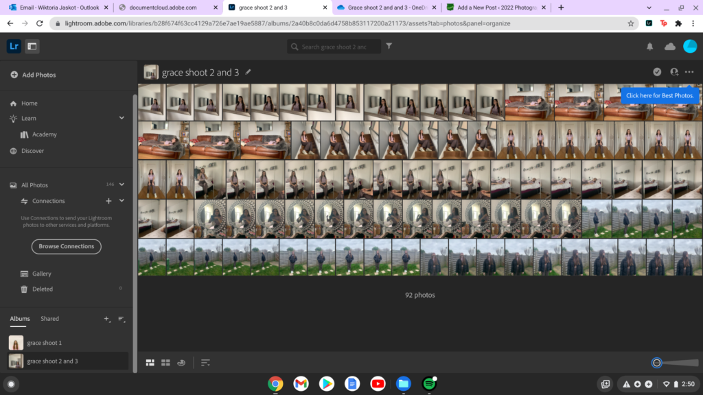
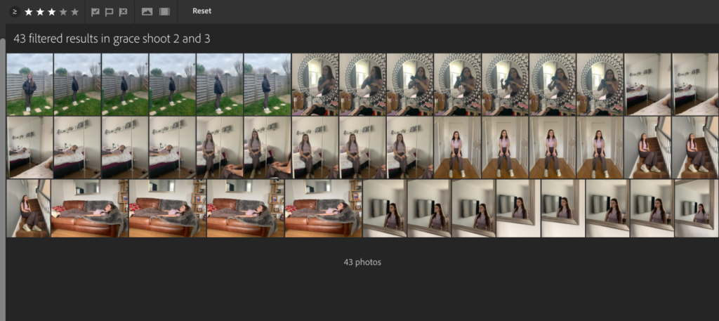
for these images, I’m going to go through the same process as my first shoot. I imported all my images onto lightroom to help me edit them first and slightly touch them up before I manipulate them on photoshop, the first thing I began to do it is rate my images from 1-5 on stars. this really helped me pick the images I wanted to use for my final project and the ones I didn’t want to use at all.

I uploaded all my images began to rate them from 1-5. I rated the images I wanted to use as 3 stars, 2 stars as the ones I would look at again and gave 1 star to the images I didn’t want to include at all.

all my images were uploaded before I rated them
I then began to rate them

once I rated all my images from 1-3, this helped me get rid of images I didn’t want to work with and it narrowed it down to fewer images that I definitely wanted to use and edit, and then work on them in photoshop.

I selected the 3 stars icon and this showed me all the images I wanted to use for my project.

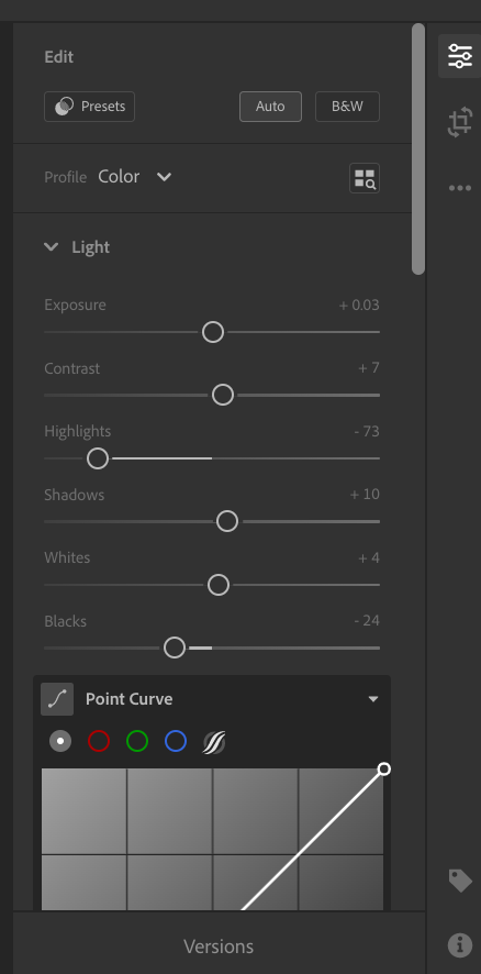
once I had the images I wanted to work with, I began to edit them individually on lightroom. I edited the hue and colour on all my images as well as cropping some and straightening them up, I did this to have the basic layer of editing done before I take them onto photoshop.

this is the editing process I went through with every image, once I was happy with each image I had a collection of all my photos ready and done to be taken to photoshop.

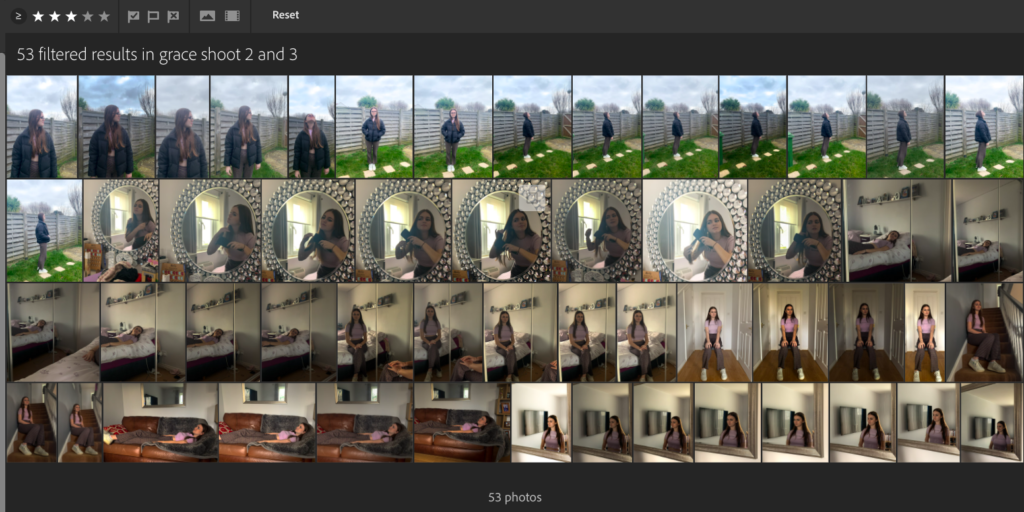
I now had all my images edited exactly how I wanted them to be. these are the images I used and downloaded to then use on photoshop and develop them by being inspired by my photographers and manipulating them to present my theme of mental health.

all my edited images

I edited most of my images quite dark to create a sad atmosphere and tension in order to present my topic, in order to present loneliness and a dark mood at home with mental illnesses.

editing my images on photoshop-

I exported all my edited images onto photoshop and this where I began to edit them properly, ready for my final outcome.

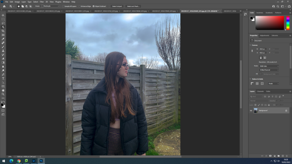
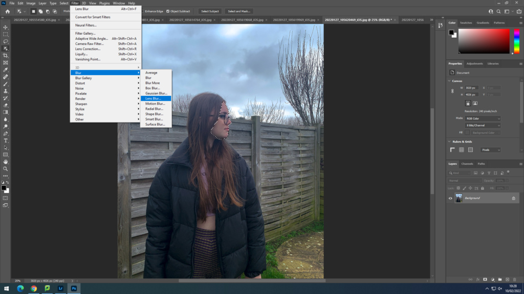
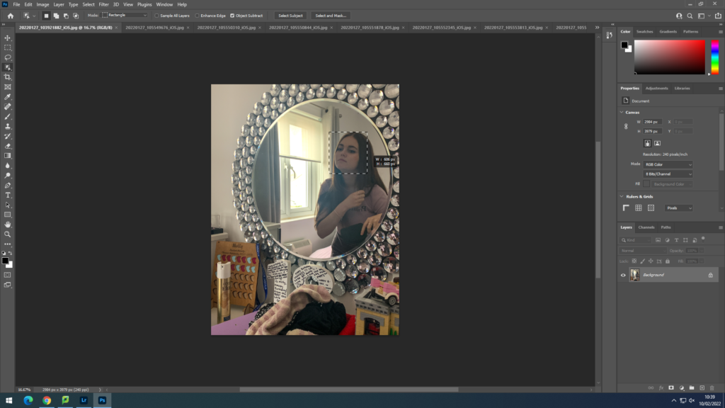
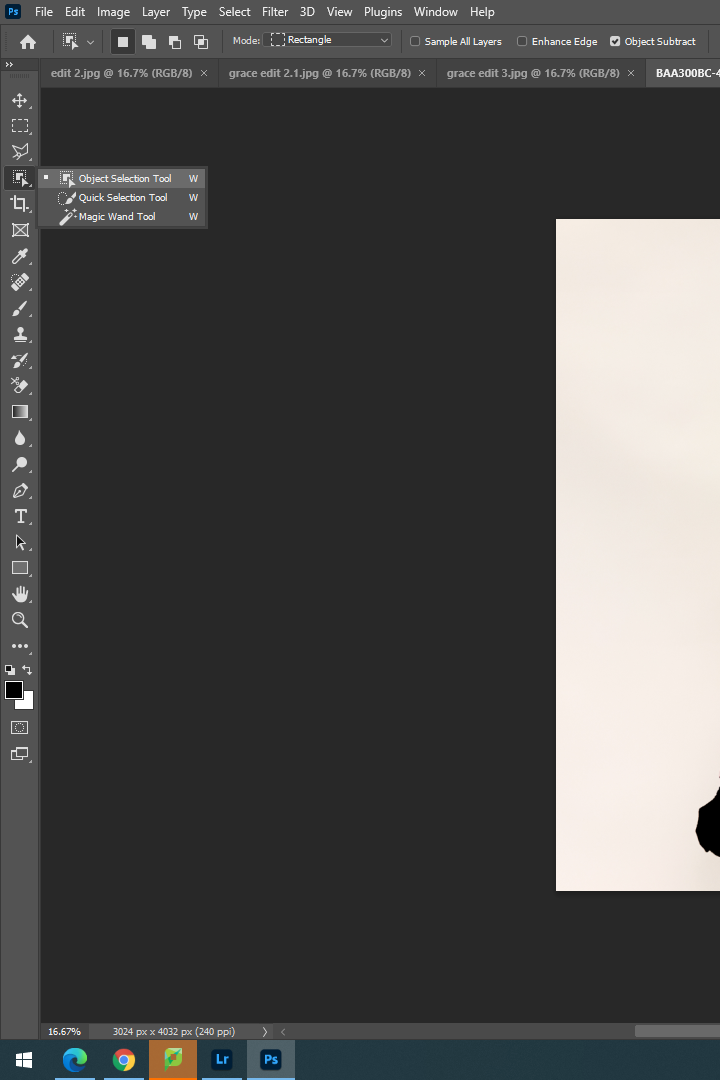
I would always start my editing process through using the Drag Selection Tool, this allowed me to selected specific sections of the image, in this case I would select the models face, I did this by dragging a box over her face and this tool would automatically select her face.

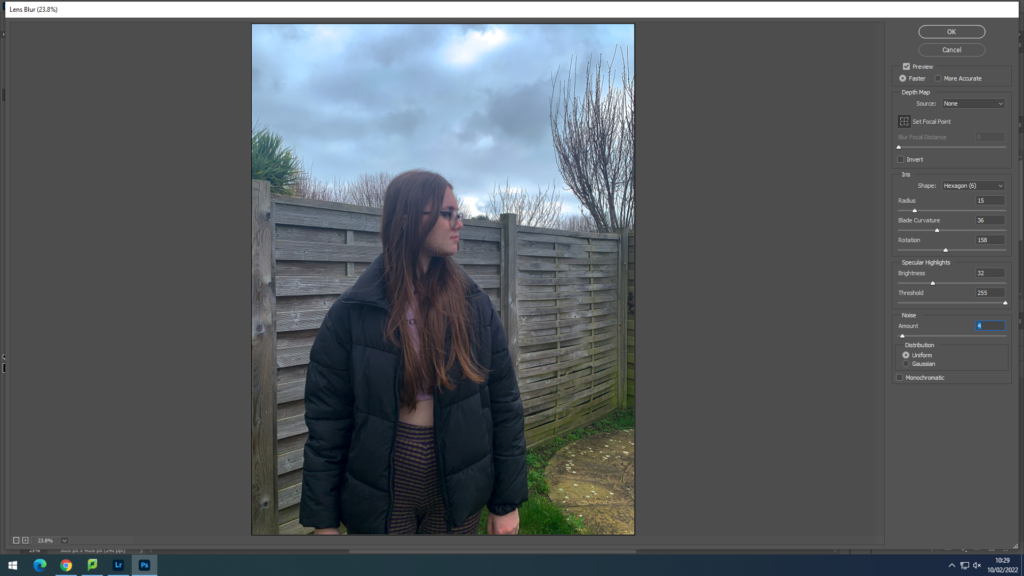
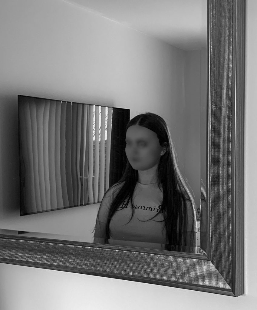
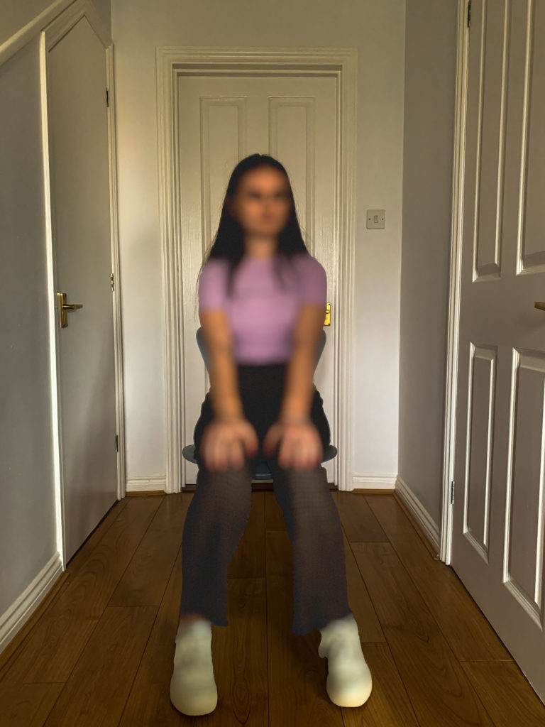
I would then go onto Filter, select the Blur option and then the Blur Lens option, this automatically blurred out her face and I adjusted it to how I wanted.

This section allowed my adjust the strength of the blur and how sharp I wanted it to be.

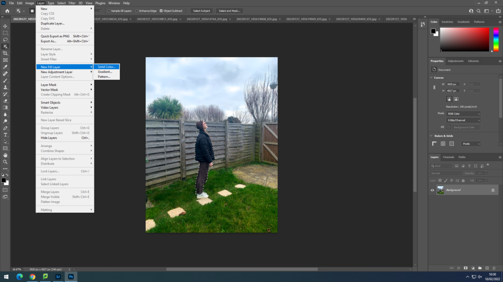
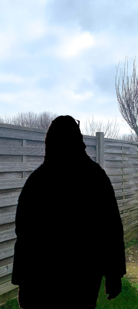
For my images that are all black shadows, I would select her whole figure in the same way but this time instead of blurring the selected area I clicked on Layer, then Fill New Layer and then Solid Colour

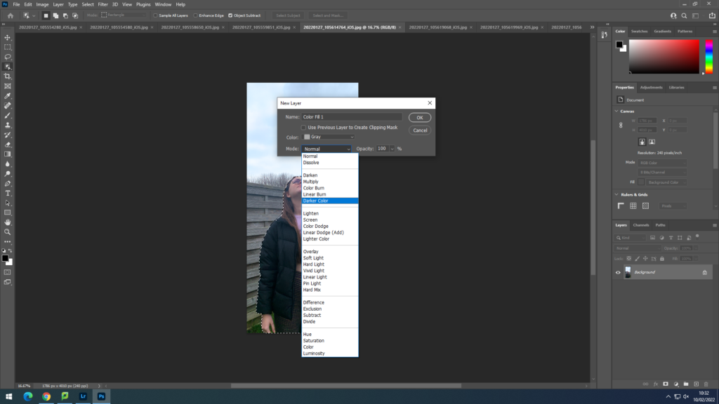
I would then Select the colour Grey and select Darken Colour to make the shadow all black

I carried on doing the same editing process for all my images by selecting the face each time and blurring it out.

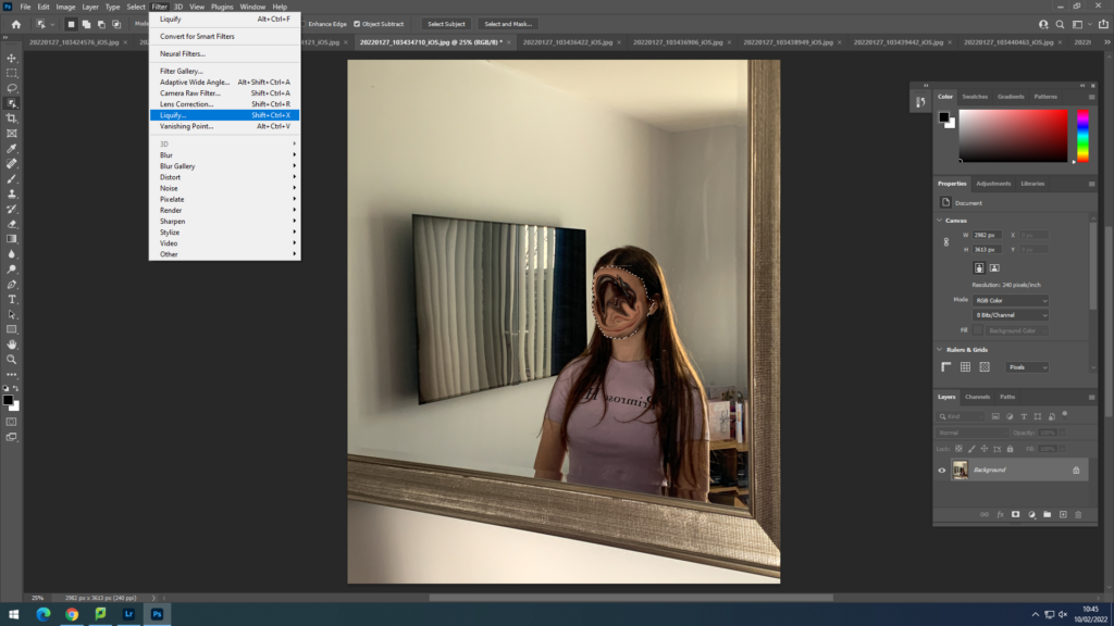
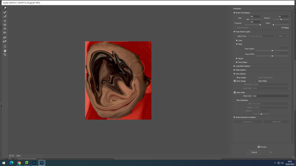
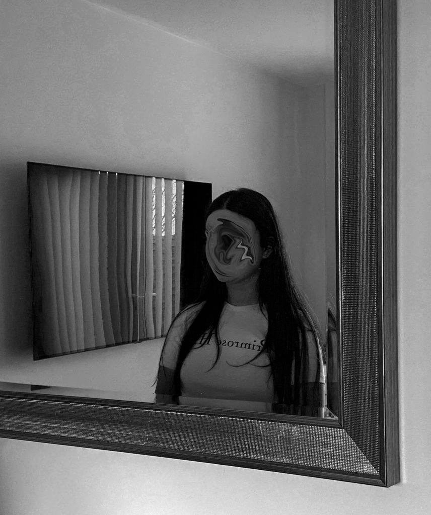
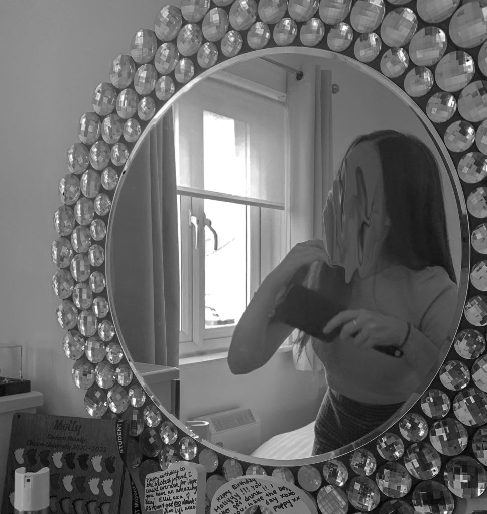
I also experimented with the Liquify option where it allowed me to distort the face completely and make it look almost melted

This is what the editing process looked like when I selected the liquify option, I only selected the face so it only let me liquify the face instead of liquifying parts of the body as well where it would all blend together and not look right.

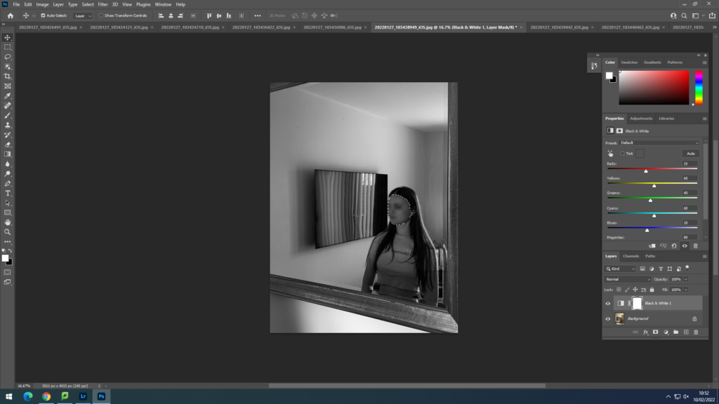
I also changed a few of my images into black and white so that it fits in with the mood of my topic and express the feelings of sadness and darkness.

This is how my edited images turned out;

Overall, I think I edited my images very well in order to make them fit in with my topic about mental health. I also took a lot of inspiration from my two chosen photographers and interpreted their editing and style of work into my project. I used a variety of different editing tools which really helped me to develop this project. I used blurring techniques, liquifying options , lots of layering, cutting and cropping, and shadow fills as well as quick selection tools. This helped me to present mental health in a visual way by editing all my images very specifically to fit the mood and atmosphere for each photo.

Planning & Recording: Shoot 1 – response to initial idea

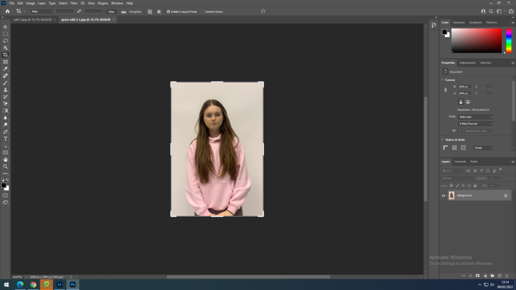
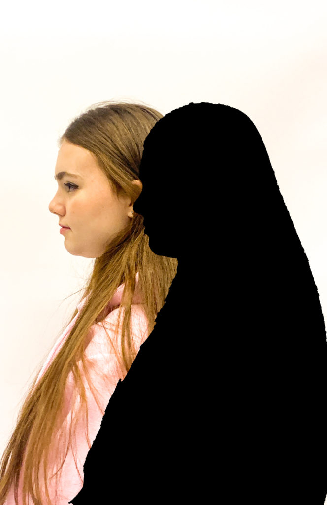
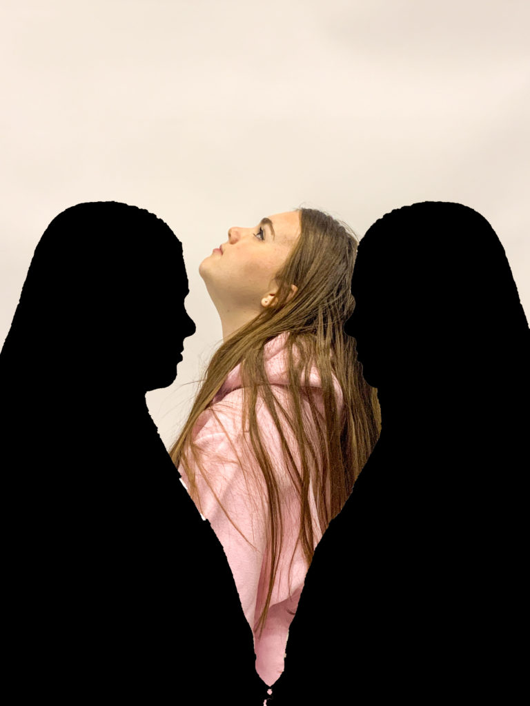
For my personal project, I wanted my first photoshoot to be taken in the studio, using bright lighting and a white backdrop. I used one of my friends as my model to achieve this. the first photoshoot was inspired by both my artists, as they use a lot of editing in their photography. I took some simple headshots and full-body portraits to have a big selection of photographs to edit and work with. the photographs I use, I will later use to edit through photoshop and cut out the models silhouette to create the same effect as Gabriel, to present mental health as two subconscious silhouettes standing next to each other which fits in with my topic of identity. one representing us as human and the other as the mind, ill achieve this through doing many different layers on photoshop and cutting and dropping different images over each other. I set up the studio with two big one-point lightings and a white backdrop as it would help me with editing. these images I first took are just to work with and being able to take several images will help me achieve to get 5-10 final images from my first shoot that are fully edited.

to help me start off with my editing process, I uploaded all my images from my first shoot onto Lightroom. this enabled me to view all my images on one software and I was then able to select the images I wanted to definitely work with, and get rid of the images that I thought weren’t as good as the others or I didn’t want to include in my editing process. for example if the model was moving or I didn’t position my camera correct I wouldn’t want to include these images.

i started with uploading everything into one file from my first shoot. this allowed me to get a quick preview and have all my images together.

this when allowed me to go through my images and rate them from 0-5 stars and pick and flag my favourite images using z on the keyboard. I rated the images I wanted to use as 3, 2 as the ones I wasn’t too sure about and 0 as the ones I definitely didn’t want to include.

I then rated and selected all my images which really helped me narrow down my images, and I had a selection of my favourite images, knowing which ones I was going to work and edit with easily. this process helped me narrow down my images to 36 photos, once I clicked on the images I rated 3 stars.

I then began to edit my photos which I was now happy with through lightroom, just for the basic editing process. such as cropping my images and making sure I was happy with the size of them, straightening them up and any more alterations I needed to make before starting the big editing part on photoshop.

I began to edit all the images I selected and rated 3 stars. I adjusted the shadows, brightness, saturation, hue and colour levels- especially focusing on the white balance as I wanted that to be on a very high level in order to make the white backdrop appear as bright as possible to make it easier to work with on photoshop and make it focus just on the model, and the silhouettes when I complete my editing. this completely gets rid of the background and creates no distractions making it look like there’s nothing there. I also cropped certain images and straightened out the full-body portraits.

my final images edited;

once I was ready with my final selection of photographs and they were all fully edited I moved on to using photoshop, where I was going to turn these images into final photos with loads of layering and cutting out.

editing on photo-shop;

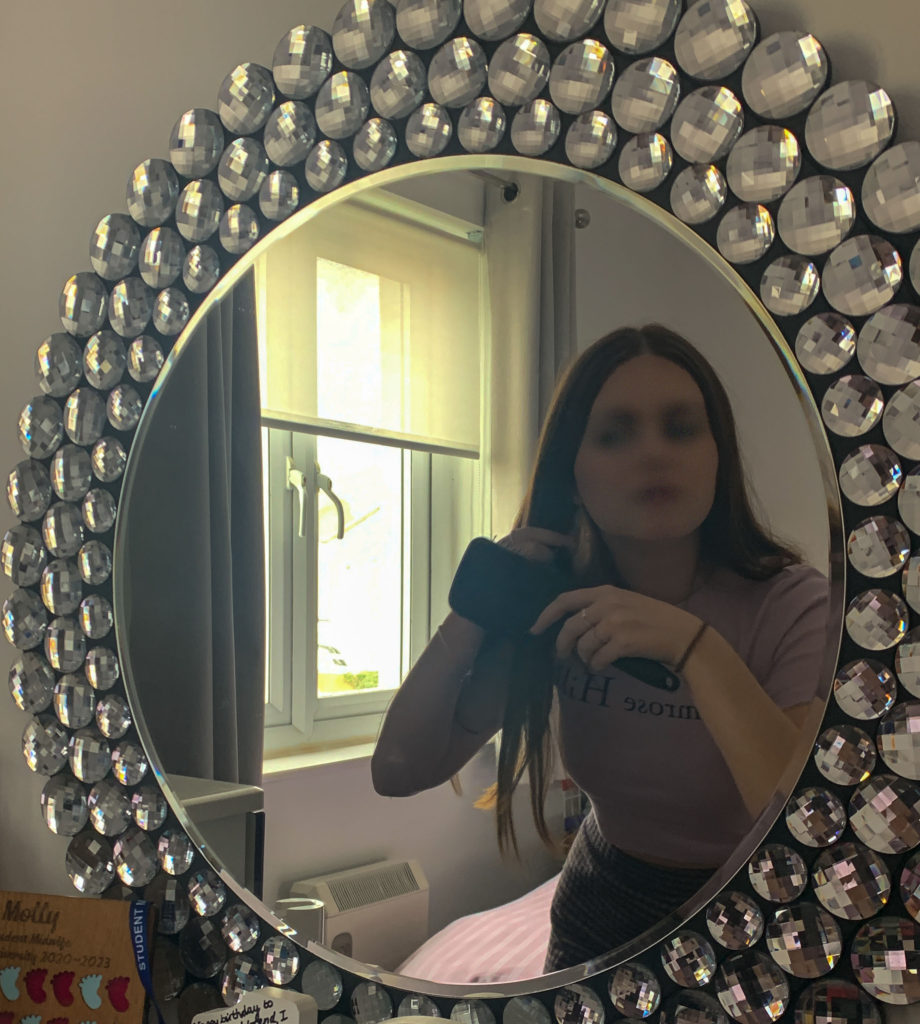
I selected one image by one and made sure to edit them perfectly , being inspired by my chosen photographers. I selected my first image and began to think about how I wanted to edit this image. I wanted to blur the models face out completely. I achieved this by exporting the images from Lightroom to Photoshop and I then selected my first image to do this. I used the ‘Object Selection Tool’ to help me achieve this effect. I used the mouse and made a box around the models face, this tool then allowed me to completely automatically select her facial structure. I then went to ‘Filter‘ , which I then clicked on ‘Blur Gallery’ and from that option I selected ‘Lens Blur’. This helped me to achieve my first image, with the models face being blurred.

I continued to use the same editing process for the rest of my images that I wanted to blur out.

For my second set of editing, I wanted to create a dark shadowed silhouette, I did this by selecting the ‘Object Selection Tool’ , which I dragged over the whole body, this then automatically cut out the shape of her silhouette. I then went onto ‘Layer’ and ‘New Fill Layer’ which allowed me to select ‘Solid Colour’ and I picked a black darkened colour to fill in her silhouette.

I then combined the two editing processes to come up with an image that included both

I continued to experiment with my images, and keep playing around with the order and cutting of them. I did this for about an hour just to create some basic ideas of what I want my final images to look like, I wanted to experiment different placings and order of the silhouettes as well as whether i wanted to use a shadow or blurred face.

these are the sort of images I would come up with to get some sort of ideas. The more I experimented with my images, the more confidence I felt with using the tools and made editing a lot more easier. All these filled in silhouettes are inspired by Gabriel Isaak.

I continued to edit my images with the ‘Object Selection Tool’, and filling in the shadow with a black solid colour as well as blurring out the individual face out in some images. Whenever I wanted to use one of more silhouettes or images in one, I would simply drag out the layer , use the ‘Object Selection Tool’ then use the ‘Move Tool’ and drag it into the image I wanted to build over , this way only the silhouette would cut over instead of the whole image which is all that I needed.

I experimented in a variety of different ways , moving the shadows around and seeing where I would like to have them positioned, I used the colour blue in one of my images to represent sadness to have a contrast between colours as it stands out.

I would open up a few images , in this case two, then create a new plain white file to have a white background. I would use the ‘Object Select Tool’ which would cut out the figure perfectly and then drag it onto the plain white document. I then select one of the figures again and fill it in with a solid colour shadow , all black to represent the mental state, behind the girl, show her inner state and thats not how it seems on the outside.

Overall, I think my editing process was very well achieved as I explored many different editing tools and used many editing processes. I selected either only the face or the whole silhouette for each photo, then I would either blur it all out or create a shadowed silhouette by dropping in a solid colour into the selected area. Whenever I had two silhouettes in one photo, I would simply drag out a photo , select the specific area and drag it over to my background image as an extra layer. I got a lot of inspiration from my artists too which helped me to achieve these final outcomes. All my images present mental health in a visual way and has a meaning behind each photo.

essay

Week 15: 5 – 9 Jan
1. Literary Sources
2. Essay Question
3. Essay Plan

  1. Research and identify 3-5 literary sources from a variety of media such as books, journal/magazines, internet, Youtube/video that relates to your personal study and artists references .
  2. Begin to read essay, texts and interviews with your chosen artists as well as commentary from critics, historians and others.
  3. It’s important that you show evidence of reading and draw upon different pints of view – not only your own.
  4. Take notes when you’re reading…key words, concepts, passages
  5. Write down page number, author, year, title, publisher, place of publication so you can list source in a bibliography
  1. Essay question:
  2. Opening quote
  3. Introduction (250-500 words): What is your area study? Which artists will you be analysing and why? How will you be responding to their work and essay question?
  4. Pg 1 (500 words): Historical/ theoretical context within art, photography and visual culture relevant to your area of study. Make links to art movements/ isms and some of the methods employed by critics and historian. Link to powerpoints and resources above about art movements and isms.
  5. Pg 2 (500 words): Analyse first artist/photographer in relation to your essay question. Present and evaluate your own images and responses.
  6. Pg 3 (500 words): Analyse second artist/photographer in relation to your essay question. Present and evaluate your own images and responses.
  7. Conclusion (250-500 words): Draw parallels, explore differences/ similarities between artists/photographers and that of your own work that you have produced
  8. Bibliography: List all relevant sources used

Essay Draft

Intro: “When I got back to my classes early Monday, I tried to carry on as if my life had not just been altered forever.” (Michael Tullberg)

The area in which I am studying is the drum and base community. I will be diving deep into what happens within the subculture of the drum and base scene. For example, people enjoying the events due to it being an escape of reality, the atmosphere people are engulfed in, how intoxicated people can get within these events and how the DJ’s get involved with everyone at these events. The artists that I will be studying are Mike Brodie, Michael Tullberg and Adrian Fisk. I will be analysing specific work that these photographers have made based on subcultures, such as; Adrian Fisk’s (London Acid City), Michael Tullberg’s (Dance Floor Thunderstorm) and Mike Brodie’s (Riding the Rails).

Moreover, as an outsider to these subcultures looking in, it is appealing to me as I get to look into a whole different world in which people lived. Although I have been to drum and bass events, personally I would say as an individual I don’t have much experience in being an insider to this subculture as there are people who are involved immensely within the scene. For example, DJ’s, people working at the events, photographers, videographers and so on. However, as someone who attends these events my position between being an outsider and insider is blurred. The audience and crowd are paramount to the identity and existence of the drum and bass community.

I will be responding to this by explaining how it gives the opportunity for individuals who have no understanding of certain subcultures, to get an understanding on why people in these subcultures lived a certain way. Therefore, I believe these subcultures could even change people’s opinions on their lives, on how they decide to live their lives as they get so see other perspectives of how people live. This in turn, will provide new ideas or change perspectives of people who consider themselves outsiders. Another way in which I will be responding to their work is through photographs that I will generate based on the subculture of drum and bass. In order to make these pictures, I will have to consider the ethics of which pictures will be correct to produce, this is due to the fact that the drum and bass culture does have the side of substances being used in these events. Therefore, I will have to think of questions such as; When is it ok to take a photograph? How responsible is a photographer for the way a photograph is represented? Can Photographs hurt people? Should you always seek permission of your subjects before taking their photograph? These questions are up in the air for me as I am an outsider looking in. Meaning that people might not be comfortable with me taking pictures of them as I am not known as a photographer within the subculture.

(Source comes from https://www.huckmag.com/art-and-culture/a-photographers-elegy-to-the-evolution-of-drum-and-bass/)

PG1: Realism is a photographic and artistic movement that emerged in the world of photography in the 1910s. My research approach focuses on documentary photography, a form of live photography, classified as realism. Realism differs from figurativism in that it includes more animistic methods applied to purely documentary works. Photojournalism focuses on establishing photography as an art form rather than a documentary medium. He focused on breaking away from commercialism and turning photography into a full-fledged manual process with the desire to achieve an aesthetic that makes photographs look like works of art, such as paintings. and drawings using various ways to manipulate images from blurred lenses, scraping negatives. and use chemicals in adarkroom. Unlike pictograms, realism is concerned with creating images that resemble what the photographer sees through the camera’s viewfinder. Realism emphasizes geometric framing and emphasizes form and form with an almost abstract aesthetic, as noted by two of the early realist photographers, Alexander Rodchenko and Jaromir Funke. These two images provide insight into how realism is incorporated into photography overall.

“A photographer’s elegy to the evolution of Drum and Bass”. Eddie Otchere was a photographer who spent a good part of the 90’s capturing the evolution of the Drum and Bass scene. The genres developed from Jungle, which then advanced to the genres of garage and grime. There is a book titled “Who Say Reload” which offers a history of the movement’s mentioned earlier. A quote that Otchere states from the book is “I hope the book reminds people of how good it felt to dance as a group of people together,” and “All races dancing together… with no judgment, just good drugs.”. In the early 90’s the rave scenes were usually held up on random fields with loads of people turning up to them. However, the scene was on a major crackdown by the government, meaning that the government started having authorities turn up to these random raves, with attentions of arresting people and shutting it down. Although authorities would turn up, the people within these subcultures often indifferent in reaction to authorities turning up as there would be reports of police turning on sirens for people to disperse, but people would just start dancing to the sirens.

In the late 90s, the raves started to move from the fields into the cities. In the early 90s the Tory government started to collapse where “Everything in the country was broken, finished and done,” remembers Otchere “As young people, we just wanted to have a good time – and we built a culture with that.” Empty spaces in the city started to get flooded as young people would show up to them, bringing sound systems and lights to dance all night. This then evolved the rave scene from once being an underground scene, which further developed it to become more mainstream giving way to clubs.

Overall, from the pictures that where taken in the book “Who Say Reload”, the pictures seem to fall in the bracket of documentary, which ash its roots in realism. This comes across with most photography that is taken for rave scenes, or in the subculture of night clubbing (also apparent with the photographers mentioned earlier). The reasoning behind this, is because images taken within this subculture are captured in the moment, meaning that the images aren’t staged/ prepared for. This is arguably the greatest way to capture an image due to the rawness of the image as the photographer couldn’t replicate the photo. Meaning no editing or changes had to be made to the image making the image as authentic as possible. Furthermore, realism in photography gave birth to photojournalism/ documentary photography because they go hand in hand with each other. This come across with most photography in the subculture of nightclubbing. This is because photographers who get images of this subculture are documenting a subculture that people wouldn’t have experienced, heard of or even understand the subculture, hence why realistic images are captured in order for outsiders to get a “real” insight on what a subculture is all about giving them a further understanding visually and contextually in documentation.

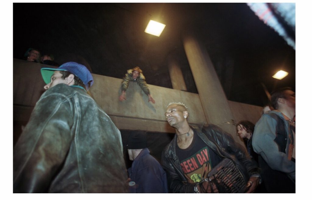
Adrian Fisk London Acid City

PG2: Adrian Fisk’s images answers my question perfectly as he portrays the “counterculture” (which he describes his subculture that he took images of) through the use of realism. This is a great way of portraying subcultures in his documentation of the rave scene in in the late 90s because people who look at the images in the book get to see the rawness of the subculture as there was “no laws, no rules, no dress code, a limitless supply of drugs and a soundtrack of pulsating Acid Techno.” As you can see from the image presented, you can see it is a realistic image from the angle of which he has taken the image from, which appears to be from about his waist facing up to the people in the image. Moreover, no one in the image is posing to the camera and people who are closest to the image close their eyes as they are surprised from the flash on the camera, further proving that the image is realistic as it wasn’t planned. Furthermore, you can see from the image how everyone is dressed in their own sense in what they feel comfortable with and people of different races are all gathered up in one closed in area to have fun till they can’t anymore. This also answers my question as you can see what this subculture represents. Which to me appears to be anyone who is wanting to have fun, uniting together no matter what race, what fashion sense or even age. This shows off the beauty of this subculture as these people could organise a fun time whenever they would like in order to have an escape from the reality of the depressing world that everyone tries to ignore.

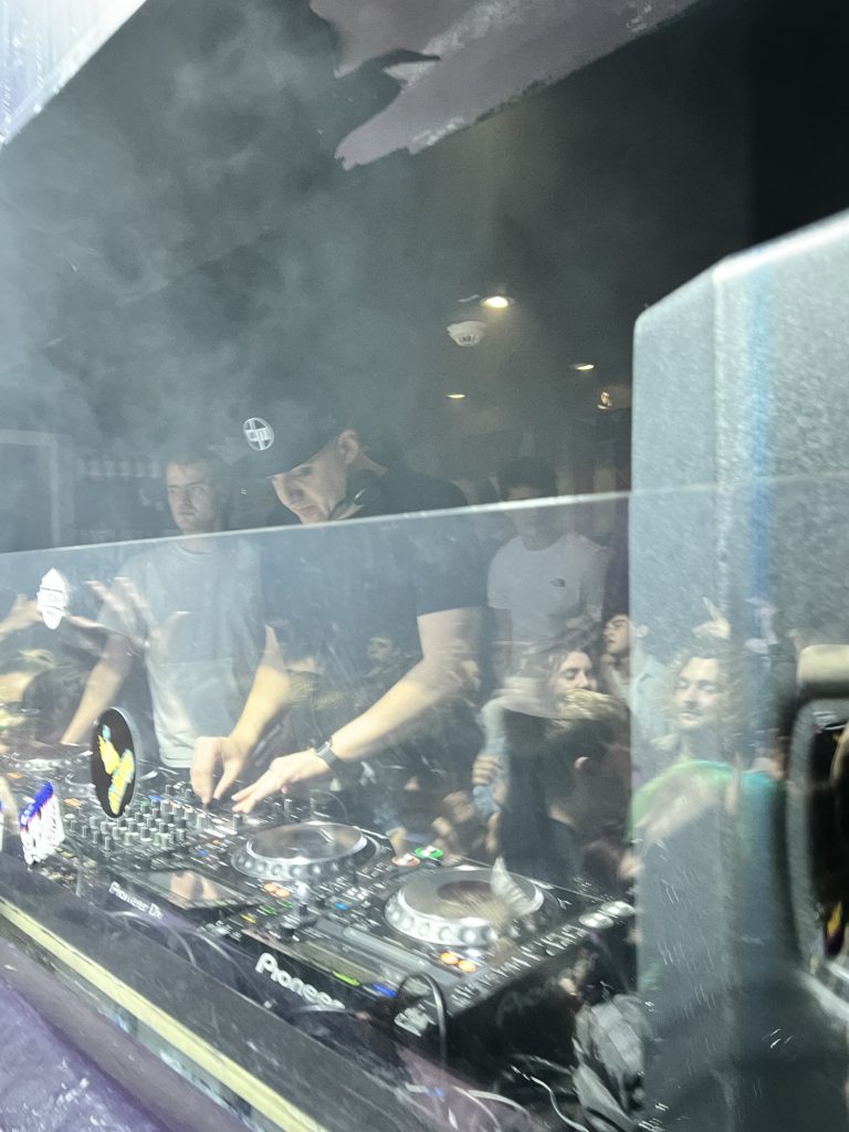
Image analysis:

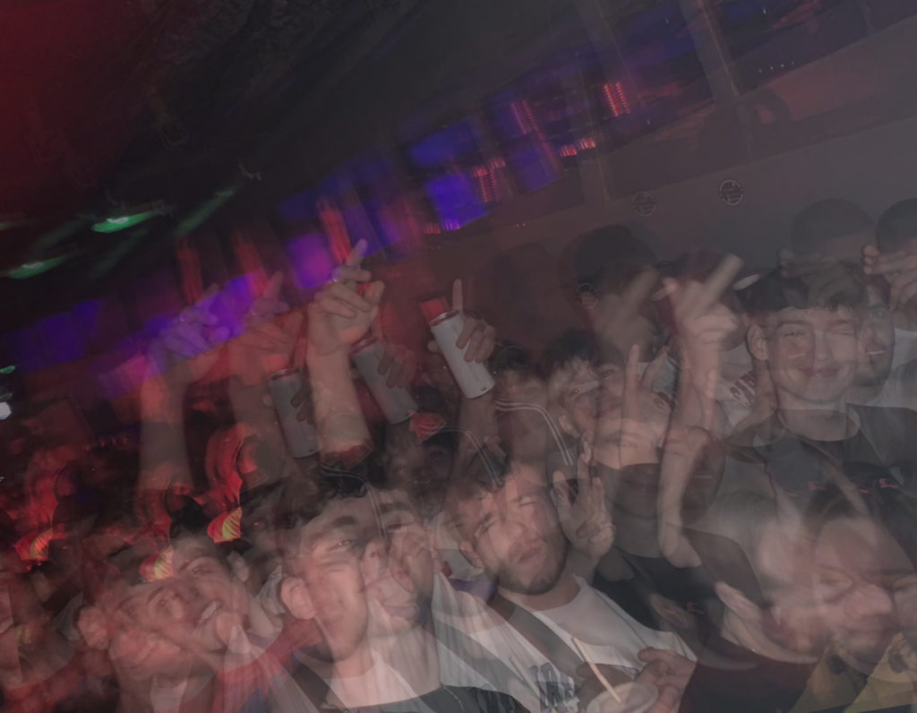
As for these set of images, I believe they answer my question pretty well because in these images I have captured the raw emotions and reactions of the people. Furthermore, in the images you can see the people in the images aren’t looking into the lens expecting the picture to be taken, meaning that the images where taken randomly meaning I got to get authentic images of the people thriving in the drum and bass environment. In the first image, you can see a range of emotions in the crowd with the different facial expressions people have from happy, to sad, to straight faces and even people doing different things with hands in the air, holding their phones up or just being neutral. As for the second image, you can see once again that there is a mixed range of emotions again. However, in this image there is a red and yellow light which is directed to two people in the image, which in my opinion makes them the focal point of the image. Although if you where to look away from the focal point you can see other people in the background of the image who are also having a good time within the environment. For the final image, I like this one the most because in the image you can see I got a picture of the DJ minding his own business, trying his best to entertain the crowd he has in front of him. Moreover, in the image you can see that there is a plastic barrier in front of the DJ which got a reflection of the crowd that he has in front of him. This stood out to me as I captured two different photo angles in one which in my opinion is amazing as the image displays the audience and the DJ in one. This is key as the energy from the crowd in this subculture is highly dependent on the energy the DJ gives off to the crowd.

Michael Tullberg DanceFloor Thunderstorm

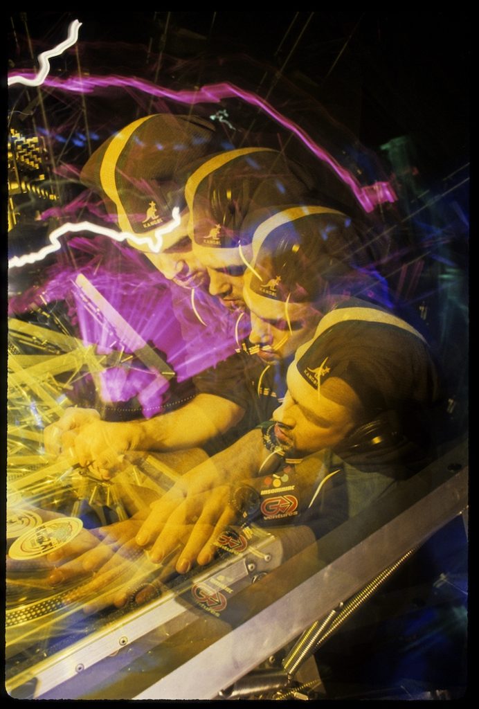
PG3: Michael Tullberg, also answers my essay question with his images however, he has a different approach compared to Adrian Fisk and here is why. As you can see from the images represented from Michael Tullberg, he has altered his images making them abstract. For example, you can see that in one of the images there appears to be 4 of the same DJ in one image. Therefore, this image responds accordingly to my essay question because Michael Tullberg is an insider to the subculture. This means that he has decided to edit the image in a way where visual euphoria is present due to the use of substances in this subculture, which enhances the experience of the rave scene. Moreover, this also shows outsiders what the subculture represents as they could gather that drugs are used in this subculture from the image as the image is abstract due to it looking distorted, like someone who would have taken substances in order to enhance their visual experience. Overall the image is effective as Michael Tullberg includes aspects of realism, he shows outsiders what people in this subculture are actually experiencing visually through substances, giving outsiders a more in depth/ realistic approach on what it is like to be a part of this subculture.

As for my images, they also correspond to my essay question as they are showing how the drum and bass subculture is being represented from an insider and outsider’s perspective. This is because as an insider to the subculture I know as an individual what happens within these events in terms of the crowd that turns up. Therefore, with the images it could represent the insiders as in them being able to see the image for what it is, all distorted due to the use of substances. Further meaning that the insiders to this subculture could almost embody the camera lens as they get a first-hand experience of these euphoric visuals. In terms of outsiders, the images show them what it is like to be submerged within the drum and bass scene. This is because from the images being abstract, outsiders looking at the images would gather the idea that these images are made due to substances being used which would enhance the visual experience of an individual in this subculture. Moreover, the images could give an understanding to the outsiders on what the atmosphere is like within the subculture. This is because from the distorted images, outsiders looking at these images could get the understanding that these events are vibrant, loud and energetic. In addition, outsiders could understand that this would mean that people within this subculture are all about having a good time. Meaning there is no discriminating or judgement at these events as everyone is there for the same purpose leading to a community of people being brought together.

Conclusion:  In conclusion, it is transparent that Michael Tullberg alters his images in making them somewhat abstract as a method of giving outsiders an understanding of what the rave subculture is about as a community. There is an air of spontaneity within the work, it is direct and lively…just like the music. This is shown throughout many of the images he has produced, using editing as an enhancement to the images, to get across that this subculture has a heavy influence with substances being used, which is where he most likely gets his inspiration for editing his images. Here, Michael has been able to show what type of world the “rave” subculture is living due to the edits demonstrating that of a visual experience no other could even imagine. In addition, outsiders gain the understanding of this community being strongly united due to people loving the experiences they have for these events. Meaning that the community is very strong, having the people within this subculture do anything to keep it together, this has been shown with history of rave subcultures always making their way to keep the “rave” alive. My work that I will produce for my personal study will resemble most of the elements demonstrated in Michael’s work. One of which will be the way I approach my edits for my images in terms of making the look distorted or acid like. The aim in developing these images will be to highlight what the experience is like through the perspective of someone who is delved deep into this subculture of substances, visuals and everyone enjoying their life in that moment no matter what. However, I will incorporate the skills of Adrian Fisk by having some images of realism. The reasoning behind this is so that outsiders can get an authentic touch to the subculture of the drum and bass community. Moreover, outsiders will get to see genuine emotions from these images, giving them a feel on what the atmosphere is like in this community.

Bibliography: (Source comes from https://www.huckmag.com/art-and-culture/a-photographers-elegy-to-the-evolution-of-drum-and-bass/)( https://dancefloorthunderstorm.com/) https://www.adrianfisk.com/london-acid-city

Shoot 3

For my third photoshoot in response to my personal study, I once again chose my whole family to be the subjects. Although for this shoot I took the photographs in a staged manner of family portraits. I chose two locations for this shoot to provide myself with a variety of images that somewhat resembled several archived family portraits I had viewed. These included an inside domestic setting, taken in the living room, and an outside pastoral setting, which was taken in the dunes near St. Ouens beach. For the inside portion of the shoot I used both natural and artificial lighting to capture these images, as there was not enough natural light to allow all members to be seen clearly. With this I used a both a medium shutter speed and ISO, as well as a small aperture. After moving outside to take pictures, I used only natural light as it was within the golden hour, providing large amounts of warm lighting to the portraits. Due to this, I used a fast shutter speed, mid to low ISO and a mid to small aperture, for these outdoor images.

Image Selection

Here I started selecting and narrowing down the images I wish to edit by first flagging the images I believe are of good quality, using the ‘P’ key to do this, as well as flagging the images I don’t wish to develop, using the ‘X’ key. With this I discounted images that were perhaps too dark or out of focus, as well as photographs in which my family did not all have similar facial expressions.

After I had gone through the 170 photographs that this shoot was comprised of, I then filtered out all the images I do not want to edit and went through the ‘P’ flagged images rating them out of 5. With this I found that the photographs I had taken outside were my strongest due to the warm glow of the golden hour.

Once I had done this, I filtered through my photographs again this time choosing to look at the ‘P’ Flagged images rates 4 and above only. Here I was able to view the best products of this shoot. Finally, I narrowed down the best of my images by colour coding them, with green being my strongest photographs and yellow as the weaker ones. This allowed me to determine which of the photographs that were of high quality but too similar to each other, were the best out of them.

Editing

Initial Edits

Shoot 2

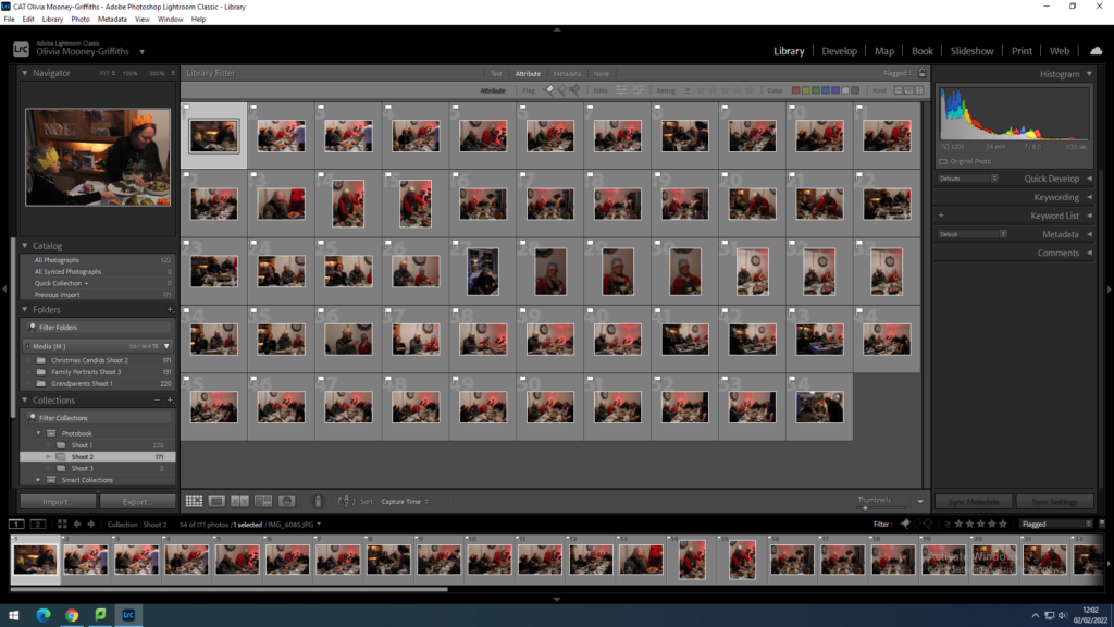
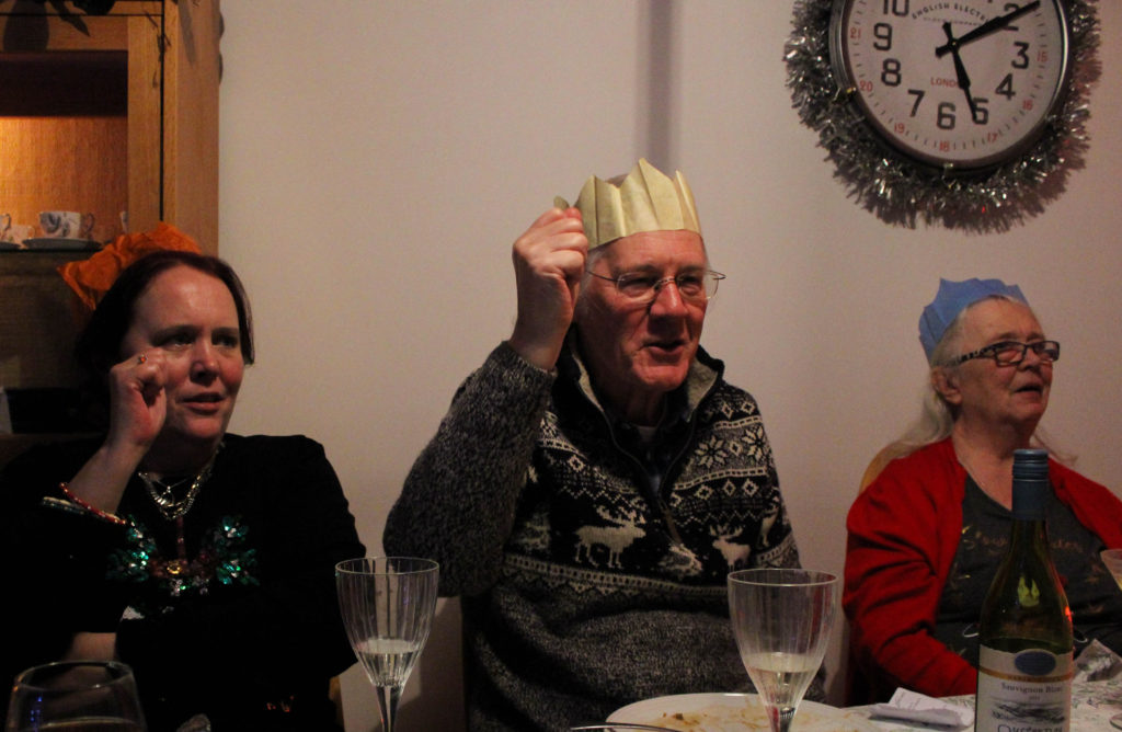
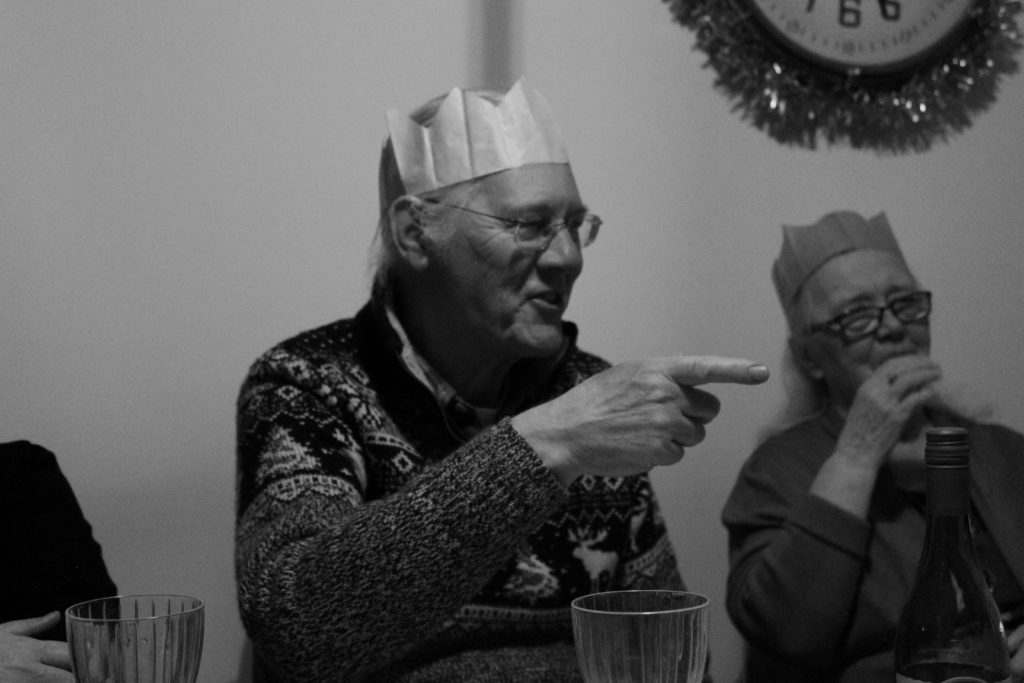
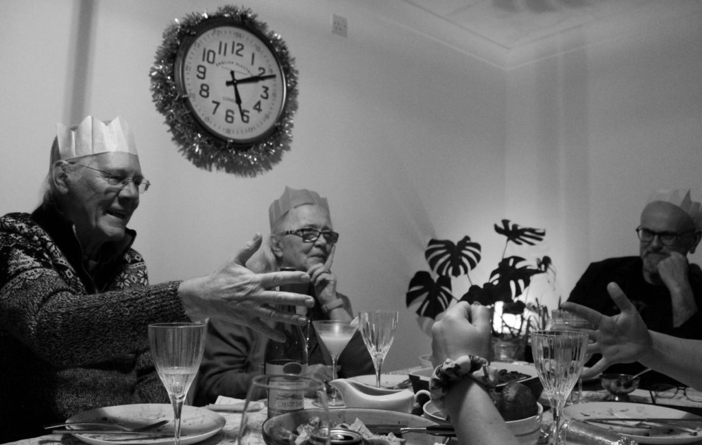
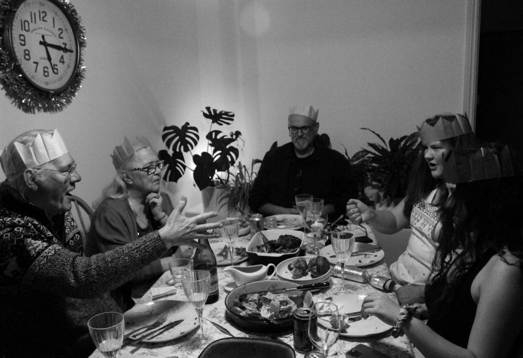
For my second photoshoot responding to my personal study project, I chose my entire family this time to be the subjects. However, the manner in which I took these images were different from my first shoot, as for this shoot I chose to take photographs with the aim of capturing candid moments, rather than staged ones. These photographs were taken at my family’s Christmas dinner. This was a result of both being one of the only times in the year when we all get to see each other, as well as being an occasion many associated with spending time with loved ones and making memories. I only used the artificial lighting already provided in my house with no extra set ups for this shoot, again presenting the candid nature of the images. This lighting however I did find hard to work with, due to it being quite dark with the subjects in movement, meaning it took some time to adjust and alter my camera settings to fit the conditions. Here I ended up using a high ISO, mid to high shutter speed and small aperture.

Image Selection

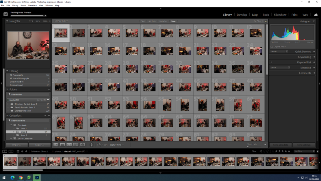
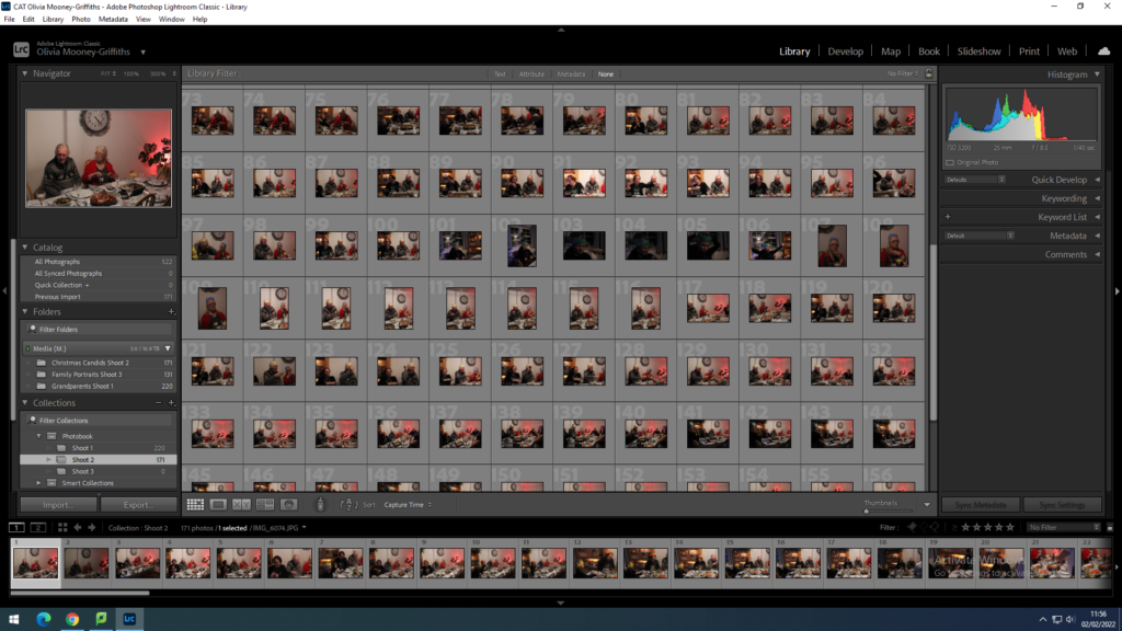
Here I started selecting and narrowing down the images I wish to edit by first flagging the images I believe are of good quality, using the ‘P’ key to do this, as well as flagging the images I don’t wish to develop, using the ‘X’ key. With this I discounted images that were perhaps too dark or over exposed, as well as some which were blurry due to the movement of the subjects.

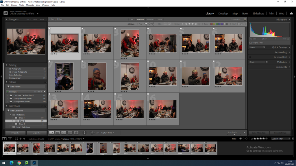
After I had gone through the 170 photographs that this shoot was comprised of, I then filtered out all the images I do not want to edit and went through the ‘P’ flagged images rating them out of 5. Here I was able to see which photographs were the most interesting composition wise, and would best be able to communicate my narrative.

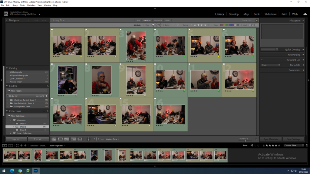
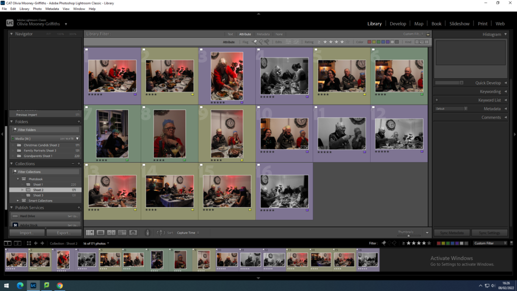
Once I had done this, I filtered through my photographs again this time choosing to look at the ‘P’ Flagged images rates 4 and above only. Here I was able to view the best products of this shoot. Finally, I narrowed down the best of my images by colour coding them, with green being my strongest photographs and yellow as the weaker ones. This allowed me to select images that showcased a variety of poses and angles making singular composite pieces.

Editing

Initial Edits

Shoot 1

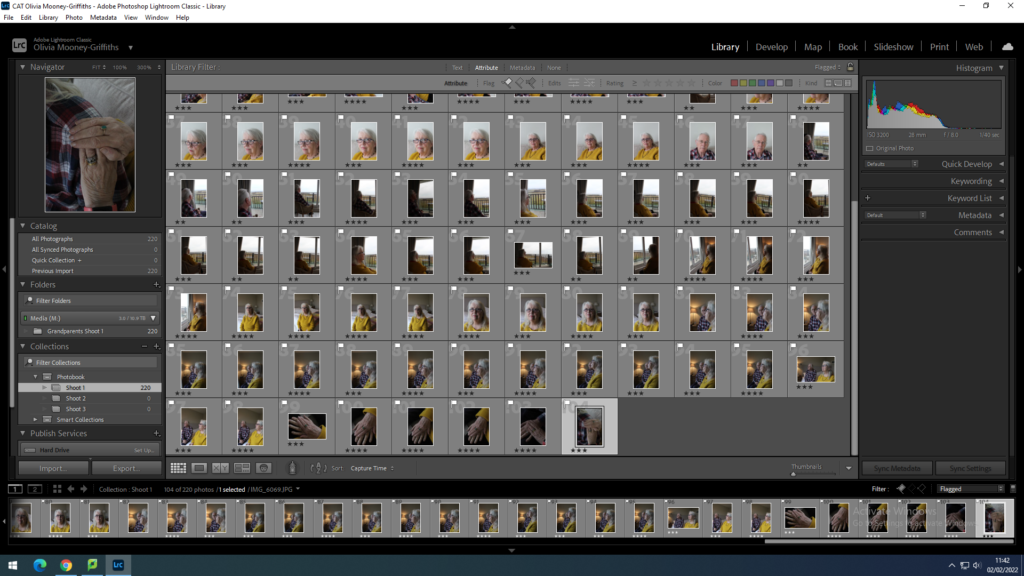
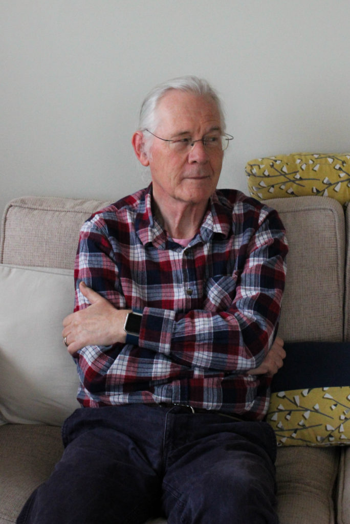
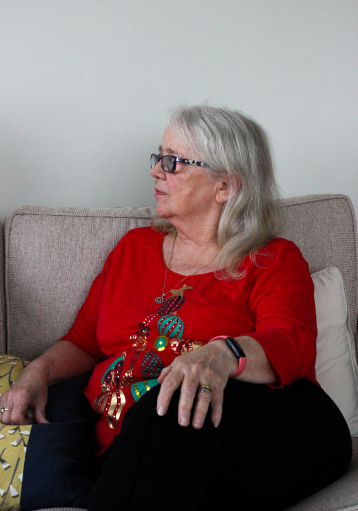
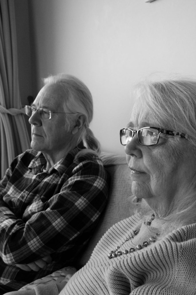
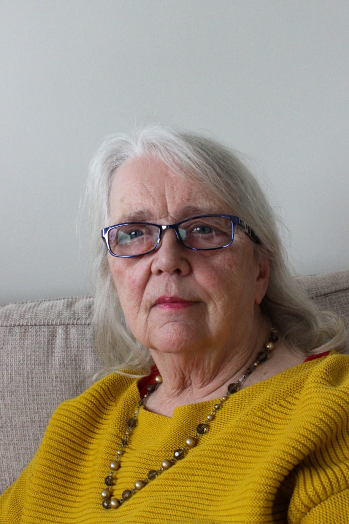
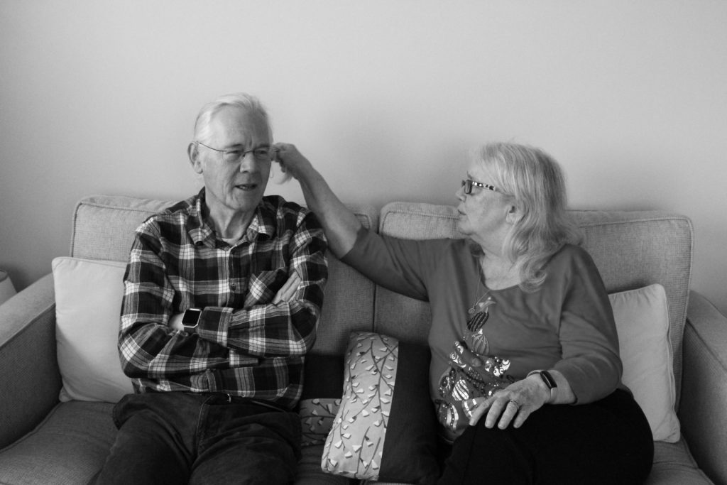
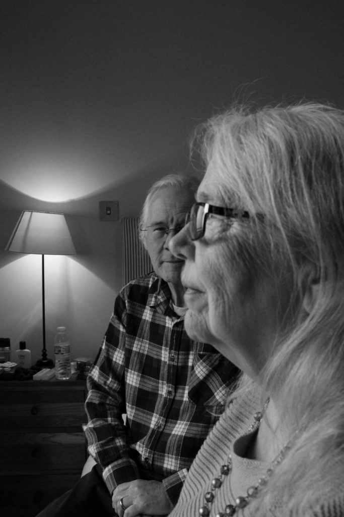
For my first photoshoot, responding to this project, I used my grandparents as the sole focus of the images. I believe that they were the best subjects to focus on for my first shoot, as they are more or less at the centre of my personal study project. I went about this by taking staged portraits with each of them separately as well as together. I took these photographs to display both a medium shot and a head and shoulder frame. In addition to this style of portraits, I also captured a small amount of images that showcased my grandparents hands, including their wedding rings. I used natural light with this shoot as I was able to take them at midday in a space that allowed a large amount of natural light in the room. I thought this type of lighting would best fit this shoot as it provides a more natural and less staged essence to the image, as well as making it appear closer to something seen in a family album. My camera was set to a fast shutter speed and low ISO for this shoot, due to the large amounts of natural light entering the lens, and a mid to large aperture.

Image Selection

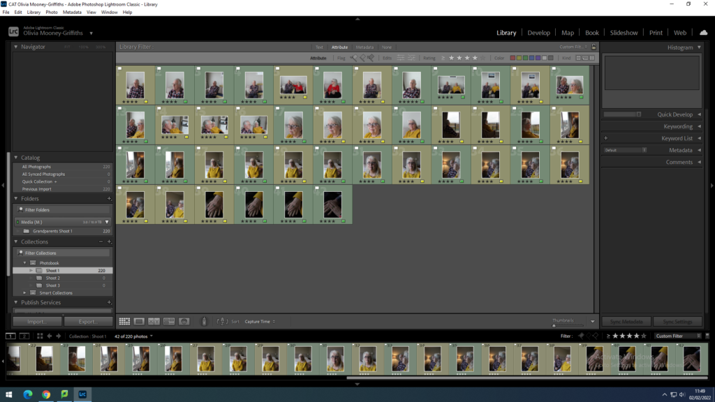
Here I started selecting and narrowing down the images I wish to edit by first flagging the images I believe are of good quality, using the ‘P’ key to do this, as well as flagging the images I don’t wish to develop, using the ‘X’ key. After going through roughly 200 photographs that my shoot was composed of, I then filtered out all the images I do not want to edit and went through the ‘P’ flagged images rating them out of 5. With this I filtered out all of the images that were und or over exposed, and not quite in focus enough.

Once I had done this, I filtered through my photographs again this time choosing to look at the ‘P’ Flagged images rates 4 and above only. Here I was able to view the best products of this shoot. Finally, I narrowed down the best of my images by colour coding them, with green being my strongest photographs and yellow as the weaker ones. This enabled me to see which of my images were the most interesting composition wise and best as singular standalone pieces.

Editing

Initial Edits