For my personal project, I wanted my first photoshoot to be taken in the studio, using bright lighting and a white backdrop. I used one of my friends as my model to achieve this. the first photoshoot was inspired by both my artists, as they use a lot of editing in their photography. I took some simple headshots and full-body portraits to have a big selection of photographs to edit and work with. the photographs I use, I will later use to edit through photoshop and cut out the models silhouette to create the same effect as Gabriel, to present mental health as two subconscious silhouettes standing next to each other which fits in with my topic of identity. one representing us as human and the other as the mind, ill achieve this through doing many different layers on photoshop and cutting and dropping different images over each other. I set up the studio with two big one-point lightings and a white backdrop as it would help me with editing. these images I first took are just to work with and being able to take several images will help me achieve to get 5-10 final images from my first shoot that are fully edited.
to help me start off with my editing process, I uploaded all my images from my first shoot onto Lightroom. this enabled me to view all my images on one software and I was then able to select the images I wanted to definitely work with, and get rid of the images that I thought weren’t as good as the others or I didn’t want to include in my editing process. for example if the model was moving or I didn’t position my camera correct I wouldn’t want to include these images.
i started with uploading everything into one file from my first shoot. this allowed me to get a quick preview and have all my images together.

this when allowed me to go through my images and rate them from 0-5 stars and pick and flag my favourite images using z on the keyboard. I rated the images I wanted to use as 3, 2 as the ones I wasn’t too sure about and 0 as the ones I definitely didn’t want to include.

I then rated and selected all my images which really helped me narrow down my images, and I had a selection of my favourite images, knowing which ones I was going to work and edit with easily. this process helped me narrow down my images to 36 photos, once I clicked on the images I rated 3 stars.


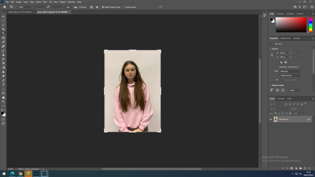
I then began to edit my photos which I was now happy with through lightroom, just for the basic editing process. such as cropping my images and making sure I was happy with the size of them, straightening them up and any more alterations I needed to make before starting the big editing part on photoshop.

I began to edit all the images I selected and rated 3 stars. I adjusted the shadows, brightness, saturation, hue and colour levels- especially focusing on the white balance as I wanted that to be on a very high level in order to make the white backdrop appear as bright as possible to make it easier to work with on photoshop and make it focus just on the model, and the silhouettes when I complete my editing. this completely gets rid of the background and creates no distractions making it look like there’s nothing there. I also cropped certain images and straightened out the full-body portraits.

my final images edited;

once I was ready with my final selection of photographs and they were all fully edited I moved on to using photoshop, where I was going to turn these images into final photos with loads of layering and cutting out.
editing on photo-shop;
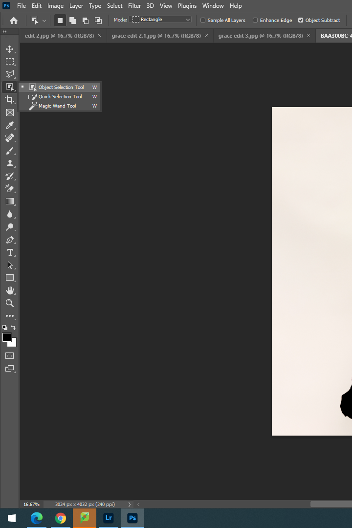
I selected one image by one and made sure to edit them perfectly , being inspired by my chosen photographers. I selected my first image and began to think about how I wanted to edit this image. I wanted to blur the models face out completely. I achieved this by exporting the images from Lightroom to Photoshop and I then selected my first image to do this. I used the ‘Object Selection Tool’ to help me achieve this effect. I used the mouse and made a box around the models face, this tool then allowed me to completely automatically select her facial structure. I then went to ‘Filter‘ , which I then clicked on ‘Blur Gallery’ and from that option I selected ‘Lens Blur’. This helped me to achieve my first image, with the models face being blurred.


I continued to use the same editing process for the rest of my images that I wanted to blur out.


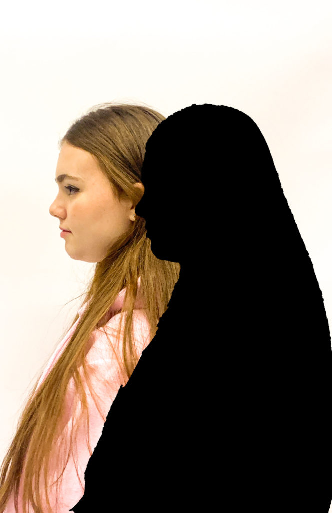
For my second set of editing, I wanted to create a dark shadowed silhouette, I did this by selecting the ‘Object Selection Tool’ , which I dragged over the whole body, this then automatically cut out the shape of her silhouette. I then went onto ‘Layer’ and ‘New Fill Layer’ which allowed me to select ‘Solid Colour’ and I picked a black darkened colour to fill in her silhouette.


I then combined the two editing processes to come up with an image that included both

I continued to experiment with my images, and keep playing around with the order and cutting of them. I did this for about an hour just to create some basic ideas of what I want my final images to look like, I wanted to experiment different placings and order of the silhouettes as well as whether i wanted to use a shadow or blurred face.

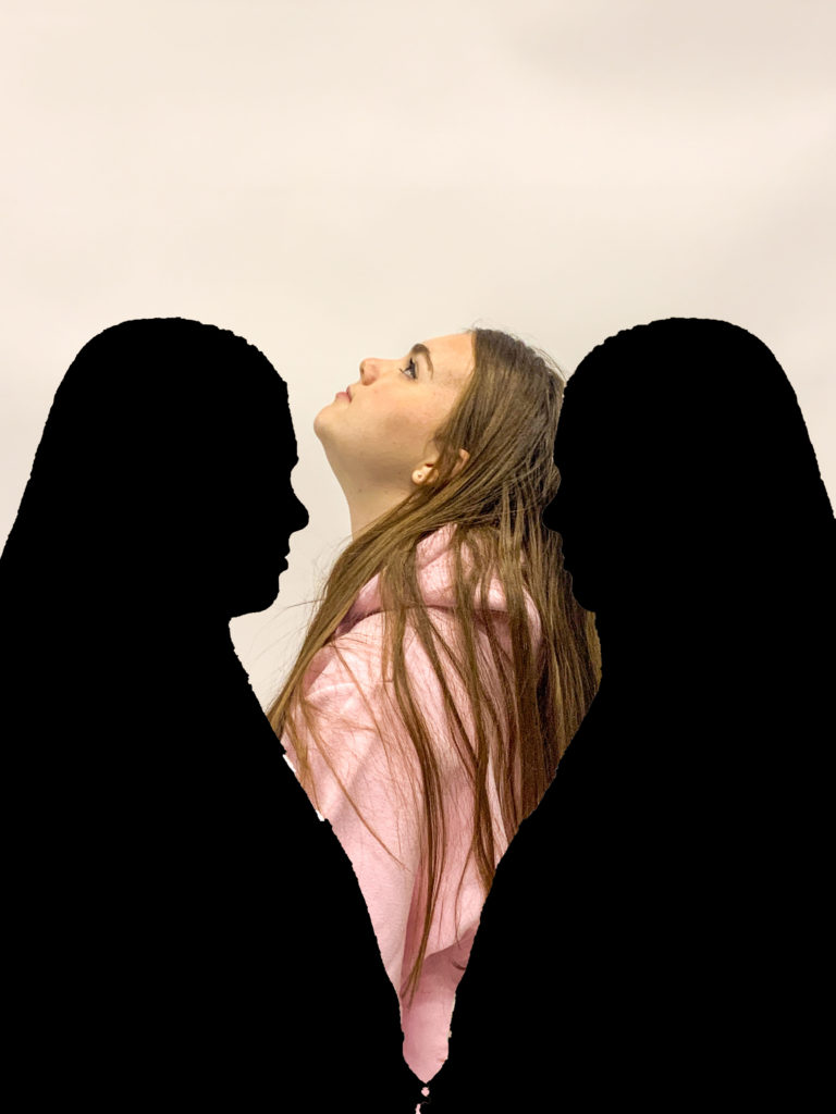
these are the sort of images I would come up with to get some sort of ideas. The more I experimented with my images, the more confidence I felt with using the tools and made editing a lot more easier. All these filled in silhouettes are inspired by Gabriel Isaak.
I continued to edit my images with the ‘Object Selection Tool’, and filling in the shadow with a black solid colour as well as blurring out the individual face out in some images. Whenever I wanted to use one of more silhouettes or images in one, I would simply drag out the layer , use the ‘Object Selection Tool’ then use the ‘Move Tool’ and drag it into the image I wanted to build over , this way only the silhouette would cut over instead of the whole image which is all that I needed.
I experimented in a variety of different ways , moving the shadows around and seeing where I would like to have them positioned, I used the colour blue in one of my images to represent sadness to have a contrast between colours as it stands out.

I would open up a few images , in this case two, then create a new plain white file to have a white background. I would use the ‘Object Select Tool’ which would cut out the figure perfectly and then drag it onto the plain white document. I then select one of the figures again and fill it in with a solid colour shadow , all black to represent the mental state, behind the girl, show her inner state and thats not how it seems on the outside.
Overall, I think my editing process was very well achieved as I explored many different editing tools and used many editing processes. I selected either only the face or the whole silhouette for each photo, then I would either blur it all out or create a shadowed silhouette by dropping in a solid colour into the selected area. Whenever I had two silhouettes in one photo, I would simply drag out a photo , select the specific area and drag it over to my background image as an extra layer. I got a lot of inspiration from my artists too which helped me to achieve these final outcomes. All my images present mental health in a visual way and has a meaning behind each photo.


