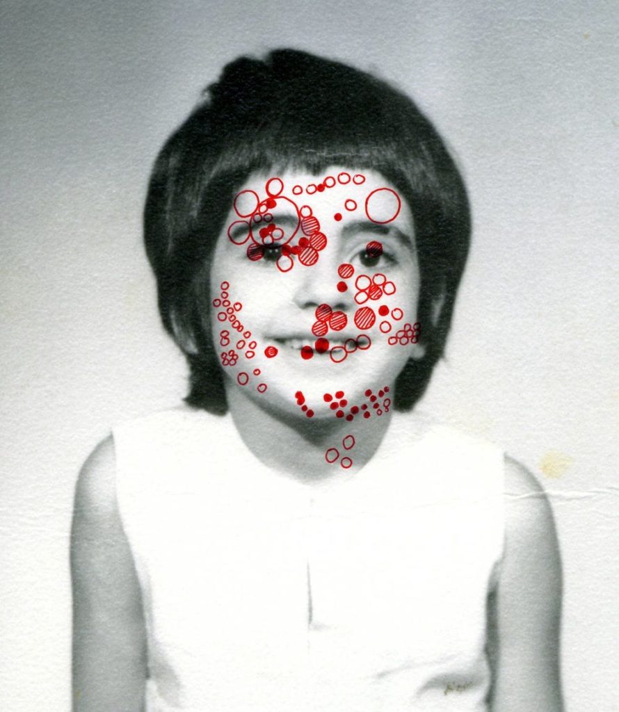
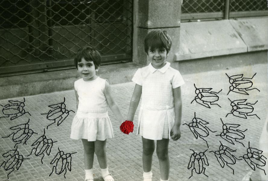
Before creating my final pieces with the photoshoots I have produced, I have experimented with different materials and methods to gain a sense of the best way I could rework both my archival and new photographs to produce new meaning, whether it is in photoshop or by hand.
Here I printed off some of the images I intend to include in my photobook and experimented with the medium of stitching. With this I used red thread, once again taking inspiration from Benitah’s work, to create both a running stitch and back stitch through my images. To develop my ideas, I looked at Benitah’s embroidery pieces, seeing how she had incorporated this element. Firstly, I tried tearing through and image and then stitching it back together, however if I were to do this again I would make the tear more obvious and messy to create a more dramatic outcome, as it is hard to see that the image has been torn in my replication. Next, I used a back stitch to outline a portrait of my grandparents, emphasising the message of togetherness and family. I believe I would like to incorporate this style into my photobook, although next time I would use this method on a black and white version of the image, to further separate the subjects from the background. Finally, I did attempt this again on a black and white image, but this time dissecting the photograph with the red thread, separating my grandparents within the portraits. Though this style did work well on the black and white image shown above, I don’t think I will use it to create and image that suggests ideas of emotional struggle, as I wish to instead promote ideas of familial bond and admiration.
In addition, I also experimented with Posca pens by drawing over the top of my images, using designs from Benitah’s work to do attempt this. Firstly, I started with a simple design by drawing a series of circles over a portrait of my grandad. I liked the appearance of this alteration, although I don’t believe it added that much conceptual meaning to my photograph. After this, I attempted using a gold Posca pen to cover some of the faces in an image of mine, replicating the circles of gold leaf seen in Benitah’s reworked archival pieces. I did like the appearance of this piece and would consider including this design in my photobook, however using a less saturated gold to do this. I also was able to create a piece that related to my narrative, using these pens. This was as I took inspiration from an image of Benitah’s which included embroidered bugs surrounding two girls in a photograph. With this I had the idea of drawing on the Manchester bee, as well as hexagons instead of small circles, as it has been the city’s emblem for many years and represents the hard work ethic of Mancunians. I chose to do this as this is where my family is from and reinforces my narrative.
Furthermore, I also tried using paint to replicate the ink and beading that Benitah sometimes uses over the top of her family photographs. In my first experimentation using paint, I mixed acrylic red paint with water to create droplets over the portrait of my grandparents that resembled beads as well as the lightness of ink. However, I don’t believe I will use this technique for my photobook at is doesn’t produce a new meaning to the photographs in the way I want it, due to it feeling more heavy and negative. In addition to this, I also attempted to conceal the faces in a family portrait with red paint.I did this by making purposefully rough and messy brushstrokes on the image and making the paint light enough so that the faces were still slightly visible.
For these experiments I used Benitah’s known colour palette of red and gold that is seen throughout her work and attempted some different styles of reworking. This included using oil pastels, tearing the images as well as using Posca pens again. In the last, image I used a red oil pastel to produce a simple design, outlining my grandma’s hand. I like the look of this method, as the oil pastel provides a strong and vibrant contrast, that cannot be replicated using the Posca pens for example. Although, by using the pens it allowed me to create a detailed pattern in the first image, which I thought resembled the mosaics that are often seen around Manchester. Furthermore, I believe the tearing of the images, revealing red strips running down the page looked good, but would be best be showcased as a standalone alteration without the clash of the gold.
By doing this it has allowed me to realise the hand-made methods I would like to incorporate in my photobook, and which uses of these mediums best communicate the message of my narrative. In addition, from this I am able to see which of these styles might look better if done in photoshop.


