Looking at the world in colour: a study of the work by William Eggleston and Saul Leiter
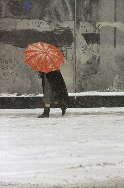
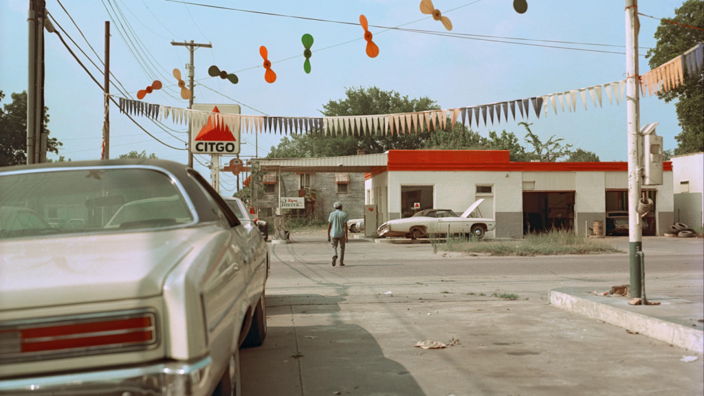
I have chosen to study these two artists as I believe they both focus on colour in their work as well as incorporating community. With Saul Leiter’s work he tends to bring colour into his work by photographing people who are holding something colourful, such as an umbrella or standing near something colourful, however the people in his images are usually faceless individuals dressed in dark clothing. William Eggleston takes a different approach at colour photography by capturing still images of places, rather than people. Many of Eggleston’s images were taken in his hometown of Memphis. A distinctive difference between these two photographers is that while they both capture images that show colour and community, they both do it in vastly different ways. Eggleston, unlike Leiter, does not take images that feature people, he instead chooses to photograph images of things such as cafes and diners, where communities may congregate, he also takes images of things that are just colourful, however, though his work does not feature people like Saul Leiter’s does, both photographers work is about people, whether it is capturing images of people or taking images where people may have connections to. For my practical study I am going to photograph images that have been inspired by both artists. I am going to take pictures of people within the community, like Saul Leiter does, as well as capturing images that focus on just colour like Eggleston does in his work. Leiter (left) Eggleston (right).
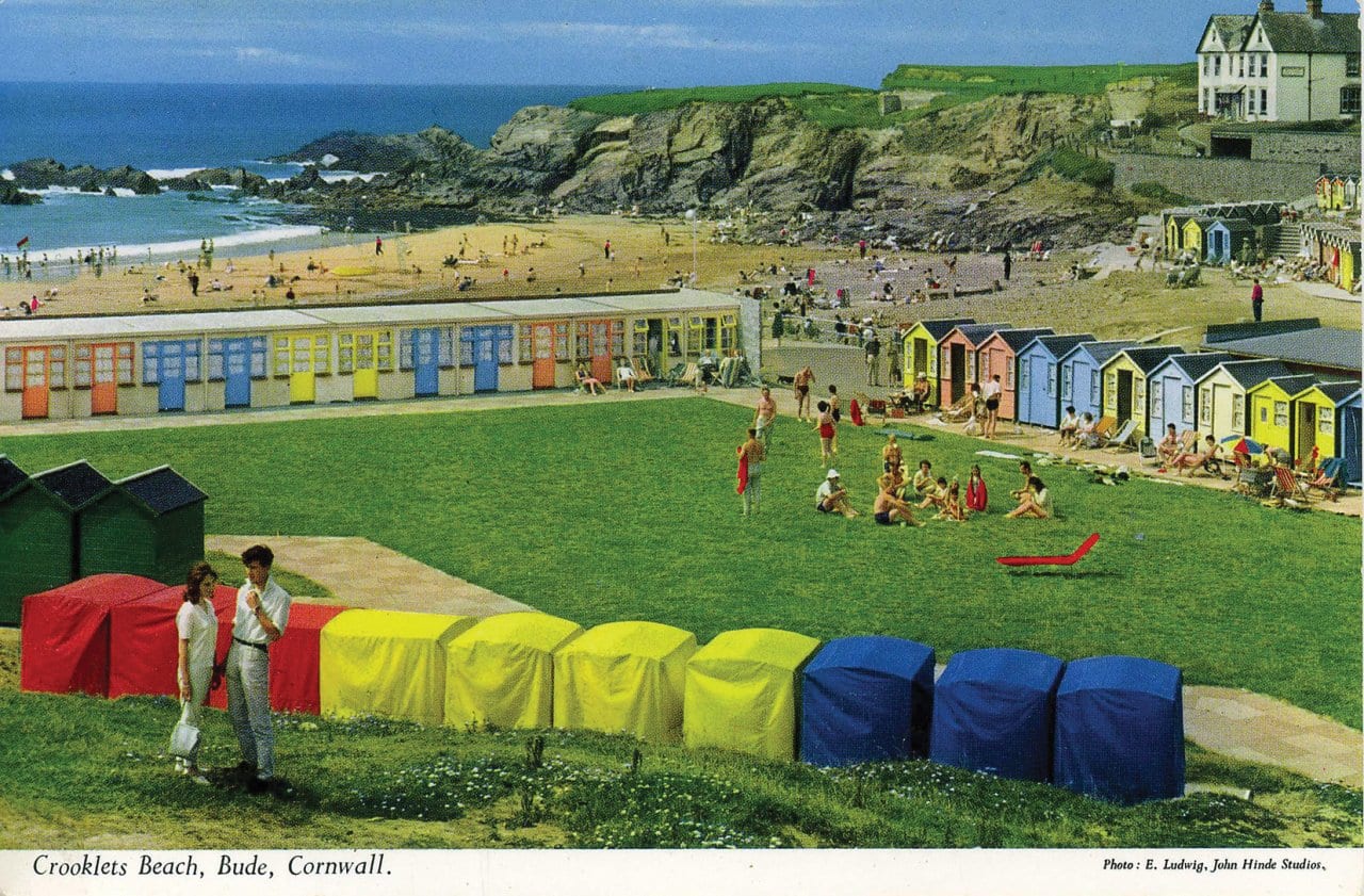
Two other photographers that I believe I can take some inspiration from for this project are Martin Parr and Fred Herzog. In 1982 Parr and his wife moved to Wallasey, England, and he switched permanently to colour photography, inspired by the work of US colour photographers, mostly Joel Meyerowitz, but also William Eggleston and Stephen Shore, and also the British Peter Fraser and Peter Mitchell. Parr has written that “I had also encountered the post cards of John Hinde when I worked at Butlin’s in the early 70s and the bright saturated colour of these had a big impact on me.” During the summers of 1983, 1984 and 1985 he photographed working-class people at the seaside in nearby New Brighton. Although John Bulmer had pioneered colour documentary photography of Britain, from 1965, Gerry Badger has said of The Last Resort: It is difficult from a perspective of almost a quarter of a century to underestimate the significance of The Last Resort, either in British photography or Martin Parr’s career. For both, it represented a seismic change in the basic mode of photographic expression, from monochrome to colour, a fundamental technical change that heralded the development of a new tone in documentary photography. (John Hinde postcard below), (John bulmer image below) (Martin Parr images below of children eating icecream in Brighton).

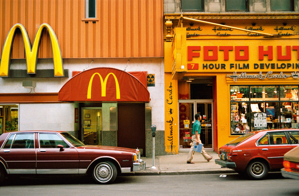
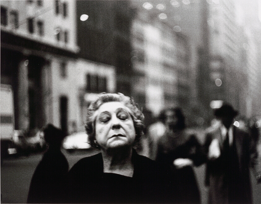
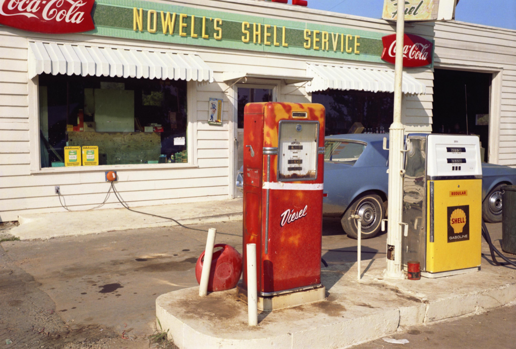
Fred Herzog devoted his artistic life to walking the streets of Vancouver as well as almost 40 countries with his Leica camera, photographing – mostly with colour slide film – his observations of the street life with all its complexities. Herzog ultimately became celebrated internationally for his pioneering street photography, his understanding of the medium combined with, as he put it, “how you see and how you think” created the right moment to take a picture. The Vancouver photographs of Fred Herzog are awash with vibrant color. They are complex, mysterious, and full of life, much like the city he photographed. Focusing his camera on storefronts, neon signs, billboards, cafes and crowds of people, he eloquently depicts the architecture of the street as a framework for human interaction. I think that Fred Herzog is a good photographer to take inspiration from as his images are taken in a similar style as how I want to capture images, I want to take images of coloured architecture in a similar way that herzog has. (images taken by Fred Herzog below).
When colour is discussed in photography, it has become common to read that William Eggleston was the first person to use colour as an artistic choice and showed his coloured images at a museum in 1976. However, Alfred Stieglitz had created colour images using the autochrome process and exhibited them as early as 1909. The autochrome process was an early colour photography process patented in 1903 by the Lumiere brothers in France and was first marketed in 1907. Autochrome was an additive colour, ‘mosaic screen plate’ process, and was the principal colour photography process for over 20 years. The medium consists of a glass plate coated on one side with a random mosaic of microscopic grains of potato starch dyed red-orange, green, and blue-violet (an unusual but functional variant of the standard red, green, and blue additive colours), the grains of starch act as colour filters. Unlike ordinary black-and-white plates, the Autochrome was loaded into the camera with the bare glass side facing the lens so that the light passed through the mosaic filter layer before reaching the emulsion. The use of an additional special orange-yellow filter in the camera was required to block ultraviolet light and restrain the effects of violet and blue light, parts of the spectrum to which the emulsion was overly sensitive. Below is a series of images of the autochrome process, starting with an image of the Lumiere brothers, a box of autochrome plates, the autochrome logo, and the coloured starch grains on an autochrome plate that has been enlarged.

Another thing that I want to explore and learn more about is how to evoke a feeling through the colours that are featured in an image. Different colours have different ways of influencing us, some colours make us feel calm, some evoke feelings of fear and tension and others make us feel happy. For example, yellow- it’s the color of sunshine, warmth, and beauty. Different hues of yellow bring different impacts. Darker shades might enrich an atmosphere even with some dramatic effect while the lighter tones make things merry and happy. So, the colors are powerful tools for creating an emotional structure of photographs. In Saul Leiter, William Eggleston and Fred Herzogs image the colours that occur the most are shades of yellow orange and red. Orange is a prominent colour against other lighter tones and has characteristics of both yellow and red, orange is said to make you feel passion, love and warmth, which makes it clear why it’s a reoccurring colour in William Eggleston’s work as he’s photographing his hometown, where he grew up which could bring back feelings of love and warmth. As well as the colours in Eggleston’s work evoking feeling they can also reveal the time period the image was taken, in his images the colours are more rich and complex than if they were taken on an iPhone camera today. In Eggleston’s work pictured below the colours on the buildings are a deep orange, where as if the same image was taken on an iPhone they would come out more blinding and bright.
A Photographer that I am going to explore is Saul Leiter, an American photographer and painter, who was an early pioneer of colour photography, and whose early work in the 1940s and 1950s was an important contribution to what came to be recognized as the New York school of photography. With distinctive imagery suffused with painterly qualities, he is often grouped with other photographers of the New York School such as Richard Avedon, Weegee, and Diane Arbus. His work, however, departs dramatically with that group regarding his subject matter—an oblique mélange of New York’s streets, architecture, and inhabitants. “A window covered with raindrops interests me more than a photograph of a famous person,” the artist said. (Images by Dianne Arbus, Richard Avedon and Weegee- left to right).
While Saul Leiter’s Street photography bares resemblance to the style of these photographs, the main difference is that his images are in colour. By the 1950s, he began to work in colour, compiling an extensive and significant body of work during the medium’s infancy. His distinctively subdued colour often has a painterly quality that stood out among the work of his contemporaries. Leiter’s first exhibition of colour photography was held in the 1950s at the Artist’s Club, a meeting place for many of the Abstract Expressionist painters of that time. Edward Steichen included twenty-three of Leiter’s black and white photographs in the seminal 1953 exhibition “Always the Young Stranger” at the Museum of Modern Art; he also included twenty of Leiter’s colour images in the 1957 MoMA conference “Experimental Photography in Colour.” I particularly like the image pictured below (left) as it embodies early street photography, whilst also incorporating colour into it, this is what I want to do with my project, and I feel that Saul Leiter’s images are good to take inspiration from. In this image, your eyes are first drawn to the patch of yellow on the truck that stands out, because of it being highly saturated, while the rest of the image drops into relatively duller colours. Like a lot of Saul Leiter’s images, this image has strong elements of abstraction, where he focuses on shapes rather than details. The yellow area in this image plays the critical role of separating the man’s head from the background, so that the contours would be visible. As a result, the viewer can then see that he is wearing a hat and looking downwards. Saul tactfully used colour as building blocks in his images. I want to try and do this in my images by taking street photography at night or on a darker day whilst there is colour in the background, ultimately creating a silhouette of the person in the image.
William Eggleston’s work (1970’s) successfully captures the world in colour with his images while also incorporating a sense of community within his work. By photographing places where community can be felt as people congregate and interact with others in these places, I think that he is the best artist for me to look at and take inspiration from for the practical side of this project. A curator at Tate art museum, Simon Baker, said, “William Eggleston never takes multiple shots of the same image just the right picture at just the right moment..” Though his images record a particular place at a certain point in time, Eggleston is not interested in their documentary qualities. Instead, when asked what he is photographing, Eggleston simply answers ‘life today.’ However, with my images I want them to have a slight documentary quality to them as I have also taken pictures featuring people, which when people look at them, I want them to have a story behind them even if it is open to interpretation of what is happening in that specific image. Whilst taking some inspiration from William Eggleston I am also putting my own twist on looking at the world in colour, by focusing on still images, like Eggleston, however, not solely focusing on buildings.
I like this particular image by William Eggleston (featured above), sometimes referred to as, ‘The red ceiling‘ as it shows colour well. At the top of the image, slightly off centre is a light fixture with a bare bulb and three white cables stapled to the ceiling leading out across the glossy ceiling like arteries towards the crimson walls. It is taken from an angle that suggests he may have stood on a chair, or simply held the camera above his head. In its apparent casualness, it is emblematic of Eggleston’s art, being both ordinary and loaded with meaning, utterly simple and yet endlessly complex. The abstract “fly’s eye view” of the room evokes how Eggleston’s compositions often appear both formal and deceptively simple. Eggleston is known for capturing sometimes garish, but always stunning colour combinations in his pictures. A mundane image, maybe, yet one that carries within it some indefinable sense of menace. His eye for colour, enhanced by his dye-transfer process, ultimately enabled colour photography to become a legitimate art form. Of this picture he once said, the deep red colour was “so powerful, I’ve never seen it reproduced on the page to my satisfaction. When you look at a dye-transfer print it’s like it’s red blood that is wet on the wall.”. At the time this photo was shown, most photographs were still black and white, so the vibrant red pigment was shockingly new and experimental. Other images by William Eggleston (pictured below).
There are many similarities between the two photographer’s work, the obvious being that they both shot their images in colour. However, as well as that they both captured images in places that they had connections too- William Eggleston shot in his birthplace, Memphis, and Saul Leiter took images in his hometown of New York. Both photographers also shoot images that either include people in, creating a sense of community or places that communities may gather. Whilst both photographers, have many similarities they also have a lot of differences, William Eggleston says that he just captures ‘life today’ and that the images have no documentative qualities or stories behind them. However, Unlike the bright, poppy 1970s colour work of William Eggleston, who is generally regarded as polychromatic photography’s pioneers, Leiter’s images possess an impressionistic quality, in keeping with his contemporaries. He says about his images, “I like it when one is not certain what one sees,” he once said. “When we do not know why the photographer has taken a picture and when we do not know why we are looking at it, suddenly we discover something that we start seeing. I like this confusion.” Capturing his images this way leaves them up to interpretation. (Eggleston-right) (Leiter-left).
Photography has a unique relationship to chance. Anyone who has used a camera has taken a picture that has been ruined by an ill-timed blink or enhanced by an unexpected gesture or expression. … On the other hand, it has given photography an extraordinary capacity to represent the unpredictableness of modern life. The notion of chance in photography is a vital part of the practice. To an extent all photographers have taken their famous images at the result of chance process, however as well as chance; photographers such as Saul Leiter have also put themselves into an environment that will present opportunities to capture a successful image. Leiter done this by knowing what type of images he wanted to capture and went out into the centre of New York to look for opportunities to capture images.
In my own practical work, I have taken images In Jersey, Brighton, and London, I have focused on street photography, as well as the graffiti community, and taken images that focus solely on colour, such as colourful objects from a close distance. I think my images are more comparable to Saul Leiter’s work as I tried to take images with his style of photography slightly using people as a silhouette to break up the colours that are present in the background of his images. In a lot of my street photography images I took a lot of images that focused on the sky as the main colour element in the background by capturing images that have sunsets in the background, two examples of this are shown below.

I like these images as they incorporate both street photography and colour in a natural way, in the image on the left I like how the purple hues in the sky are seen through the square windows; I also like how the windows are separated as it creates a nice break of colour throughout the image. In the image on the right, I like how the people in the carriage in front can be seen on the left-hand side of the image and how they are just unaware of the photograph being taken as it feels more natural. I also like the way you can see the sky through the carriage windows as well as the carriage the image was taken from. Another thing I like about this image is the lights in the ceiling of the carriage as it has just enough light to make the people visible but not enough light to take away from the sky in the background of the image.

Another image I like is this one as I feel like the silhouette of the woman in front of the billboard gives off a Saul Leiter feel. I like the placement of the woman in this image as it breaks up the background colour and makes the hat the woman is wearing more visible just like Saul Leiter does in his images. The placement of the woman makes the contours in the image more visible, and the billboard creates colour blocks in the image much like Saul Leiter’s work.
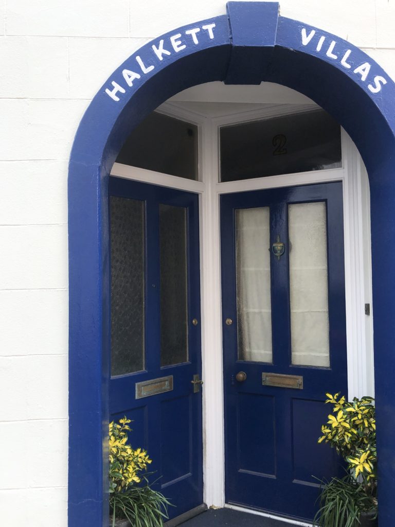
Two other images that I like are from a photoshoot inspired by the photobook ‘William Eggleston’s Guide’, the first image in the photobook depicts a light faded grey door, slightly to the right of the image, it has a gold door knocker on the centre of the door with a basket full of blue flowers hanging off it. After seeing that image I decided to take similar photographs and frame them similarly. I took the images so that the window and the door were to the right of the image much like Eggleston’s image. I like the blue shades in both of these images and like the way the darker blue shade stands out against the white wall and the way the yellow flowers at the bottom of the image frame the door way. In the image on the right I like the way the light blue shade of the window and the wall at the bottom look with the cream shade of the wall, compared to how it would look if the wall was painted a bright white colour. The light shade of the blue creates a calm, relaxed feel, combining that with the cream wall evokes a feel of femininity within the image.
Bibliography:
https://en.wikipedia.org › wiki › William_Eggleston
Lumiere brothers | Biography, Inventions, Movies, & Facts
https://www.britannica.com › Technology › Inventions
Autochrome Lumière – Wikipedia
https://en.wikipedia.org › wiki › Autochrome_Lumière
https://en.wikipedia.org/wiki/Martin_Parr
https://en.wikipedia.org/wiki/Fred_Herzog
Autochrome Process | The Historic New Orleans Collection
https://www.hnoc.org › virtual › daguerreotype-digital
http://www.artnet.com › artists › saul-leiter
Saul Leiter – Artists – Howard Greenberg Gallery
https://www.howardgreenberg.com › artists › saul-leiter
Saul Leiter review – the quiet genius who made the …
https://www.theguardian.com › artanddesign › jul › sau…
10 Lessons We Can Learn from Street Photographer Saul …
https://www.eyeem.com › blog › 10-lessons-we-can-lea…
Saul Leiter Street Photography Analysis
https://www.belindajiao.com › blog › saul-leiter-street-ph…
https://en.wikipedia.org › wiki › William_Eggleston
http://egglestonartfoundation.org
http://www.artnet.com › artists › william-eggleston
William Eggleston – 176 Artworks, Bio & Shows on Artsy
https://www.artsy.net › artist › william-eggleston
William Eggleston, the Pioneer of Color Photography
https://www.nytimes.com › 2016/10/17 › t-magazine







Katey
Connections are made here in places, but not explored in depth or detail. More critical analysis and understanding is required for higher marks.
I suggest that you at least incorporate the formal elements (composition, depth, line, shape, texture, colour etc) in your analysis of key images to gain some more marks.