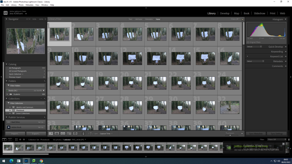
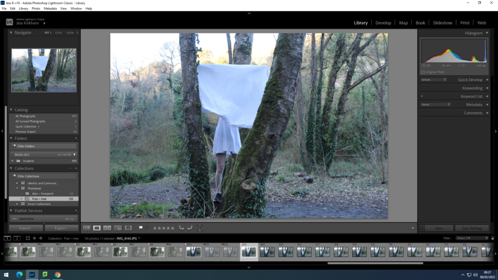
With my first photo shoot I put them into a folder in light room under a name such as Fran ~ Tree so I know that the photographer is Francesca Woodman and the Photos are of me in the tree.
Next with the images I go through them all to either reject or flag them. Usually I go through all the photos rejecting all the ones that are blurry to then go through again to see if I have missed any.
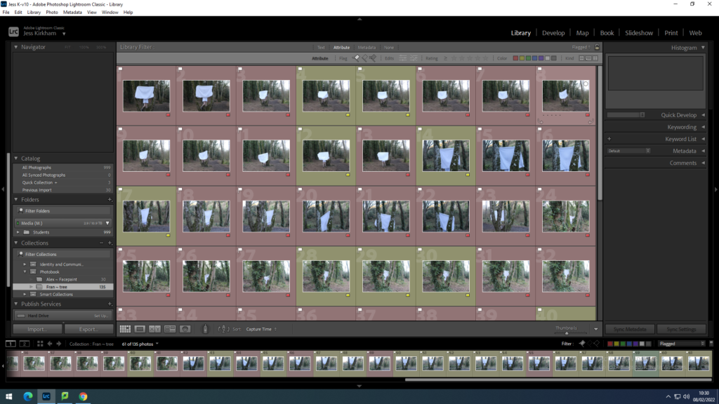
I then put the photos into 2 groups Red and Yellow. All the photos with the Red label are all the photos that I do not want for many reasons such as my jacket was showing, the photo isn’t in full focus or maybe the camera was too close.
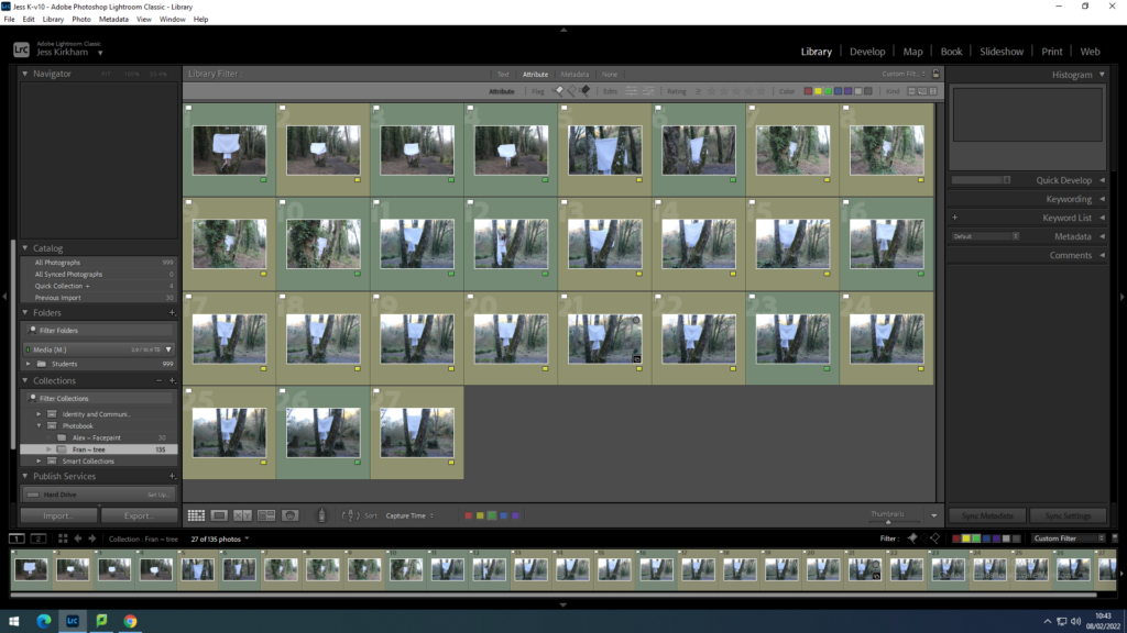
With the selected 33 photos I went through them again to find the photos I liked the most and changed the label colour from yellow to green. Selecting similar images and comparing to find the better image and then keep that as the green labelled one.
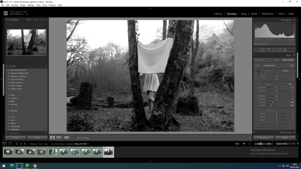
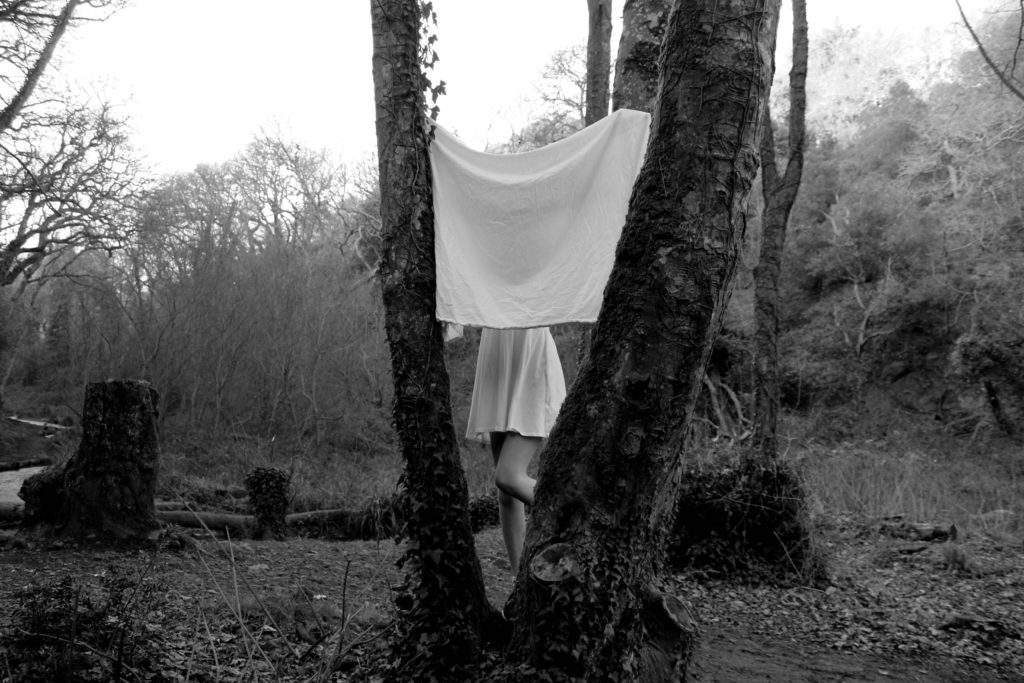
I then selected one of the green labelled images which I changed to be in black and white, adjusting it to make the white dress stand out while the trees are still dark. This would create an equal balance between black and white which creates the dress as the main focus of the image.
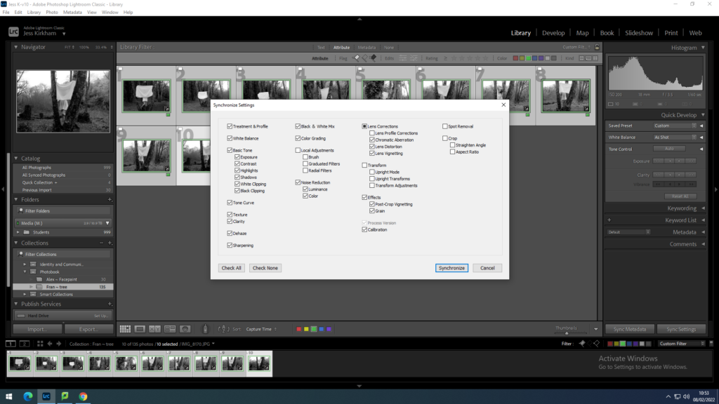
With this new edit on the photos I synced this to all the other green labelled photographs. This would make the process easier to edit all images to make them black and white. To the same balance of black and white in all images.
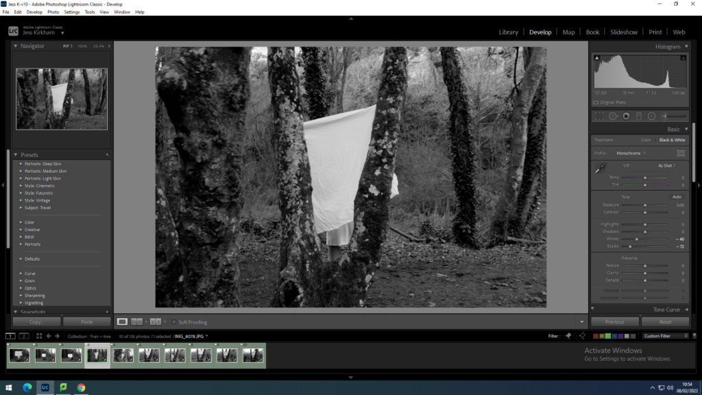
As I have changed all the green labelled photos to being in black and white I went through individually and adjusted each image to have the right level of a bright white dress and a dark tree within the photo.
shoot 2
With my second shoot I start the process again with flagging and rejecting the images. Deciding which images are too blurry or ones with my eyes shut.
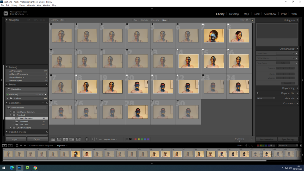
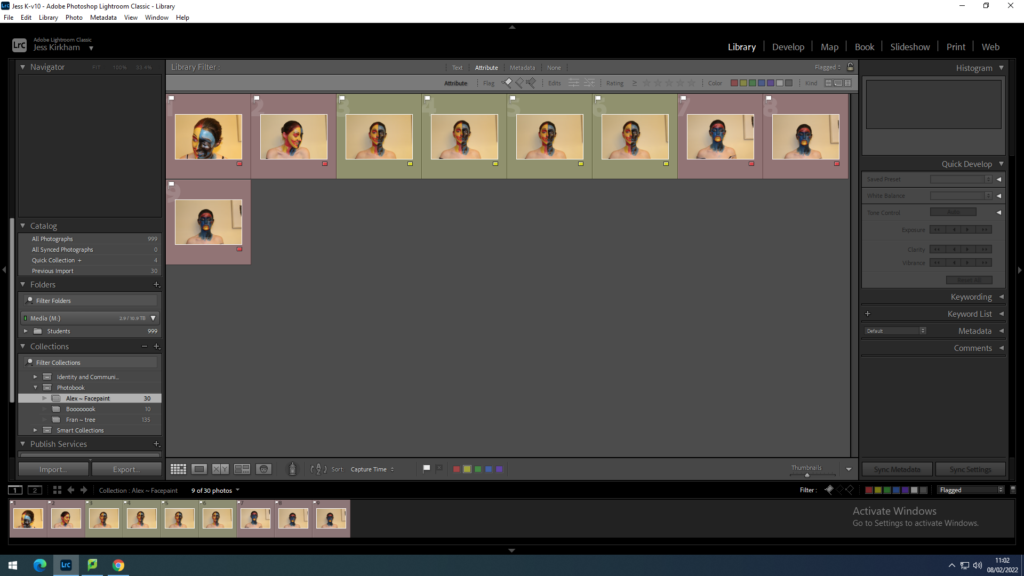
Then I sorted the photos in labelled groups of red and yellow to discard the photos I feel isn’t right for the image I am looking for. From the green images I then went through to find the one image was good enough to use and photoshop.
With my chosen image I change the background of the image to white to see whether the image would suit a white background or with a coloured one. This was a challenge as I had to try to delete the shadow behind as I wanted the image to be animation like so having no background would make it more cartoon like.
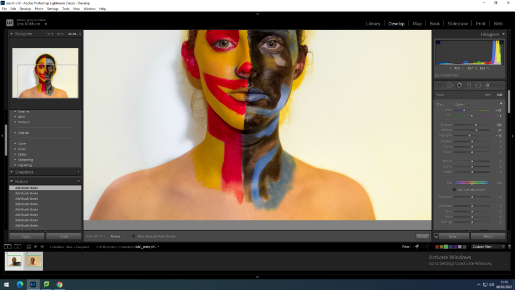
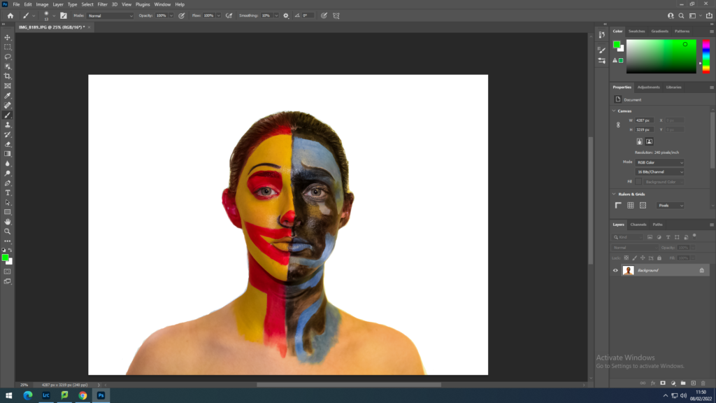
I put the photo onto photoshop to clean up around the portrait so the image would be a more fixed imaged. This way it will be easier to add the coloured background.
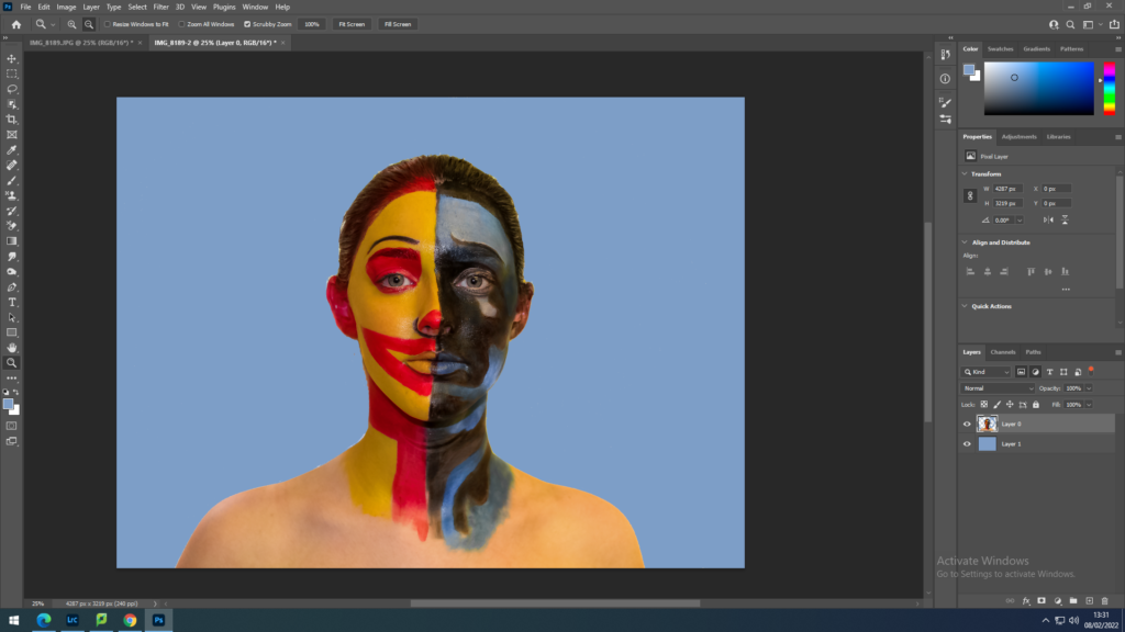
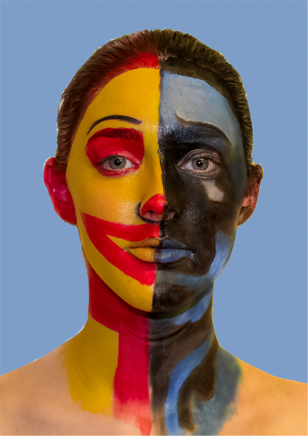
I decided to add a light blue background similar to the sad side of the face. With the blue coloured background I flattened the image then cropped it to make it more focused on the face.
shoot 3
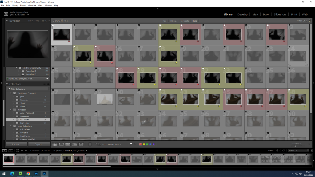
With shoot 3 I did the same as the previous shoots by flagging the photos that weren’t right then with the flagged photos I put them into 2 labelled groups of red and yellow.
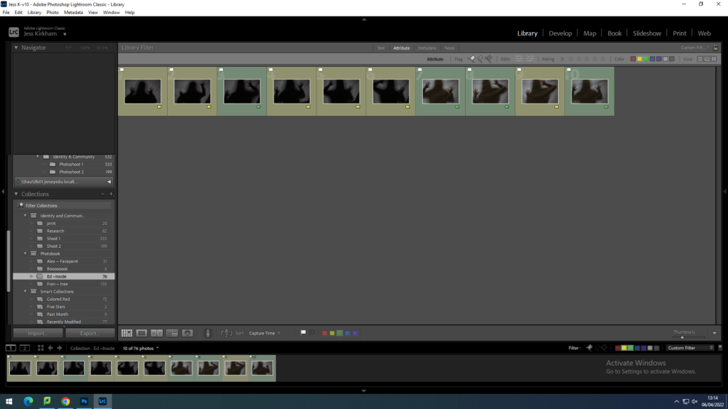
Then I went through the yellow labelled ones and changed the labels of the best images to green. Narrowing down the the few I find would show the best representation of what I am trying to show in my photographs.
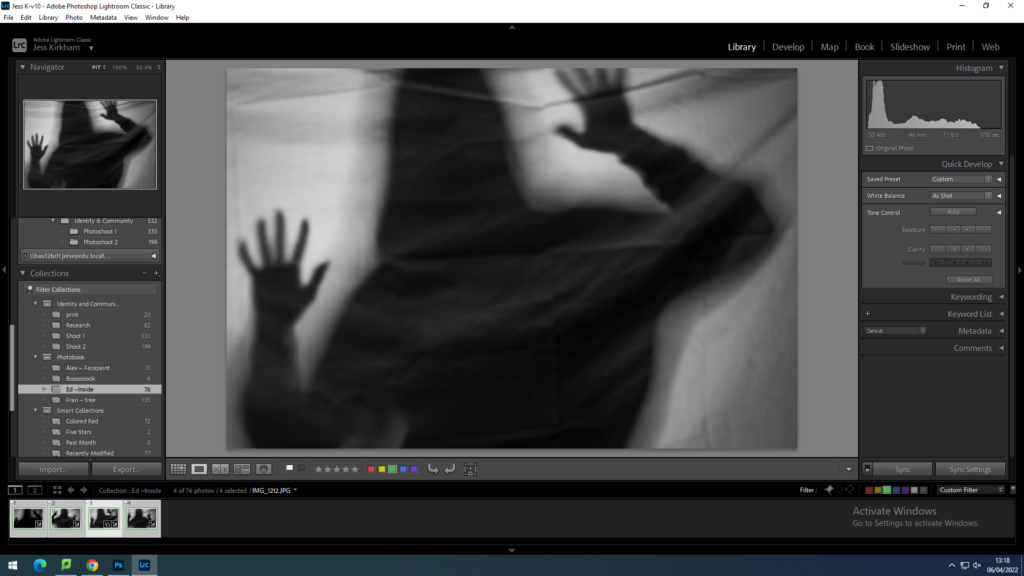
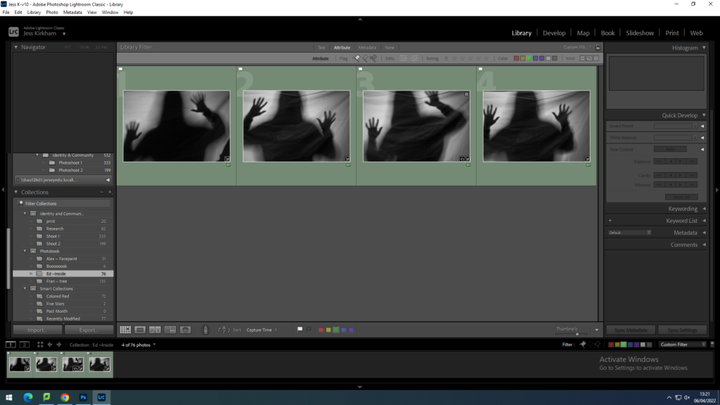
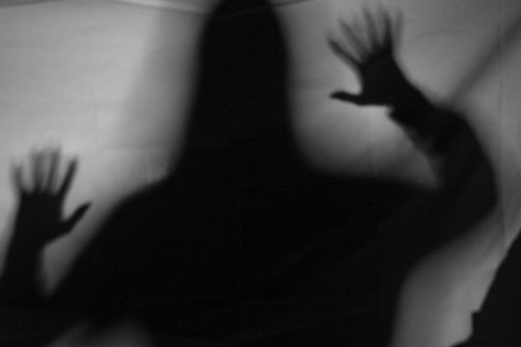
With one of the green images I edited it to make the black silhouette stronger and the white sheet brighter. In attempt on keeping the silhouette solid in colour by with a softer blend to the light.
As I edited one image, I then synced it up with the other 3 green labelled images. Which some didn’t come out the way I expected it to as it may have been too dark of a silhouette that it makes the sheet behind become too dark.
