Edward Honaker and Francesca Woodman


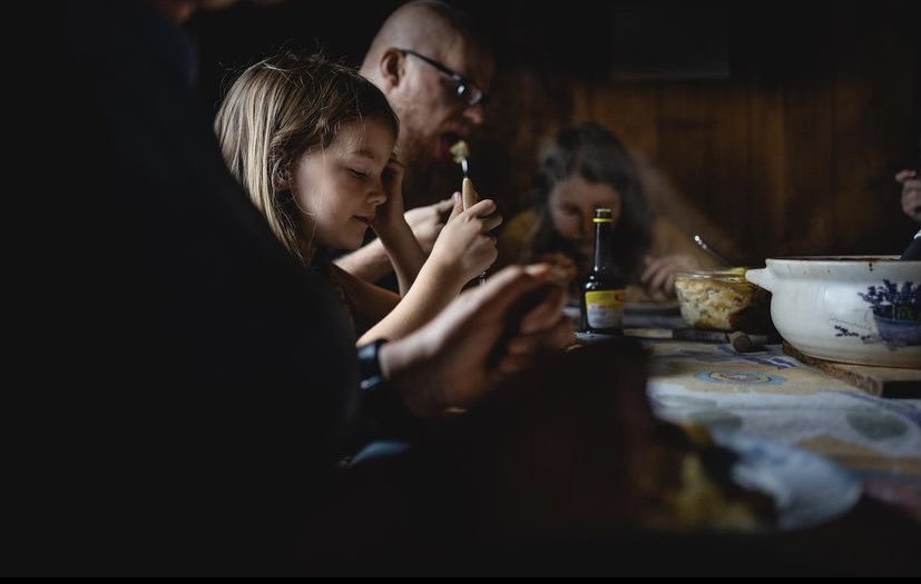


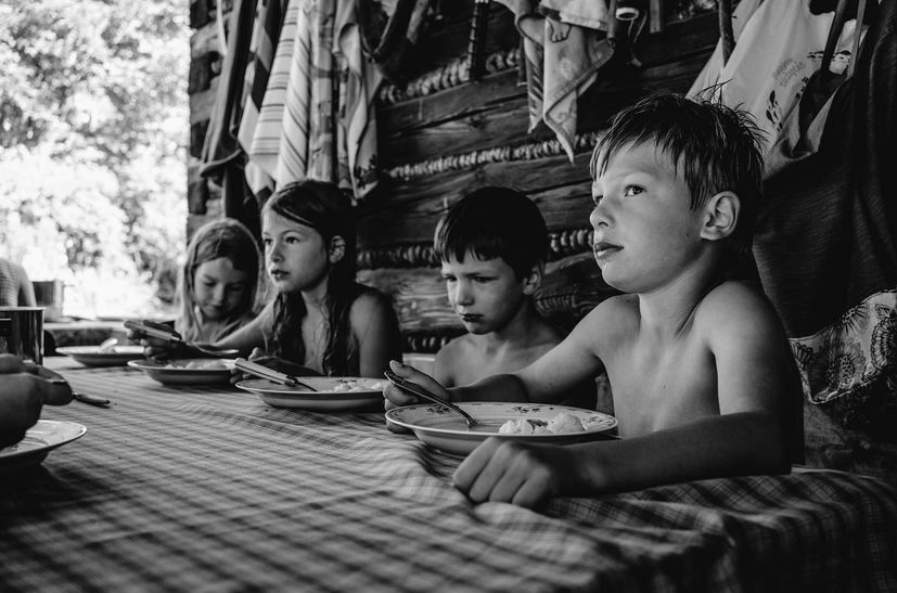


As a relatively unknown artist it is hard to find much to any information on photographer Magda Adamczak. At time of writing she currently has 2,232 followers on Instagram where she posts her photography multiple times a day. her work often features her family, specifically her young children and consists of candid photos. The photos are very raw and look barely editied and offer an insight into Adamczak’s idyllic family life. In 2019 her work was featured in a spread by National Geographic, focusing on the topic “Explore authentic food cultures around the world” https://www.nationalgeographic.com/travel/article/your-shot-photos-food-culture-around-world The piece, submitted through National Geographic’s amateur photographers program YOUR SHOT, featured her children eating together at a dinner table. The image description reads “A simple lunch brings generations together. Adamczak writes that she stayed in this vacation house as a child; now her own children visit to eat apples collected from the trees outside.”

The photo, taken from National Geographic magazine features Adamczak and her young children eating dinner at the table. Some of the children look up at the camera in feels very natural and candid despite the children looking into the camera inquisitively while others carry on with their meals in peace. The photo has an almost dirty feeling due to the rawness of the photo, lack of editing and nostalgically evocative setting. The placing of the crockery on the very rectangular table works to create sharp lines that direct to each character in the photo.


Quotes from interview with David Campany
The new neo-liberal narrative for the “creative class” omits the conditions of the working class and refuses the perspective and creativity of a subject like myself
Yet, despite their harsh criticism they also felt that photography could liberate a new way of seeing and a radical consciousness. ‘The Notion of Family’ responds to that call to suspend the passive aestheticism that turns abject poverty into an object of enjoyment
It’s imperative we tell our own stories, controlling the framework, context and narrative
Select one image from the photographer and analyse in depth following this method: TECHNICAL, VISUAL, CONTEXTUAL, CONCEPTUAL – focus on the last two aspects of analysis to achieve highest marks
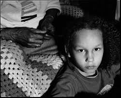
Frazier, who is very close to her grandmother and namesake Ruby often incorporates imagery of her grandmother in her subversion of traditional white social documentary photography she criticises the way white artists ostracise emergent working class photographers, she says, “The new neo-liberal narrative for the “creative class” omits the conditions of the working class and refuses the perspective and creativity of a subject like myself” This image, taken from La Toya Ruby Frazier’s photobook ‘The Notion of Family’ shows a young girl having her hair done by her grandmother who’s face is out of frame leaving to an anonymity of her identity. The photo is in black and white which gives off a dramatic, gritty ambiance elevated by the young girl looking directly into the camera, unsmiling. This could possibly be Frazier’s response to the medias interpretation of black women as aggressive and stripping black people of their identity’s as she explains in her interview with David Campany, “It’s imperative we tell our own stories, controlling the framework, context and narrative” This quote highlights the importance of storytelling in art through your ow perspective rather than what other want you to do. Frazier employs the use of leading lines of the old woman’s hands to place more emphasis on the young girl and make her gaze more powerful. This gaze is an inversion on society as customarily black people are the ones constantly scrutinised not the other way round. Frazier manages to make the photo beautiful despite it’s dark messaging. This could be purposefully done to represent how blackness is aestheticised by the media as she writes “Yet, despite their harsh criticism they also felt that photography could liberate a new way of seeing and a radical consciousness. ‘The Notion of Family’ responds to that call to suspend the passive aestheticism that turns abject poverty into an object of enjoyment” The photo resonates with many other pieces of Frazier’s work as it is heavily connected to the idea of family, specifically her grandmother.
Shilpa Gupta is an artist from Mumbai, India. Gupta uses a range of mediums from manipulated found objects to video. She often responds to the topic of human perception and how information is received and internalised everyday. Gupta looks at how objects, places, people get defined and her work links to these where definitions like labels are used. She also responds to issues in India which include gender and class barriers and religious differences.
Gupta’s works relate to the highly mediated act of seeing, retrieving and remembering trying to get the viewer to see something different or get them to question what they are looking at.

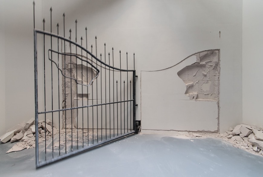


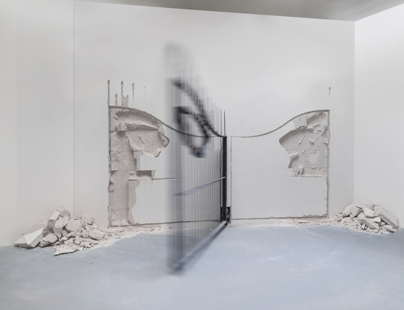

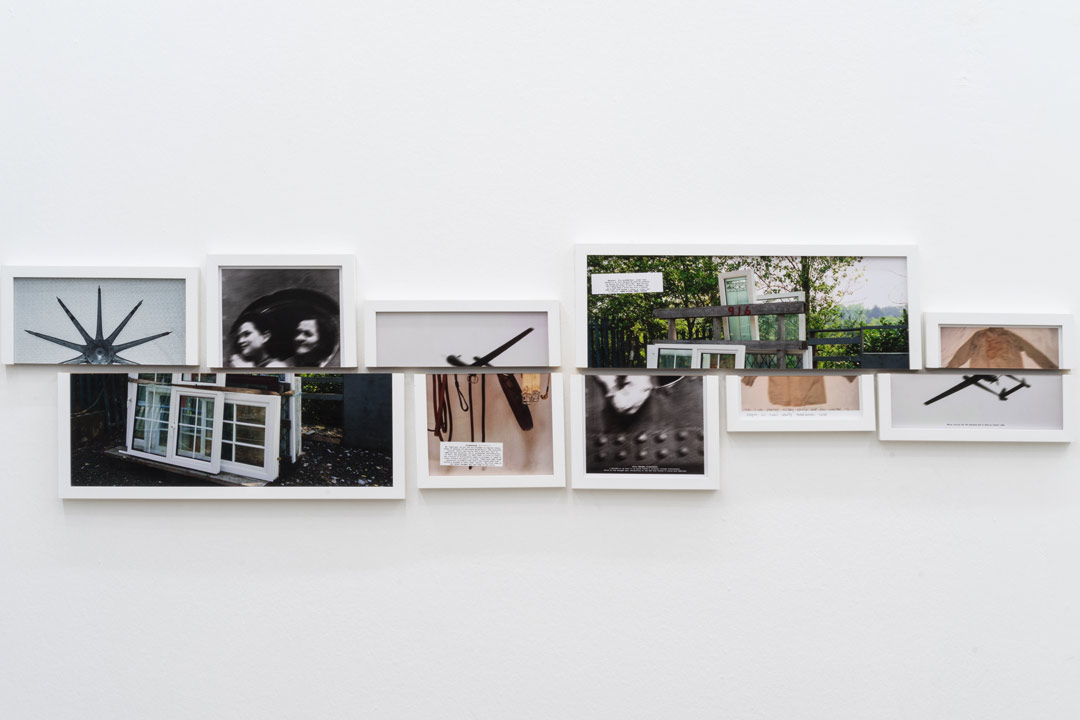
This exhibition is about how people from South Asia are treated in the Gulf. Gupta traced individual people who changed their names for survival or to succeed. The images also include the reasons behind why the names were shed. The splitting of images is showing a sharp break from the past. The words on each are “triggers for memory” in Zarina’s Home is a Foreign Place (1999), about a longing for a home she could not return to. The architecture in the exhibition is inspired by the floor plan of her childhood home. The exhibition also has a video of Zarina remembering leaving the house after the Partition in 1947 made by Sophie Ernst.
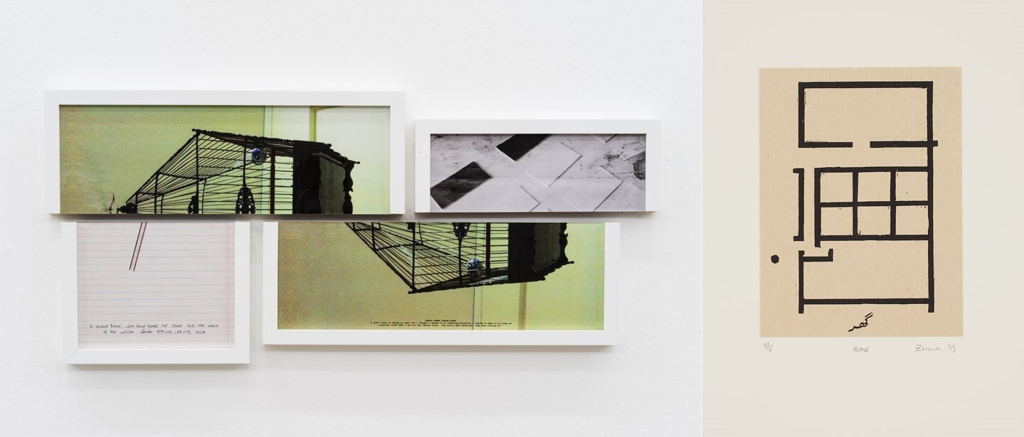
I really like the way that she splits her images in half and the presentation being misaligned, I would like to include this in my own work.
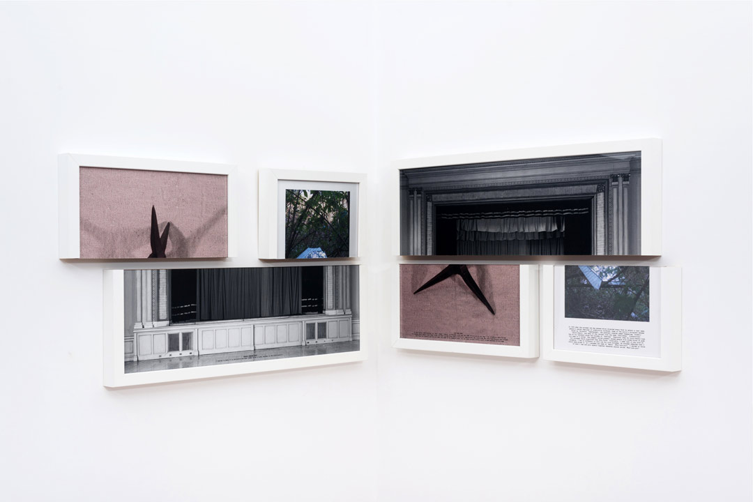
The images are also interesting, they have a sense of personality and Identity to each one whether it is an object, landscape or portrait photo. I would also like to take inspiration from these when taking my own photos.
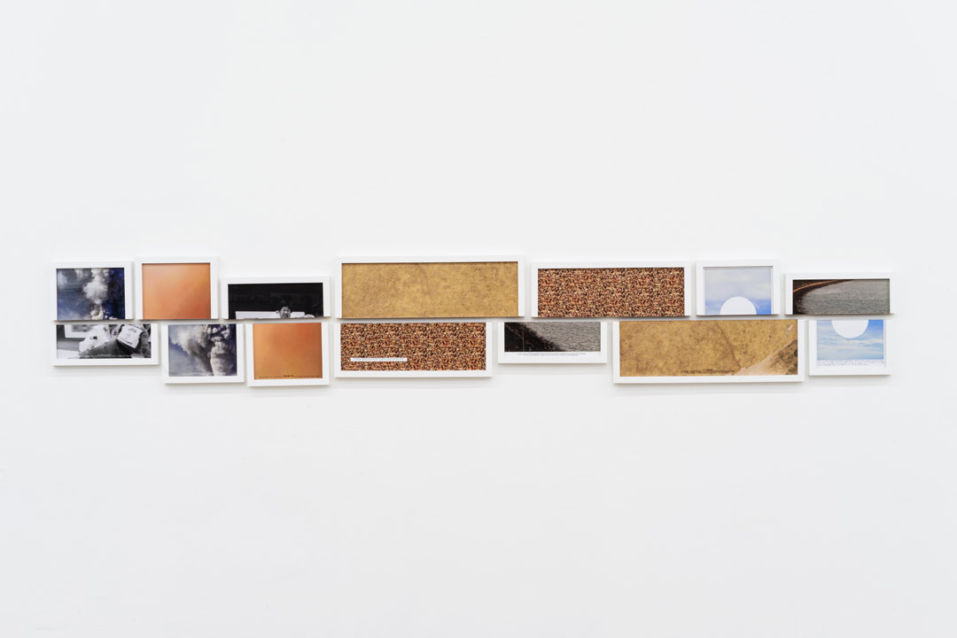
Key Themes – Shipla Gupta’s work is inspired by the issues with how south Asians are treated in the gulf and how they survived by changing their names, essentially changing their identity.
Content – Seven split images including pictures of surfaces, landscapes and one portrait image.
For the image analysis I will be focusing on the half-image at the end of the sequence, the picture of the sky, with the quote, ‘When he was getting married, he wanted him and his wife to have the same name, but felt it was unfair to ask her to take his surname. So they both changed their surnames to something new‘ hand written under the image.
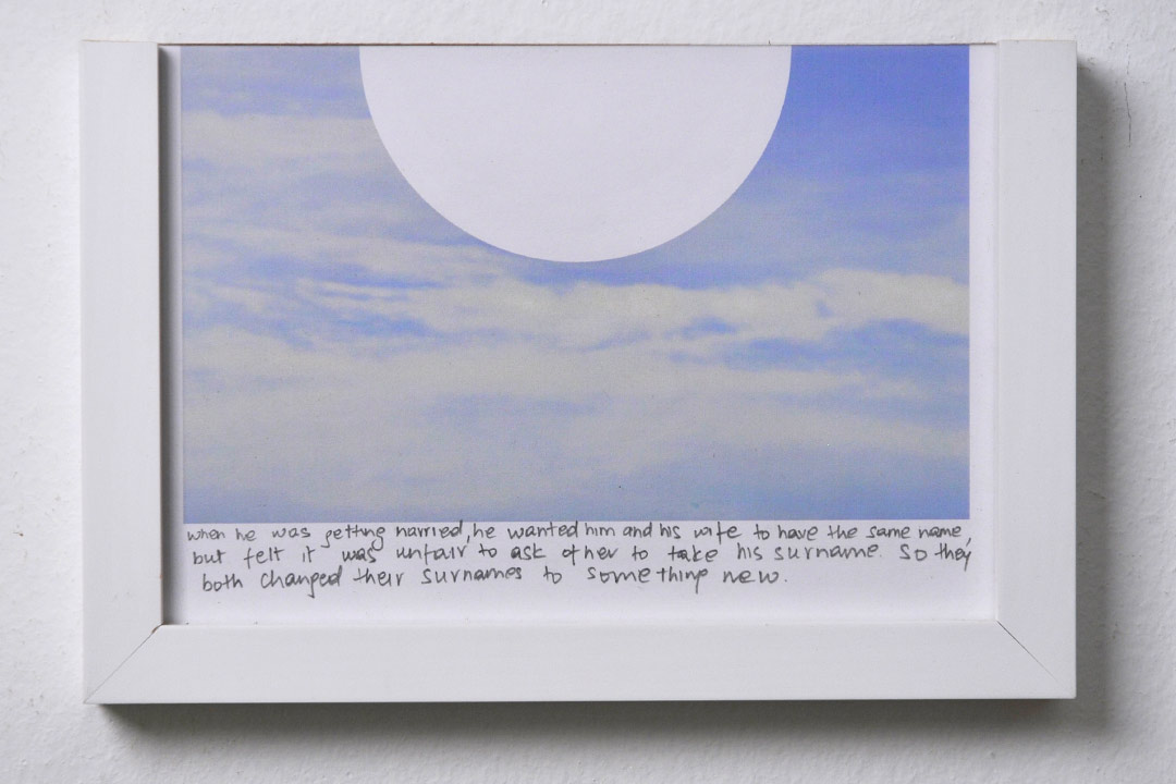
Formal Elements – The image is quite monochrome and only has two colours, being white and blue. There is not much tonal range in the image creating a low contrasting image which is very soft in colour. The image is taken from eye-level, in level with the horizon capturing the whole sky as the sole image. The natural daylight from the sky adds to the soft, bright atmosphere to the image, this could be a metaphor as it is the end of the sequence so could symbolise a happy ending. Gupta has added a white geometric circle into the centre of the very organic image creating a contrast between them. In context to the quote under the image the blank circle could suggest an empty space or new beginning.
Mood – The image creates a sense of peace and calm as the colours and clouds are soft. Gupta could be trying to link the happy ending or to heaven where everything is pure and tranquil.


Jim Goldberg is an American artist and photographer, whose work reflects long-term, in-depth collaborations with neglected, ignored, or otherwise outside-the-mainstream populations. Among the many awards Goldberg has received are three National Endowment of the Arts Fellowships in Photography, a Guggenheim Fellowship, the Henri Cartier-Bresson Award, and the Deutsche Börse Photography Prize. His project Raised By Wolves (1985-1995) focuses on two young runaway protagonists, Tweeky Dave and Echo. Their personalities, their histories, and their dreams were given equal attention, and were often presented in their own words. The sensitivity with which Goldberg approached these particular subjects reflects the affection they held for one another, a feeling which is not much shown to the homeless. Goldberg began speaking with and photographing Raised By Wolves’ subjects in 1985, and started assembling the book itself in 1991. Raised By Wolves is Goldberg’s most shambolic instalment, mirroring the experiences of its subjects. The book is made up of photographs, fragments of conversations, hand-written notes and drawings, home movie stills, Xeroxes of government correspondence, and more.
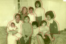
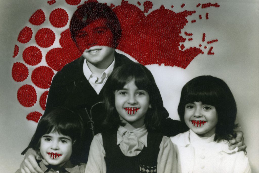


French Moroccan photographer Carolle Benitah, who worked for ten years as a fashion designer before turning to photography in 2001, explores memory, family and the passage of time. Often pairing old family snapshots with handmade accents, such as embroidery, beading and ink drawings, Benitah seeks to reinterpret her own history as daughter, wife, and mother. The work of Carolle Benitah has been published in magazines such as Leica World, Shots Magazine, Photos Nouvelles, Spot, Center for Photography Houston, Foto Noviny, and Lens Culture, among others. The series Photos Souvenirs explores the memories of her Moroccan childhood and teenage years by reworking old family snapshots. In what the Benitah describes as “excavations,” photos are unearthed from albums, categorised, scanned, transposed onto new paper, and finally hand beaded and embroidered. This final step, accomplished with red, black, or gold thread and wire and glass beads is a revelatory act for the artist; ‘To embroider my photograph, I make holes in the paper. With each stitch, I stick the needle through the paper. Each hole is a putting to death of my demons. It is like an exorcism. I stab the paper until I don’t hurt anymore.’
Write a Statement of Intent that clearly contextualises;
What you want to explore?
Why it matters to you?
How you wish to develop your project?
When and where you intend to begin your study?
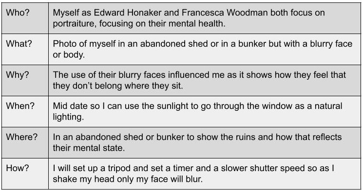
For my personal study project, I will be exploring the theme of IDENTITY, more specifically the idea of childhood and adolescence. Identity is defined as the characteristics determining who or what a person or thing is. I have chosen this theme because I think it is the more interesting option, and I think that I will be able to better explore different mediums of photography, including studio portraiture (tableaux) and more candid, real life photography, as well as still life and object photography. Additionally, I think that I will be able to create a more meaningful project, as it will be relative to real people and their lives. My personal study will focus on myself and my group of friends , and our transition from children to teenagers. My aim is to capture as many candid images as possible, in order to show our lives as they truly are and to give the viewer a realistic perspective. I will also be incorporating old childhood photos and objects as a way of showing our transition through different types of photography. I have taken inspiration from various photographers, mainly Jim Goldberg and his project ‘Raised By Wolves’. This project captured by interest because of its real and uncensored images, which was an imperative part of Goldberg’s mission to give his audience an inside look into the underground culture of New York City. My aim is to create a photobook for my final presentation, which will be filled with my images, both old childhood photos and the new ones I will have captured during this project.

For my personal study project, I will be focusing on the theme of IDENTITY, more specifically youth culture and the transition from childhood to adolescence. I have chosen this theme because I think that I will be able to produce a wide and interesting range of images, varying from tableaux and studio portraits to more candid and street photography.

In the photo it shows the use of two black and white photos layered on top of each other where the lighting in the Photos are natural with a fast shutter speed as there isn’t much light in the photos and with the two people I would expect movement which is easily cause with a fast shutter speed so there is no blurring in the image.
“The snapshot idea has always interested me – the way an object in its dysfunction or contextual orientation become an image; it seems to become an image itself.”
I agree with this statement as a dysfunctional object I find can be very interesting in the way they have become exploring how it looks which you can then photograph and become a new image itself.
The use of a small tonal range is very effective as both images relate towards the blacks and whites giving both the images that simple link between the two. the two images have a contrast in textures as the back photo has a softer texture because of the bed sheets having a comfy look to the image. With the front image it has a rougher texture as the road has a rough look to it and so does the grass with its uneven surface.
“I have found following my own image fascination difficult. It is always in conflict with my conscience intentions and leads me into unexpected, sometimes unwelcome territory.”
I do find with photography it can become bias towards conscience decisions which then again can lead to unexpected territory but it can also lead towards good decisions and the conscience decision can lead to something really impactful.
As the overlaying photo has a fork road where the one road splits into two may reflect the photo of the two women as they could be the one road parting into two. The overlaying photo also covers the women’s faces which isn’t centre so then it could be intentional on how it’s uneven and how it is purposely places on those faces or could be accidental.
“Collage is a way to create the circumstances for digression and for attention to the unintentional or inadvertent, as you say, for allowing a conscious contemplation of the image in its dream state.”
With the overlaying photo is gives both the images attention for this uniqueness whether it was intentional or not but it does allow the the conscience to contemplate the image on its dream like state.

Reviewing and reflecting my year 12/13
ANTHROPOCENE

SELF-REFLECTION-IDENTITY

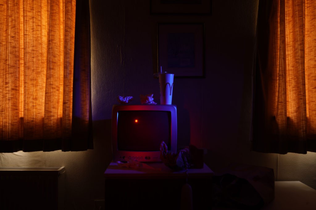
We were ask to reflect on our Identity and community project. And write an overview of what we had learned so far as Year 12 and Year 13 student and how we intend to develop our Personal Study. Last year we learned about the bases of photography and techniques to take different types of pictures for example when I took my images inspired by Troy Paiva’s style I had to learn how to use two continuous lights and added a grid and coloured gels to them to have the same effect. I also learned about contrasting warm and cool colours. We explored several subjects like Anthropocene, landscapes, many types of portraits like headshots up close, double/Multi exposures, Deadpan passport… This experience made realise how much I apricate Portraits, whether it’s close up or double exposure I find people interesting because I think it’s fun, it’s you who decides the poses and the place so it’s predictable your creativity has no limit. We also learned how to edit our pictures with multiple apps like Photoshop or Lightroom so we have the choice how and with which app we want to edit our images. Last year we worked individually in each project but this year we tried one the NFT project in groups. Is definitely different working individually and working in group. You have learn to share and mixed your ideas with the other members, Organized yourself in relation to others, At least the easiest is that we have to divide up the roles while when we are individual we have to do everything alone so it takes more time. We learned how to create a gif, and edit our NFT video. Even if I wasn’t very interested in the NFT project I still really like how our project turned out and I appreciated working with my group. We had two controlled conditions last year, Self-reflection we investigate the subject of Identity what it meant to us. We study who we were and how did we identify ourselves. I represented one of the cultures I grown up with which is Mexico. I explained one of the most famous artist in Mexico is Frida Kahlo. I love Frida Kahlo’s paintings because of the way she expresses herself behind them. So I wanted to self portraits inspired by her to honour her. I think this could be great for my community and identity project now. Our seconded control conditions was Anthropocene which means a period of time during which human activities have had an environmental impact on the Earth. On that time a knew a hotel that was closed and I thought it could be a great opportunity to take pictures so I could show a place abandoned by humans and which is being destroyed by itself little by little. And create Art with it “But what if we took the packaging of our favourite fast food and turned it into an inspiration from a 17th century painting.” I think they were my best work and I had a lot of fun making them. I explain in more detail, we can see that I have more confidence and the photos are in better quality.
Francesca Woodman was born in Denver, Colorado in 1958. She first started taking photos in her early teens while at boarding school, during her short career she took over 800 pictures. Her father was a painter and photographer and also lectured in photography at the University of Boulder in Colorado and Her mother was a ceramicist and sculptor so art became a big part of her everyday life. Her family spent their summers at her parents’ farmhouse in the countryside in Italy where many of her photographs were taken, she was inspired by Man Ray and Claude Cahun which can be seen in themes and style of her work mixed with the influence of surrealist art and the European culture. She developed her ideas and skills as a student at Rhode Island School of Design but suffered from depression after a move to New York in 1979 and in 1981, she then sadly took her own life at the age of 22.

I find this image very effective as it uses a slow shutter speed and has a tripod set up to take this photo. The blurry person I find is effective as everything is perfectly still and then yet there is just one singular person moving. The use of rustic building falling apart is effective as it could reflect how she feels and yet cannot show which she does try to through her photography.
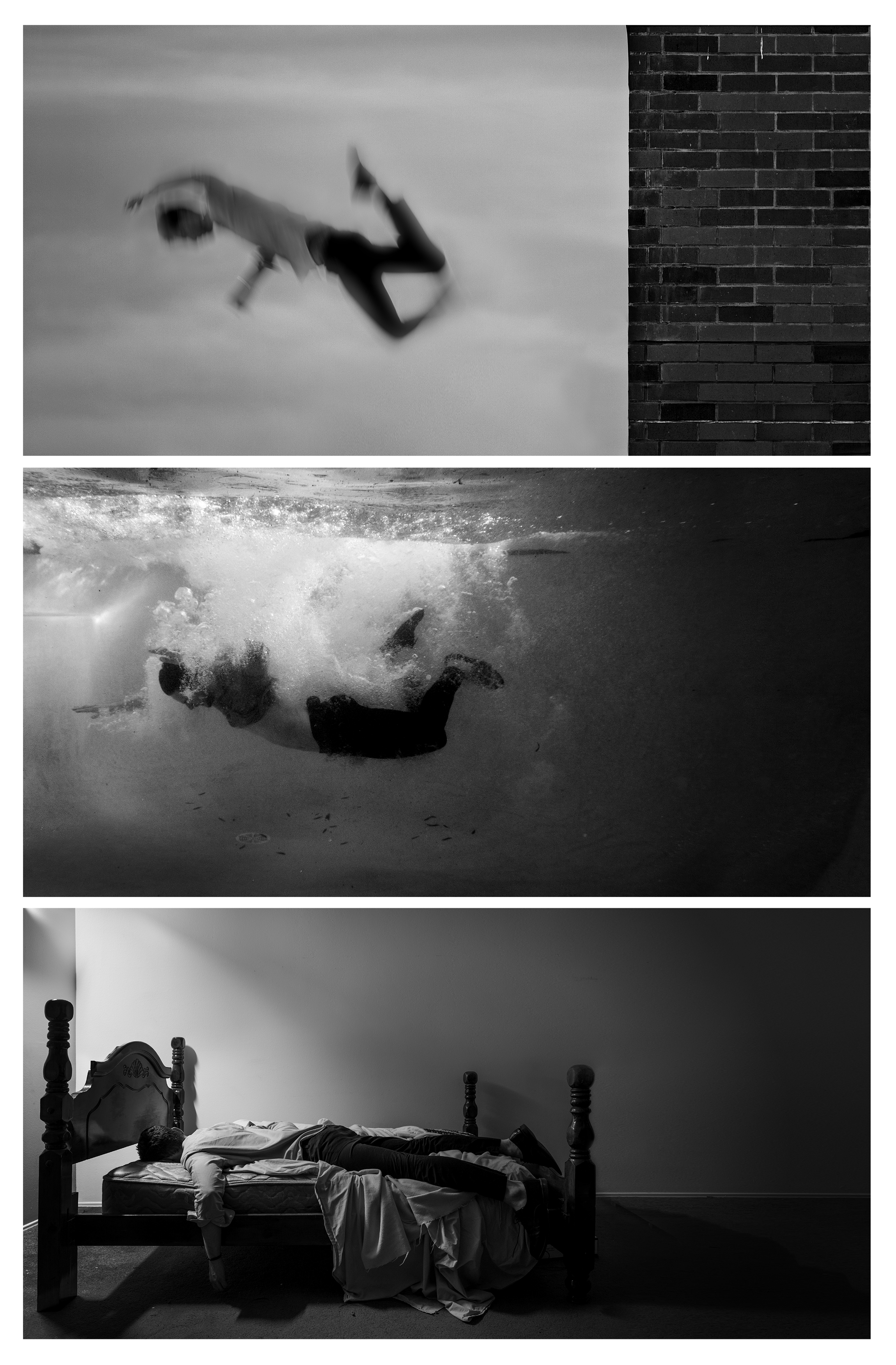
Edward Honaker was diagnosed with a mood disorder at the age of 19. He was experiencing depression which created an overwhelming obstacle in his day-to-day life. He documents his own depression through the use of self portraits, the black and white harrowing images illustrates the photographer’s experience with depression and anxiety. The photography shows his helplessness he feels while trying to battle this depressive disorder, he focuses on blurring his face and use of water in his photos to symbolise how he feels like he’s suffocating and drowning. In an attempt to raise awareness of the topic, Honaker says about the project: “Mental health disorders are such a taboo topic. If you ever bring it up in conversation, people awkwardly get silent, or try to tell you why it’s not a real problem. When I was in the worst parts of depression, the most helpful thing anyone could have done was to just listen to me – not judging, not trying to find a solution, just listen. I’m hoping that these images will help open up conversation about mental health issues. Everyone is or will be affected by them one way or another, and ignoring them doesn’t make things better.”
In this image effective as it is the use of three images put together to create one image, the images show a man falling from a building into water then onto his bed. This could show how he feels like he is falling and drowning in his depression which makes him feel exhausted. Even if the images may not intend to show him struggling I still find it enticing on lying in the similar positions in different places yet it shows different outcomes.
