Contextual studies – Stephen Shore

I started off by selecting 3 Stephen Shore quotes that I think I could include in my image analyse of one of Stephen Shores images. The first quote I found online, and the other two were from an interview that was on a PowerPoint resource.

1.

“I don’t have to have a single point of emphasis in the picture. It can be complex, because it’s so detailed that the viewer can take time and read it, and look at something here, and look at something there, and they can pay attention to a lot more.”

2.

But even in that strange world, you were definitely making “Stephen Shore” pictures: intersections, shop fronts.

That’s true. Most of the pictures do have little indications that it’s a movie set. A contemporary car in the background or some scaffolding. But even the decision to shoot in colour meant that I was making photographs that couldn’t have been made in the period setting of the movie, It’s an anachronism. There are streets in New York that still look like those streets, but the décor and dressing are anachronistic, too. It was great fun.

3.

Can you describe what you had been doing?

In making Uncommon Places, I was walking down the street and watching all the relationships changing watching objects in the foreground change in relation to the background, thinking about how space is going to be seen in monocular vision on a picture plane. What happened for me was that, right away and throughout the work, structural issues and questions came to my mind. I had to solve those questions, and in the process of solving them other questions would arise. But it wasn’t as it I was sitting around thinking about them.

Analysis

Stephen Shore’s ‘Uncommon Places’ (book) finds the beauty in the most mundane. His sprawling vision of America has become a contemporary classic, a landmark of visual Americana, influencing a generation of photographers to take to the highway.

Stephen Shore: Uncommon Places | The Independent Photographer

This photo demonstrates how Shore finds interesting and unusual places by walking around, this is his usual method he uses to find places to photograph, as he was asked in an interview, “Can you describe what you had been doing?”, and Shore replied with “I was walking down the street and watching all the relationships changing watching objects in the foreground change in relation to the background, thinking about how space is going to be seen in monocular vision on a picture plane.” This shows how Shore think about how the image will look through the view finder before setting his camera equipment up. Photo walks are very important for photographers, as they’re not only perfect for meeting other camera enthusiasts, but also for honing your skills as a photographer, learning new ideas, and experiencing different places through your camera’s viewfinder.

Walking around and exploring allows Shore to capture images of shop fronts and intersections, which have been named the, “Stephen Shore” image. the interviewer asked Shore how he creates the classic image, that comes out so perfect. Shore states, “Most of the pictures do have little indications that it’s a movie set. A contemporary car in the background or some scaffolding. But even the decision to shoot in colour meant that I was making photographs that couldn’t have been made in the period setting of the movie, It’s an anachronism.” This shows how Shore uses anachronism to his advantage. Anachronism is a chronological inconsistency in some arrangement, especially a juxtaposition of people, events, and objects from different time periods. For example in this image the colourful cars are lined up perfectly in front of the old, squatting, lit-up movie theatre in the background. This creates a juxtaposition between the colourful cars and the bright movie theatre in contrast to the dull, brown factory looking buildings, which creates a focus on the centre of the image drawing the eye to the theatre, and the people outside which gives life to the image.

The camera position in this photo is across the road from the subject, which is the theatre. This shows how Shore photographs a scene that he finds on his walks. However, Shore has thought about the composition in this image, as Shore uses depth of field to his advantage as the cars in the foreground are blurred which focuses the eye on the main focal point. Shore once said, “I don’t have to have a single point of emphasis in the picture. It can be complex, because it’s so detailed that the viewer can take time and read it, and look at something here, and look at something there, and they can pay attention to a lot more.” This image is a good example of how Shore creates the composition of an image. However, there is a main emphasis point, which is the theatre, and it is surrounded by several sub focus points, which is the cars. The surrounding buildings and lamp posts on the street, and more detail to describe the atmosphere of the scene. The choice of shooting in the early evening makes the darker buildings less noticeable, which creates a contrast with the light, white theatre building. The light blue sky is a similar colour to the blue accents on the theatre, which creates a balance in colours between dark red, light blue and white. These colours are also the same colour palette as the American flag, this is important as Shore is an American photographer and perhaps he wanted to represent himself and glorify the American lifestyle.

Island Identity – Communities

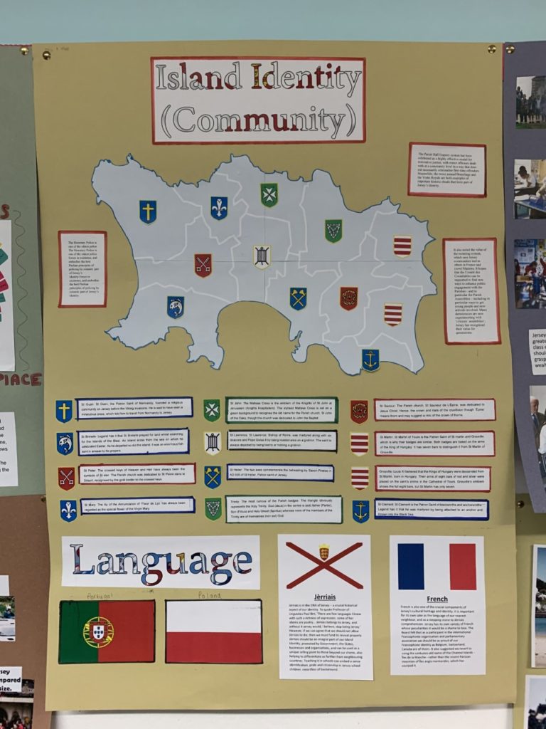
In groups of two (Ollie and I) we had to produce a poster that reflects on one of the key areas of Jersey Identity, we were given “Communities” to explore.

This is our poster, our main focus was the different communities in each parishes, and how each parish is slightly different which is depicted on there way of life. For example, St. Helier is very built up and Trinity is more rural and less busy.

The notes around the outside inform the reader about the how, the Honorary Police is one of the oldest police forces in existence, and embodies the best Peelian principles of policing by consent. The Parish Hall Enquiry system has been celebrated as a highly effective model for restorative justice, with minor offences dealt with at a community level in a way that does not necessarily criminalise first-time offenders. Meanwhile, the twice annual Branchage and the Visite Royale are both examples of important historic rituals that form part of Jersey’s Identity.

Under the map, there’s information about how the parishes got their name, with the correlating symbol on the map and next to the information. For example, St. Helier and how the blue symbolising the sea, and the axes symbolising the martyrdom of Helier at the hands of Saxon pirates in 555 AD.

Finally, the part under the map is based on the different languages in Jersey such as, English, French, Portuguese, and Polish. However, the main section is about the language Jèrriais, as it is in the DNA of Jersey. It’s a crucial historical aspect of our identity. To quote Professor of Linguistics Paul Birt, ‘There are few languages I know with such a richness of expression, some of her idioms are poetry… Jèrriais belongs to Jersey, and without it Jersey would, I believe, stop being Jersey.’ However, if we can agree that we should not allow Jèrriais to die, then we must fund its revival properly. Jèrriais should be an integral part of our Island Identity, promoted by Government, the States, businesses and organisations, and can be used as a unique selling point to those beyond our shores, also helping to differentiate us further from neighbouring countries. Teaching it in schools can embed a sense identification, pride and citizenship in Jersey school children, regardless of background.

French is also one of the crucial components of Jersey’s cultural heritage and identity. It is important for its own sake as the language of our nearest neighbour, and as a stepping stone to Jèrriais comprehension. Additionally, all of the road names are in French, like, Rue Due Mielles.

Clarissa Sligh Artist reference

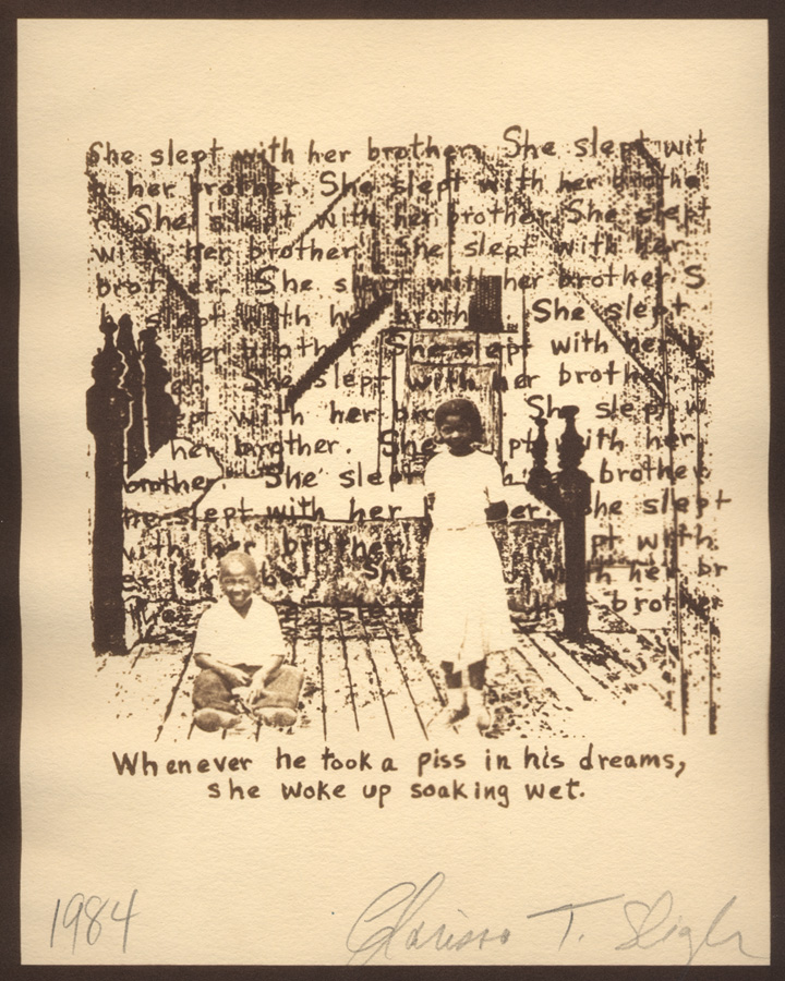
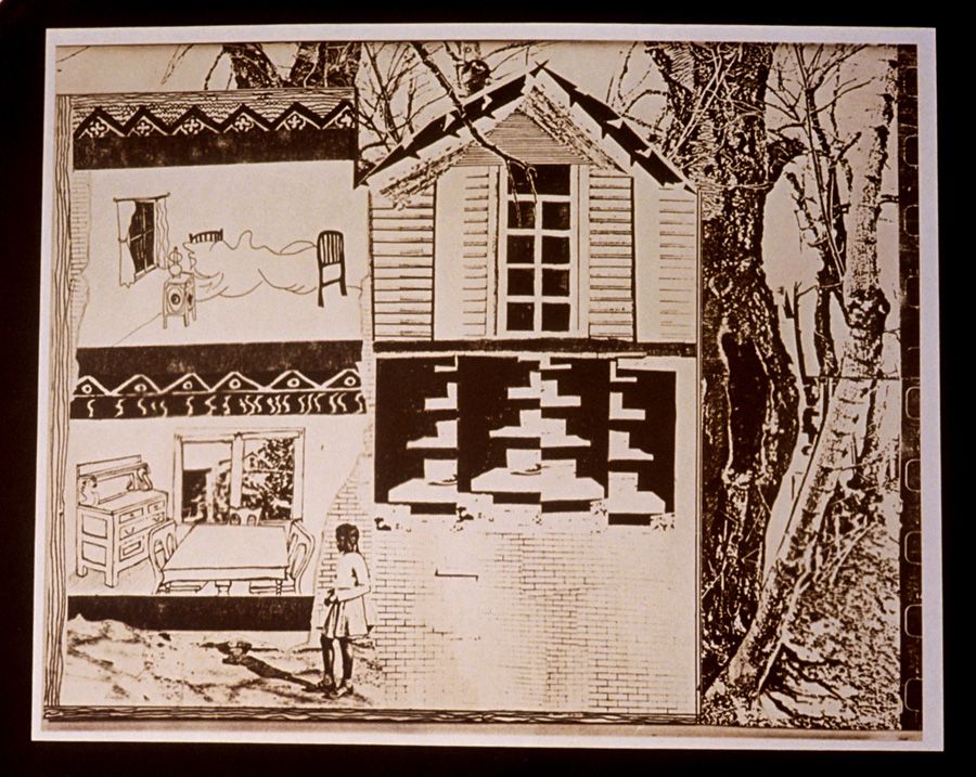
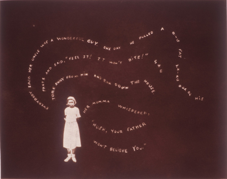
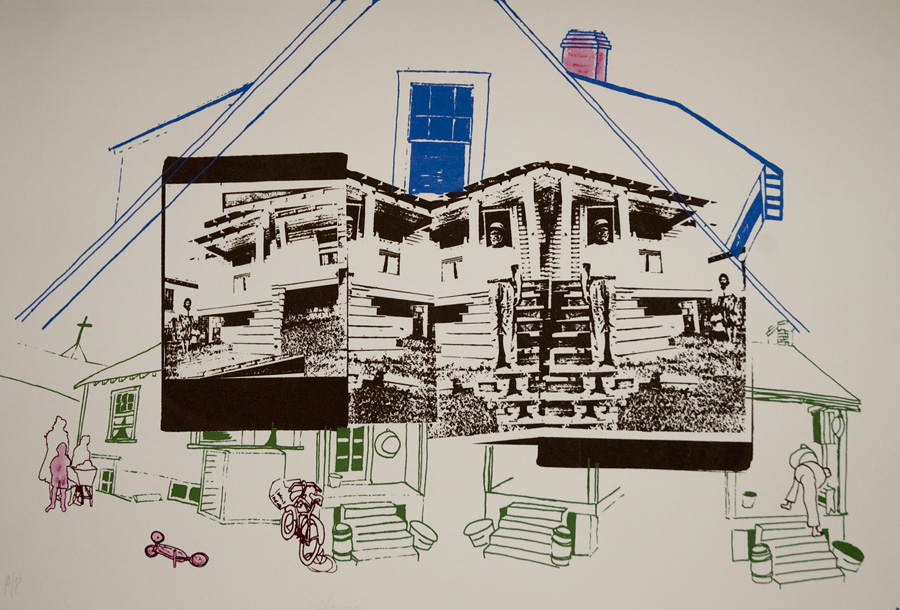
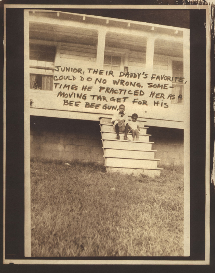
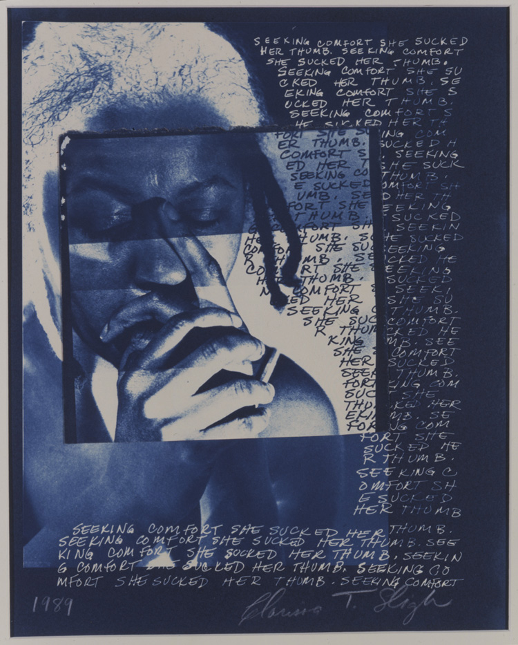
Clarissa Sligh, born in 1939, is an American artist and woman of colour who is best known for her work that comments on various social issues that relate to her own identity. Sligh creates her pieces through different mediums, including photography, collage and drawings. Sligh’s love for photography started at a young age, asking for a camera for her 12th birthday. However, Sligh only started to pursue this as a career path after quitting her job at NASA and working two part time jobs whilst taking painting classes at Howard University, after vowing to “find a richer life, with art making a part of it.”. It was here she claims she first started to see herself as an artist. Sligh’s series ‘Reframing the Past’, shown below, displays Sligh’s old family photographs and combines them with other images, drawings or text in a collage like manner. Here she re-reads and re-evaluates her family’s photo albums.

Analysis

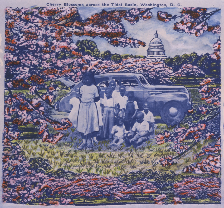
3_Cherry Blossoms_1984_3x2.5
Clarissa Sligh – Reframing the Past

This collage image created by Clarissa Sligh showcases an old photograph of Sligh’s family standing in front of what is most likely their family car, placed in a setting of blossoming nature in front of what appears to be the USA’s capitol building. This image seems to be composed of cut outs of images and drawings, which could be from a post card, however the portrait in the centre looks as if it has been blended into the illustrated background, meaning that Sligh may have uses a tool such as Photoshop to artificially layer these images. The black and white tone of Sligh’s family portrait strongly contrasts with the vibrance of the surrounding artificial setting. Here the branches of the cut out trees frame the central portrait, encircling it. These branches act as leading lines in this composition, drawing the viewer’s eye around the edges of the piece and into the centre photograph, which acts as the focal point of the image, as well as into the background towards the capitol building. There is little amounts of empty space in this piece, with the exceptions being the sky surrounding the capitol building and the illustrated grass in front of the portrait.

From at technical viewpoint, it can be said that from looking at the central image, natural light was used to take this photograph, as it is taken outside in an informal manner. This appears to have been taken at midday, due to the shadows being directly below the car and the children. As a result of the children in the image it is likely that a fast shutter speed was used to take this photography, as the younger children appear to still be in movement but are not blurry. In addition, the aperture used seems to have been small to mid setting, as the photograph is taken from further back, allowing to capture all the children, and the car behind them appears to have the same amount of focus placed on it. However as the remaining background has been cut out, it is hard to say this for definite. The ISO setting here was also most likely low, due to the large amounts of natural light entering the lens.

This piece of work is part of Sligh’s series ‘Reframing the Past’ which she stated was an attempt to re-evaluate and re-investigate her family photo album. She did this after realising that her early family album project was a produced through the lens of a stereotypical white American family, meaning that with this project her aim was to create a record of positive images of her black family. With this information, it could be argued that this image was an attempt to place her family in an idealistic setting in which she wished she was surrounded by in her youth. With this the capitol building in the background could represent the traditional American family values she feels she was deprived of. This may be a comment on racial injustice and how black people in The USA were forced to conform to colonialist views that white people were more civilised. This in turn forced many black people to have to surrender their cultural identities and backgrounds to these Eurocentric ones that they had been forced into. Alternatively, Sligh may also be trying to communicate how it actually felt to grow up in her family, surrounded by life and vibrance, which the original photograph may not fully indicate.

Statement of Intent & mood Board

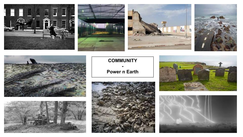
For this project I have decided to explore the idea of earth and power and the way in which the environment has a powerful and strong impact on the earth. Additionally this will create a clear comparison between different communities which have impacts on the environment. Furthermore another idea in which I wish to explore is how different peoples power represents there personal self in multiple ways. I have chosen this topic as I feel that the different impact it has on people is very different as the impact the earth and power has on people is very different. This may be due to people being power hungry as well as the power hierarchy. So overall I’m going to explore the way the environment reflects power.


Power is often defined only in negative terms, and as a form of domination, but it can also be a positive force for individual and collective capacity to act for change. The most commonly recognized form of power, ‘power over’, has many negative associations for people, such as repression, force, coercion, discrimination, corruption, and abuse. Power is seen as a win-lose kind of relationship. Having power involves taking it from someone else, and then, using it to dominate and prevent others from gaining it.


HISTORY > The Origins of Photography

Camera Obscura

Photography began in the late 1830s in France. This started off with the camera obscura in the year 1021. A camera obscura is a darkened room with a small hole or lens at one side through which an image is projected onto a wall or table opposite the hole.

1: An illustration of the pinhole camera model. (a) The camera obscura,...  | Download Scientific Diagram
An Illustration of the pinhole camera model, camera obscura…

Nicephore Niepce

Nicephore Niepce, a French inventor who was the first to make a permanent photographic image. To make the heliograph, Niépce dissolved light-sensitive bitumen in oil of lavender and added a thin coating over a polished pewter plate. He put the plate into a camera obscura and positioned it near a window.

Joseph Nicephor Niepce: The First Photographer
1793, The First Photograph

Louis Daguerre

In 1839, Louis Daguerre, the inventor of the daguerreotypes, are a highly detailed photographic image on a polished copper plate coated with silver. It was introduced in 1839 and became the first popular photographic medium.

Boulevard du Temple " , Louis Daguerre (1838). | Download Scientific Diagram
” Boulevard du Temple ” , Louis Daguerre (1838)

Daguerreotype

The daguerreotype was the first commercially successful photographic process (1839-1860) in the history of photography. Named after the inventor, Louis Jacques Mandé Daguerre, each daguerreotype is a unique image on a silvered copper plate.

The Daguerreotype Camera (1839) - FOTOVOYAGE
A daguerreotype camera, 1839…

Henry Fox Talbot

Henry Fox Talbot was best known for his development of the calotype, an early photographic process that was an improvement over the daguerreotype of the French inventor Louis Daguerre.

Calotype Camera | Science Museum Group Collection
Calotype camera with lens by Chevalier and double dark slide, c. 1843.

Richard Maddox

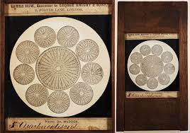
Richard Maddox was an English photographer and physician who invented lightweight gelatin negative plates for photography in 1871. He invented the dry plate, also known as gelatin process, is an improved type of photographic plate. It was invented by Dr. Richard L. Maddox in 1871, and had become so widely adopted by 1879 that the first dry plate factory had been established.

Richard L. Maddox
 A lantern slide of a photomicrograph by R.L. Maddox, 1860

George Eastman

George Eastman (1854-1932) changed the world through his spirit, bold leadership, and extraordinary vision. He will be remembered throughout history for founding the Eastman Kodak Company and revolutionizing the photography, film, and motion picture industries. He was an American entrepreneur and inventor whose introduction of the first Kodak camera helped to promote amateur photography on a large scale.

Eastman Kodak Stock Hits Multi-Year Highs: Is it Still a Buy? KODK –  PennyStocks.News

In 1888, The Eastman Kodak Company was founded and now is an American public company that produces various products related to its historic basis in analogue photography. The company is headquartered in Rochester, New York, and is incorporated in New Jersey.

A Brief History of Photography and the Camera

statement of intent

My aim is to explore the question that I have about people’s identity ; How do you present who you are? I wish to dive into the expressive forms of tattooing, the permanence of a part of who you are. Over the year, I have had the continuous stream of questions like ‘Why would you do that to your body?’ , ‘You know that’s permanent right?’ and ‘I could never do that to myself?’. There has always been a stigma around people with tattoos which upsets me as it can be a beautiful artform to express your identity.

In this project I will document my friends’ and families’ tattoos and pair the photos with what they mean to them, either a handwritten note from them or an object/photo that ties in with the meaning behind. I’m exited to do more research into this subject matter, including the history and culture values which i can add to my final piece if appropriate.

I will present my final photos as a photobook as I preferer working with still images, not only that but as the images are still and physical, it gives the viewer more time to absorb the essence of what tattooing can achieve.

CONTEXTUAL STUDIES 1 – practice

The artist I have chose to study is William Klein and looking at his interview with David Campany, from his book ‘So present, so invisible‘.

my chosen quotes from his interview that I thought were interesting;

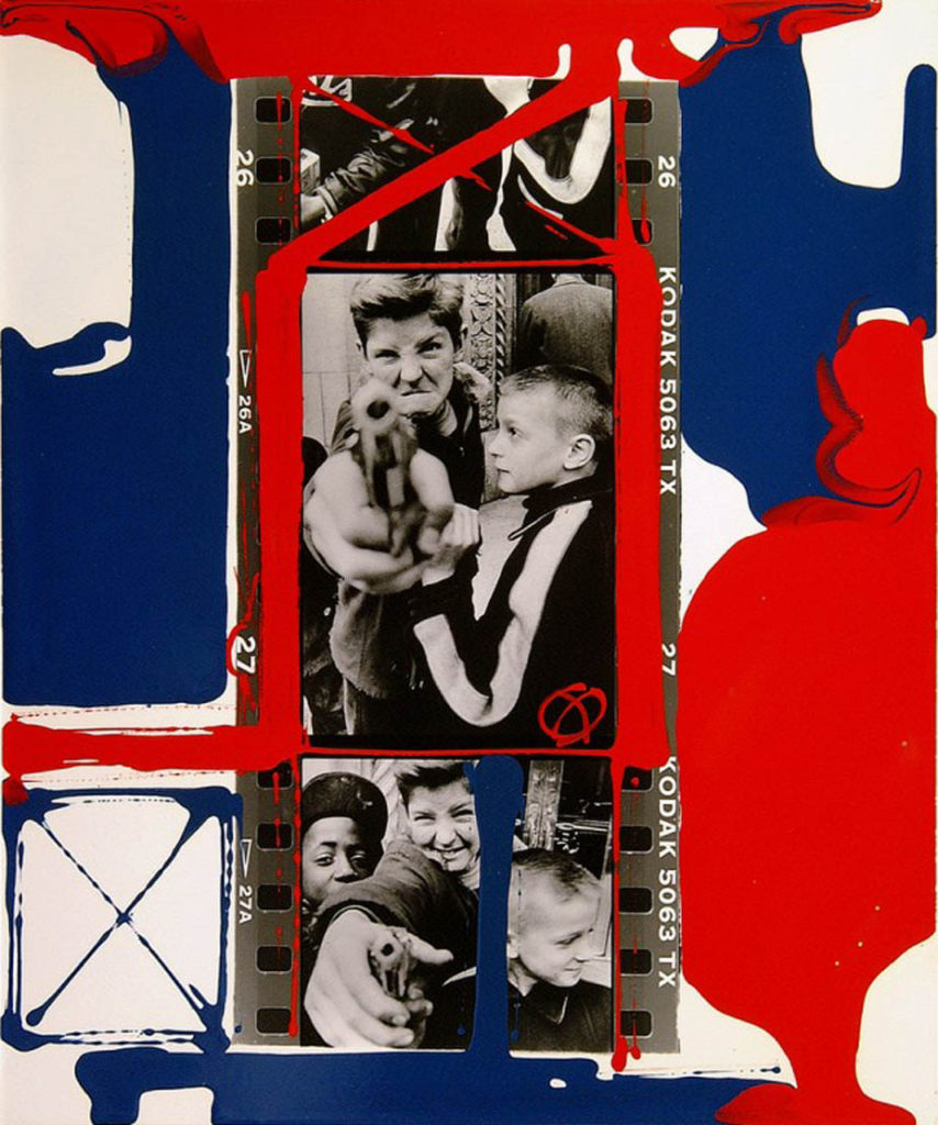
in the interview William didn’t talk about the image I have chosen but I think they were interesting as they fit into his work as he has previously photographed children during a war as well as many photographs of famous models or individuals for when he worked for Vogue.

“we didn’t know too much about the war in Vietnam, it was horrible”

“when i was in the army i won the war”

” i had one camera and two lenses”

  1. TECHNICAL, VISUAL, CONTEXTUAL, CONCEPTUAL 

Technical- the lighting in Williams photograph of the two boys is natural and taken in daylight, as you cant see any set up lighting or flash to capture the picture. He used a nice level of control to show the contrast between the dark and light areas in his photo, as you can see some very dark, basically black tones (like their clothes) and then very light grey-white tones mostly seen in the background and the two main boy’s skin. Their positioned in the centre of the image to make them the main focus on the image and very little background activity which makes the viewer directly aware of the boys and the gun one is holding as the gun is positioned right in the middle and in front of the two boys which makes it stand out. I would say the image is slightly over exposed as it has such a sharp tonal range which makes the image appear sad as it’s in black and white and gives it quite a gloomy/sad atmosphere. The shutter speed must have been quite high as the image isn’t blurry which quickly captured the image. Using his quote and what he said “i had one camera and two lenses” shows that even with such little camera equipment he still captured a powerful image to try tell a story of two boys during a war, as he has a lot of experience being in one.

Visual- This image isnt taken in colour, it’s in black and white which fits the atmosphere of the image a lot and makes it more dull as it was taken during a horrible event, therefore using colour most likely wouldnt be appropriate. It has a range of light and dark tones to create a nice sharp contrast and as its a photo telling a story there isnt any texture, lines or shapes to it as its a portrait photo.

Contextual- I think this image adds a lot of value in Williams work, as he himself was involved in a war which he mentioned in his interview and he said “we didn’t know too much about the war in Vietnam, it was horrible”. This explains why he probably wanted to photograph two little boys during one , holding a gun which can make the viewer slightly uncomfortable to look at as it’s not everyday you see a young child holding such a violent object. It contrasts between an innocent human and a violent object which makes you question why he’s holding one. In some way maybe William wanted to show his young self through taking this image as he spent such a huge time of his life at war.

Conceptual- I think William wanted to show his experience at war , “when i was in the army i won the war”, through photographing two innocent boys holding a gun, which shows that during these horrible times even children got influenced , and in the image you can see the boy smiling and laughing when holding the gun as he probably doesn’t know the harm it can cause or what the true intentions of a war is. This creates this really strong contrast between the two things as you don’t see children just casually holding guns. It can also show that these boys look up to men, like William at war as they’re fighting for them and they’re just trying to be like them. However during this war, that might have been the last image took of the boys before the war begun , which William maybe wanted to do.

personal study- statement of intent

What you want to explore?

For my personal study , I want to focus on portrait photography, as in year 12 it was my favourite part of photography. I really enjoyed having a set up and how professional the images looked with the lighting. I think portraits are a very strong way of presenting ideas as you can interpret them in any way and when it comes to editing them you can basically transform them in any way. I think by doing portraits it will present the theme of identity perfectly. For my personal study, I want to focus on capturing different emotions and feelings through portrait photography and look into how mental health can be presented and shown through photography. I think it plays a massive part in the theme of identity, as it’s a personal aspect to everyone, and everyone goes through different emotions.

Why it matters to you?

It matters to me as I think mental health is a really important and key factor through my teenage years. I want to try present it through taking portrait photographs.


How you wish to develop your project?

By taking portrait images, and editing them afterwards to show different emotions.
When and where you intend to begin your study?

I will use the studio to take all my images as it’s a professional set up and get it started as soon as I have free time in school and get a model to photograph for this project.

My chosen theme is identity, as I think mental health can identify an individual massively as it’s a very personal matter. The final outcome I want to have and achieve by the end of this project is a photobook. The artists I am going to take inspiration from are Gabriel Isak and Edward Honaker. They both focus on photographing mental health through different ways. Gabriel includes loads of blue tones in his images, and takes them out in an open environment as well as mainly capturing the silhouette of the individual instead of a clear face shot. Whereas Edward focuses more on his editing and blurs the faces out using different techniques which shows he focuses more on editing his images rather than taking them in a certain way. I think by using both of them it will give me a nice overview of both sides to this project

Personal Investigation – Reviewing and Reflecting

1. Describe which themes, medium (photography, film), approaches (documentary, tableaux, conceptual), artists (incl contextual references to art history, movements and isms) and photographic skills, processes, techniques and methods (incl learning new software) inspired you the most and why.

2. Include examples of both previous and current experiments and imagery to illustrate your thinking.

3. Produce a new mind-map and mood-board based around how you interpret one/ or both theme(s) of IDENTITY & COMMUNITY using new artists inspirations and visual references etc. Reflect on the Island Identity project and also consider themes more broadly (see below)

Inspirations throughout the course;

During the photography course, in both year 12 and 13, we have learnt a considerable amount of photographic techniques around portraiture, landscapes and abstract images. My favourite medium to use is taking still shots on a camera, although I have enjoyed learning about film making and taking moving shots I believe my skills lie more in the world of static photography. I believe I do well in portraying a certain storyline or narrative with my images, it is something I wish to continue in my personal investigation – I was very inspired by the work I created in response to photographer David Hilliard during my Identity and Place project. I enjoy the way he captures naturalism in his images, they connote a sense of normality and honesty that I really loved recreating. I have taken lots of inspiration from the documentary technique of photography, I believe it allows the observer to understand the subject more within their storyline. I really enjoy using natural lighting in my images, I have used it during the course a lot more than artificial lighting and am therefore more confident photographing with it.

More on how Hilliard inspired me.

My Response to Hilliard

Additionally, I was inspired by our year 12 abstract photography project, specifically studying repetition, pattern and rhythm. The photographer Ernst Haas was one I really enjoyed looking at, I enjoyed his use of repeating lines and shapes to create movement and rhythm in his images. I gained inspiration from the abstract unit as I loved experimenting with how different shapes and patterns could represent meaning and themes – I want to continue learning about how I can manipulate an image in terms of geometric aestheticism, using symmetry and repetition to connote ideas of memories being re-lived. I also really enjoyed studying Saul Leiter during the abstract unit, his use of colour and distorted aperture settings were really interesting to experiment with. I found inspiration with how Leiter captured windows and reflections in his images, I like how the abstract elements are still recognisable as everyday sights and objects – a sense of normality is something I really hope to experiment with further in the course. Additionally, I was influenced strongly by colour during my Saul Leiter study, I wanted to exaggerate the bold colours I captured to create an expression of freedom and non-naturalism. Previously in the course I focused on black and white photography, however during this project I enjoyed working with colour and emphasising different emotions through tones and hues.

During the photography course I have enjoyed learning about different software, such as Adobe Photoshop, Lightroom, Premier Pro and InDesign. Creating a Zine during the course has inspired me to produce a photobook for my final assessment. I believe having a physical copy of my work, where I can layout sequences of images with narratives and meaning, allows me to better use my imagination. I have been influenced throughout the course by several different artists, photographers and creative individuals that demonstrate ideas through different mediums – I look forward to experimenting further with the compositional elements of photography in this Identity project. The three areas of study that I have mentioned and shown evidence of above have been my most enjoyable parts of the course – I have been inspired by creating meaning and speaking out on prominent topics during year 12 and 13, this is something I wish to continue working on during my new project.