statement of intent – personal study

Throughout my personal study, I aim to explore how the fashion industry impacts our social identity. I have always been interested in fashion, even from a young age. Fashion does outline, express, and shape our identity. Fashion and clothing are both there as a fundamental tool in which people construct themselves. Sometimes we all want to construct a new identity using fashion, the way we dress is like communicating without words.

An important issue within the fashion world is that most people shy away from statement pieces, or even clothing items that are a little out of their comfort zone as they are afraid of judgement, whether we like it or not, people will judge us by our appearance. The global editor of vogue claims it is important that you are happy in what you wear and to do it for yourself instead of others. However, some people are the opposite. When it comes to the people who aren’t totally sure who they are inside and don’t have the words to explain it, fashion can be one of the best ways of expressing who you are, with one simple glance from a stranger you begin to show a glimpse of your identity.

To develop my project, I will research famous Vogue fashion photographers and create shoots that are similar to their work. The artists I aim to explore in detail and become inspired by are Guy Bourdin and Irving Penn. Bourdin is known to have widely changed the face of fashion photography forever and Irving Penn has been known to alter our perception of beauty. Within my personal study I will also explore Anna Wintour, the Global Editorial Director of Vogue, her use of the magazine shaped the fashion industry and she is known to have changed how the world gets dressed.

My final outcome of this project will be produced in a photobook.

FASHION

VOGUE Photographers

Charles Jourdan & Guy Bourdin

Between 1967 and 1981, Bourdin produced some of his most memorable work under the employment of shoe designer Charles Jourdan, who essentially became his patron. His work for Jourdan employed anthropomorphic compositions, suggestive narratives and explored the realms between the absurd and the sublime. His surreal aesthetics were delivered with sharp humor and were always eagerly anticipated by the media.

Widely considered to have changed the face of fashion photography forever, French photographer Guy Bourdin’s innovative voice and visionary work is no longer seen solely in the context of commercial photography but is well esteemed in the annals of contemporary fine art.

Guy Bourdin created impossible images long before photoshop, Some of Bourdin’s best-known pictures feature mannequin legs sawn off just below the knee. Those legs, says O’Neill, were “so brilliantly placed you can almost see the whole woman – the sense of her was so strong”. Usually the images were created by Bourdin drilling the mannequin’s feet through the ground then positioning them.

He was meticulous in planning his photographs, sketching out the composition and scouting locations in advance, and yet “he made it look so effortless. Today photographers can very easily make a model fly but when they do it it doesn’t have the same charge or aura.”

“An artist whose distinct style is instantly recognizable, Guy Bourdin’s use of color, frame and form is highly unique and utterly surprising.”
─── Torres, R. (January 4, 2021). Guy Bourdin, Independent Photographer.

As such, their work greatly compliments each other, both shooting contorted female bodies, scenarios tinged with a surrealist element, and employing the use of props, harsh lighting, bright colours, and pure melodrama. Bourdin continued to work for Vogue until 1987.

“I have never perceived myself as responsible for my images.
They are just accidents. I am not a director, merely an agent of chance”
—– Bourdin, G. (1981) Guy Bourdin, The Independent Photographer.

Horst P

Horst P. Horst (1906-99) created images that transcend fashion and time. He was a master of light, composition and atmospheric illusion, who conjured a world of sensual sophistication. In an extraordinary sixty-year career, his photographs graced the pages of Vogue and House and Garden under the one-word photographic byline ‘Horst’. He ranks alongside Irving Penn and Richard Avedon as one of the pre-eminent fashion and portrait photographers of the 20th century. His extraordinary range of work outside the photographic studio conveys a relentless visual curiosity and life-long desire for new challenges.

The 1930s ushered in huge technical advancements in colour photography. Horst adapted quickly to a new visual vocabulary, creating some of Vogue’s most dazzling colour images. Horst’s colour photographs are rarely exhibited because few vintage prints exist. Colour capture took place on a transparency which could be reproduced on the magazine page without the need to create a photographic print. 

Annie Leibovitz

Over the last 50 years, Annie Leibovitz’ eye has helped direct, guide and capture the fashion industry’s greatest talents. Leibovitz has been described as an Artist Who Changed Fashion Photography Forever. She is an American portrait photographer best known for her engaging portraits, particularly of celebrities, which often feature subjects in intimate settings and poses.

In 1999, Vogue sent Annie to Paris to cover the couture collections for the first time and surprised her by casting Sean Combs alongside Kate Moss. The shoot was a cross-cultural straddling of two worlds: rap culture and high fashion.

Across more than 340 photographs, 90 of which have not been seen since their original magazine publication, Leibovitz’ fashion photography for publications such as Rolling Stone, Vogue and Vanity Fair is collated: including Sarah Jessica Parker in front of a mountain of pillows, Natalia Vodianova as Alice and Marc Jacobs as the Caterpillar, and Andrew Garfield, Lily Cole and Lady Gaga as Hansel, Gretel and the Wicked Witch.

Wonderland

“Looking back at my work, I see that fashion has always been there,” says Leibovitz in the preface to Wonderland. “Fashion plays a part in the scheme of everything, but photography always comes first for me. The photograph is the most important part. And photography is so big that it can encompass journalism, portraiture, reportage, family photographs, fashion… My work for Vogue fuelled the fire for a kind of photography that I might not otherwise have explored.”

“This is the way it is in photography. Most celebrities are forgotten but fashion lasts.” —– Danziger, J. (2006) The New York Times

Statement of intent

Mind Map

This image has an empty alt attribute; its file name is Screenshot-2021-11-28-at-11.50.18-1024x549.png

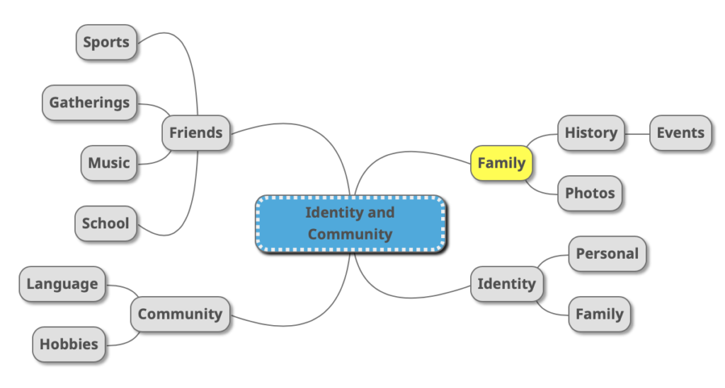
I created a new mind map shown above. I mentioned points about friends, community identity and family. I highlighted family as I believe that is the route I would like to go down for my personal project.

This image has an empty alt attribute; its file name is image-164-1024x714.png

Statement Of Intent

What do you want to explore?

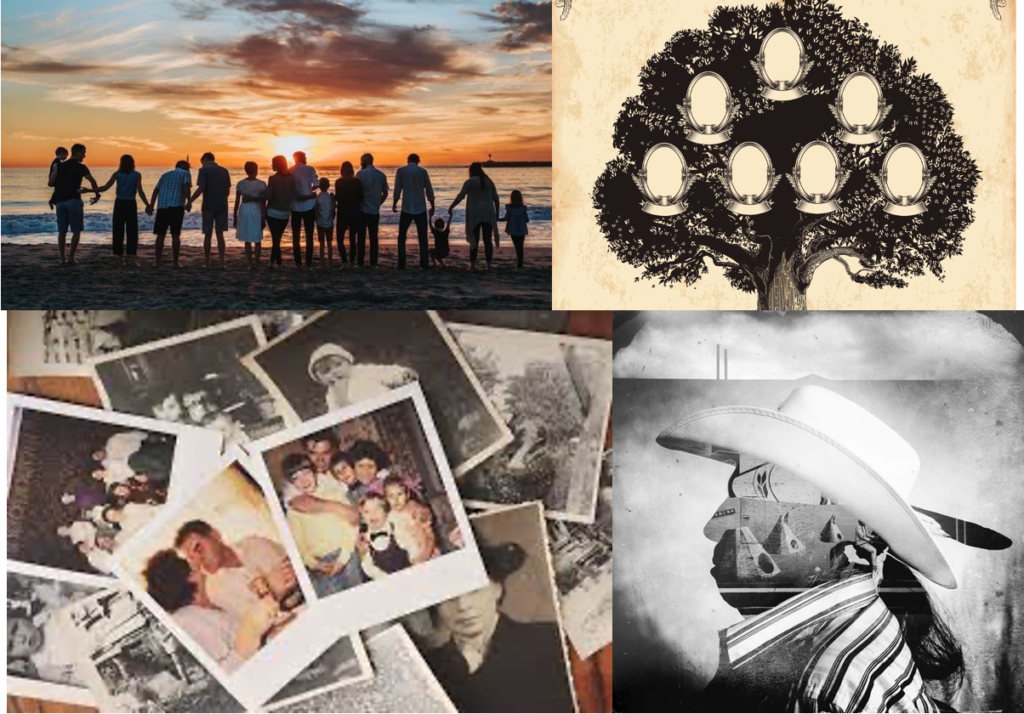
I want to explore the idea of identity being a combination of your personality and the history of your family that came before you. I want to go into the idea of influence from different places/ people and how it defines who you are. I want to look into my personal family history and who I actually am as I think bringing myself closer with my history will give me a better understanding of the person that I am.

Why it matters to me?

This matters to me because I love history generally so looking into my family history is of great interest to me so that I can find out what kind of lives my close and distant relatives lived. It would be interesting to find out what parts of the world they come from and the struggles they may have experienced and overcome.

How do you wish to develop your project?

I want to use some of my favourite photography techniques with my project including photomontage, black and white photography, candid/ portrait and landscape photography. I will also make the photos vintage looking so they fit with the idea of family history and look as if my photo-book is an old family photo journal.

Two photographers I want to look at are Daniella Zalcman and Patrick Zachmann. They both look at the idea of family identity in two different ways but their methods are both unique.

Signs of Your Identity
Daniella Zalcman – Signs of your identity
Celebration for the 33rd anniversary of the State of Israel. Paris, 1981 |  Magnum Photos Store
Patrick Zachmann

When and where you intend to begin your study?

I intend to start my project by speaking to my Grandmother who in the past has looked into our family history. I want to take photos of some of the documents/ old photos she has and try and recreate them or photomontage them.

Deconstructing A Photobook

1. Research a photo-book and describe the story it is communicating  with reference to subject-matter, genre and approach to image-making.

“In the stately ways of our shining capital the dwellings of high and low raise their roofs in rivalry as in the beginning… how often does the mansion of one age turn into the cottages of the next.” (Kamo no Chomei)
Tokyo is a visual journey through a city at once futuristic and obsolete, its visionary design worn out – like that of a past era. Johanasson uses photography to index the city, finding form and pragmatic order through accumulation and sequence, revealing the city’s hidden, modular logic: lego-like segments, a basic square unit repeated indefinitely and in various sizes. These images are unpeopled, showing only the architecture of the city, a container of 13 million people, organised around mass movement and the funnelling of human traffic. Between the concrete, glass and steel, the occasional green life sprouts – miniature gardens in the narrow alleyways, or a cluster of flower pots lining the sidewalk. The architecture creates its own topography, and the city is glimpsed as the last outpost of a fading, mechanised world.

https://josefchladek.com/book/gerry_johansson_-_tokyo

2. Who is the photographer? Why did he/she make it? (intentions/ reasons) Who is it for? (audience) How was it received? (any press, reviews, awards, legacy etc.)

Gerry Johansson. a Swedish photographer who lives in Höganäs in southern Sweden. He makes “straight and pragmatic” photographs with “an objective view of a geographic location.”

His books include America, Sweden, Germany, Antartic, Toyko, and American Winter. His work is held in the collection of Moderna Museet in Stockholm, Sweden, where he has had solo exhibitions. He has been awarded the region Skanes kulturpris and the Lars Tunbjork Prize.

Book in hand: how does it feel? Smell, sniff the paper.
The book is a hardback, with smooth paper that is easy to flick through, and it smells like paper.

Paper and ink: use of different paper/ textures/ colour or B&W or both.
Good quality paper, with black and white photos. The cover is a linen, cloth texture.

Format, size and orientation: portraiture/ landscape/ square/ A5, A4, A3 / number of pages.
There is about 50-80 pages of black and white photos. There is one photo per double spread, that is quite big. There are some landscape photos that take up both pages. The orientation is portrait approximately A4 size.

Binding, soft/hard cover. image wrap/dust jacket. perfect binding/saddle stitch/swiss binding/ Japanese stab-binding/ leperello.
It is perfect binding, that is sturdy and firm.

Cover: linen/ card. graphic/ printed image. embossed/ debossed. letterpress/ silkscreen/hot-stamping.
The front cover has a image printed on the front with linen as the border, on the back there is a shiny imprinted text on blue linen.

Title: literal or poetic / relevant or intriguing.
Literal: Tokyo (about Tokyo, title on the back of the book)

Narrative: what is the story/ subject-matter. How is it told?
Images of the city and its architecture, not a clear connection to a story. The black and photos showcase Tokyo using minimalism, shapes, and texture.

Structure and architecture: how design/ repeating motifs/ or specific features develops a concept or construct a narrative.
Every image is based off buildings, or close ups of walls that include interesting shapes. Images may juxtapose each other using different compositions.

Design and layout: image size on pages/ single page, double-spread/ images/ grid, fold- outs/ inserts.
Its either 1 image per page with a thick white border, or 1 image on a double spread that takes up about 3/4 of he space. There or there is a combination of both, a full page image with a white page with a small caption on.

Editing and sequencing: selection of images/ juxtaposition of photographs/ editing process.
There is only juxtaposition in how the image in presented, e.g. zoomed in that draws attention to its details.

Images and text: are they linked? Introduction/ essay/ statement by artists or others.  Use of captions (if any.)
There is no essay or text, there are only captions. For example, 044 Odabia. Most commonly there is one small caption on a small page, or several (3-6) captions in the corner of the blank page.