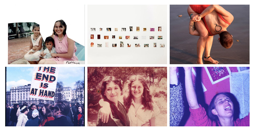
Identity and Community – Artist References

Percival Dunham

Overview –

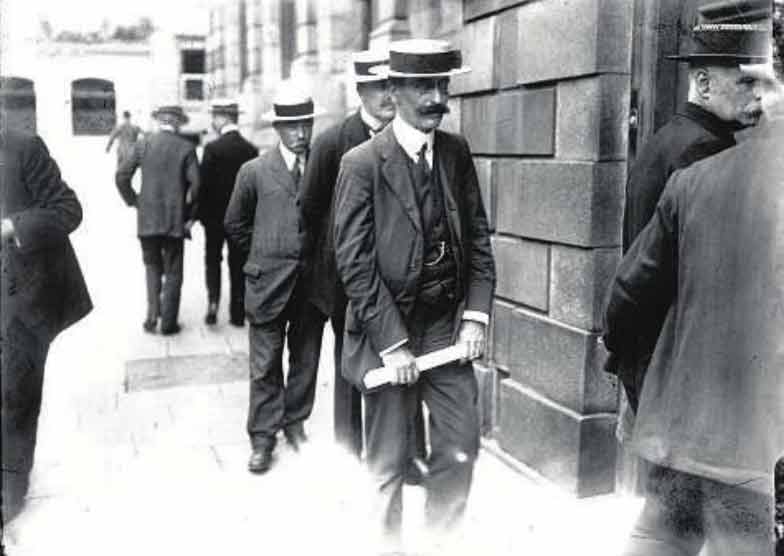
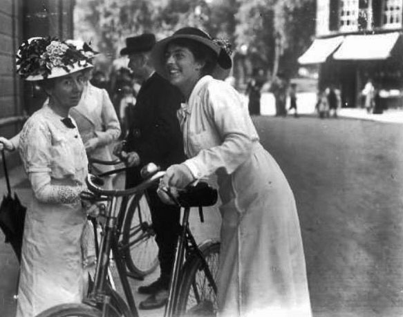
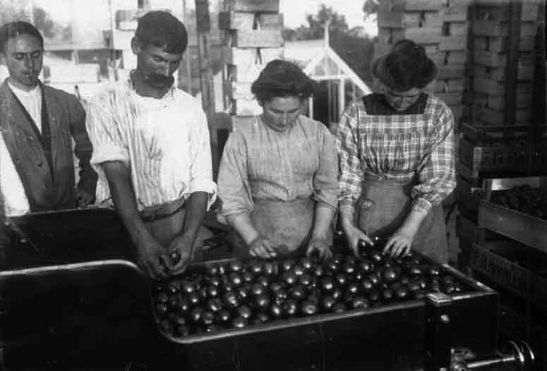
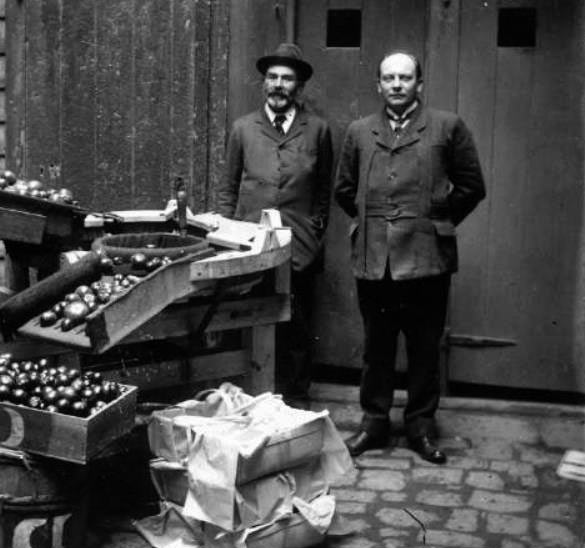
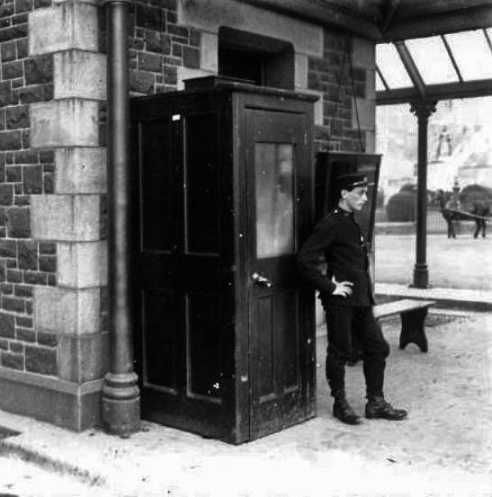
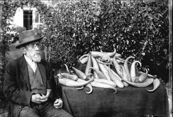
Percival Dunham worked for Jersey Illustrated Weekly and The Morning News for a brief period in 1913 and 1914 – he is known as Jersey’s very first photojournalist. Dunham had been in business as a photographer at 57 Bath Street since 1911, and had already been taking photographs of the Jersey Battle of Flowers and events such as the grounding of the Roebuck in St Brelade’s Bay in 1911. Dunham found great success while with the Illustrated Weekly and Morning News, as they were the pioneers of photojournalism, allowing Dunham to capture candid shots of the streets of Jersey in a new and upcoming style of photography. Percival Dunham presents a remarkable picture of life in Jersey before and just after the outbreak of World War One which, although it had nowhere near as dramatic impact on the island as the second global conflict which would follow 25 years later, nevertheless marked the end of an era in Jersey. More of Dunham’s images can be found here (search Dunham under ‘photographers’). His work was ahead of its time, as the term ‘photojournalist’ hadn’t even been coined yet – the images he captured relate to the modern term ‘street photography’ and show the public living their everyday lives, uninterrupted or disturbed by the camera, demonstrating sincerity in each scene.

Moodboard Of Images

George Georgiou

Overview –

George Georgiou (1961 -) is a British photographer and Photo Journalist who studied photography at The University of Westminster. After working for six years in Serbia, Greece and eastern Europe, he was recently based for four years in Istanbul. His work in Turkey led to a series of photographs titled ‘Fault Lines/Turkey/East/West’, which has led to several exhibitions and a book. Georgiou has also taught photography at Barnet College in London and a number of workshops in Europe. Georgiou’s work mostly focuses on communities of people that are split up between different cultures. An article on Georgiou’s career wrote ‘Arriving somewhere new, Georgiou’s approach is first to unburden himself of pre-existing images of the place and to try to see through superficial differences with places he knows; he then looks for commonalities and actual differences. He starts by himself and only when well underway hopes to attract commissions and make sales.’

Last Stop –

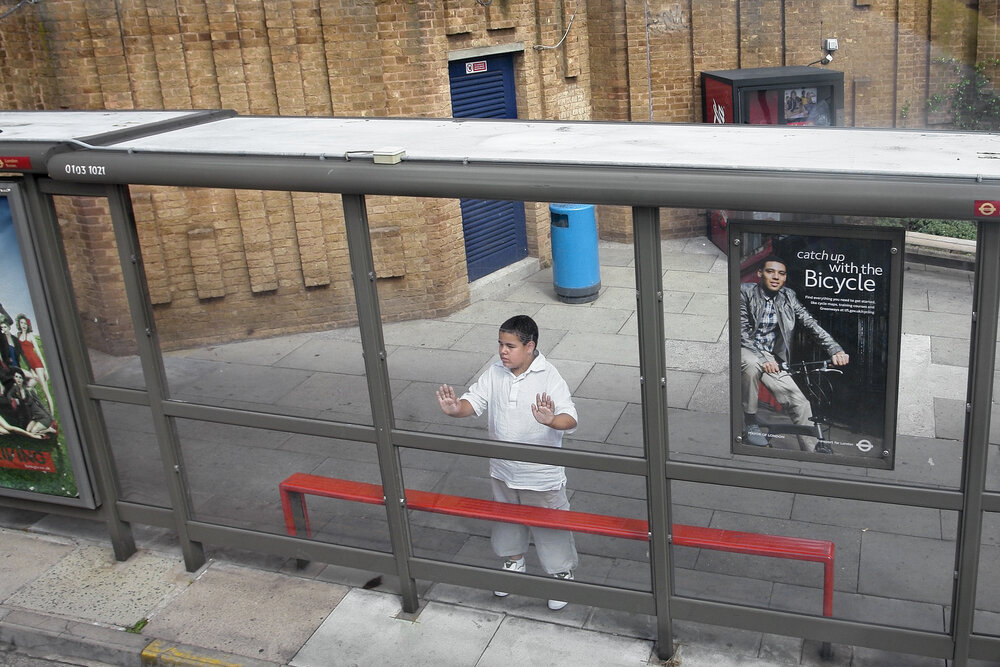
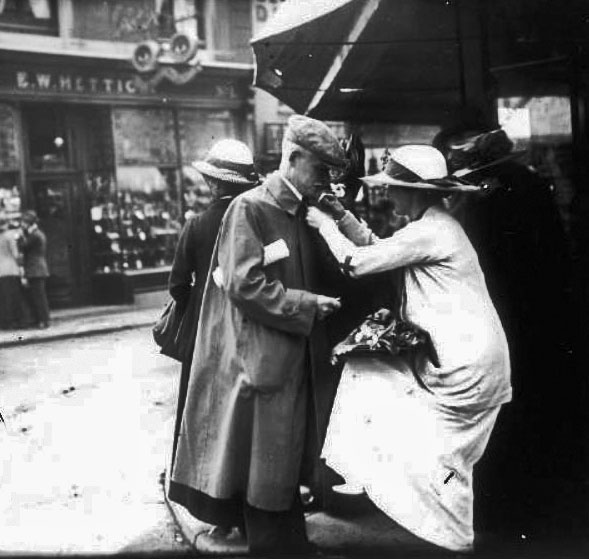
‘Last Stop’ is a series of images shot through the windows of London’s double decker buses, published as a double sided concertina book by George Georgiou in 2015. Georgiou wrote ‘The essence of Last Stop is that you might take the same route everyday but what you see, the ebb and flow on the street takes on a random nature, like a series of fleeting mini soap operas. The concertina book format reflects and mimics the flow of a bus journey, but more importantly it gives the viewer the opportunity to create their own journeys by spreading the book out and combining different images together. This moves the book away from an author-led linear narrative to one of multiple possibilities.’ Georgiou would ‘take random buses and get lost across the city’ in hopes of capturing street photography images and candid portraits from the windows of people living their everyday lives, allowing the observer to make up their story and scenario. In a video on the creation of ‘Last Stop’, Georgiou said ‘as a photographer I wanted the challenge of not having full control, taking whatever free seat there was next to the window only being able to photograph what was in reach of my static position in front of me’. I really love how he can still capture these moments without truly being involved in them, only seeing them at a glance, but portraying an entirety of different stories. When researching for my street photography photoshoot on ‘identity and community’ I wanted to take inspiration from Georgiou’s presentation of images, capturing ambiguity and mystery along with familiarity and warmth. Several of ‘Last Stop’s’ images were featured in the book Unseen London, more info can be found here.

Moodboard Of Images

Analysis – Dunham

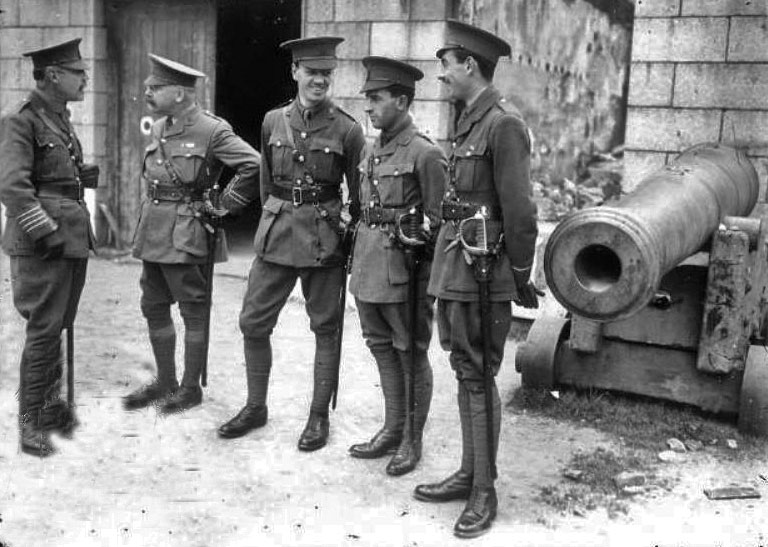
Percival Dunham | Soldiers at Town Arsenal | 1914

I made the decision to analyse this image by Percival Dunham due to it’s wide range of techniques used from ‘The Formal Elements’, yet also its ability to foreshadow and story tell. The black and white filter on the photograph shows the time period it was taken, pre-World War 1 when Dunham’s images first caught the public’s eye. From this era, we can make an assumption to which camera was used at the time; possibly the Moy & Bastie cine camera, made of wood and metal, which was the type used by British Official cinematographers working with the armed forces during the First World War. The geometric shapes on the wall behind the soldiers show defined and consistent rectangles, possibly reflecting the systematic job and duties that these men carry out. The repetition of these symmetrical shapes could link to the soldiers having to repeat the same tasks daily on the battlefield, symbolizing the methodical planning and strictness of their life. Additionally, the uniformity of straight lines created by these rectangles relates to the respect a soldier gains from his uniform.

Dunham had the ability to capture such raw moments in time, parts of history that would otherwise be imagined instead of seen. During an exhibition on Dunham’s photography at The Jersey Arts Centre in 2014 Gareth Syvret, from the Societe Jersiase, said “he really had a natural affinity for what is later called ‘the decisive moment’ in all the photographs you see around here, there are figures; he was clearly interested in the social life of the town of St Helier and Jersey and its a really powerful documentary he’s left us.” I really enjoyed this quote from Syvret as I believe it sums up Dunham’s work perfectly, with such monumental history as WWI as his setting and still creating such intimate and warm images is inspiring.

The lighting in this photograph tells such a tragic and true story, with the darkest point of the image in the background through a door behind the men- leading to a sort-of abyss of darkness and mystery. Contrastingly, the lightest point falls on the floor where the soldiers stand, creating the impression of these men starting their journey with peace and security; however lurking in the background is a foreshadowing darkness reflecting the horrors of war to come in their future. Similarly, there is a leading line created from the outline of the canon to the right of the soldiers, drawing the observers focus again to the background of the image. Here we can see a juxtaposition between the consistent pattern of ordered bricks, to the damaged building and rubble to it’s left, further in the distance. This, along with the brooding darkness behind the men, suggests Dunham wanted to capture a composition with more ambiguity and ruin further back into the image to symbolize and foreshadow how much death and destruction this war would bring.

Analysis – Georgiou

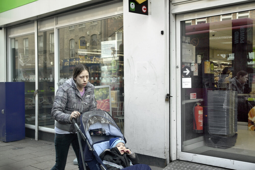
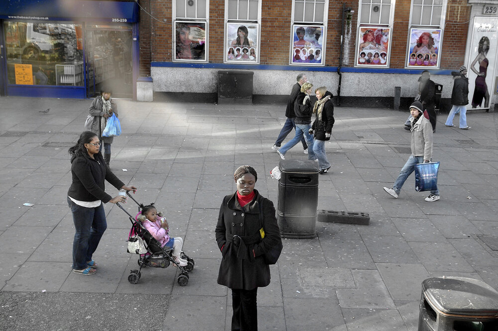
George Georgiou | Last Stop | 2015

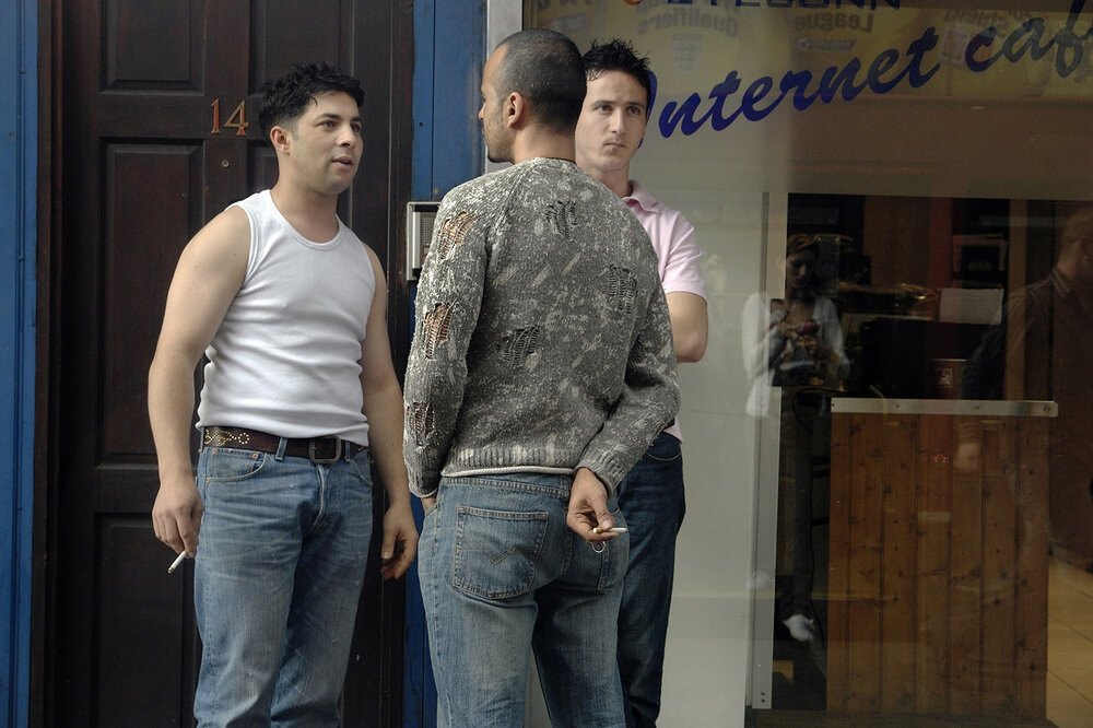
I chose to analyse this image, taken by George Georgiou in 2015, as I really enjoyed how well it told a story, a story that would be different to anyone else who saw the image. From my perspective, considering the formal elements, the reflection of the woman in the shop window on the right of the image represents how this route she walks is one taken daily – possibly taking her son to school, or going to work; the possibilities are limitless. This reflection is like a reflection of time, showing the repetition and never ending cycle she may endure while on this journey. Additionally, there are several geometric shapes in this Georgiou image, in particular the repetition of rectangles in shop windows, signs and tile flooring. The echo of this rectangular shape throughout the photo could represent uniformity and hint towards a homogeneous society where nothing is different or unique. While this series of Georgiou’s images demonstrates ‘that you might take the same route everyday but what you see, the ebb and flow on the street takes on a random nature, like a series of fleeting mini soap operas’ this one image could show a counterargument to this statement or may indicate that while the people and stories may be ever changing, the locations and surroundings witness all and stay the same. Furthermore, the range of colours in this image are limited and dull, with only brief pops of brightness of bold red, yellow, green and blue. With the only source of bright colour coming from these primary shades it reflects the child-like nature of having daily routines and set ways to live each day, as if teaching a child – Georgiou’s image may represent how each day can hold new possibilities and adventures, and that people are allowing dull ideas to overwhelm their (what should be) adventurous life.

In addition, the repetition of blue from the child’s clothing and rectangular structure on the left of the image could represent the feeling of security, as blue symbolizes trust and safety. Georgiou could be pointing out how society feels safe in their own little bubbles, isolating themselves with their own stories secret to the world around them – the child feels safe in his mother’s company, yet the story could be so different for the mother, it is for the observer to decide. A quote from Georgiou says “surveillance in the city is all around us but on the flip side of this is also our sense of invisibility, how we allow ourselves to express very private behaviour in public space, like a family argument. I see the photography as straddling, street photography, surveillance, landscape and documentary fiction.” In terms of light, the natural lighting shows it was probably mid-day as there are little shadows in the image, also hinting the weather was cloudy as there are no major reflections or highlights created by the sun. Lastly, there are many straight lines in the image, for example the straight thin lines of the shopping baskets on the right of the photo – the metallic shine on these lines is modern and mechanic, possibly portraying the idea of mass industrialization and overconsumption (also linking to this image being photographed outside a food shop). In my opinion, Georgiou capturing this repetition of a mundane, everyday object in quite a stylistic way really sums up what I have taken away from this series of images; that while everyday can be draining, similar and sometimes dull, the smallest things can make differences – life doesn’t have to be ‘an author-led linear narrative’ in the words of George Georgiou, it can ‘move to one of multiple possibilities.’

George Georgiou – Book Presentation

Community – Shoot 3

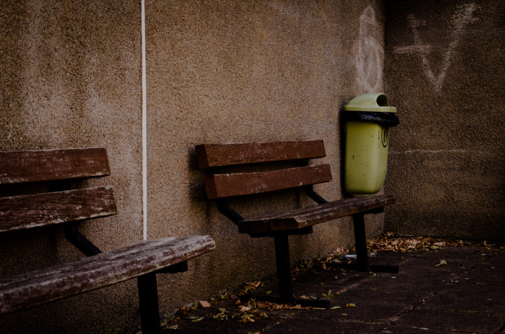
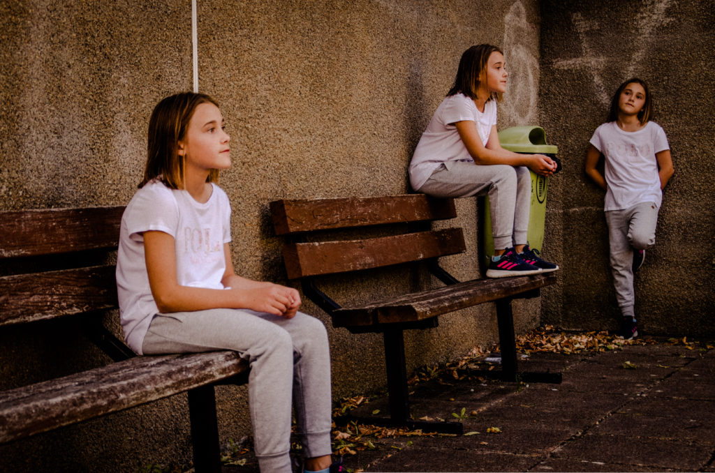
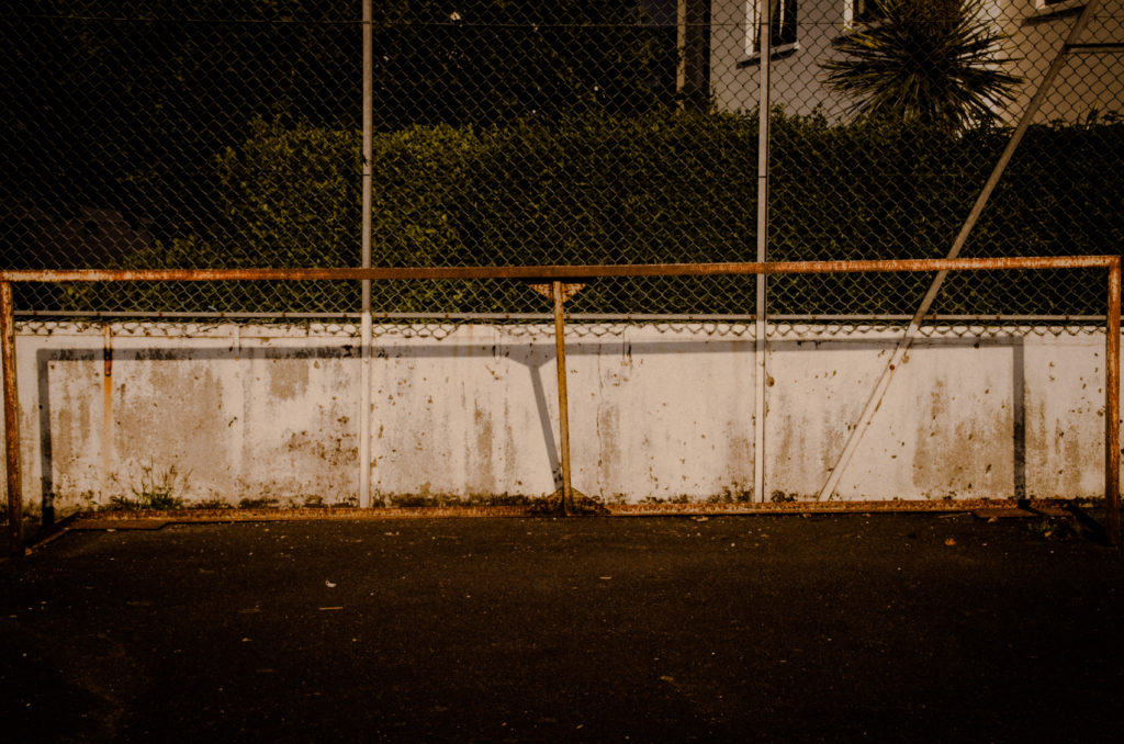
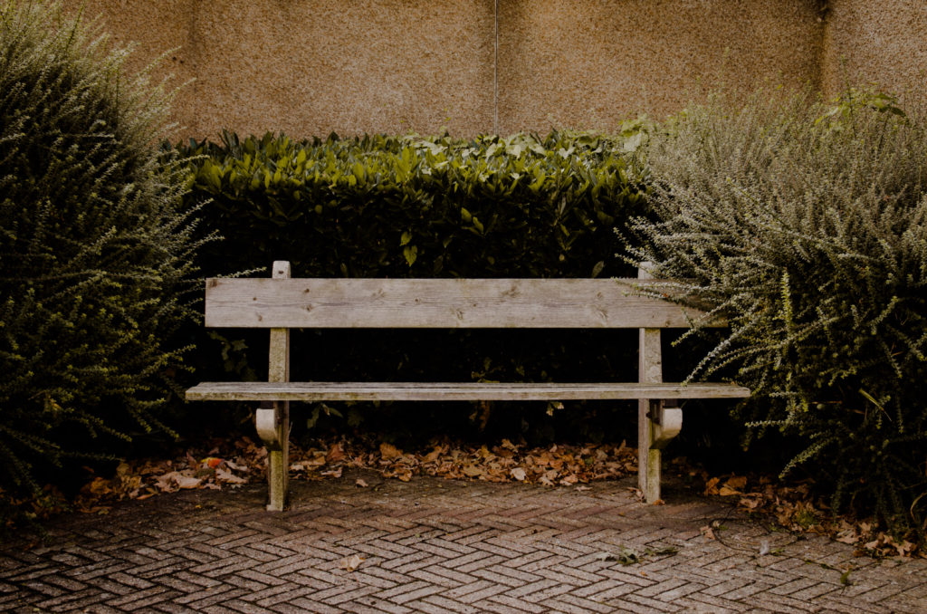
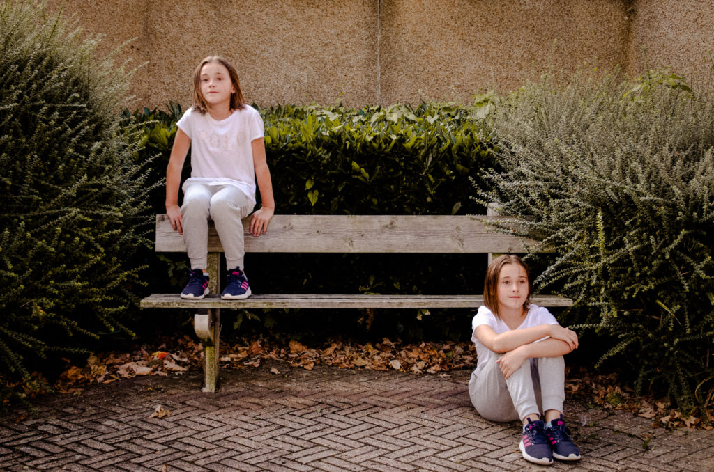
This shoot pairs with my second shoot focusing on the area closer to my home, but I take a more abstract and meaningful approach. I displays how the area can seem completely different depending on when you visit, some days it can be busy with children out having fun, where other days it can seem like a ghost town. These images will be displayed in pairs to show comparisons between the two.

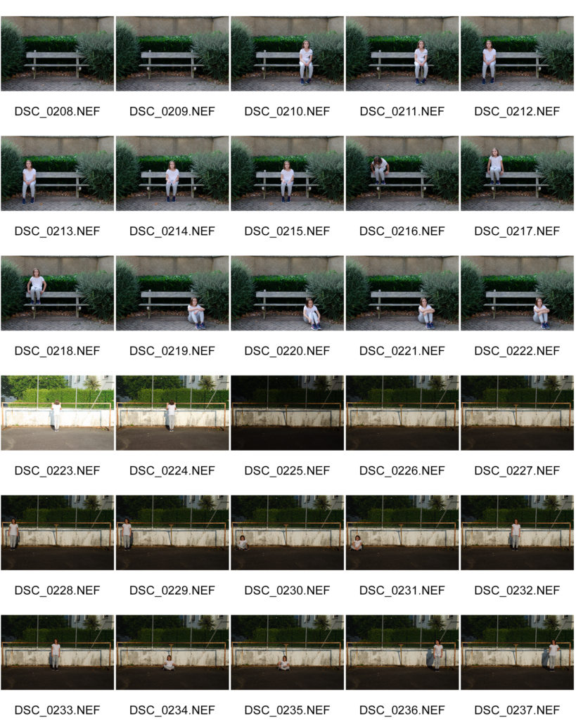
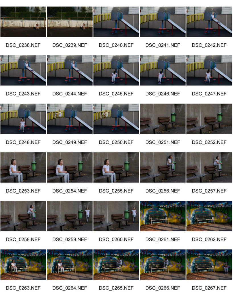
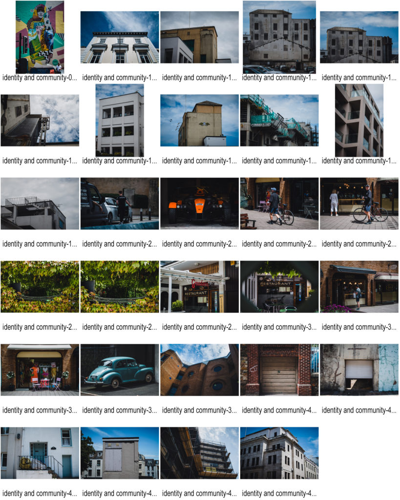
Raw Image Contact Sheet

Plan and Process

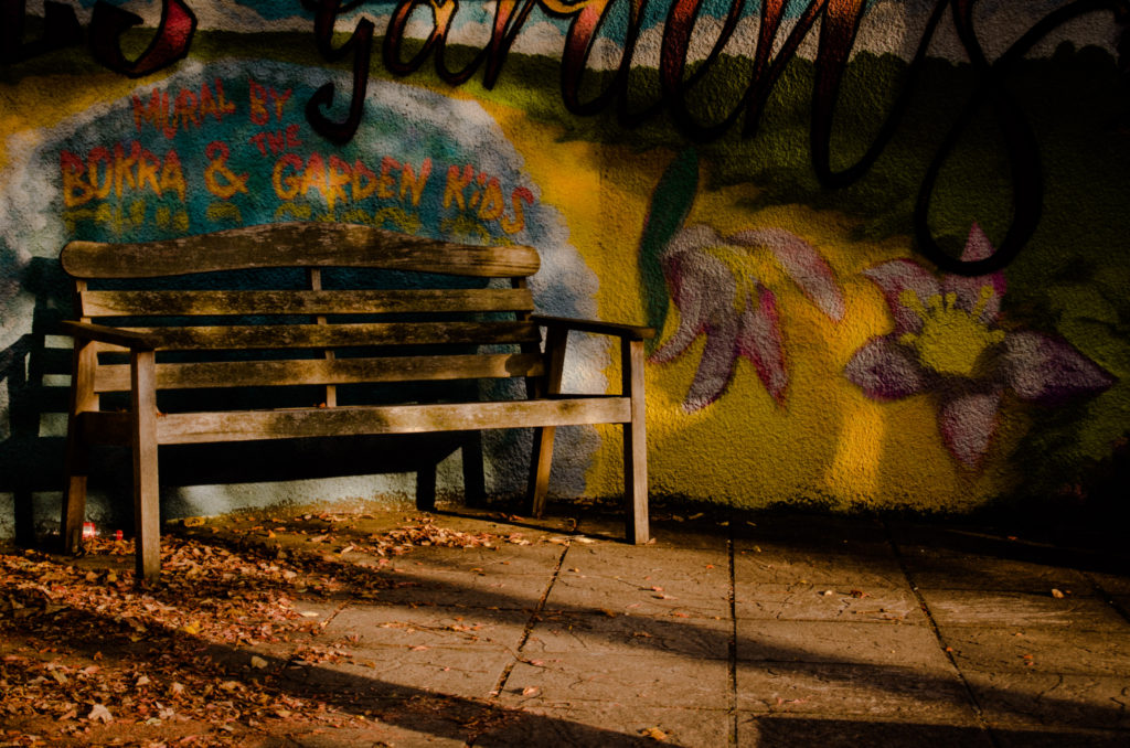
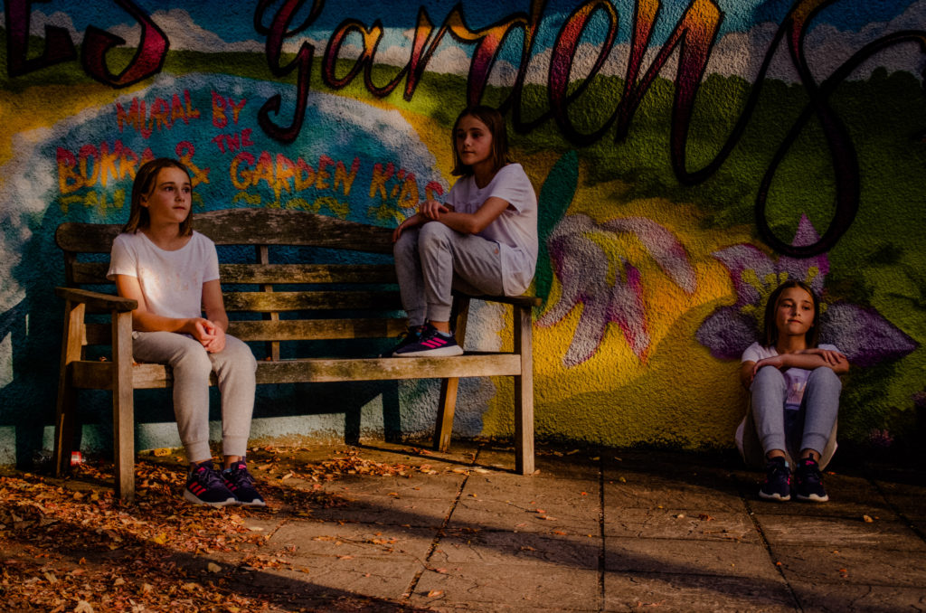
For this shoot, my plan was to use a tripod to keep the frame steady and consistent throughout different shots. I took an image of empty space with no subjects in the frame, I then photographed one subject in multiple different places within the frame, without moving the camera, My plan is to edit these images in photoshop to make the subject appear multiple times in one frame. This is to symbolise how busy and also empty areas of the local community can be.

Editing

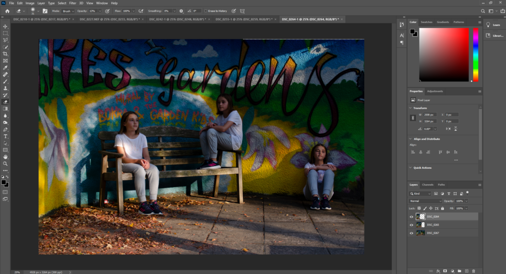
In photoshop, I cut out parts of different images and aligned them so the subject appears multiple times in one frame.

Final Image pairs

Favorite Image

This is my favorite image because it is the most seamlessly edited. This photo also caught my attention because of the colourful backgroung and texture of the wall ehich brings more life to the image.

Community – Shoot 2

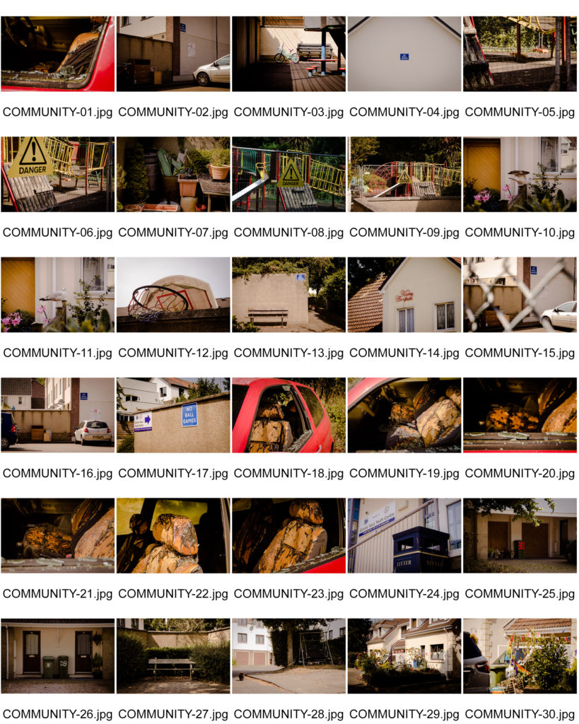
This shoot focuses on the area closer to my parish, showing the variation of how people live, their beliefs and the good/bad aspects of this area.

Edited image contact sheet

Favorite Image

This is my favourite image because it symbolises the activities that bring communities together, yet also displays the wealth and lifestyle of people in this area. The broken and worn basketball hoop has natural earthy colours from the moss, which goes with the earthy brown colors of the wall it is leaning against. To further enhance this earthy feel I colour corrected the image while editing it to have a yellow/brown hue. I think that this gives the image almost a relatable feel because nothing is too bright and crisp, making the hoop feel used, showing that it has helped bring the community together.

Community – Shoot 1

For this first shoot i focissed on street/candid photography, local businesses along with the consistent architecture of the community buildings in my parish.

When editing these images, especially for the architecture photographs, I created a big contrasty between the highlights and the shadows to create a more dramatic image.

Edited images Contact Sheet

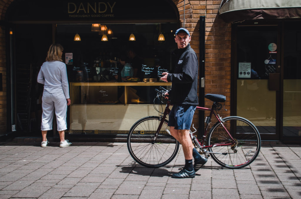
Favourite image

This is my favorite image because it shows a successful, busy local business within the community. The warm colours from the natural lighting make the image more inviting to look at. I also like the candidness of the image with the man and his bike unaware of the camera, along with the people in the shop.

Community – summer task – Intro

For these next three photo shoots, i have imagines myself as a photographer for my street, neighbourhood, town or city. And that I have been commissioned to create a sequence of photographs celebrating the spirit of this place and its people. I will be limited to 10 pictures in total. Make a larger body of images, then edit these down to just 10. Arrange in a sequence or collage that makes sense as a final set of images.

Shoot plans

My plans for these three shoots are to approach three different areas and aspects of the community around me. The first shoot will focus on street/candid photography along with the consistent architecture of the community buildings in my parish.

My next shoot will focus in on the area closer to my parish, showing the variation of how people live, their beliefs and the good/bad aspects of this area.

My final shoot will pair with my second shoot focusing on the area closer to my home, but I will take a more abstract and meaningful approach. I will display how the area can seem completely different depending on when you visit, some days it can be busy with children out having fun and other members of the community everywhere, where other days it can seem like a ghost town. These images will be displayed in pairs to show comparrisons.

Family Archives and Photoshoot

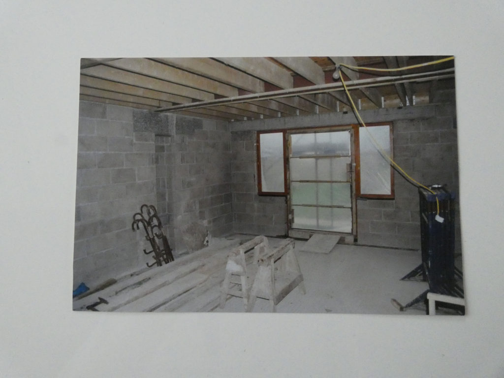
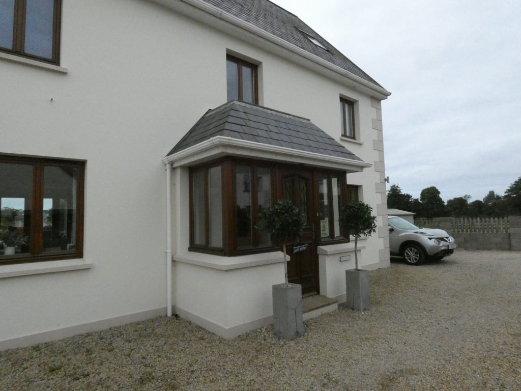
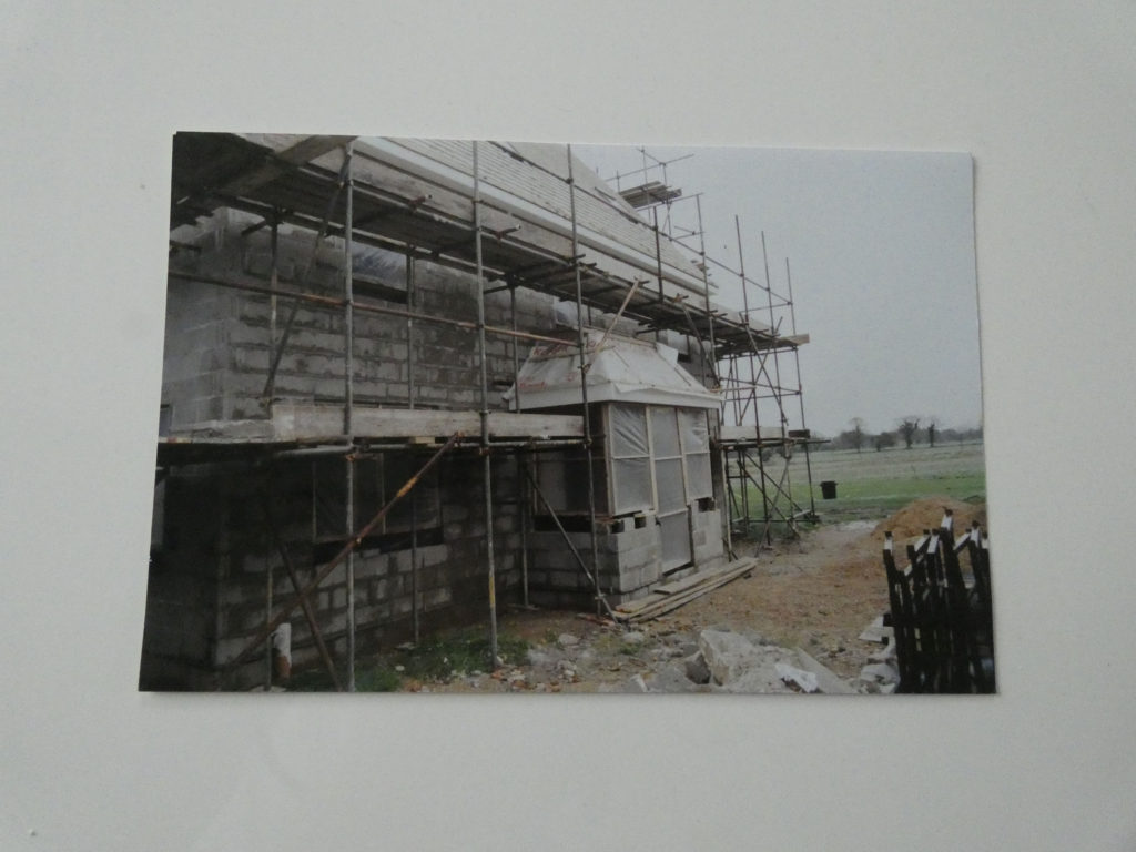
For this assignment, I decided to collect old images of my house. I thought I would take a different approach to this assignment instead of using family images, as my house projects the same idea as comparing photographs of my relatives. This is because I lived in this house ever since I was I born. Another important reason as to why my house is important to my family and I, is because my dad and grandad built and designed it themselves. For this reason there is many pictures of the process of building my house in my family photo albums, and I think creating a comparison of the changes of my house over the years is a more unique way of representing my identity and family.

Family Archives Photoshoot

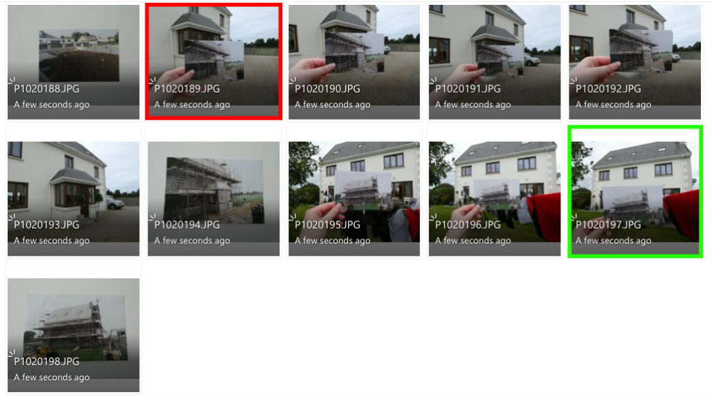
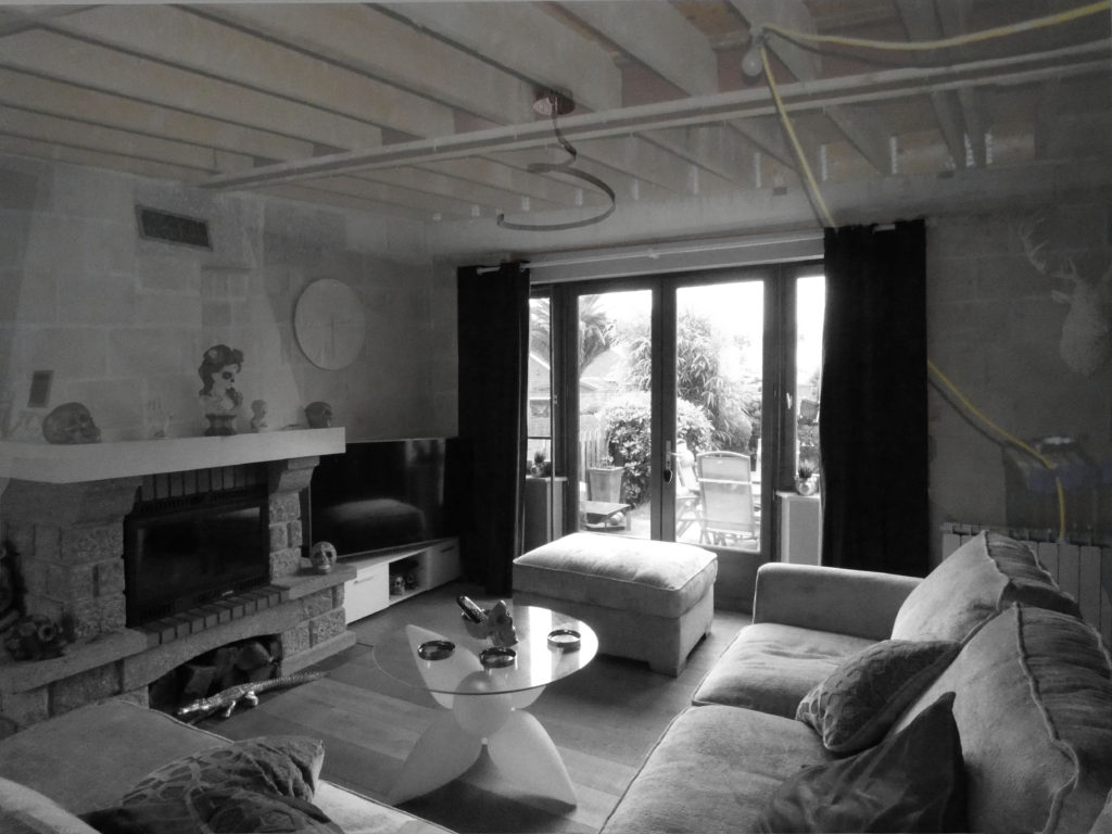
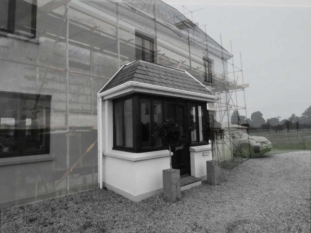
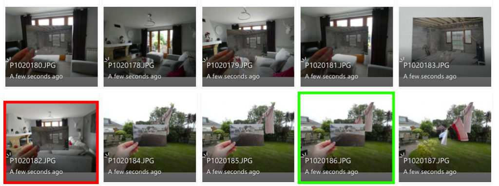
I decided to take photographs of my house compared to the building process of my house, as well as individual photographs of sections of my house and re-photographed the images from my family album. I did this to experiment in photoshop with layering and making collages to compare the changes of my house over the years.

The images I highlighted in red are the photographs I believe are my least successful photographs as I don’t think the images line up that well and I didn’t like the composition of the photographs. The images I highlighted in green are what I believe to be my most successful photographs because the photos line up better or I like the idea of layering them in that way.

I’m going to use photoshop to experiment with layering and cropping to create a collage-like affect.

Photoshop Development

Original Image
Original Image
Edited Image
Original Image
Original Image
Edited Image

To edit these images, I cropped the original image of the physical photographs from my family albums, I then layered them over the new photographs and lowered the opacity in order to achieve a “ghost-like” effect. I also erased areas of the old images to keep the contrast between the old and new. I feel like this photoshoot was successful because it’s a more unique approach to the project, yet it still projects a strong contrast between old and modern times.

If I was to do this photoshoot again, I would take a wider range of photographs at different angles. This way, I could have lined up the older images better and had more images to work with.

‘In Progress’ Exhibition Review
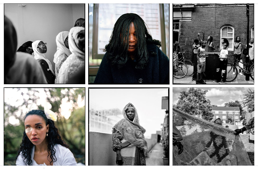
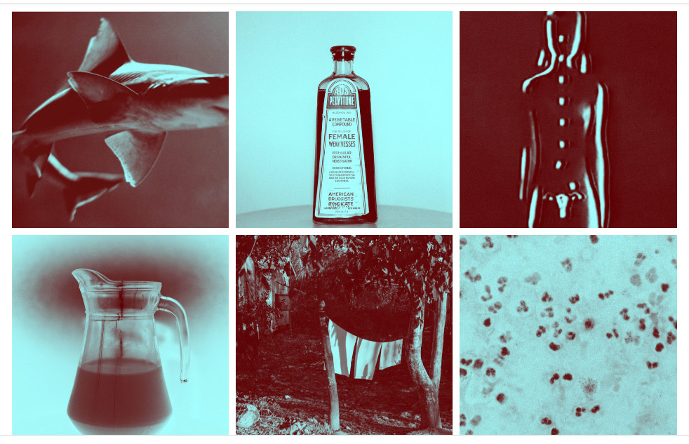
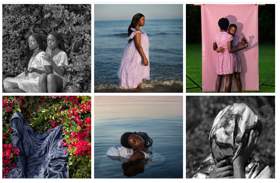
The title ‘In progress’ suggests that the work exhibited is aiming to shed light on issues that are still a problem in society today and are only being solved gradually. I believe the title of this exhibition has derived from the phrase ‘a work in progress’, as it implies that although people are making an effort to reduce these issues, they are also being put on the side-lines as other problems are being prioritised over them. For me the word ‘progress’ connotes ideas of steady change and revolution in society. In the last 5 years I think that photography has become more honest in the way we capture moments, I believe we have seen a more candid side to the world rather than a staged outer appearance, especially due to the increasing amounts of photo-journalism we have access to due to technology such as phone cameras. In addition, I also think that this honesty has come from a place of activism and a need for improvement to ourselves and the world we live in, whether it be motivated by issues such as racial or environmental injustice. My expectations for this exhibition were to see visual representations of modern issues, that are given the attention they deserve by the photographers presented. My expectations for any photography exhibition are to see images that cause me to question myself or society around me, whether it be the way I live and my impact on others, or the impact others have on the world. The themes and format of photography I would normally expect to encounter are predominantly staged portraits as most people find that these are the best story tellers and most efficient way of connecting with an audience. This exhibition supports my expectations through the work of photographer Widline Cadet, due to her staged portraits depicting women supporting each other, but is also contradicted by photographers such as Laia Abril, who has taken still life photographs.

Narrative and Sequencing

STORY: What is your migrant community story?
Describe in:

  1. 3 words – A migrant community
  2. A sentence – The migrant communities of Jersey.
  3. A paragraph – This work shows the variety and vastness of the communities we have in Jersey including sub communities and groups that link with different hobbies or beliefs.

NARRATIVE: How will you tell your story?

I will tell the story through my images I have taken on walks through St Helier which have been arranged to show/ tell different stories and show opposition.

AUDIENCE: Who is it for?

My Zine will be aimed for anyone who is part of a community in Jersey to show that communities effect identity which include both personal identity, and social identity.

Images here

THEME OR STORY

I have used an image of a mural for my front cover with a French title La Vielle Ville which translates to the old town. The main theme of the zine will be revolving around how wide communities are and how many people are part of them.

The start of the zine will be revolving around natural vs artificial light and will be images from the museum trip. There will be a few images from the trip.

Next I will start to show the communities of Jersey and show how creative and unique the outcome from different communities are showing some art in town.

Next I will show the different members of communities through images and imagination. I will show comparisons from young and creative, to old and old fashioned.

I then want to show how old communities are and how communities are creative again. I will compare signs from different places through town showing building names and graffiti artwork. This shows younger communities and how we are creating our own signs and world around us.

Design and Layout

Using Indesign, I have created a zine of the images I took over the two photography walks in town linked to identity and community. I have also used titles and a variety of images to link to identity and community.

Create new document
width: 148mm
height: 210
pages: 16
orientation: portrait
columns:2
column gutter: 5mm
margins: top, bottom, inside, outside: 10mm
bleed: top, bottom, inside, outside: 3mm

First Draft

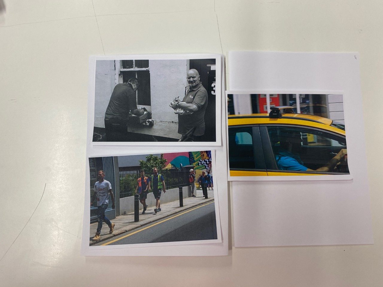
I think the group of images above work well together because they reference different parts of society. The old car references the elderly and that the elderly are still part of the community. The image of the man with the guitar references music as a part of linking people together. The three pairs of shoes represent the idea of family and how a family is like a community. And the man holding the bin bags references the idea of working and providing for his family and community.

The group of images above work well together because they are candid photographs that show people in there natural environment. I like how people look when photographed without knowing so they don’t have to act in a certain way for the photo.

I grouped the images above together because the two images on the left are both old lanterns and have a good luminance and create a nice glow. I grouped the two images on the right together because they both have similar colourways and together, the two sets of images represent the idea of blue and cold looking images versus orange warm looking images.

I grouped the images above together because they all have good contrasts in bright light and dark shadows and colours.

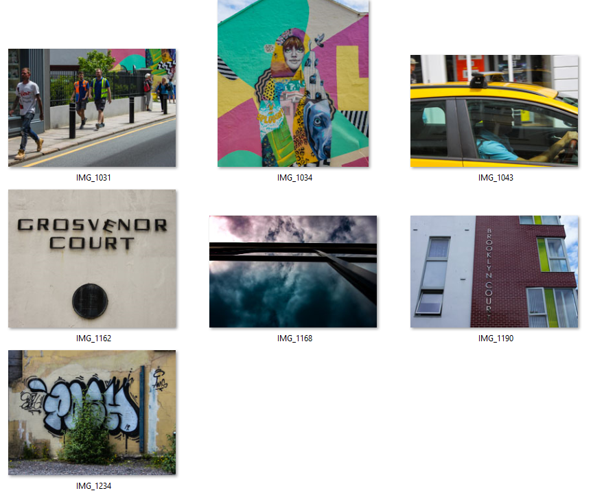
The images above are all of writing on walls and i like the grouping of the old writing (top left) the new writing (top right), the illegal writing (bottom left) and the new but weathered writing (bottom right).

I grouped the images above together because they both use similar colour schemes and also both are artwork on walls.

Actual Design

I named the zine La Vielle Ville which translates to the old town from French linking to Jersey’s French and Jerriais (Jersey French) heritage. I also used an image of an old mural near the Jersey museum in Le Chemin Du Bel.

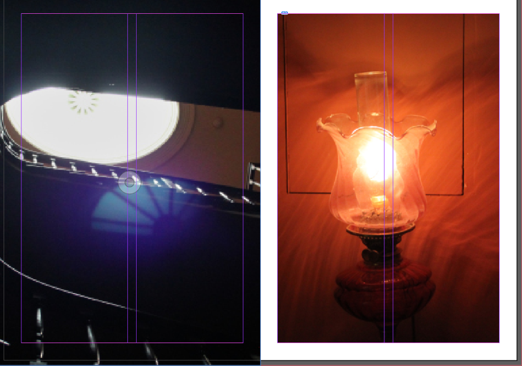
I chose to group the two images above because they both have shimmers from the light. They also oppose each other as the image on the left is very colourless and contains natural light versus the other image is artificial light and has a warm colour.

I chose to use the image above as a two page spread as the spine of the book where it folds is in the middle and looks like two different photos.

I grouped the images above as they both use the same colourway and are both murals on walls.

I grouped the two images on the left as they both relate to community. I grouped the images on the right as the one at the top is an old beer brewery and the image on the bottom right is an image of the Admiral which is a pub and links to beer.