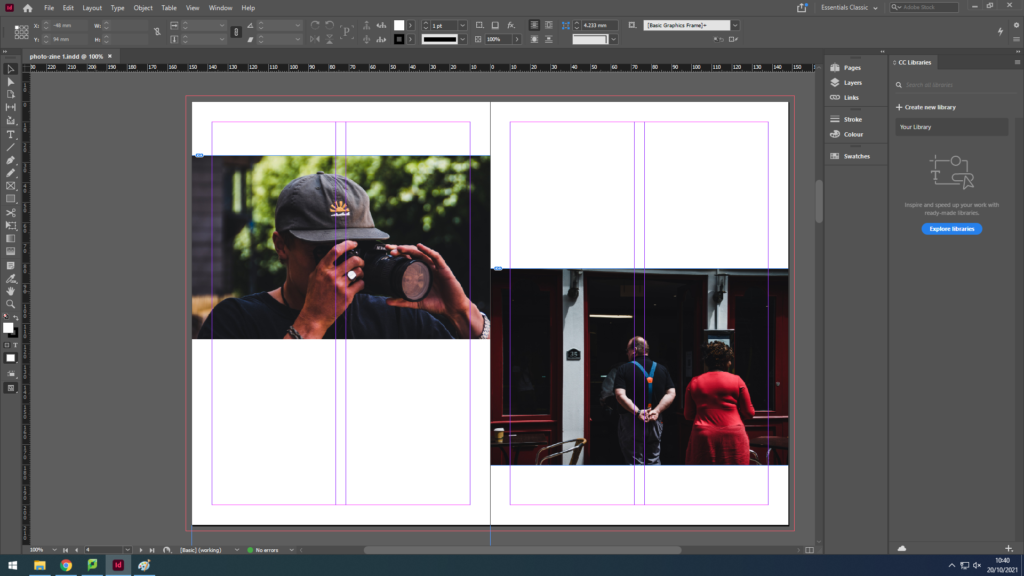
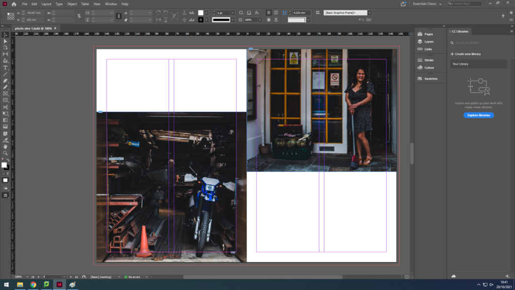
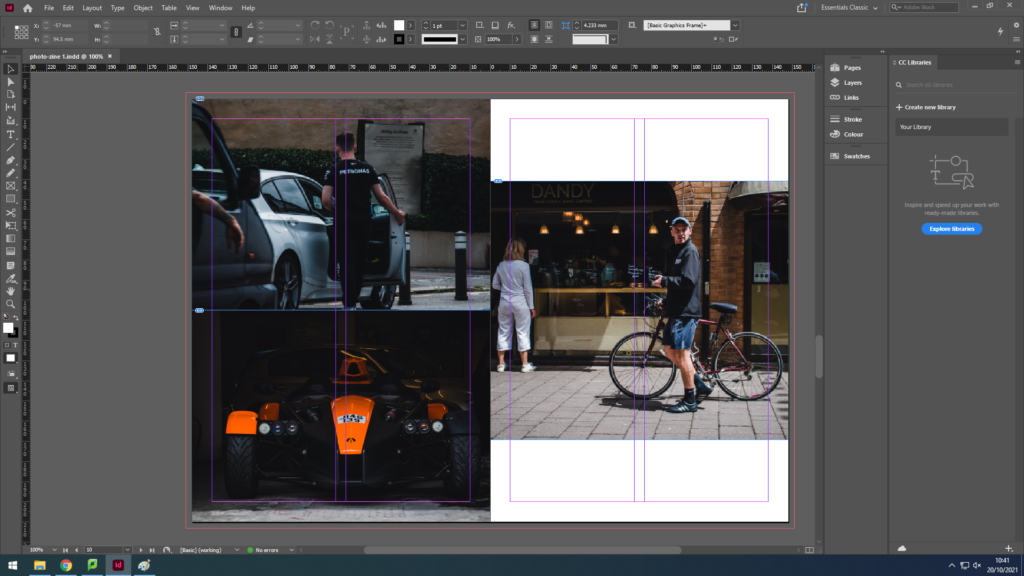
We used Adobe InDesign to create a photo zine of our photography throughout St Helier. We set boarders on the pages to make the images symmetrical and even, and imported out best edited photos from the shoot into the program. I then selected photographs that fit together well to be presented on each page, without over packing the page and cramming photos in. I decided to have some pages with one full image, these images were usually the clearest with high contrast which had a larger impact on the viewer. Other pages had smaller images with up to 2 photos on a page and 4 images on a double page spread. I chose my cover image because of the contrast between the two sides being white with highlights and the other being dark with shadows in the background. I also liked this image because the subjects stayed in the same position that they were in before we walked by to take photos, showing a glimpse into another persons life.
Here are the final pages of the zine screenshotted on Adobe InDesign.


